A customer support conversation that starts with “I deleted my client by accident” is rarely a story about a missing confirmation dialog. More often it is a story about a word. The user believed “Archive” meant “put away for later” because that is what it meant in the tool they used for six years. In your product it means “remove from every report, immediately”. Nobody lied. The button worked exactly as designed. The user was simply operating a different product, the one that existed in their head.
That private, unstated, usually wrong picture is a mental model, and it is the thing your users actually use. They never interact with your data schema, your architecture or your roadmap. They interact with their own theory of what your product is, what lives inside what, what a click will do and what the software will quietly do on its own. Every click is a prediction made from that theory. When the theory matches your product, people look competent and the product looks intuitive. When it does not, the same people look careless and the same product looks badly built.
This guide covers what a mental model means in UX and product design, how it differs from the conceptual model your team holds and the system model your engineers built, where users’ models come from, the five mismatches that cause most of the damage in SaaS products, how to find the model your users actually hold without a research budget, six ways to close the gap, and how a layer of in-app guidance teaches a model correctly without waiting for a redesign.
Key takeaways
- A mental model is the user’s private theory of how your product works. It is built in the first few minutes, mostly from the last tool they used, and it is revised reluctantly.
- You cannot ship a mental model. You ship an interface, and everything the user believes is inferred from your labels, your layout and what happened the last time they clicked.
- A discoverability problem and a mental model problem look identical on a usage dashboard and need opposite fixes. Check whether the control was never reached, or reached and abandoned.
- Most damage comes from five mismatches: vocabulary, what contains what, state and lifecycle, what the product automates, and who can see what.
- The cheapest fix is almost always a better word. The second cheapest is guidance placed on the exact element the user misreads, which ships in an afternoon instead of a quarter.
What Is a Mental Model? (Meaning and Definition)
Mental model: definition
A mental model is the internal explanation a person carries of how something works. Applied to software, it is the user’s private theory of what the product’s objects are, what contains what, what will happen when they click, and what the system will do without being asked. Users cannot usually state it, and they never write it down, but they act on it every second they are inside your interface.
The concept comes from cognitive psychology and reached design through Donald Norman’s work on everyday objects: people build a simplified, often incomplete, frequently wrong working theory of any system they use, and they use that theory to predict what will happen next. A door with a flat plate says push. A door with a handle says pull. Put a handle on a door that needs pushing and you get a lifetime of people looking foolish in lobbies. The door works. The story it tells is wrong.
Three properties of mental models matter more than the definition, because they are what makes them expensive in a SaaS product.
-
They form fast, on almost no evidence
A user does not wait until they understand your product to form a theory of it. They have one within a minute, built from the sign-up flow, the first screen and the words on the navigation bar. That theory then shapes how they read everything that follows.
-
They are simplified on purpose
Nobody wants an accurate model of your product. They want the smallest theory that lets them finish the job they came for. A model that is wrong in ways that never show up in their daily work will never be corrected, and that is a rational choice on their part, not laziness.
-
They are sticky, and they survive evidence
A user who once believed Archive deletes will avoid Archive for a year, even after reading a help article that says otherwise. Correcting a model costs more attention than forming one, so the first impression is disproportionately valuable and disproportionately dangerous.
This is why “the user should have read the tooltip” is never a satisfying answer. People do not consult documentation to check a belief they do not know they hold. They act on the belief, get a result they did not expect, and then form a second belief to explain the first one. Two wrong models later, you have a support ticket that reads like the product is broken.
It is worth separating this from two neighbouring ideas the blog covers elsewhere. Cognitive load is about how much a user has to hold in their head at once. Learnability is about how quickly they get from first attempt to competent. A mental model is about what they believe is true. A product can be light on cognitive load, quick to learn, and still systematically teach people something false about itself.
Mental Model vs. Conceptual Model vs. System Model
Three different models are in play whenever software is designed, and most arguments in product reviews are caused by two people talking about two of them.
| Model | Whose it is | Where it lives | What it controls |
|---|---|---|---|
| Conceptual model | The product and design team | Specs, naming decisions, design reviews | What the product intends to teach |
| System model | Engineering | The code and the data schema | What actually happens on a click |
| Mental model | The user | Their head, unstated | What they try next, and what they avoid |
The uncomfortable part is that you can only ship one of the three, and it is not the one you spent the most time on. You ship the interface. The user sees labels, layout, ordering, empty states, error messages and the result of their last action, and from that evidence alone they reconstruct a theory. Designers sometimes call the visible product the system image: it is the only channel through which your conceptual model can reach anybody. If the system image teaches badly, the mental model will be wrong however elegant the conceptual model was in the design review.
The conceptual model reaches users only through the product itself, and the mental model they build from it decides every subsequent click.
There is a specific failure worth naming, because it is common and it is invisible from the inside: shipping the system model as the conceptual model. It happens when the interface exposes the database. Users are asked to understand entities, parent records, join objects and states that exist because of how the software was built rather than because of how the work is done. The product is not badly designed in any obvious way. It simply requires every customer to learn your schema before they can do their job, and most of them will not.
A quick test. Take the top level of your navigation and read the labels aloud to someone who does the job your product supports but has never seen it. If they can guess what each one holds, your conceptual model is doing its work. If they ask what the words mean, you have shipped your schema.
Where Users’ Mental Models Come From
Users do not invent a theory of your product out of nothing. They import one. Knowing where they import it from tells you which corrections are worth building, and in which order.
-
The last tool they used
This is the single largest source. Someone arriving from spreadsheets expects rows, sorting and a single undo that covers everything. Someone arriving from a different product in your category expects its vocabulary and its hierarchy. The stronger their habits in the old tool, the stronger the import, which is why experienced users are often slower than novices in the first session. Our guide to onboarding users who are switching tools covers this in depth.
-
Category conventions
A bin icon restores for a while before it destroys. A star means favourite. A pencil edits in place. These are not arbitrary; they are decades of accumulated practice. Breaking one is not a bold design choice, it is teaching against a lifetime of reinforcement, and you should only do it when you are prepared to pay the teaching cost every single time a new user arrives.
-
Your own marketing
The website promised “your whole pipeline in one place”, so the user opens the product looking for a pipeline. If the first screen is a list of contacts, the model is already sliding. The sales conversation does the same thing at a larger scale, which is why the handoff from sales to onboarding is worth treating as a transfer of expectations, not just of account details.
-
The first five minutes
Whatever the empty state, the welcome screen and the first guided flow show becomes the frame everything else is read through. An empty state that shows one object type quietly teaches that the product is about that object type, whether or not you meant it to.
-
Colleagues, correct or not
In team products the model is usually inherited from whoever set the account up. If that person built a workaround in month one, everyone who joins afterwards learns the workaround as if it were the product. This is the strongest argument for enabling the customer’s internal trainer rather than only teaching individuals.
-
Your own words
Every label is a promise. “Publish”, “Sync”, “Archive”, “Deactivate”, “Workspace” and “Space” all arrive pre-loaded with meaning the user brings from elsewhere. Copy is not decoration on top of the model; it is the main way the model is transmitted. Our UX microcopy guide covers how to write it.
The practical consequence is cheap to act on: find out which tool the majority of your new accounts arrive from, and design the first session to answer the question they are actually asking, which is never “what does this product do?” but “where is the thing I used to do?”. A single question in a welcome survey is usually enough to route people into the right correction.
The Gap: How a Wrong Mental Model Shows Up in Your Data
Mental models are invisible, but the collisions between them and your product are not. Every wrong model leaves the same handful of fingerprints in support conversations and product analytics. These are the six worth watching.
Tickets, chats and in-product searches use words your interface does not contain. Zero-result searches are the purest version of this.
An action is taken and immediately undone: created then deleted inside a minute, toggled on then off, invited then removed.
People change the same setting on twenty records one at a time when a parent or bulk action exists. They do not believe the parent controls the children.
In a flow with steady completion, a single step drops sharply. That step is usually where a new concept is introduced without being explained.
Customers rebuild something you already ship: a spreadsheet beside the product, a naming convention inside titles, duplicate accounts used as folders.
Someone asks you to build a thing that shipped eighteen months ago. They found it, read the label, concluded it did something else, and left.
Signal six deserves a longer look, because it is where teams most often reach the wrong conclusion. A feature with low usage can mean two completely different things, and a usage dashboard cannot tell them apart. Either people never reached the control, which is a feature discovery problem, or they reached it, opened it, read it and walked away, which is a mental model problem. The fixes point in opposite directions. Making a misunderstood control more prominent does not increase adoption; it increases the number of people who bounce off it, and it costs you the attention you spent making it prominent.
The same low usage number, two different diagnoses. Check whether the control was ever opened before you decide to make it louder.
The way to separate them is to look one level below the usage count, at whether the screen holding the control was viewed at all and what happened in the seconds after it was opened. Products with event tracking in place can answer this in an afternoon. So can a short run of session replays filtered to people who opened the screen and left within fifteen seconds.
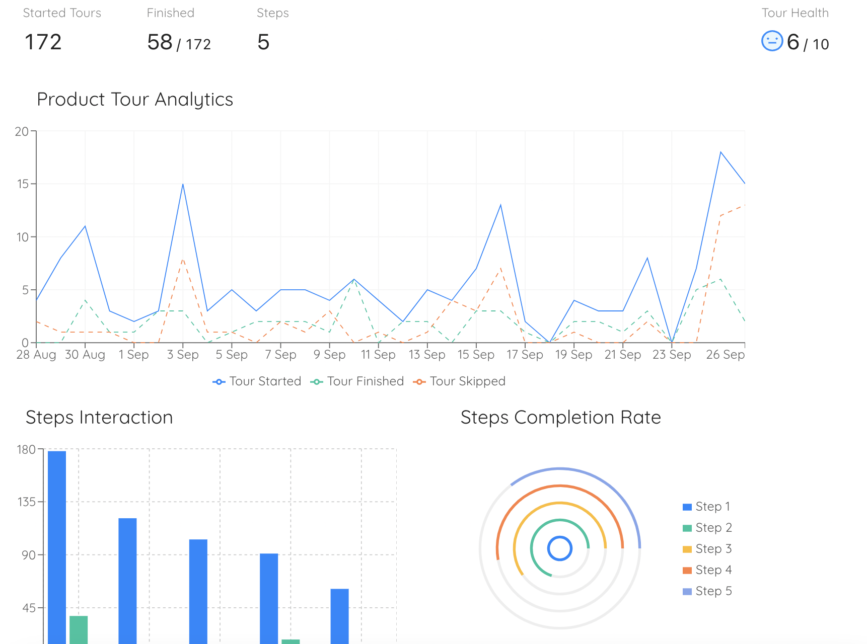
Per-step completion is the fastest way to find the step where a new concept is introduced and not understood.
One more warning about reading these signals: a wrong mental model is not evenly distributed. Self-serve sign-ups, invited teammates and migrating administrators arrive with three different imported models, so an average hides the problem. Break the numbers down by user segment before concluding that nobody has trouble with a concept.
Five Mental Model Mismatches in SaaS Products
Almost every expensive misunderstanding in a business application belongs to one of five families. Naming the family is useful, because each one has a different cheapest fix.
1. The vocabulary mismatch
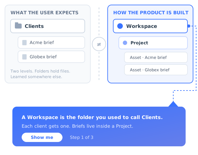
You call it a Workspace. The user calls it a folder, or an account, or a client. They are not confused about the feature, they are confused about the word, and the word is the only handle they have. The cost shows up as searches that return nothing, questions in chat that your documentation cannot match, and people scrolling past the exact thing they came for.
The cheapest fix is a rename, and it is almost always worth considering before any guidance is built. When a rename is not possible, because the term is load-bearing across the API, the contract or the brand, teach the word once, at the object, the first time the user meets it. A tooltip that says “A Workspace is what you would call a client folder” costs one sentence and removes a recurring ticket.
Rule of thumb: invent a word only when no existing word is close. Every invented word is a concept you now have to teach forever, to every new user, in every language you support.2. The container mismatch: what lives inside what
This is the most damaging family, because getting it wrong produces data in the wrong place rather than a moment of confusion. Users guess your hierarchy in the first few minutes and then build months of work on the guess. Is a campaign inside an audience or the other way round? Does a setting on the parent apply to children created before it, or only after? Can an item belong to two containers at once?
The symptom is a migration request: “we set everything up under one client and we now need it split into five”. By the time you hear it, the cost is yours as much as theirs. The fix is to show the structure once, visually, at the moment it first matters, rather than describing it in prose. A single diagram of the object model, shown when the user creates their first container, prevents more damage than twenty tooltips added later. Products with genuinely layered structures should read our guide to onboarding for complex products.
Also worth fixing: make creating at the wrong level hard to do silently. An honest breadcrumb and a “this will be created inside Acme” line under the button catch most of it.3. The state and lifecycle mismatch
Draft, scheduled, published, paused, archived. Saved locally, synced, live. Preview and production. Every product with states has users who believe there is one fewer state than there is, and the classic symptom is the sentence “I changed it but customers still see the old one”. The user completed the edit, saw no error, and concluded the work was done, because in most software they have used, editing is publishing.
State mismatches are cheap to fix and frequently ignored, because the state is displayed, usually as small grey text in a corner. Grey text is not a signal. Make the state loud: a coloured badge next to the title, a persistent bar when the user is looking at a draft, and a confirmation at the moment of the action that names the consequence rather than the operation.
Name transitions as verbs your users already own. “Publish changes” teaches better than “Commit”, and “Make live for customers” teaches better than both.4. The automation mismatch
Users are wrong about automation in both directions, and both directions cost you money. Some believe nothing is automatic, so they keep doing manually the thing your product was bought to do, which shows up at renewal as a customer who never saw the value they paid for. Others believe everything is automatic, which shows up as a genuinely bad day when four hundred emails go out that nobody intended.
The fix is to make automation legible twice: at the moment it is configured, and again the first time it actually fires. A rule that silently starts working is a rule the user does not have a model of. Our guide to onboarding automation covers the build side; the model side is simply never letting the product act invisibly on a user’s behalf the first time.
Before any consequential automated action, show the blast radius in plain numbers: “This will notify 412 people in Acme Ltd.” Users do not read settings pages, but they read numbers about themselves.5. The permission and visibility mismatch
“Who can see this?” is a model question with a trust answer. When users are unsure, they do one of two harmful things: they share something they should not have, or they refuse to use a collaborative feature at all because they cannot verify who is watching. The second is quieter and more common, and it is usually recorded internally as low adoption of a feature rather than as a trust failure.
State the audience in plain language next to the control, in the moment, not in a permissions matrix two screens away. “Everyone in Acme Ltd can see this” is worth more than any settings page. For products where this is a compliance matter as well as a usability one, our guides to building user trust and GDPR-compliant onboarding go further.
How to Find the Mental Model Your Users Actually Have
You cannot fix a model you have not heard. None of the following needs a research budget or a dedicated researcher, and four of the five can be done with data you already have.
- Read the words in thirty recent conversations and build a two-column glossary.
- Pull the searches that returned nothing.
- Ask people to predict what a click will do, before they click.
- Ask five customers to draw how they think the parts fit together.
- Watch first sessions rather than average ones.
1. Read the words, do not count them
Take thirty recent support conversations and highlight every noun the customer uses for one of your objects. Put their word in one column and yours in the other. Where the columns differ you have found a mismatch and its copy fix at the same time, which is why this is the highest-yield hour in the list. It works best when you read the raw text rather than a tagged summary, because tagging replaces the customer’s vocabulary with yours, which destroys exactly the signal you are looking for. Our guide to analysing customer feedback covers how to do this at volume without losing the wording.
2. Mine the searches that returned nothing
In-product search and help-centre search both produce a list of terms your product does not speak. Zero results is not a content gap in most cases, it is a vocabulary gap: the feature exists, under another name. Sort by frequency and you have a ranked backlog of renames and redirects. If your knowledge base is separate from the product, compare both lists, because the words people use when they are stuck differ from the words they use when they are exploring.
3. Ask for the prediction, not the outcome
In a usability test, the standard question is whether the participant completed the task. For mental models, the useful question comes one beat earlier: “before you click that, what do you think will happen?” A wrong prediction followed by a successful click is still a broken model, and it is invisible in a completion-rate report. Five sessions produce more named mismatches than a quarter of analytics.
4. Ask them to draw it
Give a customer a blank sheet and five minutes: sketch how you think the pieces fit together. The drawings will be wrong in interesting, repeatable ways, and comparing five of them against your actual object model exposes container mismatches faster than any dashboard. It also surfaces the objects users invent that you do not have, which is often the clearest statement of an unmet need you will ever receive. More techniques in our guide to user research methods.
5. Watch first sessions, not average ones
Models form in the first minutes and then harden, so an average session tells you about people whose model has already settled, right or wrong. Filter to first sessions and you can watch the frame being chosen: which nav item they open first, which word they hesitate on, where they go looking for something that is somewhere else. Our guide to the first-time user experience covers what to look for.
Run all of this per segment rather than in aggregate. A migrating administrator, a net-new self-serve user and an invited teammate arrive with three different imported models and need three different corrections, which is also why user personas built from jobs and prior tools are more useful here than personas built from demographics.
Six Ways to Close the Gap
Once you know which model your users hold, there are two honest options: change the product so the existing model becomes correct, or teach the correct model. In that order, because the first is permanent and the second is a running cost.
1. Rename before you explain
A label that matches the user’s word removes the need for the explanation entirely. This is the only fix on the list with no ongoing cost, and it is systematically underused because renaming feels trivial next to building something. Check the glossary you built from support conversations, pick the three words with the largest gap, and change them.
Removes from the queue: zero-result searches, questions your documentation cannot match, and people scrolling past the feature they came for.2. Show the structure once, visually
One picture of the object model, shown at the moment the user creates their first container, does more than any amount of prose. It does not need to be beautiful: three boxes and two arrows that say what holds what is enough. Show it once, make it reachable afterwards, and do not repeat it, because a structure diagram shown on every login becomes wallpaper.
Removes from the queue: “we set everything up in the wrong place and need it moved”, which is the most expensive ticket in this whole article.3. Make state visible and loud
Never let the absence of a signal carry meaning. If a record is a draft, say draft in colour, next to the title, on every screen where the record appears. If something is scheduled rather than live, the difference should be visible from across the room. Small grey status text satisfies the specification and teaches nobody.
Removes from the queue: “I changed it and customers still see the old version” and the escalation that follows it.4. Preview the consequence before the action
The most reliable way to correct a model is to let the user compare their prediction with reality before anything irreversible happens. A count of who will be affected, a preview of the message that will go out, a sample of the rows that will change: each one is a model correction delivered at the exact second it is needed, which is the only time a person is genuinely paying attention to how your product works.
Removes from the queue: bulk actions applied to the wrong set, and the recovery work that follows.5. Teach the concept where it appears, not up front
A concept explained in a welcome modal on day one is gone by the time it matters on day nine. Attach the explanation to the object: the first time a user opens the screen where the concept lives, explain it there, once. This is the core argument of progressive onboarding and of contextual help, and it applies with particular force to models, because a model is only correctable while the user is actively using it.
Removes from the queue: the same question asked by the same user in week three, after a perfect day-one walkthrough.6. Make being wrong cheap
You will not close every gap. What decides whether a wrong model becomes a churn event or a shrug is how recoverable the mistake is. An obvious undo, an archive that genuinely restores, a draft that is never lost, a deletion that waits thirty days: these do not fix the model, they buy the user a second attempt, and the second attempt is usually where the correct model forms.
Removes from the queue: the support conversation that starts “I deleted my client by accident”, which is where this guide started.Teaching a Mental Model Without a Redesign
Renaming an object across a product, re-nesting a hierarchy or rebuilding a settings screen is a quarter of engineering work and a migration for every existing customer. A model correction delivered as in-app guidance ships this afternoon, targeted at the exact users who need it, and can be withdrawn the moment the underlying design is fixed. Guidance is the fast lane; it is not a replacement for the road.
Different mismatches want different patterns, and matching them properly is most of the skill:
Introduce the object model in the order the user will meet it: what a Workspace is, what goes inside it, where their work will live. Three or four steps, once, at first login. See our guide to product tours that convert.
Attach one sentence to the exact word the user misreads, so the correction arrives at the label rather than in a document nobody opens. See how to create an onboarding tooltip.
A small persistent marker on the control users believe lives in another menu, shown only to the segment that keeps missing it. See our hotspot UX guide.
If the correct model is “do these four things in this order”, a checklist is the model made visible and persistent. See how to build an onboarding checklist.
A rename or a restructure invalidates a model your existing users spent months building. Say so in the product, not only in the release notes. See announcing a new feature.
Ask which tool they are coming from and route the correction accordingly. Someone arriving from spreadsheets needs a different first sentence from someone arriving from a competing product.
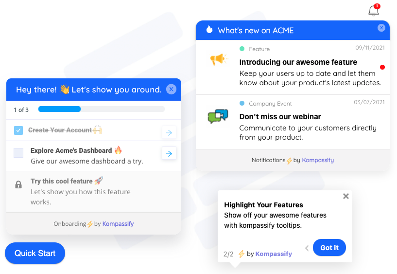
A checklist teaches the sequence, an announcement re-teaches a model that has changed, and a tooltip fixes the word, all on an interface nobody had to rebuild.
Guidance is a correction layer, not a permanent substitute. If every new user needs the same tooltip to understand the same word, the interface is asking to be renamed. Watch which guides get the most views, and especially which get repeat views from the same person: a guide with high repeat views is a design bug with a note taped over it. The goal is for each piece of guidance to become unnecessary, and to know when it has.
When You Change the Model, You Have to Re-Teach It
Every rename, re-nesting or new automation invalidates a model that existing customers have spent months building. The counter-intuitive part is that your best users are hurt most: they had a working theory, they relied on it, and it is now wrong in ways they will discover at the worst possible moment. New users, who had no model, are barely affected.
Four practices make the transition survivable, and none of them is expensive.
- Announce before, not after. A change discovered in the interface is a fault. The same change, announced two weeks earlier in the product, is a plan. Our guide to rolling out a product redesign covers the sequencing.
- Carry the old word for one cycle. “Workspaces, previously Clients” in the navigation, in search results and in the help centre. It costs a few characters and it keeps every existing mental model connected to the new one.
- Run a short re-orientation at first login after the change. Two or three steps that say what moved and where it went. This is exactly the re-onboarding case, and it is the highest-value guidance you will ever ship because it targets people who are already active.
- Write the release notes for the model, not the changelog. “Renamed Clients to Workspaces” is a changelog entry. “Your clients are now called Workspaces, and each one can now hold more than one project” teaches. More in our guide to writing release notes.
If the change is large enough to alter how people think about their work rather than only where a button lives, treat it as a change programme rather than a release, and read our guide to change management alongside this one.
How to Measure Whether the Gap Is Closing
Mental models cannot be measured directly, but the collisions can, and the collisions are what cost money. Pick three or four of these, take a baseline before you change anything, and watch the direction rather than the absolute number.
| Signal | What to measure | Direction you want |
|---|---|---|
| Vocabulary alignment | Share of searches and tickets that use your term rather than theirs | Rising |
| Zero-result searches | Count of in-product and help-centre searches returning nothing | Falling |
| Reversals | Create-then-delete or toggle-then-untoggle within sixty seconds on key objects | Falling |
| Wrong-level edits | Identical edits repeated across sibling records where a parent or bulk action exists | Falling |
| Concept step completion | Completion of the specific flow step where the concept is introduced | Rising |
| Repeat guide views | Users opening the same tooltip or guide more than twice | Falling, or rename the label |
| Duplicate feature requests | Requests for capability that already ships | Falling |
| Second-occurrence time | How long until a user repeats the task unaided | Falling |
Two method notes. First, compare cohorts rather than the whole base, because a fix applied today only affects people who arrive after it; mixing them with everyone who arrived last year will hide a real improvement. Second, where the change is large enough to justify it, hold a slice of users back and compare, which is the approach described in our guide to A/B testing onboarding. Kompassify’s own product analytics reports feature usage per user over time, which is the baseline most of these measures are built from.
Mental Models: Do vs. Don’t
✅ Do
- Use your customers’ words for your objects wherever the word is not load-bearing elsewhere.
- Show the object hierarchy once, visually, when the user creates their first container.
- Ask what people expect to happen before they click, in every usability session.
- Make state loud, in colour, next to the title, on every screen the record appears on.
- Preview the consequence of consequential actions in plain numbers.
- Correct the model at the object, at the moment the user is there.
- Carry the old term alongside the new one for a cycle after any rename.
❌ Don’t
- Treat low usage as proof that nobody wants the feature, before checking whether it was opened.
- Expose your data schema as the interface and expect customers to learn it.
- Invent a new word when an existing one is close enough.
- Explain a concept in a day-one welcome modal and consider it taught.
- Rely on the absence of a signal to communicate state.
- Make a misunderstood control more prominent instead of fixing what it says.
- Ship a rename quietly and let your most experienced users find it by failing.
Closing the Gap With Kompassify
Most mental model corrections are small, specific and urgent: one sentence on one label, one three-step tour about what lives inside what, one announcement to the users affected by a rename. They are exactly the kind of work that never survives a roadmap prioritisation meeting, because each one is too small to argue for and collectively they decide whether your product feels intuitive.
Kompassify lets a product, onboarding or customer success team publish that layer on a live product without engineering time. You point at an element and attach a tooltip that fixes a word, build a short product tour that teaches the object model in the order users meet it, place a hotspot on the control people believe is somewhere else, keep a checklist visible when the correct model is a sequence, ask a routing question so people coming from different tools get different corrections, and push an announcement when the model itself changes. Each one is targeted by segment and page, so a correction built for migrating administrators never interrupts anyone else.
Fix the word before you rebuild the screen
Publish tooltips, tours, hotspots, checklists and announcements on your live product, target them by segment and page, and correct a wrong mental model the day you find it instead of the quarter you can schedule it. No code required. Free up to 100 monthly active users, plans from $129/month, GDPR-compliant and EU-hosted.
Start for free →The One-Paragraph Version
A mental model is the user’s private theory of how your product works, built in the first few minutes mostly from the last tool they used, and it decides every click they make afterwards. You cannot ship a model; you ship an interface, and users infer everything from your labels, your structure and what happened when they last pressed the button. Five mismatches cause most of the damage: the words you use, what contains what, which states exist, what the product does automatically, and who can see what. Find them by reading the vocabulary in support conversations, mining zero-result searches, and asking people to predict what a click will do. Fix them by renaming first, showing the structure once, making state loud, previewing consequences, and teaching each concept at the object rather than in a day-one modal. Where the product cannot change this quarter, a layer of in-app guidance corrects the model today and tells you, through its own repeat-view numbers, which labels you should have renamed all along.
Frequently Asked Questions
What is a mental model in UX?
A mental model in UX is the internal theory a user holds about how a product works: what its objects are, what contains what, what will happen when they click something, and what the software does on its own. It is built quickly, mostly from previous tools and from the first few minutes of use, and users act on it constantly even though they could rarely describe it. When the model matches the product, the product feels intuitive; when it does not, users make predictable mistakes and blame the software.
What is an example of a mental model?
A common SaaS example is a user who believes Archive means put away for later, because that is what it meant in the tool they used before, when in your product it removes the record from every report immediately. Another is a user who believes editing a page publishes it, because that is how most software they have used behaves, so they change a price and never press Publish. In both cases the interface worked exactly as designed and the user acted correctly according to a theory the product gave them no reason to doubt.
What is the difference between a mental model and a conceptual model?
The conceptual model is the design team’s intended explanation of how the product works, held in specs, naming decisions and design reviews. The mental model is the user’s own theory, which they build by looking at the shipped interface. The two are connected only through the product itself, so a conceptual model that is never expressed clearly in labels, structure and feedback has no effect on what users believe. A third model, the system model, is how the software actually works internally, and exposing it directly to users is a common cause of confusion.
Why do mental models matter in product design?
Because users act on their model rather than on your product. A wrong model produces errors, reversals, work done at the wrong level, features that are found and misunderstood, support tickets phrased in vocabulary your documentation does not contain, and requests to build things you shipped two years ago. It also skews your product decisions: a feature people misunderstand looks identical in a usage dashboard to a feature people do not want, so teams delete or deprioritise capabilities that were only ever badly labelled.
How do you find out what mental model your users have?
Start with the words. Read thirty recent support conversations and list every noun customers use for one of your objects next to your own term, then pull the in-product and help-centre searches that returned nothing. Add a behavioural layer by asking participants in usability sessions what they expect to happen before each click, by asking a handful of customers to draw how they think the parts fit together, and by watching first sessions rather than average ones. Do all of it per segment, since migrating administrators, invited teammates and self-serve sign-ups import different models.
How do you fix a wrong mental model without redesigning the product?
Rename what you can, because a label that matches the user’s word removes the need for any explanation. For everything else, attach the correction to the object and deliver it at the moment the user is there: a tooltip on the word being misread, a short tour that introduces the object hierarchy in the order users meet it, a hotspot on the control people believe lives elsewhere, a checklist when the correct model is a sequence, and an announcement when the model itself changes. A no-code in-app guidance tool lets a product or customer success team publish these on a live product in an afternoon.
Is a mental model the same as a user persona?
No. A persona describes who a user is and what they are trying to achieve; a mental model describes what that user believes about how your product works. Two people with the same persona can hold completely different models depending on which tool they used before, and the same person can hold a correct model of one part of your product and a wrong model of another. Personas help you decide what to build and who to talk to; mental models tell you why people are using what you already built incorrectly.
How long does it take to change a user’s mental model?
Forming a model takes minutes; changing one takes repeated evidence at the moment it matters. A single explanation, however well written, rarely overturns a belief a user is not aware of holding, which is why day-one welcome modals are weak model-correction tools. Corrections delivered in context, at the object, on the occasions the user actually touches it, work within a handful of sessions. Making the mistake cheap to reverse buys the second attempt in which the correct model usually forms.