You've almost certainly used a tooltip today without thinking about it: you hovered over an icon you didn't recognise, and a tiny label popped up to tell you what it was. That little label is a tooltip, and it's one of the oldest and most useful patterns in interface design.
But the word has grown well beyond that original hover label. In modern software, tooltips do everything from clarifying an unlabeled button to guiding a brand-new user through their first workflow. Used well, they're the quietest, most helpful form of guidance in your product. Used badly, they're noise that people learn to ignore.
This guide explains exactly what a tooltip is, where the term comes from, the main types of tooltips you'll encounter, how they differ from modals and popovers, the UX rules that separate good tooltips from bad ones, and how to add tooltips to your own app without touching your codebase.
Tooltip: definition
A tooltip is a small contextual message that appears next to a specific element of a user interface, a button, icon, input field, or menu item, to explain what that element does or to prompt the user to act on it. A tooltip is anchored to the element it describes and stays lightweight, delivering a short piece of help exactly where and when it's needed, without taking over the screen.
Key Takeaways
- A tooltip is anchored, contextual, and small. It points at one real element and explains it in a line or two; that proximity is the whole point.
- The meaning has broadened. Originally a hover label on a tool icon, "tooltip" now covers hover, click, focus, and auto-shown onboarding tooltips.
- There are several distinct types. Hover, click, hotspot, guided onboarding, and masked tooltips each suit a different job and pressure level.
- Tooltips aren't modals or popovers. Tooltips are for quick hints; popovers hold richer content; modals interrupt everything.
- Good tooltip UX is contextual and sparing. Never hide essential information behind a hover, and never fire every tooltip at once.
- You don't need code. No-code tools like Kompassify let you attach a tooltip to any element and publish it from a dashboard.
What Is a Tooltip?
A tooltip is a small contextual message that attaches to a specific element of an interface, a button, an input field, a menu item, or an icon, to explain what it does or prompt the user to act on it. The defining trait is anchoring: a tooltip points at a real part of the UI rather than floating in the middle of the screen, so the explanation sits right next to the thing it explains.
That proximity is what makes tooltips so effective. When help appears directly beside the element in question, the user doesn't have to translate an instruction into a location on the page; the tooltip has already done that for them. A tooltip answers "what is this?" or "what do I do here?" in the exact spot the question arises.
The working parts of a tooltip: an anchor element, a pointer arrow, a short headline and body, a step counter, and clear ways to act or dismiss.
Tooltips are deliberately small and low-commitment. Unlike a modal, which takes over the screen and pauses everything until dismissed, a tooltip leaves the rest of the product visible and usable. That makes it the natural tool for lightweight, in-context guidance: highlighting a feature, clarifying an unfamiliar control, or nudging someone toward their next step without ripping them out of their flow.
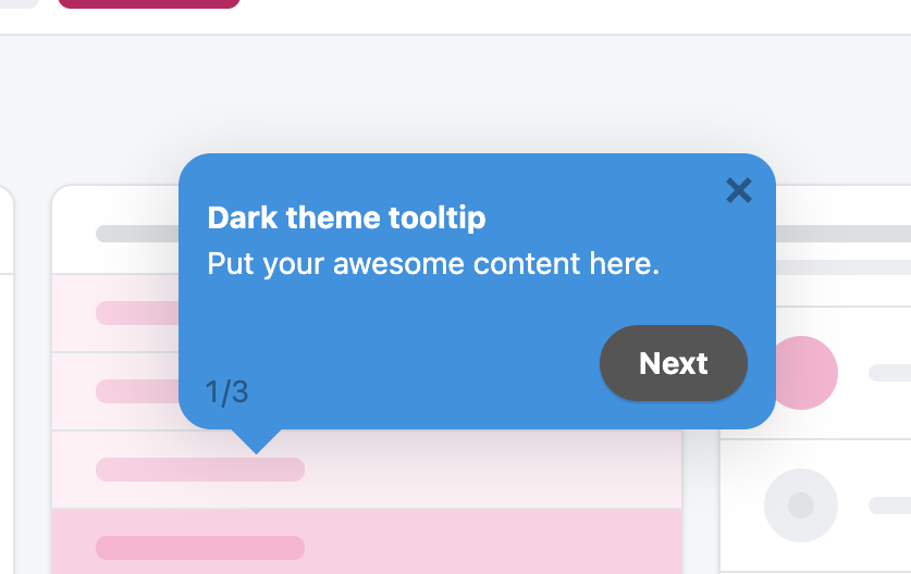
The anatomy of a tooltip: an anchor arrow onto a real element, a short headline and message, a step counter, and a clear way to move on.
What Does the Word "Tooltip" Mean?
The term comes from early graphical software. When you hovered your cursor over a small tool icon in a toolbar (the paintbrush, the eraser, the crop tool) a tiny label would appear naming that tool. It was, quite literally, a "tip" about the "tool," so it became the tooltip.
For years, that hover-to-reveal label was the entire meaning of the word. But as software moved to the web and products got more complex, the pattern stretched to cover a much wider family of small, anchored messages. Today, "tooltip" describes any compact message tied to a UI element, whether it's triggered by hovering, focusing with the keyboard, clicking, or shown automatically as one step in an onboarding flow.
So when someone says "tooltip" now, they might mean a classic hover label on an icon, or they might mean a guided in-app message that walks a new user through a feature. The underlying idea is the same, a short explanation anchored to something on screen, but the trigger and the intent have expanded a lot.
Types of Tooltips
Not all tooltips behave the same way. What changes from one to the next is how it's triggered, how much attention it demands, and what job it's doing. Here are the main types you'll come across.
A hotspot, one type of tooltip: a pulsing beacon that opens a tooltip on click, ideal for low-pressure, discoverable guidance.
1. Hover tooltip
The classic. The user moves their cursor over an element and a small label appears; move away and it disappears. Hover tooltips are perfect for naming icon-only buttons or offering an optional, one-line clarification. Their weakness is that hover doesn't exist on touch screens and can be missed entirely, so they should never hold information the user genuinely needs to complete a task.
2. Click (or focus) tooltip
Instead of appearing on hover, this tooltip opens when the user clicks a target, often a small "?" or info icon, and stays open until they dismiss it or move on. Because it's triggered deliberately, it works on touch devices and can hold a little more text. It's a good fit for "explain this field" help next to a form input or a setting.
3. Hotspot tooltip
A hotspot is a small, gently pulsing dot or beacon placed beside a feature. It says nothing on its own; it simply invites a click, and the tooltip opens when the user engages. This is the lowest-pressure pattern: it draws the eye through subtle motion without interrupting anyone, which makes it ideal for optional, discoverable guidance like a newly shipped feature or a power-user shortcut.
4. Guided onboarding tooltip
These tooltips are shown automatically as steps in a sequence, walking a new user through a workflow one anchored message at a time, often with a step counter ("2 of 5") and a Next button. This is the tooltip as a teaching tool rather than a passive label, and it's the backbone of most product tours and user onboarding flows. See real designs in our onboarding tooltip examples.
5. Masked tooltip
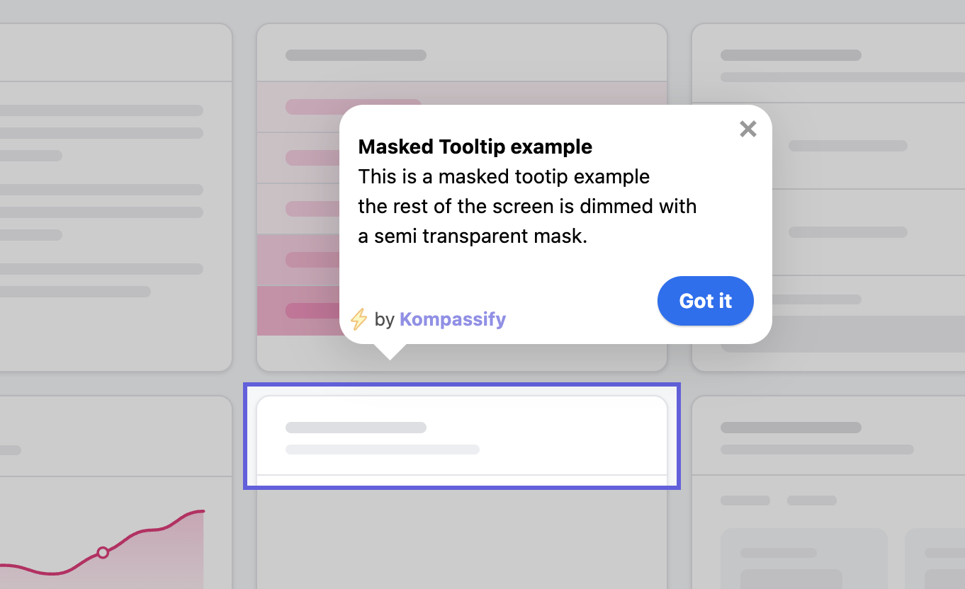
A masked tooltip dims the rest of the screen with a semi-transparent overlay and cuts a spotlight around the target element. It's the highest-attention pattern there is (everything else fades away, both visually and cognitively) so it's reserved for the single most critical step in a flow, the moment that decides whether a user activates or churns. Because it's so forceful, it should be used sparingly.
The five tooltip types arranged by attention: quiet hover labels and hotspots for optional help, guided and masked steps for the moments that decide activation.
Which type should you use? Match the tooltip's intensity to the stakes of the moment. Use quiet hover and hotspot tooltips for optional, discoverable help, and save guided or masked tooltips for the steps that genuinely decide whether a new user succeeds. Applying maximum attention to every element is the fastest way to get all of your tooltips ignored.
Tooltip vs Modal vs Popover vs Hotspot
Tooltips are often confused with other in-app patterns that also appear on top of the interface. Here's how they compare, so you can pick the right one for the job.
| Pattern | Size & content | Anchored to an element? | Interrupts the user? | Best for |
|---|---|---|---|---|
| Tooltip | Small, short text | Yes | No | Quick, in-context hints and labels |
| Popover | Medium, rich content (text, images, buttons) | Yes | No | Richer anchored content the user opens |
| Modal | Large, full message | No (center screen) | Yes (blocks the page) | Announcements or decisions that must be seen |
| Hotspot | Tiny beacon that opens a tooltip | Yes | No | Low-pressure, discoverable guidance |
The short version: a tooltip is the lightweight one, small, anchored, and non-intrusive. A popover is a heavier cousin that holds richer content. A modal deliberately interrupts to make sure something is seen. And a hotspot is really a trigger that reveals a tooltip on demand. Choosing between them is mostly a question of how much attention the moment deserves.
Tooltip UX Best Practices
A tooltip is simple to add and easy to misuse. These are the principles that separate genuinely helpful tooltips from the ones users learn to tune out.
Anchor to a real element, in context
The power of a tooltip is its proximity to the thing it explains. Always attach it to the specific button, field, or icon it describes; never let it float in the middle of the screen where the user has to hunt for what it's referring to.
Keep it short
A tooltip is a hint, not a help article. One clear sentence beats a paragraph. If you find yourself writing three lines of text, that's a sign you need a popover, a richer in-app message, or a link to documentation, not a bigger tooltip.
Never hide essential information behind a hover
Hover tooltips don't work on touch screens and are easy to miss with a mouse. Anything a user must know to finish a task belongs in the interface itself; reserve tooltips for help that's genuinely supplementary.
Show one at a time
The most common tooltip mistake is firing every hint at once on the first screen. A wall of tooltips is overwhelming, gets dismissed reflexively, and teaches the user to ignore your guidance for the rest of their journey. Show one contextual tooltip at a time, tied to where the user actually is.
Match attention to stakes
Use quiet patterns (hover labels, hotspots) for optional guidance, and heavier ones (guided steps, masks) only for the moments that decide activation. When every step demands maximum attention, none of them get it.
Mind accessibility
Good tooltips are reachable by keyboard (not hover-only), remain visible long enough to read, don't obscure the element they describe, and keep enough colour contrast to stay legible. Screen-reader users should get the same information through proper ARIA attributes. Accessible tooltips aren't just compliant; they're clearer for everyone.
The tell-tale sign of tooltip overuse: if your product needs a tooltip on almost every element, the underlying interface probably isn't clear enough on its own. Tooltips should patch the occasional ambiguous control; they shouldn't be the glue holding a confusing UI together. Fix the obvious labels first, then use tooltips for what genuinely needs explaining.
How to Add Tooltips Without Code Using Kompassify
Traditionally, adding tooltips meant asking a developer to wire up a library, hard-code the copy, and redeploy every time you wanted to change a word. That's slow, and it puts your in-app guidance behind the engineering backlog. It doesn't have to work that way.
Kompassify is a no-code user onboarding platform that lets product, onboarding, and customer-success teams build and publish tooltips without touching the codebase. You install a single JavaScript snippet once, and from then on everything is managed from the Kompassify dashboard:
- Point and click to anchor. Select any element in your live product and attach a tooltip to it, no CSS selectors to hand-write.
- Choose the trigger and style. Hover, click, hotspot beacon, guided step, or masked spotlight, with your own colours and copy.
- Sequence them into flows. Chain tooltips into a full product walkthrough, segmented by user type.
- Measure and iterate. Track how each tooltip and flow performs, then A/B test the copy and targeting, all without a redeploy.
Because nothing is hard-coded, you can edit a tooltip's wording, move it to a different element, or turn it off entirely in seconds, and it helps drive the kind of contextual guidance that lifts user activation and feature discovery. Kompassify is GDPR-compliant and EU-hosted, and it's free for up to 100 monthly active users, so you can ship your first tooltips before spending anything.
Add your first tooltip, free
Attach a tooltip to any element in your product, choose the trigger and style, and publish, no code required. Free up to 100 monthly active users.
Start for free →Frequently Asked Questions
What is a tooltip?
A tooltip is a small contextual message that appears next to a specific element of a user interface, a button, icon, input field, or menu item, to explain what that element does or prompt the user to act on it. Tooltips are anchored to the element they describe, so they deliver a short, in-context piece of help exactly where and when the user needs it, without taking over the screen the way a modal does.
What does the word "tooltip" mean?
The word tooltip originally described the little label that appeared when you hovered your cursor over a tool icon in early desktop software: it told you the name of the tool, a "tip" about the "tool." The meaning has since broadened: today a tooltip is any small, anchored message that explains or points at a UI element, whether it's triggered by hover, focus, click, or shown automatically as part of an onboarding flow.
What is the difference between a tooltip and a popover?
A tooltip is typically small, text-only, and used for a brief label or explanation, often appearing on hover or focus and disappearing when the user moves away. A popover is larger and can contain rich content, headings, images, buttons, links, and usually stays open until the user dismisses it. In short: tooltips are for quick, lightweight hints; popovers are for richer, interactive content anchored to an element.
Are tooltips good UX?
Tooltips are good UX when they're used for genuinely helpful, in-context guidance: clarifying an unfamiliar control, explaining an icon-only button, or nudging a user toward their next step. They become bad UX when they hide essential information behind a hover, fire all at once, repeat what's already obvious, or are the only way to access something important. Used sparingly and contextually, tooltips reduce confusion; overused, they add noise.
How do I add a tooltip to my app without code?
You can add tooltips without code using a no-code onboarding platform like Kompassify. You install a single JavaScript snippet once, then point and click to attach a tooltip to any element in your product, write the copy, choose the trigger and style, and publish, all from the Kompassify dashboard. This lets product, onboarding, and customer-success teams ship contextual tooltips without waiting on engineering. Learn the full workflow in our guide on how to create onboarding tooltips that convert.