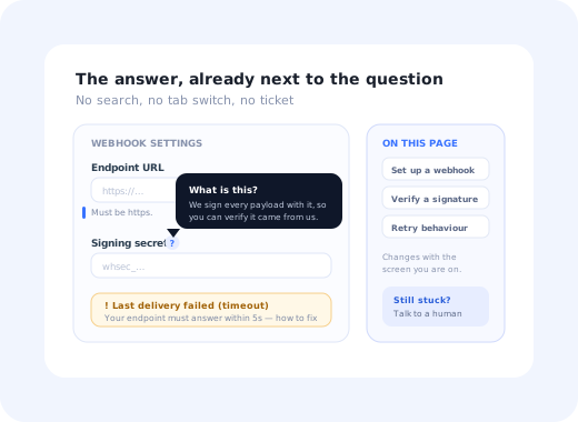
There is a particular kind of failure that no dashboard catches. A user is halfway through configuring something, hits a field whose meaning is not obvious, and stops. They do not file a ticket. They do not open your help centre. They do not search. They leave the tab open, tell themselves they will come back to it, and never do.
Contextual help is the answer to exactly that moment: assistance that appears where the confusion happens, at the moment it happens, about the thing the user is actually looking at. It is the opposite of the traditional model, which asks a stuck person to stop what they are doing, work out what to call their problem, go somewhere else, and search for it.
This guide covers what contextual help means, how it differs from documentation and support, the three kinds of context that should trigger it, the seven patterns teams actually ship, how to decide what deserves it, and how to tell whether it worked.
Key Takeaways
- Contextual help is defined by placement, not by content. The same sentence is documentation in a help centre and contextual help next to the field it explains.
- Three things create context: where the user is, what state their account is in, and what they just did. Good contextual help keys off all three.
- The best contextual help is invisible until needed. Permanent hints become part of the wallpaper; on-demand help stays useful.
- Your ticket queue is the backlog. Every repeated question is a piece of missing help sitting one screen away from where it was needed.
- Never make it the only copy of the information. Contextual help supplements documentation; it does not replace it.
- Measure the behaviour, not the impressions. Whether the user finished the task is the only outcome that matters.
What Is Contextual Help? (Meaning & Definition)
Contextual help, defined
Contextual help is guidance delivered inside the product, at the point of need, scoped to what the user is currently doing. Instead of living in a separate help centre and waiting to be searched for, it is attached to a screen, a field, a state or an action, and it appears when that context is active. The defining property is relevance by position: the user does not have to describe their problem in order to find the answer, because the answer is already next to the problem.
That definition is doing more work than it looks. Most "help" in software is generic: it explains a feature to nobody in particular, at no particular moment. Contextual help is indexed by situation. A sentence explaining what a webhook secret is becomes contextual help the moment it appears beside the webhook secret field, on the screen where you are pasting one in, and not before.
Why the timing matters more than the wording. A person who is stuck is spending their attention on the task, not on learning. Help that arrives while they are still holding the problem in their head costs them almost nothing to read. The same help, found ten minutes later after a search, costs them a context switch, and by then most people have already given up and moved on to something else.
Contextual Help vs. Documentation vs. Support
These three are complements, not competitors, and confusing them is how teams end up with a beautiful knowledge base nobody reads. Each one answers a different kind of question at a different cost.
| Contextual help | Documentation | Support | |
|---|---|---|---|
| Where it lives | Inside the screen, beside the thing | A knowledge base or docs site | A person, a queue or a chat |
| Who starts it | The product, or one click by the user | The user, by searching | The user, by asking |
| Best for | Micro-confusion: what does this field mean, what happens if I click this | Depth: full procedures, reference, edge cases | Ambiguity: account-specific problems, judgement calls |
| Cost to the user | Near zero, no context switch | A search and a tab switch | Minutes to hours of waiting |
| Cost to you | Design time, and discipline about volume | Writing and maintenance | Headcount, per conversation |
| Fails when | There is too much of it, or it is the only copy | Nobody thinks to look | The same question arrives a hundred times |
The healthy relationship between the three is a funnel that runs in the right direction: contextual help absorbs the micro-questions, documentation absorbs the procedural ones, and support handles what genuinely needs a human. When contextual help is missing, everything flows downhill into the queue, which is the pattern our guide to in-app support and ticket deflection picks up on the support side.
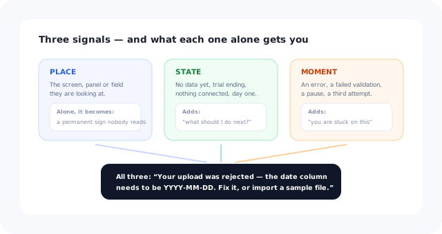
Place, state and moment. Most products only ever use the first one.
The Three Kinds of Context
"Contextual" is usually taken to mean "on the right screen", which is only a third of the idea. There are three independent signals, and the difference between adequate and genuinely good contextual help is how many of them you use.
The screen, the panel, the field. The easiest signal and the one every product already has. Answers: what is this thing in front of me?
Empty workspace, trial ending, no integration connected, plan limit reached, first session versus fiftieth. Answers: what should I be doing next, given where I am?
An error was returned, a validation failed, a long pause on one field, a third attempt at the same action. Answers: you appear to be stuck on this specific thing.
"You're on the import screen (place), you have no data yet (state), and your last upload was rejected (moment)." That combination earns an interruption. Place alone rarely does.
State and moment are what separate contextual help from decoration. A hint that shows on the billing screen to everyone forever is not contextual; it is a permanent sign, and permanent signs stop being read within a week. The same hint, shown only to accounts that have never added a payment method, is help. Our guide to onboarding triggers covers the mechanics of firing on state and behaviour rather than on page load.
Seven Contextual Help Patterns That Work
Almost every implementation is one of these seven, ordered roughly from least to most intrusive. The ordering matters: reach for the quietest pattern that can carry the message.
-
1. Inline hint text
A permanent line under a field explaining the format or the consequence. Always visible, costs one line of vertical space, and never has to be discovered. Use it whenever the answer is short and everyone needs it.
-
2. On-demand help icon
A question mark beside a label that reveals a longer explanation on click or focus. Keeps the interface clean while making depth available. See our tooltip guide for the accessibility rules this pattern has to obey.
-
3. Instructive empty states
The most under-used surface in software. A screen with no data is a screen with nothing competing for attention, perfect for explaining what belongs there and how to put it there. Our empty states guide covers the anatomy.
-
4. Error-adjacent guidance
An error message that says what went wrong, why, and what to do next, with a link to the relevant article rather than an error code. The highest-intent help moment in the entire product, and usually the worst-served.
-
5. Hotspots on new or hidden capability
A quiet marker on something worth noticing, which explains itself when clicked. Pull rather than push. The hotspot guide covers how many is too many.
-
6. A resource panel that knows what page it is on
An in-app help widget whose top three articles change with the screen. This is the bridge between contextual help and your help centre: the same content, surfaced by position rather than by search.
-
7. A short contextual walkthrough
Two or three steps, launched from the point of confusion, that do the thing with the user. Reserve it for genuinely multi-step tasks; a walkthrough for a single field is theatre.
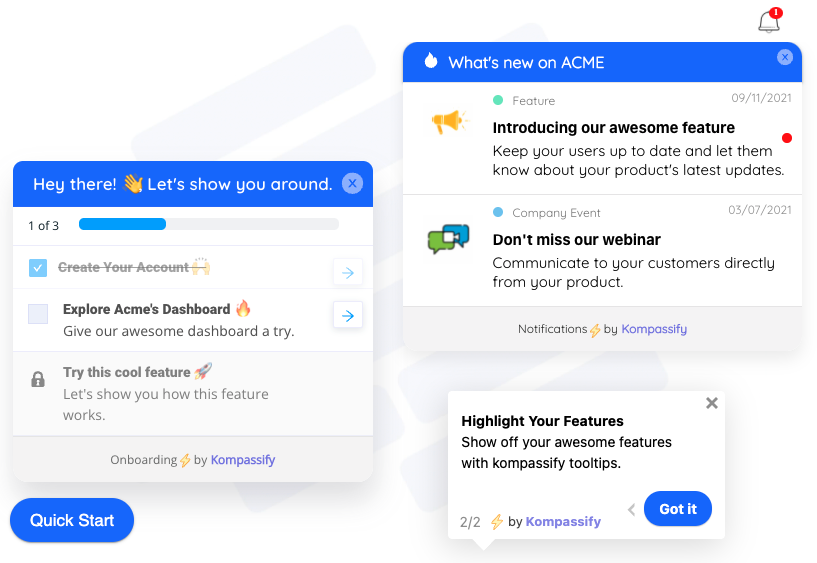
Three surfaces, one screen. The discipline is choosing which of them a given question deserves.
The volume problem. Contextual help has a failure mode that documentation does not: it competes with the interface it is helping. Every hint, icon and marker consumes a little of the user's attention budget whether or not they need it. A screen with nine help affordances has effectively none, because the user has learned to filter that entire visual class out. When in doubt, remove one.
How to Decide What Deserves Contextual Help
The instinct is to explain everything that seems complicated. The better method is to let evidence choose, because the things that confuse users are reliably not the things that worry the team. Three sources, in order of usefulness:
1. The repeated ticket
Take your last few hundred support conversations and group them by the screen the user was on. Anything asked more than a handful of times from the same screen is a contextual help item with a pre-written answer: you already have the wording, in your own agents' replies.
2. The in-product search that returns nothing
If your help widget has a search box, its zero-result queries are a list of things users expected to exist. If your help centre search is separate, look at which article people land on immediately after visiting a given screen: that pairing is a contextual help slot waiting to be filled.
3. The step where the funnel bends
A step with an unusual drop-off, a long time-on-step, or a high rate of repeat attempts is a confusion signal even when nobody complains. Our onboarding funnel guide covers finding those steps, and the friction guide covers telling useful friction from the accidental kind.
Rank whatever this produces by volume × severity, take the top five, and ignore the rest until those five are live. Contextual help is one of the few areas where a small, well-placed set beats comprehensive coverage every time.
How to Build Contextual Help in Six Steps
- Pick one confusion with evidence behind it.
- Write the answer in two sentences, in the user's words.
- Choose the quietest pattern that can carry it.
- Scope the trigger to place, state and moment, not just the URL.
- Give it an exit and a route to depth.
- Watch the behaviour it was meant to change, then keep or kill it.
1. Start from one confusion, not from a content audit
Take a single item off the ranked list. Resist the urge to design a "help system"; systems get designed and never shipped, whereas one hint on one field ships this week and starts paying immediately.
2. Write the answer before you choose the pattern
Two sentences: what this is, and what to do. If it takes five sentences, the problem is probably in the interface rather than in the explanation, and a help string is about to become a permanent bandage over a design bug. Our UX microcopy guide covers the tone.
3. Choose the quietest pattern that fits
Short and universal → inline hint. Longer and occasional → help icon. The screen is empty → empty state. It follows a failure → error-adjacent. Multi-step → short walkthrough. Only escalate when the quieter option genuinely cannot carry the message.
4. Scope the trigger properly
Add state and moment to the page condition: show it only to accounts that have not done the thing, or only after the action failed once. Anything shown to everyone forever will be ignored by everyone within a fortnight, which is the standard fate of permanent banner help.
5. Give it an exit and a route to depth
Anything that appears on its own must be dismissible, and the dismissal should stick. Anything that summarises must link to the full article, because the two-sentence version will be wrong for somebody. Contextual help should never be the only place a piece of information exists; keep the canonical version in your user guides and let the in-product copy point at it.
6. Measure the behaviour, then keep or kill it
Set the success condition before you ship: fewer tickets from that screen, more completions of that step, fewer repeat attempts at that action. If none of them move after a fair window, the help was not the problem; remove it rather than leaving it to add noise forever.
Measuring Contextual Help Honestly
The tempting metrics are impressions and clicks, and both are close to meaningless: a hint that everyone sees and nobody needs scores brilliantly on impressions. The three that mean something are harder to game.
Did the proportion of users who finished the action on that screen go up after the help shipped? This is the whole point, and it is measurable per screen.
Tag conversations by the screen they came from and watch that specific slice. A global deflection number will hide the effect of one good hint.
Fast dismissals and repeated views of the same hint both mean the same thing: it is not answering the question people actually have.
Contextual Help: Do vs. Don't
✅ Do
- Let the ticket queue choose what to explain
- Trigger on state and behaviour, not only on the URL
- Keep the answer to two sentences and link to depth
- Use the empty state; it is free real estate
- Put the best help next to errors, where intent is highest
- Make everything dismissible, and make dismissals stick
- Remove hints that did not change behaviour
❌ Don't
- Put nine help affordances on one screen
- Make a tooltip the only copy of a rule or format
- Show the same hint to everyone forever
- Use a seven-step walkthrough for a one-field problem
- Answer with an error code instead of a next action
- Ship help to paper over a confusing interface
- Report impressions and call it impact
Building Contextual Help Without Engineering Time
The reason contextual help tends to lag behind the product is that each individual item is too small to justify a ticket. A one-line hint on one field is not worth a sprint slot, so it waits, and the same question keeps arriving in the queue for another quarter.
Kompassify exists to break that loop. Tooltips, hotspots, short walkthroughs, checklists and announcements are built visually and published to a live product without a release, and each one can be targeted at a segment (accounts with no data, users in their first week, people who just hit a particular state) so it reaches the users who need it rather than everyone. Because publishing takes minutes, the natural workflow becomes the right one: ship the hint, watch the screen, remove it if it did nothing. Kompassify is free up to 100 monthly active users, plans start at $129/month, and it is GDPR-compliant and EU-hosted.
Answer the question where it gets asked
Add tooltips, hotspots, walkthroughs and checklists to your product without an engineering ticket, then target them by screen, segment and behaviour. Free up to 100 monthly active users, plans from $129/month, GDPR-compliant and EU-hosted.
Start for free →The One-Paragraph Version
Contextual help is guidance placed where the confusion happens rather than filed where it can be searched for. It is triggered by three things (the screen the user is on, the state their account is in, and what they just did) and it is delivered through inline hints, on-demand help icons, instructive empty states, error-adjacent guidance, hotspots, a screen-aware resource panel or a short walkthrough, in roughly that order of intrusiveness. Let your ticket queue choose what to explain, keep the answer to two sentences with a link to depth, trigger it narrowly, and judge it on whether people finished the task, not on how many of them saw it.
Frequently Asked Questions
What is contextual help?
Contextual help is guidance delivered inside the product, at the point of need, scoped to what the user is currently doing. Instead of living in a separate help centre and waiting to be searched for, it is attached to a screen, a field, a state or an action, and appears when that context is active. The defining property is relevance by position: the user never has to describe their problem in order to find the answer, because the answer is already next to the problem. The same sentence can be documentation in a knowledge base and contextual help beside the field it explains; placement is what makes the difference.
What is the difference between contextual help and documentation?
Documentation is comprehensive, lives in its own place, and is found by searching. Contextual help is narrow, lives inside the interface, and is found by being there already. Documentation is better for depth (full procedures, reference material, edge cases) while contextual help is better for micro-confusion, such as what a field means or what will happen if you click something. They work together: contextual help absorbs the small questions and links out to the documentation for anyone who needs the long version. Contextual help should never be the only place a piece of information exists.
What are examples of contextual help?
Seven patterns cover almost every real implementation. Inline hint text under a field explaining its format. An on-demand help icon beside a label that reveals a longer explanation. An instructive empty state that says what belongs on the screen and how to put it there. Error-adjacent guidance that explains what went wrong and what to do next. A hotspot marking new or hidden capability. An in-app resource panel whose suggested articles change with the screen. And a short two- or three-step walkthrough launched from the point of confusion. They are listed roughly from quietest to most intrusive, and the right instinct is to use the quietest one that can carry the message.
When should contextual help be triggered?
Three signals should decide, and most products only use the first. Place is the screen, panel or field the user is on. State is the condition of their account: empty workspace, no integration connected, trial ending, plan limit reached. Moment is what just happened: a failed validation, a returned error, a long pause, a third attempt at the same action. Help scoped to place alone tends to become permanent decoration that everyone filters out within a fortnight. Help scoped to all three earns the interruption, because it appears precisely when the user is in the situation it describes.
How do you decide what to explain with contextual help?
Let evidence choose, because the things that confuse users are reliably not the things that worry the team. Group your last few hundred support conversations by the screen the user was on: anything asked repeatedly from the same screen is a contextual help item whose wording your agents have already written. Then look at zero-result searches in your help widget, and at funnel steps with unusual drop-off, long time-on-step or repeated attempts. Rank the result by volume times severity, ship the top five, and ignore the rest until those five are live.
Can there be too much contextual help?
Yes, and it is the most common way this goes wrong. Contextual help competes with the interface it is helping: every hint, icon and marker consumes a little of the user's attention budget whether or not they need it. A screen with nine help affordances effectively has none, because people learn to filter that entire visual class out. Worse, help is sometimes shipped to paper over a confusing design, which makes the underlying problem permanent. If an explanation needs five sentences, the interface is usually the thing that needs changing.
How do you measure contextual help?
Not by impressions or clicks: a hint that everyone sees and nobody needs scores brilliantly on both. Measure three things instead. The primary metric is task completion on that specific screen: did the proportion of users finishing the action go up after the help shipped? The secondary metric is tickets tagged to that screen, since a global deflection number will hide the effect of one good hint. The guardrail is dismissal speed and repeat views, because both mean the help is not answering the question people actually have.
Is contextual help the same as onboarding?
They overlap but are not the same. Onboarding is a bounded programme aimed at getting a new user to their first meaningful outcome; contextual help is a permanent property of the interface that serves users at every stage, including people who have been customers for three years and have just opened a screen they never use. In practice the same patterns and often the same tooling serve both, and the best contextual help systems grow out of onboarding work; the difference is that onboarding ends and contextual help does not.