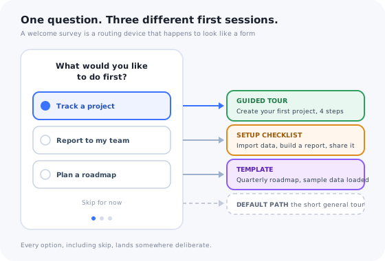
Almost every SaaS product now asks a new user two or three questions before it shows them anything. What is your role, what are you trying to do, how did you hear about us. The questions are easy to add, and they feel like personalisation, which is why they are everywhere.
Then most of the answers go into a database column that nobody reads, and the user lands on the same empty dashboard they would have landed on without answering. The survey cost thirty seconds of the most valuable attention the product will ever get, and returned nothing for it.
This guide is about the other kind of welcome survey: the one where every answer changes what happens next. Which questions earn their place, exactly what options to offer, how to design it so people finish it, and, the part that gets skipped, what to do with each answer once you have it.
Key Takeaways
- A welcome survey is a routing device, not a research instrument. Every question must change what the user sees next, or it should be cut.
- Two or three questions is the ceiling. Completion falls with every screen, and the third question is already the one most people skip.
- Role and goal are the only questions almost every product needs. Everything else is conditional on it changing the path.
- Offer tappable options, never a text field. You can only route on an answer that belongs to a known set.
- Store the answers as user attributes and use them everywhere: tours, checklists, templates, emails, segments and the customer success handoff.
- Measure activation by answer segment. A survey that moves nothing for anyone is decoration.
What Is a Welcome Survey? (Definition & Meaning)
Welcome survey: definition
A welcome survey (also called an onboarding survey, onboarding questionnaire or new-user survey) is a short set of questions, usually one to three, shown to a user immediately after signup and before the generic first screen. Its job is to decide which version of the first session the person gets: which product tour launches, which checklist appears, which template is pre-loaded, which words the interface uses. It is a routing step that happens to look like a form.
The definition matters because the welcome survey sits between four things that look similar and are not. Confusing them is where most of the wasted questions come from: a signup-form field that should have been deferred, a research question that should have waited for an in-app survey, a profile field that belongs in progressive profiling.
| Signup form | Welcome survey | In-app survey | Progressive profiling | |
|---|---|---|---|---|
| When | Before the account exists | Right after signup | During ongoing use | Over days and weeks |
| Asks for | Credentials, consent | One to three routing answers | Feedback: NPS, CSAT, a feature | Deferred profile fields |
| Purpose | Create the account | Choose the first session | Learn what to build or fix | Complete the profile |
| The answer changes | Nothing: it opens the door | What the user sees next | The roadmap | Targeting, later |
| Cost of a bad question | Lost signups | Lost trust on the first screen | Survey fatigue | An unanswered prompt |
The signup flow should ask for as little as possible, which is exactly why the welcome survey exists: it is where the questions cut from the form go, on the condition that they now do something. Research questions belong in in-app surveys later, when the user has something to have an opinion about. Everything else is progressive profiling.
The Only Rule That Matters: Every Answer Must Change Something
Here is the test to run on every proposed question. Write it down, list its answer options, and next to each option write what will be different for a user who picks it. Not what you will know: what they will see. If the honest answer for any option is “nothing yet”, the question is research wearing a welcome survey's clothes, and it should be removed or moved.
The rule is strict for a reason that has nothing to do with data hygiene. The survey stands between the user and the thing they just signed up for. It borrows attention against a promise: answer this and your first session will be better. If the first session is identical whatever they answer, the promise breaks on the very first screen, and the user learns something durable about your product: its questions are not worth answering. That lesson is expensive when, six weeks later, you ask for an NPS score and get silence.
The corollary: a welcome survey is only as good as the branches behind it. Three questions with one path afterwards is worse than one question with three paths. Design the paths first, then ask only the questions needed to choose between them. If your product currently has one onboarding path, the right welcome survey has zero questions until a second path exists.
Welcome Survey Questions That Earn Their Place
Four kinds of question pass the test often enough to be worth listing. Two of them apply to almost every product; the other two apply only when the answer genuinely forks the path.
1. Role: who is this person?
“What best describes what you do?” with four to six options written in the user's own words, not your org chart's: I run marketing, I build the product, I run the business, I support customers. Role predicts two things reliably: the vocabulary the person expects, and the first feature they will look for. A marketer and an engineer opening the same analytics tool want different first charts and would describe them with different words. Role routes the tour and the language; it rarely routes the whole product.
2. Goal: what do they want to do first?
“What would you like to do first?” with options taken directly from your three or four activation paths: track a project, report to my team, plan a roadmap. If you can ask only one question, ask this one. Goal beats role whenever roles overlap, because two people with the same title can want different things and two with different titles can want the same one. The answer routes the first task, the checklist and the template. It is also the answer that makes personalised onboarding possible without guessing.
3. Context: what shape is their situation?
Context questions are conditional. Ask them only when a specific option adds or removes a step. “Will you use this alone or with a team?” decides whether the invite step appears in the checklist. “Are you moving from another tool?” decides whether an import step appears and which one. “How many people are on your team?” is worth asking only if the answer routes large accounts to a sales-assisted path; if every answer leads to the same self-serve flow, it is a CRM field, not a welcome question.
4. Experience: have they done this before?
“Have you used a tool like this before?” is the least asked and often the most useful, because it decides the depth of guidance. A beginner gets the guided path with explanations; an expert gets the shortcuts, the import and an explicit way to skip the tour. Ask it only if the two paths actually differ. If your onboarding cannot be shortened for an expert, the question is a promise you cannot keep.
Put together, the question bank that survives the test is short:
| Question | Options (write them in the user's words) | What the answer changes |
|---|---|---|
| What best describes what you do? | 4–6 roles, plus “something else” | Which tour launches; the vocabulary in tooltips; sample data |
| What would you like to do first? | Your 3–4 activation paths | The first task; the checklist; the pre-loaded template |
| Alone or with a team? | Just me / With my team | Whether the invite step exists and where it sits |
| Moving from another tool? | No / Yes, from a spreadsheet / Yes, from another product | Whether an import step appears, and which importer |
| Have you used something like this before? | First time / I know my way around | Tour depth; whether the skip option is offered up front |
| What are you setting this up for? | Only if you have real templates per answer | Which template is pre-loaded |
| How big is the team that will use it? | Only if large answers route to a human | Self-serve path vs. a customer success touch |
Questions to Cut (and What to Do Instead)
The questions below appear in a large share of welcome surveys and fail the test in almost all of them. Each has a cheaper source or a better moment.
-
“How did you hear about us?”
Attribution matters to marketing and changes nothing for the user. If you must ask it, ask it last, make it skippable, and route nothing on it. Better: read the referrer and campaign parameters you already have, and ask only when they are missing.
-
Company name and size
The email domain answers most of it, and enrichment answers the rest. Ask only if a particular answer changes the path, such as routing a large team to a guided setup call.
-
Phone number
Never in a welcome survey. It reads as a sales trap, it converts nothing for the user, and the drop-off it causes is larger than any list it builds.
-
Industry
Worth asking only if you have industry templates or examples to load. If every industry lands on the same screen, the answer is a segment for later, and belongs in progressive profiling.
-
Open text: “What are you hoping to achieve?”
You cannot route on free text, and almost nobody types a paragraph on their first screen. Replace it with options drawn from your activation paths plus a “something else” escape, and read the escapes monthly to find the option you are missing.
-
Anything the first five minutes will reveal
Whether they connect an integration, invite someone or open the reports tab tells you more than their answer would, and costs nothing. Ask about intent; observe behaviour.
Designing the Survey: Length, Order and Format
Once the questions are right, the remaining decisions are about losing as few people as possible on the way through. Each one is small, and they compound.
Length: one to three questions, and the third is optional
Every screen loses some share of the people who reached it, and the losses multiply. A survey with three questions is answered in full by noticeably fewer users than a survey with one, and the drop concentrates on the last question. If a fourth question seems necessary, it is not: defer it to the moment it becomes relevant.
Order: the question that routes the most goes first
Put the goal question first. A user who answers one question and abandons the rest should still land on the right path, which only works if the most important answer was collected first. The order that feels natural to a form designer (who are you, then what do you want) is the reverse of the order that protects the routing.
Format: one question per screen, tappable cards, an escape and a skip
One question per screen keeps the survey feeling like a conversation rather than a form. Options are cards with a short label and, ideally, an icon or illustration, because a card can be chosen with one tap and a dropdown cannot. Every list ends with “something else”, so that a user with an unusual answer is not forced to lie. A visible skip on every screen leads to the default path. Nothing is pre-selected, because a default answer produces default data. Progress dots tell the user it is short; a progress bar that moves from a third to two thirds says the same thing more loudly.
Copy: the options are written in the user's words
The cheapest test is to read the options aloud to three recent customers and watch for the pause. Any option they have to translate (“is a workspace administrator what I am?”) is one they will skip or guess. The microcopy rules that apply to buttons apply here, twice.
Design the branches first, then ask only the questions needed to choose between them. A skip is a branch too.
Placement: before the empty dashboard, after the first win if there is an instant one
For most products the survey appears immediately after signup, because its job is to shape the first screen and it cannot do that once the first screen has been shown. The exception is a product where a user can get a real result in under a minute with no setup: let them have it, then ask the routing question when they have a reason to want a more personal path. In neither case does the survey come after the empty dashboard, where it reads as an interruption rather than a welcome.
Three Welcome Survey Shapes (Examples)
Welcome surveys that work tend to take one of three shapes. Which one fits depends on how many paths the product genuinely has and how quickly it can show value.
The router: one question, several tours
A project management tool asks a single question, what are you managing?, with four options: a software project, a marketing campaign, a client engagement, something else. Each option loads a different template with sample tasks named in that world, launches a four-step product tour through that template, and sets the checklist to the three actions that matter for that use. The user has answered one question and the product already speaks their language. This is the shape to start with: it proves the mechanism with the least to build.
The profiler: three questions, one personalised first session
An analytics product asks role, goal and whether the user is alone or with a team. Role picks the vocabulary and the first chart the tour points at; goal picks which sample report is pre-built; the team answer decides whether “invite a colleague” is the second checklist item or the fifth. Three questions produce roughly a dozen combinations, but the product does not need a dozen tours: it needs three small decisions applied to one flow. That is the trick behind profilers that stay maintainable.
The deferred survey: no questions until the first win
A scheduling tool needs nothing from the user to show value: they paste a link, see their calendar, book a test slot. So the product asks nothing at signup. After the first booking is confirmed, a single card appears: what would you like to set up next? with three options that each launch a short guide. The user has already received something, so the question feels like a next step rather than a toll. This shape suits any product whose first value needs no configuration.
What to Do With the Answers
The survey is the cheap half. The expensive half is wiring each answer into everything that happens afterwards, and it is the half that decides whether the survey was worth showing. Seven uses, roughly in the order they pay back:
Launch a different product tour, or none, per answer. This is the minimum, and on its own it justifies the survey.
Hide steps that do not apply (no invite step for solo users, no import for new starters) and reorder the rest so the first item is the user's own goal.
Load the template, seed the sample data, set the defaults. The most convincing personalisation is a product that already looks like the user's job.
Swap the vocabulary in tooltips and empty states by role. A “campaign” and a “sprint” may be the same object and are not the same word.
Onboarding emails, announcements, in-app messages and activation reporting all get better when they can target by goal rather than by signup date.
A large team or a migration from another tool is a signal worth a customer success touch. The survey tells you on day one instead of day thirty.
Role, goal and team context saved on the user record keep working for months, in every tool that targets by attribute, long after the tour has ended.
The last item is what makes the other six cheap. If the answer lives only in the survey tool, every use has to be built inside that tool. If it lives on the user profile, the same answer drives a segment in analytics, an audience in email and a trigger in customer success without anyone re-asking the question.
How to Measure Whether the Welcome Survey Works
A survey has two sets of numbers: how it performs as a form, and what it does to activation. Most teams look at the first set and stop.
| Metric | What it tells you | What to do about it |
|---|---|---|
| Completion rate | Whether the survey feels worth finishing | If it is low, the questions are wrong or there are too many; cut before rewording |
| Skip rate per question | Which question people refuse | The most-skipped question is the one to remove or defer |
| Answer distribution | Whether the options match reality | An option nobody picks is noise; if “something else” climbs, you are missing an option |
| Activation by answer segment | Whether the routing did anything | Compare each path's activation to the default path; a path that underperforms it is a path to fix |
| Activation vs. no-survey cohort | Whether the survey is net positive | Hold out a share of signups; if routed users do not activate more, the branches are not different enough |
The last row is the only one that answers the real question, and it needs the holdout to answer it. Without a comparison group you can only tell that routed users activated, not that routing made the difference. The A/B testing onboarding guide covers how to run the holdout without starving one group of onboarding entirely.
Welcome Surveys: Do vs. Don't
Do
- Design the branches first, then ask only what is needed to choose between them.
- Put the goal question first, so a partial answer still routes.
- Offer tappable options ending in “something else”, with a visible skip.
- Change something visible in the first session for every answer.
- Save the answers as user attributes and reuse them everywhere.
- Measure activation by answer, against a no-survey holdout.
Don't
- Ask a question because marketing wants the data.
- Go past three questions; defer the rest to progressive profiling.
- Use free text, dropdowns or pre-selected defaults.
- Make the survey mandatory, or send skippers to an empty screen.
- Show the survey after the dashboard has already loaded.
- Ship the survey before the second path exists.
Building a Welcome Survey Without Engineering Time
The reason most welcome surveys stop at “save the answer” is that every use of the answer is a separate engineering ticket: one to launch a different tour, one to hide a checklist step, one to pass the attribute to the email tool. The survey ships, the wiring does not, and the promise breaks.
Kompassify's multi-choice onboarding was built so the wiring is the survey. You write the question and its options in a visual editor, give each option an illustration, and attach a different product tour to each answer, so choosing a card launches that path immediately. The answer is stored on the user, which means the same choice can target a checklist, an announcement or a tooltip later, and analytics show the distribution of answers and what each group did next.
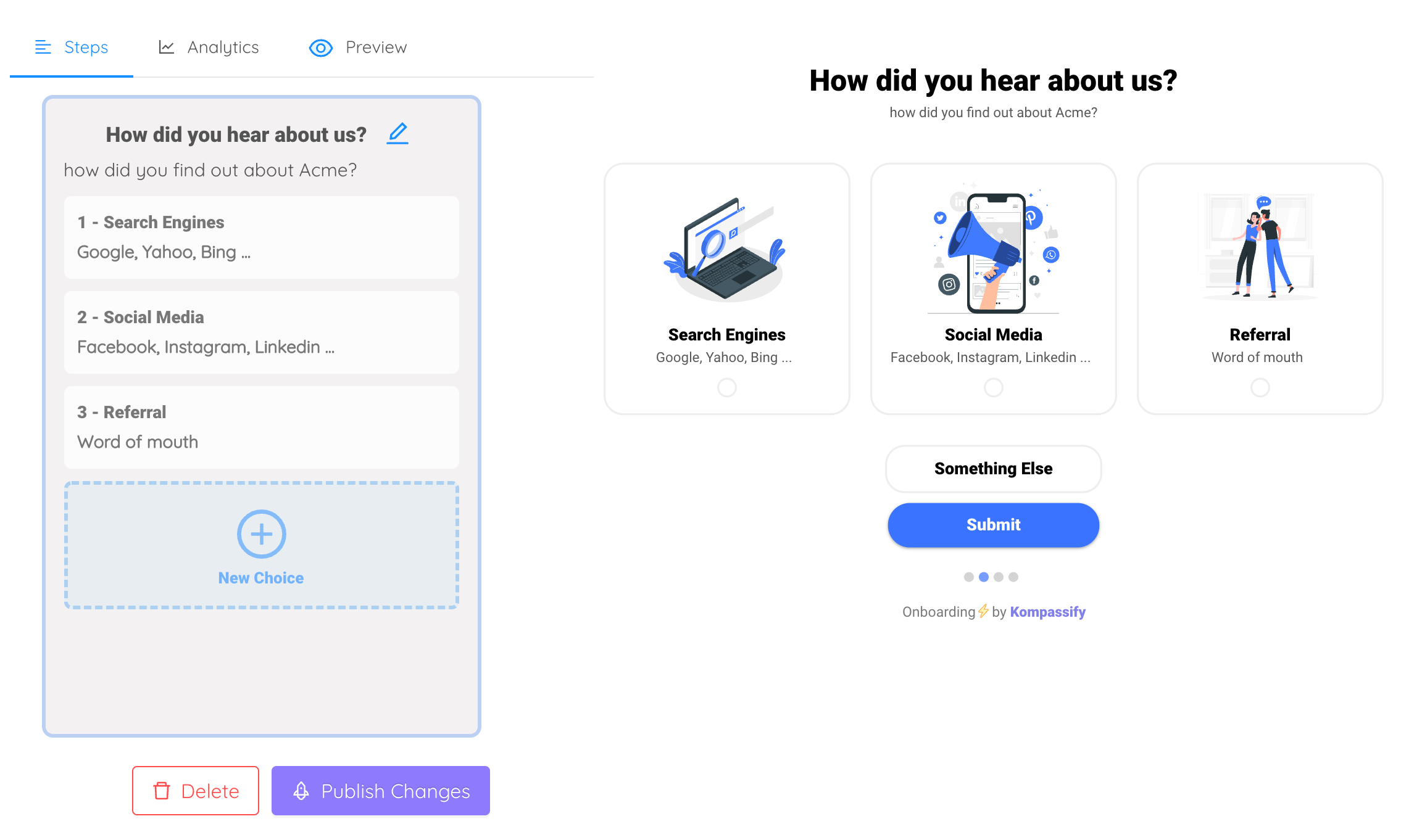
The multi-choice editor: each option is a tappable card with an illustration, ends with a “something else” escape, and launches its own product tour on submit.
The whole flow described in this guide, the welcome screen, the routing question, a tour per answer and a checklist shaped by it, layers on top of your existing product with a single script snippet, no release required. It is no-code onboarding in the literal sense: the product team owns the questions and the branches, and changes them when the answer distribution says to.
Ask one question. Change the whole first session.
Build a welcome survey with tappable options, launch a different product tour per answer, and see activation by answer in the same dashboard. Free up to 100 monthly active users, plans from $129/month, GDPR-compliant and EU-hosted.
Start for free →The One-Paragraph Version
A welcome survey is a routing device disguised as a form. It earns its place only if every answer, including skip, changes what the user sees next, so design the branches before the questions and ask nothing until a second path exists. Role and goal are the two questions nearly every product needs; context and experience are worth asking only when they add or remove a step. Keep it to three questions, put the goal first, use tappable cards with a “something else” escape and a visible skip, and show it before the empty dashboard. Then do the expensive half: route the tour, shape the checklist, load the template, swap the vocabulary, segment the downstream messages, trigger the human where it counts, and store the answers as attributes so every tool can use them. Measure activation by answer against a holdout, and cut the question people skip.
Frequently Asked Questions
What is a welcome survey?
A welcome survey is a short set of questions, usually one to three, shown to a new user immediately after signup and before the generic first screen. Teams also call it an onboarding survey, an onboarding questionnaire or a new-user survey. Its purpose is not research: it exists to decide which version of the first session the person should get, such as which product tour launches, which checklist appears, which template is pre-loaded and which vocabulary the interface uses. A question whose answer changes nothing for the user does not belong in it.
How many questions should a welcome survey have?
One to three. Every additional screen loses a share of the people who reached it, and the losses compound, so the third question is already answered by noticeably fewer users than the first. If you genuinely need more than three data points, ask the one or two that route the first session now and defer the rest to later moments through progressive profiling, when the user has experienced enough value to answer willingly. A survey that cannot be completed in under thirty seconds is a form, not a welcome.
What questions should I ask in an onboarding survey?
Start with the two questions almost every product needs: what the person's role is, and what they want to do first. Role predicts the vocabulary and the first feature; goal predicts the first task and the checklist. Add a context question only if it changes the path, for example whether they will work alone or with a team (which decides whether an invite step appears), or whether they are moving from another tool (which decides whether an import step appears). Ask about experience level if your product has a genuinely different path for beginners and experts. Cut anything you can infer from the email domain or from the first five minutes of behaviour.
Should a welcome survey be skippable?
Yes, always, and the skip should lead to a sensible default path rather than an empty screen. A mandatory survey converts a small number of extra answers into a larger number of abandoned signups, and the people who refuse to answer are often the ones with the least patience for a poor first session. The better lever is making the survey worth answering: when users can see that their answer visibly changed what came next, most of them answer the next question too.
When should the welcome survey appear: before or after the first screen?
Immediately after signup for most products, because the survey exists to shape the first screen and it cannot do that if the first screen has already been shown. The exception is a product whose first value needs no setup at all: if a user can get a real result in under a minute without telling you anything, let them, and ask the routing question after that first win, when they have a reason to want a more personal path. In both cases the survey should come before the empty dashboard, never after it.
What is the difference between a welcome survey and progressive profiling?
Timing and purpose. A welcome survey asks one to three routing questions at the very start, and the answers change the first session immediately. Progressive profiling spreads the remaining profile questions over days or weeks, asking each one at the moment it becomes relevant, such as team size when the user opens the invite screen. The two work together: the welcome survey takes the questions that must be answered before the first session can be personalised, and progressive profiling takes everything else.