
A new user signs up for your product, lands on a blank dashboard, and stares at it for ten seconds. They click two things, neither of which feels like progress. They close the tab.
That moment, repeated thousands of times, is what kills SaaS conversion. And it is exactly the moment a well-placed onboarding tooltip is supposed to fix.
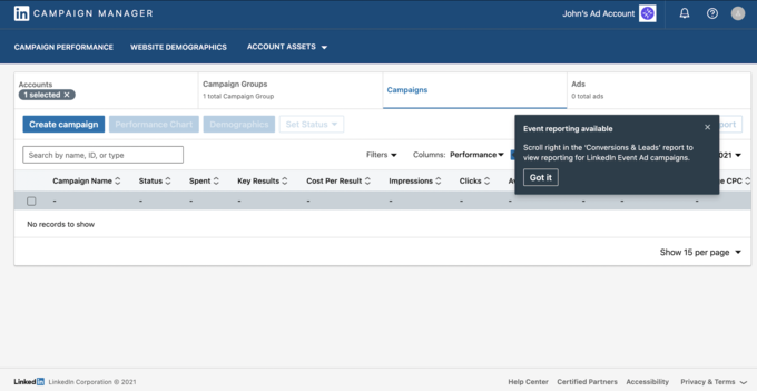
The trouble is most onboarding tooltips don't fix anything. They get dismissed, ignored, or worse, they annoy users enough to push them faster toward the close button. The difference between a tooltip that converts and one that doesn't isn't the tool, it's the strategy. Industry research shows that contextual guidance increases feature adoption by 40% compared to upfront tutorials, and that just-in-time tips significantly reduce user errors and support load (Statsig, 2025). The same tooltip can sit at either end of that gap depending on how it's built.
This guide is everything we've learned shipping onboarding tooltips for thousands of SaaS products with Kompassify. The three types that actually work, when to use each, the copy formula, the no-code build process, and three real examples you can model your own tooltips on.
Key Takeaways
- A tooltip is contextual, not constant. It appears only at the moment a user touches the element it explains. Always-on tooltips are usually banners or hints in disguise.
- Three types convert: hover, triggered, and nudge. Each does a different job. Mixing them up is the fastest way to create tooltip fatigue.
- Under 25 words. Always. One headline, one sentence of context, one CTA. Anything longer should be a tour step or a help article.
- Strategy first, tooltip second. Map the activation path, then place tooltips at the friction points, not at every clickable element on screen.
- Ship them no-code. Tooltips you can change in 30 seconds beat tooltips that take a sprint to update. Iteration speed is what makes them convert.
- Measure the downstream action, not the click. A clicked tooltip that doesn't move activation is decoration.
What is an onboarding tooltip?
An onboarding tooltip is a small, contextual in-app message anchored to a specific UI element, a button, an input field, an icon, a menu item, that explains what the element does or what the user should do next. It appears at the moment the user is most likely to need help, and disappears as soon as they move on.
The keyword is contextual. A modal that pops up when you sign in is not a tooltip. A banner across the top of the dashboard is not a tooltip. A 14-step guided tour is not a tooltip. A tooltip is a single, anchored, dismissible nudge that says "here is what this does" and then gets out of the way.
Done well, tooltips do three things at once. They reduce time-to-value by clearing up confusion in real time. They cut support tickets because users stop asking the obvious questions. And they boost activation by walking users to their first "aha" moment without forcing a tour. Done badly, they overlap with content, repeat what's already on screen, and train users to dismiss anything that looks like a popup, including the ones that matter.
Tooltip vs product tour vs onboarding checklist
This is the question every product team asks first. The short answer: they do different jobs, and the best onboarding flows use all three.
| Element | Best for | When to use |
|---|---|---|
| Tooltip | Explaining one element at the exact moment of interaction | Non-obvious buttons, advanced fields, new feature spotlights |
| Product tour | Walking a user through a sequence of steps the first time | Welcome flow, complex multi-step setups, first-run experiences |
| Onboarding checklist | Showing progress across a multi-session journey | Free trial activation, multi-day setup, repeated visits |
If you can build product tours, onboarding checklists and tooltips inside the same platform, the three reinforce each other instead of competing for screen real estate.
Why onboarding tooltips drive conversion
Tooltips work because they respect how users actually learn a product: in tiny increments, at the moment of need, while doing the thing, not before. The data backs this up.
- +40% feature adoption. Contextual guidance increases feature adoption by 40% compared to upfront tutorials (Statsig, 2025).
- Lower error rates and support load. Just-in-time, in-context tooltips reduce user errors at the moment of need and cut helpdesk escalations significantly compared to documentation-first onboarding (Panopto, 2026).
- Top performers convert at 35–45%. B2B SaaS trial-to-paid conversion typically falls between 15% and 30%, with top performers reaching 35–45% (Discovered Labs, 2025). The gap is almost always activation, and tooltips are one of the cheapest ways to close it.
- Quick wins multiply retention. Products with a clear "quick win" in onboarding dramatically out-retain those without one, and tooltips are one of the cheapest ways to surface that quick win in context.
The single biggest factor separating top trial-to-paid performers from the average is whether trial users reach their "aha" moment before the trial expires. Every extra second between sign-up and that moment is a chance for the user to leave. Tooltips are one of the cheapest ways to shorten that distance, because they remove confusion exactly where it costs you the most.
The math is straightforward. If your trial-to-paid conversion sits at 18% and tooltips lift activation by even five percentage points, that is roughly a 28% relative increase in revenue from the same top-of-funnel traffic. That is why tooltips are usually the highest-ROI onboarding investment a small team can make.
The Three Types of Onboarding Tooltips
There are three tooltip patterns that actually convert. Each has a different trigger, a different best use, and a different failure mode. Most teams pick one and stick to it; the better teams use all three but never two of them on the same screen.
The hover tooltip
Triggered when the user hovers over an element, usually a small "?" or "i" icon next to a label. The tooltip stays dormant until the user explicitly asks for help, which makes it the least intrusive of the three.
Use it for: definitions, glossary terms, optional context for advanced fields, anything where most users won't need help but some will.
Failure mode: blocking common mouse pathways. If your hover tooltip appears every time someone moves the cursor across the screen, it stops being help and starts being clutter. Always make hover tooltips dismissible with a click outside, an X icon, or a clear close action.
The triggered tooltip
Appears automatically when the user lands on a specific page, clicks a specific button, or completes a specific action. This is the workhorse of onboarding, the one most teams mean when they say "tooltip."
Use it for: the first time a user reaches an important screen, after they complete an early activation step, or when they hover on a disabled element ("you'll need to add data before exporting").
Failure mode: firing on every visit forever. A triggered tooltip should appear once, maybe twice, and then leave the user alone. If you can't tell whether a user has seen it, you can't stop showing it, and that is how tooltip fatigue starts.
The nudge
A dismissible slide-out or floating tip that appears in response to user behaviour, not user position. Nudges are the right answer when the user is doing something the product can detect but the UI can't explain.
Use it for: rage-click recovery, pages where the user has been stuck longer than usual, or to surface a feature the user has not yet discovered after several sessions.
Failure mode: using nudges as marketing. The moment a "nudge" becomes a promo for an upgrade, users learn to dismiss it on sight. Nudges only work when they solve a real problem the user is having right now.
Rule of thumb: if the user is asking the question, use a hover tooltip. If you can predict they will need help, use a triggered tooltip. If they're already stuck, use a nudge. Mix the three at most twice per session.
When to Use a Tooltip (and When Not To)
Tooltips are not a substitute for good UI. If you find yourself reaching for a tooltip to explain a button label, the answer is usually to fix the button label. Here is a clearer framework.
✅ Use a tooltip when
- The element does something non-obvious that can be explained in under 25 words
- The user is about to make a decision with consequences (delete, publish, charge)
- You're spotlighting a new feature in an existing UI users already know
- An element is disabled and the user needs to know why
- You're guiding a known activation step (connect a data source, invite the first teammate, run the first report)
- You're surfacing a keyboard shortcut or hidden capability that power users will love
❌ Don't use a tooltip when
- The explanation needs more than two short sentences (write a help article instead)
- You're explaining a label that should just be clearer in the first place
- The same tooltip would need to appear on five different elements (that's a tour or a checklist)
- The user has already dismissed it twice, they are telling you something
- You're trying to upsell, that's a banner or a notification, not a tooltip
- The tooltip would cover the element it's explaining, no exceptions
How to Write Onboarding Tooltip Copy That Converts
Tooltip copy has tighter constraints than almost any other surface in your product. You have one second of attention, three lines of space, and one chance to make the user act. Here is the structure that works.
The 3-line tooltip formula
Every converting tooltip follows roughly the same shape: a headline of about 8 words, a single sentence of context, and an optional 2–3 word CTA.
-
Headline (under 8 words): the action or the value, never the feature name on its own.
-
Body (one sentence, under 18 words): the why, the what-next, or the consequence of not acting.
-
CTA (2–3 words, optional): the verb that moves the user forward.
A converting tooltip in 19 words: "Connect your first data source. This is where your dashboards get their data, without it, the rest of the product stays empty. → Connect now." One clear action. The cost of not doing it is implied right there in the body.
A tooltip that doesn't convert in 35 words: "Welcome to Data Sources! Data Sources is the powerful integration hub where you can connect your favourite tools and unlock the full potential of our platform's analytics capabilities. Click around to learn more!" No action. "Click around to learn more" is what users do when they're already lost.
Lead with the verb, not the feature name
"Invite your team" beats "Team Management." Users care about what they can do, not what the feature is called. A tooltip headline that sounds like a navigation label is a wasted tooltip.
Cut every adjective
"Powerful," "seamless," "intuitive," "robust", none of these belong in a tooltip. They take up space and add zero information. If a tooltip needs an adjective to make sense, the underlying feature isn't clear enough yet.
Show the consequence, not the feature
"Skip this and your dashboards stay empty" beats "Connecting a data source enables dashboard population." The first one shows what happens if the user does nothing. The second one is just a description.
Use second person, present tense
"You can drag tasks between columns" beats "Tasks can be dragged between columns" beats "We let you drag tasks between columns." Talk to one user, in their moment, doing the thing.
The "click around" trap: if a tooltip ends with "click around to learn more," it is not a tooltip, it is a stalling tactic. Either tell the user the next concrete step or don't show the tooltip at all.
How to Create Onboarding Tooltips (The No-Code Way)
You have two paths: code your tooltips inside the product, or use a no-code tool. For 90% of SaaS teams, the no-code path wins on speed and iteration, and iteration speed is what makes tooltips convert. Here is the process step by step.
Map the activation path before you build anything
Before opening any tool, write down the exact sequence of actions a new user has to complete to reach their first value moment. For most products this is between 3 and 7 steps: sign up → create something → invite or connect → see the result. The tooltips go on the steps where users drop off most, not on every step. See our complete guide on product walkthrough best practices for a framework on mapping the activation path.
If you don't have data on where users drop off yet, do a friction audit. Record 10 first-run sessions and note every place a user pauses for more than 5 seconds, hovers without clicking, or rage-clicks. Those moments are your tooltip slots.
Install the no-code script once
Most no-code tooltip platforms work the same way: a developer pastes a single script tag in your app's header, once. From that moment forward, anyone on the team can build, edit, target, and ship tooltips without another deploy.
With Kompassify, the script install takes under 5 minutes. After that, your product, growth and customer success teams can build tooltips directly in the live product, see them rendered in place, and publish them without touching the codebase.
Anchor the tooltip to the right element
Click the element you want the tooltip to attach to. Place the tooltip next to the element, not on top of it, overlapping the thing you're explaining is one of the most common conversion killers. Use the arrow indicator to make the connection explicit.
If your app has multiple breakpoints, check that the anchor still works on the smallest viewport you support. A tooltip that looks fine on desktop but covers half the screen on mobile is worse than no tooltip at all.
Write the copy in the 3-line formula
Headline → body → CTA. Under 25 words total. Read it out loud once: if it takes more than 2 seconds, cut.
Match the voice of your product. If your UI uses "Send" instead of "Submit," your tooltips should too. If your product is for technical users, skip the analogies. If it's for non-technical users, skip the jargon.
Set the targeting and trigger
Decide who sees the tooltip, when, and how often. The four targeting questions that matter most:
User segment: all users, or just users in a specific plan, role or lifecycle stage?
Trigger: on page load, on element hover, on element click, or on a custom event you fire from your code?
Frequency: once per user, once per session, or until they explicitly dismiss it?
Order: if the tooltip is part of a sequence, what other tooltips have to fire (or not fire) before it?
This is where most homemade tooltip systems break. Targeting is hard to get right without a tool that handles it natively.
Match the visual style to your product
The tooltip should look like it was always part of your product, not like a popup from a third-party tool. Match your brand colours, your border radius, your font, your shadow style. If your app has a dark mode, build a dark variant.
Subtle entry animation helps, a slight fade-up draws the eye without feeling intrusive. Skip the bouncy animations: they read as marketing, and marketing-feel tooltips get dismissed.
Ship to a small segment first, then roll out
Don't ship a new tooltip to 100% of users on day one. Roll it out to 10–20% first, watch the engagement data for 48–72 hours, and only then expand. You're looking for two things: are users clicking through, and is the downstream activation rate moving?
If you have product analytics wired into the same platform, you can compare the activation rate of users who saw the tooltip against a control group directly, no spreadsheet gymnastics.
Best Practices for Onboarding Tooltips
What separates tooltips that lift activation from ones that get dismissed on sight.
One tooltip per screen, max two per session
Three tooltips firing on the same screen don't help the user three times more, they help zero times, because the user dismisses everything at once. Cap it at one tooltip per screen, max two per session, until the user has completed the activation step.
Anchor next to the element, never on top of it
Overlapping the thing you're explaining is the most common conversion killer in tooltip design. Use the arrow indicator to make the connection visual, and leave a small gap so the user can still interact with the element while reading.
Always include a clear way to dismiss
A tooltip without a clear close button is a popup. Users learn to dismiss popups by clicking through them randomly, which means they never read what's inside. Include an X icon, a click-outside-to-dismiss behaviour, and respect the dismiss the next time around.
Respect "I've seen this"
Once a user has seen and dismissed a tooltip, that tooltip is done. Showing it again on the next visit is the fastest way to train users to ignore everything your product surfaces. Track the dismiss event, and use it.
Match your product's visual language
A tooltip that looks like it was bolted on by a third-party tool reads as marketing and gets closed on instinct. Match your brand colours, your border radius, your font, your shadow style. The best tooltips are the ones users don't realise are tooltips.
Build for mobile from day one
If your product has a mobile experience, your tooltips need a mobile experience. A tooltip that covers two-thirds of a phone screen, blocks the touch target it's explaining, or can't be dismissed with a tap is worse than no tooltip at all.
Make tooltips accessible
Tooltips need to work with screen readers, keyboard navigation, and high-contrast modes. The fastest way to test: try to navigate your tooltip with the keyboard alone. If you can't, neither can a meaningful percentage of your users.
What NOT to Do When Creating Onboarding Tooltips
The mistakes below are common, costly, and entirely avoidable. Most of them come from treating tooltips as decoration rather than as a deliberate part of the activation funnel.
✅ Do
- Map the activation path before placing a single tooltip
- Lead with the user's action or outcome, not the feature name
- Keep copy under 25 words, total
- Anchor next to the element, never on top of it
- Include a clear dismiss option on every tooltip
- Cap at one tooltip per screen, two per session
- Track the downstream action, not just the click
- Respect dismissals, do not re-show a closed tooltip
- Test on the smallest viewport you support
❌ Don't
- Use tooltips to compensate for unclear UI labels
- Stack three or more tooltips on the same screen
- End copy with "click around to learn more"
- Cover the element you're explaining
- Re-fire the same tooltip on every visit
- Use tooltips for marketing or upsell messages
- Optimise for click-through rate alone
- Skip mobile and accessibility testing
- Bundle multiple unrelated tips into one tooltip
Real-World Onboarding Tooltip Examples
Three patterns we see consistently in products with strong activation rates. Different industries, different feature sets, but the same underlying principle: tooltips that remove a single moment of confusion at the exact instant the user is most likely to drop off.
The first time a new user clicks into a blank Notion page, a tiny tooltip appears next to the cursor: "Type / to add anything: text, images, embeds, and more." One line. One action. The most powerful feature in the entire product, surfaced in 12 words at the exact moment the user is staring at an empty page wondering what to do next.
What makes it work:
- It targets the single biggest activation blocker. The blank canvas is the one moment new users are most likely to bounce. The tooltip removes that blocker without forcing a tour of features users haven't asked about yet.
- It teaches a behaviour, not a feature. Once a user knows about "/", they unlock dozens of features through a single muscle-memory action. The tooltip is doing the work of ten tooltips.
- The copy fits in one breath. 12 words, all of them load-bearing. No adjectives, no "powerful," no "intuitive." Just the action and the payoff.
- It only fires when needed. The tooltip appears in the empty state, not on every page visit. Once the user has typed something, the tooltip's job is done and it doesn't return.
When a new Linear user tries to assign an issue before they've invited any teammates, the "Assign" button stays disabled, and a tooltip appears explaining why: "Invite a teammate to assign issues." with a single link straight to the invite flow. No prior tour, no preemptive popup, just a contextual unblock at the exact moment the user wants to move forward.
What makes it work:
- It explains the disabled state in context. Disabled buttons without tooltips are one of the most common silent churn drivers in SaaS. The user assumes the product is broken, when actually they just haven't met a prerequisite.
- It turns confusion into a one-click recovery. The tooltip doesn't just describe the problem, it offers the exact next action with a single link. The path from confusion to resolution is one click long.
- It surfaces the second-order activation step. Inviting a teammate isn't a feature most users would discover on their own in the first session. The tooltip makes "team activation" happen as a side effect of trying to assign an issue.
- It only appears when the user actually tries. A user who never clicks "Assign" never sees the tooltip. The system doesn't waste attention on people who don't need it yet.
The first time a new user lands in Loom's dashboard, a tooltip points at the record button: "Record your first video, most teams share theirs in under 2 minutes." The headline is the action; the body sets a realistic expectation that the experience is short. Two seconds to read, two minutes to complete, and the user is fully activated.
What makes it work:
- It ties the action to a quick win. Products with a clear quick win in onboarding consistently out-retain those without one. The tooltip is the doorway to that quick win, sitting on the one button that delivers it.
- It pre-empts the "this is going to take forever" objection. "Under 2 minutes" tells the user the cost of trying is small, before they have time to assume otherwise.
- It uses social proof inside a tooltip. "Most teams share theirs in" implies that other people have done it successfully. That single phrase converts the tooltip from instruction to invitation.
- It points at the action, not the feature. "Record your first video" is what the user wants to do. "Try Loom Recorder" would be what Loom wants the user to do. The first one converts; the second one gets dismissed.
The pattern across all three examples: every converting tooltip removes a single, specific moment of confusion at the exact instant the user is most likely to drop off. The format differs (empty-state hint, disabled-state explanation, quick-win invitation), but the underlying principle is the same. Tooltips are surgical instruments, not decorations.
How to Measure Onboarding Tooltip Success
If you can't measure a tooltip's impact, you can't iterate on it, and tooltips that don't iterate stop working within a release or two as your product changes around them. There are three layers of measurement that matter, and most teams stop at the first.
| Metric | What It Measures | How to Interpret It |
|---|---|---|
| Impression Rate | Percentage of the targeted segment that actually saw the tooltip | A low impression rate usually means a targeting or trigger problem, the tooltip is firing before the page loads or against the wrong segment |
| Click-Through Rate | Percentage of users who saw the tooltip and clicked the CTA | Low CTR points to a copy issue. Either the headline isn't pulling users in or the CTA isn't compelling enough |
| Dismiss Rate | Percentage of users who closed the tooltip without clicking | High dismiss rate often signals a relevance problem, the tooltip is appearing for users who don't need it |
| Downstream Action Conversion | Percentage of users who completed the action the tooltip was guiding them to | This is the only metric that matters at the bottom line. A clicked tooltip that doesn't drive the action is decoration |
| Activation Rate Lift | Activation rate of users who saw the tooltip vs a control group who didn't | The cleanest signal of tooltip impact. If lift is zero or negative, the tooltip is adding noise rather than removing friction |
| Time to Action | Time between tooltip impression and the action being completed | Shortening time-to-action is the second-order goal of every tooltip, longer times suggest the next step still has friction |
Build a tooltip funnel
Think of every tooltip as a 4-step funnel: Impression (did the user see it?), Engagement (did they read or click it?), Action (did they complete the step it was pointing to?), and Activation (did the action move them closer to value?). Each stage can leak users, and each leak points to a different fix.
High impressions with low engagement means the copy or visual is wrong. High engagement with low action means the tooltip is interesting but the next step has friction. High action with no activation lift means the tooltip is firing on users who would have done the action anyway, your control group is telling you the tooltip is decoration.
Kompassify's product analytics lets you track tooltip impressions, click-through, downstream actions and activation lift in the same place you build the tooltip itself, so you can see at a glance which tooltips are pulling their weight and which are just adding noise.
Putting It All Together: Your Onboarding Tooltip Checklist
Use this checklist for every new tooltip you ship. Adapt it to the size of the change: a single hover tooltip might only need a copy review, while a multi-tooltip activation flow deserves the full process.
Before You Build
- Map the user activation path and identify the top 3 friction points
- Decide which type of tooltip fits each friction point (hover, triggered, or nudge)
- Confirm each tooltip is the lightest possible solution (not a tour or a checklist in disguise)
- Define the downstream action and success metric for each tooltip
Build & Ship
- Anchor each tooltip next to (never on top of) its target element
- Write copy in the 3-line formula, headline + body + CTA, under 25 words total
- Match the tooltip's visual style to your product (colour, font, radius, shadow)
- Set targeting (segment, trigger, frequency, sequence order)
- Test on the smallest viewport you support and with keyboard navigation
- Roll out to 10–20% of users first, then expand based on data
Post-Launch (Days 7–30)
- Review the tooltip funnel: impression → engagement → action → activation
- Compare activation lift against a control group, not just raw click-through
- Identify dismiss patterns and adjust targeting (lower frequency, narrower segment)
- Iterate on copy for tooltips with low CTR; iterate on placement for low impression
- Retire tooltips that show no activation lift, dead tooltips train users to ignore live ones
- Document what worked and what didn't for the next round of activation work
Ready to Ship Onboarding Tooltips That Actually Convert?
Kompassify gives you no-code onboarding tooltips, product tours, onboarding checklists, notification widgets, and product analytics, everything you need to build, ship and measure tooltips that drive activation, without writing a single line of code.
Start for Free →Frequently Asked Questions
What is an onboarding tooltip?
An onboarding tooltip is a small, contextual in-app message anchored to a specific UI element, a button, an input field, or an icon. It explains what the element does or what the user should do next, and appears at the moment a new user is most likely to need help. Tooltips are one of the lightest-weight ways to guide users through a product without forcing them through a full tour.
Do onboarding tooltips actually increase conversion?
Yes, when they are contextual and well-timed. Industry research shows that contextual guidance increases feature adoption by roughly 40% compared to upfront tutorials (Statsig, 2025), and just-in-time tooltips reduce errors and support load at the moment of need. The conversion impact compounds at the activation step: removing one moment of confusion in a free trial directly raises trial-to-paid conversion.
How long should a tooltip be?
Under 25 words total: a headline of about 8 words, a single sentence of context, and an optional 2–3 word CTA. A tooltip should be readable in under one second. If it cannot be, it is not a tooltip, it is a modal in the wrong costume, and you should either rewrite it or split the message across multiple steps.
How many tooltips should I show during onboarding?
As few as possible. The right number is the smallest set that gets a new user to their first value moment. For most SaaS products that means three to five tooltips, one for each non-obvious step in the activation path. More than seven in a single session usually hurts conversion instead of helping it. Pair tooltips with an onboarding checklist if your activation flow spans multiple sessions.
Tooltip vs product tour vs onboarding checklist, which should I use?
Use a tooltip to explain a single element at the exact moment a user touches it. Use a product tour to walk a user through a sequence of steps the first time they sign up. Use an onboarding checklist to show progress across a multi-session activation journey. Most products end up using all three together, with tooltips filling the gaps between tour steps.
Can I create onboarding tooltips without a developer?
Yes. No-code platforms like Kompassify let product, growth, and customer success teams build, target, A/B test and ship tooltips without touching the codebase. The script is installed once by a developer; from that point onward every tooltip change goes live in seconds, with no deploy. That iteration speed is usually what separates tooltips that convert from tooltips that get stuck in their first version forever.
How do I measure onboarding tooltip success?
Track three layers: tooltip-level metrics (impression, click-through, dismiss rate), the downstream action you wanted the user to take, and the activation rate lift for users who saw the tooltip versus a control group. Kompassify's product analytics lets you track all three in the same place you build the tooltip, so you can see at a glance which tooltips are pulling their weight and which are decoration.