Read enough software reviews and one complaint turns up in almost every category, from accounting tools to design suites: powerful, but a steep learning curve. It is rarely the headline of a one-star review. It is the sentence in a three-star review that explains why a team that liked the product still chose something else, and why an account that bought forty seats is actively using eleven.
The quality those reviewers are describing has a name. Learnability is how easily people become competent with a product, and unlike most UX qualities it can be measured directly from your own usage data: you look at how long a task takes the first time, the second time and the tenth, and you study the shape the numbers make. That shape tells you whether your problem is getting started, understanding a concept, or never finding the faster way, and each of those needs a different fix.
This guide covers what learnability means and how it differs from usability and intuitiveness, what a steep learning curve actually is, how to measure learnability with or without a lab, how to read the curve you get, and how to shorten it, including a scaffold-and-fade approach to in-app guidance that helps a first-timer without getting in the way of the same person on their tenth attempt.
Key Takeaways
- Learnability is how quickly competence arrives. It is measured by how performance on the same task improves with repetition, not by how a screen looks at first sight.
- A “steep learning curve” is one of three different problems. A costly first attempt, a concept that never clicks, or a plateau far below expert speed. Each has its own fix.
- You can measure it without a lab. Time the same core task on each user’s first, second and fifth occurrence, take the medians and plot them.
- Guidance should fade. Walk users through attempt one, remind them on attempts two and three, then stay out of the way until they ask.
- Every release is a learnability cost. Re-check the curves of your core tasks after you ship, not only the adoption of the new feature.
What Is Learnability?
Learnability: definition
Learnability is the ease with which a new user reaches a reasonable level of competence with a product, and the speed at which their performance improves with use. A highly learnable product lets people complete core tasks successfully on their early attempts and get noticeably faster each time they repeat them.
Learnability is one of the oldest ideas in usability. Jakob Nielsen’s widely used definition of usability names it first among five quality components, alongside efficiency, memorability, errors and satisfaction. The order makes sense. Efficiency describes how fast an experienced user works. Learnability describes how long it takes to become that experienced user, and in most software most people never get all the way there.
It is easy to confuse learnability with neighbouring ideas that sound similar but point to different work:
| Concept | The question it answers | What improves it |
|---|---|---|
| Learnability | How quickly do people become competent, and how much faster do they get with practice? | Clear concepts, consistent patterns, guidance matched to the attempt |
| Usability | How well does the product work for the person using it right now? | Everything, learnability included |
| Intuitiveness | Can someone succeed on the very first try without help? | Familiar conventions and good defaults |
| Memorability | Do returning users still know how after time away? | Consistency and refreshers for returning users |
| Time to value | How long until a new user gets a first meaningful outcome? | A shorter path to the first win |
Two of those distinctions matter most in practice. Intuitiveness is about attempt one only. A product can feel intuitive on the first try and still be frustrating on the fiftieth, because nothing ever gets faster. And time to value measures the first win, not competence. A user can reach value on day one through a guided setup and still be unable to repeat the same task unaided on day eight. Our guide to time to value covers the first win; learnability covers everything that comes after it. Memorability, the problem of users who come back after weeks away, has its own guide on re-onboarding returning users.
What a Steep Learning Curve Actually Means
The phrase comes from psychology, where a learning curve plots performance against practice. Put proficiency on the vertical axis and a steep curve means people improve quickly, which is good news. In everyday speech it means the opposite: hard to learn. Both readings describe the same experience from different angles, and the confusion disappears once you plot what users actually feel, which is effort.
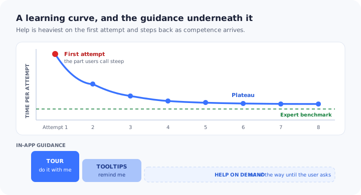
Put attempts at a task along the bottom and the time each attempt takes up the side. Almost every learning curve then has the same basic shape: expensive at first, falling quickly, then levelling off. The regularity behind it is known as the power law of practice: the gains from repetition are large early on and shrink as you go. What separates an easy product from a hard one is not the shape. It is four numbers you can read straight off the chart.
How much time, help and nerve the first successful attempt takes. This is what most people mean by steep.
How much faster the second, third and fifth attempts get. A curve that barely falls means repetition is not teaching anything.
How many repetitions it takes before performance stops improving, which is how long a user stays a learner.
Where the curve levels out compared with how fast an expert does the same task. A high plateau means users have settled for a slow way.
When a customer says your product has a steep learning curve, they are telling you that at least one of these numbers is bad. They are almost never telling you which one. That is what measurement is for.
Powerful products are allowed a learning curve. Nobody expects to master accounting, analytics or design software in an afternoon. What users do not forgive is a curve steeper than the job requires: a first attempt made hard by vocabulary, layout or missing guidance rather than by the work itself. The goal is not a flat curve. It is removing the part of the curve that is your fault.
First-Use Learnability vs. Extended Learnability
Research on software learnability separates two questions that are easy to lump together, and keeping them apart is the single most useful thing you can do before trying to improve either.
First-use learnability, sometimes called initial learnability, is how well a newcomer performs their first attempts at a core task. It is the concern of onboarding, trials and first sessions, and it decides whether someone gets far enough to see the product work at all.
Extended learnability is how a user’s competence keeps growing over weeks and months: whether they move beyond the handful of tasks they learned first, whether they find the faster ways to do those tasks, and whether their performance ever approaches that of your most experienced users.
| First-use learnability | Extended learnability | |
|---|---|---|
| The question | Can a newcomer succeed at the core task on early attempts? | Does competence keep growing after the basics? |
| Where it shows up | Trial conversion, activation, first-week drop-off | Seat usage, feature breadth, efficiency, renewal |
| Typical symptom | Abandoned setup and “how do I” tickets in week one | Users still doing everything the long way a year in |
| What fixes it | Guided first attempts, better defaults, clearer concepts | Pointers to advanced paths at the moment they become useful |
| Who usually owns it | Onboarding and growth teams | Product and customer success teams |
The distinction matters because the fixes point in opposite directions. First-use learnability improves when you add help at the start. Extended learnability improves when you remove help that has turned into noise and replace it with well-timed invitations to go further. A team that only thinks about first use ends up with a product that is easy to start and hard to get good at; a team that only thinks about experts builds the reverse. Our guide to power users covers the far end of that journey.
Why Learnability Is a Revenue Problem, Not Just a UX One
Learnability tends to be discussed as a design quality. Its consequences land on the commercial side of the business, which is why it belongs in the same conversations as conversion and retention.
- Trials are a learning race. A trial user has days, not months. If the first-attempt cost of your core task is higher than their patience, they leave without seeing what the product does, and they leave believing it is harder than it is. Our guide to free trial conversion covers the rest of that funnel.
- Every new seat starts at attempt one. Expansion means new people, and a new person in a five-year-old account learns the product from zero, usually without the onboarding the original buyer received.
- A high plateau looks like low value. Users stuck on the long way round spend more time for less output, and at renewal the product is judged on output.
- Support volume follows the curve. Many of the questions that fill a support queue are early-attempt questions: where is it, what does this mean, why did that not work. A product that is easier to learn generates fewer of them per user.
- Reviews carry it to prospects. “Steep learning curve” is a phrase buyers read before they ever start a trial, so a hard first attempt also costs you prospects you never see.
Why Software Gets Hard to Learn
Very few products are designed to be hard. They become hard one reasonable decision at a time. These are the causes that come up most often, and each one leaves a recognisable mark on the learning curve.
1. The product’s vocabulary is not the user’s
Every product invents nouns: workspaces, pipelines, objects, collections, sources. Inside the company they become so familiar that nobody notices a new user has to learn a small language before doing anything. When a label names the system’s concept rather than the user’s goal, every early attempt starts with an act of translation, and translation is slow.
2. A hidden model has to be understood before anything works
Some products only make sense once you grasp how they are put together: that a record belongs to an account, that a template is not the same as an instance, that nothing is live until it is published. If that model stays hidden, users learn tasks by rote without understanding them, which is why the curve for those tasks falls so slowly. Our guide to onboarding for complex products covers how to introduce concepts without front-loading them.
3. Similar things behave differently
When saving works one way on this screen and another way on that one, practice on the first screen does not transfer to the second. Inconsistency is expensive precisely because it breaks the mechanism that makes learning curves fall: what you learned last time is supposed to help this time.
4. Too much arrives at once
A first screen that shows every capability forces the newcomer to work out what matters before they can do anything. The difficulty of the work has not changed, but the first attempt now includes a sorting exercise. Our guide to cognitive load in onboarding covers this failure in detail.
5. The efficient path is invisible
Keyboard shortcuts, bulk actions, saved views and templates exist precisely to lower the plateau, and many users never meet them, because nothing on the slow path points to the fast one. The long way works, so nobody goes looking.
6. The product grew and nobody re-checked the path
Each new feature is small on its own. Together, years of them bury the core task under options that did not exist when onboarding was designed. Learnability decays even when no single release made anything worse, which is the quiet mechanism behind feature bloat.
How to Measure Learnability
Learnability is one of the few UX qualities you can measure precisely, because its definition already contains a measurement: performance as a function of practice. There are two ways to collect the data, and most teams benefit from using both.
Method 1: Repeated-trial usability testing
The classic approach is a test in which the same participants perform the same core task several times, either within one session or spread over a few days. For each attempt you record the time taken, whether they succeeded, the number of errors and how often they needed help. Four or five attempts are normally enough to see where the curve begins to level off.
Two details make or break it. Use realistic tasks with realistic data, because the difficulty of an empty test account is not the difficulty of a real one. And have one or two experienced users perform the same task, because a plateau means nothing until you know where expert speed sits. Our usability testing guide covers recruiting, scripts and sample sizes.
Method 2: Learning curves from your product data
A test tells you why people struggle. Your usage data tells you how much, across every user, all the time. The method is straightforward once your core tasks are tracked:
- Pick two or three core tasks that users repeat, each with a clear start and a clear finish: create an invoice, publish a report, approve a request.
- For every user, number their occurrences of that task: first, second, third and so on.
- For each occurrence number, take the median time from start to finish across all users. Use the median, because a handful of people who left a tab open overnight will wreck an average.
- Next to time, record the success rate for each occurrence (started and finished versus started and abandoned) and the help rate: the share of occurrences in which the user opened help, replayed a guide or contacted support.
- Plot the medians against occurrence number. That chart is your product’s real learning curve for that task.
If your tracking does not yet have clean start and finish points for your core tasks, that is the first job, and our guide to event tracking covers how to set it up.
| Learnability metric | What it tells you |
|---|---|
| First-attempt success rate | The share of users who complete the task on their first try, including the ones who never came back |
| First-attempt time | The cost of getting started: the number behind “steep” |
| Improvement from attempt one to attempt three | Whether repetition is teaching anything |
| Attempts to plateau | How long users remain learners on this task |
| Plateau versus expert time | How much efficiency users leave on the table once they stop improving |
| Help rate per attempt | Whether users are learning or are simply being carried |
| Guide completion per step | Where the guidance itself loses people on their first attempt |
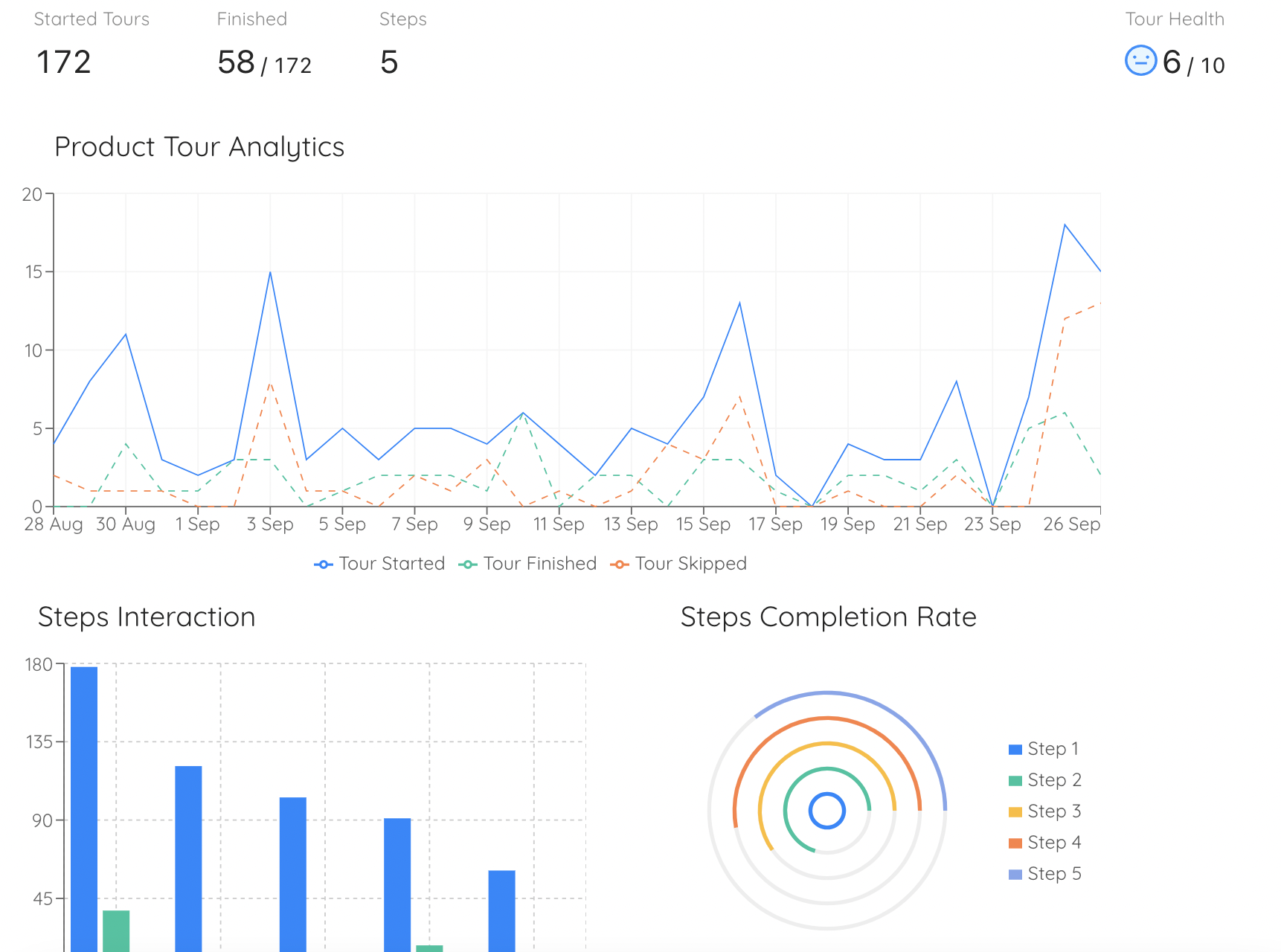
Per-step completion shows where a guided first attempt loses people, which is usually the same place an unguided attempt would have failed.
Watch the help rate as closely as the time. A curve that falls nicely while the help rate stays flat is not a learnable product. It is a product people can only use with the guide open. Real learning shows up as time and help falling together.
Learning curves sit comfortably alongside the task-success measures in the HEART framework, and they add something the usual onboarding metrics miss: what happens on the second and fifth attempt, long after the onboarding flow has been marked complete.
Reading the Learning Curve: Four Shapes and What Each One Needs
Once you have a curve for a core task, its shape is more useful than any single number on it. Most curves fall into one of four patterns, and each one points to a different kind of fix.
Four curves, four different problems. Adding another product tour fixes exactly one of them.
1. Healthy: falls fast, levels out near expert speed
The first attempt costs something, the second costs much less, and by the fourth or fifth users are close to the speed of your experienced users. There is nothing to fix in the product. The only risk is guidance that keeps appearing long after it is needed, so check that tours and tips switch themselves off once they have done their job.
2. Painful first attempt: very high start, then normal
The curve starts very high and then behaves normally. Users who get through the first attempt learn fine; the problem is getting through it, and the users who did not are missing from the chart entirely because they abandoned. Read the first-attempt success rate next to the time. This is the classic onboarding problem, and it responds best to a guided first attempt, better defaults, and moving any setup that does not need to happen before the first success to after it.
3. Never clicks: slow, steady decline
The curve starts moderately high and declines slowly, attempt after attempt. Repetition is not producing understanding, which usually means users are following steps without a model of what the steps do. More walkthroughs will not help, because a walkthrough teaches the steps. Rename things in the user’s language, explain the concept at the moment it matters, and look for inconsistent behaviour that stops practice from transferring between screens.
4. Stuck on a plateau: normal fall, high floor
The curve falls normally and then flattens well above expert speed. Users are competent and slow, and they will stay that way, because the path they learned works well enough that they have no reason to look for another. This is extended learnability, and it is fixed at the plateau, not at the start: point out the shortcut, bulk action or template at the moment a user does the task the long way for the fifth time. Our feature discovery guide covers the patterns for doing that without nagging.
There is a fifth shape: the sawtooth. For tasks people perform monthly or quarterly, the curve can fall within a stretch of use and jump back up at the next occurrence, because the user forgot in between. That is a memorability problem rather than a learnability one, and it is handled with refreshers for returning users rather than with better first-time guidance.
Scaffold and Fade: In-App Guidance That Steps Back as Users Learn
Most in-app guidance is designed as if every user were on attempt one forever. A product tour plays on the first visit and then vanishes, or it plays on every visit. The first version abandons users on attempt two, which is exactly when they try the task alone for the first time. The second version turns into noise by attempt three, and users learn to dismiss it without reading, the same habit behind banner blindness.
Educators worked this out long ago. In instructional design, scaffolding is temporary support that lets a learner do something they cannot yet do alone, and fading is the deliberate, gradual removal of that support as their competence grows. The idea comes from 1970s research on how tutors help learners solve problems, and it translates to software almost unchanged: support should be heaviest on the first attempt and should withdraw, on a rule, as the user shows they no longer need it.
| Stage | What the user needs | Guidance that fits | When it steps back |
|---|---|---|---|
| Attempt one | Do it with me | A short walkthrough of the task itself, three to five steps, triggered when they start it | When the task is completed, not when the tour is closed |
| Attempts two and three | Remind me of the tricky part | A tooltip or hotspot on the one or two controls where unaided attempts fail, with the task kept on a checklist | After the task has been completed unaided |
| Attempt four onwards | Stay out of my way | Nothing proactive; help available on demand | Never, because it only appears when asked for |
| The plateau | Show me the faster way | One dismissible pointer to the shortcut, bulk action or template | Once it has been used or dismissed |
| After a long gap | Refresh my memory | A brief refresher for users returning to a task they have not done in a while | After the first task back |
Three rules make fading work in practice:
- Fade on behaviour, not on the calendar. “Seven days after signup” says nothing about competence. “Has completed the task” does.
- Fade on the task, not on the guide. A user who dismissed a tour and then completed the task unaided has learned. A user who clicked through every step and then abandoned the task has not.
- Keep one door open. When proactive guidance steps back, the same help should stay reachable on demand, so a user who forgets is never worse off than a user who never saw it.
Scaffold and fade is a close relative of progressive onboarding, but it answers a different question. Progressive onboarding decides which things to teach and when. Fading decides how much help to give for the same thing as the user repeats it.
How to Reduce Your Product’s Learning Curve: 8 Fixes
The fixes below run roughly from the start of the curve to the plateau. Each one names the part of the curve it moves, so you can go straight to the ones your measurement pointed at.
- Rename things in the user’s words
- Teach a task, not a tour of the screen
- Make the first attempt the easy version
- Put a pointer where unaided attempts fail
- Keep the sequence out of the user’s head
- Fade guidance on a rule
- Surface the faster path at the plateau
- Re-measure core tasks after every major release
1. Rename things in the user’s words
List the nouns and verbs a new user meets in their first session and ask whether each one names what the user wants or what your system calls it. Where a system term is unavoidable, explain it once, on the screen where it first appears, in a sentence that starts from the user’s goal. Our guide to UX microcopy covers the writing itself.
Moves the curve: first-attempt cost, and the slow decline of shape three.2. Teach a task, not a tour of the screen
A tour that explains every panel on a page teaches the layout, and layouts are not what users came to learn. Build guidance around a single job, from its first click to its visible result, and trigger it when the user starts that job. Three to five steps is enough for most tasks; if a task needs twelve, it needs simplifying before it needs a tour. Our guide to creating a product tour that converts covers step design.
Moves the curve: first-attempt time and first-attempt success.3. Make the first attempt the easy version
The first time through, a user should meet sensible defaults, a prefilled example or a template rather than twenty blank fields. They can learn the options after they have seen a result. Where a screen starts empty, use the empty state to show what it will look like and offer the first step; our guide to empty states has the patterns.
Moves the curve: first-attempt cost.4. Put a pointer where unaided attempts fail
Your test sessions or your support tickets will show one or two controls where the second attempt goes wrong: the field with two plausible meanings, the setting that must be changed before the button works. A tooltip or hotspot on exactly those controls is worth more than any amount of general guidance. Our guide to creating onboarding tooltips covers placement and copy.
Moves the curve: the drop between attempt one and attempt three.5. Keep the sequence out of the user’s head
Multi-step setups are hard to learn partly because the user has to remember where they are. A persistent checklist carries the order for them, shows what is done, and gives each item a button that opens the right screen. Our onboarding checklist guide covers how to structure one.
Moves the curve: first-attempt success on multi-step tasks.6. Fade guidance on a rule
For every piece of proactive guidance, decide the behaviour that switches it off and write it down before you publish. Showing it once is the minimum. Better is a condition tied to the task itself: completed, or dismissed and then completed anyway. Then check the help rate per attempt, which should fall roughly as fast as the time does.
Moves the curve: stops guidance from propping up a curve that only looks healthy.7. Surface the faster path at the plateau
Wait until a user has done the task the long way several times, then show them the shortcut, bulk action or saved view once, in context, with a way to dismiss it for good. Shown on day one, the same tip is noise. Shown at the plateau, it answers a frustration the user has already begun to feel.
Moves the curve: plateau height, which is extended learnability.8. Re-measure core tasks after every major release
New features get measured by their own adoption. Almost nobody checks whether they made the existing core tasks harder to learn. Keep the learning curves for your two or three core tasks where the team can see them, and compare users who signed up after a release with those who signed up before. A first-attempt cost that crept up is a learnability regression, and it is far cheaper to catch in a month than in a renewal conversation.
Moves the curve: protects every other fix on this list from slowly undoing itself.Learnability: Do vs. Don’t
✅ Do
- Measure the same task on repeated attempts
- Use medians for each occurrence number
- Track help rate alongside time
- Benchmark against experienced users
- Guide the first attempt at a real task
- Switch guidance off on behaviour
- Show the faster path at the plateau
- Re-check core tasks after big releases
❌ Don’t
- Judge learnability from first impressions
- Treat “intuitive” as the whole goal
- Replay the same tour on every visit
- Remove all help after the first session
- Answer a concept problem with more steps
- Tour the layout instead of a job
- Show expert features on day one
- Read a falling curve without the help rate
Improving Learnability With Kompassify
Most of the work in this guide comes down to matching guidance to the attempt a user is on: heavy on the first, light on the third, absent until asked for on the tenth, and back briefly at the plateau. That is a targeting and timing problem more than a content problem, and it is hard to get right when every change to in-app help needs a developer and a release.
Kompassify is a no-code layer that sits on top of your product and lets the team that owns onboarding build and change that guidance directly. Build a short product tour around a single task. Attach tooltips and hotspots to the controls where unaided attempts go wrong. Keep multi-step setups on an onboarding checklist that persists between sessions. Use segments and trigger rules so each guide reaches the users it is meant for, and set it to show once or to repeat only under a condition, so it steps back as people learn. When a faster path ships, point it out with an announcement aimed at the users who will benefit.
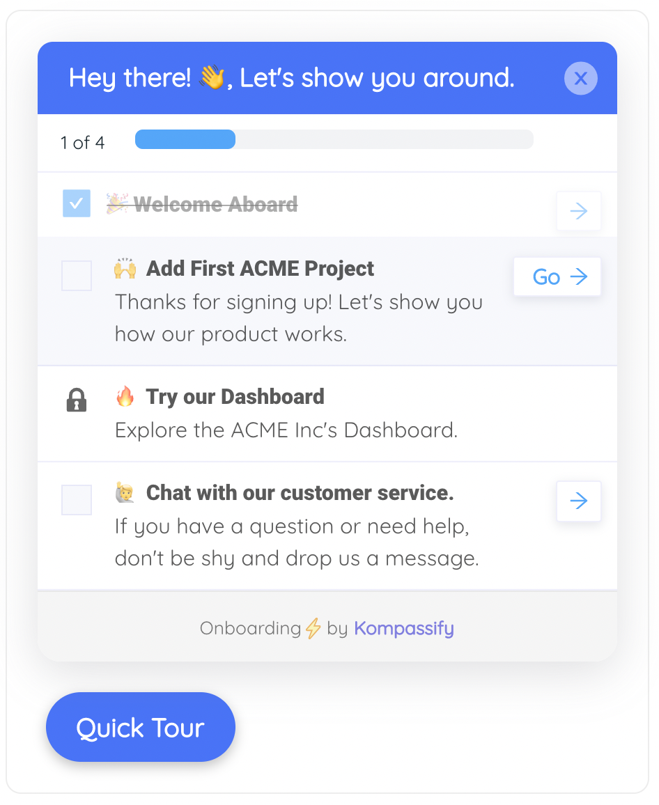
A checklist holds the sequence so the user does not have to, and each item opens the screen where the task actually happens.
Product analytics shows completion for every step of every guide, which is how you find the step where a guided first attempt loses people, and a multi-choice question at the start lets you route people with different jobs to the task they actually need to learn first. Because it is all configuration rather than code, cutting a tour from eight steps to four, adding a tooltip to the field that keeps tripping people up, or changing when guidance fades is an afternoon’s work.
Shorten your learning curve without waiting for a release
Add task-based tours, tooltips, hotspots and checklists to your live product, target them by segment and page, and decide exactly when each one steps back. No code required. Free up to 100 monthly active users, plans from $129/month, GDPR-compliant and EU-hosted.
Start for free →The One-Paragraph Version
Learnability is how easily people become competent with a product and how quickly they improve with practice, and the best way to see it is a learning curve: the time and help each attempt at the same core task requires. A steep learning curve is really one of three problems, an expensive first attempt, a concept that repetition never makes clear, or a plateau far above expert speed, and each needs a different fix. You can measure it in a repeated-trial usability test or directly from product data by plotting the median time, success rate and help rate for each user’s first, second and later occurrences of a task. First-use learnability improves with guided first attempts, clearer vocabulary and better defaults; extended learnability improves when the faster path is shown at the plateau. In-app guidance should scaffold and fade: walk users through attempt one, remind them where unaided attempts fail, step back once they succeed alone, and stay available on demand. Keep the curves for your core tasks visible and re-check them after every major release, because learnability erodes one reasonable feature at a time.
Frequently Asked Questions
What is learnability in UX?
Learnability is how easily new users become competent with a product and how quickly their performance improves as they repeat tasks. It is one of the five quality components in Jakob Nielsen's widely used definition of usability, alongside efficiency, memorability, errors and satisfaction. A learnable product lets people succeed at core tasks on their early attempts and get noticeably faster with each repetition.
What is the difference between learnability and usability?
Usability is the umbrella quality: how well a product works for the people using it. Learnability is one component of usability, concerned specifically with how quickly people become competent. A product can be very usable for experienced users and still be hard to learn, which is common in powerful professional software, or it can be easy to learn and inefficient once learned.
What does a steep learning curve mean?
In everyday use, a steep learning curve means a product is hard to learn: early attempts at a task take a lot of time, effort or help. In its original psychological sense, a steep curve that plots proficiency against practice actually means fast learning. For software, the useful reading is to plot the time or effort each attempt takes and look at how costly the first attempt is, how quickly effort falls with repetition, how many attempts it takes to level off, and how far that plateau sits above expert speed.
How do you measure learnability?
Measure how performance on the same task changes with repetition. In a usability test, have participants perform a core task several times and record time, success, errors and requests for help on each attempt. From product data, number each user's occurrences of a core task and plot the median completion time, success rate and help rate for the first, second, third and later occurrences. Then compare where the curve levels off with the time experienced users take.
What is the difference between first-use and extended learnability?
First-use learnability, also called initial learnability, is how well newcomers perform their first attempts at core tasks, and it drives activation and trial conversion. Extended learnability is how competence keeps growing over weeks and months, including finding faster ways to work and using more of the product, and it drives efficiency, seat usage and renewal. They need opposite kinds of help: more guidance at the start, and fewer but better-timed pointers later on.
How do you reduce the learning curve of software?
Start by measuring which part of the curve is the problem. Then rename things in the user's language, guide the first attempt at a real task rather than touring the layout, give the first attempt sensible defaults, put tooltips on the controls where unaided attempts fail, carry multi-step sequences in a checklist, fade proactive guidance once users complete the task on their own, show faster paths once users reach a plateau, and re-check your core tasks after every major release.
Is an intuitive product the same as a learnable one?
No. Intuitiveness describes whether someone can succeed on the very first try without help. Learnability also covers what happens afterwards: whether the second and tenth attempts get faster, whether understanding builds, and whether users ever approach expert speed. A product can feel intuitive on day one and never get faster, and a powerful product can be unintuitive at first and still highly learnable.