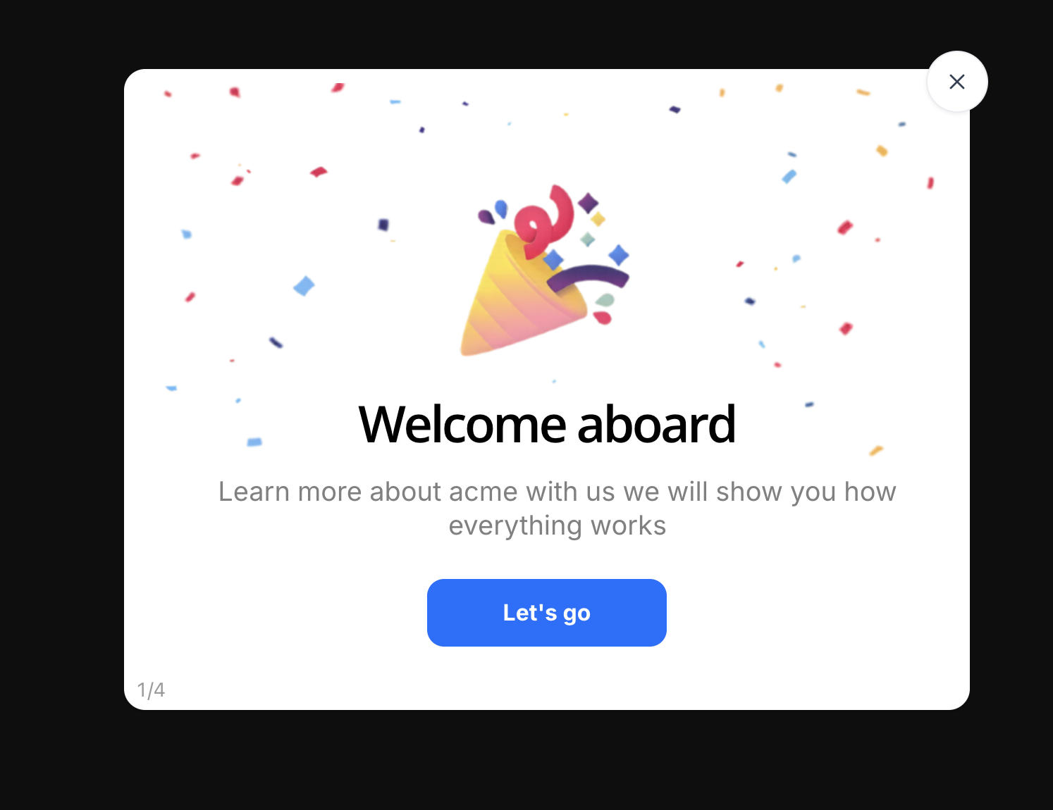
Think about the last time you signed up for a new SaaS product. You had a problem, you'd read the landing page, you'd handed over your email, and for a few minutes, your motivation was as high as it will ever be. What the product did with those minutes decided everything that followed. That handoff moment, the first deliberate screen after signup, is the welcome screen, and it is the single cheapest place in your entire funnel to influence whether a signup becomes a user.
Most products treat it as a formality: a logo, a "Welcome!", a button. That's not a welcome; it's a speed bump. A well-designed welcome screen does real work in a few seconds: it confirms the user is in the right place, asks the one question that personalizes everything downstream, and hands them a first step matched to their goal. The difference shows up directly in activation: users greeted with a routed, personal first step reach their first win faster than users dropped onto a generic dashboard and left to wander.
This guide covers the whole subject: what a welcome screen is (and how it differs from a splash screen, an empty state, and a product tour), why the first hello has an outsized effect on time to value, the anatomy of a great welcome screen, welcome message examples you can adapt, and eight best practices for designing a welcome flow, including how to ship one without waiting for an engineering sprint.
Key Takeaways
- A welcome screen is the first deliberate screen after signup: a greeting, a value confirmation, and a first step. It is seen exactly once per user, at the moment of peak motivation.
- It is not a splash screen. A splash screen buys loading time; a welcome screen buys activation. Confusing the two is why so many welcome screens say nothing.
- A great welcome screen has four parts: a personal greeting, one line confirming the value the user signed up for, at most one question that personalizes what happens next, and one clear call to action.
- Ask only questions that change the experience. A welcome survey earns its screen time by routing each role or goal to a different first win, never by collecting data that alters nothing.
- Keep it under thirty seconds and always skippable. The welcome flow stands between a motivated user and your product; every extra screen taxes the best moment you'll ever get.
- The welcome screen starts a journey, it doesn't finish one: bridge it straight into a product tour or an onboarding checklist so the warmth of the hello turns into a completed first action, no code required.
What Is a Welcome Screen? (Meaning & Definition)
A welcome screen is the first deliberate screen a product shows a brand-new user, after signup completes, before the working interface takes over. Depending on the product it appears as a full welcome page, a welcome modal over the dashboard, or a short multi-step welcome flow; teams also call it the first-run experience, the welcome page, or (when it asks questions) a welcome survey. Whatever the form, the job is the same: greet the person, confirm they're in the right place, and point them at a first step worth taking.
Welcome screen, defined. A welcome screen is the transition surface between "I just signed up" and "I'm using the product": a designed moment that greets the user, restates the value they came for, optionally asks one question to personalize what follows, and hands over exactly one first action. The key property is that it's ephemeral by design: each user crosses it once, which is precisely why it deserves more design attention than screens users see every day, not less.
The term gets blurred with several neighbors, and the blur causes real design mistakes: a welcome screen written like a splash screen says nothing, and one written like a product tour says far too much. Here's the map:
| Surface | When it appears | Its job | How long it lives |
|---|---|---|---|
| Welcome screen | Once, right after the first signup or first login | Greet, confirm value, personalize, hand over the first step | One session, one time, per user |
| Splash screen | Every launch, while the app loads | Cover loading time with branding: no message, no input | A second or two, every time |
| Empty state | Whenever a screen has no content to display | Explain what the space is for and how to fill it | Until the screen has content |
| Product tour | After the welcome screen, in the live interface | Walk the user step-by-step to their first completed action | A few guided minutes |
The four are teammates, not rivals, and the welcome screen is the dispatcher. It's the one surface that meets every new user, which makes it the natural place to decide what each of them should see next: which product tour to launch, which checklist to show, which empty state they'll land on first. A product with a great tour but no welcome screen is giving the same guided visit to every visitor, whatever they came for.
Why Welcome Screens Matter: You Only Get One First Moment
It's tempting to see the welcome screen as decoration, a politeness before the real product. The reasons it belongs at the heart of your onboarding strategy:
-
It lands at the moment of peak motivation
Motivation decays from the second the signup form is submitted. The welcome screen is the only surface guaranteed to catch users at the top of that curve, which means a first step offered here gets taken at a rate no in-app banner or day-three email will ever match.
-
It's your one chance to route users before they wander
A marketer, a developer, and a founder sign up for the same product wanting three different first wins. The welcome screen is the only point where all three are in the same place and answering one question can split them onto the right paths. Skip it, and everyone gets the average experience, which fits nobody.
-
It confirms the promise before the product complicates it
The landing page made a promise; the interface, full of menus and settings, doesn't obviously repeat it. A welcome screen that restates the value in one line, "You're 3 steps from your first published tour", bridges the gap between what was promised and what's on screen, before doubt gets a vote.
-
It compresses time to value
The stretch between signup and first win, time to value, burns most of its minutes where users don't know the next step. A welcome screen that ends in a concrete, personalized first action removes the single largest "what now?" from the journey, and pulls the aha moment closer to minute one.
-
It captures segmentation data nothing else can
One welcome-survey question, "What's your main goal?", tags every account with intent from day one. That answer keeps paying: it decides which tour launches today, which checklist appears tomorrow, and which announcement is worth showing next quarter. No analytics tool can infer what a user would have simply told you if asked at the right moment.
The cost of a wasted hello. A weak welcome screen rarely shows up in feedback: nobody writes a support ticket about a bland greeting. It shows up one screen later, as new users wander an unfamiliar dashboard, hit their first empty state without context, and quietly close the tab. If your week-one retention leaks, the first place to look is the first thing users see.
The Anatomy of a Great Welcome Screen
Strip a well-designed welcome screen from any product you admire and you'll find the same four parts, each answering a question the new user is silently asking:
Greeting, value confirmation, one personalizing question, one action, plus a visible way out for users who'd rather explore. If any part is missing, one of the new user's silent questions goes unanswered.
1. The greeting: "am I acknowledged?"
A human hello, ideally with the user's name: "Welcome, Sarah 👋" outperforms "Welcome to AppName" because it's about the person, not the software. This is also where tone is set: warm, confident, brief. One line. The greeting earns its space by making the next two lines feel like they're addressed to someone, not broadcast at everyone.
2. The value confirmation: "am I in the right place?"
One sentence that restates why the user signed up, framed as what's about to happen: "Let's get your first product tour live. Most teams publish one in under 15 minutes." It converts the landing page's promise into a near-term expectation, and quietly answers the doubt every new signup carries: did I just waste my time?
3. The question: "will this fit me?"
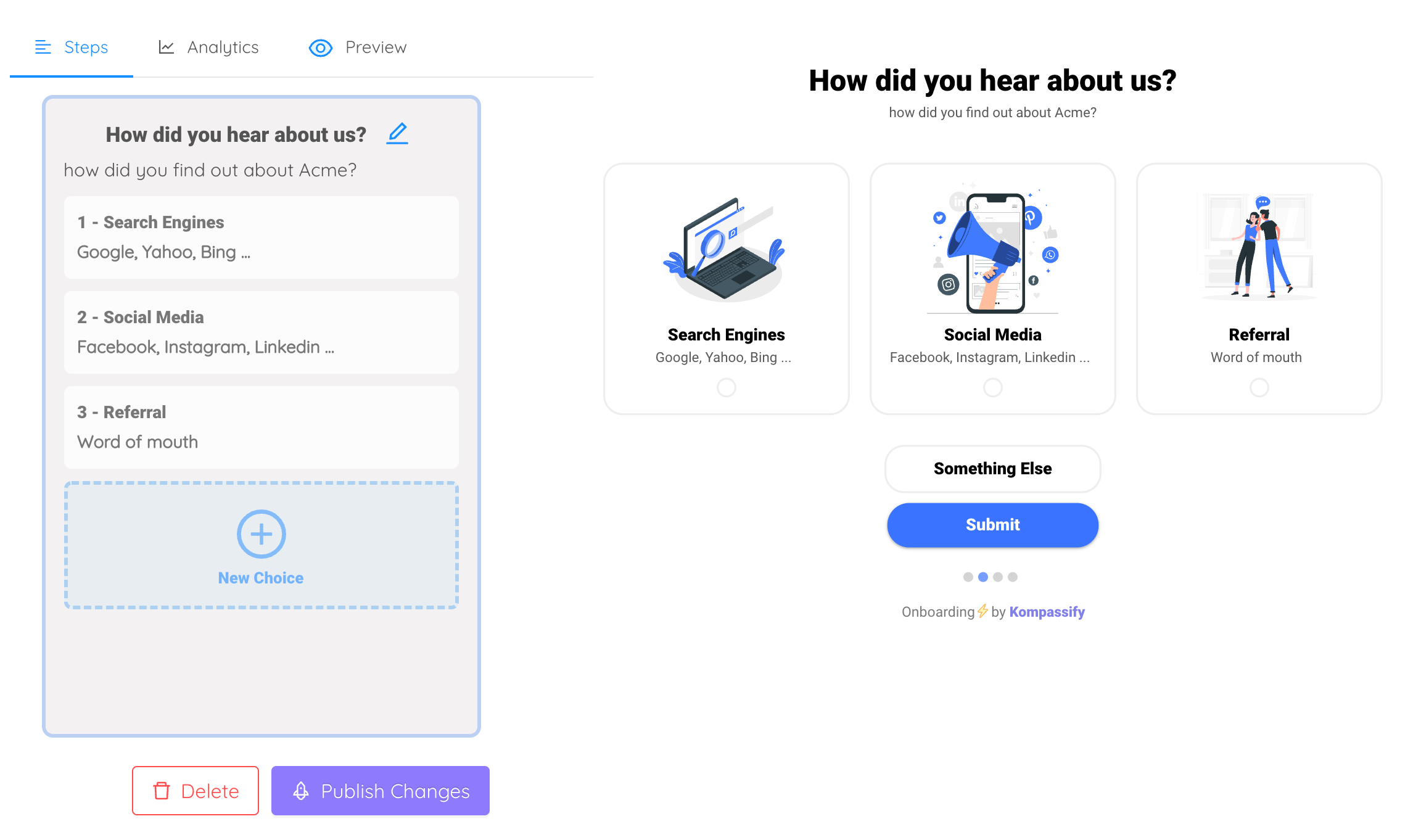
At most one or two, and only if the answers change what happens next. "What best describes your role?" or "What are you here to do first?", presented as tappable options, not a form. The question does double duty: it gives you the segmentation data, and it signals to the user that the product intends to adapt to them. A multi-choice welcome flow is the canonical shape: each answer routes to a different tour, checklist, or starting screen.
4. The call to action: "what's my first step?"
One primary button that starts the first win for the path the user just chose: "Build my first tour," "Import my data," "Show me around." Exactly one: a welcome screen offering four equal buttons has re-created the wandering problem it exists to solve. Below it, in lower emphasis, the skip link: "I'll explore on my own." Guidance you can decline is hospitality; guidance you can't is a toll booth.
How to Design a Welcome Screen: 8 Best Practices
The principles, in the order you should apply them:
1. Design for thirty seconds, not three minutes
The welcome flow stands between a motivated user and the product they just chose. Every additional screen spends motivation you cannot buy back. One greeting screen and one or two question screens is the ceiling for most SaaS products; if you have more to say, say it later, in a tour, a checklist, or the interface itself. The test: a stopwatch started at "signup complete" should read under thirty seconds when the user lands on a real product screen with a clear next step.
2. Greet like a person, not a splash screen
Use the name you were just given. Write like a helpful colleague, not a brand voice guide: "Welcome, Amir: let's get your first checklist live" beats "Welcome to the future of digital adoption." The welcome screen is the one moment users will forgive, even enjoy, a little warmth; spending it on slogan-speak reads as nobody home.
3. Ask only questions that change what happens next
Before adding any question to the welcome survey, name the thing that changes based on the answer. Role → different tour. Goal → different checklist. Company size → honestly, usually nothing, so don't ask. Users can feel the difference between being routed and being profiled: a question whose answer visibly shapes the next screen builds trust, and a questionnaire that changes nothing burns the goodwill the greeting just earned.
4. Route each answer to a different first win
The payoff of asking is branching. A user who picks "I'm here to announce features" should land in the announcement builder with a template open; one who picks "I want to onboard new users" should get the tour builder and a 3-step starter. Same product, three different front doors. This is multi-choice onboarding doing what no generic flow can: making the product's first impression specifically relevant to each person who arrives.
5. Set expectations: show the shape of what's ahead
Uncertainty, not effort, is what stalls new users. "3 quick steps: connect, build, publish" on the welcome screen tells the user the journey is short and finite before they commit to it. Pair the welcome flow with an onboarding checklist and a progress bar, and that promise stays visible for the entire first session: every step completed is progress the user can see.
6. Always leave the door open: make skipping visible
Some of your best future customers arrive already knowing what they want: evaluators on their second look, invited teammates joining an existing workspace, power users migrating from a spreadsheet. Forcing them through the full welcome flow punishes exactly the users who need it least. A visible "Skip: I'll explore on my own" costs the guided majority nothing, and the skip rate itself becomes a metric: when it climbs, your welcome flow has grown too long or landed at the wrong moment.
7. Bridge straight into the first action: never end on a dead drop
The most common welcome-screen failure isn't the screen; it's the exit. A lovely greeting that ends by dumping the user onto an unexplained dashboard has moved the churn point one click later. The welcome flow's CTA should hand off directly into guided motion: launch the matching product tour, open the checklist, land on the exact screen where the first item gets created. And since that landing screen is usually an empty state, make sure it continues the conversation the welcome screen started, rather than shrugging "No data available" at a user you greeted by name ten seconds ago.
8. Measure the welcome flow like the funnel step it is
Four numbers tell you everything: completion rate (who finishes the flow), skip rate (who opts out), question answer distribution (which paths users actually choose), and (the one that matters) first-action rate afterward: what share of users who saw the welcome screen complete the first step it pointed to. A welcome flow with high completion but low follow-through is a pretty hallway to a locked door; fix the handoff, not the greeting. Watch these weekly, the way you'd watch any onboarding funnel step.
Welcome Screen Examples: The Formality vs. The Dispatcher
Here is the same moment, a new user's first second inside the product, designed both ways. The left version is the formality most products ship; the right version applies the anatomy from this guide:
The all-in-one platform for modern teams.
Get StartedLet's get your first product tour live; most teams publish one in under 15 minutes. What are you here to do first?
The same transformation works on welcome messages, the copy itself. A few before-and-after rewrites:
- The greeting: "Welcome to AppName, the all-in-one platform" → "Welcome, Sarah 👋 Let's get your first tour live; most teams do it in under 15 minutes."
- The question: "Tell us about yourself (5 questions)" → "One quick question: what are you here to do first? We'll set things up around your answer."
- The CTA: "Get Started" → "Build my first tour →", the button names the win, not the process.
- The skip: a hidden ✕ in the corner → "I'll explore on my own →", respect, stated in words.
- The handoff: …dashboard → the tour builder opens with a 3-step starter template, and the checklist appears with step one already ticked: "Create your account ✓"
Notice what changed in every rewrite: the copy stopped describing the product and started describing the user's next fifteen minutes. That's the whole craft, compressed into one habit.

Welcome Screen Design: Do vs. Don't
✅ Do
- Greet with the user's name and a human tone
- Restate the value they signed up for in one line
- Ask one question, and visibly change the path based on the answer
- End in one clear, named first action ("Build my first tour")
- Keep the whole flow under thirty seconds
- Offer a visible, judgment-free skip
- Hand off directly into a tour, checklist, or the exact first screen
- Track completion, skip rate, and the first-action rate after the flow
❌ Don't
- Open with a slogan and a logo; that's a splash screen with delusions
- Ask five profile questions whose answers change nothing
- Offer four equal buttons, or a lone, unlabeled "Get Started"
- Force an unskippable multi-step flow on invited teammates
- List every feature; the welcome screen is a dispatcher, not a brochure
- Drop users onto an unexplained dashboard when the flow ends
- Show the welcome screen again on every login
- Ship it once and never look at its metrics again
Building a Welcome Flow Without Engineering Time
A welcome experience touches signup, routing, and the first session, which makes it sound like a quarter's roadmap. It doesn't have to be. The entire flow described in this guide can be layered onto your existing product with Kompassify, no code required:
- A welcome modal that greets new users on their first login: name, value line, and one clear first step, built in a visual editor and targeted to first-session users only.
- A multi-choice welcome survey that asks the routing question and launches a different product tour for each answer: the marketer, the developer, and the founder each get their own first win.
- A product tour per path that carries the handoff, from the welcome screen's CTA straight through to the first completed item.
- An onboarding checklist with a progress bar that keeps the welcome's promise visible across the whole first week: whichever screen the user lands on, the next step is one glance away.
Everything ships with a single script snippet, is targeted by segment, and is measured in built-in analytics: completion rate, skip rate, and what users do after the flow ends. Kompassify is GDPR compliant and EU-hosted, free for under 100 monthly active users, with paid plans from $129/month.
Make Your First Hello Count
Kompassify lets you build welcome modals, multi-choice welcome surveys, product tours, and onboarding checklists on top of your existing product: no code, no release cycle. Greet every new user by name, route them to the right first win, and watch your activation rate move. GDPR compliant, EU-hosted, and free for under 100 monthly active users.
Start for Free →Frequently Asked Questions
What is a welcome screen?
A welcome screen is the first deliberate screen a product shows a brand-new user, right after signup and before they reach the interface itself. Its job is to greet the user, confirm they're in the right place, set expectations for what happens next, and hand them one clear first action. In SaaS it usually appears as a full-page welcome or a welcome modal, often with a short question that personalizes the rest of onboarding, and it exists for exactly one session: a user only ever sees it once, at the moment their motivation is highest.
What is the difference between a welcome screen and a splash screen?
A splash screen is a loading screen, a logo shown for a second or two while the app starts, carrying no message and requiring no input. A welcome screen is an onboarding surface: it appears once, after the first signup, and actively communicates, greeting the user, confirming the product's value, often asking a question, and pointing to the first step. A splash screen buys time; a welcome screen buys activation. They're also distinct from empty states, which are what individual screens show when they have no content to display.
What should a welcome screen include?
Four elements: a warm, personal greeting (ideally using the user's name); one line that confirms the value they signed up for, reassurance that they're in the right place; at most one question that personalizes what happens next, such as their role or main goal; and one clear call to action that starts the first step, with a visible way to skip for users who want to explore alone. Anything beyond that (feature lists, multiple competing buttons, long forms) belongs later in onboarding, not on the welcome screen.
Should a welcome screen ask questions?
One or two, if the answers genuinely change what happens next. A welcome survey asking for the user's role or primary goal lets you route a marketer, a developer, and a founder to three different first wins instead of one generic tour; that's segmentation working for the user, and users feel it as a product that understands them. The failure mode is the interrogation: five demographic questions whose answers change nothing. Every question must earn its place by visibly shaping the experience that follows; if the answer doesn't alter the next screen, don't ask.
How long should a welcome flow be?
As short as it can be while still routing the user well: one greeting screen and one or two questions is the sweet spot for most SaaS products. The welcome flow stands between a motivated new user and their first experience of the product, so every extra screen taxes the moment of peak motivation. A good test: the user should reach a real product screen, pointed at a concrete first action, within about thirty seconds of finishing signup. If your welcome flow needs more than three steps, move the extra material into a checklist or tour that runs alongside the product instead.
Can users skip the welcome screen?
They should always be able to. A visible skip or "I'll explore on my own" link costs nothing with users who want guidance and earns real goodwill with those who don't: experienced users, returning evaluators, and people who were invited into an existing workspace and don't need the pitch. Forcing every user through an unskippable flow trades a minority's mild convenience for a vocal minority's genuine irritation. Track the skip rate: a rising one is early feedback that the welcome flow has grown too long or arrived at the wrong moment.
How do you add a welcome screen without coding?
With a no-code onboarding platform like Kompassify you can build the entire welcome experience on top of your existing product: a welcome modal that greets new users on first login, a multi-choice welcome survey that asks for their role or goal and routes each answer to a different product tour, and a checklist that carries the momentum through the first session. Everything is created in a visual editor, targeted by segment, and shipped with a single script snippet, no release cycle needed. Kompassify is GDPR compliant and EU-hosted, free for under 100 monthly active users, with paid plans from $129/month.