Shipping a redesign to people who have never seen your product is easy: they have nothing to unlearn. Shipping one to the users you already have is the hardest release a product team does, because those users are not evaluating your interface. They are trying to finish a job they used to be fast at, and you have just moved everything.
The uncomfortable part is that this happens even when the new design is genuinely better. A measurable improvement in usability can still produce a week of angry tickets, a dip in daily usage, and a thread of people asking for the old version back. Teams that have not planned for that read the dip as failure and either panic-revert a good design or dig in and defend a bad one.
This guide is the rollout plan: why the dip happens, how to tell it apart from an actual regression, the four-phase release that contains the risk, the in-app guidance that shortens the recovery, and the rollback triggers worth agreeing while everyone is still calm.
Key Takeaways
- The dip is normal; the shape of it is the signal. A better design still costs existing users their muscle memory, so expect a temporary drop, and judge the rollout by how fast it recovers, not by whether it happened.
- Task completion rate is the discriminator. Complaints and time-on-task spike for both change aversion and real regressions. Completion rate that recovers means aversion; completion rate that stays flat means you broke something.
- Phase it: opt-in → default with a way back → sunset. This turns one enormous risk into three small ones and finds regressions on volunteers rather than on your whole base.
- A migration tour is not an onboarding tour. Existing users need a map of what moved, in three to five steps, not a re-explanation of the product they use daily.
- Keep the old interface for a full usage cycle. Monthly users meet the new UI once a month; a two-week window gives them exactly one unsupported encounter with it.
- Write the rollback triggers before launch. Decided in advance they are engineering; decided afterwards they are politics.
Why a Better Design Still Feels Worse
Change aversion, in one paragraph
Change aversion is the temporary drop in satisfaction and performance that follows an interface change, caused by the loss of accumulated familiarity rather than by any defect in the new design. An experienced user does not read your interface; they move to remembered positions, and that remembered speed is real value your redesign deletes on day one. The new design has to be better by more than the value of what it removed before the user feels the improvement, and until then a genuine upgrade registers as a downgrade.
This is why the loudest feedback arrives from your best users. Someone who opens the product twice a month barely had muscle memory to lose. Someone who lives in it eight hours a day loses a great deal, and they are also the people whose opinion carries most weight internally. The volume of complaint correlates with engagement, not with design quality, which makes it a dangerous signal to steer by.
It also explains the timeline. For users who stay engaged, the effect usually resolves within two to six weeks as new patterns form. The risk is what happens inside that window: users who were already ambivalent do not push through it, and a redesign becomes the visible reason for a churn decision that was half-made already. The rollout's job is to make that window as short and as supported as possible.
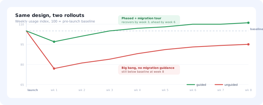
Both rollouts shipped the same design. The difference is phasing and in-app guidance, the depth and length of the dip, not whether there was one.
Change Aversion vs. a Real Regression
Every redesign team eventually has the same argument: is this noise we should ride out, or did we break something? Both sides usually cite the same evidence, which is why the argument does not resolve. The way out is to notice that some metrics move identically in both cases and are therefore useless for telling them apart.
| Signal | Change aversion | Real regression |
|---|---|---|
| Complaint volume | High: spikes immediately, decays | High: spikes immediately, persists |
| Time on task | Up, then falls back toward baseline | Up and stays up |
| Task completion rate | Roughly held, recovers week over week | Drops on specific tasks and stays flat |
| Distribution | Broad: everyone is a bit slower | Concentrated in a task, segment or device |
| Trend after 2–3 weeks | Improving | Flat or worsening |
| Right response | Guide, communicate, hold your nerve | Fix the specific thing, or revert it |
The practical rule: trust completion rate and trend, distrust volume. If people still finish the job and are getting faster each week, you are watching adaptation. If a specific task's completion rate falls off and does not climb back, you have a defect, and no amount of communication will fix a defect.
Session replay is the fastest way to convert a suspicion into a diagnosis here: watching ten sessions of the task whose completion rate dropped almost always shows you exactly which control people are hunting for.
The Four-Phase Redesign Rollout
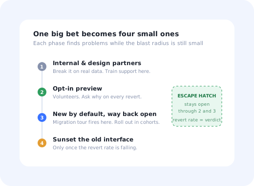
A redesign released all at once is a single enormous bet with no way to learn cheaply. Phasing it turns that into a series of small bets, each of which surfaces problems while the blast radius is still small. The sequence below is the one that works for products with an established user base.
- Internal and design-partner preview: catch the obvious breakage before any customer sees it.
- Opt-in preview: volunteers get a toggle, and you learn from users who chose the risk.
- New by default, with a way back: the real test, because now you have the unwilling majority.
- Sunset the old interface: announced early, reminded twice, executed only when the numbers allow.
1. Internal and design-partner preview
Ship it to your own team and a handful of friendly accounts first. The goal is not validation: people who know the redesign is coming are terrible proxies for people who do not. It is catching the embarrassing category of problem: broken flows on real data volumes, integrations that assumed old markup, accessibility regressions, and anything that behaves differently at a thousand rows than at ten.
This is also the phase where support and customer success should be trained, not the week of launch. If the people answering tickets are learning the new interface from the tickets, the first week goes badly regardless of the design.
2. Opt-in preview
Give users a visible, reversible switch and let volunteers move early. Self-selected users are more tolerant, more articulate about what broke, and, critically, their behaviour still reveals genuine regressions even though their sentiment is unrepresentatively positive.
Two things make this phase worth the effort. First, make the toggle genuinely two-way; a preview you cannot leave is not a preview, and users will not enter it. Second, ask a single question at the moment someone switches back: an in-app survey triggered by the revert action gets you the real reason while it is still fresh, which no scheduled survey ever will.
Target the invitation rather than showing it to everyone. Inviting your most advanced users first is tempting because they give the best feedback, but they also have the most muscle memory to lose; a mixed cohort tells you more.
3. New by default, with a way back
This is the phase that matters, because the population is now the unwilling majority rather than volunteers. Two decisions define it.
The first is that the escape hatch stays. A revert link is not a sign of weak conviction; it is your most honest instrument. The percentage of users who actively choose to go back, and whether that percentage is falling week over week, is the single clearest read on whether the redesign is landing, and it is far more trustworthy than any survey.
The second is that this is where in-app guidance earns its place. A user meeting the new interface unwillingly, mid-task, needs to be told where things went, right then, in the product, not in an email they did not open. That is the migration tour, covered next.
Roll the default forward in cohorts rather than all at once, by plan, region or signup date. Staged defaults keep support volume survivable and give you a still-unmigrated control group to compare against, which is the only clean way to know what the redesign actually did to your numbers.
4. Sunset the old interface
Maintaining two interfaces is expensive and slows everything behind it, so the sunset is necessary, but it is also the point of no return, and it should be earned rather than scheduled. Announce the date when phase three begins, remind at least twice, and make the final reminder impossible to miss for people who are still on the old version.
Then check the revert rate before you pull the trigger. If it is still climbing, or flat at a high level, something in the design is genuinely wrong and the sunset will convert a design problem into a churn problem. A falling revert rate is your permission to proceed.
The Migration Tour: A Map, Not a Lesson
The most common mistake in a redesign rollout is reusing the new-user onboarding flow for existing users. It is understandable: the tour exists, the interface changed, it seems reasonable. It is also the single most irritating experience you can hand a long-time customer: being taught, slowly, how to use the tool they have used every day for two years.
Existing users have not lost their understanding of the product. They have lost the map. Everything they need is a translation from where it was to where it is now, and nothing else.
Do: three to five steps, all spatial
Point at the things that moved and name the old location. "Exports now live under Reports; the toolbar icon is gone." Short, specific, dismissible.
Don't: re-explain the product
No "welcome to your dashboard", no feature tour, no value proposition. They bought it already.
Do: trigger it on first exposure
Show it the first time each user lands in the new interface, not on a date. People migrate at different times, and a broadcast misses most of them mid-task.
Don't: block the screen
A modal that must be cleared before working is the wrong shape here. Use contextual tooltips anchored to what moved, so the guidance sits next to the answer.
Do: leave a permanent "what moved" reference
A short old-to-new list in a resource centre or help article, findable for weeks. Infrequent users will need it long after the tour has been dismissed.
Don't: show it to brand-new users
Someone who signed up yesterday has no old interface to be migrated from. Segment the audience or the tour is nonsense to them.
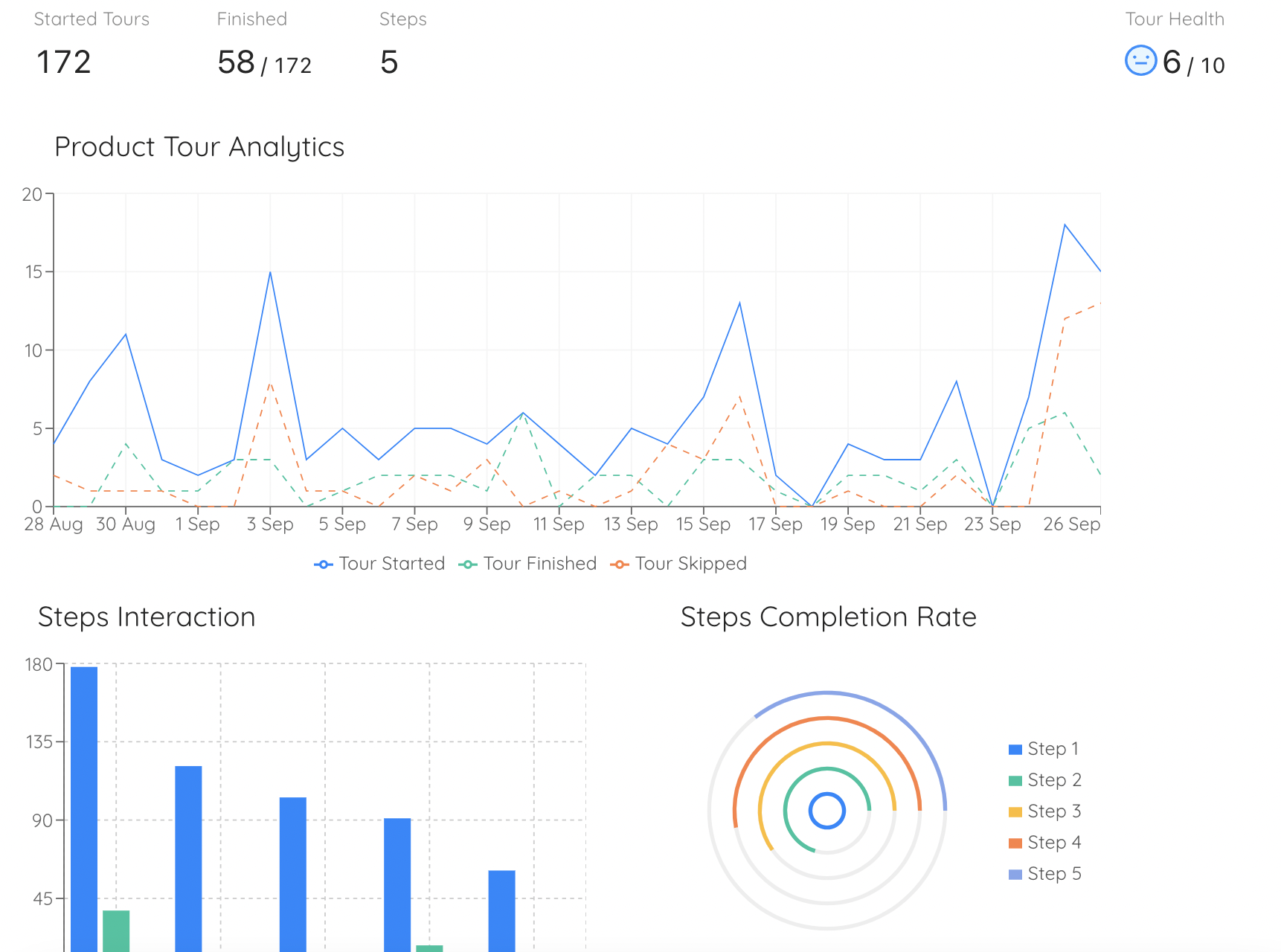
Step-level completion on the migration tour tells you which change people could not absorb, and it is available on day three, while you can still rewrite the step.
Practically, this is a targeting problem as much as a content problem: the migration tour must reach users created before the redesign and nobody else. That is standard user segmentation work, and it is worth getting exactly right: the cost of showing a "here is what changed" tour to a user with no baseline is a confusing first session for your newest customers.
For the mechanics of building the tour itself (step count, anchoring, dismissal behaviour) the principles in our guide to product tours that convert apply, with one adjustment: a migration tour should be roughly half the length of an onboarding tour, because it has half the job.
Communicating It Outside the Product
In-app guidance handles the moment of contact, but the redesign also needs a story before and after it. The pattern that works is: tell people it is coming, tell them why in terms of their problems rather than your architecture, and tell them what you did with what they said.
The "why" matters more than teams expect. A redesign explained as "we modernised the interface" reads as change for its own sake, and invites the response that nobody asked for it. A redesign explained as "the four things you told us were slowest are now two clicks shorter" is a different conversation, and it is usually also true: redesigns are rarely purely cosmetic.
Keep the announcement and the release notes specific about what moved. And when the first wave of complaints arrives, respond publicly to the substantive ones with what you changed as a result. A visible fix in week two does more for sentiment than any amount of pre-launch messaging.
What to Measure, and the Rollback Triggers
Agree these before launch. Once the redesign is live and people are defending their work, metric selection becomes an argument about who was right rather than about what is happening.
| Metric | What it tells you | Healthy pattern |
|---|---|---|
| Core task completion rate | Whether the product still works for its main jobs | Small dip, recovering weekly to at or above baseline |
| Revert rate (opt-out) | The most honest verdict you have | Falls week over week; low enough to sunset |
| Time on core tasks | Muscle-memory recovery speed | Spikes, then trends down over 2–6 weeks |
| Support contacts per active user | How much the guidance is failing to cover | Sharp spike, clear decay within 2–3 weeks |
| Migration tour completion | Whether anyone is reading the map | High completion and low step-level drop-off |
| Feature usage by segment | Whether something got hidden rather than moved | No feature quietly falling toward zero |
| Weekly active users by cohort | Whether the dip became disengagement | Migrated cohort tracks the unmigrated control |
The last row is the one teams most often skip and most need. Because the rollout is staged, you have a natural control group, users who have not been switched yet. Comparing migrated against unmigrated cohorts is far more reliable than comparing this month against last month, which mixes the redesign with seasonality and everything else you shipped. Standard cohort analysis does this cleanly.
Write these rollback triggers down before launch
- Core task completion rate down and not recovering across two consecutive weeks.
- Revert rate flat or rising after the first two weeks.
- Support contact rate plateauing at a much higher level instead of decaying.
- A regression concentrated in a high-value segment, even if the aggregate looks fine.
- Any accessibility regression: this one is not a judgement call.
Note that "a lot of people are angry" is deliberately not on that list. Anger is guaranteed and tells you nothing about whether to revert. The triggers are behavioural because behaviour is what distinguishes a design that needs defending from one that needs fixing.
Six Ways Redesign Rollouts Go Wrong
Big bang with no way back
Every user meets every problem simultaneously, support drowns, and the only available response to a real regression is an emergency release.
Reverting on day three
Day three is peak change aversion by definition. Reverting then guarantees you will never ship an improvement to your most-used surfaces again.
Steering by the loudest users
Complaint volume tracks engagement, not defect severity. Weight it, but never let it outvote completion rates.
Onboarding tour for existing users
Teaching a two-year customer what a dashboard is converts mild irritation into contempt. They need a map, not a lesson.
Sunsetting too early
A two-week window means your monthly users get exactly one unsupported encounter with the new UI. Cover a full usage cycle.
No control group
Without unmigrated cohorts to compare against, every number is contaminated by seasonality and by everything else you shipped that month.
The Rollout Checklist
Before the opt-in preview opens:
- Rollback triggers written down and agreed by product, support and leadership.
- Core tasks instrumented so completion rate is measurable per task, not just in aggregate.
- Support and customer success trained on the new interface, with an old-to-new reference sheet.
- Migration tour built and targeted to pre-redesign users only.
- Revert path implemented, visible, and instrumented with a one-question survey.
- Sunset date chosen, covering a full usage cycle for infrequent users.
- Cohort comparison set up so migrated and unmigrated groups can be read side by side.
- A named person who decides, using the agreed triggers, whether to hold or roll back.
Most of that list is unglamorous, and most of it is what separates a redesign that is remembered as an upgrade from one remembered as the month everything broke. If you want a broader framing of the human side (resistance, communication, reinforcement) our guide to change management for software adoption covers the models this sits inside.
Ship the migration guidance without shipping a release
Kompassify lets you build the migration tour, the contextual "this moved here" tooltips and the revert-reason survey yourself, target them to users who existed before the redesign, and watch step-level completion as the rollout progresses, so the guidance can change on day three when you learn what people are actually hunting for. Free up to 100 monthly active users, plans from $129/month, GDPR-compliant and EU-hosted.
Start for free →The One-Sentence Version
A redesign takes away speed your best users spent months building, so ship it in phases with a way back, hand people a map of what moved rather than a lesson about your product, and decide in advance which behavioural numbers, not which complaints, would make you turn around.
Frequently Asked Questions
Why do users hate a redesign even when it is objectively better?
Because for an existing user, the value of an interface is not only in its design quality but in the muscle memory built on top of it. Someone who has used a product daily for two years does not read the screen. They move to remembered coordinates. A redesign deletes that accumulated speed overnight and replaces it with deliberate, slower navigation, so a genuinely better interface still feels worse in week one. That gap between measured quality and felt quality is change aversion, and it usually resolves in two to six weeks for the users who stay engaged through it.
How do you tell change aversion from a real regression?
Change aversion is loud, broad and improves over time; a regression is narrower and does not improve. In practice, split the metrics. Complaint volume and time-on-task both spike in either case, so they cannot distinguish the two. Task completion rate is the discriminator: if users still finish the job, just more slowly, and the completion rate recovers week over week, that is aversion. If a specific task's completion rate drops and stays flat, or a specific segment never recovers while others do, that is a regression and the design needs fixing rather than defending.
Should a redesign be released all at once or gradually?
Gradually, in almost every case where users already depend on the product. A phased rollout, opt-in preview, then new-by-default with a way back, then sunset of the old interface, lets you find genuine regressions on a small, self-selected group before they hit everyone, gives support time to learn the new interface before volume arrives, and turns one large risk into several small ones. A big-bang switch is defensible only when the two interfaces genuinely cannot coexist, and even then the guidance and communication work still has to happen.
What should a redesign migration tour actually show?
It should answer where things moved, not what the product does. Existing users already know the product; what they have lost is the map. A good migration tour is short, three to five steps, and each step points at a thing that changed location or name and says where it is now, ideally phrased as old-to-new. Skip the feature evangelism about why the new design is better, and never reuse the new-user onboarding tour for existing users: being taught your own daily tool is the single most irritating part of a bad redesign rollout.
How long should you keep the old interface available?
Long enough to cover a full usage cycle for your least frequent legitimate user, which for most B2B products means one to three months rather than one to three weeks. The reason is that monthly users only meet the new interface once per month, so a two-week window gives them a single, unsupported encounter with it. Announce the sunset date at the moment new-by-default starts, remind people at least twice, and watch the revert rate: if it is still climbing rather than falling, the sunset is premature and something in the design is still wrong.
What should trigger a rollback?
Agree the triggers before launch, while nobody is defensive. Sensible ones are a sustained drop in the completion rate of a core task that does not recover across two consecutive weeks, a revert rate that stays high or grows once the novelty period has passed, a support-contact rate that plateaus at a much higher level rather than decaying, and any regression concentrated in a high-value segment. Writing these down in advance is what stops the decision becoming a matter of who argues hardest after the fact.