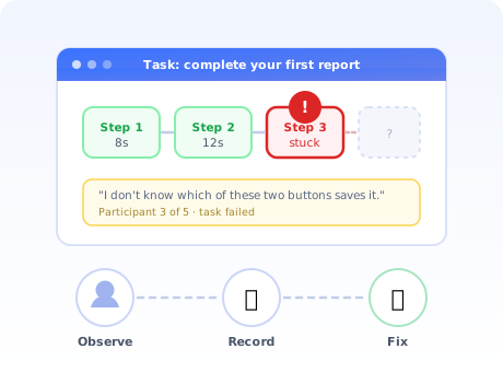
There is a specific kind of silence that happens about ninety seconds into a usability test. The participant has stopped moving the mouse. They are looking at a screen your team designed, reviewed, and shipped, and they cannot work out what to do next.
Nobody on the product team could have predicted the pause, because everybody on the product team already knows where the button is. That is the entire value of usability testing: it is the only research method that reliably shows you the parts of your product that are invisible to the people who built it.
This guide covers what usability testing is, the six methods and when each one is worth its cost, the metrics that mean something, how many participants you actually need, a seven-step process you can run this week, and a copy-ready script for testing the flow where usability problems are most expensive: onboarding.
Key Takeaways
- Watch behaviour, don't collect opinions. Usability testing means giving someone a realistic task and observing what happens. The moment you ask "do you like this?", you have stopped testing usability.
- Five participants per group finds most of the problems. Five is the right number for qualitative, problem-finding tests. It is the wrong number if you intend to report a percentage.
- Task success rate is the headline metric. Can people complete the task unaided? Everything else (time on task, errors, ease scores) explains that number rather than replacing it.
- Moderated finds the "why", unmoderated finds the "how many". Use moderated sessions for early, complex, or ambiguous flows; unmoderated for well-defined tasks you want to run at volume.
- Usability testing and A/B testing are sequential, not rival. Test to find the cause and design the fix, then A/B test the fix at scale.
- Onboarding is the highest-value flow to test. It is the one part of your product every single user experiences, exactly once, with no accumulated knowledge to fall back on.
What is usability testing?
Usability testing definition: a research method in which representative users attempt realistic tasks in a product while an observer records where they succeed, hesitate, or fail. Its purpose is to measure how easily a specific task can actually be completed, not to gather opinions about the design.
The distinction matters more than it sounds. Ask someone what they think of a screen and they will be polite, helpful, and almost entirely wrong, not because they are lying, but because people are poor witnesses to their own confusion. Ask the same person to complete a task on that screen and watch, and within a minute you will have observed things they would never have been able to articulate.
What usability testing is good at
- Finding the exact point of failure. Analytics tell you 40% of users drop at step three. A usability test tells you it is because the primary and secondary buttons look identical.
- Exposing vocabulary problems. Internal terms leak into interfaces constantly, and users route around words they do not understand rather than asking.
- Testing before you build. A clickable prototype can be tested in an afternoon. A shipped feature costs a quarter.
- Settling internal arguments cheaply. Three recordings of real people failing at something end a debate faster than any amount of opinion.
What usability testing is not good at
- Telling you whether people want the product. That is a desirability and market question, closer to Jobs to Be Done research than to usability.
- Producing statistically reliable numbers from small samples. "Four out of five participants failed" is a signal, not a measurement.
- Predicting long-term behaviour. A task completed in a session says nothing about whether someone will come back next week.
- Replacing analytics. Testing explains behaviour you already detected. It is a poor way to detect behaviour in the first place.
Usability testing vs UX research vs A/B testing
These three get used interchangeably in planning meetings and they answer genuinely different questions. Choosing the wrong one is how teams end up with a beautiful research deck that changes nothing, or an A/B test that proves version B is worse without ever explaining why.
| Method | Question it answers | Sample size | Output |
|---|---|---|---|
| Usability testing | Can people complete this task, and where exactly do they struggle? | 5–8 per group | Observed failure points, quotes, a prioritised fix list |
| User / UX research (interviews, field studies) | What are people actually trying to achieve, and in what context? | 8–15 | Jobs, needs, mental models, segment definitions |
| A/B testing | Which of these two versions performs better on a metric? | Hundreds to thousands | A statistically comparable winner, with no explanation |
| Product analytics | Where, at scale, are users dropping off? | All users | Funnels, drop-off rates, cohort behaviour |
The sequence that works: analytics find where users drop off → usability testing explains why → you design a fix → A/B testing proves the fix works at scale. Skipping the middle step is why so many experiments are inconclusive: without a diagnosis, version B is just a guess wearing a lab coat.
The 6 usability testing methods
Every usability test sits somewhere on two axes: whether a researcher is present, and whether you are counting things or explaining them. Those two choices produce the six practical formats below.
1. Moderated remote testing
A researcher and a participant share a screen over video. The participant works through tasks while thinking aloud; the researcher stays quiet and asks a follow-up only when something interesting happens. This is the default method for most SaaS teams: it gives you the depth of in-person testing without the travel, and recordings are trivially shareable with the rest of the team.
Cost: moderate. Turnaround: a few days. Best for: anything you are unsure about.
2. Unmoderated remote testing
Participants receive tasks and complete them alone while their screen and voice are recorded. You get ten sessions overnight instead of five over a week, and you lose the ability to ask "what were you expecting to happen there?" at the one moment it mattered.
Unmoderated works well when the task is unambiguous and the product actually functions. It works badly on rough prototypes, where participants spend the session confused about the test rather than the design.
3. In-person moderated testing
Still the highest-fidelity option, because you see posture, hesitation and the small physical tells that never survive a video call. The cost is real, so most teams reserve it for high-stakes flows (a pricing change, a checkout, a redesign of a core workflow) or for participants who are hard to reach any other way.
4. Guerrilla testing
Five minutes, one task, whoever is willing. The sample is unrepresentative and you should be honest about that. But if your question is "does anyone understand what this button does?", guerrilla testing answers it today rather than in three weeks, and a clear failure is informative regardless of who the participant was.
5. First-click and tree testing
Narrow, quantitative methods aimed at navigation. First-click testing asks where someone would click to accomplish a goal; tree testing asks them to find an item in a stripped-down version of your information architecture with no visual design at all. Both scale to hundreds of participants, both are cheap, and both are unusually good at proving that a menu label nobody argued about is quietly failing.
6. Benchmark testing
The same tasks, the same script, run against the same metrics every few months. Individual rounds are less interesting than the trend: a task success rate that slides from 78% to 61% over three releases is telling you that accumulated features have made a core flow harder, which is the mechanism behind most feature bloat.
Usability testing metrics that matter
Small qualitative studies produce observations, not statistics. Record the numbers anyway; they discipline the analysis and make round-over-round comparison possible, but be honest about which ones carry weight at n=5.
| Metric | What it measures | How to read it |
|---|---|---|
| Task success rate | Share of participants who complete the task unaided | The headline number. Anything under roughly 78% on a core task deserves immediate attention |
| Time on task | How long completion takes | Useful compared against itself over time, or against a realistic expectation, not against an arbitrary target |
| Error rate | Wrong clicks, wrong paths, wrong inputs per task | Clusters of the same error point at one fixable design flaw, not at inattentive users |
| Assists | How often the moderator had to intervene | An assist is a failure with a polite name. Count them honestly |
| Single Ease Question (SEQ) | A 1–7 rating asked immediately after each task | One question, asked while the experience is fresh. Cheapest useful subjective metric there is |
| System Usability Scale (SUS) | A 10-item questionnaire at the end of the session, scored 0–100 | Roughly 68 is average. Meaningful mainly as a trend across rounds or against your own past score |
| Drop-off point | The specific step where participants stop | The most actionable output of the whole session, and the one that maps directly onto your funnel |
Do not report percentages from five people. "60% of users failed" from a sample of five is three people, and the confidence interval around that number is enormous. Say "three of five participants failed at the same step, all for the same reason." It is more honest and, in practice, considerably more persuasive.
How many participants do you need?
This is the most-argued question in usability testing and it has a boring answer: it depends entirely on whether you are finding problems or measuring them.
✅ Five is right when…
- You want to find usability problems, not count them
- The participants belong to one reasonably homogeneous group
- You plan to fix what you find and test again
- You are testing a prototype or a single flow
❌ Five is wrong when…
- You need a number you intend to report or compare
- You serve genuinely distinct segments (run five each)
- You are benchmarking release over release
- The decision is expensive and irreversible
The "five users" rule comes from Jakob Nielsen's observation that around five participants surface roughly 85% of the usability problems in a given flow, because problems are not evenly distributed: the serious ones hit almost everybody. That logic holds for problem discovery and collapses completely for measurement, where you generally want 20 or more per group.
The more useful reframing: run more rounds, not bigger rounds. Three rounds of five participants with fixes between them will improve a product far more than one round of fifteen, because rounds two and three are testing something better than round one did.
How to run a usability test in 7 steps
Define one question the test must answer
Write realistic, outcome-shaped tasks
Recruit the right participants
Prepare the script and the environment
Run the session and stay quiet
Analyse by pattern, not by anecdote
Fix, ship, and re-test
1. Define one question the test must answer
"Let's test the new dashboard" is not a research question. "Can a first-time user create and share a report without help?" is. A single sharp question determines your tasks, your participants, and what counts as a result, and it stops the session drifting into a general product feedback chat.
The best source of these questions is your own funnel. Wherever onboarding analytics show an unexplained drop, you have a question worth five sessions.
2. Write realistic, outcome-shaped tasks
A task should describe a goal and a context, and it must not contain the instructions for completing it. The single most common way to ruin a usability test is to name the button in the task.
✅ Good task wording
- "Your manager wants last month's numbers before Friday. Get them a report they can open."
- "You've just joined this team. Find out what you're supposed to work on first."
- "You need a colleague to review this before it goes out. Make that happen."
❌ Task wording that leaks the answer
- "Click Reports, then choose Export, then select PDF."
- "Use the sharing feature to share the document."
- "Do you find the new navigation intuitive?"
3. Recruit the right participants
Representative beats convenient. If you are testing a first-run experience, the one disqualifying attribute is familiarity with your product, which rules out your colleagues, your investors, and any existing customer.
Sources that work: recent signups who have not yet logged in a second time, users from a churned cohort, a recruiting panel, or a targeted in-app survey offering an incentive to users matching a specific behaviour. Screen for the behaviour that matters, not the job title.
4. Prepare the script and the environment
Write the script down, including the introduction, and read the same introduction every time. Two things belong in it and are routinely forgotten: an explicit statement that you are testing the product rather than the participant, and permission to record.
Then check the environment. A test account pre-populated with tidy demo data will hide every empty-state problem you have; a genuinely blank account will reproduce the real first-run experience. Decide deliberately which one you are testing.
5. Run the session and stay quiet
Silence is the moderator's main tool and the hardest part of the job. When a participant hesitates, the instinct to help is overwhelming, and helping destroys the data you came for. Wait. Count to ten. Most of the time they resolve it themselves and you learn exactly how.
Three phrases handle almost every situation:
- "What are you thinking right now?": for silence
- "What would you expect to happen if you clicked that?": for hesitation
- "What would you do if I wasn't here?": for a direct request for help
6. Analyse by pattern, not by anecdote
After the sessions, list every observed problem with the participant number and the step it occurred at. Then group them. A problem that appeared once is a note; a problem that appeared in four of five sessions at the same step is a defect with a queue position.
Rank the groups by severity (did it block the task?) and frequency (how many participants hit it?). Blocking and frequent goes first. The seductive trap here is the single vivid quote from an articulate participant; it will be the most memorable thing in the debrief and it is not necessarily the most important.
7. Fix, ship, and re-test
A usability test that ends in a document has failed. The output should be a short prioritised list, each item owned, most of them small: a label, a default, a reordered step, an explanation moved to where the confusion happens.
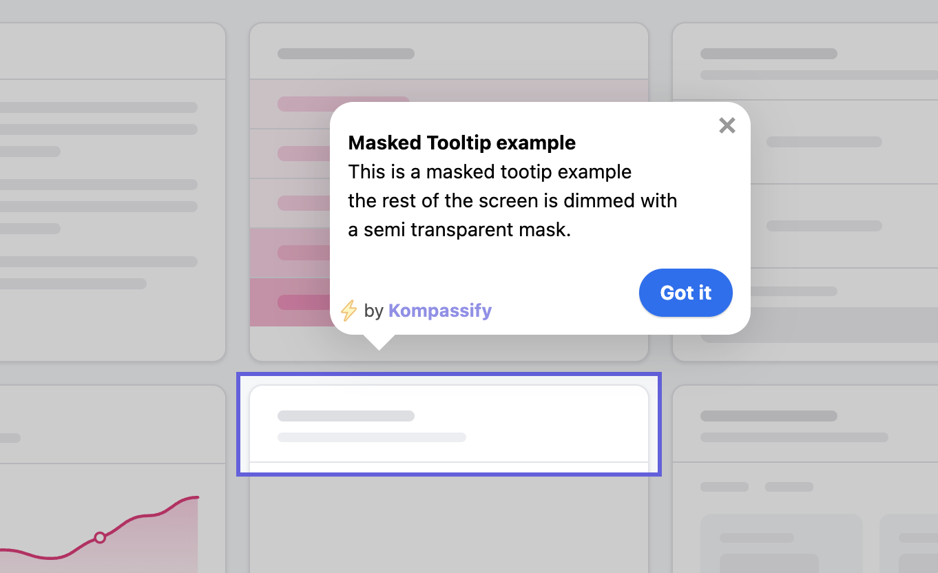
That last category is worth dwelling on. A meaningful share of usability findings are not layout problems but missing explanation at a specific moment. Those do not need a redesign; they need a tooltip or a short product tour anchored to the exact element where four out of five people paused. With Kompassify you can ship that fix the same afternoon, without a release, and re-test the following week.
How to usability-test your onboarding flow
Onboarding deserves its own section because it breaks the normal rules of testing. Every user experiences it, each user experiences it exactly once, and it is the only flow where the participant has zero accumulated knowledge to fall back on. It is also the flow your own team is least capable of evaluating, because none of you can un-know your product.
Start at the real beginning
Not the dashboard. Not a pre-configured account. The actual entry point, the landing page or the signup form, because a surprising share of first-run friction is created before anyone is logged in, in the shape of a confusing field, an unexpected required step, or a mismatch between what the marketing page promised and what the product opens with. Our signup flow guide covers that stretch in detail.
Set one outcome-shaped task, then say nothing
One task, phrased as the outcome the user came for: "Get to the point where you'd know whether this tool is worth using." Then stop talking. The temptation to narrate is strongest here, and every sentence you add makes the test less like reality.
Record four things
- Time to first meaningful outcome, the observable version of time to value
- The first moment of hesitation, usually earlier than anyone on the team expects
- Every question asked aloud, each one is a piece of missing in-product copy
- Whether they reached the aha moment at all, and if so, whether they noticed
Test the empty state deliberately
The single most common onboarding failure is a user arriving at a screen with nothing on it and no idea what to put there. It never shows up in internal review because internal accounts are full of data. Run at least one participant through a genuinely empty account and watch what happens, then read our guide to empty states.
Close the loop in-product
Onboarding findings translate unusually directly into in-product fixes. Participants stalled on the empty dashboard? That is a checklist. Nobody found the feature that delivers the value? That is a product tour triggered on first entry. Everyone asked the same question at step three? That is one line of microcopy.
Because these are configuration rather than code, you can fix on Monday and re-test on Thursday, which is what makes onboarding the flow where usability testing compounds fastest. Kompassify's product analytics then tell you whether the fix moved the funnel for everyone, not just for your five participants.
A usability test script you can copy
Adapt the bracketed parts. Keep the structure, and keep the introduction identical across every session: consistency is what makes five sessions comparable.
Introduction (2 minutes)
- "Thanks for making the time. This should take about [30] minutes."
- "We're testing the product, not you. There are no wrong answers; if something is confusing, that's a problem with our design."
- "Please think out loud. Tell me what you're looking at, what you expect, and what surprises you."
- "I'll mostly stay quiet so I can see how you'd use this on your own."
- "Is it okay if I record the screen and audio? It stays internal."
Warm-up (3 minutes)
- "Tell me a bit about your role and what a typical week looks like."
- "How do you currently handle [the job this product serves]?"
- "What made you look for something new?": the push force, in one question
Tasks (20 minutes)
- Task 1 (first impression): "Take a look at this page. Without clicking anything, tell me what you think this does and who it's for."
- Task 2 (the core job): "[Realistic scenario]. Get to the point where you'd have what you need."
- Task 3 (the flow under suspicion): "[The specific step your funnel says people abandon]."
- After each task: "On a scale of 1 to 7, how easy or difficult was that?" (SEQ)
Wrap-up (5 minutes)
- "What was the most confusing part of that?"
- "If you could change one thing, what would it be?"
- "Would you have kept going if I hadn't been here? At what point would you have stopped?"
- Optional: the 10-item System Usability Scale
Common usability testing mistakes
✅ Do
- Test with people who have never seen the product
- Write tasks as outcomes, never as instructions
- Stay silent through hesitation
- Record sessions and share the clips, not just the summary
- Prioritise by severity and frequency together
- Run small rounds often rather than one big round rarely
- Re-test after fixing
❌ Don't
- Test with colleagues, friends, or existing power users
- Name the button you want them to click
- Ask whether they "like" the design
- Rescue a participant the moment they pause
- Report percentages from five people
- Test on a demo account full of tidy sample data
- Let the findings end their life in a slide deck
The mistake that invalidates everything: leading the participant. It happens in small increments: a task that names the menu item, a moderator who says "have you tried the top right?", a nod when someone moves toward the correct answer. Each one feels harmless, and collectively they turn a usability test into a guided demo that confirms whatever you already believed.
Fix What Your Usability Tests Find Without Waiting for a Release
Kompassify lets you add product tours, tooltips, onboarding checklists and in-app surveys exactly where users get stuck, with no code and no deploy. Measure the result with built-in product analytics. Free up to 100 monthly active users, GDPR-compliant and hosted in the EU.
Start for Free →Frequently Asked Questions
What is usability testing?
Usability testing is a research method in which real users attempt realistic tasks in a product while an observer records where they succeed, hesitate, or fail. The goal is not to ask people whether they like the interface but to watch what actually happens when they try to use it. Usability testing measures how easily a specific task can be completed, and it reliably surfaces problems that internal teams cannot see because they already know how the product works.
How many users do you need for a usability test?
Five participants per user group is the standard working number, based on Jakob Nielsen's finding that five users typically uncover around 85% of usability problems in a given flow. Five is right for qualitative, problem-finding tests. If you need statistically reliable numbers, a task success rate you intend to report or compare over time, you need considerably more, usually 20 or more per group. If you serve genuinely distinct segments, run five per segment rather than five in total.
What is the difference between usability testing and A/B testing?
Usability testing tells you why something is failing; A/B testing tells you which version wins. Usability testing is qualitative, runs with a handful of participants, and produces explanations and observed causes. A/B testing is quantitative, needs substantial live traffic, and produces a statistically comparable result with no explanation attached. The two work best in sequence: usability-test to discover the problem and design a credible fix, then A/B test the fix at scale.
What are the main usability testing metrics?
The most useful are task success rate (the percentage of participants who complete the task unaided), time on task, error rate, the number of assists required, the Single Ease Question score collected right after each task, and the System Usability Scale collected at the end of the session. Task success rate and observed friction points carry the most weight in small qualitative studies; the questionnaire scores become meaningful mainly when you compare them across rounds.
What is the difference between moderated and unmoderated usability testing?
In moderated testing a researcher is present, live or remote, and can ask follow-up questions when a participant hesitates. It produces richer insight and is best for complex flows and early prototypes. In unmoderated testing participants complete tasks alone while their screen is recorded. It is cheaper, faster, and easier to run at volume, but you cannot probe the moment someone gets confused, so it works best on well-defined tasks in a working product.
How do you usability-test an onboarding flow?
Recruit people who have never seen the product, since anyone familiar with it can no longer experience first-run confusion. Start the session at the real entry point, usually the signup page rather than a logged-in state, and set one outcome-shaped task such as reaching a first completed result. Do not explain anything. Record where participants stop, what they say aloud, and how long the first meaningful outcome takes. Then close the loop in-product by adding contextual guidance exactly where people got stuck, using something like Kompassify's no-code product tours, and re-test.
How often should you run usability tests?
Small and continuous beats large and occasional. A useful rhythm for most SaaS teams is one short round every sprint or every two sprints, with three to five participants and a narrow focus on whatever shipped or is about to ship. Additionally, run a dedicated session on any flow whose analytics show an unexplained drop-off, and re-test your signup and first-run experience at least twice a year; it drifts as features accumulate. Our onboarding audit guide covers how to structure that periodic review.