Watch a recording of a first session and the moment is unmistakable. The user arrives on a screen, the cursor moves once, and then nothing happens for eleven seconds. They are not reading. They are not idle. They are trying to work out what any of this means, and in a moment they will either commit to one thing or close the tab.
Teams tend to explain that pause as disinterest, or as a sign the product is “complex.” It is usually neither. It is the point at which the number of unfamiliar things the person is holding exceeded what they can hold, and the first thing to be dropped is always the thing they came to do.
This guide covers what cognitive load is in a software product, why a first session has a much smaller budget than most onboarding flows assume, where the load comes from, how choice overload works, the behavioural signals that separate overload from disinterest, and seven ways to reduce it without removing a single capability from the product.
Key Takeaways
- Load is not the same as difficulty. A hard task with clear labels can be easier than a trivial task with unfamiliar ones.
- Most of the load is extraneous — spent on vocabulary, layout and uncertainty rather than on the work itself. That is the part you can delete.
- The budget is roughly four items, and a first session is already spending most of them before your feature is mentioned.
- Options are not free. Every additional choice on a first screen costs something from the same budget, whether or not the user picks it.
- Overload shows up as hesitation, not complaint. Long pauses without interaction are the clearest signature you will find.
What Cognitive Load Actually Is
Cognitive load is the mental effort a person is spending at a given moment. The useful part of the theory, for product teams, is that it divides into three kinds, and they should be treated completely differently.
Intrinsic load: the difficulty of the thing itself
Configuring a tax rule is inherently harder than uploading an avatar. Building a multi-condition automation is inherently harder than sending a message. This load is a property of the domain, not of your interface, and design does not remove it. It can only be sequenced: taught in a sensible order, split across sessions, or deferred until the user has a reason to care.
Extraneous load: everything spent on not-the-task
Working out what your product calls a familiar concept. Finding where a control lives. Deciding whether an action is reversible. Reading a tooltip about a feature that has nothing to do with the current goal. Parsing an error that describes a system state rather than a next step. This is the category worth attacking, because none of it produces any value for the user and almost all of it is removable.
Germane load: the effort that becomes understanding
The work of forming a mental model — realising that in this product a “workspace” contains projects, and projects contain tasks. This load is productive. The whole purpose of reducing extraneous load is to leave room for it, because a user who forms a working model of your product early stops needing guidance at all.
The distinction that matters most in practice is between load and friction. Friction is effort: extra clicks, slow pages, required fields. Load is confusion. A one-click action can carry enormous load if nobody knows what it will do, and a long form can carry almost none if every field is obvious. Users complain about friction and go quiet about load, which is why load is systematically under-diagnosed.
The Budget: Why Four New Things Is the Limit
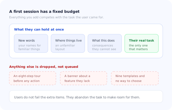
Research on working memory commonly puts the number of independent items an adult can actively hold at around four. Whatever the precise figure, the practical implication for onboarding is not in dispute: it is a very small number, and a first session spends most of it before your product says anything interesting.
Reducing load is almost never about deleting capability. It is about deciding what the user does not need to know yet.
This is the argument for progressive onboarding stated in terms of the constraint that makes it necessary. Teaching over time is not a stylistic preference; it is the only way to fit a product with thirty concepts into a mind that can hold four.
Where the Load Comes From in a First Session
Five sources account for most of it. Ranked by how much you can do about them:
1. Vocabulary
Every product renames things. Your “spaces” are their “folders”; your “flows” are their “campaigns.” Each renamed concept is an item held in memory purely to translate, and the cost is paid on every screen until it becomes automatic. Naming things the way your users already do is the single cheapest load reduction available, and the microcopy guide covers how to find the words they use.
2. Spatial layout
A new user does not know where anything is, so every action begins with a search. This is why pointing at the control is often more valuable than explaining it: a tooltip anchored to the right element removes the search entirely, and search cost is pure extraneous load.
3. Consequence uncertainty
“If I click this, what happens, and can I undo it?” Users who cannot answer that stop moving. Destructive-looking actions with no preview, buttons that might send something to real customers, and settings whose scope is unclear all produce the same paralysis. Stating the consequence next to the control, and making things reversible, buys back more attention than any amount of encouragement.
4. Decisions presented before they matter
A choice the user cannot yet evaluate is the most expensive thing on a first screen. Asking someone to pick a plan, a template, a timezone strategy or a workflow type before they understand the product forces them to hold the whole decision open while learning everything else.
5. The guidance itself
The uncomfortable one. A tour, a checklist, a tooltip and a banner all consume the same budget as the product does. Guidance earns its cost only when it removes more load than it adds, which is a real test that a surprising amount of onboarding content fails.
Choice Overload and the Cost of Options
Teams add options to be helpful. Twelve templates instead of three. Every configuration exposed on the setup screen. Three equally weighted paths on the welcome screen so nobody feels railroaded.
For an experienced user this is generosity. For a new one it is a bill. Every additional option must be read, understood well enough to be eliminated, and held while the others are considered — and because the user does not yet know what distinguishes the options, none of that work can be done confidently. The common result is not a bad choice but no choice at all.
Recommend, do not enumerate. Three options with one marked as the usual starting point outperforms twelve equal ones, because the recommendation converts a comparison problem into a yes-or-no. Keep the full set one click away for the people who want it: nobody is deprived of anything, and the default carries the load for everyone else.
The same logic applies to empty states. An empty screen offering five ways to begin is a chooser; an empty screen offering one obvious first action and a quiet link to the rest is a starting line.
How to Spot Overload in Your Data
Overload produces a distinctive behavioural signature, and it is not the one most teams look for. It does not look like anger. It looks like stillness.
| Signal | Usually means | First thing to try |
|---|---|---|
| Long dwell, no interaction, then exit | Overload: they could not decide what to do | Remove one decision; add a default |
| Fast interaction, then undo or repeat | Labelling: the control did not mean what it said | Rename it and state the consequence |
| Back and forth between two screens | Working memory overflow: they cannot hold both | Put the needed information on one screen |
| Help opened, then closed with no action | The answer was not findable, or not the blocker | Move the answer inline, next to the control |
| Completion falls as options grow | Choice overload | Recommend one; collapse the rest |
| Tour completed, feature unused | Guidance was held, not absorbed | Shorten it and attach each step to an action |
The last row deserves emphasis, because it is the most misread number in onboarding analytics. A high tour completion rate paired with flat feature usage is not a success with a measurement problem. It is a description of someone clicking “next” until a thing goes away.
Seven Ways to Cut Load Without Cutting Capability
1. One new concept per screen
If a screen introduces two ideas the user has never met, split it or defer one. This constraint alone reshapes most onboarding flows, and it costs nothing in capability.
2. Default everything that can be defaulted
A pre-filled sensible value converts a decision into a review, which is dramatically cheaper. Reserve genuine choices for the small number of settings where the wrong default would actually hurt.
3. Point instead of explaining
Where the answer to “how do I do this” is really “that button, there,” a tooltip anchored to the element beats a paragraph. Removing search cost is the highest-yield thing in-product guidance does, which is also the argument for keeping product tours short and anchored.
4. State consequences beside the control
“This sends to 1,240 contacts” next to the button removes an entire category of hesitation. So does “you can change this later,” when it is true.
5. Externalise memory
Anything the user must remember across screens should be visible instead. A persistent onboarding checklist is load reduction in its purest form: it holds the sequence so the user does not have to, and its progress indicator answers “how much is left” without anyone counting.
6. Delay the commercial layer
Upgrade prompts, feature teasers and cross-sell banners compete for the same budget as the task. They are not free because they are ignorable — ignoring something is itself work. Hold them until the user has completed one real outcome.
7. Cut your own guidance first
Before removing a product feature from the first session, remove a step from the tour. Onboarding content accumulates the way features do, and it is rarely audited. Most flows can lose a third of their steps with no loss of comprehension, and gain it back in completion.
When Guidance Adds Load Instead of Removing It
Guidance is a tax on attention that buys a reduction in confusion, and the trade is not automatically favourable. Four patterns reliably lose it.
The lecture. A tour that explains several features before the user has done anything. Each step is an item to hold, with no task to attach it to, so none of them survive to the moment they would be useful.
The interruption. Guidance that arrives while the user is mid-task. They must now hold their unfinished action and parse the new message, and typically abandon one of them.
The stack. A tour, a checklist, a banner and a survey all live in the same session with no coordination. Individually reasonable, collectively an ambush. Frequency rules and priority between messages are exactly what onboarding triggers exist to enforce.
The mismatch. Guidance aimed at a segment the user is not in — an enterprise walkthrough shown to a solo trial user, or an admin flow shown to a viewer. Every irrelevant item still costs a read before it can be dismissed.
The test for any piece of guidance. Does it let the user do something within the next few seconds? If yes, it is probably paying for itself. If it can only be appreciated later, it belongs later — in the session where the thing it describes becomes relevant.
Audiences with a smaller effective budget deserve special attention here: users new to software generally, and users for whom confidence is already low, feel every one of these patterns more sharply. The guides to onboarding non-technical users and onboarding older users cover the specifics, and accessible onboarding covers the cases where load is compounded by an interface that is hard to perceive in the first place.
Reducing Load With Kompassify
Most of the reductions in this guide are sequencing decisions rather than engineering ones: show this later, show that to a different segment, replace a paragraph with a pointer, hold the sequence outside the user's head. That is precisely what an in-app guidance layer is for.
With Kompassify you can anchor a tooltip to the exact control instead of explaining where it is, keep a checklist visible so the user is not remembering the order, target guidance by segment so nobody reads something aimed at a different plan or role, split a long tour into short ones triggered when each part becomes relevant, and see per-step completion so you can find the step where people stop. Because it is no-code and published to your live product, cutting a tour from eight steps to three is an afternoon's work rather than a release.
Show less, at better moments
Build short anchored tours, persistent checklists and segment-targeted tooltips without code, and measure where users stall step by step. Free up to 100 monthly active users, plans from $129/month, GDPR-compliant and EU-hosted.
Start for free →The One-Paragraph Version
A new user has a small budget of attention and is already spending most of it on your vocabulary, your layout and their uncertainty about what a click will do. Anything else you present competes with the task they came for, and the task is what gets dropped. Attack extraneous load first because it produces no value for anyone: use their words, point instead of describing, state consequences beside the control, default every decision that can be defaulted, and let a checklist hold the sequence so nobody has to remember it. Treat options as a cost and recommend one. Then audit your own guidance with the same severity, because a tour that has to be endured before anything can be done is the most expensive thing on the screen. Nothing here removes capability from the product; it only decides what the user does not need to know yet.
Frequently Asked Questions
What is cognitive load in UX?
Cognitive load is the total amount of mental effort a person is using at one moment to hold information, make sense of an interface and decide what to do next. In a product it splits three ways: the inherent difficulty of the task itself, the effort wasted on things that are not the task such as unfamiliar labels or an unclear layout, and the effort that actually goes into building a mental model of how the product works. Reducing load does not mean simplifying the product; it means spending as little as possible on the second category so more is available for the first and third.
How many new things can a user learn in one session?
Far fewer than most onboarding flows assume. Research on working memory commonly puts the number of independent items an adult can actively hold at around four, and a first session is already spending several of those on things that are not your feature: what your product calls things, where they live on the screen, what a given click is going to do, and the task the user actually came to complete. In practice this means one concept per screen, one decision at a time, and a hard limit on how many genuinely new ideas a first session introduces.
Is cognitive load the same as friction?
No, and confusing the two leads to the wrong fixes. Friction is anything that makes an action harder to complete, including slow pages, extra clicks and required fields. Cognitive load is specifically the mental effort of understanding and deciding. A one-click action can carry enormous load if the user has no idea what it will do, and a five-field form can carry almost none if every field is obvious. When users hesitate rather than complain, the problem is usually load; when they complain about effort, it is usually friction.
Does a product tour reduce or increase cognitive load?
Either, depending on length and timing. A short tour that points at one thing and hands control back reduces load, because it removes the search cost of finding where something lives. A long tour that explains eight features before the user has done anything increases load sharply, because every step is a new item to hold with no task to attach it to. The reliable test is whether each step lets the user do something immediately afterwards. If not, it is a lecture, and lectures are the most expensive form of onboarding content.
How do I know if my onboarding is overloading users?
Look for hesitation rather than exits. The signals are long pauses on a screen with no interaction, repeated back-and-forth between two screens, opening help and returning without acting, abandoning at the first genuine decision rather than at the first effort, and completion rates that fall as an optional choice set grows. A screen where users spend a long time and then leave without doing anything is the clearest overload signature there is; a screen where they act quickly and wrongly is usually a labelling problem instead.
What is the difference between intrinsic and extraneous cognitive load in a product?
Intrinsic load is the irreducible difficulty of the thing the user is trying to do: configuring a tax rule is inherently harder than changing an avatar, and no design removes that. Extraneous load is everything they spend effort on that is not the task, including jargon, inconsistent layouts, unexplained states, decisions presented before they matter and guidance that arrives at the wrong moment. Extraneous load is the part you can remove outright, and it is usually where most of the loss in a first session sits.