
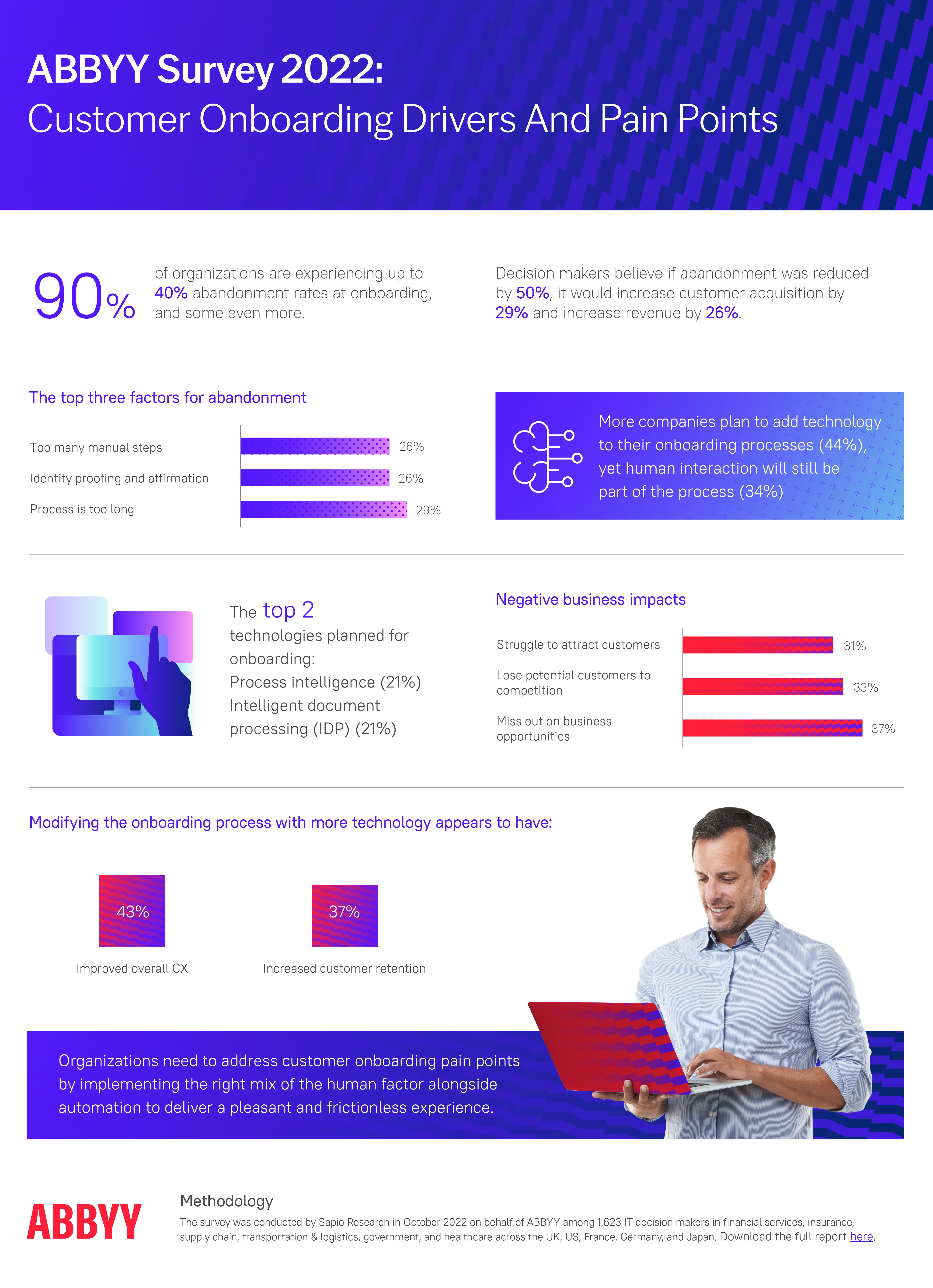
According to ABBYY's State of Automation Report, 9 in 10 companies experience up to 40% abandonment during onboarding. Nearly half of new users walk out the door before they have understood what your product does for them.
A well-designed product tour attacks this problem at the source. It is the first real conversation your product has with a new user — a chance to say: here is what this does, here is why it matters to you specifically, and here is the fastest path to your first win.
This guide covers everything: what a product tour is and how it relates to a walkthrough, why it matters, which UI formats work best, a 5-step creation framework, 8 best practices, real-world examples, and how to measure whether your tour is actually working.
Key Takeaways
- Orient before you activate. A product tour sets context and communicates value. A walkthrough drives task completion. Both are necessary — the tour comes first.
- Keep it to 4–6 steps. Anything longer turns orientation into an obstacle. For complex products, build several short contextual tours rather than one long one.
- Personalize from the first screen. One segmentation question at sign-up is enough to route users into a tour that feels built specifically for them.
- Lead with outcomes, not features. Every step should answer "what will I be able to do?" not "what does this button do?"
- Use contextual triggers. Tours triggered by user behavior outperform time-based ones every time.
- Iterate relentlessly. Track step-level drop-off and treat your tour like a product feature — ship it, measure it, improve it.
What Is a Product Tour?
A product tour — sometimes called a guided product tour or in-app tour — is an in-app experience that introduces new users to your product's core value, primary features, and key workflows, typically triggered the moment someone signs up and lands on their dashboard for the first time.
The defining job of a product tour is orientation and value communication. It is not primarily trying to get users to complete a specific task. It is trying to answer the most urgent question a new user has: should I bother learning this product?
Done well, a product tour makes the answer obvious. It surfaces the two or three things your product does best, frames them in terms of outcomes the user actually cares about, and gives them enough context to feel confident taking their first independent steps.
Product tour vs. product walkthrough: The industry uses these terms interchangeably — major platforms like Pendo, Appcues, and Userpilot treat them as overlapping. Where a distinction is drawn, a tour typically covers the product broadly while a walkthrough focuses narrowly on a specific task with required user actions at each step. The next chapter covers this in detail.
Product Tour vs. Product Walkthrough: What the Industry Actually Says
Here is the honest answer: there is no universally agreed definition that separates the two. Major platforms like Pendo, Appcues, and Userpilot use the terms interchangeably. That said, there is a practical distinction worth understanding — and being clear about which definition you are using matters for how you design your onboarding strategy.
The most widely used distinction
The definition most commonly applied across the SaaS onboarding space is scope-based: a product tour covers the product broadly, while a walkthrough focuses narrowly on a specific task or feature. Under this view, a tour is the high-level orientation layer — it shows users the landscape. A walkthrough is the ground-level guide — it leads users through a specific action step by step, requiring real interaction at each stage before advancing.
A second definition worth knowing
Some teams and tools use "product tour" to describe a pre-signup interactive demo — a sandbox experience that prospects explore before they even create an account. Under this definition, a tour is a sales and marketing tool, and a walkthrough is the post-signup in-app guide. If you work with a sales-led team, it is worth being explicit about which meaning you have in mind when discussing either format.
🗺️ Product Tour (broad-scope definition)
- Goal: Orient users and communicate value
- Triggered: First login, new feature launches
- Format: Modal slideshow, hotspots, tooltips
- Length: 4–6 slides or steps
- Covers: Multiple features or the full product surface
- Outcome: User understands what the product does
🧭 Product Walkthrough (task-focused definition)
- Goal: Guide through one specific task or flow
- Triggered: First use of a feature, key setup step
- Format: Interactive tooltip sequence
- Length: 3–7 required interactive steps
- Covers: One focused workflow or feature
- Outcome: User completes a meaningful action
Whichever definition you use, the practical recommendation is the same: a broader orientation experience and a focused task-completion flow work best in combination. The tour builds context and motivation; the walkthrough converts that motivation into the user's first real win.
Why Product Tours Matter
A product tour is not a UX nicety. For most SaaS products, it is the single highest-leverage intervention in the entire user journey.
Higher activation rates
Activation is the moment a new user takes their first meaningful action inside your product — the point at which they stop being a sign-up and start being a user. Without any guidance, a large share of people who create an account will poke around briefly, hit a moment of confusion, and quietly leave. A well-designed product tour closes that gap by giving users a clear, immediate path to their first win — and the confidence to take it.
Shorter time to value
Time to value is one of the most critical metrics in SaaS. Every hour that passes between sign-up and the aha moment is a window in which a user can churn. A well-designed tour compresses that window by eliminating wrong turns and dead ends. Rather than letting users wander, you route them directly to the actions that make your product click.
Reduced support load
Research by Wyzowl found that 80% of people have deleted an app because they did not know how to use it — not because the product was bad, but because nobody showed them what to do. A product tour that proactively covers the most common friction points prevents a meaningful share of support tickets before they are ever written. That is not just a cost saving — it is a signal that your onboarding is doing its job.
Better feature adoption
Most users discover only a fraction of what any product can do. Features that are not surfaced during onboarding tend to stay undiscovered indefinitely. A product tour lets you take control of that first impression: you choose what users see first, and you frame it around outcomes they care about. Contextual tours triggered on first entry to a new feature area extend this effect throughout the user's lifecycle — not just in their first session.
Higher retention and lifetime value
Retention is downstream of activation. Users who reach their aha moment in the first session are significantly more likely to return for a second, and a third. A joint study by Forrester and Adobe found that experience-driven businesses see nearly twice the annual growth in customer retention and lifetime value compared to those that are not. A product tour is not just a UX decision — it is a retention investment.
Actionable behavioral data
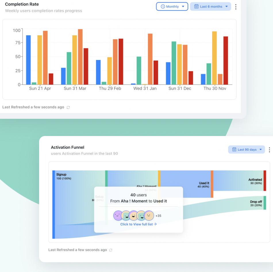
When you instrument a product tour properly, you gain step-level behavioral insight that passive product analytics cannot provide. You can see not just that users dropped off somewhere in the onboarding flow, but exactly which step they abandoned, how long they spent on each one, and where they went next. That data is a map of friction — and it tells you exactly where to focus your next iteration.
Types of Product Tours and UI Patterns
A product tour is a strategy, not a single format. The right choice depends on the complexity of your product, how much context users need before they can act, and where they are in their journey.
-
Interactive Tooltip Sequences
A series of tooltips anchored to specific UI elements that explain what each one does and why it matters. The most versatile format — works both as a lightweight orientation tour and as the foundation of a deeper interactive walkthrough. Best for products with a clear, discoverable UI where users need signposting more than hand-holding.
-
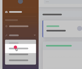
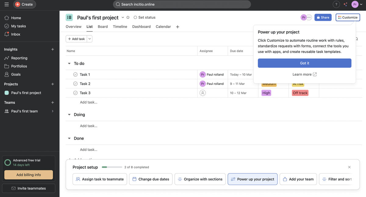
Hotspot Beacons
Small pulsing indicators attached to UI elements that draw attention without blocking the interface. Each beacon reveals a short explanation when clicked. This format respects user autonomy — it signals what is worth noticing without forcing a linear flow. Works especially well for returning users discovering new features after a product update.
-
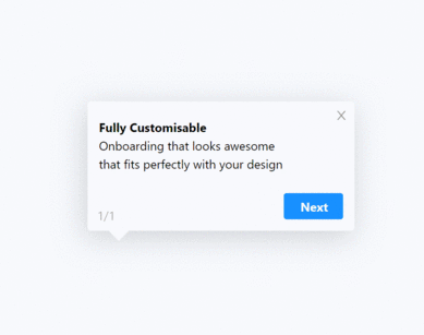
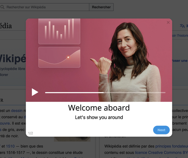
Modal Slideshow Tour
A sequence of full-screen or overlay modals walking users through the product's value proposition, key features, and primary use cases. Most effective as the very first experience after sign-up — especially for complex products where users need context before they can act independently.
-
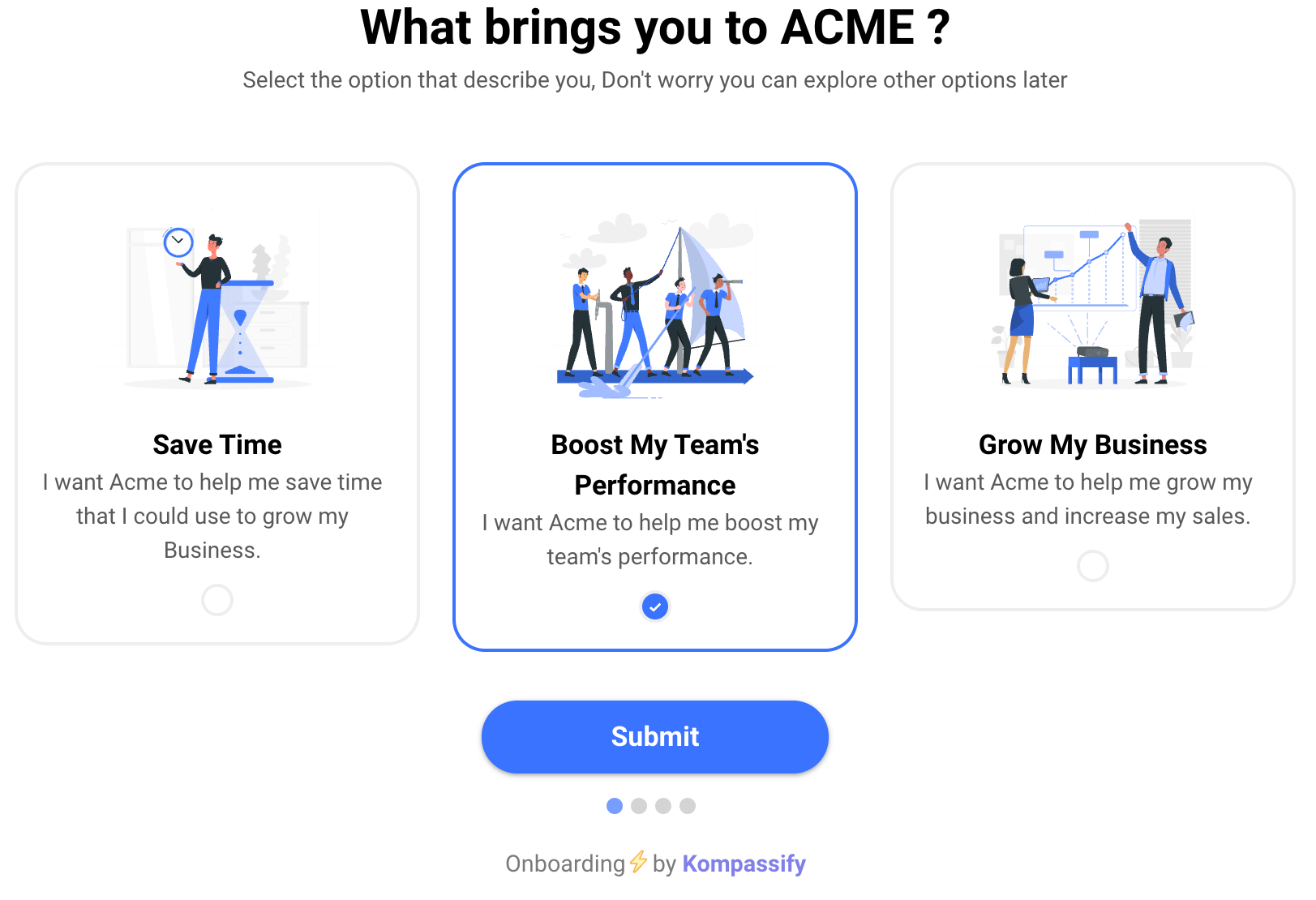
Welcome Screen + Segmentation Tour
A welcome screen that asks one or two questions (role, use case, primary goal) and routes users into a personalized tour based on their answers. The most powerful format for products with distinct user segments. Zendesk research found that 90% of consumers are willing to spend more with companies that personalize their experience — a principle that applies directly to onboarding.
-
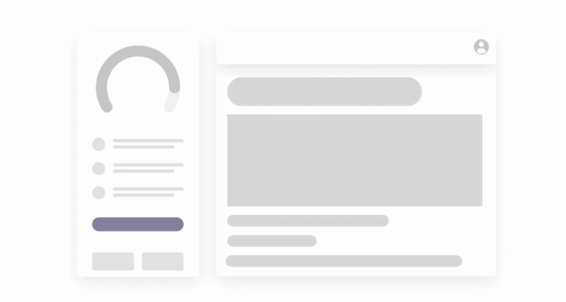
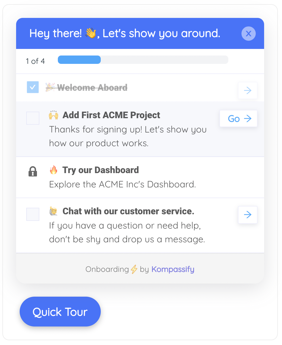
Tour + Onboarding Checklist
A short orientation tour that ends by handing the user a persistent onboarding checklist — a panel listing the key setup tasks they need to complete to get full value from the product. The tour provides context; the checklist provides structure and momentum. Together, they are the most complete new-user onboarding pattern available.
-
Explainer Video Tour
A 60–90 second product overview video triggered on first login. Works well for complex products where the value proposition is difficult to communicate through screenshots or short text alone. The risk is passivity — users watch but do not act. Best used as a first step that leads immediately into an interactive tooltip sequence or walkthrough.
Pro tip: The most effective product tours chain two formats together. A welcome screen with a segmentation question feeds into a personalized tooltip tour, which ends by handing users a getting started checklist — or by launching a focused interactive walkthrough. Each layer adds context and confidence; the walkthrough delivers the first real win.
How to Create a Product Tour: 5-Step Framework
Here is the framework that consistently produces product tours that orient, motivate, and convert — regardless of product complexity or team size.
Define Your Aha Moment and Work Backwards
Before designing a single slide, identify exactly where you are taking users. The aha moment is the specific point at which a user first understands the real value of your product — the moment they think "this is exactly what I needed."
Dig into your analytics. Look at cohorts of users who stayed versus those who churned. What actions did retained users take in their first session that churned users did not? That gap almost always points directly to the aha moment your tour should be moving users toward. Once you know the destination, every step in the tour is evaluated against a single question: does this get users closer to that moment?
Segment Your Users and Plan Personalized Paths
A generic product tour is a mediocre product tour. If your product serves users with meaningfully different goals or roles, a single linear flow will feel irrelevant to most of them. Add a segmentation question at the welcome screen and use the answer to route users into a version of the tour that highlights what is most relevant to them.
Map the drop-off points in your existing funnel using funnel analysis. If a large share of users is abandoning at a specific step, that drop is telling you something critical about where friction lives for that segment — and which barriers your tour most urgently needs to address.
Write Outcome-Led Copy for Every Step
The most common failure mode in product tour copy is feature narration: "This is the Projects tab. Here you can create and manage your projects." Nobody reads this and thinks, "yes, this is the product for me." Reframe every step around what the user will be able to achieve: "From here, you can see every project your team is working on at a glance — no more asking for status updates."
One idea per step. One clear headline. Two or three sentences maximum. Active verbs, no jargon, no passive voice. Write it the way you would explain something to a smart colleague using your product for the first time. If it sounds stilted when you read it aloud, rewrite it.
Choose Your UI Pattern and Build the Tour
Match your format to your content and your user. For products with a strong visual UI: a tooltip sequence lets the product do the talking. For complex products with a steep initial learning curve: a modal slideshow with annotated screenshots provides the context users need before they can act. For products with distinct personas: a segmented welcome screen is non-negotiable.
Design the tour as an extension of your product's visual language. The fonts, colors, border radii, and button styles in your tour should feel indistinguishable from the product itself. A tour that looks bolted on erodes trust at exactly the moment you are trying to build it. If you are using a no-code tool like Kompassify, prioritize visual customization — brand consistency is part of your product's trust signal.
Launch, Measure, and Iterate
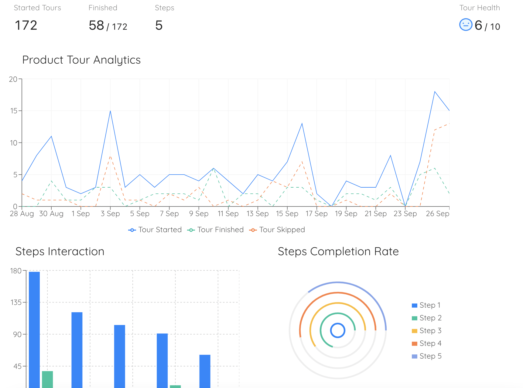
Your first tour is a hypothesis. Launch it, instrument it (completion rate, step-level drop-off, time to first key action post-tour), and treat the data as feedback. A step with a high skip or drop-off rate is either too long, too complex, or unclear — and every drop-off is a fixable problem.
Run A/B tests on copy first — it is the fastest thing to change and often the highest-leverage. Then test format, order, and trigger timing. And when users complete the tour, hand them immediately into a focused product walkthrough — that handoff is where orientation converts into activation.
8 Product Tour Best Practices
These are the principles that separate tours users remember from tours users skip. Apply as many as possible — each one compounds on the others.
1. Start with the user's goal, not your product's features
The opening step of your tour is the highest-leverage piece of copy in your entire onboarding flow. Most products waste it by describing themselves. The best tours open with a direct acknowledgment of what the user came to accomplish: "You're here to [outcome]. Here is how we get you there." That sentence — before a single feature has been mentioned — is what makes users lean in rather than reach for the skip button. It signals: we understand why you signed up, and we are going to make that worth your time.
2. Keep it to 4–6 steps maximum
A product tour that runs to 10 or 12 steps is not a tour — it is a lecture. By step 7, most users have stopped reading and are just clicking through to get to the product. Ruthlessly cut anything that does not directly move a user toward their aha moment. If you cannot articulate exactly why a step needs to be in the flow, it should not be there. For complex products, build several shorter focused tours, each triggered at the relevant moment in the user's journey.
3. Use visuals that show, not just tell
A screenshot of the feature you are describing is worth three sentences of explanation. An annotated screenshot with an arrow pointing to the relevant element is worth six. A short GIF showing the feature in action is worth ten. Every step in your tour should include a visual that does real communicative work — not a stock photo, not a decorative illustration, but a direct representation of what the product does. Visuals reduce cognitive load and keep users engaged long enough to complete the tour.
4. Personalize for the user's role or goal
If your product serves both marketers and engineers, a single generic tour will feel slightly off for everyone. Ask a segmentation question at the welcome screen and show each segment the capabilities most relevant to them. Even swapping out two or three steps based on a user's selected role produces a meaningfully more relevant experience. Relevance is the single most reliable predictor of tour completion, and personalization is the fastest path to relevance.
5. Always include a visible skip option
Forcing users through a tour creates a negative first impression. Experienced users, returning users, and users who prefer to explore on their own terms will resent being blocked from the product they signed up for. A clearly visible skip option sends a message: we respect your time and your confidence. The users who need the tour will stay in it anyway. The users who do not will be grateful you let them go — and that goodwill compounds.
6. End with a clear next action
The worst product tours end with a "you're all set!" screen that dumps users back into the dashboard with no guidance. The best ones end with a single, clear CTA that routes users directly into their first meaningful action — or surfaces a getting started checklist that gives them a structured path forward. The tour has built context and motivation; the final step should convert that into momentum.
7. Make the tour re-accessible
Users do not always have the bandwidth to pay full attention to a tour when it first appears. If it fires once and disappears, users who were not ready the first time have lost it entirely. Link the tour from a persistent help menu or resource center so users can return to it on their own terms. This is especially important for products where multiple team members will be onboarded over time.
8. Update after every significant product change
A tour that references a button that has been moved, a feature that has been renamed, or a flow that no longer exists is worse than having no tour at all — it actively misleads users and creates support requests instead of preventing them. Product tours decay. Assign tour ownership to a specific person on your product or growth team, include tour reviews in your standard release checklist, and audit all active tours at least once a quarter.
Real-World Product Tour Examples
Theory is useful. Examples are better. Here are four products whose tours consistently get praised for getting the fundamentals right. (Looking for more inspiration? Our roundup of product tour modal examples breaks down real welcome screens and feature spotlights screen by screen.)
Asana: role-based personalization at every step
When a new user signs up for Asana, the very first thing the product does is ask them to select a role. This is not a cosmetic question. The tour that follows is genuinely different depending on the answer — highlighting the features, terminology, and workflows most relevant to how that specific type of person will actually use the tool. A project manager is shown how to create projects and assign tasks. A developer is shown how to integrate with their existing tools. Neither person has to sit through steps that are irrelevant to their job.
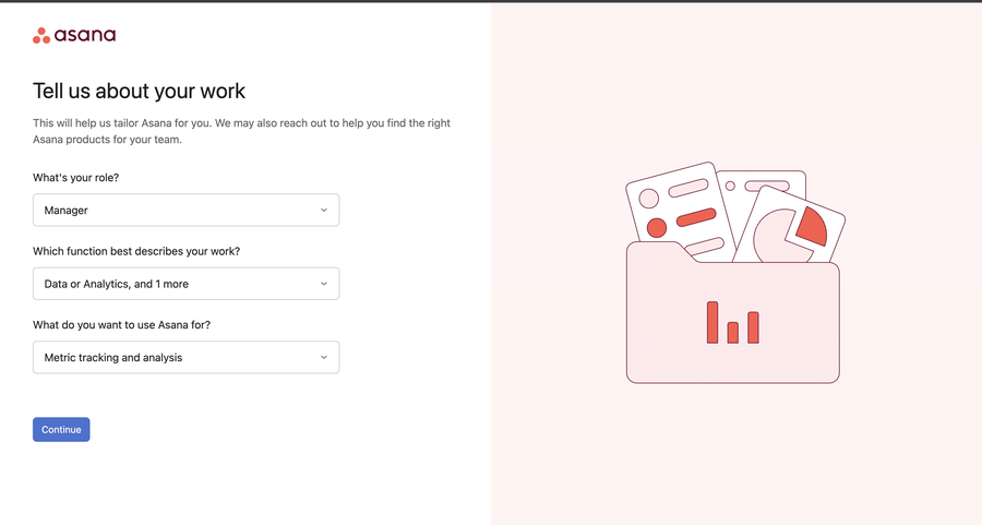
Asana also uses hotspot beacons effectively throughout the tour — placing pulsing indicators on key features like due dates and priority flags, with short contextual explanations of what each one does and why it matters. This keeps the tour feeling light while ensuring no critical capability goes unnoticed.
Grammarly: persona-first orientation with a hands-on demo
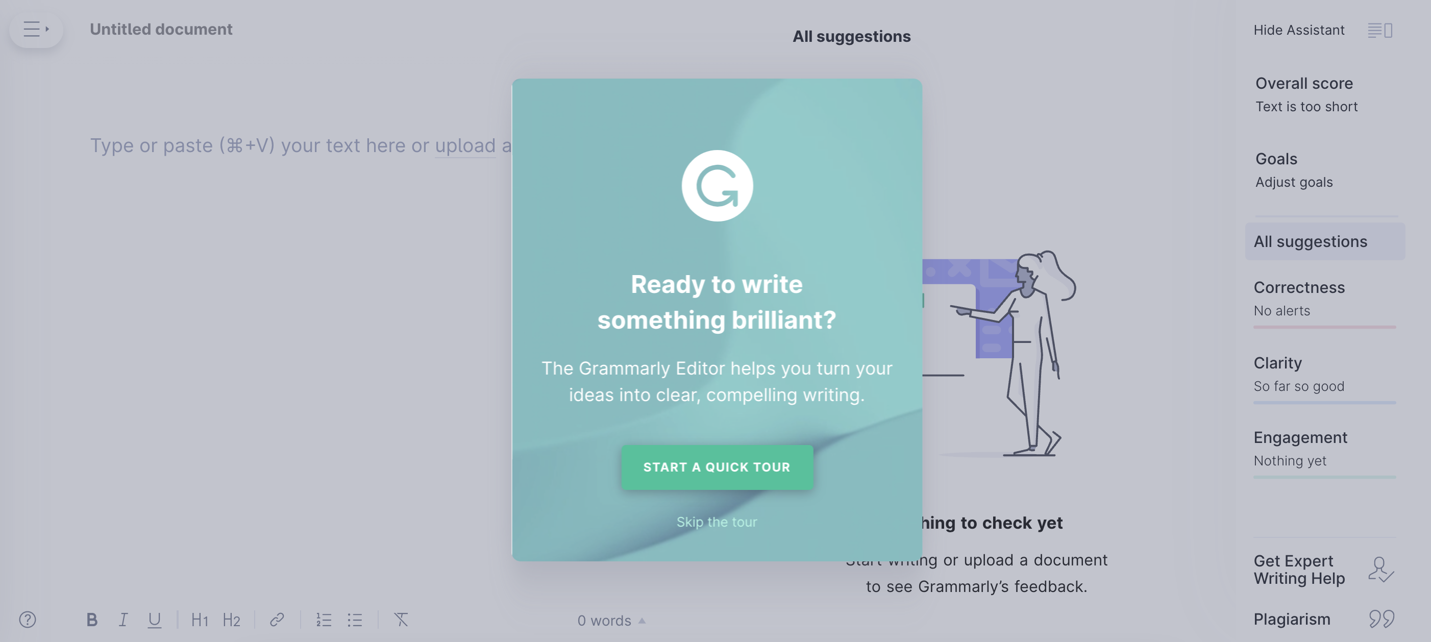
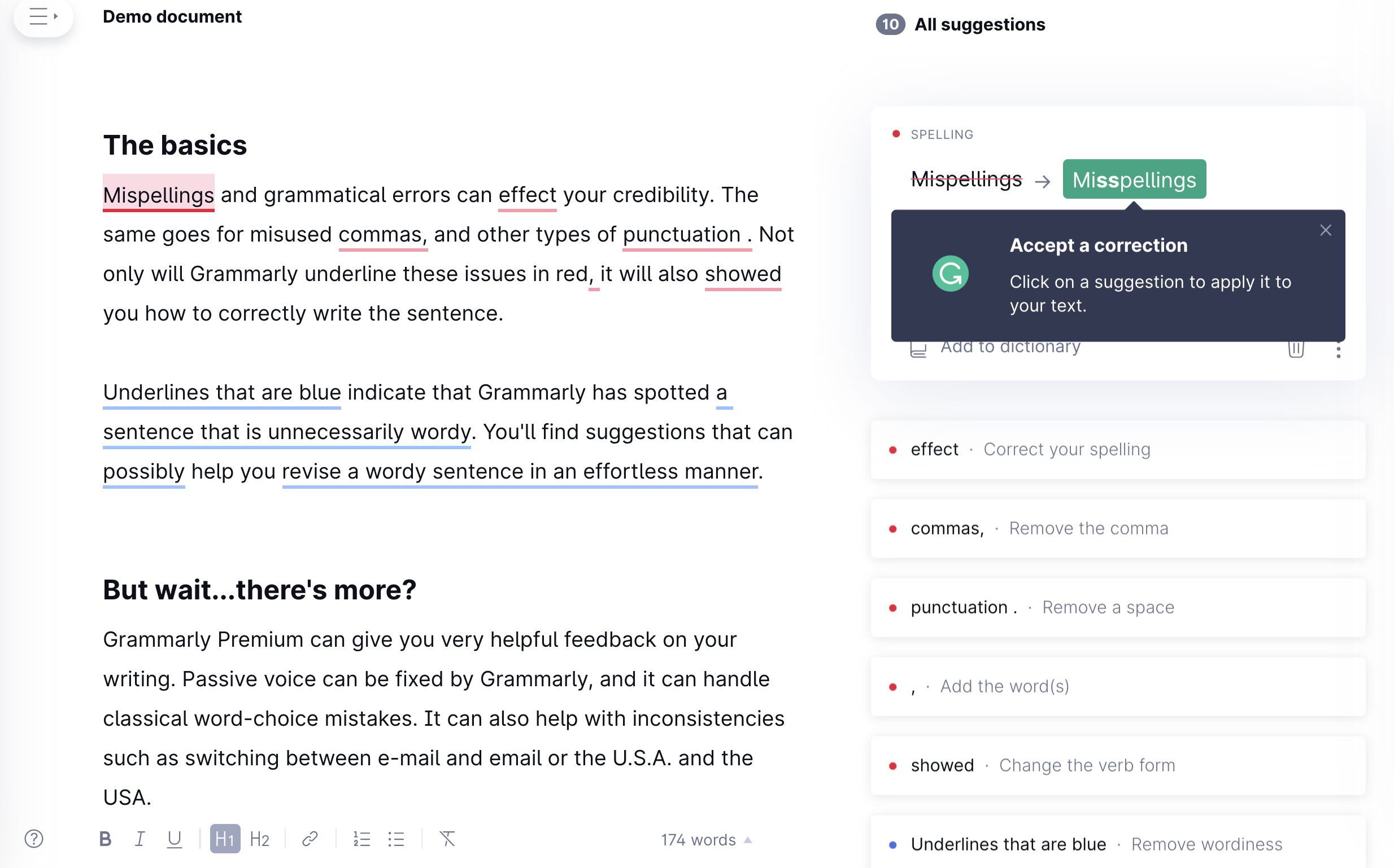
Grammarly's tour is a near-perfect example of the welcome screen + segmentation pattern in action. It opens by identifying the user's persona — professional, student, casual writer — and uses that answer to frame everything that follows. The product then delivers a concise 4-step feature overview, followed by a predefined document with live tooltips that let users experience the core functionality in a safe, guided context before working on their own content.
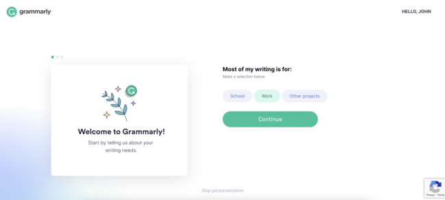
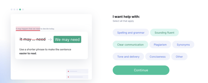
The feature overview is concise — four steps, each anchored to a specific capability, each framed around what the user gains rather than what the feature does.
The tour ends with a predefined document pre-populated with intentional errors, so users experience the product's core value in a context where they cannot fail. It is one of the cleanest examples of a tour that shows rather than tells.
Slack: contextual tours instead of a front-loaded flow
Slack's approach to product tours is deliberately minimal at first login — and brilliantly contextual throughout. Rather than front-loading new users with a long guided tour of every feature on day one, it places short, targeted tours and tooltips the first time a user encounters a feature or performs an action, at exactly the moment they are most relevant. Users who already know how to use Slack barely notice any guidance at all. Users who are new get exactly the help they need, precisely when they need it.
The lesson: not every product benefits from a linear front-loaded tour. For products with a learnable interface, a lighter contextual approach — triggered by what users are actually doing — often produces a better experience than a structured slideshow that treats everyone like a first-time user.
Duolingo: turning the tour into the product experience itself
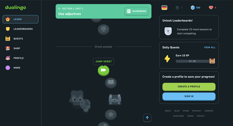
Duolingo's onboarding is one of the most studied in consumer software. From the very first screen, users are not told about the app — they are doing the thing the app is for. There is no feature tour, no explainer video, no list of tips. You pick a language, you pick a goal, and within thirty seconds you are completing your first lesson. The tour is the product experience itself.
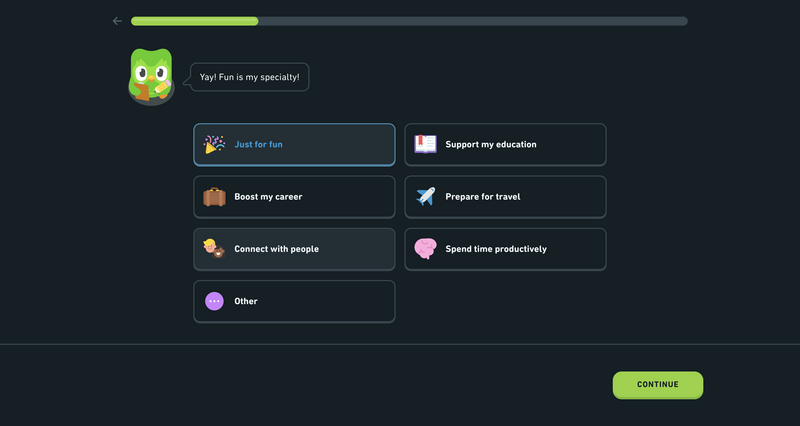
What makes this work is the layered motivation system built into every step: progress bars that fill as you advance, streaks that reward daily usage, completion badges that mark milestones. Each of these is a micro-motivation — a small signal that you are making progress and that progress is worth continuing. For SaaS products, the lesson is clear: if you can make the first session feel like an accomplishment rather than a setup task, you dramatically increase the odds that users will return.
How to Measure Product Tour Success
You cannot improve what you do not measure. Here are the metrics that actually tell you whether your product tour is doing its job.
| Metric | What It Tells You | What to Do If It's Low |
|---|---|---|
| Completion Rate | The percentage of users who reach the final step | Shorten the tour; find and fix the highest drop-off step |
| Step-Level Drop-off | Exactly where users exit the tour | Rewrite the copy on that step or replace the visual; consider removing the step entirely |
| Skip Rate | How many users dismiss the tour immediately | Rework the opening step — the value proposition is not landing quickly enough |
| Time to First Key Action | How long after the tour users complete their first meaningful action | Strengthen the closing CTA; ensure the walkthrough handoff is seamless |
| Feature Adoption Post-Tour | Whether users go on to use the features highlighted in the tour | Review whether highlighted features match the user's stated goal; improve outcome framing |
| Trial-to-Paid Conversion | Whether tour completers convert at a higher rate than skippers | If the gap is small, the tour is not communicating value effectively — revisit the narrative |
A note on attribution: When comparing tour completers vs. skippers, control for the selection effect — users who complete the tour may already be more motivated. To isolate the tour's actual impact, run a controlled experiment where one cohort sees the tour and another goes directly to the dashboard. The difference in downstream metrics is the true lift your tour is producing.
Ready to Build Your First Product Tour?
Kompassify lets you create personalized product tours, onboarding checklists, tooltips, and in-app announcements — without writing a single line of code. Free plan available.
Start for Free →Frequently Asked Questions
What is a product tour?
A product tour is an in-app experience that introduces new users to your product's core value, primary features, and key workflows — typically triggered immediately after sign-up. It uses UI elements like tooltips, modals, hotspot beacons, and checklists to orient users and move them toward their first meaningful action.
What is the difference between a product tour and a product walkthrough?
The honest answer is that the industry uses these terms interchangeably — major platforms like Pendo, Appcues, and Userpilot treat them as overlapping. Where a distinction is drawn, a product tour typically refers to a broader, product-wide orientation experience, while a product walkthrough is narrower and more interactive, guiding users through a specific task step by step with required actions at each stage. Some sales-led teams also use "product tour" to refer to a pre-signup interactive demo, distinct from post-signup in-app onboarding. The key is being consistent in how your own team uses the terms.
How long should a product tour be?
An effective product tour should take no longer than 2 to 3 minutes to complete. For tooltip or modal-based tours, 4 to 6 steps is the sweet spot. Anything longer risks losing users before they reach the point where the product makes sense to them. For complex products, build several shorter contextual tours triggered at relevant moments rather than one long tour that tries to cover everything up front.
When should you trigger a product tour?
The most effective moment is immediately after a new user signs up and lands on their dashboard for the first time. Secondary triggers include: the first time a user navigates to a new feature area, immediately after a significant product update or new feature release, and when a user returns after a long period of inactivity. As with all onboarding, behavioral triggers consistently outperform time-based ones — a tour that appears when a user is actively trying to do something feels like a helpful nudge, not an interruption.
What metrics should I track for a product tour?
The most important metrics are: completion rate, step-level drop-off rate, skip rate, time to first key action after the tour, feature adoption rate for features highlighted in the tour, and trial-to-paid conversion rate segmented by whether users completed or skipped the tour. Track these from day one and use step-level drop-off data to prioritize your iteration efforts.
Should I build a product tour myself or use a tool?
Building a product tour in-house is possible but expensive in developer time and slow to iterate — every copy change or logic update requires engineering involvement. No-code tools like Kompassify let product managers and growth teams build, launch, A/B test, and iterate on tours without touching the codebase. That speed of iteration is usually the single biggest factor in how quickly you reach a tour that actually converts. If you are comparing product tour tools, our side-by-side breakdowns of UserGuiding alternatives and Pendo alternatives cover pricing and features across the market.