Every product team knows the frustration: you ship a genuinely useful feature, announce it, document it, and three months later, support tickets prove most users never found it. The feature isn't hidden. It's right there in the interface. But interfaces are full of things that are "right there," and users have learned to look only at what they already use. Getting a busy person to notice one specific element, without interrupting what they came to do, is one of the oldest problems in product design, and the hotspot is the pattern that solves it most politely.
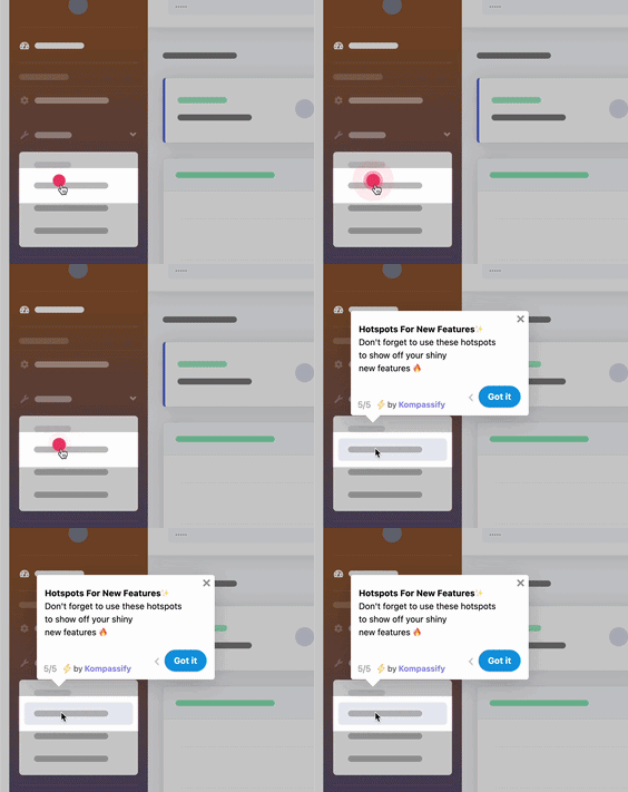
A hotspot is a small, gently pulsing dot anchored to an element in your UI. It doesn't open a modal, doesn't steal focus, doesn't demand anything. It just glows, "there's something here worth knowing", until curiosity wins and the user clicks. Then, and only then, it explains itself. That inversion, the user pulls the explanation instead of having it pushed at them, is why hotspots drive feature discovery in places where another popup would just get closed on reflex.
This guide covers the whole pattern: what a hotspot is in UX terms, how it relates to its neighbors, tooltips, product tours, announcement modals, the anatomy of a well-designed hotspot, the situations where hotspots shine and the ones where they backfire, and eight best practices for shipping hotspots your users will thank you for, including how to do it without writing code.
Key Takeaways
- A hotspot is a persistent, pulsing marker anchored to a UI element, an invitation to discover, not an interruption. It waits for the user's click before explaining anything.
- Hotspot vs. tooltip: a tooltip explains an element the user already noticed; a hotspot earns the notice first. The hotspot is the invitation, the tooltip content it opens is the explanation.
- Hotspots are pull, tours are push. Use a product tour for sequences users must complete; use hotspots for features users can discover in any order, at their own pace.
- Scarcity is the whole trick: one to three hotspots per screen. A single beacon is a signal; a screenful of blinking dots is noise users learn to ignore.
- A consumed hotspot must retire. Once opened or dismissed, the beacon should never pulse at that user again; persistence after the job is done turns guidance into nagging.
- Design for the edge of attention: small, slow pulse, one accent color, placed beside the target, and always measured, so you know which hotspots earn their place on the screen.
What Is a Hotspot in UX? (Meaning & Definition)
A hotspot (sometimes called a beacon, a pulse dot, or a pulsing hotspot) is a small animated marker anchored to a specific element of a product's interface. It stays visible as the user works, softly pulsing to draw the eye. When the user clicks or hovers it, the hotspot opens a compact card: a title, a sentence or two on what the element does and why it's worth using, and often a link to try it or learn more. Until that click, it does nothing at all, which is precisely its power.
Hotspot, defined. A hotspot is a persistent, low-intensity visual cue that marks a point of interest in an interface and reveals contextual guidance on demand. It differs from every push-based onboarding pattern in one structural way: the user decides if and when the explanation appears. That consent is why hotspot content gets read: the user who clicks a beacon has literally asked for the answer it contains.
The pattern sits in a family of in-app guidance surfaces that are often confused with each other. The differences matter, because each one fits a different job:
| Pattern | How it appears | Its job | Who controls the moment |
|---|---|---|---|
| Hotspot | A pulsing dot, visible until consumed | Draw attention to one element; explain on demand | The user clicks when curious |
| Tooltip | Appears on hover or focus, invisible otherwise | Explain an element the user already found | The user hovers when unsure |
| Product tour | A guided sequence of steps, launched at a set moment | Walk users through a path in a fixed order | The product pushes the sequence |
| Announcement modal | A dialog over the whole interface | Broadcast one message to everyone, once | The product interrupts to deliver |
The closest neighbor is the tooltip, and the cleanest way to keep them straight: a tooltip is the explanation; a hotspot is the invitation to it. Plain onboarding tooltips serve elements users naturally encounter: they hover, they learn. But a tooltip on an element nobody notices explains nothing to no one. The hotspot adds the missing half: a visible cue that earns the glance first, then hands over to tooltip-style content. In practice most onboarding stacks use both, and the strongest ones combine them with product tours and checklists into one coherent journey.
Why Hotspots Matter: Pull Beats Push for Discovery
In a world of popups competing for attention, the case for the quietest pattern in the toolbox:
-
They guide with consent, so the guidance gets read
Every unprompted popup starts its life one reflex away from the close button. A hotspot never triggers that reflex, because it never interrupts: the card only opens when the user asks. Content that arrives by invitation is read with attention; content that arrives by ambush is dismissed on sight. Same words, completely different outcome.
-
They solve the discovery problem tours can't reach
A product tour runs once, at a moment the product chooses, usually before the user knows enough to care about feature #7. A hotspot has no schedule: it's still there in week three, when the user has grown into the problem that feature solves. Feature discovery isn't an event, it's a long tail, and hotspots are the only pattern that patiently covers it.
-
They respect the task the user came to do
New users arrive mid-mission: they're trying to send the invoice, publish the page, close the ticket. Guidance that blocks the mission gets resented, however useful. A hotspot costs the mission nothing; it sits at the edge of vision, ignorable for as long as the user needs, which is exactly why it's tolerated on screens where a modal would feel hostile.
-
They turn shipped features into adopted features
The gap between "released" and "used" is where product value quietly dies. A hotspot on a newly shipped improvement, placed exactly where the improvement lives, converts announcement into adoption at the only moment that matters: when the user is on that screen, in context, one click from trying it. It's the follow-through that makes a feature announcement stick.
-
They generate an honest signal about your UI
Hotspot analytics read like a map of your interface's blind spots: a beacon everyone clicks marks a feature users wanted but couldn't see, a discoverability bug worth fixing in the design itself. One nobody clicks marks a feature users don't care about, which is its own answer. Either way, you learn something a survey wouldn't tell you.
The pattern's dark side is real. Everything above holds for hotspots used sparingly. Used greedily, a dot on every button, pulsing forever, the pattern inverts: users habituate, learn that beacons mean noise, and stop clicking all of them, including the one that mattered. A hotspot strategy lives or dies on restraint, which is why half of the best practices below are about what not to do.
The Anatomy of a Well-Designed Hotspot
A hotspot looks like a dot, but it's a small system with four working parts, and each one has a job:
A hotspot is a four-part system: the beacon earns attention, the trigger hands control to the user, the card explains and offers one action, and the exit makes sure a consumed hotspot never nags again.
1. The beacon: earning the glance
The visible dot. Its entire job is to register at the edge of attention without breaking focus: 8–16 pixels, a slow soft pulse (around two seconds per cycle: a heartbeat, not a strobe), in your product's accent color, used consistently so users learn that this exact dot means "optional insight here." Position it adjacent to its target, top-right corner by convention, never covering the element it's explaining.
2. The trigger: handing over the moment
Click, tap, or hover: whatever fits your product, the rule is the same: the card opens only on the user's action. No auto-expanding after a delay, no opening on page load. The trigger is where the pattern's contract lives: you choose when. Break that contract and you've built a slow-motion popup wearing a hotspot's clothes.
3. The card: explaining and offering one action
The payload: a plain-language title, one or two sentences on what the element does and, more importantly, why the user would want it, and at most one call to action ("Try it," "See an example," "Turn it on"). Write it like a colleague leaning over: benefit first, mechanics second. If the explanation needs a paragraph and three screenshots, the feature needs a tour, not a hotspot; the card's size is a feature, because it forces the message to stay glanceable.
4. The exit: retiring gracefully
The part teams forget, and the one users judge you by. Once a user opens the card, or dismisses it unread, the beacon must stop appearing for that user, permanently. A hotspot that keeps pulsing after it's been consumed converts from signal to nag, and poisons trust in every other beacon you'll ever ship. This requires per-user state (shown, opened, dismissed), which is exactly the plumbing a dedicated onboarding platform handles for you.
When to Use Hotspots and When Not To
Hotspots are a specialist tool: superb for a particular class of guidance, wrong for others. The four situations where they're the best pattern available:
- Secondary features on busy screens. The filters panel, the keyboard-shortcut menu, the bulk-edit mode: valuable, non-obvious, and impossible to tour without boring the majority who aren't ready. A hotspot serves exactly the users who are.
- Newly shipped improvements, in context. Announce the release in a modal or changelog if you like, then put a hotspot where the change actually lives. The announcement creates awareness; the hotspot converts it into a first use, right on the spot.
- Power features users grow into. Automation rules, integrations, advanced reports: features that mean nothing on day one and everything in month two. A hotspot waits for that readiness in a way no scheduled campaign can.
- The long tail after onboarding ends. The tour covered the critical path; the checklist covered the first week. Hotspots cover everything else, the ambient layer of discoverability that keeps product adoption deepening long after "onboarding" officially ended.
And the situations where a hotspot is the wrong tool:
- Required steps. If the user must connect a data source before anything works, don't hint; guide. Required sequences belong to a product tour or an actionable empty state; a hotspot's whole nature is that it can be ignored, which is disqualifying for steps that can't be.
- Urgent or important messages. Billing problems, breaking changes, security notices: anything the user must see gets an explicit surface. Optional is the hotspot's contract; don't smuggle mandatory content into it.
- Compensating for broken design. If a primary action needs a pulsing dot to be found, the fix is the design, not an annotation on it. Hotspots explain the reasonably-designed-but-overlooked; they can't rescue the genuinely confusing.
Hotspot Best Practices: 8 Rules for Guiding Without Nagging
The principles, in the order you should apply them:
1. Ration them: one to three per screen, ever
A hotspot works because it's rare. One beacon on a screen is information; five are wallpaper. Users habituate to repeated stimuli with ruthless efficiency; show them a screenful of pulsing dots once, and they'll ignore every dot you ship for the rest of their subscription. If you have ten things to explain, you don't have a hotspot problem, you have a prioritization problem: pick the one or two with the highest payoff per click, and let the rest wait their turn.
2. Mark only what pays off: respect the click
Every opened hotspot is a micro-transaction: the user spends a click and a moment of attention, expecting insight in return. A card that says "This is the Settings button" defaults on that debt, and the user remembers. Reserve beacons for genuine payoffs: the feature that saves an hour a week, the shortcut nobody guesses, the new capability that changes a workflow. The test for every hotspot: would a reasonable user, after reading the card, think "glad I clicked that"? If not, cut it.
3. Keep the beacon at the edge of attention
Small (8–16px), slow (a ~2-second pulse cycle, easing out), consistent (one accent color, everywhere), and adjacent to the target rather than on top of it. The beacon should be findable by a user who's looking and invisible to one who's mid-task; that balance is the craft. And respect users who've asked for calm: honor the reduced-motion preference by swapping the pulse for a static halo. A hotspot that flashes urgently isn't a better signal, it's a worse popup.
4. Write the card like a colleague, not a manual
Lead with the benefit, in the user's words: "See which steps lose your users" beats "Funnel Analysis Module." Two sentences maximum, one clearly labeled action, no jargon. The card is a conversation, not documentation; its job is to make the user want the feature, then hand them the shortest path to trying it. Everything longer belongs behind the card's link, not in it.
5. Retire every consumed hotspot, permanently
Opened or dismissed, the beacon disappears for that user and stays gone. This single rule separates hotspot systems users trust from ones they resent, and it's non-negotiable: guidance that doesn't remember being seen isn't guidance, it's a leak in your product's manners. Per-user state across devices and sessions is table stakes, which is a real argument for building on a platform that tracks it rather than hand-rolling localStorage flags per feature.
6. Target by segment and stage, not broadcast
The best hotspot for a first-week marketer is noise to a two-year admin. Target beacons the way you'd target any onboarding surface: by role, by plan, by lifecycle stage, by whether the user has already used the feature in question; a hotspot promoting a feature the user adopted last month is an ad for their own furniture. Segmented hotspots feel like the product paying attention; broadcast hotspots feel like marketing.
7. Stagger, don't swarm
When several features genuinely deserve hotspots on one screen, sequence them: the second beacon appears only after the first is consumed. The user experiences a patient drip of single discoveries instead of a swarm: same content, opposite feeling. Pacing also preserves the scarcity that gives each beacon its pull, and gives you per-hotspot metrics that a simultaneous cluster would muddy.
8. Measure hotspots like the funnel steps they are
Three numbers per hotspot: open rate (of users who saw the beacon, how many clicked), action rate (of those who opened, how many took the card's CTA), and dismissal rate. High open + high action = a discoverability gap worth fixing in the UI itself. High open + low action = a card that promises more than the feature delivers. Low open = a beacon nobody needed; retire it and reclaim the attention budget. Review monthly, prune ruthlessly; a hotspot layer that only ever grows is a hotspot layer going stale, and it drags your activation work down with it.
Hotspot Examples: The Swarm vs. The Signal
Here is the same screen, annotated both ways, and both versions are live CSS, so you're watching the actual pattern, not a picture of it. The left version is what happens when every team gets to add "just one more" beacon; the right applies the rules from this guide:
See which step loses your users, no query needed. Most teams find their first fix in minutes.
Try it → Got it ✕Everything in this guide is visible in the contrast. On the left: six beacons, fast red flashing, no hierarchy; the screen shouts, so the user hears nothing. On the right: one beacon, slow pulse, brand color, adjacent to its target, and the opened card leads with a benefit, offers one action, and includes its own polite exit. The left screen trained its users to ignore hotspots; the right one taught them that beacons pay off. That trust is the actual asset you're building; each hotspot either deposits into it or withdraws from it.
Hotspot Design: Do vs. Don't
✅ Do
- Limit beacons to one to three per screen
- Reserve hotspots for genuinely valuable, overlooked features
- Use a small, slow pulse in one consistent accent color
- Open the card only on the user's click or hover
- Lead the card with the benefit and one clear action
- Retire the beacon permanently once opened or dismissed
- Target by role, stage, and prior feature usage
- Track open, action, and dismissal rates, and prune
❌ Don't
- Scatter dots across the interface until they read as decoration
- Use hotspots for required steps or urgent messages
- Auto-open the card after a delay; that's a popup in disguise
- Flash fast, in alarm colors, or ignore reduced-motion settings
- Write cards that restate the button's label in more words
- Keep pulsing at users who already opened or dismissed it
- Promote a feature to a user who already uses it
- Ship hotspots and never look at their metrics again
Adding Hotspots to Your Product Without Engineering Time
Everything in this guide (anchored beacons, on-demand cards, per-user retirement, segmentation, analytics) sounds like a sprint of frontend work per hotspot. It doesn't have to be. With Kompassify the whole hotspot layer runs on top of your existing product, no code required:
- Place beacons visually. Point at any element of your live interface in the visual editor, and the hotspot anchors to it: no selectors to hand-write, no release to wait for.
- Write the card once, target it precisely. Title, message, one CTA, then choose who sees the beacon (by segment, role, or lifecycle stage) and when it starts and stops showing.
- Retirement is handled. Opened and dismissed states are tracked per user automatically, so a consumed hotspot never nags; the manners are built in.
- Compose the full journey. Hotspots ship from the same builder as product tours, tooltips, checklists, and announcements: the tour handles the critical path, hotspots handle the long tail of discovery, one snippet powers it all.
- Measure everything. Built-in analytics show each hotspot's opens and actions, so pruning stale beacons is a monthly glance, not a data project.
Kompassify is GDPR compliant and EU-hosted, free for under 100 monthly active users, with paid plans from $129/month.
Make Every Feature Findable
Kompassify lets you place hotspots, product tours, tooltips, and onboarding checklists on top of your existing product: no code, no release cycle. Mark the features users keep missing, explain them at the moment of curiosity, and watch your feature adoption climb. GDPR compliant, EU-hosted, and free for under 100 monthly active users.
Start for Free →Frequently Asked Questions
What is a hotspot in UX?
A hotspot is a small, persistent visual marker, usually a pulsing dot or beacon, anchored to a specific element in a product's interface. It signals "there's something worth knowing here" and waits. When the user clicks or hovers it, the hotspot opens a short explanation: what the element does, why it matters, and optionally a link or action. Unlike a product tour, a hotspot never interrupts; it invites. That makes hotspots the canonical pull-based onboarding pattern: the user chooses the moment, so the explanation lands with attention instead of against it.
What is the difference between a hotspot and a tooltip?
A tooltip is the explanation; a hotspot is the invitation to it. Tooltips are usually invisible until the user hovers an element they already noticed: they explain things users find on their own. A hotspot adds a visible, gently animated marker that actively draws the eye to an element the user would otherwise overlook, and opens a tooltip-like card on demand. In practice the two are teammates: the hotspot earns the glance, the tooltip content it reveals does the explaining. Use plain tooltips for elements users naturally encounter, and hotspots for valuable features they don't.
When should you use hotspots instead of a product tour?
Use a product tour when the user must complete a specific sequence: first-run setup, a critical path with an order to it. Use hotspots when there is no required order: secondary features, power-user shortcuts, recently shipped improvements, or dense screens where different users need different things. A tour pushes everyone down one path at one moment; hotspots let each user pull explanations for what they care about, when they care. The strongest onboarding uses both: a short tour for the critical path, then hotspots to make the rest of the interface discoverable at the user's own pace.
How many hotspots should be on a screen at once?
One to three. A single pulsing beacon is a signal; five of them are noise that users learn to ignore, and a screen full of blinking dots reads as a product apologizing for its own interface. If more than three elements on one screen genuinely need explanation, that's a sign to stagger the hotspots (show the next after the first is consumed), segment them by user role, or fix the underlying design rather than annotate it. Scarcity is what gives a hotspot its pull: it should mark the exception worth noticing, not decorate the rule.
Should hotspots disappear after being clicked?
Yes, a hotspot that has done its job should retire. Once a user opens a hotspot and reads its card, the beacon should stop showing for that user; keeping it pulsing after it's been consumed turns a helpful signal into a nagging one and erodes trust in every other hotspot you ship. The same applies to dismissal: if a user closes a hotspot without reading, respect the choice. Persistent per-user state, shown, opened, dismissed, is what separates a well-behaved hotspot system from decoration, and it's built into dedicated onboarding tools so you don't have to wire it yourself.
Are pulsing hotspots distracting?
Only badly designed ones. A hotspot should sit at the edge of attention, not in the middle of it: small (8–16px), a slow soft pulse rather than a blink, one accent color used consistently, and placed adjacent to its target rather than covering it. Distraction comes from overuse and overanimation, many dots, fast flashing, garish colors, not from the pattern itself. Done with restraint, a hotspot is less intrusive than any alternative: it interrupts nothing, blocks nothing, and can be ignored indefinitely, which is exactly why users tolerate it where they resent unprompted popups.
How do you add hotspots to your product without coding?
With a no-code onboarding platform like Kompassify you can place hotspots on any element of your live product from a visual editor: pick the element, write the card's title and message, choose when the beacon appears and for whom, and publish, no release cycle needed. Hotspots ship alongside product tours, tooltips, checklists, and announcements from the same builder, targeted by segment and measured in built-in analytics. Kompassify is GDPR compliant and EU-hosted, free for under 100 monthly active users, with paid plans from $129/month.