Most user research that fails does not fail during the sessions. It fails at the point where somebody chose the method, when a team ran interviews to answer a question that needed analytics, or read a funnel chart to answer a question that needed a conversation.
The symptom is familiar: a research round finishes, everyone agrees it was interesting, and nothing on the roadmap changes. That is almost always a mismatch between the question asked and the instrument used to answer it.
This guide is a reference for that decision. It covers the two axes every method sits on, twelve methods worth knowing, what each one can and cannot tell you, how many participants each needs, and how to sequence them when you are investigating something specific, like why new users abandon your setup flow.
Key takeaways
- Every method sits on two axes: what people say vs what they do, and why it happens vs how often.
- Pick the method from the question, not from what your team is comfortable running.
- Quantitative methods locate and size a problem; qualitative methods explain it. You usually need both, in that order.
- Five participants per segment is enough for discovery and for usability rounds; one hundred responses per segment is the bar for survey percentages.
- What users say and what users do diverge routinely; when they conflict, behaviour wins.
- Onboarding is the cheapest flow to research, because the behaviour is concentrated in the first few sessions.
The two axes that organize every method
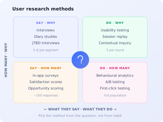
Before the individual methods, the map. Every research method can be placed on two independent axes, and knowing where a method sits tells you what class of answer it can produce.
Axis one: attitudinal versus behavioural. Attitudinal methods capture what people say: their stated preferences, their reported reasons, their recalled experience. Behavioural methods capture what people do: the clicks, the abandonment, the session that ended at 2am. Both are legitimate data, but they answer different questions and they disagree more often than teams expect. Users routinely report that they read the onboarding instructions; replay shows them clicking past.
Axis two: qualitative versus quantitative. Qualitative methods work with small samples and produce explanations. Quantitative methods work with large samples and produce proportions. A qualitative finding tells you a problem exists and what shape it is; a quantitative finding tells you how many people it affects and whether it is getting worse.
Placing a method on the grid tells you what kind of answer it can give, and which second method you will need to complete the picture.
The practical rule that falls out of the map: when a stakeholder asks a "why" question, do not answer it with a number. When they ask a "how many" question, do not answer it with a quote. Most research credibility is lost by mixing those up in a readout.
The 12 user research methods worth knowing
Grouped by the job they do: discovering what the problem is, evaluating whether a design solves it, and measuring how widespread it is.
Discovery methods: finding out what the problem is
1. User interviews
A semi-structured conversation, usually 30 to 45 minutes, aimed at understanding context, goals and frustrations. The most flexible method available and the most commonly done badly.
The failure mode is asking about the future. "Would you use a feature that did X?" produces polite agreement with near-zero predictive value. Ask about the last time instead: what they actually did, in what order, what they tried first, where they got stuck. Past behaviour is recallable; future behaviour is invented on the spot.
Best for: understanding context and motivation. Sample: 5–8 per distinct segment. Cannot tell you: how common anything is.
2. Jobs-to-be-done interviews
A structured interview variant that reconstructs the timeline of a purchase or adoption decision: what triggered the search, what the person tried first, what finally made them switch. It surfaces the forces pushing users toward and away from change rather than their feature preferences.
It is a distinct skill from a general interview and is worth learning separately; the jobs-to-be-done guide covers the interview structure and how to turn transcripts into job statements.
Best for: understanding why people switched, or didn't. Sample: 8–12 recent switchers. Cannot tell you: anything about users who never considered you.
3. Contextual inquiry / field studies
Watching people work in their own environment, with their own data, interrupting only to ask what they are doing and why. It is the only method that reliably surfaces the workarounds: the exported spreadsheet, the second browser tab, the shared doc where the real process lives.
Those workarounds are the highest-value finding in most B2B research, because each one is a feature request nobody thought to file. Expensive in time; usually worth it once a year per major workflow.
Best for: discovering unarticulated needs and workarounds. Sample: 4–6 sessions. Cannot tell you: whether the workaround is common.
4. Diary studies
Participants log their own experience over days or weeks against short prompts. This is the only practical way to observe behaviour that unfolds over time: how someone actually settles into a new tool across their first fortnight, which tasks appear only at month-end, where enthusiasm decays.
Design for drop-off: recruit 30% more participants than you need, keep each entry under two minutes, and prompt at fixed times rather than relying on people to remember. A diary study is the natural complement to a first-time user experience review, because it covers the period after the first session that no lab test reaches.
Best for: experience over time, infrequent tasks. Sample: 8–15, expect attrition. Cannot tell you: anything precise; self-reporting is lossy.
Evaluation methods: testing whether a design works
5. Usability testing
Give a participant a realistic task, watch them attempt it, say as little as possible. The workhorse evaluative method, and the fastest way to discover that something obvious to your team is invisible to everyone else.
Five participants per round per segment catches the large majority of serious problems, which is why running three rounds of five beats one round of fifteen. Our usability testing guide covers moderated versus unmoderated setups, task writing, and the metrics worth recording.
Best for: finding where a specific design breaks. Sample: 5 per segment per round. Cannot tell you: whether users want the feature at all.
6. Card sorting
Participants group your content or features into categories and name the groups. Open sorting (they invent the categories) reveals their mental model; closed sorting (your categories, their assignments) validates one you already have.
Most useful before an information-architecture decision: naming a navigation section, structuring a settings area, deciding what belongs in a help centre. Runs asynchronously at low cost.
Best for: designing structure and naming. Sample: 15–30 (it is semi-quantitative). Cannot tell you: whether people can find things in the structure you build.
7. Tree testing
The mirror image of card sorting. Strip your navigation down to a bare text hierarchy, give participants a task, "where would you go to change who gets billed?", and record the path they take. Because there is no visual design, the result isolates the structure itself.
Sort to design, tree test to verify. Teams that skip the second half frequently ship a taxonomy that made sense to the workshop and to nobody else.
Best for: validating navigation and findability. Sample: 30+. Cannot tell you: whether the labels are visible once real design is applied.
8. Session replay
Recorded playback of real sessions: cursor movement, rage clicks, dead ends, the eleven seconds of hesitation before someone closes the tab. Behavioural and qualitative at once: you are watching a real user, but not one you recruited or briefed.
Its strength is that it captures failure you would never reproduce in a lab, from users who would never join a study. Its weakness is that you cannot ask a recording what it was thinking. Segment ruthlessly: watching random sessions is a poor use of an afternoon; watching ten sessions that all abandoned at step three is not. The session replay guide covers segmentation and privacy handling.
Best for: seeing real failure in the wild. Sample: 10–20 targeted sessions. Cannot tell you: intent or reasoning.
Measurement methods: sizing the problem
9. In-app surveys
Short, targeted questions asked inside the product at the moment the relevant behaviour happens. Response rates are dramatically higher than email because the context is already loaded: the user is looking at the thing you are asking about.
One or two questions maximum, triggered on a specific screen or event. The single highest-value placement is at the point of abandonment: a one-question prompt for people who started setup and stopped tells you in a week what a month of funnel-staring cannot. See the in-app surveys guide for question design, and the survey fatigue guide for how often you can safely ask.
Best for: sizing an attitude, catching stated reasons. Sample: ~100 responses per segment. Cannot tell you: anything about people who dismissed the survey.
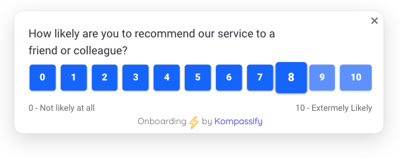
A one-question in-app survey asked at the moment the behaviour happens: the context is already loaded, which is why response rates beat email so heavily.
10. Behavioural analytics
Event and funnel data: who reached which step, how long it took, where they stopped, what they never touched. It is the only method that covers your entire user base rather than a sample, which makes it the right starting point for almost every investigation.
The discipline that makes analytics research rather than reporting is deciding the question before opening the dashboard. "Where do trial accounts stop making progress in week one?" is a research question. "Let's look at the numbers" is not. Kompassify's product analytics tracks flows and feature usage in-app, and cohort analysis is what turns a flat funnel into a trend you can act on.
Best for: locating and sizing behaviour. Sample: everyone. Cannot tell you: why any of it happened.
11. A/B testing
Two variants, randomly assigned, one metric decided in advance. The only method on this list that establishes causation rather than correlation, which is why it is the right last step after qualitative work has generated a specific hypothesis.
It is badly suited to discovery: testing variants without a hypothesis burns traffic to learn that two arbitrary designs perform about the same. Calculate the sample size before launching, not after peeking. Our A/B testing guide for onboarding covers what to test in a flow with low traffic.
Best for: proving a specific change caused a specific effect. Sample: calculated from baseline rate. Cannot tell you: why the winner won.
12. First-click testing
Show a screen, give a task, record only where the participant clicks first. Cheap, fast, and unusually predictive: where the first click is correct, task success rises sharply. Where it is wrong, the rest of the session is usually recovery.
Ideal for evaluating a screen before it is built, and for settling arguments about whether a call to action is actually findable. Pairs naturally with heatmaps, which show the same thing for live traffic.
Best for: testing findability of a single screen. Sample: 30+. Cannot tell you: what happens after the first click.
Which method answers which question
Start from the question, not from the method. This table maps the questions product teams actually ask onto the instrument that can answer them.
| The question you have | Method to reach for | Typical sample |
|---|---|---|
| Where are users dropping out? | Behavioural analytics | Full population |
| Why are they dropping out there? | Session replay, then in-app survey at that step | 10–20 sessions / ~100 responses |
| Can a new user complete setup unaided? | Usability testing | 5 per segment |
| What are people doing outside our product to get the job done? | Contextual inquiry | 4–6 |
| Why did these accounts choose us over the status quo? | Jobs-to-be-done interviews | 8–12 switchers |
| What should this navigation section be called? | Card sorting, then tree testing | 15–30, then 30+ |
| How does the experience change over the first two weeks? | Diary study | 8–15 |
| How many users are affected by this frustration? | In-app survey | ~100 per segment |
| Did our fix actually improve conversion? | A/B test | Calculated in advance |
| Is this button findable at all? | First-click test | 30+ |
The most common sequencing error is starting with interviews. Interviews are expensive and unfocused when you do not yet know where the problem is. Analytics first tells you which screen to ask about, which turns a vague 45-minute conversation into a targeted 20-minute one.
How many participants do you actually need?
Sample size is where research arguments stall, usually because the two sides are talking about different classes of method. The answer depends entirely on whether you are looking for patterns or proportions.
5–8 per segment
Interviews, contextual inquiry, usability rounds. You are looking for recurring patterns, and new themes stop appearing quickly. If your segments genuinely differ, run 5 in each rather than 15 mixed together.
15–30
Card sorting, tree testing, first-click. Enough for agreement percentages to stabilise without needing statistical machinery.
~100 per segment
Surveys. Below roughly a hundred responses, percentages swing enough between rounds that you will chase noise.
Calculated, not guessed
A/B tests. Derive the sample from your baseline rate and the smallest effect worth detecting, and fix the duration before launch.
Segment before you count. Five participants from one role tells you more than fifteen drawn from four roles, because mixed samples produce findings that are true of nobody in particular. If you have not defined your segments, the user personas guide and the user segmentation guide cover how to draw the lines.
A worked example: researching an onboarding drop-off
Onboarding is the cheapest flow in your product to research, because all the behaviour you care about happens in the first few sessions and every new signup is a fresh participant. Here is the sequence that resolves most drop-offs inside a week.
1. Locate it: analytics
Build the funnel from signup to first meaningful action and find the step where the largest cohort stops. Do not stop at the aggregate number: split by segment, plan and acquisition source, because a 40% overall drop is often 15% for one segment and 70% for another. The onboarding funnel guide covers how to define the steps.
2. Watch it: session replay
Pull ten to fifteen replays of accounts that abandoned at exactly that step. Watch for the shape of the failure rather than individual mistakes: hesitation before a field, repeated clicks on something not clickable, a scroll past the button, a tab switch that never comes back.
3. Ask about it: a one-question in-app survey
Trigger a single question for users who reach that step and stall: "what stopped you here?" with three or four plausible options and a free-text field. This catches reasons that behaviour cannot show, such as missing information the user needed from a colleague.
4. Reproduce it: five first-run sessions
Recruit five people who match the affected segment and have never seen the product, and watch them attempt real setup. By this point you have a specific hypothesis, so the sessions are short and targeted rather than exploratory.
5. Fix and confirm: guidance, then measurement
Most onboarding drop-offs turn out to be one of three things: a step that needs information the user does not have yet, a step whose purpose is unexplained, or a step that is genuinely optional but does not look it. The first needs a change to the flow; the second and third are usually solved with contextual guidance: a tooltip or a short product tour at that exact step, shown only to the segment that struggles. Then re-measure the same funnel to confirm the step actually moved, and look at friction further down the flow that the fix may have exposed.
Turn onboarding research into a fix, in-app
Kompassify lets you find where users stall with in-app analytics, ask them why with targeted surveys, and fix it with tours, tooltips and checklists, no code required. Free up to 100 monthly active users, paid plans from $129/month, GDPR-compliant and EU-hosted.
Start for freeResearch mistakes that waste a round
✓ Do this
- Write the question down before choosing the method
- Use analytics to locate, qualitative to explain
- Ask about the last time, not about hypotheticals
- Recruit within one segment per round
- Run three rounds of five rather than one of fifteen
- Record what would change your mind, before you look
- Share raw clips, not just a summary slide
✗ Avoid this
- Asking "would you use…" and treating yes as evidence
- Reading a funnel and inferring the reason
- Mixing four roles into one sample of eight
- Running an A/B test with no hypothesis
- Quoting a percentage from 12 survey responses
- Demoing to participants before they attempt the task
- Letting the person who designed the flow moderate the test
Frequently asked questions
What are the main types of user research methods?
User research methods divide along two axes. The first is attitudinal versus behavioural: what people say (interviews, surveys) against what they do (analytics, session replay, usability testing). The second is qualitative versus quantitative: methods that explain why, in small samples, against methods that measure how many, at scale. Every method sits somewhere on that grid, and the grid is what tells you which one answers your question.
How many users do I need for user research?
It depends entirely on the method. Qualitative discovery (interviews, contextual inquiry, diary studies) reaches saturation around five to eight participants per distinct segment. Usability testing catches the majority of serious issues with five participants per round. Quantitative methods are different: surveys need roughly one hundred responses per segment before percentages are stable, and A/B tests need a sample size calculated in advance from your baseline conversion rate.
What is the difference between qualitative and quantitative user research?
Qualitative research explains why something happens. It works with small samples, produces observations and quotes, and is how you discover problems you did not know existed. Quantitative research measures how often something happens. It works with large samples, produces numbers you can track over time, and is how you size a problem you already know about. Neither substitutes for the other: quantitative research tells you where to look, qualitative research tells you what you are looking at.
What is a diary study?
A diary study asks participants to log their own experience over days or weeks, usually with short prompts at fixed moments. It is the only practical way to observe behaviour that unfolds over time rather than in a single session: how someone actually settles into a new tool over their first two weeks, for instance, or which tasks they hit only once a month. The trade-off is high participant effort and a drop-off rate that needs planning for.
What is the difference between card sorting and tree testing?
They are two halves of the same problem. Card sorting is generative: you give participants your content or features on cards and ask them to group and name them, which tells you how they mentally organise the domain. Tree testing is evaluative: you give participants your existing navigation structure, stripped of visual design, and ask them to find specific things, which tells you whether the structure you built actually works. Sort first to design the structure, tree test to verify it.
When should I use analytics instead of talking to users?
Use analytics to find where the problem is, then talk to users to find out what it is. Analytics reliably tells you that 60% of new accounts abandon at the third step of setup; it cannot tell you why, and inferring the reason from the funnel shape is how teams end up fixing the wrong thing. The efficient sequence is quantitative first to locate and size the issue, qualitative second to explain it, quantitative again to confirm the fix worked.
How do I research an onboarding flow specifically?
Instrument the onboarding funnel to find the drop-off step, watch session replays of the accounts that abandoned there, then run five moderated first-run sessions with new users who match that segment. Add a one-question in-app survey at the abandonment point to catch the reasons that behaviour alone cannot show. Together those four inputs usually explain a drop-off within a week.