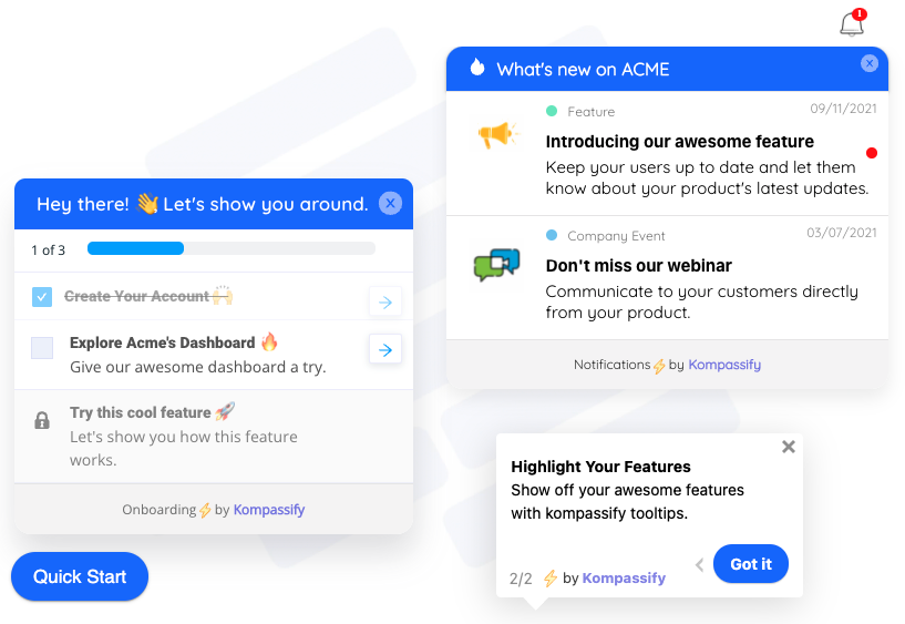
Product teams polish the screens their power users live in: the dashboard full of charts, the project board in full swing, the inbox at inbox-zero-minus-forty. But the screen that decides whether a new user ever becomes a power user is none of those. It's the version of your product with nothing in it: the dashboard with no data, the board with no cards, the report page politely announcing that there is nothing to report. That screen is the empty state, and for every single new signup, it is the product.
Empty states are where onboarding quietly succeeds or fails. The signup flow ends, the confirmation email is opened, and the user lands on… a blank page. If that page explains itself and offers one obvious next step, the user starts moving toward their first win. If it just says "No data available," the user is left to manufacture their own first success from nothing, and a large share of them won't. They won't complain, either. They'll just close the tab, which is why weak empty states rarely show up in feedback and always show up in activation numbers.
This guide covers the whole subject: what an empty state is in UX, the five types worth telling apart, why the blank first screen has an outsized effect on time to value and churn, the anatomy of a great empty state, and nine best practices for designing empty states that onboard, with examples, and ways to enrich the screens you already have without an engineering sprint.
Key Takeaways
- An empty state is any screen with no content to display: a new account's blank dashboard, an emptied inbox, a search with no results, a failed load, or a locked feature.
- For new users, the empty state IS the product. Most SaaS value lives in the user's own data, and every new account starts with none, so the first-use empty state is the real first impression.
- There are five types (first-use, cleared/completed, no-results, error, and permission) and each needs a different message, tone, and call to action.
- A great empty state has four parts: a supportive visual, a headline that says what this space is for, a line on why it's empty and what will appear, and one clear action that fills it.
- Never leave a dead end. Every empty state should offer exactly one primary next step (create, import, refine, retry, or request access) plus templates or sample data when starting from scratch is hard.
- Empty states are onboarding surfaces: pairing them with a product tour, an onboarding checklist, and contextual tooltips turns the blank screen into a guided path to the first win, no code required.
What Is an Empty State? (UX Meaning & Definition)
An empty state is what an interface shows when it has no content to display. The container exists (the table, the feed, the dashboard, the results list) but the content that normally fills it doesn't, either because it hasn't been created yet, because it was all cleared, because a query matched nothing, or because something failed to load. Empty states are sometimes called blank states, zero states, or blank slates; designers also talk about "zero data" screens. Same idea: the interface has nothing to show, and must decide what to say instead.
Empty state, defined. An empty state is the deliberate design of a screen whose content area is empty, communicating what this space is for, why it's empty right now, and what action will fill it. The key word is deliberate: an empty state isn't the absence of design, it's a designed moment. "No data available" on a gray background is not an empty state; it's a missing one.
Why do they matter so much in SaaS specifically? Because SaaS products demonstrate their value through the user's own content. A project tool is compelling when it holds your projects; an analytics tool earns its keep when the charts show your traffic. Which means every single account begins in the one condition the demo never showed: completely empty. The distance between "empty" and "first item created" is exactly the distance between a signup and an activated user, the same stretch that user onboarding exists to shorten.
Same product, same user, same blank database: the only difference is whether the empty screen is a dead end or an on-ramp. That difference is decided in design, not in engineering.
The 5 Types of Empty States (And What Each One Should Say)
"Empty" happens for five different reasons, and the worst empty-state mistake is showing the same shrug for all of them. A brand-new user, a user who just hit inbox zero, and a user whose search found nothing are in three completely different emotional states; the screen should know which one it's talking to:
| Type | When it appears | User's state of mind | The job of the screen |
|---|---|---|---|
| First-use | A new account, feature, or workspace with nothing created yet | Curious but uncertain: "what do I do here?" | Onboard: explain the space, offer one clear first action, provide templates or sample data |
| Cleared / completed | The user finished or removed everything: inbox zero, all tasks done | Accomplished: this emptiness was earned | Celebrate the win, then suggest what's next (review, plan, explore) |
| No results | A search or filter combination matches nothing | Mildly frustrated: "where is the thing I'm looking for?" | Help refine: show the query, suggest corrections, offer to clear filters or broaden the search |
| Error | Content exists but failed to load: network, server, timeout | Worried: "is my data gone?" | Reassure that data is safe, explain in plain words, offer a retry |
| Permission | The user's role or plan doesn't grant access to this content | Blocked: "why can't I see this?" | Explain who can access it and show the path: request access, contact an admin, or upgrade |
Of the five, the first-use empty state deserves most of your attention; it sits exactly where activation is won or lost, and every user crosses it exactly once, at the moment their motivation is highest and their knowledge is lowest. The cleared state is the one teams most often get tonally wrong: showing "Nothing here 😕" to a user who just emptied their task list turns an achievement into an apology. And the error state is the one users forgive least when it's lazy; an empty chart with no explanation reads as "your data vanished," which is a much worse message than anything you could have written.
Empty state ≠ error state. An empty state means there is legitimately nothing to show; an error state means there's something to show but it couldn't be loaded. Blurring them, the same blank screen for "no data yet" and "the request failed", leaves users guessing whether they should act or wait. The states need different copy, and your interface needs to know which one it's in.
Why Empty States Matter: The Blank Page Is Where Users Stall
It's tempting to file empty states under visual polish: a nice illustration, a friendly line, ship it. The reason they belong in your onboarding strategy instead:
-
The first-use empty state is your real first impression
Marketing showed a product full of life; the account starts as a vacuum. The empty state is the handoff between the promise and the product; handle it badly and the gap between the screenshot and the blank screen reads as disappointment within the first minute.
-
Blank screens inflate time to value
The clock between signup and the first real win, time to value, burns most of its minutes wherever users don't know the next step. An unguided empty screen is precisely that: a step with no visible next step. Fixing it is one of the cheapest TTV cuts available.
-
Dead ends convert into silent churn
Users who stall on a blank screen don't file tickets; they leave. The aha moment never happened, so there's nothing to miss and nothing to complain about. Weak empty states are invisible in support volume and very visible in week-one retention.
-
Empty states teach the product's mental model
"Your reports will appear here once you connect a data source" teaches, in one line, what reports are, where they live, and what they depend on. Multiply that across every screen and your empty states quietly become the product's built-in instruction manual, read at exactly the moment each lesson is relevant.
-
They keep working after day one
Every new feature you ship starts empty for every existing customer. A well-designed feature-level empty state doubles as a feature discovery surface, explaining the new capability to users who would otherwise scroll past a blank tab and never return to it.
The Anatomy of a Great Empty State
Strip any well-designed empty state, from any product you admire, and you'll find the same four parts in roughly the same order. None of them is decoration; each answers a question the user is silently asking:
Visual, headline, explanation, one primary action, plus an optional easier path for users not ready to start from scratch. If any part is missing, one of the user's silent questions goes unanswered.
1. The visual: "is this broken?"
An illustration or icon does two jobs in half a second: it signals that this screen is intentional (a styled graphic can't be an accident, so nothing is broken), and it sets the emotional tone: calm for first use, celebratory for completed, sympathetic for errors. It should not dominate: the visual is seasoning, and an oversized illustration with a buried action is the most common way empty states go wrong.
2. The headline: "what is this space?"
One short line naming what lives here, written about the user's work rather than the interface: "Your product tours" beats "No tours found." State what the space is for, not what it currently lacks.
3. The explanation: "why is it empty, and what will appear?"
One or two sentences that resolve the uncertainty: why there's nothing here (you haven't created one yet / your search matched nothing / this loads after you connect a source) and what the space will look like once alive. This is the line that teaches the product's mental model; spend real writing effort on it.
4. The call to action: "what do I do now?"
One primary button that begins filling the space: create, import, connect, browse templates. Exactly one: an empty state with four equal buttons is a decision, and decisions stall exactly the users the screen exists to help. A secondary, lower-emphasis link (use a template, load sample data, watch how it works) catches users who aren't ready for the blank-canvas version of the action.
How to Design Empty States: 9 Best Practices
The principles, in the order you should apply them:
1. Inventory your empty states: you have more than you think
Create a fresh account in your own product and screenshot every screen exactly as a new user meets it. Then check each feature tab, run a nonsense search, and load a page on a throttled connection. Most teams find a dozen or more empty screens this way, and discover that half of them were never designed at all, just left to whatever the component library renders when the array is empty.
2. Never leave a dead end: every empty state gets one next step
This is the single non-negotiable rule. First-use gets "create" or "import." No-results gets "clear filters" or a corrected suggestion. Error gets "retry." Permission gets "request access." If a screen tells the user there's nothing here and offers nothing to do about it, it isn't an empty state; it's an exit.
3. Educate, don't apologize
Emptiness at first use is not a failure, so don't write it like one: no sad-face icons, no "It's lonely in here" without direction. The first-use empty state is a teaching moment: what this space does, what it looks like when working, and how to get there. Confident, specific microcopy ("Tours you build will appear here. Most teams start with a 3-step welcome tour") outperforms cute-but-lost every time.
4. Offer templates and sample data, not just a blank canvas
"Create from scratch" is the hardest possible version of the first step. Templates and sample data let users experience the filled state before they've done the work: the product proves itself first and asks for effort second. If your dashboard genuinely needs a week of data, show it populated with clearly-labeled example data rather than a void with a promise attached.
5. Match the tone to the type
The five types deserve five voices. First-use: encouraging and directive. Cleared: congratulatory, the user earned this emptiness, celebrate it and suggest what's next. No-results: practical, restate the query, offer fixes. Error: calm and honest, data is safe, here's retry. Permission: transparent, who has access and how to get it. Run all five through the same "friendly + illustration" template and at least three of them will strike the wrong note.
6. Guide from the empty state to the first win: don't stop at one click
The CTA starts the journey; it rarely finishes it. "Create your first tour" opens an editor with twenty options, and a user who stalls there churned one screen later than they would have anyway. Connect the empty state to a short product tour that walks from the button to a completed first item, and let a welcome flow route different personas to different first wins; the right first step for a marketer and a developer is rarely the same one.
7. Use a checklist to bridge multiple empty states
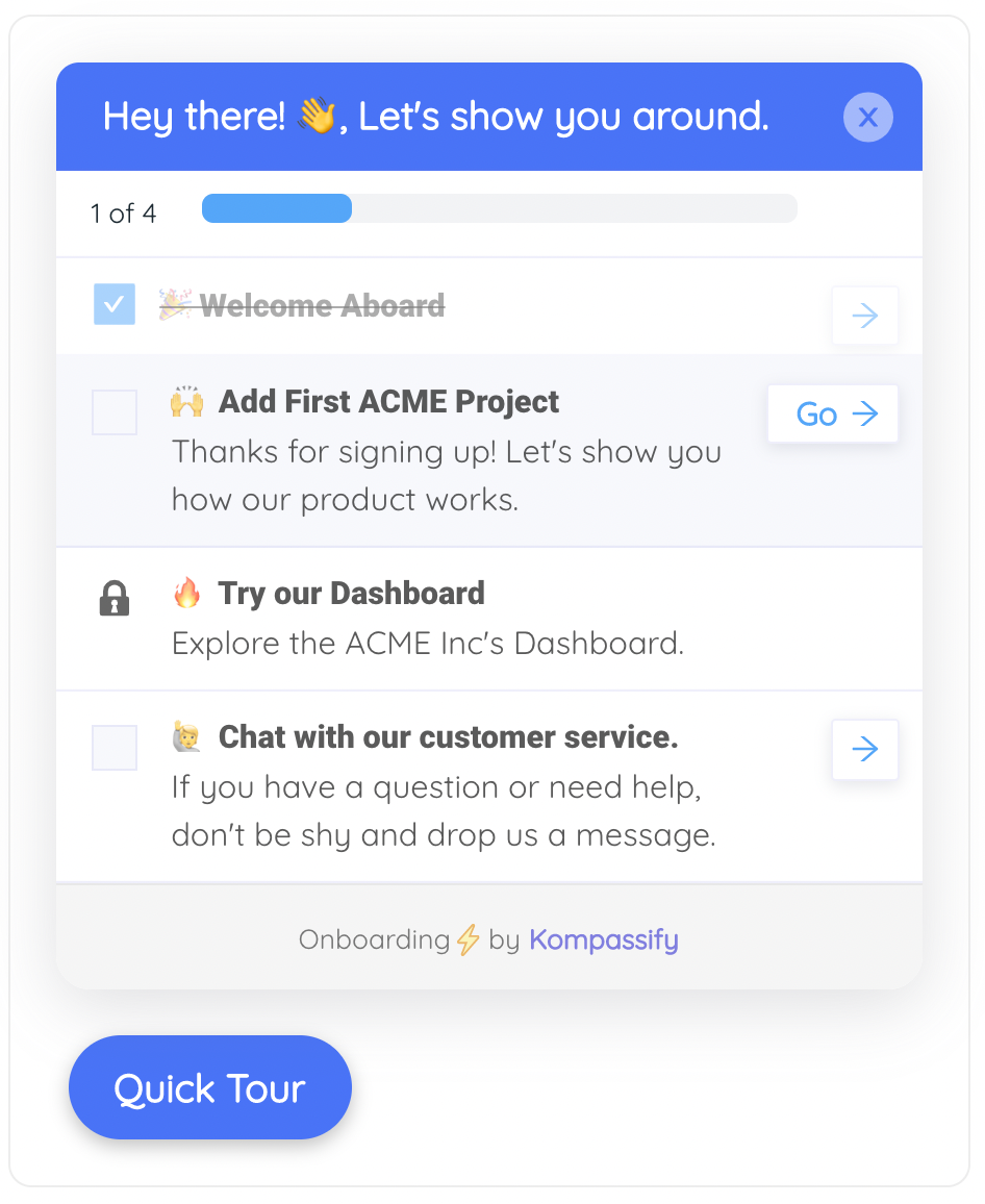
A new account usually has several empty spaces to fill: profile, first project, first integration, first teammate. An onboarding checklist with a progress bar turns that scatter into one visible sequence, and keeps momentum across sessions: whichever empty screen the user lands on, the checklist shows where they are in the larger journey and what to fill next.
8. Design the cleared state as a reward
When a user empties their queue or completes their list, the screen they see is a small trophy room. Acknowledge the win ("All caught up 🎉"), then point forward: review what shipped, plan tomorrow, explore a feature they haven't tried. Teams that treat the completed state as an engagement surface get a bonus re-engagement moment exactly when the user is feeling best about the product.
9. Measure your empty states like the funnel steps they are
Track what share of new users take the empty state's primary action, and how long they linger before acting or leaving. An empty screen where most first-time visitors bounce is an activation bug with a screenshot attached. Fix the worst one, watch the next cohort, repeat: the same loop you'd run on any other onboarding step.
Empty State Examples: Dead End vs. On-Ramp
Here is the same screen, a brand-new account's tours page, designed both ways. The left version is what a component library renders by default; the right version applies the anatomy from this guide:
No data available.
Build a step-by-step tour that walks new users to their first win. Most teams start with a 3-step welcome tour.
Create your first tour or start from a template →Run the same transformation across each type and the pattern holds:
- First-use: "No segments yet" → "Segments let you target the right users with the right guidance. Create your first segment, or start with the 'New users' template."
- Cleared: "Nothing here" → "All caught up 🎉 Every task from today is done. Tomorrow's queue opens at 9:00, or take a look at what your team shipped this week."
- No results: "0 results" → "Nothing matches 'onbaording' with the Archived filter on. Try 'onboarding', or clear filters to search everywhere."
- Error: a blank chart → "We couldn't load your analytics. Your data is safe, the connection timed out. Retry now, or check back in a minute."
- Permission: a hidden page → "Analytics is available to Admins on the Growth plan. Ask your workspace admin for access, or see what's included."
Notice what changed in every rewrite: the screen stopped describing the absence and started describing the path. That's the whole craft, compressed into one habit.
Empty State Design: Do vs. Don't
✅ Do
- Design every empty state deliberately; audit them with a fresh account
- Give each screen one clear primary action
- Explain what the space is for and what will appear in it
- Offer templates or sample data as an easier first step
- Match tone to type: celebrate cleared states, reassure error states
- Pair first-use screens with a tour or checklist to the first win
- Use feature-level empty states to introduce new features
- Measure conversion from empty state to first action
❌ Don't
- Ship whatever the component library renders for an empty array
- Write "No data available" and call it designed
- Offer four equal buttons, or zero
- Let the illustration outweigh the action
- Apologize for a brand-new account being empty
- Use the same blank screen for "no data" and "failed to load"
- Joke around in error states while users worry about their data
- Design it once and never look at its metrics again
Enriching Empty States Without Engineering Time
Redesigning every empty screen in the codebase is a real project: worth doing, and rarely done this quarter. The good news: the highest-impact layer of an empty state strategy is guidance, and guidance doesn't have to wait for a sprint. With Kompassify you can layer the on-ramp onto the empty screens you already have, no code required:
- A welcome flow that meets users before the first blank screen does: a multi-choice welcome survey routes each persona to the first win that fits them.
- A product tour that launches on the empty page and walks the user from "Create your first…" through to a completed first item: the on-ramp, guided end to end.
- An onboarding checklist with a progress bar that bridges all of a new account's empty spaces into one visible sequence that survives across sessions.
- Tooltips and announcement widgets pinned to empty screens, including the new-feature tabs that start empty for every existing customer after each release.
Everything is built in a visual editor, targeted by segment, shipped with a single script snippet, and measured in built-in analytics, so you can watch the share of users who make it from the blank screen to the first action move week over week. Kompassify is GDPR compliant and EU-hosted, free for under 100 monthly active users, with paid plans from $129/month.
Turn Your Blank Screens Into On-Ramps
Kompassify lets you add welcome flows, product tours, onboarding checklists, and tooltips on top of your existing empty states: no code, no waiting for a sprint. Ship it with one script snippet and watch more of your signups reach their first win. GDPR compliant, EU-hosted, and free for under 100 monthly active users.
Start for Free →Frequently Asked Questions
What is an empty state in UX?
An empty state is any screen a user sees when there is no content to display: a brand-new dashboard with no data, an inbox with zero messages, a search that returned no results, or a list the user just cleared. In UX design, the empty state is the moment the interface has nothing to show and must decide what to say instead. Well-designed empty states explain what the screen will contain, why it's empty right now, and what single action fills it, turning a dead end into the first step of onboarding.
Why are empty states important?
Because for a new user, the empty state IS the product. Most SaaS products show their value through the user's own data: dashboards, projects, reports, which means every new account starts with none of it. If that first blank screen offers no guidance, the user has to manufacture their own first success from nothing, and many quietly give up instead. A good empty state shortens time to value, lifts activation, and reduces early churn, because it converts the most common stall point in onboarding into a guided next step.
What are the different types of empty states?
Five types cover nearly every case. First-use empty states appear when a brand-new user hasn't created anything yet, the most important type for onboarding. Cleared (or completed) empty states appear when the user finished everything, like an emptied inbox, a moment to celebrate, not apologize. No-results empty states appear when a search or filter matches nothing and should help the user refine the query. Error empty states appear when content failed to load and should explain and offer a retry. Permission empty states appear when the user's role or plan doesn't grant access and should explain how to get it.
What should an empty state include?
Four elements: a supportive visual (illustration or icon) that sets tone and confirms nothing is broken; a short headline that says what this space is for; one or two lines of explanation covering why it's empty and what will appear here; and one clear primary call to action that creates the first item, plus optionally a secondary link to a template, sample data, or help. The test of a good empty state is that a first-time user knows exactly what to do next within seconds, without opening the docs.
How do empty states affect user onboarding and activation?
The first-use empty state is usually the first real screen of onboarding: it's where the signup flow ends and the product begins. If it's a dead end, users stall exactly where activation is decided: between account creation and the first meaningful action. Treating empty states as onboarding surfaces, with a clear next step, templates or sample data, and supporting guidance like a product tour or an onboarding checklist, measurably increases the share of signups that reach their first win, which is the definition of user activation.
What is the difference between an empty state and an error state?
An empty state means there is legitimately nothing to display: no data yet, no results for this query, or everything completed. An error state means content exists (or should) but couldn't be shown because something failed: a network problem, a server error, a timeout. They need different messages: an empty state guides the user toward creating or finding content, while an error state reassures the user their data is safe, explains what went wrong in plain words, and offers a retry. Using a generic blank screen for both confuses users about whether they should act or wait.
How do you improve empty states without engineering time?
You can layer guidance on top of existing empty screens without touching the codebase. With a no-code platform like Kompassify you can attach a welcome flow that routes users to the right starting point, launch a short product tour that walks them from the empty screen to their first created item, show an onboarding checklist with a progress bar that keeps momentum across sessions, and add tooltips or announcement widgets on the empty screens themselves. It ships with a single script snippet, is GDPR compliant and EU-hosted, free for under 100 monthly active users, with paid plans from $129/month.