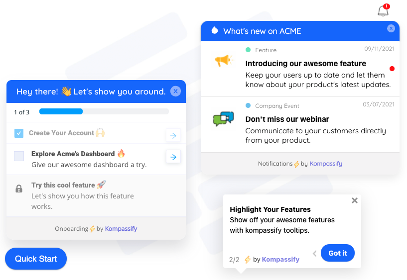
Watch a recording of a new user's first ninety seconds in your product. Not a customer, not a colleague, someone who signed up yesterday and had never seen it before. Most product people find this experience physically uncomfortable, and the discomfort is always the same shape: the user lands, scans, hesitates, clicks something that isn't what you'd have clicked, backs out, scrolls, and either finds the thread or closes the tab. All of it happens before they have done anything you'd count as usage.
That stretch is the first-time user experience, and it is structurally different from every session that comes after. A user in week three has context, invested effort, and a reason to push through friction. A user in minute one has none of those things. They have a question, "is this going to be worth my afternoon?", and they will answer it from very little evidence, very quickly.
This guide covers what FTUE is and how it differs from onboarding overall, why the first session carries so much weight, a minute-by-minute anatomy of a first run that works, the five patterns behind strong first sessions, a first-run audit you can do in an afternoon, the metrics that prove it, and the mistakes that lose people before anything has happened.
Key Takeaways
- FTUE is the first session, not the whole onboarding programme. They fail differently and need different fixes.
- The first session has no sunk cost; it's the only one where ordinary friction produces permanent departure.
- Something useful must happen in minutes. The constraint isn't step count, it's how much the user gives before they get anything back.
- Defer every setup task that isn't required for the first outcome: profile fields, invites, preferences, integrations.
- Borrow data when real data isn't there. Sample datasets and templates let evaluators see the product work before they can supply anything.
- Measure where first sessions end, by name. That single step is usually the whole diagnosis.
What Is First-Time User Experience?
First-time user experience (FTUE) is everything a person meets on their first use of a product: the first screen after signup, whatever setup is demanded, whatever guidance is offered, whatever they manage to accomplish, and how the session ends. It's a design problem with an unusual constraint: the user has no accumulated knowledge, no habits, and no investment to protect.
FTUE, defined. The complete first session with a product, from first screen to exit. Distinct from onboarding as a whole because it is bounded by one sitting, and because it is the only session where a user's default assumption is that leaving costs them nothing.
| FTUE | Onboarding | |
|---|---|---|
| Duration | One session | Days to weeks |
| Surfaces | In-product only | Product, email, checklists, campaigns, support |
| Goal | One useful thing happens; they come back | Reach activation, then habit |
| Fails as | Users who never return after day one | Users who return but never reach value |
| Fixed by | Cutting the path to one outcome | Sequencing, nudges, checklists over time |
The last two rows are why the distinction is worth keeping. A team seeing poor activation often responds with a longer onboarding programme (more emails, more prompts) when their actual problem is that 60% of signups never came back after the first session. Onboarding work cannot reach people who aren't there.
Why the First Session Carries So Much Weight
-
There's no sunk cost holding anyone in place
Later sessions are protected by investment: configured settings, imported data, colleagues who now depend on it. In session one there is nothing to lose by leaving, so friction that a month-three user shrugs off is terminal here.
-
The mental model forms now and is expensive to change
Within a couple of minutes a user has decided what your product is for, whether it's aimed at someone like them, and how much work it demands. Correcting a wrong model later takes far more effort than forming the right one now.
-
Most of the funnel's loss is concentrated here
In most SaaS products the single largest drop in the whole journey sits between "account created" and "did anything at all". Improving a mid-funnel step by ten points moves fewer people than a first-session fix moving the same ten.
-
It sets the ceiling for every downstream metric
Activation, time to value, trial conversion, retention: all of them are computed over people who survived session one. Every one of them is capped by it.
-
It's what people describe when they describe your product
The first run is the version of your product most people have seen, including the ones who tell colleagues about it. Reviews, word of mouth and internal recommendations are disproportionately about ninety seconds of experience.
The Anatomy of a Strong First Session
Two versions of the same product's first run, laid out on the clock:
The right column isn't more work to build than the left; in several places it's less. What changed is the order: value before setup, one path instead of eleven, borrowed data instead of a blocker, and an ask made only after something had already worked. That reordering is the substance of most FTUE improvement.
The 5 Patterns Behind First Sessions That Work
1. Defer every setup task that isn't load-bearing
Go through your first-run screens and ask of each field and step: is this required for the user to see one useful thing? Profile details, preferences, team invites, billing information, notification settings: almost none of it is. Move it after the first outcome, where a user with evidence is far more willing to invest. This alone is usually the single largest FTUE win available.
2. Borrow data when the user has none
The hardest first-run problem in B2B software is that the product is empty until real data arrives, and real data often requires credentials, permission or an approval the user cannot obtain today. Sample datasets, templates and demo workspaces let the product demonstrate itself immediately. Users who see it work are dramatically more likely to go and get the credential, and evaluators who never could have got one still leave knowing what you do.
3. Aim the whole session at exactly one outcome
Not a tour of the product; one thing accomplished. Pick the smallest action that genuinely demonstrates value (a report built, a page published, a message sent, an issue tracked) and design the first session as the shortest possible path to it. Everything that isn't on that path is either deferred or removed. If different users want different outcomes, ask one question and branch, rather than averaging them into a path that fits nobody.
4. Make progress visible and resumable
First sessions get interrupted: meetings, tabs, life. What decides whether the user returns is whether returning is easy: a saved state, a visible sense of what's done and what remains, and no requirement to reconstruct where they were. An onboarding checklist is the standard way to do this, and its real value is less motivational than logistical.
5. Guide contextually, don't lecture up front
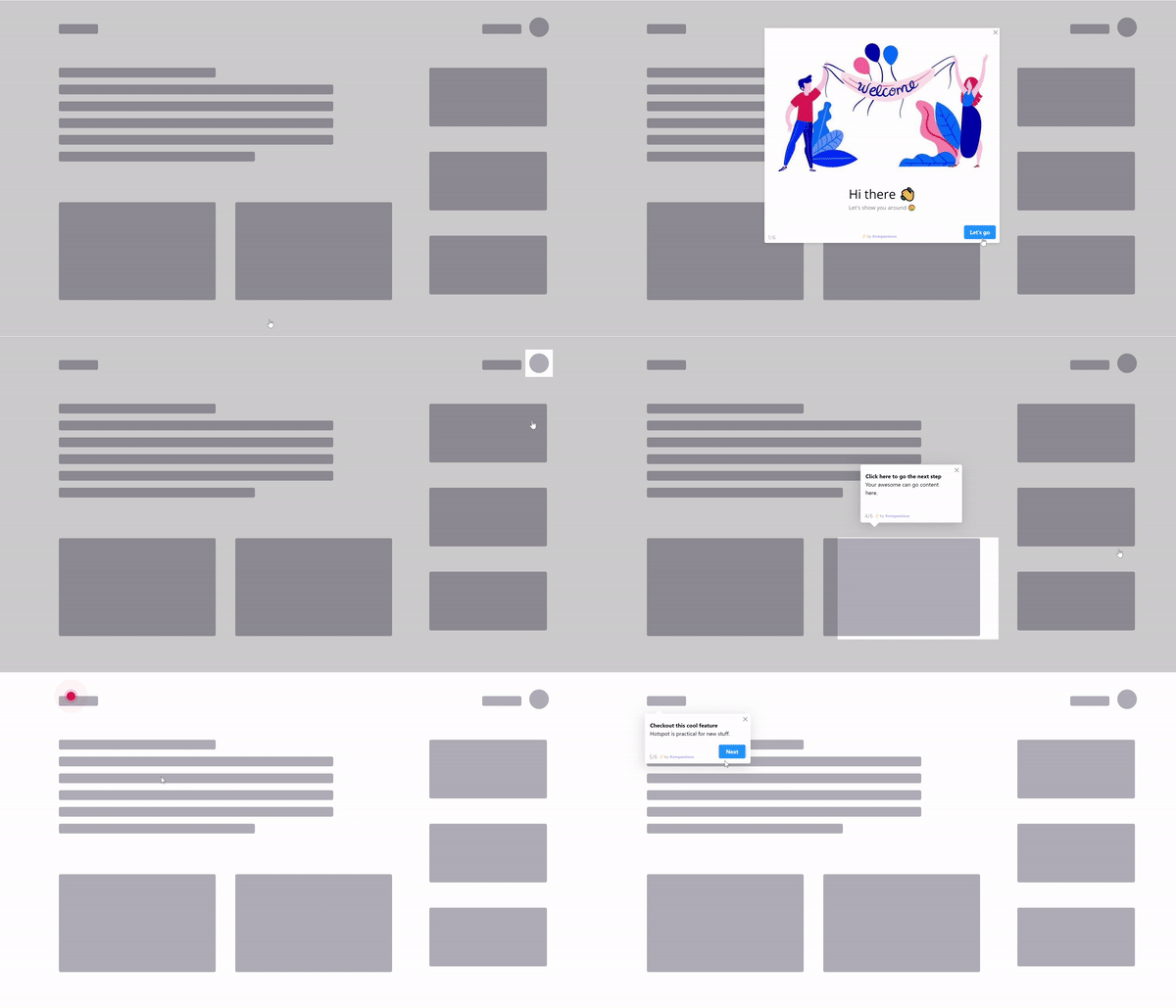
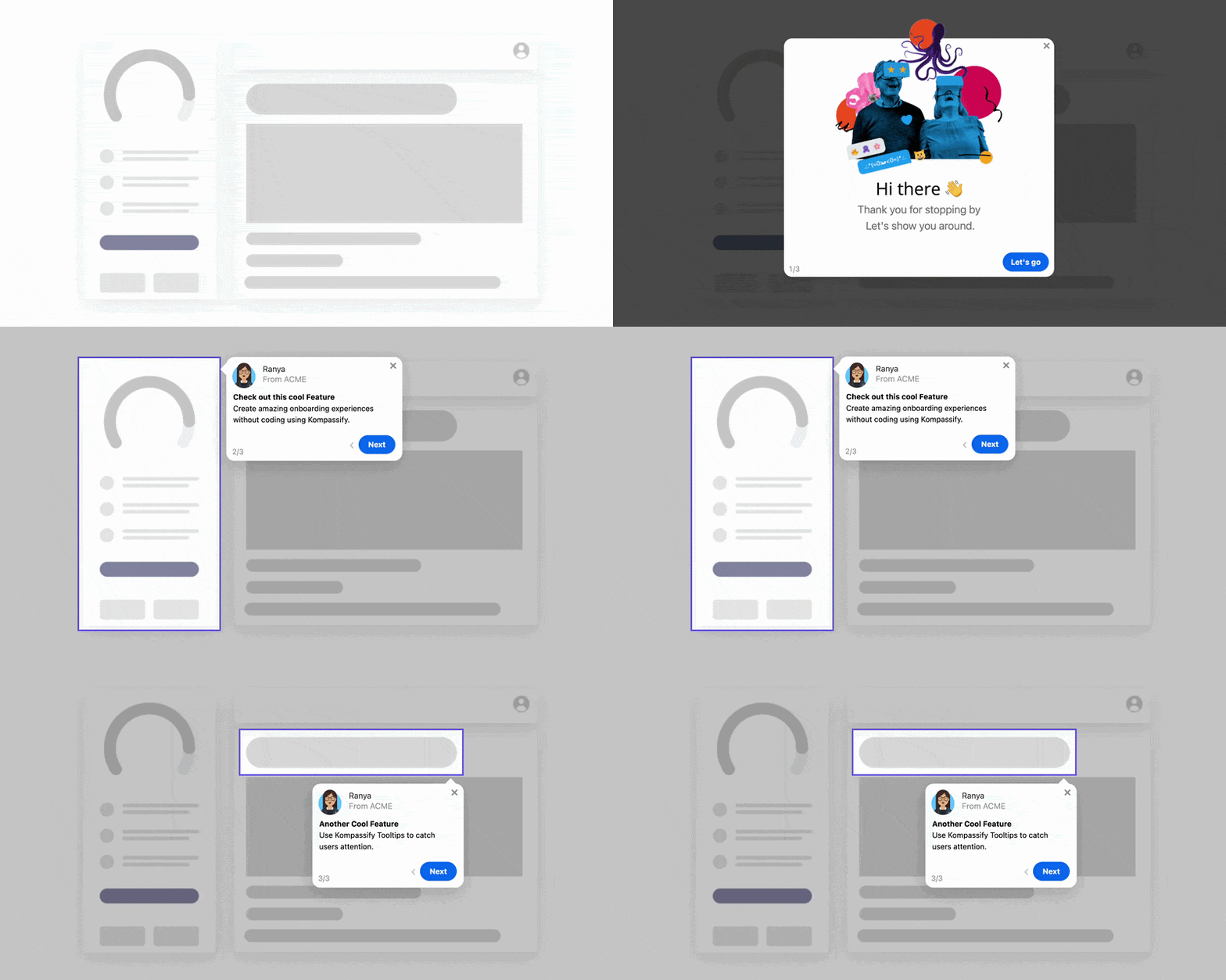
A long tour before the user has touched anything is explanation without a question attached, and it gets skipped. Guidance works when it arrives at the moment of doubt: a tooltip on the control that confuses people, a three-step walkthrough for the one path that matters, a hotspot on the thing users miss. Short, contextual, and interruptible.
The Surfaces That Make Up a First Session
Each of these is a separate design decision, and each has its own way of going wrong:
| Surface | Its job in session one | Common failure |
|---|---|---|
| Welcome screen | Set expectations, capture intent, point at one path | A greeting with no next action |
| Empty states | Turn every blank screen into a starting line | "No data yet" and nothing else |
| Sample data / templates | Let the product demonstrate itself immediately | Product is inert until real data arrives |
| Short guided walkthrough | Walk the one path to the first outcome | An eight-step tour of the interface |
| Contextual tooltips | Answer doubt at the exact control | Restating the label in more words |
| Checklist | Show progress, make the session resumable | Twelve items, none of them completed |
| The exit | Leave a reason and a route to return | Session ends with no state and no follow-up |
Auditing Your Own First Run in an Afternoon
You cannot evaluate your own FTUE from memory; you know too much. Do it properly with a fresh account, a stopwatch and a screen recording:
- Create a genuinely new account and record the screen. Not a staging account, not one with seeded data. Start the timer at the first post-signup screen.
- Note the time of the first useful thing that happens. Not the first click, the first moment the product did something for the user. If you can't find one, that's the finding.
- Count what you were asked for before that moment. Every field, permission, credential and decision. Each is a place someone leaves.
- Mark every screen that offers no obvious next action. Any blank or ambiguous state in the first two minutes is a priority fix.
- Try it without real data. Can an evaluator with no credentials see the product work at all? For most B2B products the honest answer is no, and it's fixable.
- Interrupt yourself, then come back an hour later. Is the state saved? Is it obvious what remains? Most first sessions really do get interrupted.
- Watch five real recordings of new users. Session replays of first sessions, uncut. Note where each one hesitates; the pattern will be unmistakable by the third.
- Write down the one step where first sessions end. Name it. That name is your next sprint.
The output of this afternoon should be a single sentence: "new users stop at X because Y." Teams that can say that sentence fix their first run; teams that can only say "our onboarding needs work" tend to add another email.
Measuring FTUE
Four numbers, watched as a set, tell you whether the first session works:
- Session-one action rate: the share of new accounts that take any meaningful action at all. The most brutal and most useful number here, and the one most dashboards omit.
- Time to first meaningful action: median minutes. If it's climbing, you've added something to the front of the experience that shouldn't be there.
- First-session completion: the share who accomplish something real before leaving. This is the outcome FTUE design is aiming at.
- Day-1 to day-2 return rate: by signup cohort. The verdict: did the first session leave a reason to come back?
Alongside them, publish the step where first sessions end, by name, every week. A percentage invites discussion; a named step gets an owner. All four fit inside the wider frame in our guide to user onboarding metrics.
First-Time User Experience: Do vs. Don't
✅ Do
- Design the session around one visible outcome
- Defer every setup task not required for it
- Offer sample data or a template when data is missing
- Ask one intent question and branch the path
- Turn every empty screen into a starting line
- Save progress so the session is resumable
- Guide contextually, in three steps or fewer
- Watch real recordings of first sessions
❌ Don't
- Open with a form before anything has worked
- Launch an eight-step tour of the interface
- Require a credential the user can't get today
- Ask for team invites before the first outcome
- Ship a dashboard that says "No data yet"
- Lose the user's state when they get interrupted
- Judge your own first run from memory
- Answer first-session drop-off with more emails
Improving Your First Run Without a Release Cycle
Most first-run fixes are guidance and sequencing rather than architecture, which is why they're so often postponed behind feature work. With Kompassify they ship on top of your live product with no code:
- Point the session at one outcome. A three-step walkthrough that takes a first-time user to a real result, on your existing interface.
- Branch on intent. A multi-choice question routes each new user to the path that fits them, so nobody walks a tour built for someone else.
- Rescue the blank screens. Layer guidance and a clear next action onto empty states, where the first session most often dies.
- Make it resumable. A checklist that shows progress and remembers it, so an interrupted first session has a way back in.
- Find where it ends. Step-level analytics name the exact moment first sessions stop, and because changes publish live, you can test a fix the same week you find the problem.
Kompassify is GDPR compliant and EU-hosted, free for under 100 monthly active users, with paid plans from $129/month.
Make the First Ninety Seconds Count
Kompassify lets you build first-run walkthroughs, contextual tooltips and resumable onboarding checklists on top of your existing product: no code, no release cycle. Get new users to one real outcome in their first session, and find out exactly where the ones who leave stop. GDPR compliant, EU-hosted, and free for under 100 monthly active users.
Start for Free →Frequently Asked Questions
What is first-time user experience (FTUE)?
First-time user experience is everything a person encounters the first time they use a product, from the moment after signup through to the end of that first session. It covers the first screen, the setup asked of them, the guidance offered, the first thing they manage to accomplish, and how they leave. FTUE is narrower than onboarding as a whole: onboarding can run for weeks across emails, checklists and campaigns, while FTUE is one session with no prior context, no accumulated patience, and no reason yet to persist.
Why is the first-time user experience so important?
Because it is the only session where the user has no sunk cost. Someone in week three who hits friction works around it; someone ninety seconds into their first visit closes the tab and does not come back, and no email sequence recovers them. The first session is also where the mental model forms: what the product is for, whether it is for people like them, how much effort it demands. That model is expensive to correct later, which is why the first run carries far more weight in retention than any single session that follows.
What is the difference between FTUE and onboarding?
Scope and duration. FTUE is the first session; onboarding is the whole programme that gets a user from signup to habit, which may span weeks and several channels. The distinction matters operationally, because they fail in different ways and need different fixes: a weak FTUE shows up as users who never return after day one, while weak onboarding shows up as users who return but never reach value. Diagnosing one and treating the other is a common and expensive mistake.
How long should a first-time user experience be?
Short enough that something useful happens inside the first session, which in practice means aiming for a visible outcome within a few minutes rather than a fixed step count. The useful constraint is not the number of steps but the ratio: how much the user has to give before they get anything back. Any first run that asks for more than a couple of minutes of effort before showing a result is gambling on patience that new users do not have.
What makes a bad first-time user experience?
Four things, in order of damage. Demanding setup before showing value: configuration, integrations, invites, profile fields, all before anything works. An empty screen with nothing to do and nothing explaining what to do. A long product tour that explains the interface rather than helping the user achieve something. And no way to get a result without real data, so users who are just evaluating can never see the product work at all. Each one produces the same outcome: a first session that ends with nothing accomplished.
How do you measure first-time user experience?
Four numbers together. The share of new accounts that take any meaningful action at all in session one. Time to first meaningful action, as a median. The share who complete something real in that first session. And day-one-to-day-two return rate for the signup cohort. Watch those alongside the step where first sessions end: that step, named specifically, is usually the whole diagnosis, and it is the number most worth publishing weekly.
How can you improve FTUE without engineering time?
Most first-run fixes are guidance rather than architecture. With a no-code platform like Kompassify you can add a short product tour that walks a new user to one real outcome, turn empty screens into starting lines, put tooltips on the controls that cause hesitation, and give the first session a checklist that shows progress and remembers it, all published to your live product without a release, targeted to first-session users only, and measured step by step. Kompassify is GDPR compliant and EU-hosted, free for under 100 monthly active users, with paid plans from $129/month.