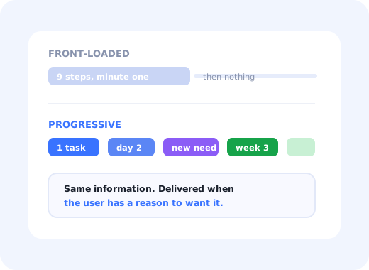
Every product team eventually notices the same thing: the tour they built explains nine things, users remember roughly one, and the questions in support are about the other eight, asked three weeks later, on a screen the tour never mentioned.
Progressive onboarding is the response. Instead of front-loading everything a user might eventually need, you deliver each piece at the moment it becomes relevant, and let the product teach itself over weeks rather than in the first ninety seconds.
This guide covers what progressive onboarding is, why timing beats volume, how to map moments to guidance, the patterns that implement it, when it is the wrong choice, and how to measure whether it worked.
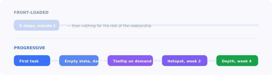
Same information, different distribution. Only one of them survives contact with human memory.
Key Takeaways
- Progressive onboarding delivers guidance when it becomes relevant, instead of delivering all of it on the first screen.
- It is defined by conditions, not sequence. Each piece fires on a behaviour: a first visit, an unused feature, an abandoned task.
- Retention of instructions is the constraint. People do not remember what they had no reason to care about.
- Contextual and just-in-time onboarding describe the same idea from the user's side; progressive describes it from the design side.
- It is not always right. Irreversible setup, compliance steps and genuinely blocking configuration belong up front.
- Measure feature depth over time, not first-session completion: the whole point is what happens in week three.
What is progressive onboarding?
Progressive onboarding definition: an approach that spreads guidance across a user's lifecycle, revealing each piece at the point where it becomes relevant to what they are trying to do, rather than presenting the product's full capability during the first session. Each element is triggered by a condition (a screen visited, a task completed or abandoned, a feature never used) so the sequence is determined by the user's behaviour rather than by a fixed script.
You will also see this called contextual onboarding or just-in-time onboarding. The terms describe the same practice from different angles: contextual emphasises where the guidance appears, just-in-time emphasises when, progressive emphasises that it accumulates. In practice they are used interchangeably.
Why front-loading fails
The argument for progressive onboarding is not aesthetic. It rests on three properties of new users that no amount of design effort changes:
- They cannot store instructions they have no use for yet. A step about bulk export means nothing to someone with no records; it will be forgotten before it is needed.
- They have a task, not a curriculum. Someone who signed up to solve one problem will tolerate guidance about that problem and skip everything else.
- They arrive continuously. Users join a team in month seven and never see the flow designed for the launch cohort. Conditional guidance still catches them.
The dismissal spiral: the more a first session interrupts, the faster users learn that your overlays are noise, and the dismissal reflex they build applies to the genuinely useful message you send in week two. Front-loading does not just waste the first session; it devalues every message after it.
Mapping moments to guidance
Designing progressive onboarding is mostly an exercise in writing conditions. For each thing a user must eventually learn, answer two questions: what happens immediately before they need it, and what is the smallest thing that would unblock them.
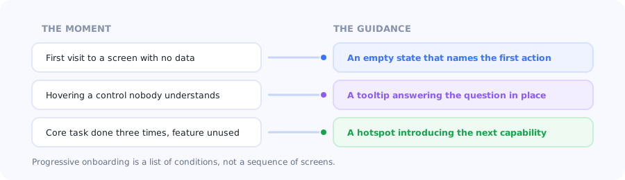
Write the condition first. The format follows from it.
| Condition | What the user is doing | Right format |
|---|---|---|
| First session, no data yet | Deciding whether this is worth setting up | Short tour driving one task to one result |
| Lands on a screen with nothing on it | Wondering what this section is for | An instructive empty state |
| Pauses on an unfamiliar control | Guessing at a label or a setting | A tooltip that answers in place |
| Setup started but unfinished | Lost track of what is left | A persistent checklist with progress |
| Core task done repeatedly, feature untouched | Ready for depth they do not know exists | A hotspot or a single-step callout |
| Returns after two weeks away | Has forgotten the layout | A brief re-orientation, not the original tour |
The patterns that implement it
-
Contextual tooltips
The workhorse. One sentence, attached to the element that raises the question, shown the first time the user encounters it. See how to create onboarding tooltips.
-
Hotspots
A persistent marker on something new or advanced, waiting to be noticed rather than demanding attention. The hotspot guide covers when they help and when they become wallpaper.
-
Checklists that unfold
Setup work presented as a bounded list, with later items appearing only once earlier ones are done, so the whole hill is never visible at once.
-
Instructive empty states
Every blank screen is a teaching surface with a captive audience. The empty states guide covers the patterns that convert.
-
Secondary onboarding
Guidance for capabilities that only matter to established users (automations, integrations, admin settings) triggered by usage depth rather than by account age.
When progressive onboarding is the wrong choice
Deferring guidance is a default, not a law. Four cases belong up front:
- Genuinely blocking configuration. If nothing in the product works until a data source is connected, hiding that behind contextual discovery just produces a broken first session.
- Irreversible or expensive choices. A workspace URL, a currency, a data region. Explain these once, clearly, at the moment they are set.
- Compliance and safety steps. Anything with a legal or security consequence should be explicit and unmissable.
- Single-use products. If a user will interact with the product once, there is no "later" to defer anything to.
The workable compromise for most SaaS products is a short front-loaded core (the one task that produces a visible result, described in our guide to the first-time user experience) with everything else distributed progressively.
How to measure it
Progressive onboarding fails the standard onboarding dashboard, because its whole purpose is to affect week three. Four measures work better:
| Measure | What to look at | What good looks like |
|---|---|---|
| Feature depth over time | Distinct core features used per account, week by week | Rises steadily instead of plateauing after week one |
| Guidance engagement | Interaction rate per triggered element | High for the ones that fire in context; low means the trigger is wrong |
| Dismissal rate | Share of users closing a message without reading | Climbing dismissal means you are interrupting too often |
| Support volume by topic | Tickets about the capability you guided | Falls after the trigger goes live |
Set the baseline before you start: our onboarding metrics guide covers the definitions, and feature discovery covers the specific problem of getting existing users to notice capability they already pay for.
Do's and don'ts
✅ Do
- Write the condition before the content
- Keep a short front-loaded core for the first task
- Use the smallest format that unblocks the user
- Trigger on behaviour, never on account age alone
- Cap how many messages a user can see per session
- Front-load anything irreversible or blocking
- Measure depth in week three, not completion in minute one
❌ Don't
- Explain features the user has no data to use yet
- Re-run the original tour for a returning user
- Stack several overlays in one session
- Rely on hotspots users have learned to ignore
- Defer a step that blocks the entire product
- Ship guidance with no way to dismiss it for good
- Judge the approach on first-session metrics
Building progressive onboarding with Kompassify
Progressive onboarding is mostly a targeting problem: the same guidance, shown to the right user at the right moment. That is configuration work rather than engineering work.
- Trigger by behaviour (page, segment, feature usage or elapsed time) so each guide fires on its own condition.
- Start with one short product tour covering the first task, and let the rest arrive later.
- Layer tooltips and hotspots on the controls that generate the most questions.
- Keep setup visible with a checklist that persists between sessions.
- Check the effect in product analytics: feature depth per segment, week over week.
Kompassify is a no-code digital adoption platform for SaaS teams: tours, checklists, tooltips, announcements, surveys and analytics in one place. Free up to 100 monthly active users, paid plans from $129/month, GDPR-compliant with EU hosting.
Stop teaching everything at once
Trigger each piece of guidance on the moment it becomes useful, and watch feature depth rise instead of plateauing after week one.
Start for Free →Frequently Asked Questions
What is progressive onboarding?
Progressive onboarding is an approach that spreads guidance across a user's lifecycle, revealing each piece at the point where it becomes relevant rather than presenting the product's full capability in the first session. Each element is triggered by a condition such as a screen visited, a task completed or abandoned, or a feature never used, so the order is determined by the user's behaviour rather than by a fixed script.
What is the difference between progressive and contextual onboarding?
They describe the same practice from different angles and are used interchangeably in most teams. Contextual onboarding emphasises where the guidance appears, next to the element that raises the question. Just-in-time onboarding emphasises when it appears, at the moment of need. Progressive onboarding emphasises that it accumulates over time rather than arriving all at once. If a distinction is being drawn, progressive usually refers to the overall strategy and contextual to an individual element.
Why is front-loaded onboarding less effective?
Because it fights three properties of new users. They cannot retain instructions for things they have no use for yet, so a step about bulk export means nothing to someone with no records. They arrived with a task rather than a curriculum, so they will tolerate guidance about that task and skip everything else. And they keep arriving over time, so a flow designed for the launch cohort never reaches the person who joins in month seven. There is also a compounding cost: heavy first-session interruption trains users to dismiss overlays, which devalues every later message.
When should onboarding not be progressive?
In four cases. Genuinely blocking configuration, where nothing works until a data source is connected, belongs up front. Irreversible or expensive choices such as a workspace URL, a currency or a data region should be explained clearly at the moment they are set. Compliance and safety steps must be explicit and unmissable. And single-use products have no later to defer anything to. The workable compromise is a short front-loaded core covering the first valuable task, with everything else distributed progressively.
What patterns are used for progressive onboarding?
Contextual tooltips attached to the element that raises the question, hotspots that mark something new or advanced without demanding attention, checklists whose later items appear only once earlier ones are done, instructive empty states that teach on screens with no data yet, and secondary onboarding for capabilities that only matter to established users, triggered by usage depth rather than account age.
How do you measure progressive onboarding?
Not with first-session completion, since the whole point is to affect week three. Track feature depth over time, meaning distinct core features used per account week by week, which should rise steadily rather than plateau. Track engagement per triggered element, since a low rate usually means the trigger condition is wrong rather than the content. Watch dismissal rate as a warning that you are interrupting too often. And check support volume on the specific topic you guided.
Does progressive onboarding replace the product tour?
It changes what the tour is for. Rather than a twelve-step narration of the interface, the tour becomes a short opening sequence that drives one task to one visible result, and everything the old tour tried to cover is redistributed as tooltips, hotspots, empty states and later triggers. Most products still need that opening sequence; what they do not need is for it to carry the entire product's documentation.
How many in-app messages should a user see per session?
Fewer than most teams ship. There is no universal number, but the operating principle is to cap the count per session and let the highest-priority trigger win when several qualify at once, because each additional interruption reduces the attention available for the next one. The measurable signal that you have crossed the line is a rising dismissal rate, which indicates users are closing messages reflexively rather than reading them.