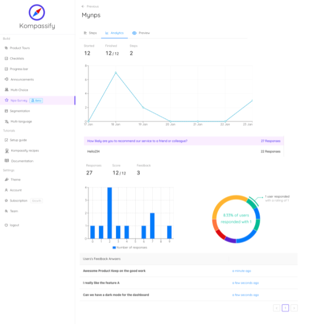
Every company that has run surveys for a year owns the same artefact: a spreadsheet with a few thousand rows of free text, a column of scores, and a filter nobody uses. It is proof that customers were asked. It is not evidence of anything, because nothing has been done to it.
Collecting feedback is a solved problem; the tooling is cheap and the in-app survey response rates are good. Analysing it is where programmes die, because analysis is genuinely harder: it means reading things people wrote quickly and angrily, deciding what they actually meant, and then defending a ranking of problems in a room where everyone has an anecdote. This guide is a method for doing that repeatably.
Key Takeaways
- Feedback analysis is a coding job, not a reading job; untagged text cannot be ranked.
- Strip every item to the observation underneath the suggestion; customers propose solutions, not problems.
- Count accounts, not messages; one furious customer can generate a fake theme single-handed.
- Rank on frequency times severity times segment value, or you will build for whoever writes most.
- Sentiment scoring is triage, not analysis. It cannot tell mild annoyance from a calmly described blocker.
- Half of what analysis surfaces is confusion, not missing features, and confusion ships this week, not next quarter.
- Closing the loop is part of the method, not a courtesy: it is what keeps response rates alive.
What Is Customer Feedback Analysis?
Customer feedback analysis (definition): the process of consolidating, coding and ranking what customers tell you (across surveys, support tickets, interviews, reviews and sales conversations) into a short list of themes that are specific enough to act on and prioritised by how much they are worth fixing.
The distinction that matters is between collection and analysis. Collection is instrumentation: asking the right question at the right moment to the right person. Analysis is interpretation: deciding what the answers mean together. A team can be excellent at the first and produce nothing from the second, and usually the symptom is recognisable: feedback gets quoted in meetings as individual anecdotes, and whichever quote is most vivid wins.
Analysis replaces anecdotes with a ranked list. That is the entire deliverable. Not a dashboard, not a sentiment trend line: a list of named problems, each with a count, a severity, a segment, and a decision attached.
Three things analysis is not
-
It is not a score
An NPS or CSAT number tells you the temperature. It never tells you the cause. The score is the trigger for analysis, not the output of it.
-
It is not a quote wall
A slide of representative comments is persuasion, not analysis. It is chosen after the conclusion, which means it can support any conclusion.
-
It is not a feature vote
Counting requested features ranks solutions customers imagined. Analysis ranks problems customers had, which is a different and much shorter list.
The Five Sources Worth Analysing
Different channels are biased in different directions, and the bias is the useful part: once you know which way each one leans, you can read them against each other.
| Source | Best at revealing | Its bias | Read it for |
|---|---|---|---|
| In-app microsurveys | Reactions tied to a specific moment | Only reaches people still using the product | Cause, while the memory is fresh |
| Support tickets | Blockers severe enough to be worth the effort of writing in | Heavily skewed to the willing-to-complain | Severity, and repeat patterns |
| Churn & cancellation answers | What finally broke the relationship | Post-hoc rationalisation; the real cause is often earlier | Themes to trace backwards |
| Sales & CS call notes | Objections and unmet expectations before purchase | Filtered through the person taking notes | Gaps between promise and product |
| Reviews & public posts | How you are described to strangers | Extremes only: the delighted and the furious | Positioning and language |
The silent majority problem. Every one of these sources over-samples people who chose to speak. The users who quietly stopped logging in are usually the largest group and the least represented, which is why feedback analysis has to be read next to behavioural data: see product analytics and the user churn guide. If a theme appears in the words of ten customers and in the behaviour of a thousand, it is a bigger theme than the count suggests.
Building a Taxonomy That Survives Real Feedback
Coding is the step everybody skips and the step everything else depends on. Untagged text can be read but not counted, and a theme you cannot count is a theme you cannot defend against somebody else's anecdote.
A taxonomy is just the set of labels you apply to every incoming item. Four dimensions are enough, and going beyond them is the most common way to build a system nobody maintains.
The four dimensions
| Dimension | Example values | What it lets you answer |
|---|---|---|
| Theme | Discoverability, reliability, performance, pricing, missing capability, integration | What kind of problem is this? |
| Product area | Onboarding, reporting, imports, permissions, billing | Whose backlog does it belong in? |
| Severity | Blocking / friction / preference | How much does it cost the user? |
| Lifecycle stage | Trial, first week, established, at-risk | Does this hurt activation, adoption or retention? |
Rules that keep a taxonomy alive
Start with about a dozen theme labels, never more than twenty. Add a label only when at least five items do not fit anywhere; merge two labels the moment coders keep hesitating between them. Write a one-line definition for each and put the definitions where the coding happens: disagreement between two people coding the same item is not a personality problem, it is a missing definition. And keep a "review" bucket rather than forcing awkward items into the closest label; the review bucket is where next quarter's new theme is hiding.
How to Analyse Customer Feedback in 7 Steps
- Consolidate every source into one table
- Strip each item to the observation
- Code against the taxonomy
- Group into themes and count by account
- Score frequency × severity × segment value
- Decide: fix, explain, or decline
- Close the loop
1. Consolidate every source into one table
One row per item, with the same columns regardless of where it came from: date, source, account, segment, verbatim text, and empty columns for the codes. This step is boring and non-negotiable: as long as survey responses live in one tool and tickets in another, nobody can see that the same problem is appearing in both, which is precisely the signal you want.
2. Strip each item to the observation
Customers report solutions. "Add a bulk edit button" is a proposal; the observation underneath is "changing twenty records one at a time takes too long". Write the observation in the row next to the verbatim. This single habit changes what gets built, because several different proposals usually collapse into one observation, and the observation often has a cheaper fix than any of the proposals did.
3. Code against the taxonomy
Apply theme, product area, severity and stage to every row. Have two people independently code the same twenty rows at the start and compare; where they disagree, fix the definition rather than arguing the item. Once the taxonomy is stable, coding a week of feedback is typically under an hour.
4. Group into themes and count by account
Count distinct accounts, not messages. One customer who wrote eleven tickets about the same thing is one account with a severe problem, not eleven votes. Then split the counts by segment: a theme that looks moderate in aggregate is often overwhelming inside one plan tier or one role, and that is the version of the number worth acting on.
5. Score frequency × severity × segment value
Give each theme three numbers: how many accounts raised it, how badly it hurts (blocking, friction, preference), and how much you care about the segment it came from. Multiply, or just rank on all three and argue about the ties. The point is not arithmetic precision; it is that the ranking is explicit, so somebody can disagree with a specific input rather than with the conclusion.
6. Decide: fix, explain, or decline
Every theme above the line gets one of three decisions, written down. Fix means the product must change. Explain means the product is fine and the communication is not; a large share of feedback lands here. Decline means you have read it and chosen not to act, which is a legitimate and under-used answer, provided it is recorded rather than left to quietly rot in a backlog.
7. Close the loop
Go back to the people who raised each theme and tell them what happened. This is covered in its own section below, because it is the step that determines whether your next round of feedback is any good.
Prioritising Themes: The Four Quadrants
Once themes carry a frequency and a severity, they sort themselves into four groups, and each group has a different owner and a different timeline.
Fix now
High severity, high frequency. Blocking problems hitting many accounts.
Owner: engineering. Timeline: this sprint.Investigate
High severity, low frequency. Rare but brutal, often one segment or one integration.
Owner: product + support. Timeline: understand before scheduling.Guide & explain
Low severity, high frequency. Usually confusion, not absence: people cannot find it or do not know it exists.
Owner: onboarding / CS. Timeline: this week, no release needed.Park & record
Low severity, low frequency. Preferences and one-offs.
Owner: nobody. Timeline: revisit next quarter.The quadrant most teams under-use is "guide & explain". A theme like "I did not know the product could do that" is not a feature request and not a bug; it is a discoverability failure, and fixing it costs a tooltip, not a sprint. When feedback analysis keeps producing requests for features that already exist, the finding is about feature discovery, not about the roadmap.
Frameworks like the Kano model are useful downstream of this, once you are choosing between things worth building. They are not a substitute for the coding work: Kano ranks candidate features, and this process is what produces trustworthy candidates in the first place.
Sentiment, Themes and the Limits of Automation
Automated sentiment scoring and clustering are genuinely useful, as triage. They sort a queue, flag spikes, and make large volumes approachable. What they cannot do is the part that decides what you build.
✅ Automate this
- Sorting the queue so the angriest items get read first
- Spotting volume spikes on a theme after a release
- Suggesting candidate clusters for a human to name
- Routing items to the right product area
- Translating incoming feedback into your working language
- Deduplicating near-identical submissions
❌ Don't automate this
- Naming the theme: labels chosen by a model drift each run
- Deciding severity: calm sentences describe blockers too
- Reading sarcasm, jargon or domain shorthand
- Ranking, where segment value has to be a judgement
- Concluding from sentiment trend alone that something improved
- Writing the decision, that has to be defensible by a person
The failure mode worth naming: a sentiment dashboard that goes up and to the right while the underlying themes are unchanged. Sentiment is an aggregate of how people phrased things. It moves with who answered, not only with what you shipped. Trust theme counts by account over sentiment averages every time.
Closing the Loop: The Half Everyone Skips
Response rates decay for one reason: people learn that answering changes nothing. Closing the loop is the countermeasure, and it works in two layers.
The outer loop: tell everybody
Announce what changed in the words customers used to describe the problem. If the theme was "I can never find where exports go", the release note should say exports are now easier to find, not "improved navigation affordances". An in-app announcement reaches the people who actually hit the problem far better than an email does, because it can be targeted to the segment that raised it.
The inner loop: tell the person
Reply to the individual who wrote in, even months later, even when the answer is no. "You asked for this in March, here it is" is the single highest-return message most SaaS companies never send. A declined request handled honestly (here is why, here is the workaround) costs you almost nothing and buys the next honest answer from that customer.
Do not close the loop with a survey. Following up on feedback by asking for more feedback is how programmes acquire a reputation for extraction. Give something first: an answer, a change, a workaround, a date.
The Metrics That Show the Analysis Is Working
Feedback programmes are easy to measure badly. Volume collected is not a result; it is an input. Four numbers actually indicate health.
| Metric | What it tells you | Warning sign |
|---|---|---|
| Coding coverage | Share of incoming items actually coded | Falling below ~90%: the backlog is winning |
| Theme decay | Whether a theme's account count drops after you acted | Flat after a fix shipped: you solved the proposal, not the observation |
| Time to decision | Days from a theme crossing the threshold to a written decision | Themes that never get a decision, only discussion |
| Loop closure rate | Share of raised themes where the raisers were told the outcome | Near zero, which predicts a collapsing response rate |
Theme decay is the one to watch hardest, because it is the only metric that connects analysis to reality. If the "cannot find exports" theme is still arriving at the same rate a month after you moved the button, the problem was never the button's position, and pairing the theme count with your friction data will usually show you why.
Acting on Analysis Without Waiting for a Release
The most useful outcome of a good analysis pass is discovering how much of the pile is not engineering work. "I did not know that existed", "I could not find it", "I did not understand what it does", "nobody told me it changed": these are guidance problems, and they are the majority of most feedback sets. With Kompassify they can be answered in the product this week:
- Answer the confusion where it happens. Attach a tooltip or a hotspot to the exact control people asked about, built visually on your live product.
- Turn a repeated question into a short tour. If several accounts described the same lost journey, a three-step product tour on that screen retires the theme faster than a roadmap item.
- Close the loop in-app. Announce the change to the segment that raised it, so the people who told you actually see the answer.
- Ask the next question at the right moment. Run a one-question microsurvey triggered on the specific flow you just changed, targeted and frequency-capped.
- Watch the theme decay. Built-in analytics show whether the guidance was seen and completed, so you can tell whether the theme faded because you fixed it or because people gave up reporting it.
Kompassify is GDPR compliant and EU-hosted, free for under 100 monthly active users, with paid plans from $129/month.
Turn Feedback Themes Into Fixes This Week
Most of what customer feedback analysis surfaces is confusion, not missing features, and confusion does not need a release cycle. Kompassify adds tooltips, hotspots, product tours, checklists and in-app announcements to your existing product with no code, targeted to the exact segment that raised the theme, with analytics to show whether it worked. GDPR compliant, EU-hosted, and free for under 100 monthly active users.
Start for Free →Frequently Asked Questions
What is customer feedback analysis?
Customer feedback analysis is the process of turning everything customers tell you, survey responses, support tickets, sales notes, reviews, interview transcripts, into a small number of themes that are specific enough to act on, ranked by how much they are worth fixing. It is deliberately different from feedback collection. Collection produces volume; analysis produces decisions. The work is mostly unglamorous: consolidating sources into one place, coding each item against a shared taxonomy, scoring the resulting themes, and then telling the people who wrote in what happened as a result.
How do you analyse customer feedback step by step?
Seven steps. Consolidate every source into one table with the same columns. Strip each item to the observation underneath the suggestion. Code it against a taxonomy of theme, product area, severity and stage. Group the codes into themes and count them by segment rather than in aggregate. Score each theme on frequency, severity and segment value. Decide explicitly what you will fix, what you will explain better, and what you will not do. Then close the loop with the people who raised it. Skipping the coding step is what produces the familiar spreadsheet nobody can draw a conclusion from.
What is the difference between quantitative and qualitative feedback analysis?
Quantitative analysis tells you how much and how many: score distributions, trend lines, the share of users hitting a problem. Qualitative analysis tells you why, in the customer's own words. Neither works alone: a score that drops tells you something happened but not what, and a vivid quote tells you what happened to one person but not whether it matters. The useful move is to quantify the qualitative: code the free-text answers into themes, then count the themes. That gives you a ranked list where every number has a sentence behind it.
How do you prioritise what to fix after analysing feedback?
Score each theme on three things and read them together. Frequency: how many distinct accounts raised it, not how many messages arrived. Severity: whether it blocks the job entirely, adds friction, or is a preference. Segment value: whether it comes from the users you are built for or from an edge that will never convert. A high-frequency, low-severity theme from a non-target segment loses to a low-frequency theme that blocks activation for your core users. Ranking on raw counts alone reliably promotes whichever group of customers is loudest.
Is automated sentiment analysis useful for customer feedback?
It is useful for triage and misleading as an answer. Sentiment scoring is good at flagging which items to read first and at showing direction over time across large volumes. It is weak exactly where product decisions get made: it cannot tell a mild complaint about a cosmetic issue from a calmly worded description of a blocking bug, it mishandles sarcasm and domain jargon, and a neutral-sounding sentence often contains the most important finding in the batch. Use it to sort the queue, then read the items that matter. The themes still have to be named by a human.
What does closing the feedback loop mean?
It means going back to the people who gave you feedback and telling them what you did with it, including when the answer is no. It has an outer loop and an inner loop. The outer loop is public: release notes, an in-app announcement, a changelog entry that names the problem in the words customers used. The inner loop is personal: a reply to the specific person who asked. Teams that close the loop get better feedback next time, because responding is the only proof a customer has that answering was worth their attention.
How often should you analyse customer feedback?
Run a light pass weekly and a deep pass monthly or quarterly. The weekly pass is triage: code the new items, watch for anything spiking, escalate blockers. It should take under an hour once the taxonomy exists. The deep pass is where the ranking gets redone, themes get merged or split, and decisions get made and written down. Real-time dashboards feel productive but rarely change anything, because a decision needs enough accumulated evidence to be worth defending.
How do you act on feedback analysis without a long engineering cycle?
Split the themes by what they actually require. A theme that says "this feature does not do X" is engineering work. A theme that says "I could not find X" or "I did not understand what X does" is a guidance problem, and guidance can ship this week. With a no-code platform like Kompassify you add a tooltip, a hotspot, a short product tour or an in-app announcement on top of your live product to answer the confusion the analysis exposed, target it to the segment that raised it, and measure whether the theme fades. Kompassify is GDPR compliant and EU-hosted, free for under 100 monthly active users, with paid plans from $129/month.