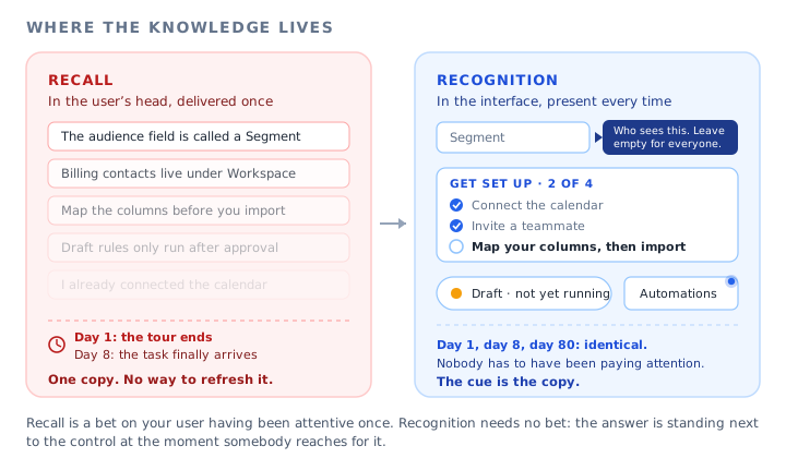
A support conversation that happens in every SaaS company. A customer asks where to change who receives a notification. The answer is a screen they have already seen. They saw it in their first session, in a guided walkthrough they completed, on a step that was measured as viewed and passed. Three weeks later, the screen might as well not exist.
The usual reading of this is that the user did not pay attention, or that the tour was too long, or that people do not read. None of those explain it. The information was delivered correctly. It was simply delivered on the only day in that person's entire relationship with your product when they had no reason to need it, and then it was taken off the screen.
There is a word for what you asked them to do in the weeks that followed, and it comes from a distinction psychologists have drawn for over a century between two different kinds of remembering. You asked for recall. You could have designed for recognition. The gap between those two words is the difference between onboarding that holds and onboarding that evaporates, and it decides what you build rather than merely how you word it.
This guide covers what recognition over recall means, how the two differ in ways that matter to a product team, why a tour is structurally the most recall-dependent format you can ship, the six categories of thing products routinely ask users to remember, the four places that knowledge can live, eight recognition patterns that work in real interfaces, a memory audit you can run on a single task this week, the cases where recall is genuinely the better trade, and what to measure so you can tell a delivery problem from a memory problem.
Key takeaways
- Recognition is judging something familiar when you can see it. Recall is producing it from memory with nothing on the screen to help. Interfaces can demand either, and most demand far more recall than their designers realise.
- Onboarding is a bet on memory. You deliver the knowledge on day one and the user needs it on day eight, in a different mood, on a different screen, with nothing left on the page.
- A product tour is the most recall-dependent format there is, because it shows several things and then removes all of them. That is fine as orientation and fatal as the only copy.
- Products ask users to remember six kinds of thing: names, locations, sequences, values, state and rules. Sorting a task by those six is the fastest way to find your memory debt.
- A recall failure produces nothing: no click, no event, no complaint. It is invisible in a funnel, which is why it survives for years while teams keep rewriting the tour.
- Recognition is not always right. Expert speed, high-frequency work and destructive actions are three places where a deliberate act of retrieval is the better design.
What Recognition Over Recall Means (Meaning and Definition)
Recognition and recall are two different ways of getting at something you have learned. Recognition is the easy one. Something appears in front of you and you judge whether it is familiar and whether it is what you want. You do this without effort dozens of times a minute: scanning a menu, picking a file out of a list, spotting the right icon in a toolbar. Recall is the hard one. Nothing is in front of you, and you have to produce the answer yourself out of memory.
Recognition: definition
Recognition is identifying something as familiar when it is present on the screen. The interface supplies the cue and the user only has to judge it. Choosing from a visible list of segments, recognising a status colour, or noticing that a marker has appeared on a menu item are all recognition.
Recall: definition
Recall is retrieving something from memory with no cue on the screen. The interface supplies nothing and the user has to produce the answer. Remembering what a setting is called, which menu it lives under, what order the steps go in, or what you were told about a feature during onboarding are all recall.
Recognition over recall: definition
Recognition over recall is the design principle that an interface should make the things a user needs visible and selectable rather than requiring them to be remembered. It appears in Jakob Nielsen's widely used usability heuristics as minimising the user's memory load by making objects, actions and options visible. For a product team the operative version is blunter: any knowledge your product depends on and does not display is knowledge you have stored in one unreliable place.
The psychology behind the asymmetry is not controversial. Recognition is easier than recall because the cue does most of the work: you are matching against something present rather than searching an unstructured memory with no starting point. This is why almost everyone can pick a familiar face out of a crowd and almost nobody can describe that face accurately from memory, and why you can recognise the name of a setting instantly when you see it in a list and draw a blank when asked to type it.
The sentence worth writing on a whiteboard: every time your interface demands recall, the product is relying on something you shipped once and can never refresh. Every time it supports recognition, the product is relying on something that is on screen right now.
It is worth separating this from two neighbouring ideas that get blurred into it. It is not the same as cognitive load, which is about how much a person has to handle in one moment. Load is reduced by showing less; recall is reduced by showing more, later, in the right place. The two can point in opposite directions, and a first session that has been stripped to four essential steps can be beautifully load-managed and still leave everything it removed running entirely on memory. It is also not the same as mental models, which is about whether the user understood your product correctly in the first place. Recall assumes they understood and asks whether they can still produce it. Those are different failures with different fixes, and confusing them is how a team ends up explaining a concept again to someone whose only problem was that they could not remember the name of a button.
Recognition vs Recall: The Difference That Changes What You Build
The reason this distinction earns its place in a product conversation is that the two failures look nothing alike, arrive through different channels, and respond to opposite fixes. Teams that only have one word for both spend their effort on whichever one is louder, which is always the wrong one.
| Recognition | Recall | |
|---|---|---|
| What the user does | Judges something present on the screen | Produces something from memory |
| What the interface gives them | A cue: a label, a list, a marker, a state | Nothing. A blank field, an empty screen, a menu with no hint |
| Typical example | Picking the right template out of six shown | Typing the name of the template you used last quarter |
| How it fails | The user picks the wrong thing, then corrects | The user does nothing at all, or leaves and asks somebody |
| What you see in your data | Wrong option chosen, quick reversal, an extra event | No event. A silent gap that looks like disinterest |
| Where it surfaces | Session replays, error rates, support tickets about mistakes | Where do I find messages, repeat help-article views, nothing |
| The fix | Better labels, clearer grouping, fewer near-identical options | Put the answer back on the screen, at the element, permanently |
| Who usually owns it | Design and content | Nobody, which is why it persists |
Read the fifth row again, because it is the whole problem. A recognition failure generates evidence. The user clicks something, regrets it, clicks something else, and your analytics records all three moves. A recall failure generates an absence. There is no event for a person who could not remember where a feature was and therefore never went there. Our guide to the gulf of execution and the gulf of evaluation makes a related point about missing versus extra events; the version that matters here is that memory debt is paid in silence, and silence does not get prioritised.
Onboarding Is a Recall Bet, and the Odds Are Bad
Here is the structural problem with the way most SaaS products teach. Onboarding is concentrated in the first session. The tasks it prepares people for are spread across the following months. So you are delivering information at the single moment of lowest possible relevance and asking it to survive until relevance arrives.
Worse, the first session is the moment when a new user has the least to attach the information to. They do not yet know your nouns, they have no projects, no data, no colleagues in the account, no reason to care about the difference between a draft and a scheduled item. Memory works by association, and there is nothing yet to associate with. This is a real part of why a well-designed walkthrough can be viewed attentively and retained almost not at all.
Onboarding is delivered at one point in time. The needs it was meant to serve are spread across months. Whatever you left on the screen is what serves them.
Now look at formats through this lens, because it reorders them. A product walkthrough is the most recall-dependent thing you can ship: it presents a sequence of things and then takes every one of them away. A tooltip anchored to a field is much less dependent, because it returns whenever somebody arrives at that field. An onboarding checklist that stays reachable is barely dependent at all, because it holds both the sequence and the completion state outside the user's head. And a well-labelled interface with good empty states is not dependent on memory in any interesting way, because the instruction is the screen.
The trap: a tour's own numbers look healthy while this is happening. Completion rate is a delivery metric. It tells you the information left your product and says nothing about whether it arrived anywhere durable. A flow at ninety percent completion and a feature at four percent adoption is not a contradiction, it is the expected result of shipping one copy of the instructions and deleting it.
This is a different argument from the one in our guide to the paradox of the active user, which is about the users who skip your onboarding because they would rather start doing. This is about the ones who did not skip. They watched, they understood at the time, and eight days later they are in exactly the same position as the skippers. It is also distinct from the problem covered in our guide to re-onboarding returning users, which deals with the specific case of a long absence: recall debt does not need an absence at all, it accrues in users who are logging in every single day.
The Six Things You Ask Users to Remember
Memory load in software is not one undifferentiated thing. Sort any task by what it demands and you get six categories, each with a different and mostly inexpensive recognition fix. This is the part of this guide that turns into work you can schedule.
The user knows what they want and not what you named it. They are looking for audience and you call it segment, for folder and you call it workspace. Every piece of your vocabulary is a recall demand, and the ones you invented are the heaviest. Fix: put the user's word next to yours once, in the interface, where the object lives. Our guide to UX microcopy covers the wording itself.
They remember that the product can do the thing and not where. This is the most common single cause of a where do I find ticket, and it gets worse with every navigation change you ship. Fix: a marker on the entry point, search that accepts the user's word as well as yours, and a path shown from the screen where the need arises rather than from your home page.
Map the columns before importing. Verify the domain before sending. Publish before sharing. Order dependencies are invisible in an interface that presents all the doors at once, and users discover them by failing. Fix: show the sequence as a list with state, or disable later steps and say in one line what unlocks them.
A reference number, a code, a setting copied from another screen or another system. The user holds it in working memory while they navigate, and working memory is where information goes to be lost. Fix: echo values you already know, allow selection instead of typing, and never make somebody leave a form to fetch something you could have shown beside the field.
Did I finish setting this up? Did that send? Is this live or still a draft? Users who cannot tell will either redo the work or avoid it, and both are expensive. Fix: persistent completion state, unambiguous status on the object itself, and an onboarding progress indicator for anything multi-session.
Who can see this. Whether the change is retroactive. Whether the action can be undone. Rules are usually explained during onboarding and then enforced silently forever, which is the worst possible combination. Fix: state the consequence beside the control that causes it, at the moment of the decision, in one sentence.
Two useful properties of this list. First, the categories are independent, so a single task can be heavy on one and clean on the rest: a data import is usually a sequence and values problem with no name problem at all. Second, the fixes barely overlap, which means a team that has diagnosed a task by category knows which of six quite different things to build, instead of defaulting to another tour because a tour is the only tool that feels like teaching.
Where the Knowledge Can Live
Once you accept that knowledge has to be somewhere, the design question becomes a placement question. There are four places, and they differ enormously in how likely they are to be available at the moment somebody needs them and how much it costs to put something there.
The user's memory is the only free option and the least reliable one. The guidance layer is the only one that is both cheap and present at the moment of need.
The top-right option is the real answer and it is the slowest. Renaming a confusing object, adding a status badge that does not exist, or rebuilding an empty state all mean product work, a design review and a place in a roadmap, and they should all happen. The bottom-left option is what you are using today whether you chose it or not, because anything the product does not display is being stored in somebody's head for free.
The one in the bottom right is the interesting one, and it is the one most teams underuse. A guidance layer sitting on top of your existing interface can put a sentence on the field that confuses people, a marker on the menu item nobody opens, and a list that remembers where somebody stopped, without changing the underlying product at all. It does not remove the need for the top-right fix. It removes the need to wait for it. Our guide to contextual help covers the pattern library in more detail, and the knowledge base guide covers what genuinely belongs in the middle option instead.
Eight Recognition Patterns That Work in SaaS
These are concrete moves, ordered roughly from cheapest to most involved. Each one takes a specific demand out of memory, so the useful question for each is not whether it looks nice but what it removes.
1. Put the explanation on the field, not above the form
A paragraph at the top of a form is read once and then scrolled past. A short line attached to the control it describes is there every time somebody reaches that control, including the fifth time, when they have forgotten the paragraph entirely. This is the single highest-yield swap in most products, and it applies to the two or three fields that generate questions rather than to all of them. Our guide to tooltips covers where the line belongs.
Removes from memory: names and rules.
2. Mark the entry point instead of describing the path
Telling someone that reports live under the analytics menu is a location demand you have created and will have to keep paying. Putting a small marker on the menu item is the same information delivered as a cue. Markers also survive navigation changes far better than written instructions, which quietly go wrong the moment you move anything. Our guide to hotspots covers the restraint this needs, and feature discovery covers findability more broadly.
Removes from memory: locations.
3. Show the sequence and hold the state outside the head
A list of the steps in a setup, with the finished ones visibly finished, is the cheapest way to stop asking people to remember where they got to. It works across sessions, across devices in the sense that matters to the user, and across the three-week gap that ends most setups. It is also the only pattern that carries two of the six demands at once, which is why it consistently outperforms its reputation.
Removes from memory: sequences and state.
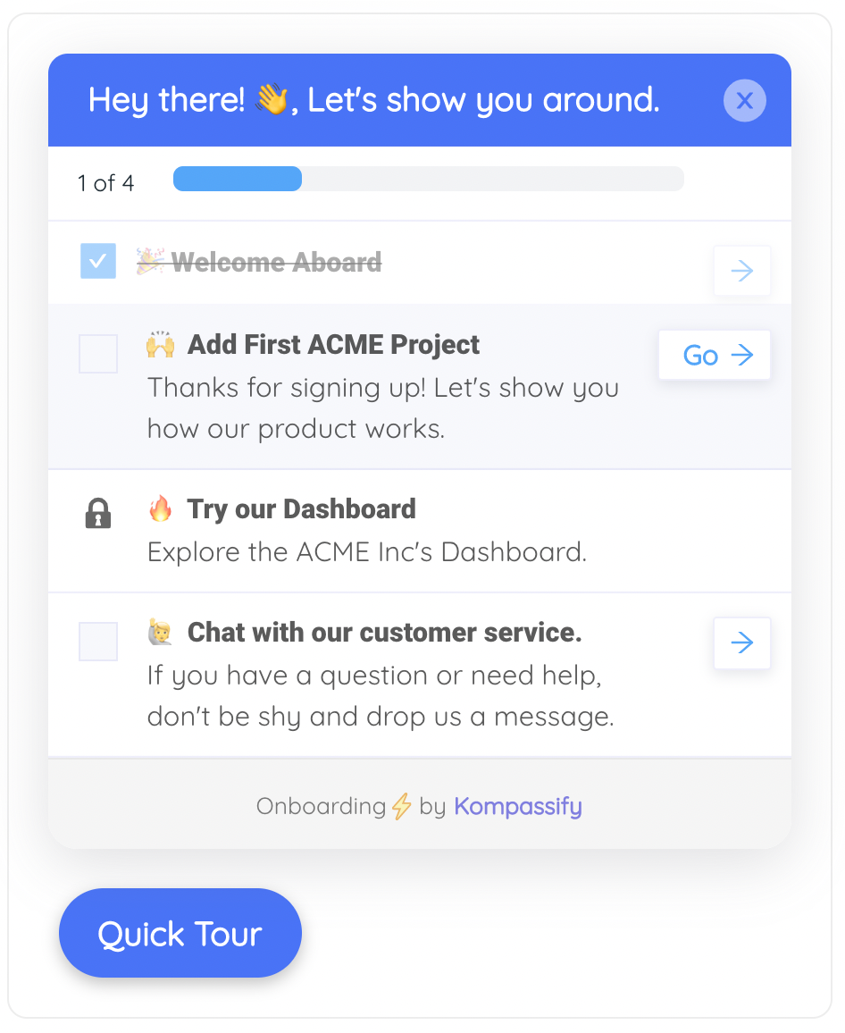
A checklist is a recognition device before it is a motivation device: it holds the order of the steps and the record of what is done, so neither has to be remembered.
4. Offer selection where you currently expect typing
Any blank input is a recall demand by construction. A search field that only matches your own vocabulary is a recall demand twice over. Wherever the set of valid answers is known and small enough, show it: recent items, suggested values, the five templates rather than a name to type. Where the set is large, make the search forgiving enough that the user's word finds your object.
Removes from memory: names and values.
5. Make status say what it means on the object itself
Draft, scheduled, paused and live are the kind of distinction a team explains once and then relies on forever. If the difference is carried by a colour alone, or by the absence of a badge, users will reconstruct it from memory and get it wrong. One word on the object removes an entire class of ticket, and the pattern extends to anything asynchronous: work that finished after the user left needs to say so somewhere they will return to.
Removes from memory: state and rules.
6. Name the consequence next to the control that causes it
The rules people most need at the moment of a decision are the ones about scope and reversibility: how many records this touches, whether it applies retroactively, who will be able to see it, whether it can be undone. These almost always exist somewhere in your documentation and almost never exist beside the button. One sentence, at the point of commitment, is worth several paragraphs anywhere else.
Removes from memory: rules.
7. Use the empty state as the instruction
An empty screen is the most attentive moment a user will ever give you, because there is nothing else on it. A blank table that names what goes there, why it matters and the one action that starts it is permanent onboarding that nobody has to have been present for. Our guide to empty states covers the shape of a good one, and the discipline is to write them for the person arriving in month four, not month zero.
Removes from memory: sequences and locations.
8. Re-arm the cue at the moment of need, not at signup
Some knowledge genuinely only matters occasionally: the quarter-end export, the annual renewal screen, the feature that only applies once a team reaches a certain size. Teaching those during onboarding is guaranteed waste. Attaching them to the conditions that make them relevant, so they appear when somebody lands on that screen or crosses that threshold, converts a recall demand into a recognition one. Our guides to onboarding triggers and the five moments of need cover the timing and the moment model behind this.
Removes from memory: all six, for the occasional task.
Notice what is not on this list: a longer tour, a better tour, or a second tour. Every pattern here leaves something behind. That is the entire selection criterion.
How to Run a Memory Audit on One Task
This is deliberately small. Pick one task that matters commercially and that your data says people struggle with, and audit that one thing properly rather than surveying your whole product. A single task takes an afternoon and usually produces four or five changes you can ship the same week.
- Choose the task and write down the outcome, not the screens.
- Walk it as a competent stranger and log every micro-step.
- Tag each step with the demand it makes: name, location, sequence, value, state or rule.
- Ask where that demand was first answered, and whether the answer is still on screen.
- Pick the cheapest surface that can hold each orphaned answer.
- Ship the cues, then re-check second-attempt behaviour rather than completion.
1. Choose the task and write the outcome
Write it the way the customer would: send the first invoice reminder, publish a report a colleague can read, get data in from the old system. Not open the settings page. Framing by outcome keeps the audit honest, because a screen-based framing will quietly exclude the two steps where people actually get lost, which are usually before and after the screen you were thinking of.
2. Walk it as a competent stranger
Do the task yourself in a fresh account, and write down every decision point, including the ones you pass through automatically. This is where the learnability of your product stops being abstract. Your own fluency is the main obstacle here: you will skip three steps without noticing because you know the answers. Watching one real user do it, or a session replay of somebody failing it, is worth more than a careful solo walkthrough.
3. Tag each step with its demand
Go through the log and put one of the six labels against every step: name, location, sequence, value, state or rule. Some steps carry two. The tally is the finding. A task that turns out to be eleven steps with seven location demands has a navigation and marking problem, and no amount of better explanation will help it. A task with five value demands has a form problem and needs echoing and selection, not teaching.
4. Ask where each answer currently lives
For every demand, find where the user was supposed to learn it, then check whether that source is still visible at the moment of the step. A tour step from day one is not visible. A help article is visible only to somebody already searching. A label on the control is visible. Anything with no visible source is running on memory, and those are your candidates, in order of how often the step occurs.
5. Pick the cheapest surface that can hold it
Work down from the interface itself to the guidance layer. If a label change fixes it and a label change is realistic this quarter, do the label change. If it needs a status badge that does not exist, put a guidance cue on the element now and file the badge. The order matters, because a cue explaining a badly named control is a permanent tax, and our UX debt guide covers what happens when those accumulate unexamined.
6. Ship, then measure the second attempt
The metric that moves when you have converted a recall demand into a recognition one is not first-time completion. It is what happens on the second and third occurrence: fewer help views, less time, fewer where do I find messages, and a smaller gap between first use and next use. Measuring completion again will tell you nothing, because completion was never the part that was broken.
When Recall Is the Right Bet
Treated as an absolute, this principle produces cluttered, patronising products where every control carries an explanation and expert users are slowed to the speed of a first-timer. There are three situations where asking for recall is the better design, and they are worth stating plainly so the principle stays usable.
| Case | Why recall wins | What to do instead of removing it |
|---|---|---|
| Expert speed | A remembered command or shortcut is far faster than navigating a visible menu, and the people using it have already paid the learning cost willingly. | Keep both paths. Show the shortcut beside the menu item so the recall path is learnable by recognition. |
| High frequency | Something done thirty times a day should not keep spending screen space on an explanation. The cue becomes noise, and noise stops being read at all. | Let cues retire. Fade the explanation after a few successful uses rather than showing it forever. |
| Destructive actions | A small deliberate act of retrieval, such as typing the name of the thing being deleted, is friction that exists to stop an accident. | Keep the friction and remove the ambiguity. Name exactly what will be destroyed, then ask for the deliberate act. |
The retirement point in the second row is where most implementations go wrong in the other direction. A cue that was helpful on attempt one becomes wallpaper by attempt ten, and wallpaper is not neutral: it trains people to ignore the surface you will need later for something important. Our guide to banner blindness covers how quickly that happens, and progressive disclosure covers deciding what to show at all. The honest summary is that recognition support should be generous for rare tasks and quietly disappear for frequent ones, which is a rule about frequency rather than about the user.
Designing for Recognition With Kompassify
Most of the cheap moves in this guide are cues placed on elements of an interface you are not otherwise changing, which is exactly what a no-code guidance layer is for. Kompassify is built for that placement work, and every pattern below maps to one of the six demands rather than to a format for its own sake.
- Tooltips on the two or three fields that generate questions, built by selecting the element rather than by writing anything, so the sentence that answers a name or a rule demand is present on every visit rather than in a paragraph somebody scrolled past in week one.
- Hotspots on the entry points people miss, which is the location demand handled as a cue instead of as an instruction, and which keeps working when the copy in your help centre has gone stale.
- Onboarding checklists and multi-checklists that hold the sequence and the completion state outside the user's head. A checklist item can open a new tab, redirect to the right page or start a tour, so the list stays the one place somebody returns to rather than a decoration.
- An onboarding progress bar for setups that span sessions, so nobody has to remember how far they got.
- The announcements widget, a bell and a what is new panel, for reporting back on things that changed or finished while the user was away, and it can launch a tour or collect feedback from the announcement itself.
- Product tours where a step waits for the user's real click, using the step transition setting, so the sequence is performed rather than watched. A performed step attaches to the task and survives better than a viewed one, though it is still no substitute for leaving a cue behind.
- Segment and page targeting, so an occasional-task cue appears on the screen and for the people it applies to rather than during signup for everybody.
- No-code product analytics, with feature usage, user flow and activation reports plus per-step tour analytics, which is how you tell a delivery problem from a memory problem.
It installs with a single script, needs no engineering time for any of the above, is free up to 100 monthly active users with plans from $129/month, and is GDPR-compliant and EU-hosted. One caveat worth stating: a guidance layer cannot invent a status badge your product does not have, so the state demands in the list above are partly product work. What it can do is carry the cue today and tell you which ones are worth the roadmap slot. Our guide to why product tours break covers keeping any of this anchored as the interface changes underneath it.
Put the answer where the question gets asked
Attach a sentence to the field that confuses people, mark the capability nobody finds, and keep a checklist that remembers where each user stopped. No code required. Free up to 100 monthly active users, plans from $129/month, GDPR-compliant and EU-hosted.
Start for free →What to Measure
There is no single recall metric, which is part of why this problem hides. What you can do is watch for the fingerprint of knowledge that was delivered and did not stay. Each row below is a signal that says the user knew this once.
| Signal | What it tells you | What to do about it |
|---|---|---|
| Gap between first use and second use | The feature was reachable with help and not reachable without it. | Leave a cue on the entry point. This is a location demand. |
| Repeat views of the same help article by the same account | The answer is correct and lives in the wrong place. | Move the one sentence that matters onto the screen it describes. |
| In-product searches using your onboarding vocabulary | Your word was learned and your navigation does not accept it. | Fix the label, or make search match both words. |
| Time on task rising on attempt two or three | Nothing was retained between attempts. A healthy curve falls. | Audit that task by the six demands. |
| Where do I find tickets, counted separately | The purest recall signal you have, and usually untagged. | Tag them, rank by frequency, place a cue for the top five. |
| Setups abandoned mid-sequence and never resumed | Sequence and state were both held in memory and both lost. | A persistent checklist with visible progress. |
| High tour completion with flat feature usage | Delivery worked and retention did not. This is the headline case. | Keep the tour, add cues that stay on the elements it covered. |
| Work redone rather than resumed | Users cannot tell what they already did. | Status on the object, and completion state that persists. |
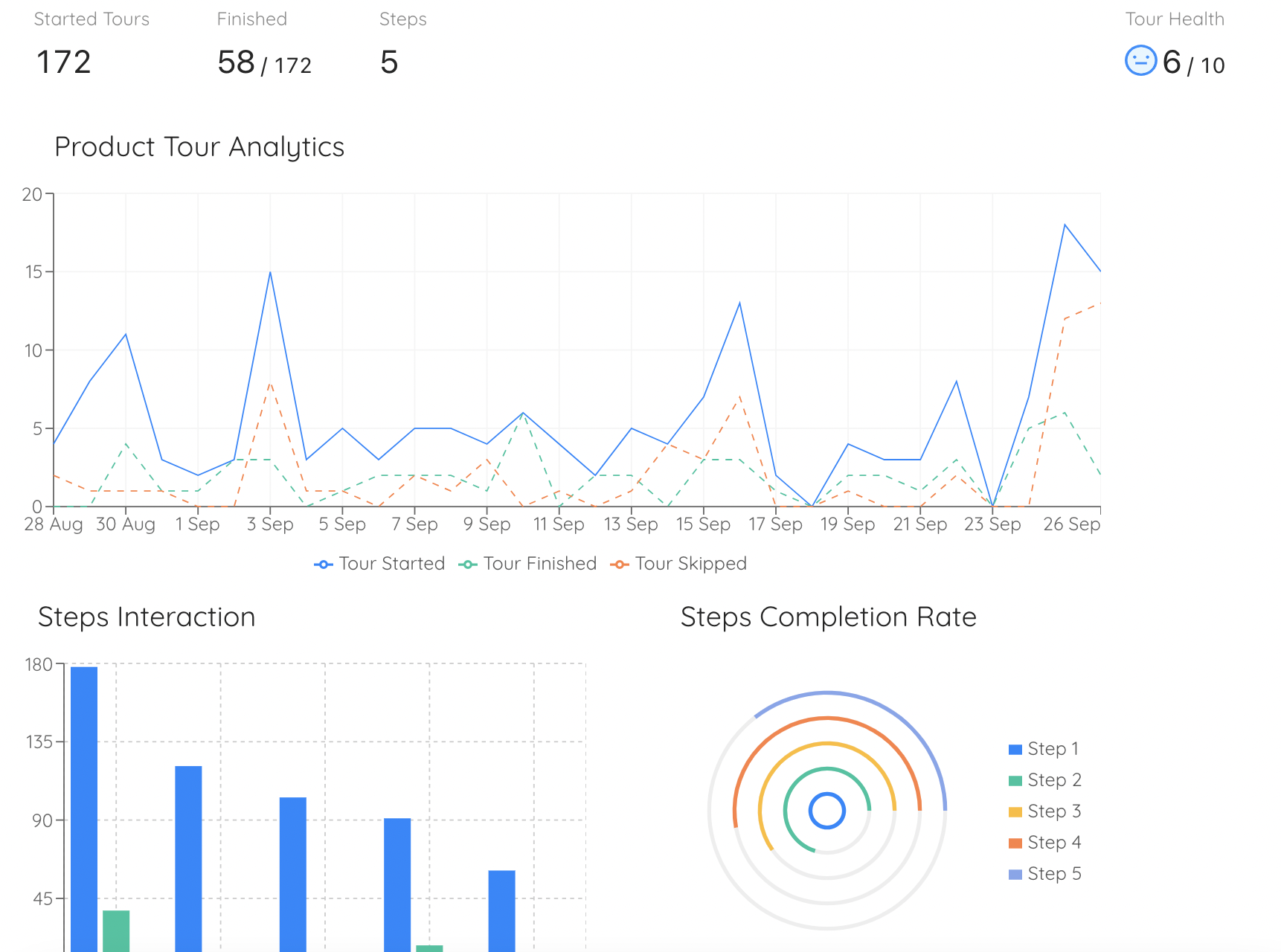
Per-step tour analytics answers the delivery question. Pair it with feature usage over the following weeks, because that is where a recall problem shows up and a completion rate never will.
Most of these need only ordinary event data with a timestamp and an account, which our guides to event tracking and behavioural analytics cover setting up without a data team. The one that costs nothing at all is tagging support conversations by question shape, and it is usually the fastest route to your top five cues. For the wider measurement picture, our user onboarding metrics guide covers how these sit alongside activation and time to value.
Recognition Over Recall: Do vs. Don’t
✅ Do
- Ask of every onboarding step what will be left on the screen afterwards.
- Tag one important task by the six demands before designing anything.
- Put the sentence on the field rather than above the form.
- Hold sequence and completion state in a list the user can return to.
- Count where do I find tickets separately from how does this work tickets.
- Write empty states for the person arriving in month four.
- Attach occasional-task cues to the moment, not to signup.
- Let cues retire once somebody has succeeded a few times.
❌ Don’t
- Answer a forgetting problem with a longer or better tour.
- Read a high completion rate as evidence that anything was retained.
- Explain a rule during onboarding and then enforce it silently forever.
- Make people carry an identifier across screens you control.
- Use a colour as the only carrier of a status distinction.
- Put a cue on every control and call it helpfulness.
- Assume a documented answer is an available answer.
- Treat silence in your funnel as evidence that nobody wanted the feature.
The One-Paragraph Version
Recognition is judging something familiar that is in front of you; recall is producing it from memory with nothing on the screen to help. Onboarding is almost entirely a recall bet: you deliver the knowledge in the first session, when the user has no task and nothing to attach it to, and the task arrives days or weeks later on a screen that says nothing. That is why a walkthrough can be completed attentively and change nothing, and why the failure is invisible in your reports, because a user who cannot remember where something lives produces no event at all. Sort any task by the six things products ask people to remember, which are names, locations, sequences, values, state and rules, then find where each answer was supposed to be learned and whether it is still visible at the moment of the step. Move the orphaned answers to the cheapest surface that can hold them: the interface itself where you can change it, a cue on the element where you cannot yet. Keep recall where it earns its place, for expert speed, for work done thirty times a day, and for actions that should be hard to do by accident. And stop measuring completion, which was never the broken part, and start measuring what happens on the second attempt.
Frequently Asked Questions
What does recognition over recall mean?
Recognition over recall means designing an interface so that people can recognise what they need when they see it, instead of having to retrieve it from memory. Recognition is the easier of the two: you see a label, an icon or a list of options and you know which one you want. Recall means the interface gives you nothing and you have to produce the answer yourself, such as remembering what a setting is called, where it lives or which step comes next. It is one of Jakob Nielsen's usability heuristics, and for a product team the practical version is simple: every time your interface demands recall, you are relying on something you shipped once and cannot refresh.
What is the difference between recognition and recall?
Recognition is judging something familiar when it is in front of you. Recall is producing it from memory with no cue on the screen. Picking the right option out of a visible list is recognition. Typing the name of a setting you were shown last week into a search box is recall. The difference matters for product teams because the two fail differently: a recognition failure shows up as the wrong option chosen, which is a labelling problem, while a recall failure shows up as nothing happening at all, which looks like disinterest in your reports and almost never gets diagnosed.
Why do users forget product onboarding?
Because of when it happens rather than how good it is. Onboarding is usually delivered in the first session, when the user has no task, no context and nothing to attach the information to. The task that needed the information arrives days or weeks later, in a different mood, often on a different screen. Memory for something you were told once, out of context, and have not used since is poor, and no amount of polish on the tour changes that. The fix is not a better tour but a second copy of the knowledge left in the interface where the task happens.
Is a product tour bad for user onboarding?
A tour is not bad, it is just the most recall-dependent format there is, so it should never be the only copy. A tour shows a user several things and then removes all of them, which means every piece of it now lives in one place: their memory. Used well, a tour orients someone quickly, sets expectations and shows a shape. Used as the whole onboarding programme, it produces the pattern most teams recognise: a healthy completion rate and flat feature usage. Pair it with cues that stay, such as tooltips on the fields that raised questions, a checklist that remains reachable and markers on the capabilities people miss.
What are the six things products ask users to remember?
Names, locations, sequences, values, state and rules. Names are what you call things, which is where your vocabulary and the user's diverge. Locations are where a capability lives in your navigation. Sequences are what has to happen before what. Values are identifiers, codes and settings the user has to carry from somewhere else. State is what they have already done and what is still outstanding. Rules are what is allowed and what an action will do. Sorting a task by these six categories is the fastest way to see which parts of your product are running on memory, because each category has a different and mostly cheap recognition fix.
How do you reduce memory load in a user interface?
Move each demand out of the user's head and into the nearest surface. Show options rather than expecting typed input. Keep the instruction beside the field it describes instead of in a paragraph above the form. Display progress and completion so nobody has to remember where they stopped. Echo values you already know rather than asking the user to fetch them. Name the consequence next to the button that causes it. Where the interface itself cannot be changed quickly, a guidance layer can carry the same cue on the same element, which is usually the difference between a fix this quarter and a fix next year.
Is recognition always better than recall?
No, and treating it as an absolute produces cluttered products. Recall is the right trade in three situations: for expert speed, where a typed command or keyboard shortcut beats hunting through visible menus; for frequency, where something done twenty times a day should not keep spending screen space on an explanation; and for safety, where a small deliberate act of retrieval, such as typing a name to confirm a deletion, is what stops an accident. The rule is not to remove all recall but to stop demanding it for things people do rarely, do under pressure, or were told about once during onboarding.
How is recognition over recall different from reducing cognitive load?
Cognitive load is about how much a user has to handle at one moment, so the fix is usually to show less. Recognition over recall is about where knowledge lives over time, and the fix is often to show more, just later and in the right place. The two can pull in opposite directions, which is why they are worth keeping separate: stripping a first session down to the essentials is good load management and does nothing about recall, because whatever you removed still has to be findable on the day it is needed.
How do I measure whether my product depends on recall?
Look for the fingerprint of forgotten knowledge rather than a single metric. The clearest signals are a gap between first use and second use of a feature, repeat visits to the same help article by the same accounts, search queries inside your product that use your own onboarding vocabulary, a rise in time on task on the second or third attempt rather than a fall, and support questions phrased as where do I find. Each of those says the knowledge was delivered and did not stay. Pair them with per-step tour completion so you can tell a delivery problem from a retention problem.