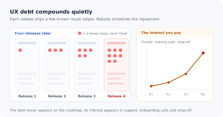
The billing settings page has a field labelled Account ID. It does not want the account ID. It wants the ID from the customer’s payment provider, which is a different number in a different format, and everyone on the team has known this since the page shipped. It was going to be renamed in the next release. It is now eleven releases later.
Nobody thinks of that label as a problem, because nobody owns it. Support has a saved reply for it. The onboarding team mentions it on every kick-off call. A share of new accounts enter the wrong number, fail their first sync, and quietly assume the integration is broken. None of these costs appear anywhere near the roadmap, which is where the decision to fix the label would be made.
That is UX debt: not a design flaw nobody noticed, but a known one that was never paid back, whose cost has moved into other people’s working days. This guide covers what UX debt is and how it differs from technical debt, how it accumulates, where it shows up in your data, how to build an inventory, how to decide what to fix now and what to bridge, and how to stop it growing back.
Key Takeaways
- UX debt is known and unpaid. It is the usability shortcut that shipped on purpose, or the problem everyone mentions, that nobody ever scheduled.
- The interest is paid by other teams. Support tickets, onboarding calls, training time and early drop-off are where UX debt becomes visible.
- Write each item as a user problem with evidence. An inventory of design opinions loses every roadmap argument; an inventory of costs does not.
- Rank by cost to users against effort to fix. The expensive quadrant, high cost and high effort, is where most of the damage sits.
- Bridge what you cannot fix yet, and set a removal date. In-app guidance lowers the interest immediately, but it is a bridge, not a repayment.
What UX Debt Is
UX debt, in one paragraph
UX debt (user experience debt) is the accumulated backlog of known usability problems in a product: confusing labels, inconsistent patterns, workflows with unnecessary steps, features placed where nobody finds them, errors that do not explain themselves. Each item was either a deliberate shortcut taken to ship, or a problem discovered after release and never prioritised. Like financial debt it accrues interest, and the interest is paid continuously, by users in time and mistakes, and by the company in support load, training effort and lost activation.
The metaphor is borrowed from technical debt, and the comparison is useful precisely where the two differ.
| Technical debt | UX debt | |
|---|---|---|
| Where it lives | The codebase and architecture | The interface, flows, copy and structure |
| Who pays the interest | Engineers, in slower and riskier changes | Users, support, onboarding and success teams |
| Who notices first | The team building the product | The team explaining the product |
| How it shows up | Velocity, incidents, fragile releases | Repeated questions, drop-off, workarounds |
| Why it survives | Invisible to customers until something breaks | Invisible to the roadmap because nobody owns it |
The last row is the important one. Technical debt at least has natural advocates, because the people who suffer from it are the people who decide what to build. UX debt is suffered by people who are rarely in the room when priorities are set, which is why a product can carry the same misleading label for two years while everyone who has to explain it is exasperated.
You will also hear design debt. Teams that separate the terms usually mean visual and component inconsistency by design debt (five button styles, three date pickers) and use UX debt for the broader set that includes flows, wording and missing guidance. In B2B products the second group is where most of the cost sits.
How UX Debt Accumulates
UX debt is not a sign of a careless team. It is the normal residue of shipping, and it builds from a small number of predictable sources.
1. The first version that became the only version
A feature ships in its simplest workable form with the intention of returning to it. The team moves on, the feature gains users, and the simple version becomes load-bearing. This is the largest single source of UX debt in fast-moving products, and it is created knowingly, which is also why it is the easiest to record at the moment it happens.
2. Features added where there was space
Settings pages, overflow menus and admin areas absorb every new capability that did not have an obvious home. Each addition is reasonable. Together they produce a product where finding anything requires already knowing where it is, which is the same mechanism described in our guide to feature bloat, seen from the navigation rather than from usage.
3. Several teams, several patterns
Once more than one squad builds the interface, the same task starts to work differently in different places: saving is automatic here and manual there, filters apply instantly on one screen and on submit on the next. Users build a mental model on the first screen and the product contradicts it on the second.
4. Copy written at the last minute
Labels, empty states and error messages written by whoever implemented the screen, in the vocabulary of the database rather than of the user. The Account ID field above is this kind of debt. It is cheap to fix and survives for years because a wording change never feels urgent enough to schedule.
5. The product outgrew its assumptions
A flow designed for a solo user now serves a twenty-person team with permissions. A dashboard designed for ten records now shows ten thousand. Nothing is broken, but the design no longer fits the customer it serves, and the gap grows with every larger account.
6. Workarounds that became the workflow
When a flow is awkward, customers invent a workaround and support starts recommending it. After a while the workaround is documented, taught in onboarding and assumed by power users, so fixing the original problem now also means changing a habit.
Where UX Debt Shows Up in Your Data
UX debt is hard to see in a design review and easy to see in operational data, as long as you look at the data per screen and per flow rather than per account.
| Signal | What it usually means | Where to look |
|---|---|---|
| The same how-do-I question every week | A task that cannot be discovered or understood from the screen | Support tags, saved replies, chat transcripts |
| A step where many users stop | A confusing field, a missing default, an unclear next action | Step-level funnel and flow analytics |
| Repeated clicks on something that is not clickable | A visual pattern that promises an interaction it does not have | Session replay, heatmaps |
| The same explanation on every onboarding call | Something the product should say for itself | Onboarding and CS call notes |
| A requested feature that already exists | A discoverability problem, not a missing feature | Feature request log, sales call notes |
| A spreadsheet customers keep beside the product | A workflow the product makes harder than it should be | Customer interviews, screen shares |
The fifth row deserves a second look. A feature request for something you already have is one of the cleanest signals of UX debt available, because the demand is proven and the capability is built: the only thing missing is the user finding it.
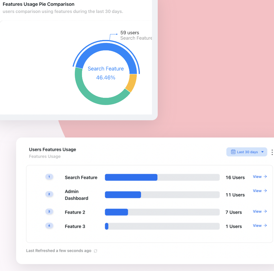
Usage per feature over 30 days: a capability with real demand and almost no users is usually a discoverability debt, not a missing feature.
How to Build a UX Debt Inventory
Most teams already have their UX debt recorded, scattered across a design file of ideas, a support macro library, a few old tickets and the memory of whoever has been there longest. An inventory brings it into one place in a form that can be ranked.
1. Collect from the teams that pay the interest
Ask support for their top recurring questions by screen, onboarding for the explanations they repeat, sales for the objections that are really usability issues, and design for the shortcuts they know shipped. Add your own analytics: the steps with the worst drop-off in the flows that matter most.
2. Write every item as a user problem
Not the settings page is messy, but admins cannot find where to add a second payment method, and ask support about it. The user-problem form forces a location, an audience and an observable consequence, and it prevents the inventory from becoming a list of aesthetic preferences that engineering can reasonably ignore.
3. Attach evidence
Link each item to at least one signal from the table above: a ticket count, a drop-off figure, a number of calls, a quote. Items with no evidence are not deleted, but they rank below items with evidence until someone finds some.
4. Estimate the fix, roughly
A t-shirt size is enough: copy change, small interface change, flow redesign, structural change. Precision is not the point; separating the label fixes from the rebuilds is.
5. Give the inventory an owner
Usually a product manager or product designer, with a standing review. An unowned inventory decays back into the scattered state within a quarter, because each new item has nowhere to go.
Record it when you create it. The cheapest moment to log UX debt is the planning meeting where the team agrees to ship the simpler version. One line in the inventory at that point saves months of rediscovery through complaints later.
Prioritising UX Debt: Cost Against Effort
Once each item has evidence and a rough size, the question becomes which to do first. The useful measure of cost has three parts: how often users hit the problem, how badly it hurts when they do, and how many users it reaches. A confusing field that every new account meets during setup outranks an awkward report used monthly by a handful of administrators, even if the report looks worse.
The top-right quadrant is where debt does the most damage and waits the longest, because it is too big to fix in passing.
Fix now is the obvious quadrant and still routinely neglected, because each item looks too small to justify attention. Batch them into a single release and they become worth announcing.
Bridge, then schedule is where most of the cost sits: problems that hurt many users but need a real redesign. These are the items that have been going to be fixed next quarter for a year. They need two actions at once: a dated place on the roadmap, and something that lowers the cost for users in the meantime.
Batch and accept are both legitimate outcomes. Accepting a debt item is not failure, as long as it is written down, explained in the help centre and revisited when that part of the product is rebuilt anyway.
Getting UX debt onto the roadmap
UX debt loses roadmap arguments when it is presented as quality and wins when it is presented as outcomes. Frame each high-cost item the way a feature would be framed: which users it affects, which metric it moves (activation, support volume, time to value, adoption of a specific feature) and what the evidence is. Many teams also reserve a fixed share of every cycle for debt, which removes the need to win the argument item by item. If you use a scoring model for features, score debt items with the same model, as described in our guide to feature prioritization; debt with strong evidence tends to score well against speculative features.
Bridging the Debt You Cannot Fix This Quarter
For items in the expensive quadrant, the realistic choice is not between fixing and not fixing. It is between users paying the full interest until the redesign ships, and users paying a reduced interest because the product explains itself at the exact point of confusion.
1. A tooltip on the misleading element
For a label or field that means something other than what it says, a short tooltip anchored to that field (this is the ID from your payment provider, not your account number) removes most of the errors immediately. It is the smallest possible intervention and often the most effective. Our guide to contextual help covers the patterns.
2. A short walkthrough for a buried workflow
When a task requires visiting three screens in an order nobody would guess, a guided walkthrough that takes users through it once, launched when they first need it, turns an undiscoverable flow into a learnable one while the navigation waits for its redesign.
3. An in-app notice for a known limitation
If a report is slow for large accounts or an export excludes archived records, saying so in the product prevents the ticket that would otherwise follow. Honesty about a limitation costs far less trust than a user discovering it.
4. A checklist that imposes the right order
Setup flows with hidden dependencies (you must create a team before you can assign a role) produce dead ends. A checklist that sequences the steps absorbs the dependency until the flow itself is rebuilt.
Guidance is a bridge, not a repayment. Link every piece of bridging guidance to its debt item, measure whether the associated signal improves, and remove the guidance when the fix ships. Otherwise the product slowly gains a permanent layer of explanations over problems nobody is fixing any more, because the pain has been hidden rather than resolved.
Bridging guidance has a second, underused benefit: it is a cheap experiment. If a tooltip on the confusing field removes most of the related tickets, the real fix is probably a wording change. If users complete the guidance and still make the error, the problem is deeper than wording, and the redesign is justified with evidence rather than opinion.
Paying It Down Without Breaking Habits
Fixing UX debt is still a change, and established users have learned the old version, workarounds included. A better flow can briefly feel worse to someone whose muscle memory it breaks. For small fixes this rarely matters; for a restructured page or navigation it matters a great deal.
- Tell users what moved and why, at the moment they look for the old location, not in a release email they will not read.
- Retire the workaround explicitly. If support has been recommending an export and a spreadsheet, update the saved replies and help articles on the day the fix ships.
- Remove the bridging guidance and replace it, if needed, with a single message explaining the new behaviour.
- Watch the original signal for a few weeks: the ticket tag, the drop-off step, the call-note theme. The debt is only paid when the interest stops.
For larger structural fixes, the sequencing in our guide to rolling out a product redesign applies directly.
How to Tell Whether the Debt Is Shrinking
1. Recurring how-do-I tickets per active account
The most direct measure of interest paid. Normalise by active accounts so growth does not hide progress, and track it for the screens in the inventory specifically.
2. Drop-off at inventoried steps
For each debt item tied to a flow step, the share of users who stop there. This moves quickly after both bridging guidance and real fixes, which makes it the best short-term signal.
3. Inventory age
The median age of open high-cost items. A healthy inventory has items entering and leaving; an inventory whose oldest items keep getting older is a list, not a process.
4. Bridges with no scheduled fix
The number of pieces of bridging guidance whose underlying debt has no date. It should be small. When it grows, guidance has quietly become the fix.
UX Debt: Do vs. Don’t
✅ Do
- Log debt the moment a simpler version is agreed
- Write each item as a user problem with a location
- Attach evidence from support, analytics or calls
- Rank by frequency, severity and reach against effort
- Batch small fixes into one visible release
- Bridge expensive items with guidance at the point of confusion
- Give every bridge a linked debt item and a removal trigger
- Reserve a regular share of each cycle for repayment
❌ Don’t
- Keep the inventory in people’s heads
- Present debt as aesthetics when it is cost
- Treat every rough edge as equally urgent
- Let bridging guidance become the permanent fix
- Build a new feature for demand an existing one already meets
- Ship a structural fix without explaining what moved
- Forget to update the workaround in support replies
- Declare the debt paid before the signal drops
Managing UX Debt With Kompassify
The expensive quadrant of UX debt has a timing problem: the fix needs a redesign, the redesign needs a slot on the roadmap, and users keep paying in the meantime. Kompassify is built for that interval.
Without engineering work, you can anchor a tooltip to the misleading field, attach a short walkthrough to the buried workflow, push an announcement about a known limitation or sequence a setup with a checklist, each targeted to the users who actually meet the problem. Because guidance is published from a visual editor, it can go live the same day the debt item is logged, and it can be edited or switched off the day the fix ships.
The analytics side turns bridges into evidence: per-step completion shows whether users follow the guidance, and no-code event tracking on the underlying action shows whether the error actually stopped. If it did, the fix is probably small. If it did not, you have the case for the redesign. Kompassify is free up to 100 monthly active users and from $129/month beyond that, GDPR-compliant and hosted in the EU.
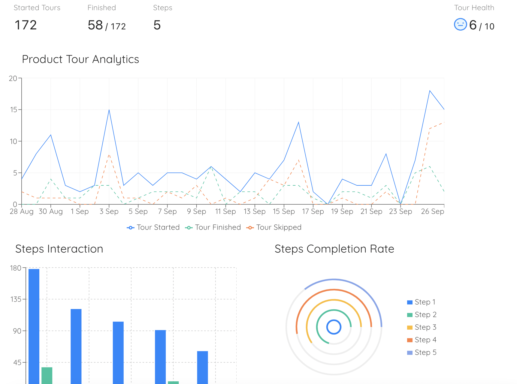
Per-step completion shows whether users follow a bridge. If they complete it and still make the error, the UX debt is deeper than the wording.
Lower the interest on your UX debt this week
Put guidance exactly where users get confused, measure whether it removes the error, and switch it off when the real fix ships. No code required. Free up to 100 monthly active users, plans from $129/month, GDPR-compliant and EU-hosted.
Start for free →The One-Paragraph Version
UX debt is the backlog of known usability problems a product has shipped and never fixed, and its interest is paid by users in time and mistakes and by support, onboarding and success teams in repeated explanations. It accumulates from predictable sources: first versions that became permanent, features added wherever there was room, inconsistent patterns across teams, last-minute copy, designs the customer base outgrew and workarounds that became the workflow. Find it in operational data per screen, write each item as a user problem with evidence and a rough fix size, and rank items by frequency, severity and reach against effort. Fix the cheap, painful items now, batch or accept the minor ones, and for the expensive items that need a redesign, schedule the fix and bridge the gap with guidance at the exact point of confusion, linked to the debt item and removed when the fix ships. Measure progress by the interest, not the backlog: recurring tickets, drop-off at inventoried steps and the age of the oldest open items.
Frequently Asked Questions
What is UX debt?
UX debt is the accumulated set of known usability problems in a product that were shipped, noticed and never fixed: confusing labels, inconsistent patterns, workflows that take more steps than they should, settings in places nobody looks. Like financial debt it carries interest, except the interest is paid by users in time and errors, and by your company in support tickets, training effort and lost activation. It grows fastest in products that ship quickly and rarely return to finished work.
What is the difference between UX debt and technical debt?
Technical debt lives in the code and slows down the people who build the product. UX debt lives in the interface and slows down the people who use it. They often share a cause, a shortcut taken to ship on time, but they are paid by different people: engineers feel technical debt in every change, while UX debt is felt by customers and by the support and success teams who explain the product. A codebase can be clean while the experience is full of debt, and the reverse.
Is design debt the same as UX debt?
The terms are often used interchangeably. When teams distinguish them, design debt usually means visual and component inconsistency, such as five button styles or three date pickers, while UX debt is broader and includes flows, information architecture, copy and missing guidance. Visual inconsistency is one source of UX debt, but most of the expensive UX debt in B2B products is about workflows and wording rather than appearance.
How do you measure UX debt?
You cannot measure it as a single number, but you can measure its interest. Count repeated how-do-I support tickets per screen, step-level drop-off in key flows, time on task for common jobs, the questions that come up in every onboarding call, and features with demand but low adoption. Tie each item in your UX debt inventory to at least one of these signals, so the backlog is ranked by evidence rather than by whoever argues most strongly.
How do you prioritise UX debt against new features?
Score each debt item by how often users hit it, how badly it hurts when they do, and how many users it reaches, then compare that cost with the effort to fix it. High-cost, low-effort items should be fixed immediately. High-cost, high-effort items need a scheduled fix and something to reduce the cost meanwhile. Low-cost items can be batched or accepted. Presenting debt in the same currency as features, meaning users affected and outcomes changed, is what gets it onto the roadmap.
Can in-app guidance fix UX debt?
It cannot remove the debt, but it can lower the interest while a real fix waits. A tooltip on a misleading field, a short walkthrough for a buried workflow or an in-app notice explaining a known limitation reduces errors and tickets immediately, without an engineering release. The discipline is to treat that guidance as temporary: link it to the debt item, measure whether it works, and remove it when the underlying problem is fixed, so guidance does not become a permanent layer over a broken interface.
How do you stop UX debt from building up again?
Record debt at the moment it is created, when a team knowingly ships the simpler version, rather than rediscovering it months later through complaints. Give the inventory an owner, review it on a fixed cadence, reserve a regular share of each cycle for paying it down, and add a usability check to the definition of done for new features. Debt that is written down and visible is rarely allowed to grow unchecked; debt that lives in people's heads always is.