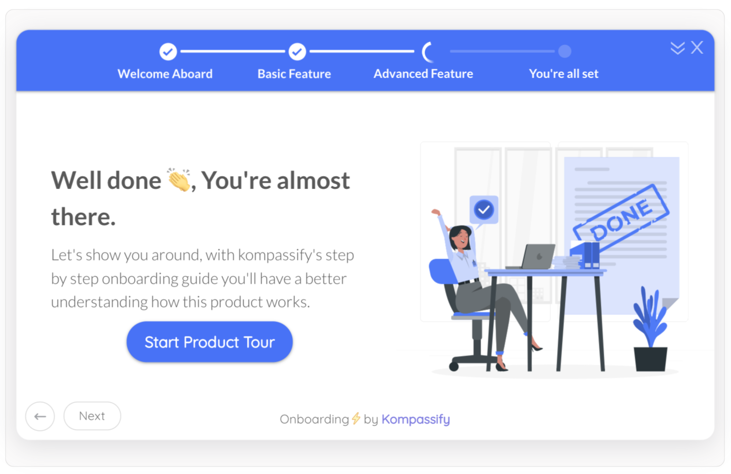
Every new user who lands in your product is silently asking one question: how much work is this going to be? When the answer is invisible (an empty dashboard, a vague "get started" page, an unknown number of setup hoops) a large share of them decide the answer is "too much" and leave. Most never say goodbye: roughly 70% of new SaaS users stop using a product within three months, and the first sessions are where the bleeding is worst.
An onboarding progress bar attacks that problem with almost embarrassing efficiency. It takes the open-ended, anxiety-inducing blob of "setting up" and turns it into a visible, finishable goal: you are 40% done, three steps left, here's the next one. It is a single UI element, it ships in an afternoon, and it sits on top of some of the most reliable findings in behavioral psychology. Few onboarding investments return more per pixel.
This guide covers the full picture: what an onboarding progress bar is, the psychology that makes progress indicators work (goal-gradient, endowed progress, and the Zeigarnik effect), the main types you can choose from, where progress bars belong in your user onboarding flow, how they pair with onboarding checklists, a step-by-step setup, and the do's and don'ts that separate a motivating bar from a manipulative one.
Key Takeaways
- An onboarding progress bar shows new users how far they've come and how little remains, as a filling bar, a percentage, a step counter, or a checklist completion fraction.
- It works because of three documented effects: people speed up near goals (goal-gradient), people finish what feels already started (endowed progress), and unfinished visible tasks nag at the mind (Zeigarnik).
- Never start the bar at 0%. Credit a genuinely completed step, like creating the account, so the journey opens at 15–25% and the endowed progress effect does its work.
- Progress bars motivate; checklists direct. The strongest onboarding pattern is a checklist with a progress bar on top: the list supplies the next action, the bar supplies the pull.
- 3–7 milestone steps is the sweet spot. Each step should be a real activation milestone, not administrative filler.
- Measure it like a feature, not a decoration: onboarding completion rate, step drop-off, and activation rate tell you whether the bar is actually pulling users to value.
What Is an Onboarding Progress Bar?
An onboarding progress bar is a visual indicator that shows a new user how far they have advanced through your product's setup and how much remains. It can literally be a bar that fills, but the same job is done by a percentage ("60% complete"), a step counter ("Step 2 of 5"), a task fraction ("3 of 5 tasks done") on an onboarding checklist, or a ring that closes as setup finishes. Whatever the shape, the function is identical: make progress visible, and make the finish line feel close.
Onboarding progress bar, defined. A progress bar (or progress indicator) is any persistent visual element that communicates a new user's position between "just signed up" and "fully set up." It converts an unknown quantity of remaining effort, the thing that makes users abandon, into a known, shrinking one. The moment progress is visible, finishing becomes a goal; and humans are famously bad at walking away from a goal they can see.
Here is the same setup journey expressed in the three most common progress formats; notice how each one answers "how far along am I?" at a glance:
The reason this tiny element matters so much is where it sits in the user journey. Onboarding is the steepest part of the drop-off curve, the days in which users decide whether your product becomes a habit or a forgotten tab. Anything that pulls one extra cohort-percent through setup compounds into retention later, because users who complete onboarding are the users who reach the aha moment, and users who reach the aha moment are the ones who stay.
The Psychology: Why Progress Bars Actually Work
Progress bars are not a designer's decoration; they are applied behavioral science. Three findings, each replicated across decades, explain nearly all of their power:
1. The goal-gradient effect: effort accelerates near the finish
In 1934, psychologist Clark Hull observed that rats in a maze ran faster as they approached the food reward. Seventy years later, Ran Kivetz and colleagues found the same pattern in humans: café customers with buy-ten-get-one-free loyalty cards bought coffee more and more frequently as the card filled up. The closer a goal appears, the harder we work toward it, and a progress bar's entire job is to make the goal appear, and appear close. Every filled pixel is a small announcement that the reward is nearer than it was yesterday.
2. The endowed progress effect: a head start doubles completion
In a classic 2006 study, researchers Joseph Nunes and Xavier Drèze handed out two kinds of car-wash loyalty cards: one needing 8 stamps to earn a free wash, and one needing 10 stamps, but with 2 stamps already applied. Both cards required exactly 8 purchases. The result: 34% of the pre-stamped cards were completed, versus 19% of the blank ones, nearly double, and the pre-stamped group finished faster. People who feel a goal is already underway are dramatically more likely to see it through than people starting from zero, even when the remaining work is identical.
The endowed progress effect: identical remaining effort, but the card that starts 20% "done" gets finished almost twice as often. This is why an onboarding progress bar should never open at zero.
3. The Zeigarnik effect: unfinished tasks refuse to be forgotten
Psychologist Bluma Zeigarnik documented in the 1920s that people remember interrupted, incomplete tasks far better than completed ones; the unfinished business keeps a small background process running in the mind. A visible "80% complete" in your product's corner weaponizes this benignly: the user who leaves mid-setup carries the open loop with them, and closing it becomes a small reason to come back. The most famous product application is LinkedIn's profile-completeness meter, which turned "filling in a profile", a chore nobody wakes up wanting to do, into a bar millions of professionals felt compelled to finish.
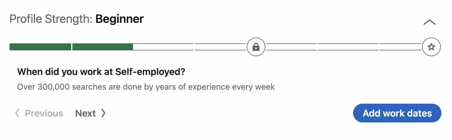
The three effects, one sentence each: goal-gradient makes users speed up as the bar fills; endowed progress makes them start because the bar isn't empty; Zeigarnik makes them come back because the bar isn't full. A well-designed onboarding progress bar is all three running simultaneously on a single strip of pixels.
The Types of Progress Indicators (And When to Use Each)
"Progress bar" is one name for a family of patterns. They differ in what they count, how they display it, and which part of onboarding they fit best:
| Type | What it shows | Best for | Watch out for |
|---|---|---|---|
| Step counter ("Step 2 of 5") | Position in a fixed sequence | Product tours, signup wizards, multi-step forms | Only works when the sequence is truly linear |
| Percentage bar ("60% complete") | Share of total setup done | Setup journeys with many small tasks of similar weight | Percentages invite skepticism if they move dishonestly |
| Checklist fraction ("3 of 5 tasks") | Completed vs remaining concrete tasks | Onboarding checklists, the strongest general-purpose pattern | Tasks must be real milestones, not filler |
| Completeness meter | Quality/completeness of a profile or workspace | Profile setup, workspace configuration (the LinkedIn pattern) | Needs a credible definition of "100%" |
| Milestone path / journey map | Named stages ("Setup → Invite team → First report") | Longer B2B onboarding spanning days or weeks | Overkill for products with a 10-minute setup |
Choosing between them is mostly a question of what your onboarding actually looks like. A linear five-screen wizard wants a step counter. A flexible "do these in any order" setup wants a checklist fraction. A long, multi-session B2B rollout wants named milestones. And if you genuinely cannot decide, the checklist fraction with a bar on top is the safest default: it is directive, honest, and flexible at once.
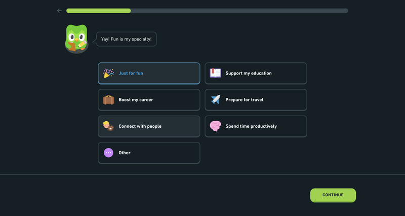
Progress indicators aren't one element but a relay: the tour's step counter hands off to the checklist's progress bar, which hands off to a long-running completeness meter.
Checklists and Progress Bars: The Strongest Pairing in Onboarding Flows
The most common question teams ask (how do you use checklists and progress bars in onboarding flows?) has a satisfying answer: together, because each fixes the other's weakness.
A progress bar alone is motivating but mute. It tells the user they are 40% done and says nothing about what to do next; the user is left pulling on a door with no handle. An onboarding checklist alone is directive but flat: a stack of unchecked boxes reads as homework, and homework is exactly the feeling that makes new users close the tab. Put them together and the psychology snaps into place: the checklist supplies the next action, the bar supplies the pull to take it, and every checked item pays the user instantly in visible progress.
-
The bar answers "how far?", the list answers "what next?"
Motivation and direction are different jobs. Users abandon onboarding either because they don't know what to do or because they don't feel like doing it; the pairing addresses both failure modes at once.
-
Every checkmark is an instant reward
Checking an item and watching the bar jump gives a small completion payoff several times per session. That rhythm of effort → visible progress is what turns setup from a chore into something weirdly satisfying to finish.
-
Checklist items should be activation milestones
The tasks behind the bar decide whether completing it means anything. Fill the list with the actions your retained users share, the path to the aha moment, not with "confirm your email" busywork. Our roundup of onboarding checklist examples shows what good milestone lists look like in practice.
-
Auto-check completed steps
Nothing kills trust in a progress bar faster than doing the work and not getting the credit. Detect the action in-product and check the item automatically. The user should never have to tell the bar what they did.
-
Celebrate 100%
The moment the bar fills is a micro-graduation. Mark it (a confetti burst, a congratulations modal, an unlocked next step) and use it to hand the user their first real win, not just an empty "done."
How to Add a Progress Bar to Your Onboarding (Step by Step)
The mechanics are simple; the design decisions are where progress bars are won or lost. Here is the sequence that works:
1. Define the milestones the bar will measure
Start from your activation data, not your feature list: which 3–7 actions separate users who stick from users who vanish? Those are the steps. If you haven't identified them yet, that analysis, finding your activation milestones and aha moment, comes first, because a progress bar over the wrong steps just speeds users toward the wrong destination.
2. Choose the format that matches the journey
Linear wizard or tour → step counter. Flexible task set → checklist with a fraction and bar. Multi-week B2B rollout → named milestone path. Long single operations (imports, syncs) → a real-time bar with a time estimate. Don't force one format to do every job; use the relay pattern, tour counter → checklist bar → completeness meter, as users move deeper.
3. Start above zero
Credit something the user genuinely completed, "Create your account ✅", so the bar opens at 15–25%. This is the endowed progress effect applied honestly: the head start is real, and it nearly doubles the odds the journey gets finished. An empty bar on first login is a design bug.
4. Wire progress to real behavior
Each step should complete automatically when the user performs the actual action in your product: imported data, invited a teammate, created the first project. Manual "mark as done" checkboxes measure clicking, not adoption, and they let users hollow out the bar's meaning.
5. Make it visible, dismissible, and finite
The bar should live where the user works (a corner widget or a persistent card, not a buried settings page), be minimizable for users who want to explore freely, and end. When setup is done, celebrate and retire it; a progress bar that lingers at 100% forever becomes furniture, and one that never reaches 100% becomes an accusation.
6. Measure whether it moves the numbers that matter
Compare onboarding completion rate, per-step drop-off, and activation rate before and after. A step everyone skips is mis-ordered or mis-chosen; a bar that lifts completion but not activation is measuring the wrong steps. The bar is working when more of each cohort reaches first value; everything else is decoration.
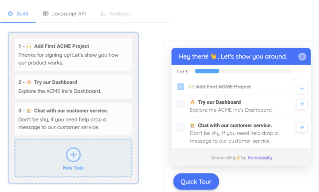
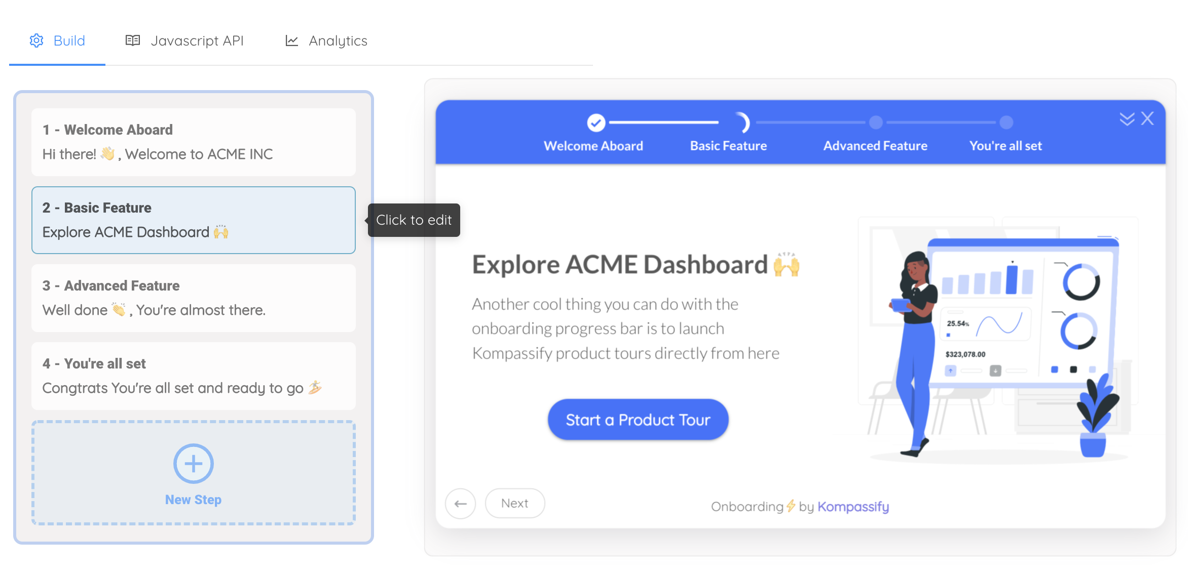
None of this requires engineering time anymore. With Kompassify you build the checklist in a visual editor, attach a progress bar that fills as tasks complete, auto-check steps from real in-app actions, and ship the whole thing with one script snippet, then watch completion and activation respond in product analytics. It's GDPR compliant, EU-hosted, and free for under 100 monthly active users.
Onboarding Progress Bar Best Practices: Do vs. Don't
The difference between a bar users love and a bar users resent is a handful of design decisions:
✅ Do
- Start the bar at 15–25% by crediting real completed steps
- Keep it to 3–7 meaningful milestones
- Auto-complete steps from real in-app behavior
- Show the next action right next to the bar
- Make each step's payoff clear ("Import data → see your first report")
- Celebrate reaching 100%, then retire the bar
- Let users minimize it and come back later
- A/B test step order and wording against activation
❌ Don't
- Open onboarding with a 0% bar and 12 unchecked tasks
- Pad the list with busywork to make the product look deep
- Fake progress or jump percentages without cause
- Let the bar stall; a step nobody completes is your bug
- Block the whole product until the bar is full
- Nag with popups every time progress hasn't moved
- Leave a 100% bar on screen for weeks
- Measure success by bar completions instead of activation
The honesty rule. Every psychological effect a progress bar uses runs on trust, and trust is spent the first time the bar lies: a percentage that leaps for no reason, a "quick setup" that sprouts new steps at 90%, a pre-filled stamp for something the user never did. Endowed progress works because the credit is real. The moment users suspect the bar is managing them rather than informing them, it stops being motivation and starts being friction with a paint job.
Measuring the Impact: The Three Numbers That Matter
A progress bar is a feature with a job, and the job is measurable. Watch these three metrics, in this order:
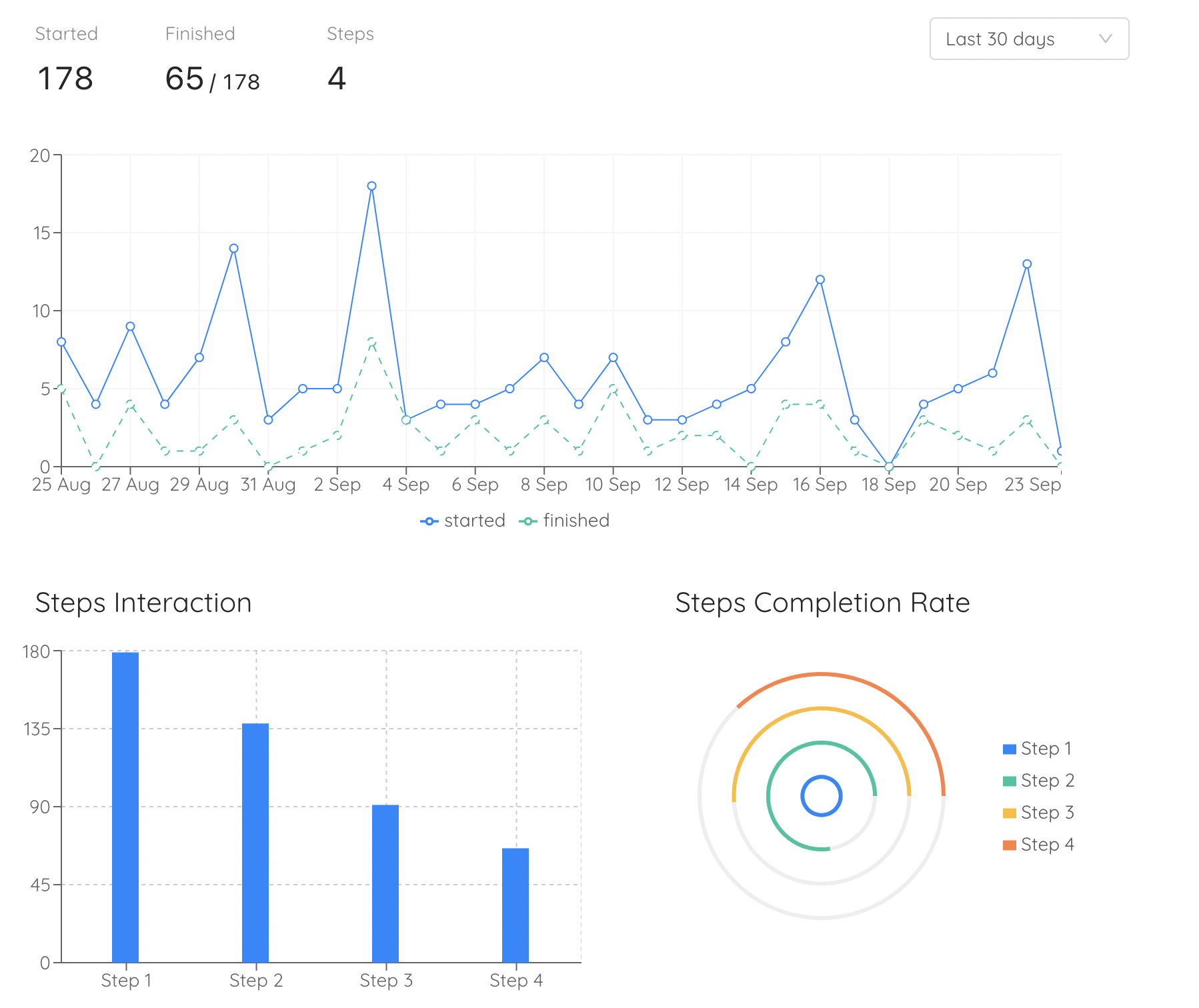
- Onboarding completion rate. The share of new users who finish every defined step. This is the bar's direct output; if it doesn't rise after shipping, the steps, order, or placement need work.
- Per-step drop-off. Where exactly users stall. A cliff at one step is a gift: it points at the precise moment onboarding asks too much, too early, or too vaguely. Reorder, simplify, or support that step with a tooltip or micro-tour, then watch the cliff move.
- Activation rate. The share of sign-ups reaching first value, the metric the whole apparatus exists to move. Completion without activation means the checklist rewards the wrong actions; activation rising with completion means the bar is pulling users somewhere worth going.
The virtuous chain looks like this: the bar lifts completion, completion routes users through real milestones, milestones produce activation, and activation feeds engagement and long-term retention. Any link can break independently, which is exactly why you measure all three instead of declaring victory when the bar ships.
Ready to Put a Progress Bar on Your Onboarding?
Kompassify lets you build onboarding checklists with progress bars, product tours, tooltips, and feature announcements: no code, no engineering sprint. Auto-complete steps from real user actions and watch completion and activation respond in built-in analytics. GDPR compliant, EU-hosted, and free for under 100 monthly active users.
Start for Free →Frequently Asked Questions
What is an onboarding progress bar?
An onboarding progress bar is a visual indicator that shows new users how far they have advanced through your product's setup and how much remains, as a filling bar, a percentage, a step counter (Step 2 of 5), or a completed-tasks fraction on an onboarding checklist. Its job is to turn an open-ended setup into a visible, finishable goal: users who can see the finish line are far more likely to reach it than users staring into an unknown amount of remaining work.
Why do progress bars work in onboarding?
Three well-documented psychological effects do the heavy lifting. The goal-gradient effect: people accelerate their effort as they get closer to a goal, so a visibly advancing bar keeps pulling users forward. The endowed progress effect: people who feel a goal is already partly complete are far more likely to finish it: in Nunes and Drèze's classic loyalty-card study, customers given a head start completed at nearly double the rate (34% vs 19%). And the Zeigarnik effect: unfinished, visible tasks occupy the mind, so an 80%-complete bar quietly nags the user back to finish. A progress bar packages all three into one UI element.
Should an onboarding progress bar start at 0%?
No. Starting above zero is the single highest-leverage trick in progress design, because of the endowed progress effect. Credit something the user has genuinely already done ("Create your account" checked off, or "Watch the welcome video" completed after the intro plays) so the bar opens at 15–25% instead of 0%. An empty bar communicates "all of the work is ahead of you"; a partly filled one communicates "you've already started, don't waste it." The credit must be honest: pre-fill with real completed actions, never with fake padding.
What is the difference between a progress bar and an onboarding checklist?
They answer different questions and work best together. A progress bar answers "how far along am I?"; it motivates, but on its own it doesn't say what to do next. An onboarding checklist answers "what exactly should I do next?"; it directs, but a list of unchecked boxes can feel like homework. The strongest pattern in SaaS onboarding is the checklist with a progress bar on top: the checklist supplies the next action, the bar supplies the pull to take it, and every checked item visibly moves the bar.
How many steps should an onboarding progress bar have?
Between 3 and 7 for most SaaS products. Fewer than 3 and there is no journey to visualize; more than 7 and the goal looks exhausting before the user starts, which triggers abandonment instead of momentum. Each step should be a real activation milestone, an action correlated with users sticking around, not administrative filler. If your setup genuinely has 15 tasks, group them into 4–6 milestone chunks and let each chunk fill a visible slice of the bar.
How do you measure whether an onboarding progress bar is working?
Track three numbers before and after shipping it. Onboarding completion rate: the share of new users who finish all defined steps. Step drop-off: where users stall. A step nobody completes is mis-designed or mis-ordered, not proof users are lazy. And activation rate: the share of new sign-ups reaching your product's first-value moment, which is the metric the progress bar ultimately exists to move. If completion rises but activation doesn't, your steps are the wrong steps.
How do you add a progress bar to your onboarding without coding?
No-code onboarding platforms let you ship one without engineering time. With Kompassify you build an onboarding checklist in a visual editor, attach a progress bar that fills as tasks complete, auto-check steps when users actually perform them in your app, and launch it with a single script snippet. It is GDPR compliant, EU-hosted, free for under 100 monthly active users, and paid plans start at $129/month.