Every product team has seen this ticket. A customer writes in to say they clicked Save and nothing happened. An engineer checks the logs. It saved. The record is there, correct, timestamped, exactly as intended. Nothing is broken, and the ticket is still completely valid.
The same week brings a different ticket. A customer asks whether there is any way to edit several records at once. There is. The control has been in the toolbar for two years, a few centimetres from where that person works every single day.
Both of these are adoption failures, and they arrive in your reports looking like the same thing: a feature with disappointing usage. They are also opposites. The second user could not find the door. The first user walked through it and could not tell whether they had arrived. If you treat them the same way, one of the two gets a fix that makes their experience worse.
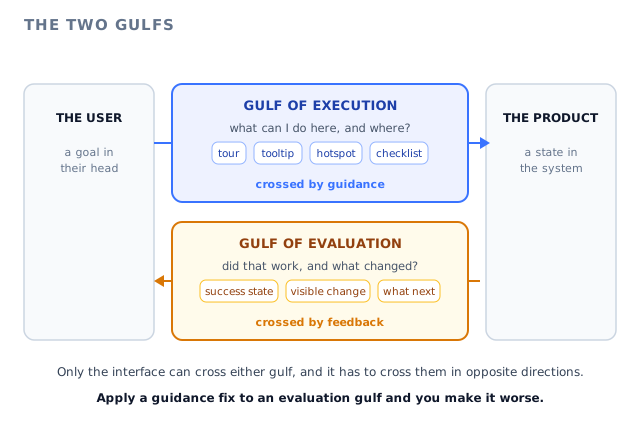
The cognitive scientist and designer Donald Norman gave these two failures names that are worth borrowing, because having two words instead of one changes what you build. He called them the gulf of execution and the gulf of evaluation. One sits before the action, one sits after it, and the interface is the only thing that can cross either.
This guide covers what both gulfs mean, how the seven stages of action translate into questions your users are actually asking, why the moment of action is a dividing line your funnel is blind to, five signs of each gulf in data you already have, six fixes for each side, what to measure, and which half of the work belongs to in-app guidance and which half belongs to the product itself.
Key takeaways
- The gulf of execution is the distance between what a user wants to achieve and the actions your interface makes visible and understandable. It is the gap before the click.
- The gulf of evaluation is the distance between what your product actually did and what the user can work out from the screen. It is the gap after the click.
- They leave opposite traces. An execution gulf leaves a missing event. An evaluation gulf leaves extra events: repeats, reversals, reloads, a ticket that starts with the words did that work.
- Your funnel counts the action, so it registers an evaluation gulf as a success. This is why the second kind of gap goes unfixed for years while teams keep adding more guidance to the first.
- Guidance closes the execution gulf: a tooltip on the control, a hotspot on the thing nobody opens, a tour triggered on the page where the task starts, a checklist that stays available. Feedback closes the evaluation gulf: a visible state change, a success message that names what changed, a clear next step.
- Adding guidance to an evaluation gulf makes it worse. The user was never lost. Telling them again what to do, when their question is what happened, adds noise to an already uncertain moment.
What Are the Gulf of Execution and the Gulf of Evaluation? (Meaning and Definition)
Gulf of execution: definition
The gulf of execution is the gap between the goal a user has in mind and the actions the interface offers them to reach it. It is wide when a user cannot tell what is possible, cannot tell which control does the thing they want, or cannot operate that control correctly once they find it. Every part of it sits before the action is performed.
Gulf of evaluation: definition
The gulf of evaluation is the gap between the new state of the system and what the user can perceive, interpret and compare against their original goal. It is wide when the product changed something and the screen does not say so, says so in a way the user does not understand, or says so somewhere the user is not looking. Every part of it sits after the action is performed.
Both terms come from Donald Norman, whose broader point was that most of what we call user error is actually a design property: the interface either bridges these two gaps or it does not, and blaming the person standing on the wrong side of a gulf explains nothing. The names were coined about physical objects as much as software, which is why they survive so well in a SaaS product, where nothing is physical and every clue the user gets has to be deliberately put there by somebody.
The useful way to hold the idea is that your interface has to speak twice about every capability it has. Before the action it has to say: this exists, it applies to you, here is where it lives, this is what it will do. After the action it has to say: that worked, here is what changed, here is where the result went, here is what you can do next. Most products are reasonably good at the first sentence and surprisingly bad at the second, because the first sentence is what design reviews and onboarding projects are about, while the second one is assumed to be obvious to the person who built the feature.
Those two sentences have their own names in design writing. Feedforward is the information that helps a user predict what an action will do before they commit to it. Feedback is the information that tells them what actually happened. A confirmation dialog that explains what is about to be deleted is feedforward. A toast that names the thing that was deleted and offers to undo it is feedback. A product can have plenty of one and almost none of the other, and the symptoms will look nothing alike.
The sentence worth writing on a whiteboard: a user who does not act has an execution problem, and a user who acts and then acts again has an evaluation problem. The first one is a gap in what your product tells them. The second one is a gap in what your product tells them back.
It is worth being precise about what these gulfs are not. They are not the same as difficulty. A genuinely complicated task can have a narrow execution gulf, because the interface is honest and legible about every step, and a trivial task can have a very wide one, because the only control that does it is hidden behind an icon nobody recognises. They are also not the same as friction, which is about the effort a path costs once you are on it. The gulfs are about whether the path is visible at all, and whether you can tell you reached the end of it.
The Seven Stages of Action, Translated for Product Teams
The two gulfs sit inside a longer model of how a person does anything at all. Norman described seven stages, and they are more useful to a product team than they first look, because each stage fails in a different way and each failure has a different fix. Read them as the seven questions one user asks themselves during one attempt at one task.
The goal forms in the user’s head. Everything between the goal and the action is the gulf of execution, and everything between the action and the verdict is the gulf of evaluation.
| Stage | What the user is asking | What it looks like when it fails | Gulf |
|---|---|---|---|
| 1. Goal | What do I actually want here? | The user has no goal yet. They are browsing, or they were told to log in by somebody else. | Neither |
| 2. Plan | Is this even possible in this product? | They assume it is not, so they never look. They build a workaround in a spreadsheet instead. | Execution |
| 3. Specify | Which control does this? | They know it exists, and they hunt through three menus, then search your help centre. | Execution |
| 4. Perform | Can I operate this correctly? | They fill the form wrong, pick the wrong option, abandon at the third field. | Execution |
| 5. Perceive | Did anything change? | The screen looks identical. There was a spinner, maybe. They press the button again. | Evaluation |
| 6. Interpret | What does that mean? | Something changed and they cannot decode it. A status went to Pending and nobody said for how long. | Evaluation |
| 7. Compare | Is that what I wanted? | They cannot connect the result to the goal, so they are not sure whether to move on or start again. | Evaluation |
Two things jump out of that table once you have it in front of you. The first is that six of the seven stages can fail because of something your interface did or did not say, and only the first one is genuinely outside your control. The second is that almost every product analytics setup in existence instruments stage four and nothing else. You know how many people clicked the button. You have no idea how many of them could tell what the button did.
The stages also explain a pattern that support teams recognise instantly: the same feature generating two completely different kinds of ticket. How do I export this is a stage three failure. Did my export work is a stage five failure. They are about the same feature, they arrive in the same queue, and they need opposite responses. If your team treats both by writing a better help article, only one of them gets better.
The Action Is the Dividing Line, and Your Funnel Cannot See It
Here is the part that changes how you work. Both gulfs cause low feature usage, low activation and support volume, but they leave completely different fingerprints in your event data, and only one of those fingerprints is the kind that any funnel report is built to notice.
An execution gulf produces a missing event, which every funnel report is designed to surface. An evaluation gulf produces duplicate events and a reload, which your funnel reads as a completed step.
An execution gulf subtracts. The event you care about never fires, the step is never reached, the onboarding funnel shows a cliff at a specific point, and somebody opens a ticket in your product team asking why nobody uses the bulk editor. This is a visible, well-understood, well-tooled problem. There is an entire industry of dashboards for it.
An evaluation gulf adds. The event fires, and then it fires again, and sometimes a third time. There is a page reload in the middle. There may be an undo, a delete of the duplicate that the repeat created, or a visit to your help centre thirty seconds after a successful action. Then the user asks a colleague or writes to support to ask whether it went through. In your funnel, that user converted. In the weekly review, that feature is doing fine.
The trap: because evaluation gulfs register as successes, the only place they surface is support volume and qualitative feedback, which are exactly the two signals product teams discount as anecdotal. A feature can sit at ninety percent completion rate and still be generating a steady stream of did that actually work messages every week, and nothing in your reporting will ever connect the two.
There is one more fork worth naming so that you diagnose within the right gulf rather than across both. An execution gulf has two flavours of its own: the user never opened the control, which is a discoverability problem, or the user opened it and backed straight out, which usually means the word on the control meant something different to them than it does to you. Our guide to mental models in UX covers that second case in full, including why making a misunderstood control more prominent increases bounces rather than usage. Use this guide to work out which side of the action your problem sits on, and that one to work out why the before-the-action side is failing.
Five Signs of a Gulf of Execution
None of these require a research programme. They are all visible in data you already collect, or in the sentences your customers already send you.
A feature that shipped a year ago and is used by a tiny fraction of accounts, with no pattern by plan or role. If it were badly designed, the people who need it would use it and complain. Silence plus low reach usually means nobody knows it is there. See our guide to feature discovery.
Users reach the outcome, but through five steps when there are two. Exporting to a spreadsheet to do something your filters already do. Creating records one at a time next to a bulk import. The goal is in reach, the shortest route is not.
A screen with high entries and a median session of four seconds. They found the door, opened it, and could not tell what to do inside. Empty states are the usual culprit, which our guide to empty states covers.
Count them separately from everything else in your queue for one month. A queue dominated by how do I is a queue telling you your interface is not answering stage two and stage three, which is what in-app support exists to fix.
The single cheapest gulf-of-execution report you can build. Every zero-result search is a user telling you, in their own words, what they wanted and could not find, and the words they used are the words your interface should be using.
Five Signs of a Gulf of Evaluation
These are harder to see, because none of them looks like failure. Every one of them is a user who did the thing you wanted and then could not tell that they had.
Two Save events, two invites to the same address, two payment attempts, two exports of one report. The single highest-value evaluation signal there is, and almost nobody has an alert on it. If duplicates cause real damage in your product, this is not a UX nicety.
A setting toggled on and off inside ten seconds. A record created and deleted. A change saved and reverted. The user is not experimenting for fun, they are probing the interface to work out what their action did, because the screen would not tell them.
Reloading a page is the universal human gesture for I do not believe this screen. When it clusters right after one particular action, that action has a feedback problem, not a performance problem. Our guide to loading states covers the cases where it genuinely is about speed.
Did it save, did it send, did they get it, is it live yet. Tag these separately from how do I. They tell you which actions in your product complete silently, and each one is a five-minute fix in copy rather than a roadmap item.
Imports, syncs, scheduled sends, anything asynchronous. The product did exactly what it promised, twenty minutes later, on a screen the user had already left. As far as the user is concerned, nothing happened at all.
Two of those five cost you money directly rather than just goodwill. Duplicate actions create data your customer then has to clean up, which turns into a support conversation with a real hourly cost, and reversals on a paid action can look like a billing dispute. The other three cost you trust, which shows up later and is harder to trace back. Our guide to user trust covers why an unexplained outcome does more damage than a visible error.
How to Close the Gulf of Execution
Everything on this side of the line is about making capability visible, legible and reachable at the moment a goal forms. Six moves, ordered by how cheap they are relative to what they remove from your support queue.
1. Name the control the way the user names the goal
Before you explain anything, check the word. If your users say send the invoice and your button says Generate document, you have created a stage three failure out of nothing, and no amount of guidance fully compensates for it. Take the vocabulary from your zero-result searches and your support tickets, not from your data model.
What this removes: the hunt. The user recognises the control instead of deducing it.
2. Put the answer on the element, not in a document
A question that takes one sentence to answer should be answered where it is raised. A tooltip attached to the field that confuses people costs nothing to read and keeps the user inside the task. Sending them to a help centre article costs a context switch and usually a return trip. Our guide to contextual help covers how to decide which questions deserve which surface.
What this removes: the trip out of the product to answer a ten-second question.
3. Mark the thing nobody opens
For a capability with near-zero reach, the cheapest intervention is a small persistent marker on the control itself, shown only to the segment it applies to and dismissed once they engage. A hotspot is a pull pattern rather than a push one, so it waits for curiosity instead of interrupting work, which is what makes it survivable on a screen people use daily.
What this removes: the invisibility of anything that is not on the user’s usual route.
4. Trigger the walkthrough where the task starts, not where the account starts
A multi-step task deserves a guided sequence, but the trigger matters more than the content. A tour that runs once at signup serves a state the user leaves in days. A tour triggered on the page where the task actually begins serves them for years, including the third time they do a quarterly job. Our guide to onboarding triggers covers choosing between page, event and segment conditions.
What this removes: guidance that only ever existed during week one.
5. Give every flow a second door
Users skip things, and they are right to: the paradox of the active user explains why almost everyone dives in rather than reading first. What matters is that skipping is not permanent. A checklist that stays available, where an item can open the relevant page, redirect or start the tour, turns a dismissed flow into one the user can come back to when they have a reason.
What this removes: the one-way decision a user made in their first five minutes.
6. Show what the action will do before they commit
This is feedforward, and it is the cheapest anxiety reduction in software. A preview of the number of records affected, a sample of the message that will go out, a plain sentence naming what happens next. It does not prevent mistakes so much as it makes people willing to press the button at all, which is the actual blocker on anything irreversible. Our guide to UX microcopy has the formulas.
What this removes: the hesitation that stops a user from acting on a control they did find.
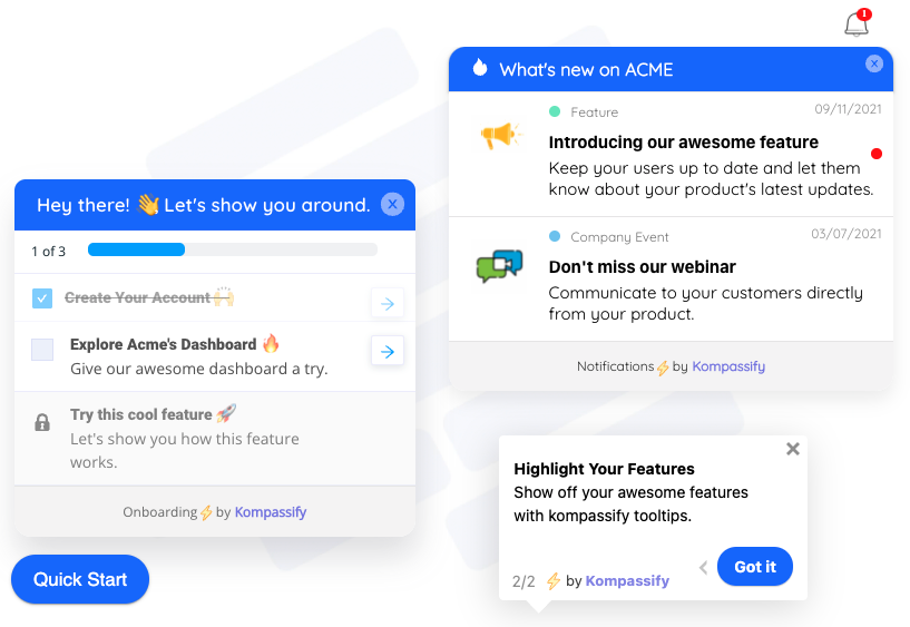
The execution side is a layer you can add to an interface you are not changing: a marker on the control, a sentence on the field, a sequence on the page where the task starts, and a list that stays reachable.
How to Close the Gulf of Evaluation
Everything on this side of the line is about answering a question the user already has: what just happened. These fixes are usually smaller than execution fixes and they are almost always neglected, which makes this the highest-yield list in the guide.
1. Make the state change visible on the screen they are already on
The strongest feedback is not a message about a change, it is the change itself, rendered where the user is looking. A status badge that flips, a row that appears in a list, a counter that moves, a field that now shows a value. A message can be missed. A visible difference in the thing they were staring at cannot.
What this removes: the need to trust a notification instead of seeing the result.
2. Name the object, not the operation
Saved is the weakest possible confirmation, because it confirms that the software ran rather than that the user’s goal was met. Invoice 1043 sent to accounts@northfield.co is feedback. It names the thing, the action and the destination, which is exactly the set of facts the user needs to compare the result against what they intended.
What this removes: the second check in a different screen to confirm the first one.
3. Close asynchronous loops wherever the user ends up
Anything that finishes later has to report back later, and it has to report back somewhere the user will actually be. A completed import, a finished sync, a scheduled send: these are the actions most likely to complete in total silence. An in-app notification or an announcement that appears on the user’s next visit closes a loop that would otherwise stay open forever. Our guides to in-app notifications and announcing changes in the product cover the delivery side.
What this removes: work that succeeded on a screen nobody was watching.
4. Say what to do next, not just that you are done
Stage seven is comparison against a goal, and the goal is almost never the action the user just performed: nobody wants to have saved a setting, they want the outcome the setting produces. A confirmation that ends with the next step closes the comparison for them. Your first campaign is scheduled for Monday, and you can preview it here.
What this removes: the pause where a user who succeeded does not know whether they are finished.
5. Make errors say what to do, and never fail silently
A silent failure is the worst possible evaluation gulf, because the user leaves believing they succeeded and discovers otherwise from a colleague or a customer. Any error that is visible, specific and paired with the next action is better than a quiet one, and it is worth auditing your product for actions that can fail without saying so.
What this removes: the class of failure a user finds out about from somebody else.
6. Make being wrong cheap and obvious
Undo is a feedback mechanism, not just a safety feature. A visible way back tells the user that probing the interface is safe, which is what lets them evaluate an outcome by testing it rather than by writing to support. The pairing to aim for is a clear statement of what happened plus a one-click way to reverse it.
What this removes: the caution that turns one uncertain action into a support conversation.
Notice how many of those six are copy and layout rather than architecture. That is the good news about the evaluation side: the gap is usually a sentence and a visible difference, not a rebuild. The bad news is that nobody owns it. Execution problems get raised by growth and onboarding teams because they show up in funnels. Evaluation problems get raised by nobody, because the funnel says they are fine, which is why who owns the guidance layer turns out to matter as much as what the layer contains.
Every Release Reopens Both Gulfs
The gulfs are not a first-session problem. They reopen on every change you ship, for every user who already had a working model of the old screen.
When you move a control, you widen the execution gulf for everyone who knew where it used to be. They are not beginners, so no onboarding flow will catch them, and they will look for the old location twice before opening a ticket. When you change what an action does, or add a confirmation step, or make something asynchronous that used to be instant, you widen the evaluation gulf instead: the same action they have taken a hundred times now produces a different signal, and their trained reading of the screen is suddenly wrong.
This is why a release note is not a guidance strategy. A note lives outside the product, is read by a small minority, and is forgotten before the next time the person touches that screen. The thing that closes a release-shaped gulf is a marker where the change is, shown to the people affected by it, at the moment they arrive at the screen. Our guide to why product tours break covers the other half of this problem, which is that your existing guidance was anchored to an interface you just changed.
-
Moved a control
Execution gulf for existing users. Mark the new location for the segment that used the old one, and keep the marker up for one full usage cycle rather than one week.
-
Changed what an action does
Evaluation gulf. The confirmation copy has to change with the behaviour, or trained users will read the new outcome as the old one.
-
Made something asynchronous
Evaluation gulf, and the most commonly missed one. Something that used to finish while they watched now finishes after they leave, so it needs a report back.
-
Shipped something new
Execution gulf for your entire existing base at once, because none of them met it during onboarding. This is the case where announcing in the product, next to the change, does the work.
Closing Both Gulfs With Kompassify
The honest division of labour is this: the execution gulf can largely be closed with a guidance layer on top of an interface you are not changing, and the evaluation gulf mostly cannot, because the confirmation of a state change belongs inside the product that changed the state. What a guidance and analytics layer can do on the evaluation side is help you find the gaps and close the slower loops. Both halves are worth doing, and only one of them needs your engineering team.
-
Tooltips and hotspots on the real elements
Build by selecting the control on your own screen, with no code, and attach the one sentence that answers the question it raises. This is the direct fix for stage two and stage three failures.
-
Product tours with per-step analytics
Guide a multi-step task, and see which step loses people. A step can also wait for the user’s real click on the element rather than a Next button, so the guidance follows the work instead of narrating it.
-
Checklists that stay available
An item can open a page, redirect or start a tour, which gives every flow a second door and turns a skipped walkthrough into something a user can come back to. The visible ticks are also feedback in their own right: progress the user can see without asking.
-
Announcements for the loops that close later
A bell and a what is new panel that can launch a tour from an announcement and collect feedback, which is how a change that landed after the user left still gets reported back to them.
-
No-code product analytics to find both gulfs
Feature usage side by side shows you the near-zero reach that signals an execution gulf. User flow and tracked events are where you look for the repeat, the reversal and the reload that signal an evaluation gulf, which is the pattern no standard funnel report will show you.
-
Segment and page targeting on every flow
So the marker on a moved control goes only to the people who used the old one, and nobody is told about a feature they already use every day.
Kompassify is no-code: flows are built by pointing at your own interface, and the same layer serves a first-week user and a two-year customer, because the trigger is the page and the behaviour rather than the signup date. It is free up to 100 monthly active users, plans start at $129 per month, and it is GDPR-compliant and EU-hosted.
Find out which gulf your users are standing in
Mark the controls nobody finds, answer at the element, and use feature usage and user flow reports to spot the repeats and reversals your funnel is reading as successes. No code required. Free up to 100 monthly active users, plans from $129/month, GDPR-compliant and EU-hosted.
Start for free →What to Measure
Six numbers, three for each gulf. The point of splitting them is that a single feature adoption number averages the two problems together and hides the one you are not looking for.
| Measure | Gulf | What a bad number means | What you do about it |
|---|---|---|---|
| Reach per feature | Execution | The capability is invisible to most of the accounts it applies to. | Mark the control for that segment, then re-measure reach, not clicks. |
| Entry-to-first-action rate | Execution | People arrive at the screen and do nothing. The door was found, the inside was not legible. | Fix the empty state and put a sentence on the first control. |
| Zero-result searches | Execution | Users are asking for things in words your interface does not use. | Rename before you explain, then check the same list a month later. |
| Repeat rate within 60 seconds | Evaluation | The action completed and the screen did not say so convincingly. | Make the state change visible and name the object in the confirmation. |
| Immediate reversal rate | Evaluation | Users are probing the interface to work out what their action did. | Add feedforward before the action and a specific result after it. |
| Did-it tickets as a share of the queue | Evaluation | Specific actions in your product complete silently. | Tag by action, fix the loudest three in copy, watch the tag volume. |
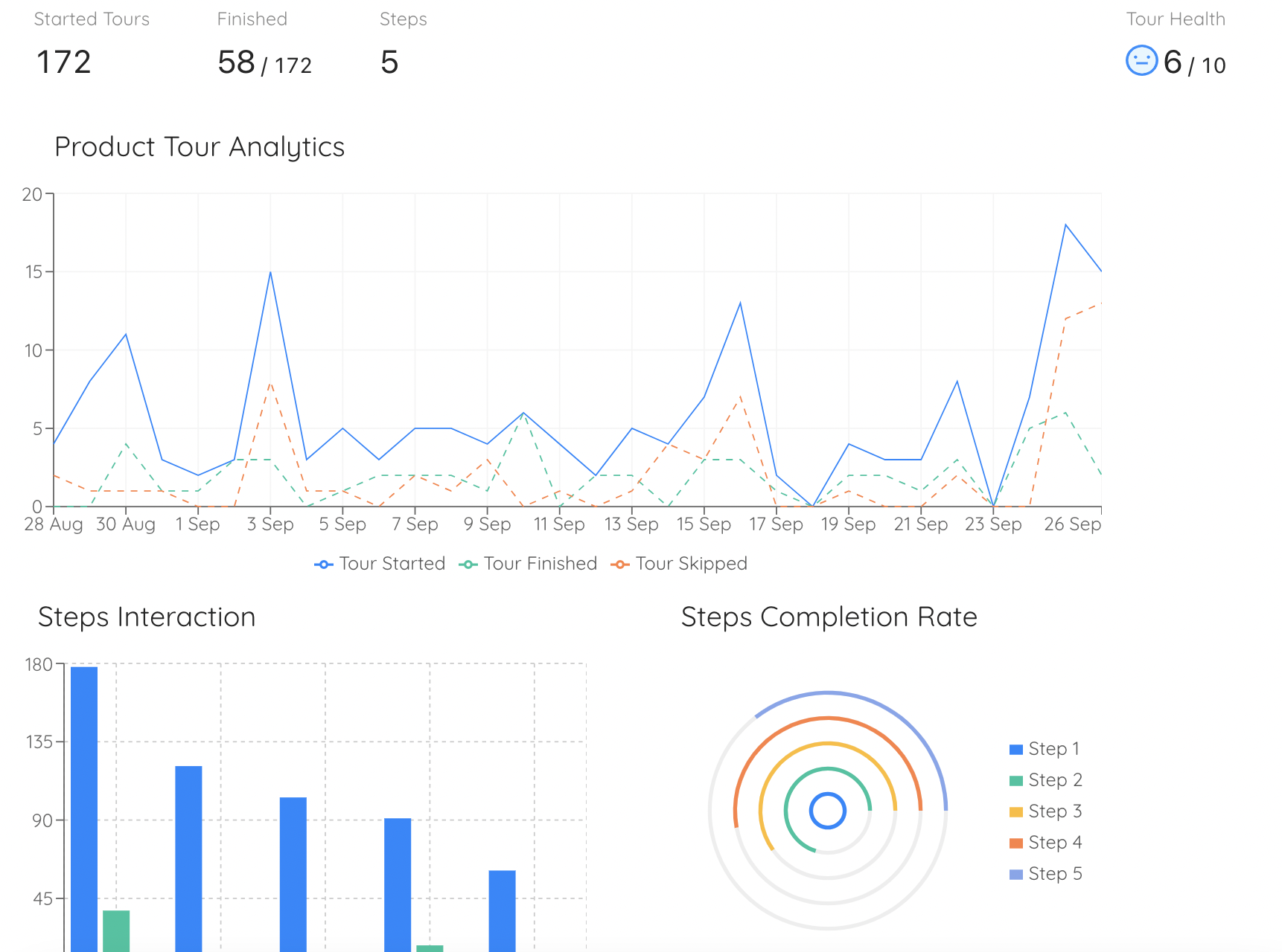
Per-step drop-off is the execution side made visible: the step where people leave is the stage of the task your interface is not explaining.
Two of those six are probably not in your analytics today. Repeat rate and immediate reversal rate need an event on the action and a small amount of intent about the window you count over, and once you have them they tend to be the two most actionable numbers on the list, because each one points at a specific sentence on a specific screen. Our guides to event tracking and behavioural analytics cover how to set them up without a data team, and session replay is the fastest way to confirm what a repeat actually looked like.
The Two Gulfs: Do vs. Don’t
✅ Do
- Ask which side of the action the confusion sits on before choosing a fix.
- Tag support tickets as how do I or did it, and count both separately.
- Alert on repeat actions inside a short window.
- Name the object and the outcome in every confirmation.
- Report back on anything that finishes after the user leaves.
- End a success message with the next step, not a full stop.
- Re-check both gulfs after any release that moves or changes a control.
- Fix the word on the control before you add guidance to explain it.
❌ Don’t
- Answer every adoption problem with another tour.
- Treat a ninety percent completion rate as proof that a flow is understood.
- Let Saved be the whole confirmation for a meaningful action.
- Allow any action to fail silently.
- Assume a spinner counts as feedback once it disappears.
- Put a new capability only in a changelog or a release email.
- Make a misunderstood control more prominent and call it discovery.
- Dismiss did that work messages as users not reading carefully.
The One-Paragraph Version
Every task a user attempts has two gaps in it. Before they act, they have to work out whether what they want is possible, which control does it and how to operate it: that is the gulf of execution, and it is closed by guidance, by the words on your controls, and by putting answers on the elements that raise questions. After they act, they have to work out whether anything changed, what it means and whether it matches what they wanted: that is the gulf of evaluation, and it is closed by visible state changes, by confirmations that name the object rather than the operation, and by reporting back on work that finishes after they have gone. Both gulfs produce low feature adoption, and your funnel only shows you one of them, because a user who acts and cannot tell what happened is recorded as a conversion. Split your adoption problems by which side of the action they sit on, count the repeats and the reversals as carefully as you count the drop-offs, and stop answering an evaluation gulf with more guidance: that user was never lost, and telling them again what to do does not answer the question they are asking.
Frequently Asked Questions
What is the gulf of execution?
The gulf of execution is the gap between what a user wants to achieve and the actions your interface makes visible and understandable to them. It is wide when a user cannot tell whether something is possible in your product, cannot tell which control does it, or cannot operate that control correctly once they have found it. Everything in this gulf happens before the action is performed, which is why it is closed by guidance: the words on your controls, a tooltip on the field that confuses people, a marker on the capability nobody opens, and a guided sequence triggered on the page where the task starts.
What is the gulf of evaluation?
The gulf of evaluation is the gap between the new state of your system after an action and what the user can actually work out from the screen. It is wide when your product changed something and the interface does not say so, says it in a way the user cannot decode, or says it somewhere the user is not looking. Everything in this gulf happens after the action, which is why it is closed by feedback rather than guidance: a visible state change, a confirmation that names the object and the outcome, a report back on work that finished later, and a clear next step.
What is the difference between the gulf of execution and the gulf of evaluation?
The action divides them. The gulf of execution covers everything up to and including performing the action, and the user's question is what can I do here and where. The gulf of evaluation covers everything after the action, and the user's question is did that work and what changed. They also leave opposite traces in your data: an execution gulf means the event never fires, while an evaluation gulf means the event fires more than once, gets reversed, or is followed by a page reload and a support message.
Who came up with the gulf of execution and the gulf of evaluation?
Both terms come from the cognitive scientist and designer Donald Norman, as part of a seven-stage model of how people act on the world and then judge the result. His wider argument was that most of what gets recorded as user error is really a design property: an interface either bridges these two gaps or it leaves the person stranded on one side of them, and calling the person careless explains nothing and fixes nothing.
What are the seven stages of action?
Goal, plan, specify, perform, perceive, interpret and compare. The goal forms in the user's head. Plan, specify and perform are the gulf of execution: is this possible, which control does it, can I operate it. Perceive, interpret and compare are the gulf of evaluation: did anything change, what does that mean, is it what I wanted. The useful part for a product team is that six of the seven stages can fail because of something the interface did or did not say, while most analytics setups only ever instrument the fourth one.
Why does a gulf of evaluation not show up in product analytics?
Because your funnel counts the action, and in an evaluation gulf the action happened. The user pressed the button, the event fired, the step is recorded as complete, and the report says the feature is performing well. The evidence of the problem is in signals most teams do not track: the same action repeated within a minute, a change made and immediately reversed, a page reloaded right after a success, and support tickets that begin with did it save or did they get it. Until you count those, an evaluation gulf is invisible to everyone except your support team.
How do I know whether to add guidance or fix feedback?
Ask whether the user acted. If the event never fires, or fires far below the number of accounts the capability applies to, you have an execution gulf and guidance is the right tool. If the event fires and is then repeated, reversed, or followed by a reload or a did-it-work message, you have an evaluation gulf and more guidance will make it worse, because the user was never lost. Within the execution gulf there is a second fork worth checking: never opened means a discoverability problem, while opened and abandoned in seconds usually means the label meant something different to the user than it does to you.
What is the difference between feedforward and feedback?
Feedforward is the information that helps a user predict what an action will do before they commit to it, such as a preview of how many records will be affected or a sentence naming what happens next. Feedback is the information that tells them what actually happened, such as a status badge that flips or a message naming the object that was sent and where it went. Feedforward narrows the gulf of execution and feedback narrows the gulf of evaluation, and a product can have plenty of one and almost none of the other.
Can in-app guidance close the gulf of evaluation, or does that need engineering?
Mostly it needs the product, because the confirmation of a state change belongs inside the thing that changed the state, and a guidance layer sitting on top of your interface cannot invent a status badge that does not exist. What a guidance and analytics layer does on the evaluation side is find the gaps and close the slower loops: feature usage and user flow reports show you the repeats and reversals your funnel is reading as successes, and an in-app announcement can report back on work that finished after the user left. The execution side, by contrast, is almost entirely closeable without engineering time.