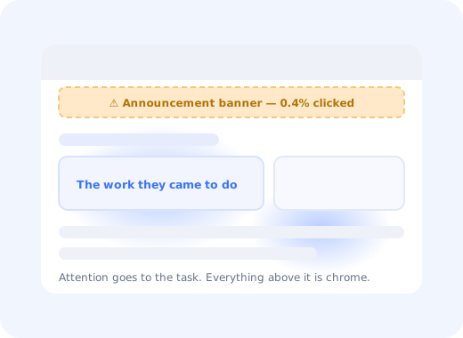
You ship an announcement bar for the feature the whole quarter went into. It sits at the top of every page for two weeks. Then the analytics come back: a fraction of a percent clicked, and support is still answering the question the banner answers.
The banner was not missed because it was too small or the wrong colour. It was filtered out before it was ever read, by a habit users have been building since the first web ad, and by everything your own product has taught them since they signed up.
This guide covers what banner blindness is, the three mechanisms that cause it, how to diagnose it in your own product, and seven fixes that get a message read without shouting.
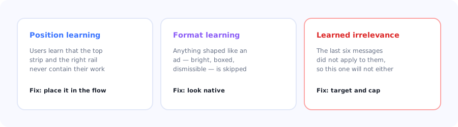
Three separate habits. Each one needs a different fix.
Key Takeaways
- Banner blindness is a learned filter, not a failure of attention: users skip regions and formats that have never been useful.
- Making it louder makes it worse. Ad-like styling is one of the cues the filter keys on.
- Your own irrelevant messages train it. Six untargeted announcements teach users that the seventh is safe to ignore.
- Position is the strongest lever: a message inside the workflow beats a message in the chrome, every time.
- Diagnose with the view-to-interaction ratio, not with impressions.
- Frequency capping is a feature, not a limitation. Attention is a shared budget across every message you send.
What is banner blindness?
Banner blindness definition: the tendency of users to ignore elements they have learned to associate with promotion rather than content, originally observed with web advertising, and now applying to any interface region or visual format that has repeatedly failed to contain something useful. It is not a conscious decision: the element is filtered out during visual scanning, before the user has evaluated what it says.
The important consequence is that it operates on regions and formats, not on content. Your genuinely useful message inherits the fate of every promotional banner that occupied the same strip of screen before it. That is why "but this one is actually important" never rescues a top-of-page bar.
The three mechanisms
1. Position learning
Users build a map of where their work lives and where it does not. The full-width strip above the header, the right-hand rail, the empty space under the footer: these are learned as non-content zones within a few sessions, and attention stops travelling there at all.
2. Format learning
Bright background, rounded box, an icon, a close button in the corner. That visual grammar means "promotion" to anyone who has used the internet, and it triggers the filter even when the message inside is a security notice. Design that shouts is design that gets skipped.
3. Learned irrelevance
The one you control most directly and damage most often. Every message that did not apply to the user teaches them that your messages do not apply to them. After a handful of untargeted announcements, dismissal becomes a reflex, and it applies to the one message that would have mattered.
Attention is a shared budget. Every in-app message you send spends from the same pool, and the balance carries across campaigns. A feature announcement blasted to the entire base does not just underperform; it raises the price of the next message you need people to read. This is the strongest practical argument for segmentation in product communication.
How to diagnose it in your product
Impressions will always look healthy, because impressions count pixels rendered rather than attention paid. Three measures tell the truth:
| Signal | How to read it | What it indicates |
|---|---|---|
| View-to-interaction ratio | Clicks or actions ÷ times displayed | Below a fraction of a percent on a persistent element usually means it is being filtered |
| Time-to-dismiss | Median seconds before close | Under two seconds means it was closed, not read |
| Support volume on the topic | Tickets about what the banner announced | Unchanged volume after a campaign is the clearest possible evidence |
The last one is the most convincing to a sceptical team: if the message had been read, the questions would have changed.
Seven fixes
Move it into the workflow
Make it look native
Trigger on relevance
Cap the frequency
Say the outcome, not the noun
Anchor to the thing it is about
Let it be dismissed for good
1. Move it into the workflow
The single highest-leverage change. A message placed next to the control it concerns (inside the panel, beside the field, on the empty state where the user is already looking) does not sit in a learned dead zone. Position beats every styling decision you could make.
2. Make it look native
Use the product's own visual language: the same card, the same type scale, the same subdued palette. Counterintuitively, the quieter a message looks, the more likely it is to be read, because it does not match the promotional pattern the filter is trained on.
3. Trigger on relevance
Show the message to the users for whom it is true: people on the plan it affects, people who use the feature it changes, people who have hit the limit it removes. Targeted messages get read because the previous ones were worth reading; relevance compounds in both directions.
4. Cap the frequency
Set a hard limit on messages per user per session and per week, and make campaigns compete for those slots. A cap forces prioritisation and protects the pool of attention you will need for something genuinely urgent.
5. Say the outcome, not the noun
"Introducing Workspaces" asks the user to work out whether they care. "Give your team separate spaces without separate accounts" answers it. The microcopy guide covers the formulas; the rule of thumb is that the first four words must contain the benefit.
6. Anchor to the thing it is about
A tooltip or a hotspot attached to the actual element carries the context that a page-level banner cannot. It also arrives at the moment the user is thinking about that part of the product, which is worth more than any amount of contrast.
7. Let it be dismissed for good
A message that returns after being dismissed converts a mild annoyance into a trained reflex. Persist the dismissal, and treat it as a signal: a high dismissal rate on a targeted message means the targeting is wrong, not that the message needs to be bigger.
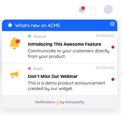
Native styling, one message at a time, targeted at the people it applies to.
When a banner is still the right choice
Persistent bars are not always wrong. They work for states rather than for news: an expiring trial, a failed payment, a scheduled maintenance window, a degraded service. What these have in common is that they describe the user's own situation and stay true until the user acts, so the message earns its permanence instead of merely occupying it. For everything else, the formats in our in-app messaging guide will outperform a bar.
Do's and don'ts
✅ Do
- Place messages inside the workflow
- Match the product's visual language
- Target by plan, behaviour and segment
- Cap messages per session and per week
- Lead with the outcome in the first four words
- Persist dismissals
- Measure interaction rate, not impressions
❌ Don't
- Answer low engagement with more contrast
- Broadcast every release to the whole base
- Stack two messages in one session
- Use the top strip for anything discretionary
- Re-show something the user closed
- Name the feature and stop there
- Report impressions as reach
Beating banner blindness with Kompassify
Every fix above is a targeting and placement decision rather than a design overhaul, which means they can be tested one at a time.
- Target by segment so each message goes only to the users it is true for.
- Anchor guidance to the element it concerns with tooltips and hotspots instead of page-level bars.
- Use the announcement widget for release news, so updates wait to be opened rather than interrupting.
- Check the ratio in product analytics: displays versus interactions, per message.
- Ask directly with a short in-app survey when a message underperforms: wrong audience or wrong offer.
Kompassify is a no-code digital adoption platform for SaaS teams: tours, checklists, tooltips, announcements, surveys and analytics in one place. Free up to 100 monthly active users, paid plans from $129/month, GDPR-compliant with EU hosting.
Get the message read
Move announcements out of the dead zones and into the workflow, targeted at the people they apply to.
Start for Free →Frequently Asked Questions
What is banner blindness?
Banner blindness is the tendency of users to ignore elements they have learned to associate with promotion rather than content. It was first observed with web advertising and now applies to any interface region or visual format that has repeatedly failed to contain something useful. It is not a conscious decision: the element is filtered out during visual scanning, before the user has evaluated what it says, which is why an important message placed in a promotional slot still goes unread.
What causes banner blindness in apps?
Three mechanisms. Position learning means users map where their work lives and stop looking at the strip above the header or the right-hand rail. Format learning means anything shaped like an advertisement, with a bright box, an icon and a close button, triggers the filter regardless of content. And learned irrelevance means that every message which did not apply to a user teaches them that your messages do not apply to them, turning dismissal into a reflex.
How do you fix banner blindness?
Move the message into the workflow next to the control it concerns, make it match the product's own visual language rather than shouting, trigger it only for users it is actually true for, cap how many messages a user can see per session and per week, lead with the outcome in the first few words rather than the feature name, anchor it to the element it is about with a tooltip or hotspot, and persist dismissals so a closed message stays closed.
Does making a banner bigger or brighter help?
No, it usually makes things worse. Ad-like styling is one of the cues the filter keys on, so increasing contrast, size and colour pushes the element further into the pattern users have learned to skip. The counterintuitive rule is that quieter, more native-looking messages get read more often, and the real lever is position and relevance rather than visual weight.
How do you measure banner blindness?
Not with impressions, which count pixels rendered rather than attention paid. Use the view-to-interaction ratio, meaning clicks or actions divided by times displayed, where a fraction of a percent on a persistent element indicates filtering. Use median time-to-dismiss, where under two seconds means the message was closed rather than read. And compare support volume on the topic before and after the campaign, since a message that was genuinely read changes the questions people ask.
When is a persistent banner still appropriate?
When it describes the user's own state rather than announcing news: an expiring trial, a failed payment, a scheduled maintenance window, a degraded service. What these have in common is that they remain true until the user acts, so the message earns its permanence rather than merely occupying it. Discretionary content such as feature announcements performs better in formats that wait to be opened or that anchor to the relevant part of the interface.
How many in-app messages is too many?
The practical answer is to set a hard cap per user per session and per week and make campaigns compete for those slots, because attention is a shared budget across every message you send. The measurable warning sign that you have exceeded it is a rising dismissal rate and falling interaction rates across all campaigns, not just the newest one, which indicates users are closing messages reflexively rather than evaluating them.
Is banner blindness the same as ad blindness?
Ad blindness is the original and narrower phenomenon, describing how users ignore advertising units on web pages. Banner blindness as used in product design extends the same learned filtering to in-app elements that look or sit like advertising, including announcement bars, promotional cards and sidebar callouts inside software the user pays for. The underlying mechanism is identical: repeated irrelevance in a given position or format trains the user to skip it.