Ask a product team how onboarding is going and you'll usually get one of two answers: a shrug, or a dashboard. The dashboard has twenty numbers on it. Signups, logins, sessions, DAU, tour views, NPS, a funnel chart with six steps. Everyone glances at it in the Monday meeting, nobody has changed a decision because of it in six months, and the one number that would have mattered, where exactly new users stall, isn't on there at all.
The problem isn't measurement, it's selection. User onboarding metrics are only useful when each one is attached to a decision: when this moves down, we look at that; when it moves up, we do more of this. A dozen such numbers, arranged along the funnel a new user actually walks, will tell you more than a hundred that merely exist.
This guide lays out that stack: the onboarding funnel as a measurement frame, twelve metrics worth tracking with their formulas and what to do when each one moves, the vanity metrics to leave off the board, how to instrument all of it without a data-engineering project, and how to run a weekly review that ends in a decision rather than a nod.
Key Takeaways
- Measure the funnel, not the totals. Onboarding is a sequence; a single completion percentage hides the one step that's actually breaking.
- Activation rate is the keystone metric: downstream of setup, upstream of retention and revenue. Define it from your own data, not from someone else's benchmark.
- Always measure by signup cohort. Calendar-week numbers move when marketing spends money, which makes them useless for judging onboarding.
- Pair every rate with a time. "80% activate" means something very different at two hours than at three weeks; rate and speed are two metrics, not one.
- If a number wouldn't change a decision, take it off the dashboard. Signups, tour views and total logins are the usual suspects.
- Instrument the guidance layer first. Tour and checklist step analytics give you the whole onboarding funnel without an events pipeline.
The Onboarding Funnel: The Frame Every Metric Hangs On
Before choosing metrics, agree on the sequence they measure. Almost every SaaS onboarding walks the same five stages, whatever the product does:
Five stages, five questions. Metrics that don't attach to a stage usually belong to marketing or to general product usage, not to onboarding.
Two rules make this frame work. First, measure by signup cohort, not calendar period: group users by the week they signed up and follow that group forward. Calendar numbers move whenever acquisition spends money, which makes them worthless for judging whether onboarding improved. Second, pair every rate with a time: 70% of users activating within three weeks is a very different product from 70% activating in the first hour, and only one of them has an onboarding problem.
Stage 1–2 Metrics: Do They Start, and Do They Finish?
1. Signup-to-start rate
Formula: users who began onboarding ÷ users who created an account × 100.
The most commonly missing metric on the board, and often the biggest leak. A meaningful share of accounts never take a single step: they signed up out of curiosity, got interrupted, or landed somewhere that gave them nothing to do. If this number is low, the problem is your first screen: a blank dashboard with no obvious next action, an empty state that explains nothing, or a welcome screen that asks for effort before showing value.
2. Setup completion rate, overall and per step
Formula: users who completed setup ÷ users who started it × 100, and the same per step.
Track both. The overall number tells you there's a problem; the per-step breakdown tells you which step, which is the only version you can act on. Watch for the classic pattern where one step (usually a permission grant, an integration, or a data import) accounts for the majority of all abandonment.
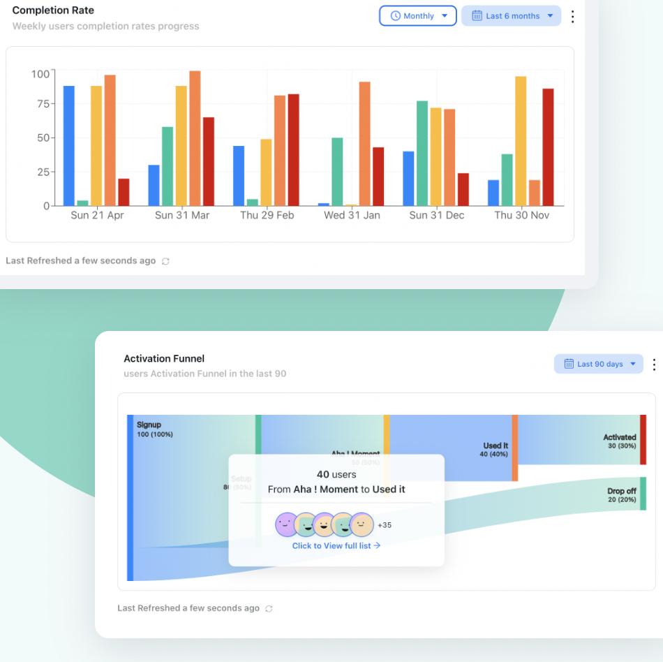
One step is eating this funnel. An aggregate "26% activation" hides it completely; the per-step view names it in three seconds, and names next sprint's work.
3. Time to first action
Formula: median minutes from signup to the first meaningful in-product action.
Use the median, not the mean: a handful of users who came back three weeks later will drag an average into fiction. This metric is the early-warning system for time to value: if the first real action takes twenty minutes, the value is landing outside the session where enthusiasm lives.
4. Onboarding drop-off point
Formula: the step with the largest percentage loss between consecutive steps.
Not a rate but a location, and arguably the single most actionable thing on the list. Publish it every week by name ("we lose 44% at Connect a data source"), because a named step gets an owner while a percentage gets a nod.
Stage 3–4 Metrics: Did Value Actually Land?
5. Activation rate
Formula: users who performed the activation action ÷ users in the signup cohort × 100.
The keystone. Everything upstream exists to raise it and everything downstream depends on it. The hard part isn't the arithmetic, it's the definition: find the early behaviour that best separates users who are still around at day 30 from users who aren't, and make that your activation event. Then hold it still: a definition that drifts makes every trend line a lie. The full method is in our guide to increasing user activation.
6. Time to value (TTV)
Formula: median time from signup to the first moment of real value.
Activation's twin: one measures whether users get there, the other how long it takes. Track them together, because they move independently: a redesign that raises activation while doubling the time to reach it has usually made things worse. See the time to value guide for how to define the moment and shorten it.
7. Onboarding checklist completion rate
Formula: users who completed all checklist items ÷ users who saw the checklist × 100.
Useful in two directions. As an outcome it tells you whether your guided path works; as a diagnostic, the per-item completion tells you which task users refuse to do. An item that everyone skips is either badly explained or genuinely unnecessary, and both answers are worth having. More on designing the path itself in our onboarding checklist guide.
8. Guidance engagement: tour and tooltip completion
Formula: users who completed the tour ÷ users who started it × 100, plus per-step drop-off.
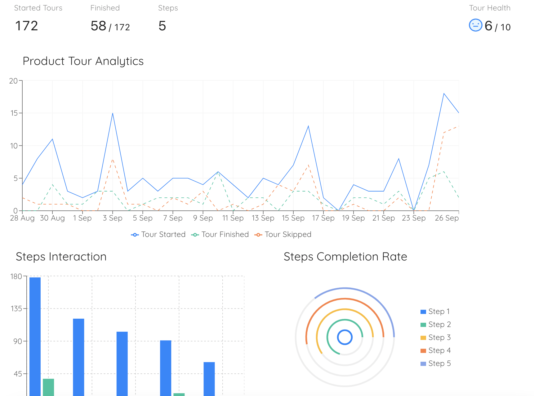
Not "views": completion. A product tour with a 90% view rate and a 20% completion rate is being closed, not consumed, and its step-level drop-off will usually point at the exact moment you asked for too much. This is also the cheapest metric on the whole list to instrument, because guidance tools track it natively.
9. Feature adoption breadth in week one
Formula: average number of distinct core features used by a new user in their first seven days.
Depth of engagement, early. Users who touch three core features in week one behave very differently from users who touch one; breadth is one of the strongest predictors of retention there is, and it's the metric that tells you whether onboarding is teaching the product or just the first screen of it. Pair it with feature discovery work.
Stage 5 Metrics: Did It Hold?
10. Week-one (and day-30) retention by cohort
Formula: users active in days 1–7 ÷ users in the signup cohort × 100, repeated for day 30.
The verdict on everything before it. Onboarding changes show up here first and most honestly, which is why cohort retention is the right scoreboard for an onboarding team even though it isn't strictly an onboarding metric. Read it as a curve rather than a point; our retention curve guide covers how to tell a flattening curve from a falling one, and user retention covers the benchmarks.
11. Support tickets per 100 new users
Formula: onboarding-related tickets ÷ new users in the cohort × 100.
The most under-rated metric here, because it converts confusion into a number a finance team understands. It also comes with free qualitative data attached: the ticket text names the exact step that failed. Falling tickets per new user is one of the clearest signals that a guidance change worked, and it's the metric that justifies in-app support investment.
12. Trial-to-paid conversion by activation status
Formula: paid conversions ÷ trials started × 100, split by whether the user activated.
The split is the whole point. Comparing conversion among activated versus non-activated users turns onboarding from a cost centre into a revenue argument, and the gap between the two numbers is the strongest case you will ever make for onboarding investment. More on the mechanics in our free trial conversion guide.
The Vanity Metrics to Leave Off the Dashboard
Every one of these appears on onboarding dashboards constantly, and none of them survives the question "what would we do differently if this moved?"
| Vanity metric | Why it misleads | Track this instead |
|---|---|---|
| Total signups | Measures marketing spend, not onboarding | Signup-to-start and activation rate |
| Tour / tooltip views | Counts delivery, not comprehension | Completion rate and per-step drop-off |
| Total logins | Mixes new users with power users | Cohort retention by signup week |
| Average session length | Long sessions can mean confusion | Time to first action, time to value |
| Email open rate | Opening isn't acting | Click-through into the product, then activation |
| Mean time to activate | Outliers make the average fiction | The median, plus the distribution |
The one-question filter. For every number on your board, ask: "if this improved 20% tomorrow, what would we do differently?" If the honest answer is "nothing", it isn't a metric; it's a mood. Cutting the dashboard down to the numbers that survive this question is usually the highest-leverage thing an onboarding team does all quarter.
How to Instrument This Without a Data Team
The reason most teams don't measure onboarding properly isn't disagreement about which metrics matter; it's that instrumenting them looks like a quarter of engineering work. It doesn't have to be. Split the list in two:
- The funnel half comes from your guidance layer. Setup completion per step, checklist item completion, tour and tooltip drop-off, time between steps: these are all properties of the onboarding experience itself, and tools that deliver that experience track them natively. No events to define, no pipeline to maintain.
- The outcome half comes from your product data. Activation, retention by cohort, feature breadth, trial conversion. Most teams already have these events; what's usually missing is the cohort framing and a stable activation definition, both of which are analysis decisions rather than engineering ones.
Start with the funnel half: it's the part you can turn on this week, and it contains the drop-off point, which is where the work is. Then connect the outcome half so you can prove a fixed step actually moved retention. Our guide to product analytics covers the outcome side in more depth.
Turning the Dashboard Into a Weekly Decision
Metrics change nothing until a ritual attaches them to a decision. A 20-minute weekly onboarding review, five questions, same order every time:
1. Where did this week's cohort lose the most people?
Name the step, not the percentage. The answer is a place in the product, and places have owners.
2. Did last week's change move that step?
Compare cohort to cohort, not week to week. If you changed nothing, say so: an unchanged number after an unchanged week is information too.
3. Are activation rate and time to value moving in the same direction?
If the rate rose but the time got longer, you've probably added guidance where you needed to remove work.
4. What are new users writing to support about?
The ticket text is the qualitative half of every number above, and it usually names the fix. Pair it with what your in-app surveys collected the same week.
5. What is the one change we're shipping before the next review?
One. A review that produces five ideas produces nothing; a review that produces one shipped change compounds every week it happens.
Onboarding Measurement: Do vs. Don't
✅ Do
- Group users by signup cohort, always
- Track completion per step, not just overall
- Pair every rate with a median time
- Define activation from your own retention data
- Publish the biggest drop-off step by name each week
- Split trial conversion by activation status
- Count onboarding support tickets per 100 new users
- End every review with one shipped change
❌ Don't
- Report onboarding health as total signups
- Use means where outliers live; use medians
- Count tour views as tour engagement
- Change the activation definition mid-quarter
- Compare your rate to a benchmark you can't inspect
- Measure by calendar week when acquisition is spiky
- Keep numbers nobody would act on
- Wait for a data pipeline before measuring anything
Measuring Onboarding Without Building a Pipeline
With Kompassify, the onboarding funnel is instrumented by the act of building the onboarding:
- Every step is measured by default. Tours, checklists, tooltips and surveys report starts, completions and per-step drop-off without an engineer defining events.
- See where people stall, by name. Step-level analytics point at the specific moment users leave, the metric that turns a dashboard into a sprint.
- Compare segments against each other. Admins versus members, plan versus plan, this month's cohort versus last: the comparisons that explain an aggregate.
- Change the flow and re-measure the same week. Because guidance ships without a release, the loop between "we think this step is the problem" and "we know" is days, not quarters.
Kompassify is GDPR compliant and EU-hosted, free for under 100 monthly active users, with paid plans from $129/month.
Know Exactly Where New Users Stall
Kompassify lets you build onboarding tours, checklists and tooltips on top of your existing product, and measures every step of them automatically. See the drop-off point by name, fix it without a release, and watch the next cohort move. GDPR compliant, EU-hosted, and free for under 100 monthly active users.
Start for Free →Frequently Asked Questions
What are user onboarding metrics?
User onboarding metrics are the numbers that describe how reliably new users get from signing up to getting real value from a product. They sit in a funnel: how many people start setup, how many finish it, how long it takes to reach the first meaningful action, how many reach activation, and how many are still there a week later. Good onboarding metrics share one property: each has a clear owner and a clear action when it moves. A number nobody would act on isn't a metric, it's decoration.
What is the most important onboarding metric?
Activation rate: the share of new users who complete the action that reliably predicts retention in your product. It matters most because it sits at the junction of everything else: it is downstream of setup completion and time to first action, and upstream of week-one retention and trial-to-paid conversion. If you can track only one number, track activation, and define it from your own data by finding the early behaviour that separates users who stay from users who don't.
How do you calculate onboarding completion rate?
Divide the number of users who finished the defined onboarding sequence by the number who started it, over a fixed cohort window: completion rate = finished ÷ started × 100. Two details make it honest. Measure by signup cohort rather than by calendar week, so a spike in signups doesn't distort the rate. And measure per step as well as overall: an aggregate of 46% tells you there is a problem, while the per-step view tells you it is step three, which is the only version you can act on.
What is a good activation rate for SaaS?
There is no universal number, because activation is defined per product: one team counts a connected data source, another counts an invited teammate, another a published project. A rate that looks poor against someone else's benchmark may be excellent for a product with a heavier setup. The useful comparison is your own trend and your own cohorts: is this month's signup cohort activating faster and in greater numbers than last month's? Chase that delta rather than an industry figure whose definition you can't see.
What are vanity metrics in onboarding?
Numbers that move without telling you anything you can act on. Signups is the classic: it measures marketing, not onboarding. Tour views, tooltip impressions and email opens measure delivery, not comprehension. Total logins conflates a power user's tenth visit with a new user's first. The test: if this number improved by 20% tomorrow, would you do anything differently? If not, it belongs in a report nobody reads rather than on the dashboard your team looks at every week.
How long should onboarding take to measure?
Measure over two windows. A short one, usually the first session and the first 24 hours, captures whether setup works at all. A longer one, typically 7 to 30 days depending on your usage cycle, captures whether value actually landed. Weekly-use products need a 30-day window to see a fair signal; daily-use products can read most of the story in a week. Fix the window, publish it, and never change it silently, because a moved window makes every historical comparison meaningless.
How do you track onboarding metrics without a data team?
Instrument the guidance layer rather than building a pipeline. A no-code platform like Kompassify tracks the steps of your product tours and onboarding checklists: who started, who finished, where people dropped, how long each step took, and shows it next to the segments the users came from, without an engineer instrumenting events. That covers the onboarding funnel end to end; you can then connect the outcome metrics you already have in your product analytics. Kompassify is GDPR compliant and EU-hosted, free for under 100 monthly active users, with paid plans from $129/month.