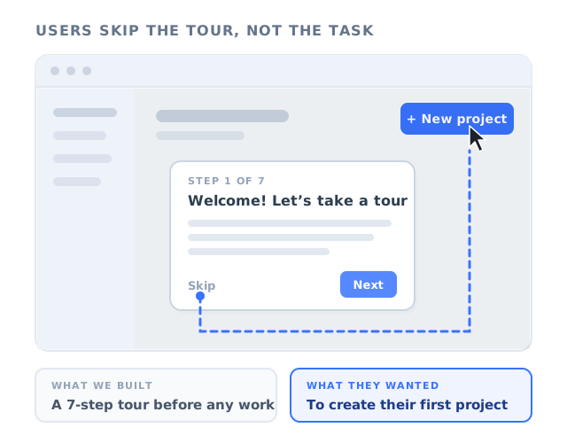
Watch a recording of a new user's first session and there is a good chance you will see the same two seconds that every product team eventually sees. The welcome tour opens. The user's cursor is already moving. It finds the small grey Skip link, clicks it, and heads straight for the button the user came to press. Seven carefully written steps, a week of debate about the copy, gone before the first sentence was read.
The usual reaction in the room is some version of "users are lazy" or "nobody reads anything any more". Both are wrong, and neither is new. In 1987, two IBM researchers, John Carroll and Mary Beth Rosson, described exactly this behaviour in people learning to use office software, and gave it a name: the paradox of the active user. The people they studied skipped the manuals, skipped the tutorials, and started trying to do real work straight away, even when a little learning up front would clearly have saved them time.
Nearly forty years and several generations of software later, the paradox has not gone anywhere. What has changed is that product teams now have far better tools to design for it. This guide covers what the paradox of the active user is, the two biases behind it, why skipping your tour is a rational decision from the user's side, how the paradox shows up in your onboarding data, the four places active users leave your guidance, the minimalist instruction principles that were the original answer to it, eight design rules for in-app guidance that works with active users instead of against them, and how to measure whether it does.
Key takeaways
- The paradox of the active user: people are so focused on getting a task done that they skip instructions and start acting straight away, even when learning first would save them time overall.
- Two biases drive it: production bias (users care about output, not learning, and keep the first method that works) and assimilation bias (users read a new product through what they know from other tools).
- Skipping is rational from the user's side: the cost of learning is immediate and certain, the payoff later and uncertain. Persuading users to learn first rarely works. Designing guidance that is itself a way of doing the task does.
- Active users leave guidance at four predictable points: before it starts, during a run of reading steps, at the end when nothing was produced, and later when help sits outside the task. Per-step analytics tell you which one you have.
- The fix is to move guidance up the Tell, Show, Guide, Do ladder: steps that wait for the user's real click, tours that end in a real result, and answers placed exactly where users' guesses go wrong.
What Is the Paradox of the Active User? (Meaning and Definition)
Paradox of the active user: definition
The paradox of the active user is the observation that people using a new piece of software do not stop to learn it. They start trying to accomplish real tasks immediately, skipping manuals, tutorials and tours, even though investing a little time in learning would make them faster overall. It is a paradox because the behaviour that feels fastest to the user is the one that keeps them slower in the long run.
Carroll and Rosson were studying how people learned to use computer systems in the workplace, at a time when software shipped with thick printed manuals and structured tutorials. What they saw, again and again, was that learners did not use them the way the authors intended. People skimmed, skipped ahead, ignored the exercises and tried to do the thing they actually needed to do. They learned only as much as the task in front of them required. And once they found a way of doing something that worked, they kept doing it that way, even after a faster method was pointed out to them.
The word paradox is precise. If users invested some time in learning the system, they would become more productive. Because they are so focused on being productive right now, they do not invest that time, and so they stay less productive than they could be. The very motivation that makes them want to use the software is what stops them from learning to use it well.
It is also not only a new-user phenomenon. The same pattern appears when an experienced user meets a new feature, when someone returns to a product after months away, and when employees are handed new internal software on a Monday morning with a deadline on Tuesday. As our guide to the 5 moments of need puts it, users meet a feature as new only once but use it for real work every time after that. The paradox describes how they behave in both situations: they reach for the work.
Production Bias and Assimilation Bias: The Two Forces Behind the Paradox
Carroll and Rosson explained the paradox with two biases. One is about motivation, the other about how people understand something new. They produce different symptoms in a SaaS product and need different fixes, so it is worth keeping them apart.
Production bias: the task comes first
Users open your product to produce something: a report, an invoice, a campaign, a scheduled post, a closed ticket. Anything that does not visibly move that task forward registers as a cost. Reading, watching a video or clicking Next through a tour produces nothing, so it gets skipped or rushed. This is production bias, and it explains the first half of the paradox, the skipping.
It also explains the second half. Once a user has a method that works, stopping to learn a better one is another interruption to production, so they keep the method they have. That is how you end up with customers who export data to a spreadsheet every week to do a filter your product has built in, or who edit forty records one by one next to a bulk-edit button they have never clicked. Nobody taught them the slow way. It was simply the first way that worked.
Assimilation bias: the new is read through the old
Users approach your product carrying everything they learned from the products before it. They assume the gear icon holds the settings, that dragging moves things, that deleting can be undone, and that "archive" means what it means in their email. Where the assumption fits, it is a huge accelerator: nobody needs a tour to find a search box. Where it does not fit, users make confident mistakes and often do not notice, because the product seemed to respond the way they expected.
Assimilation bias is closely related to the idea of mental models, the internal picture a user builds of how a product works. Our guide to mental models in UX covers where those pictures come from and how to find out what yours look like. For the paradox, the point that matters is simpler: users will guess before they look, and they will guess from other software.
| Bias | What the user does | How it looks in a SaaS product | What it costs you |
|---|---|---|---|
| Production bias | Starts the task immediately and skips anything that is not the task | Tour dismissed at step one, help center unopened, onboarding videos unplayed | Features learned by trial and error, or never learned at all |
| Production bias (the plateau) | Keeps the first method that works | Workarounds: weekly exports, repeated manual steps, copy and paste between screens | Users stuck at low efficiency who describe your product as basic |
| Assimilation bias | Transfers expectations from other tools | Confident wrong actions: the wrong object type, the wrong setting, an assumed undo | Silent errors, data problems, "is this a bug?" tickets |
| Assimilation bias | Skims past anything that looks familiar | A standard-looking control that behaves differently is used as if it were standard | Features that look adopted in usage data but are misunderstood |
Why Skipping Your Tour Is a Rational Decision
It is tempting to read the paradox as a flaw in users that better onboarding copy could correct. It is more useful to read it as a sensible decision made with the information the user has at the moment they make it.
Look at the choice from the user's side. A tour announces its cost up front: "Step 1 of 7". It promises a benefit later, and that benefit is vague, because the user does not yet know what they do not know. Diving in, on the other hand, produces visible progress immediately. At the moment of decision, which is the only moment the user can see, diving in is ahead. Learning first only wins much later, if it wins at all, and the user has no way of knowing that in advance.
The chart makes the trap visible. Learning first eventually overtakes diving in, but only long after the user made the choice, and the early part of that line, where nothing gets produced, is exactly what the user is trying to avoid. The only curve that beats diving in from the start is the third one: learning that happens while doing, where each piece of guidance is itself a step of the real task. There is no dip to sit through and no plateau to get stuck on, because the user never had to choose between learning and working.
Two other forces push users towards diving in. The first is experience. Most software they have used could be figured out by poking around, and most tours they have sat through told them what buttons were called rather than how to get a job done. They have learned, correctly, that instructions are usually optional. The second is what the economist Herbert Simon called satisficing: choosing the first option that is good enough rather than searching for the best one. Active users satisfice on methods. Good enough to finish today's task beats optimal after an hour of study.
The practical rule that follows: never ask an active user to choose between learning and doing. If skipping were laziness, the answer would be persuasion: better copy, a progress bar, a reward for finishing. Because skipping is a sensible trade-off, the answer is to change the trade-off, by designing guidance that costs nothing extra because following it is the task.
How the Paradox Shows Up in Your Onboarding Data
You rarely need a usability lab to see the paradox at work. It leaves recognisable traces in data most product teams already have. None of these signals proves it on its own; together, they tell you it is operating and roughly which bias dominates.
Most tour abandonment happens on the first or second step instead of being spread across the tour. Users are not getting bored halfway; they are declining the tour itself.
Completion looks healthy, but users who finish the tour activate at about the same rate as those who skip it. People clicked Next to get the tour out of the way.
How-to questions arrive about exactly the things the welcome tour explained. It was shown to people who were not ready to listen yet.
Documentation gets its traffic from error states and searches, almost never from browsing. Users do not read ahead; they look things up mid-task, or not at all.
Frequent exports, repeated manual actions and copy-paste patterns where a built-in feature would do the job. This is the plateau, visible in your analytics.
Wrong settings, misused objects and "is this a bug?" tickets that turn out to be the product doing exactly what it says. This is assimilation bias at work.
The Four Exits: Where Active Users Leave Your Guidance
Active users do not abandon guidance at random. They leave at four points, each for a different reason and each with a different fix. Knowing which exit you have is more useful than knowing your overall completion rate, because the fixes pull in different directions.
Exit 1: Before it starts (the wrong moment)
The tour opens on login, in front of the task the user came to do. They have not done anything yet, so the tour is pure cost, and it is standing between them and the thing they want. The problem is worst for returning users and for anyone who arrived through a link to a specific page with a specific job in mind. The fix is timing: start guidance on the page where the task happens, at the moment the user begins it. Our guide to onboarding triggers covers the rules that make this work.
Where you see it: a steep drop between the tour's first and second step.
Exit 2: In the middle (the reading streak)
The user tolerates a step or two, then meets three or four "here is the reports panel" steps in a row. Each Next click produces nothing. Somewhere in that streak they decide the tour is a lecture and leave. The fix is to turn reading steps into steps where the user does something, or to cut them.
Where you see it: step-by-step drop-off that accelerates across consecutive steps that only ask for Next.
Exit 3: At the end (nothing was produced)
The user finishes the tour and has made nothing. They know where the buttons are, but the first real task still lies ahead of them and looks as intimidating as it did before. Many will not come back to attempt it. The fix is to end the tour on a real result, which is the definition of activation in most products. Our guide on how to increase user activation covers how to pick that result.
Where you see it: the activation rate of tour completers is barely higher than that of users who skipped.
Exit 4: Later (help outside the task)
Days later, the user hits a question in the middle of real work. The answer exists, in a help article, a video, or the welcome tour they skipped. Getting to it means leaving the task, so they guess instead, or open a ticket. The fix is to put the answer on the element where the question arises and to give users a way back into guided flows from inside the product. Our guide to contextual help covers the patterns.
Where you see it: how-to tickets and workarounds on features that already have documentation.
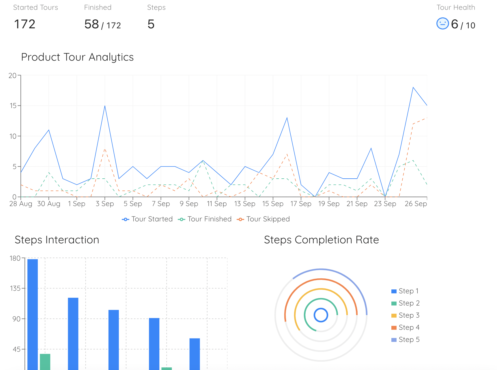
Per-step completion tells you which exit you have: a cliff at step one is a timing problem, a slope through the middle is a reading streak.
Minimalist Instruction: The Original Answer to the Paradox
Carroll did not stop at describing the problem. With colleagues, he developed an approach to instruction design built around it, which he called minimalism. Instead of comprehensive manuals that tried to teach everything before the user started, minimalist instruction gave learners short, task-focused material that let them act straight away, and it put deliberate effort into helping them notice and recover from mistakes. In their studies, learners working from slimmed-down, task-oriented material became productive faster than learners working through a standard comprehensive manual.
The approach was later summarised in four principles. They were written for printed documentation, but they translate almost directly into in-app guidance.
| Minimalist principle | What it meant for manuals | What it means for in-app guidance |
|---|---|---|
| 1. Choose an action-oriented approach | Let readers start real work on the first page; cut the preamble | Make the first step of every tour something the user does; drop welcome screens that only describe |
| 2. Anchor the tool in the task domain | Organise material around the reader's tasks, not the software's menus | Build each tour around one job ("send your first invoice"), not around the layout ("this is the sidebar") |
| 3. Support error recognition and recovery | Tell readers how to spot and undo the mistakes they are likely to make | Put help where errors happen: the field that fails validation, the empty result, the disabled button |
| 4. Support reading to do, study and locate | Keep text brief; make it easy to find the one thing you need | One or two sentences per step; every guided flow relaunchable from a place users can find |
The third principle is the one product teams most often miss. Active users will make mistakes; that is the price of learning by doing, and it is a price they are happy to pay. A product that makes mistakes cheap to see and cheap to undo turns trial and error into a teaching method. A product that hides them, or makes them expensive, turns trial and error into support tickets and churn.
Tell, Show, Guide, Do: Rating Your Guidance for Active Users
A simple way to apply all of this to the guidance you already have is to rate every step by how much of the action belongs to the user. There are four rungs.
-
1. Tell: text and a Next button
A modal or a floating card explains something. The user reads it, or does not, and clicks Next. This is the rung active users skip.
-
2. Show: pointing at the real element
A tooltip is attached to a real part of the interface, which is better, because the user learns where something is. But the step still advances on Next, so the user is watching rather than doing.
-
3. Guide: waiting for the real click
The element is highlighted and the step waits until the user clicks it. There is no Next button to press. The user is acting on the real interface, so following the guidance and doing the task are the same movement.
-
4. Do: ending in a real result
The user completes a real piece of work, and the guidance is finished because the work is. A checklist item ticks itself off; a project exists that did not exist before.
To audit a tour, list its steps and give each one a rung. Most welcome tours turn out to be almost entirely Tell and Show, which is exactly what production bias punishes. A tour built for active users is mostly Guide steps and ends on a Do.
Tell steps are not forbidden. A single sentence that explains a concept the user genuinely cannot infer, or a question that routes them to the right path, is worth a brief interruption. The problem is the tour made of nothing else. If you want to know how much a Tell step costs, look at the drop-off on the step after it.
How to Design Onboarding for Active Users: 8 Rules
The rules below apply the paradox to the guidance most SaaS teams actually ship: product tours, tooltips, hotspots and checklists. Each one is aimed at a specific exit or bias.
- Trigger guidance on intent, not on login
- Make the first step something the user does
- End every tour with a real result
- Never put two reading steps in a row
- Let users leave, and leave the door open
- Put the answer where the guess goes wrong
- Show the faster path once the slow one works
- Write for someone scanning with one hand on the mouse
1. Trigger guidance on intent, not on login
Show the tour for building a report when the user opens the reports page for the first time, or clicks "New report", not when they log in. The same content, shown at the moment of intent, is no longer an interruption to the task: it is help with the task they just started. Use page targeting and segment rules so that returning users, and users who have already done the task, never see it at all.
What it changes: Exit 1. The step-one cliff shrinks because the tour now starts where the user was already going.
2. Make the first step something the user does
The first step decides whether the user reads your guidance as a lesson or as a shortcut. Replace "Welcome to your dashboard" with a highlighted "New project" button and one line: "Start here: create your first project." Then set the step to advance only when the user clicks the real button, not a Next button inside a tooltip. From the user's point of view, the tour has not interrupted them at all. It has simply shown them where to click.
What it changes: the tour stops competing with the task, because its first move is the task's first move.
3. End every tour with a real result
Define each tour's end state as something the user has made: a project with one task in it, an invoice ready to send, a connected integration, a first report saved. If a tour ends with "That's it, you're ready to go!", it ends just before the hard part. Working backwards from the result also keeps tours short, because every step that does not lead to it becomes easy to cut. Our guide to time to value covers how to shorten the path to that first result.
What it changes: Exit 3. Completing the tour and reaching first value become the same event.
4. Never put two reading steps in a row
Treat this as a working rule rather than a law: if two consecutive steps only ask for Next, merge them, cut one, or turn one into an action. A reading streak is where active users conclude the tour is a lecture. Anything that cannot be turned into an action should fit in one sentence, attached to the element it describes.
What it changes: Exit 2. The mid-tour slope flattens because every step moves the task forward.
5. Let users leave, and leave the door open
Always offer a way out. Forcing an active user through a tour turns a skipped tour into a resentful user, and they will click through it without reading anyway. But make the exit a pause, not a goodbye. Put the same guided flow behind an item in an onboarding checklist, so the user who skipped the tour on day one can launch it on day four, at the moment they actually need it. Our guide to creating an onboarding checklist covers how to structure one.
What it changes: skipping stops being a loss. The guidance waits until the user is ready to pull it.
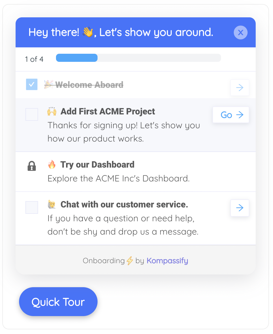
A checklist turns a skipped tour into one the user can start later, from inside the product, when the task is actually in front of them.
6. Put the answer where the guess goes wrong
Assimilation bias means users will guess first. Find the places where their guesses fail: a support ticket pattern, a setting that is often changed and changed back, a field that is often filled in wrongly. Then put a tooltip or a hotspot exactly there, with one sentence that names the difference: "Unlike a folder, a label can hold the same item in several places." Guidance at the point of the wrong guess gets read, because the user has just noticed that something did not work the way they expected.
What it changes: Exit 4 and the confident mistakes. The correction arrives at the only moment the user is open to it.
7. Show the faster path once the slow one works
The plateau is production bias at work: the user has a method that works and no reason to look for a better one. The right moment to show the shortcut, the bulk action or the automation is after they have done the slow version a few times, when the saving is concrete. A hotspot on the bulk-edit button, shown to users who edited a dozen records one by one this week, is a very different message from the same feature squeezed into a first-week tour. Our guide to learnability covers how to spot users stuck on a plateau in your product data.
What it changes: users move off their workarounds, because the better method is offered when its value is obvious.
8. Write for someone scanning with one hand on the mouse
Active users read in fragments: the first few words of a step, the button label, anything in bold. Lead with the verb and the outcome ("Add a teammate so they can see this board"), keep each step to a sentence or two, and never explain what the user can already see ("This is the Save button"). Our guide to UX microcopy covers the formulas that work.
What it changes: the steps that remain get read, because they are short enough to read in the time the user is willing to give.
Designing for Assimilation Bias: When Users Guess From Other Tools
Production bias decides that users will skip your instructions. Assimilation bias decides what they do instead: they act on what worked in the last product they used. Three moves keep that from turning into silent errors.
Let familiar things behave the familiar way. Wherever your product can match a common convention (standard icons, undo, drag and drop, keyboard shortcuts, the place settings usually live), matching it is free onboarding. Being different where it does not matter to your product's value costs you in errors and support tickets, and no tour will fully pay that cost back.
When you must differ, say so at the point of difference. Your product is different in the ways that make it worth buying, and those are exactly the places where users' guesses will fail. One sentence attached to the control that behaves differently ("Unlike a spreadsheet, changes here save automatically") does more than any tour, because it appears at the moment the old habit is about to misfire.
Expect the strongest guesses from switchers. Users migrating from another tool bring years of habits, and they often arrive with a deadline. They need their own path, built around the handful of differences that will trip them up. Our guide to switcher onboarding covers how to build it.
What the Paradox of the Active User Does Not Mean
The paradox is easy to over-apply. Five readings of it lead teams in the wrong direction.
-
"Users are lazy."
They are busy, which is different. Their effort goes into the task, often a lot of effort. Your guidance has to become part of that effort instead of competing with it.
-
"Onboarding is pointless."
The paradox argues against guidance that postpones the task, not against guidance. Users learn constantly. They learn by doing, and guidance that is part of the doing is the most effective kind there is.
-
"Never show a product tour."
A short tour that is the task, triggered when the user starts it and advancing on their real clicks, is exactly what the paradox recommends. What it rules out is the tour of the interface on first login.
-
"Make everything skippable and you are done."
A skip option is necessary, but on its own it just makes the loss faster. Without a way back in, a skipped tour is gone for good, and so is the chance to help at the moment the user needs it.
-
"Documentation no longer matters."
It matters a great deal, just not as the way people start. Users go to documentation to solve a specific problem or to look up a specific answer, so write and structure it for looking things up, not for reading front to back.
How to Measure Whether Your Guidance Works for Active Users
Tour completion rate is the metric the paradox makes least trustworthy: active users will click Next to make a tour disappear, and that counts as a completion. The metrics below measure what the guidance changed instead.
| Metric | What it tells you | Watch out for |
|---|---|---|
| Step-one exit rate | Whether the tour starts at a moment of intent | Compare tours launched on login with tours launched on the page where the task happens |
| Drop-off per step, by rung | Whether Tell and Show steps lose more people than Guide steps | Small samples per step; read the pattern across steps, not single values |
| Activation: completers vs. skippers | Whether finishing the tour produces the outcome it was built for | Completers self-select; a holdout group gives a fairer comparison |
| Time to first real action | How long users spend before they produce anything | Measure from the first session, not from signup |
| Relaunches from the checklist | Whether users who skipped come back to guidance when they need it | A low number can mean the item is hard to find, not that it is unwanted |
| How-to tickets on guided features | Whether help reaches users at the moment of need | Tag tickets by feature and by question type, or the trend is invisible |
| Workaround events | Whether users leave slow methods after the faster path is shown | Define the workaround event before the nudge goes live, so you have a baseline |
For the completers versus skippers comparison, remember that the people who finish a tour were often more motivated to begin with. If you want a clean answer to whether a tour helps, hold it back from a random share of eligible users and compare their activation with everyone else's. Our guide to A/B testing onboarding covers how to set that up and how long to run it.
Paradox of the Active User: Do vs. Don’t
✅ Do
- Trigger guidance when the user starts the task it helps with.
- Make the first step an action on the real interface.
- End every tour on a real result.
- Keep each step to a sentence or two.
- Offer skip, and a way back in from a checklist.
- Put corrections where users' guesses fail.
- Show the faster path after the slow one is established.
❌ Don’t
- Open a long tour on first login, in front of the task.
- Stack steps that only ask for Next.
- Describe what the user can already see.
- Measure tour completion and call it learning.
- Force users through guidance they are trying to leave.
- Blame users for skipping instead of reading it as feedback on timing.
- Assume familiar-looking controls need no explanation.
Designing for Active Users With Kompassify
The rules above are simple to state and awkward to ship when every change to a tour needs an engineering ticket. That is why so much onboarding stays on the Tell rung: the first version was the only one anybody had time to build, and moving a step, retargeting a tour or adding a tooltip where users keep guessing wrong never makes it into a sprint.
Kompassify lets product, onboarding and customer success teams build and change in-app guidance on the live product without writing code:
- Tours that wait for the real click: product tours are built by selecting elements on your own interface, and each step's transition can be set to advance on the Next button or only when the user clicks the highlighted element, so a step can be the action itself rather than a description of it.
- A way back in: tours can be skipped, and onboarding checklists hold items that start a tour, redirect to a page or open a new tab, so a tour skipped on day one is one click away on day four.
- Answers where guesses fail: tooltips and hotspots attached to the exact element where users go wrong, or to the faster path you want plateaued users to find.
- Guidance on intent: page and segment targeting, so a tour appears where the task happens and only for users who have not done it yet.
- One question, the right path: multi-choice onboarding asks users what they came to do and routes them to the guidance that fits.
- Measurement: per-step tour analytics show which exit a tour has, and no-code product analytics show whether the guidance changed what users actually do.
Kompassify is GDPR compliant and EU-hosted, free for up to 100 monthly active users, with paid plans from $129/month.
Build guidance that is the task, not a detour from it
Create tours whose steps wait for the user's real click, relaunch them from a checklist, and see step by step where users leave. No code required. Free up to 100 monthly active users, plans from $129/month, GDPR-compliant and EU-hosted.
Start for free →The One-Paragraph Version
The paradox of the active user, described by John Carroll and Mary Beth Rosson in 1987, says that people using software are so focused on getting work done that they skip instructions and dive straight in, even though some learning up front would make them faster overall. Production bias makes them skip anything that is not the task and keep the first method that works; assimilation bias makes them read a new product through the old ones. From the user's side, skipping is rational, so persuading people to learn first is a losing game. Design for it instead: trigger guidance when the task starts, make each step an action on the real interface, end every tour on a real result, keep a way back in through a checklist, put corrections where users' guesses fail, show the faster path once the slow one is established, and judge the whole thing by what users produce, not by how many times they clicked Next.
Frequently Asked Questions
What is the paradox of the active user?
The paradox of the active user is the observation that people using software focus on getting real tasks done and skip manuals, tutorials and tours, even though spending a little time learning would make them faster overall. It is a paradox because the urge to be productive right now is what keeps users less productive than they could be. The term was introduced by John Carroll and Mary Beth Rosson in 1987.
Who came up with the paradox of the active user?
John M. Carroll and Mary Beth Rosson, researchers at IBM, described it in 1987 after observing how people learned to use computer systems at work. Carroll later developed minimalist instruction, an approach to documentation and training designed around the paradox, which favours short, task-focused material and support for recovering from errors.
What is production bias?
Production bias is the tendency of users to focus on getting output from a system rather than on learning it. Because learning produces nothing visible in the moment, users skip it, and once they find a method that works they keep using it even when a faster one exists. In SaaS products it shows up as skipped tours and as workarounds such as repeated exports or manual steps.
What is assimilation bias?
Assimilation bias is the tendency to interpret a new system through knowledge of the systems used before it. Users assume a new product works like the ones they already know. When the assumption fits, it speeds learning up; when it does not, users make confident mistakes. The fix is to match familiar conventions where possible and to explain the difference exactly where the product departs from them.
Why do users skip product tours?
Mostly because the tour asks them to stop working in order to learn, at a moment when the cost is obvious and the benefit is not. Tours that open on login, describe the interface one panel at a time and end without the user having produced anything are the ones skipped most. Tours triggered when the user starts a task, whose steps wait for the user to click the real element and which end in a real result, give users far less reason to skip, because following them is doing the task.
Does the paradox of the active user mean onboarding does not work?
No. It means onboarding that postpones the task does not work well. Users learn constantly, but they learn by doing. Guidance that is part of the task, such as a step that waits for the user's real click or a tooltip at the point where a common mistake happens, fits the way active users behave and is usually the most effective onboarding a product can have.
How do you design onboarding for active users?
Trigger guidance when the user starts the task it supports, make the first step an action on the real interface, end each tour on a real result, avoid consecutive steps that only ask for Next, offer a skip option together with a way to relaunch the tour from a checklist, put short explanations where users' guesses go wrong, and show faster methods only after users have established a slower one.
What is minimalist instruction?
Minimalist instruction is an approach to documentation and training developed by John Carroll and colleagues as a response to the paradox of the active user. Its four principles are to choose an action-oriented approach, anchor the tool in the task domain, support error recognition and recovery, and support reading to do, study and locate. Applied to in-app guidance, it means short, task-based tours and help placed where errors happen.