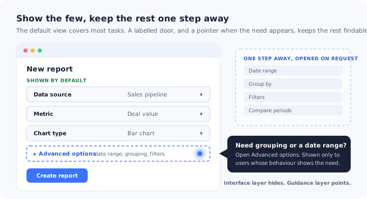
Open the settings of almost any mature SaaS product and you can read its history. Every option on the screen was added for a reason: a customer asked for it, a deal depended on it, an edge case bit someone in production. Each addition was sensible on its own. Together they produce a screen that a new user looks at for a few seconds before deciding the product is not for them.
Progressive disclosure is the design principle that keeps this from happening. Instead of showing everything at once, you show what most people need most of the time and put the rest one deliberate step away: behind an “Advanced” link, a “More options” menu, a second tab or a later step. Done well, it is one of the most dependable ways to make a complex product feel simple without removing anything from it.
Done badly, it produces a quieter failure. The advanced features are still there, but the people who need them never learn they exist. They ask support for things you have already built, they work around the gap with spreadsheets, and they show up in your analytics as evidence that nobody wanted the feature. This guide covers what progressive disclosure means, the forms it takes in SaaS products, how to decide what to show and what to defer, the discoverability cost that makes it backfire, how to measure it, and how a layer of in-app guidance keeps deferred features findable without redesigning the interface.
Key Takeaways
- Progressive disclosure splits an interface in two. What is shown by default, and what is one step away. The split should come from usage data, not from what the team finds interesting.
- It depends on two conditions. The default view must cover most users’ most frequent tasks, and the way into the rest must be easy to see. Break either one and it backfires.
- Hidden means harder to find. Every feature you defer loses some of the people who need it, unless something points them to it at the moment the need appears.
- The door matters as much as the room. “Advanced filters: date, owner, status” tells users what is behind it. A bare “More” or three dots does not.
- Guidance can disclose progressively too. Tours, tooltips and hotspots can stage what users notice on top of an unchanged interface, and point to deferred features when behaviour shows the need.
What Is Progressive Disclosure?
Progressive disclosure: definition
Progressive disclosure is an interaction design technique that shows users only the information and controls they need for the task in front of them, and moves advanced or rarely used options to a secondary layer that they open on request. The first view stays simple for most people, and the full capability stays available, one step away, for the people who need it.
The idea is almost as old as the graphical interface. Designers were already separating everyday commands from rarely used ones in the desktop software of the 1980s, and usability researchers have recommended the approach ever since. Jakob Nielsen’s writing on the subject credits it with improving three components of usability at once: learnability, efficiency of use and error rate. That is an unusual combination. Most design decisions trade one of those against another.
The mechanism is always the same: two layers. The primary layer holds what is shown by default. The secondary layer holds everything else, and the user decides when to open it. You meet it dozens of times a day without noticing. A print dialog shows the printer, the number of copies and the page range, and keeps paper size, margins and scaling under “More settings”. A search box has an “Advanced search” link for the minority who want to filter by date or exact phrase. An email composer keeps its formatting toolbar out of sight until you ask for it.
Progressive disclosure is often confused with three neighbouring ideas that share a word or a goal but manage something different:
| Concept | What it manages | Typical form |
|---|---|---|
| Progressive disclosure | What the interface shows, and when | Advanced sections, overflow menus, secondary tabs, “Show more” |
| Staged disclosure | The order in which a task’s options appear | Wizards and steppers that show one part of a task at a time |
| Progressive onboarding | What guidance teaches, and when | Tooltips and short tours triggered as users reach each feature |
| Progressive profiling | What you ask users, and when | Questions spread across signup, first session and later milestones |
Staged disclosure is the one most often mixed up with it. In a staged flow, every user goes through every step in order, and each step shows only part of the options. In progressive disclosure, most users never open the secondary layer at all. A setup wizard is staged disclosure; an “Advanced settings” link is progressive disclosure. Both reduce what a user sees at once, but only one lets them skip the rest entirely. Our guide to the onboarding wizard covers the staged kind. The other two neighbours have guides of their own: progressive onboarding decides what to teach and when, and progressive profiling decides what to ask. Progressive disclosure decides what to show.
Why Progressive Disclosure Works
Every visible option is a small tax. The user has to notice it, work out what it does, and decide whether it matters to them right now. Most of the time the answer is no, but the work of reaching that answer still has to be done, on every screen, by every new user. Progressive disclosure removes the tax for the options that rarely matter, and the gains show up in four places.
Fewer visible choices means a lighter first session. It is one of the most direct ways to lower the cognitive load that makes new users freeze.
Rarely needed settings are also the ones most likely to be changed by someone who does not understand them. Deferring them protects beginners from themselves.
What appears first tells users what the screen is for. When everything has equal weight, users have to work out the priorities themselves.
Experienced users lose one click, not the capability. The depth that makes the product worth paying for is still there when they reach for it.
The first of these deserves its own attention, because it is where most onboarding problems start. Our guide to cognitive load in onboarding explains why new users stall when a screen asks them to evaluate too much at once, and progressive disclosure is the interface-level answer to it.
Progressive disclosure rests on two conditions. First, the split has to be right: the default layer must contain everything most users need for their most frequent tasks, so they rarely have to open the second. Second, the way into the second layer has to be easy to see and clearly labelled, so the people who do need it find it. The first condition is a data question. The second is a design and guidance question. Almost every failure of progressive disclosure comes from getting one of them right and ignoring the other.
Progressive Disclosure Examples: 8 Patterns in SaaS Products
Progressive disclosure is a principle, not a component, so it shows up in many shapes. These are the eight you will meet most often in business software, with what each one is good for and the specific way each one fails.
-
1. The “Advanced” section
A collapsed block beneath the core fields of a form, a settings page or a filter bar. It suits screens with a clear core and a long tail of refinements. It fails when it turns into a junk drawer that collects everything the team could not place, so that users stop believing it holds anything useful.
-
2. The overflow menu
The “More” button or three dots that hold secondary actions on an object: duplicate, archive, export, move. It suits lists where each item needs a handful of occasional actions. It fails because the icon says that something is there without saying what, so a user looking for “export” has no reason to think it is inside.
-
3. “Show more” and expandable details
Long descriptions, metadata and history truncated behind a “Show more” or “View details” link. It suits records and logs where the summary answers most questions. It fails when the truncation cuts off the one field people opened the record to read.
-
4. Secondary tabs and settings pages
A “General” tab first, with integrations, permissions and billing on later tabs or pages. It suits configuration that most users set once or never. It fails when tabs are named in the system’s vocabulary rather than the user’s, because the label is the only clue to what is inside.
-
5. Contextual toolbars
Controls that appear only when something is selected: tick a few rows and the bulk actions appear, highlight text and the formatting options appear. It suits products where users act on things they have chosen. It has the purest discoverability risk of any pattern, because a user who never selects anything never learns the actions exist.
-
6. Hover-revealed actions
Edit and delete icons that appear when the pointer rests on a row. It suits dense desktop lists where permanent icons would be visual noise. It fails on touch screens, where there is no hover, and for anyone who moves the mouse with purpose rather than exploring.
-
7. Simple and advanced modes
A toggle between a basic editor and a full one, such as a visual rule builder and a raw expression editor. It suits products that serve both beginners and specialists doing the same job. It fails when users settle into the simple mode and never discover that the advanced one would solve the problem they keep working around, and it doubles what the team has to maintain.
-
8. Staged setup
Strictly this is staged disclosure, but it is used for the same purpose: a setup flow that asks for two things now and moves the rest to later. It suits first-run configuration with real dependencies. It fails when every optional step is forced on everyone, which is the opposite of disclosure.
Two more cases are worth knowing even though they are rarely called progressive disclosure. An empty screen that grows into a full interface as data arrives is disclosure driven by the user’s own progress, and our guide to empty states covers how to design the first version of it. And interfaces that show different controls to different roles, admins and members for example, are disclosure by segment rather than by request.
The Hidden Cost: Out of Sight, Out of Mind
Every feature you move into the secondary layer pays a discoverability tax. Users are driven by goals, not by curiosity. They open a menu when they expect it to contain something they need, and they only expect that if they already know the feature exists or the label promises it. A deferred feature that nobody knows about is, in practice, a feature that was never shipped.
The symptoms are consistent enough to recognise:
- Requests for things you already have. Customers ask for a capability that has been sitting behind an overflow menu for a year. Tag these separately when you triage feature requests, because they are a findability problem, not a roadmap item.
- Workarounds outside the product. Users export data to a spreadsheet to group or filter it by hand, because they never found the grouping and filtering one click away.
- Flat adoption for a feature that tested well. The team concludes that nobody wants it and moves on. Sometimes that is true. Sometimes the feature is simply buried.
- Accidental discovery. Long-standing customers mention, months in, that they only just found an option they would have used from the start.
Low usage of a hidden feature is ambiguous. It can mean nobody needs it, or that the people who need it cannot find it. Those readings lead to opposite decisions, retire it or surface it, and the usage number on its own cannot tell them apart. Our guide to feature discovery covers the wider problem; the rest of this guide covers how to keep progressive disclosure from creating it.
The practical way to think about any control is to ask two questions at once: how many people in this segment need it, and where does it currently live? The answers put every control in one of four places, and each place has a different job.
Primary and deferred are where you want everything to end up. The other two are the failure modes, and they are mirror images. Clutter is progressive disclosure that was never applied: everyone pays attention to a control only a few people use. Buried is progressive disclosure applied to the wrong thing: most people need a control that sits behind a door. The deferred quadrant carries an obligation of its own. Leaving a control there is correct, but the few who need it still have to find it, which is why the answer there is “leave it, and point to it” rather than just “leave it”.
How to Decide What to Show and What to Defer
The split between the two layers is the most important decision in progressive disclosure, and it is usually made in a design review by whoever argues most confidently. It does not need to be. The steps below turn it into something you can check.
- Inventory every control on the screen
- Measure how often each one is used, and by whom
- Weigh the cost of not finding it
- Sort into primary, secondary and expert
- Name each door after what is behind it
- Keep it to two levels
- Test the hidden path, not only the simple one
1. Inventory every control on the screen
List every field, button, toggle and menu item on the screen you are simplifying, including the ones already hidden inside menus. Next to each, write the job it serves in one short phrase. You will find duplicates, controls nobody on the team can explain, and options that belong on a different screen entirely.
You end up with: a flat list of everything competing for attention, with the orphans visible.2. Measure how often each one is used, and by whom
From your product analytics, take the share of active users who use each control in a typical month, and how often they use it. Break it down by segment wherever roles differ: a setting used by every admin and no member is primary for one group and noise for the other. If a control is not tracked at all, that is the first finding. Our guide to event tracking covers how to name and capture these events so the numbers mean something.
You end up with: usage and frequency for each control, per segment.3. Weigh the cost of not finding it
Frequency is not the only axis. Some rarely used controls matter a great deal at the moment they are needed: restoring something deleted by mistake, removing access for someone who has left the company, pausing an automation that is emailing customers. These can live in the secondary layer, but they must be findable in seconds by someone under pressure, which means an obvious door and a predictable location.
You end up with: a second column next to usage, the consequence of a user missing it.4. Sort into primary, secondary and expert
Primary controls are used by most people in the segment, or are needed to finish the task the screen exists for, whatever their frequency. Secondary controls are used regularly by a minority, or occasionally by most. Expert controls are used by a small group who know exactly what they are looking for. Primary stays visible, secondary goes one step away, and expert can sit a little deeper, in settings or behind an advanced mode.
You end up with: a proposed split you can defend with numbers rather than taste.5. Name each door after what is behind it
A disclosure control is a promise about its contents. “Advanced filters: date, owner, status” keeps that promise before it is opened. “More”, “Other” and a gear icon only say that something exists. Where space rules out a descriptive label, put a short tooltip on the control so the first hover answers the question. Our guide to tooltips covers when a tooltip is the right tool and when it is hiding a labelling problem.
You end up with: every disclosure control passes the test “could a user guess what is inside?”6. Keep it to two levels
A door that opens onto another door is a maze. A user who opens “Advanced” and finds another “More” inside has to guess twice, and most people stop guessing after the first miss. If the secondary layer needs a secondary layer of its own, either the grouping is wrong or the screen carries more than one job and should be split.
You end up with: at most one step between a user and any control on the screen.7. Test the hidden path, not only the simple one
Usability tests of a simplified screen usually test the primary task, show that it got faster, and stop there. Add one task that needs a deferred control and watch whether participants find it unaided and how long it takes. That second task is the only direct evidence you will get for the second condition. Our usability testing guide covers how to run the sessions.
You end up with: evidence that both conditions hold, not just the one that is easy to see.7 Common Progressive Disclosure Mistakes
Most progressive disclosure problems are not failures of the idea. They are small decisions that each looked tidy at the time. These seven come up again and again.
1. Hiding the primary action to make a screen look clean
Minimalism is a common reason for moving things behind menus, and it is the most dangerous one. A clean screen where the main action sits inside an overflow menu has swapped visual calm for a hunt on every visit. If the usage data says most people need it, it stays visible, however much the mockup prefers otherwise.
2. Doors labelled “More”
Generic labels turn the secondary layer into a place users only visit by accident. Name the contents, or the most important item in them, and treat any disclosure control that needs a support article to explain as a labelling bug.
3. Hiding state along with the controls
When an active filter or a changed setting sits inside a collapsed panel, users see results they cannot explain: a report missing half its rows, notifications that never arrive. Hide the controls if you must, but show the state on the closed door, as in “Advanced filters (2 active)”, so nobody is misled by a choice they cannot see.
4. Forgetting what the user opened
A power user who expands the advanced section on every visit should find it expanded the next time. Resetting every disclosure to closed treats your most engaged users as permanent beginners and charges them a click for their loyalty.
5. Splitting by guessed personas
Deciding that “admins need this and members do not” without looking at the data produces splits that fit the org chart and not the work. Real usage often cuts across roles: some members configure things, and some admins never touch settings. Our guide to user segmentation covers how to find segments that reflect behaviour.
6. Using disclosure to hide bloat
Moving forty settings behind an “Advanced” link does not make a product simpler. It moves the complexity to a place where it is harder to see and easier to ignore in planning. If most of the secondary layer is unused by everyone, the problem is not disclosure; our guide to feature bloat covers what to do instead.
7. Moving familiar options without saying where
Simplifying an existing screen means moving things long-standing users know by muscle memory. When a control they use weekly disappears into a menu, they read it as removed. Point to the new location for the people who used the old one, and keep pointing until they have found it once. Our guide to rolling out a product redesign covers the wider change.
The Guidance Layer: Progressive Disclosure Without a Redesign
Everything above treats progressive disclosure as a property of the interface: which controls are rendered where. That is the half owned by design and engineering, and it changes on their schedule. Changing a screen’s layout means a design cycle, a build and a release, and it competes with everything else on the roadmap.
There is a second half that most teams overlook. Progressive disclosure is ultimately about managing attention, and attention can be staged without moving a single control. A short tour can point at the three things that matter on a busy screen and leave the other twenty alone. A hotspot can make a door visible to the one segment that needs what is behind it. A checklist can hold secondary setup tasks until the primary ones are done. This is the guidance layer, and it does two jobs the interface cannot do on its own: it simplifies a screen you cannot redesign yet, and it keeps deferred features findable for the people who need them.
| Moment | What the user needs | Guidance that fits | When it steps back |
|---|---|---|---|
| First session | To know which few controls matter | A short tour that points only at the controls the core task needs, three to five steps | When the core task is done, not when the tour is closed |
| First sign of a deferred need | To learn the door exists | A hotspot or tooltip on the disclosure control, shown on the page where the need arises and to the segment that has it | Once the door has been opened, or the pointer dismissed |
| Setup spread over days | To do secondary setup later, not never | A checklist that holds the secondary tasks, each with a button that opens the right screen | As each item is completed |
| Something has moved | To find a familiar option again | An announcement or a pointer at the new location, for users of the old one | After their first visit to the new location |
| Ready for the expert layer | To hear the advanced mode exists | One dismissible pointer to the advanced mode or shortcut, once the user has done the task the long way several times | Once used or dismissed |
The pattern that matters most is the second row. The strongest signals of a deferred need are behaviours you can already see: users who export a report every time they build one, users who apply the same manual workaround again and again, users who visit the page where an advanced option lives and leave without using it. A pointer aimed at exactly those users, on exactly that page, turns the deferred quadrant from “hidden” into “hidden until needed”, which is what progressive disclosure promised in the first place. Our guide to hotspots in UX covers how to make that kind of pointer noticeable without being intrusive.
This is close kin to progressive onboarding, applied to one specific problem. Progressive onboarding asks what to teach and when. The guidance layer of progressive disclosure asks a narrower question: of everything the interface has deliberately put out of sight, what does this user need to know about right now? Like any good guidance, it should fade as users learn, and step back as soon as the door has been found.
How to Measure Progressive Disclosure
A simplified screen is easy to judge on how it looks and hard to judge on what it did. These signals tell you whether both conditions are holding, and what to do when one is not.
| Signal | What it tells you | What to do |
|---|---|---|
| Primary task success and time | Whether the default view actually got easier to use | Compare users who arrived before and after the change on the task the screen exists for |
| Open rate of each disclosure control | How often users need what is behind the door | If a large share of sessions open it, its contents are primary: promote them |
| Use of deferred features by users who need them | Whether the second condition holds, which overall usage cannot show | Define “need” by behaviour, then track what share of that group finds the feature |
| Requests and tickets for things that exist | Which doors are mislabelled or invisible | Rename the door, or add a pointer for the segment asking |
| Secondary settings changed and quickly reverted | Options being changed by people who did not understand them | Better defaults, a clearer label, or move them one level deeper |
The hardest case is a door that almost nobody opens. It is either a correctly deferred feature or a buried one, and the way to find out is to ask the product rather than the team. Take the users whose behaviour shows the need, show a pointer to half of them, and compare what the two halves do next. If usage rises in the half that saw the pointer, the feature was buried and the pointer, or a better label, is the fix. If it does not, the need was weaker than it looked, and the feature is a candidate for the kind of review our feature adoption guide describes. Our guide to A/B testing onboarding covers how to set the comparison up so the result means something.
Progressive Disclosure: Do vs. Don’t
✅ Do
- Split on usage data, per segment
- Keep whatever finishes the core task visible
- Label every door with what is behind it
- Show active hidden settings on the closed door
- Remember what each user expanded
- Test a task that needs a deferred feature
- Point to deferred features when the need shows
- Read low usage by segment before retiring
❌ Don’t
- Hide primary actions for a cleaner screen
- Rely on “More” or three dots alone
- Nest disclosures more than two levels deep
- Hide state together with the controls
- Move familiar options without saying where
- Split by roles you have not checked
- Relocate bloat instead of reducing it
- Read low usage as proof of low demand
Progressive Disclosure With Kompassify
The interface half of progressive disclosure belongs to your design and engineering teams. The guidance half, pointing new users at the few controls that matter and making sure deferred features reach the people who need them, is where most products fall short, because every change to in-app help usually needs a developer and a release.
Kompassify is a no-code layer that sits on top of your product and lets the team that owns onboarding build and change that guidance directly. Build a short product tour for the first session that points only at the primary controls. Attach tooltips and hotspots to the doors, the “Advanced” sections, overflow menus and settings tabs, so they become visible at the moment they matter. Hold secondary setup on an onboarding checklist that persists between sessions. Use segments and page targeting so each pointer reaches the users who need it, and set it to show once so it steps back after it has done its job. When a simplification moves a familiar option, tell the people who used it where it went with an announcement.
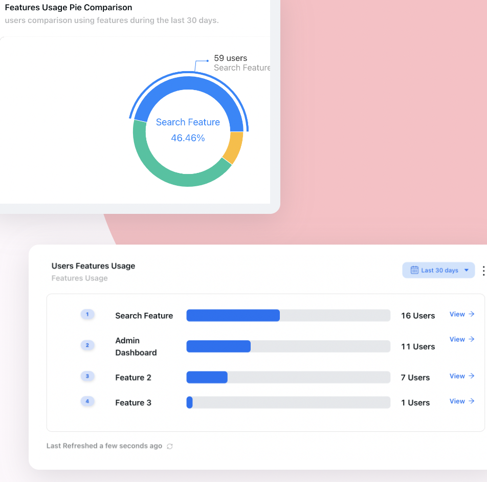
Feature usage per user over a period is the starting point for the split between what stays visible and what moves one step away.
Product analytics shows how many users use each feature over a period, which is the raw material for deciding what stays visible, along with completion for every step of every guide. A multi-choice question at the start lets people tell you what they came to do, so specialists can be pointed to the advanced path on day one while everyone else sees the simple one. Because it is all configuration rather than code, adding a pointer to a buried option, or retiring it once people have found it, is an afternoon’s work.
Keep deferred features findable, without waiting for a release
Add tours, tooltips, hotspots and checklists to your live product, target them by segment and page, and point users to the options your interface keeps one step away. No code required. Free up to 100 monthly active users, plans from $129/month, GDPR-compliant and EU-hosted.
Start for free →The One-Paragraph Version
Progressive disclosure is the design technique of showing users only what they need for the task in front of them and keeping advanced or rarely used options one step away, behind an “Advanced” section, an overflow menu, a secondary tab or a later step. It improves learnability, efficiency and error rates at once, but only when two conditions hold: the default view covers most users’ most frequent tasks, and the way into the rest is obvious. Decide the split from usage data by segment, weigh the cost of a user not finding each control, label every door with what is behind it, keep it to two levels, and test a task that needs a deferred feature. The price of progressive disclosure is discoverability: hidden features get found less, and low usage of a hidden feature cannot tell you whether it is unwanted or buried. A guidance layer of short tours, tooltips, hotspots and checklists pays that price back, by pointing each deferred feature out to the users whose behaviour shows they need it, at the moment they need it.
Frequently Asked Questions
What is progressive disclosure in UX?
Progressive disclosure is an interaction design technique that shows users only the information and controls they need for their current task and moves advanced or rarely used options to a secondary layer they open on request, such as an Advanced section, a More menu or a second tab. It keeps the first view simple for most users while leaving the full capability one step away for those who need it.
What is an example of progressive disclosure?
A print dialog is the classic example: it shows the printer, the number of copies and the page range, and keeps paper size, margins and scaling under a More settings link. In SaaS products, common examples are Advanced sections in forms and filter bars, overflow menus that hold secondary actions, Show more links on long records, bulk-action toolbars that appear only when rows are selected, and separate simple and advanced editing modes.
What are the benefits of progressive disclosure?
Progressive disclosure reduces what new users have to process on each screen, which lowers cognitive load and makes a product quicker to learn. It cuts errors by keeping rarely needed settings away from people who do not understand them, makes the purpose of each screen clearer by giving the most used controls prominence, and keeps advanced capability available to experienced users at the cost of one extra click.
What are the disadvantages of progressive disclosure?
The main disadvantage is discoverability. Features moved behind a menu or a secondary screen are found less often, so users who need them may never learn they exist, ask for things the product already does, or work around the gap. It also adds a click for experienced users, can hide important state such as an active filter, and becomes confusing when disclosures are nested or labelled vaguely.
What is the difference between progressive disclosure and staged disclosure?
Progressive disclosure splits options into a primary layer shown by default and a secondary layer that users open only if they need it, so most users never see the secondary options at all. Staged disclosure splits a task into a sequence of steps, as in a wizard, and every user goes through each step in order. Both reduce what is shown at once, but only progressive disclosure lets users skip the rest.
What is the difference between progressive disclosure and progressive onboarding?
Progressive disclosure is about the interface: which controls are shown by default and which are one step away. Progressive onboarding is about guidance: teaching each part of the product at the moment a user reaches it, with tooltips and short tours, instead of all at once on day one. They work well together, because guidance can point users to the features the interface deliberately keeps out of sight.
How do you decide what to hide with progressive disclosure?
Start from usage data rather than opinion. List every control on the screen, measure what share of each user segment uses it and how often, and note what happens if someone cannot find it. Keep visible whatever most of the segment uses or needs to finish the core task, move what a minority uses one step away, and put specialist controls deeper. Then test a task that needs a deferred control to confirm people can still find it.
How many levels of progressive disclosure should you use?
Keep it to two levels in most cases: a primary view and one secondary layer. Once users have to open a disclosure inside another disclosure, they must guess correctly twice to find a control, and many stop after the first wrong guess. If a secondary layer seems to need its own secondary layer, the grouping is usually wrong or the screen is doing more than one job.