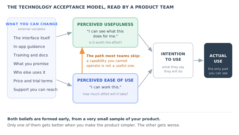
There is a meeting that happens in every software company, usually about eighteen months in, and it always goes the same way. Adoption is below plan. Two people at the table have read the same customer interviews and reached opposite conclusions. One of them says users do not see the value. The other says the product is too complicated. Both have quotes to back them up, because both things are being said by real customers, and the meeting ends with a compromise that is really just whichever person was more senior.
The compromise matters more than it looks, because the two diagnoses lead to opposite work. If the problem is value, the answer is to strip the path down and put a real outcome in front of the user sooner: take things away. If the problem is difficulty, the answer is to explain the hard steps at the moment the user is on them: add things. Pick the wrong one and you do not merely waste a quarter. You make the actual problem worse, because you have either buried a hesitant user under guidance they never asked for, or removed the capability that was the only reason anyone was interested.
The technology acceptance model is the framework that separates those two diagnoses properly. It has been replicated, extended and argued over for decades in information systems research, and almost everything written about it is aimed at people writing papers rather than people shipping software. This guide is the other version: what the model actually says, what each half looks like inside a real SaaS product, how to tell which one is blocking you, and what moves each of them.
Key takeaways
- The technology acceptance model (TAM) says two beliefs drive whether someone uses a piece of software: perceived usefulness and perceived ease of use. Together they form an intention, and the intention produces use.
- The load-bearing word is perceived. Neither belief is a measurement of your product. Both are judgements made early, from a very small and unrepresentative sample of it.
- The two beliefs fail with different symptoms and their fixes point in opposite directions. One asks you to add explanation to the screen. The other asks you to take steps out of the path.
- The model also has an arrow that most adoption work ignores: ease of use feeds usefulness. A capability nobody can operate is not, in practice, a useful capability.
- The chain ends in intention, and intention only predicts behaviour when use is voluntary. In a mandated rollout the model stops predicting whether people use the tool and starts predicting how well they use it.
- You do not need an academic questionnaire to read either belief. Six short in-app questions and four behavioural signals will separate them well enough to act on.
What Is the Technology Acceptance Model? (Meaning and Origin)
Technology acceptance model: definition
The technology acceptance model states that a person's use of a technology is driven by their intention to use it, and that this intention is formed by two beliefs: perceived usefulness, the degree to which they believe the technology will improve their performance, and perceived ease of use, the degree to which they believe using it will be free of effort. Everything else that influences adoption, from the interface to training to price, does so indirectly by changing one of those two beliefs.
The model was introduced by the information systems researcher Fred Davis, who adapted the theory of reasoned action from social psychology, work associated with Martin Fishbein and Icek Ajzen, and narrowed it to the specific question of why people accept or reject a system at work. The general theory said that beliefs shape attitudes, attitudes shape intentions, and intentions shape behaviour. Davis's contribution was to identify which two beliefs do most of the work when the behaviour in question is using software.
The original chain runs like this. External variables, meaning anything you can change about the system or the situation, shape the two beliefs. The two beliefs shape an attitude toward using the thing. The attitude shapes a behavioural intention. The intention produces actual use. Later formulations dropped the attitude step, because the beliefs turned out to predict intention well enough on their own, and most modern versions of the diagram run the two beliefs straight into intention. That is the version in the illustration at the top of this guide.
Two details in that chain are easy to read past and worth slowing down for.
The first is the word perceived. TAM does not say that useful software gets used. It says that software believed to be useful gets used. The gap between those two sentences is where most adoption problems live. A product can be genuinely faster than the spreadsheet it replaces and still lose, because the belief was formed in a first session where nothing was faster than anything.
The second is that external variables is not a footnote. It is the entire list of things a product team can actually touch: the interface, the in-app guidance, the documentation, the training, the trial terms, the price, who else at the company already uses it, whether support answers. TAM's real discipline for a product team is that it forces every one of those to declare which belief it is supposed to move. An adoption initiative that cannot name its belief is not a plan, it is a list of activities.
The Two Beliefs, and Why They Are Not the Same Problem
Teams routinely collapse the two beliefs into one number, usually a satisfaction score or a single "how was setup?" question. That number cannot tell you which belief is low, which makes it useless for deciding what to build next. Kept apart, the two behave very differently.
| Perceived usefulness | Perceived ease of use | |
|---|---|---|
| The question it answers | Will this make my work better? | What will it cost me to get that? |
| What the user says | "I am not sure why I would use this." | "I can see the point. I cannot make it work." |
| Where it is formed | Marketing, the demo, and the first real outcome. | The setup screens and the first three attempts at a task. |
| What your data looks like | Setup completes, then nothing. No second week. | Drop-off mid-flow, time on step rising, repeat visits. |
| What support hears | Silence, then a cancellation with no reason given. | Questions that begin with "how do I". |
| The usual wrong fix | Adding a product tour to explain a product nobody wanted. | Removing the advanced capability that was the whole draw. |
| Direction of the real fix | Subtract. Fewer steps between arrival and one real result. | Add. Explanation on the control, at the moment it is needed. |
| Who usually owns it | Product and marketing. | Design, onboarding and support, often nobody in particular. |
The last two rows are the reason this distinction earns its keep. The two fixes are not just different, they are opposed. Every step you remove to raise perceived usefulness is a step you are no longer explaining, and every explanation you add to raise perceived ease of use is another thing on the screen between the user and the outcome. A team that has not decided which belief it is fixing will do both at once, and the two will quietly cancel.
The Path Most Teams Skip: Ease of Use Feeds Usefulness
In the original model, perceived ease of use does not only run to intention. It also runs to perceived usefulness. That second arrow is drawn in every textbook version of the diagram and ignored in almost every real adoption conversation, and it is the most commercially important line in the model.
The logic is simple once stated. Usefulness is not a property of a capability. It is a property of a capability net of what it costs you to operate it. A report that would save forty minutes but takes twenty-five minutes of fumbling to produce is not a forty-minute saving to the person producing it. For the first few attempts it is not a saving at all. Those attempts are where the belief gets set.
Consider the arithmetic, which is illustrative rather than a benchmark. A weekly report takes an analyst fifty minutes by hand. Your product can generate it in five. That is a forty-five minute weekly saving and it is the entire sales argument. Now add the real first month: the first attempt takes thirty minutes of hunting, the second twenty, the third ten, and from then on it is five. Across that first month the user has spent sixty-five minutes to save what would have been two hundred, and they have done it in four separate sessions each of which felt like a fight. The saving is real and arrives in month two. The belief was finished in week one.
This is why the sentence "we do not have an onboarding problem, we have a value problem" is so often both sincere and wrong. For a product of any depth, a large part of the perceived value is gated behind operability. You cannot separate them by asserting harder in the marketing. The user's estimate of what your product is worth is being computed from sessions in which they were mostly lost.
It also explains an experience most product teams have had and found confusing: a feature ships, the launch email goes out, usage spikes, and eleven days later it is back at baseline. Nothing about the feature's usefulness changed in eleven days. What happened is that the asserted usefulness from the email was replaced by a computed usefulness from three attempts at using it, and the computation included the effort. Our guide to feature adoption covers the measurement side of that pattern, and learnability covers what happens to that effort over repeated attempts, which is the part TAM treats as a single belief and a learning curve treats as a shape.
One caution on that pairing, because it is a distinction worth keeping clean. Learnability is about how quickly the real cost falls. Perceived ease of use is about what the user believes the cost is. They come apart in both directions. A product can be genuinely learnable and feel impossible, because the first screen is intimidating and nobody stays long enough to find out. A product can also feel easy and turn out not to be, which produces a different and nastier failure: the user commits, hits the wall in week three, and now has sunk cost as well as frustration. Tesler's law is the structural version of the same trade: complexity that the product refuses to absorb has to be carried by somebody, and if it lands on the user it lands on this belief.
Technology Acceptance Model Examples: Five SaaS Situations, Diagnosed
The model earns its place when you use it as a diagnostic rather than a description. Here are five situations most product teams will recognise, each read through the two beliefs.
-
1. The powerful feature that admins never switch on. Every customer conversation confirms they want it. The configuration screen has a seventy percent abandonment rate and the average admin visits it twice before giving up. Perceived usefulness is high and doing nothing wrong. Perceived ease of use is the whole problem, and no amount of further convincing will move it.
-
2. The trial that completes everything and never converts. Setup finished, checklist finished, tour finished, three logins in the first four days and then nothing. This is the mirror image. Ease of use is fine, which is exactly why the flow completed. The user did everything you asked and still did not arrive at a reason to come back, which means the tasks you asked for were your tasks rather than theirs.
-
3. The internal tool everyone logs into and nobody really uses. Licence utilisation looks excellent. Weekly active users is close to headcount. Then you look at what people do in a session and it is a login, a glance and an exit, while the real work continues in the old spreadsheet alongside. Use was mandated, so intention stopped predicting whether they log in, and all the information moved into how well they use it.
-
4. The integration everyone describes as "too technical". You look at the screen and it is two fields and a permission toggle. Nobody who says this has reached the screen. The belief was formed by the words on the card in the integrations list, or by the phrase "API key" in a sentence, or by a colleague's shrug. Perceived ease of use is a perception, and it responds to signals long before it responds to the actual interaction.
-
5. The launch that spikes and decays in eleven days. The announcement asserted the usefulness of a new capability and that assertion moved the belief temporarily. Then users tried it, and the belief was recomputed including the effort of using it. What you are watching decay is not interest. It is an estimate being corrected by experience.
The common thread: in four of these five cases the team's instinct is to explain the product harder, and in only two of them is explanation the right instrument.
The Diagnosis: Which Belief Is Actually Blocking You
Put the two beliefs on two axes and you get four situations that need four different responses. The chart below is the most useful thing in this guide, because it is the part that stops a team from spending a quarter on the wrong half.
Perceived ease of use runs left to right, perceived usefulness bottom to top. The two arrows into the adopted quadrant are different pieces of work, and they cannot be done by the same team in the same sprint without one undoing the other.
Stalled (top left) is high usefulness and low ease of use. The user wants the outcome and cannot reach it. This is the most recoverable quadrant in the model, and it is the one where in-app guidance does its clearest work, because the motivation is already there and only the path is missing.
Tourist (bottom right) is the opposite: they got through your onboarding comfortably and have no reason to return. Adding guidance here is the classic misfire. The user did not fail your flow, they completed it. What they did not get was a result that mattered to them, which means the flow was aimed at your setup steps rather than at their job. The fix is to move a real outcome earlier, which usually means cutting steps, not adding them.
Adopted (top right) is not a resting state. Every release can push a customer back out of it, either by adding effort or by moving something they had learned. That is the quiet cost of a redesign, and it is why rolling out a redesign is a re-acceptance problem rather than a communication problem.
Gone (bottom left) is the one worth being honest about. If a user finds your product neither obviously useful nor obviously workable, that is usually not an onboarding problem at all. It is a fit or positioning problem, and pouring guidance into it is expensive theatre. Check who you are attracting before you check how you are teaching them.
How to tell them apart from data you already have
You do not have to guess which quadrant a cohort sits in. Four signals separate them reliably:
Drop-off before the first real outcome, especially with time on step climbing, is an ease of use signal. Drop-off after the first real outcome is a usefulness signal. The dividing line is the moment they produced something, not the moment they finished your steps.
A user returning three times to the same configuration screen without completing it has high motivation and blocked ability. That is the stalled quadrant almost by definition, and it is the cheapest adoption win available to most teams.
Sort a month of support conversations into questions that start with "how do I" and questions that start with "why would I" or "can it even". The ratio is a free, continuously updated read on which belief is weaker, and it costs nothing to produce.
The single best behavioural proxy for perceived usefulness is a second session that no email triggered. If your second sessions only happen after a nudge, you are measuring your lifecycle emails, not the belief.
Where the Belief Is Formed, and Why It Is Formed Too Early
TAM was built largely on studies of people who had already used the system they were rating. Self-serve software broke that assumption. In a trial, both beliefs are formed and effectively locked long before the user has seen the product do the thing it is for.
The two beliefs are answered from an empty workspace and a setup form. The evidence that would justify them arrives weeks later, usually after the trial has already been decided.
This produces three consequences that are worth designing around.
The first session is not a tutorial, it is the hearing. Both beliefs are on trial in it, and the evidence admitted is whatever happens to be on screen. An empty workspace is evidence about usefulness. A five-field form before anything happens is evidence about ease of use. Neither was intended as an argument and both are read as one. Our guide to the first-time user experience goes deeper into what that session has to carry.
Anything that arrives late has to overturn, not form. Changing an existing belief is several times the work of forming one, and almost nobody budgets for the difference. This is the real reason time to value matters so much: it is not an efficiency metric, it is a deadline for getting evidence in front of a belief before the belief hardens.
The aha moment is a usefulness event with a timestamp. Everything in our aha moment guide can be restated in TAM's terms: find the moment where perceived usefulness jumps, then move it earlier in the session. The two frameworks agree completely and the reason to hold both is that TAM insists you say what happened to the other belief while you were doing it. An aha moment reached by a path the user found exhausting buys you less than the same moment reached easily, because the effort is subtracted from the value in the user's own accounting.
How to Measure Perceived Usefulness and Perceived Ease of Use
The academic instrument is a battery of agree-or-disagree statements, several per belief, validated across a long series of studies. You do not need it, and running it in-app usually gets you a response rate that would embarrass a survey team. What you do need is to keep the two constructs apart, because a blended satisfaction score cannot tell you which one to work on.
Read both from four sources rather than one, and treat disagreement between them as information:
| Source | Reads perceived usefulness as | Reads perceived ease of use as | The trap |
|---|---|---|---|
| In-app questions | Agreement that the product will improve their work. | Agreement that it takes little effort to get there. | Asking both at the same moment. One is judged early, one late. |
| Behaviour | An unprompted second session; the workflow moving in. | Time on step, repeat visits, abandonment before the outcome. | Reading completion as belief. Completion can be compliance. |
| Support and sales language | "Why would I", "does it also", "is this worth". | "How do I", "where is", "it will not let me". | Only counting tickets. Most of both beliefs never writes in. |
| Churn and lost-deal reasons | "We did not get the value we expected." | "We never really got it set up." | Accepting the first reason given. The second one is truer. |
Six questions that separate the two
If you want a direct read, three short statements per belief will do it. Ask them in-app, one or two at a time, and at different moments rather than as a block.
For perceived usefulness: using this will make my work faster; using this will improve the quality of my work; I expect this to be worth the time it takes. For perceived ease of use: it was clear what to do next; I could do that without asking anyone; getting that done took about as long as I expected. The last one on each side is the useful one, because both beliefs are comparative judgements against an expectation the user brought with them.
Timing matters more than wording. Ease of use should be asked immediately after a task, while the effort is still fresh. Usefulness should be asked after the first real outcome, not after setup, or you are measuring your marketing rather than your product. Our guide to in-app surveys covers triggering and timing, and onboarding metrics covers the behavioural side.
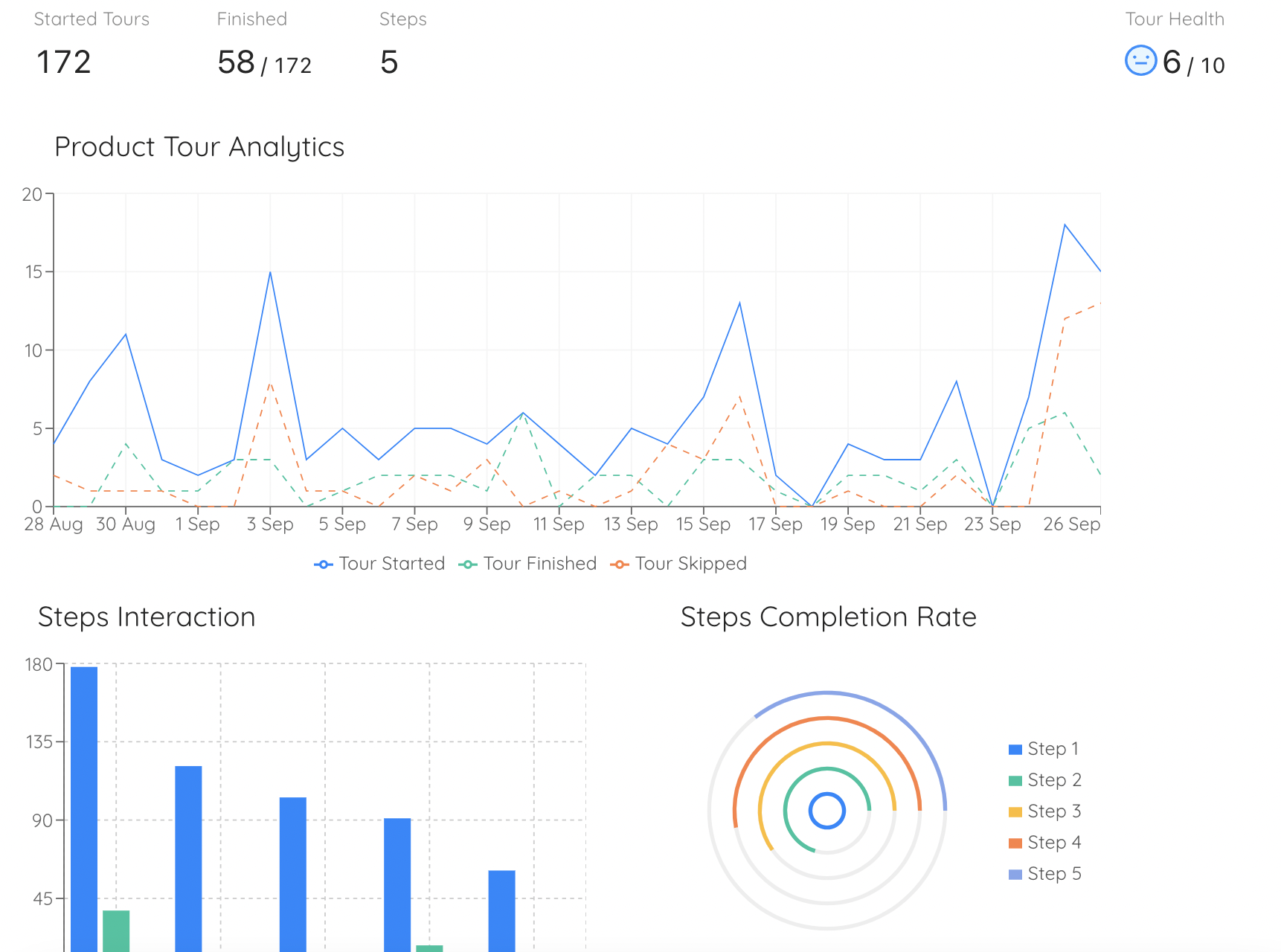
Per-step drop-off is the cheapest perceived ease of use signal you own. One step losing far more users than its neighbours is not a funnel curiosity, it is the moment a belief is being formed about your whole product.
Keep one behavioural number next to every stated one. TAM's chain ends in intention, and intention is a famously generous predictor of behaviour: people overstate what they will do, particularly to a survey that arrives from the product they are currently trying to be fair to. A belief score that is rising while second sessions are flat is telling you about your survey, not your adoption.
Moving Perceived Usefulness: Six Things That Work
These all do the same underlying thing: they replace an assertion about value with an observation of it, earlier than you currently do.
-
1. Pick one outcome and cut everything between arrival and it. Not a demonstration outcome. A thing the user would have had to do anyway this week. Every step you remove from that path is worth more than any sentence you add to it.
-
2. Use their data as early as you can survive. A result computed on the user's own numbers is evidence. The same result on sample data is a screenshot. If a full import is too heavy for a first session, take the smallest real slice you can: one project, one file, one week.
-
3. State the outcome in their units, not your features. Hours, tickets, errors caught, days shortened. A feature name is a claim about your product. A unit is a claim about their week, and only the second one can be judged as useful.
-
4. Show the result before you ask for the setup. Where the product allows it, render the output first and let configuration be the thing that makes it theirs. This is what the later extensions of TAM call result demonstrability, and it is the single highest-leverage change available to most products.
-
5. Report back what the product did. Usefulness decays quietly once the product becomes background. A short periodic summary of what was caught, saved or automated keeps the belief supplied with evidence, which matters most at renewal, when somebody who never used it asks what it is for.
-
6. Route by role before you teach anything. The same first task is a strong usefulness event for one role and a chore for another. One routing question at the start beats any amount of clever sequencing afterwards, which is the argument in our welcome survey guide and our personalised onboarding guide.
Test for this whole section: could the user, at the end of their first session, name something the product did for them without using one of your feature names? If not, perceived usefulness has nothing to stand on.
Moving Perceived Ease of Use: Seven Things That Work
These all reduce what the user has to carry into a moment, rather than what the product can do.
-
1. Put the explanation on the control, not in a document. Help in another tab is help the user has to decide to go and get, and that decision is itself effort. A tooltip on the field that confuses people costs the user nothing to receive.
-
2. Give the session a visible finish line. Most of the felt difficulty of a setup is not any single step, it is not knowing how many are left. A checklist converts an open-ended obligation into a bounded one, and the belief responds to the boundary as much as to the work.
-
3. Remove the decision rather than explaining it. A well chosen default is cheaper than the best possible tooltip about a choice. Explain only what the user must genuinely decide, and only where they must decide it.
-
4. Guide the first attempt, then get out of the way. Perceived ease of use is set by the first few attempts and then stops moving much. Guidance that persists past competence stops being help and becomes evidence that the product is complicated, which is the opposite of the intended effect. Our learnability guide covers how to scaffold and then fade.
-
5. Fix the two worst steps before touching the other nine. Effort is not felt as an average. One step where people stall does more damage to the belief than four mildly tedious ones, which makes per-step data more actionable than any overall completion rate.
-
6. Make being wrong cheap, and say so. A great deal of perceived difficulty is actually perceived risk: users slow down because they are not sure what a button will do to real data. An undo, a draft state, or one line saying that nothing is sent until they confirm removes more friction than a redesign.
-
7. Call things what your users call them. A label drawn from your data model rather than their vocabulary makes a simple screen feel technical. This is the cheapest ease of use work in existence and it is almost never scheduled. See our UX microcopy guide and onboarding non-technical users.
Test for this section: watch someone do the task and count the moments they pause and look around the screen. Each one is a small deposit into the belief that your product is hard, and none of them appears in your funnel.
When Use Is Mandated, the Model Breaks (Usefully)
TAM's chain ends with intention producing use, and that link only holds where the person can decide. In an internal rollout, they cannot. The tool is the system of record, the old one is switched off, and use is a condition of the job.
What happens then is not that the beliefs stop mattering. It is that they stop showing up in your usage numbers and start showing up somewhere less convenient. You get compliance without adoption: logins that satisfy a requirement, a shadow spreadsheet kept alongside for the real work, one person in each team who does the data entry for everybody else, and a licence utilisation chart that looks healthy right up until renewal.
The practical reading for a mandated rollout: stop using logins as your adoption metric, because mandate guarantees them. Measure the workflow instead, and specifically measure whether the work that was supposed to move actually moved. Perceived ease of use still predicts the quality of the use you get, and perceived usefulness still predicts whether anybody defends the tool when the budget is reviewed.
This is also where TAM hands off cleanly to the change management literature, which was built for exactly this situation. Our guides to change management and the ADKAR model cover the organisational half, training employees on new software covers the enablement half, and licence utilisation covers the metric that most often hides the problem.
TAM2, TAM3 and UTAUT: What the Later Models Added
TAM's simplicity was its strength and the obvious place to attack it. Three extensions matter enough to know by name, and each is best understood as an answer to the question TAM leaves open: what actually determines the two beliefs?
Developed by Venkatesh and Davis, it unpacks perceived usefulness into social influence and cognitive factors: whether important colleagues think you should use it, whether using it improves your standing, how relevant it is to your actual job, the quality of what it produces, and how visible the results are to others. That last one, result demonstrability, is the most directly actionable idea in the whole family for a product team.
The companion extension does the same job on the other belief, bringing in a person's confidence with software in general, their anxiety about it, how much external help and support they believe is available, and how all of that adjusts as they gain experience. The practical translation: the same screen is not equally easy for two users, and the difference is not intelligence, it is confidence and the presence of a visible safety net.
Venkatesh and colleagues combined several competing models into four drivers: performance expectancy (usefulness under a new name), effort expectancy (ease of use under a new name), social influence, and facilitating conditions, meaning whether the resources and support to use the thing actually exist. It also made voluntariness an explicit moderator, which is the formal version of the mandated-use point above.
For a product team the useful compression is this: the later models mostly enumerate external variables, and two of them earn a place on your roadmap. Result demonstrability says that value nobody can see does not count as value, which is an argument for reporting back what your product did. Facilitating conditions says that adoption depends on help being genuinely available at the moment it is needed, which is an argument for the guidance layer living inside the product rather than in a knowledge base somebody has to go and find. Our guides to in-app support and contextual help are that argument in practice.
What the Technology Acceptance Model Gets Wrong (Honest Limitations)
TAM is among the most cited models in its field and also among the most criticised, largely by people who use it. The criticisms are fair and knowing them keeps you from over-reading it.
The model predicts stated intention well and actual sustained use considerably less well. People overstate what they will do, and they do so most when asked politely by the product they are evaluating. Never let a belief score travel without a behavioural number beside it.
TAM explains acceptance of a system that already exists. It has nothing to say about what you should have built. A high score on both beliefs from a small, unrepresentative set of early users is not evidence of product-market fit.
The model describes a decision, and most software use is not a decision, it is a routine. What keeps people using a product in month six is closer to the loop described in our hook model guide than to a fresh weighing of usefulness against effort.
Users are almost never choosing between your product and nothing. They are choosing against a tool they already know, whose ease of use is enormous because it is learned. Beating it on paper is not the same as beating it, which is the whole subject of our switcher onboarding guide.
Continued use, expansion and renewal involve costs and beliefs the model does not carry: switching costs, contractual lock-in, sunk investment, and the politics of having championed something internally.
Knowing that perceived ease of use is low does not tell you which screen to fix. TAM tells you which half of the problem you are in. Product analytics, session review and watching five people do the task tell you where, and you need both.
Technology Acceptance Model: Do vs. Don't
✅ Do
- Decide which of the two beliefs a piece of work is meant to move, before starting it.
- Split drop-off at the first real outcome, not at the end of your setup steps.
- Ask about effort straight after a task and about value after a result.
- Treat an unprompted second session as your best usefulness signal.
- Count "how do I" against "why would I" in a month of support conversations.
- Assume both beliefs are already formed by the end of the first session.
- Keep a behavioural number beside every stated one.
- In a mandated rollout, measure the workflow rather than the logins.
❌ Don't
- Blend the two beliefs into one satisfaction score and then ask what to fix.
- Add guidance to a product whose problem is that nobody wants the outcome.
- Remove the powerful capability to fix a problem that was never about the capability.
- Read completion of your onboarding as belief in your product.
- Assume "too technical" means the user reached the technical screen.
- Spend the guidance budget on the quadrant where fit is the real issue.
- Quote a belief score as evidence of adoption.
- Expect a late explanation to do the work of an early demonstration.
Running the Ease of Use Half With Kompassify
It is worth being straight about which half of this model a guidance tool can touch. Kompassify cannot make your product more useful. What it can do is remove most of what makes your product feel hard, and because ease of use feeds usefulness, that is a larger share of the adoption problem than it appears from the outside.
In practice the mapping is direct. Product tours carry the first attempt at a task, which is the attempt that sets the belief. Tooltips and hotspots put the explanation on the control rather than in a document nobody opens. Checklists give an open-ended setup a visible finish line. Announcements re-form the belief after a release changes something people had already learned. In-app surveys ask the two questions at the two right moments, and product analytics give you the per-step drop-off that tells you which step is doing the damage.
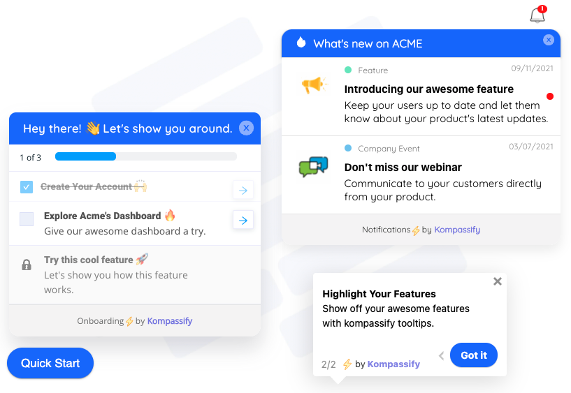
The guidance layer sits on the product you already have. Nothing about the underlying screens changes, which is precisely why it moves the belief about effort without touching the capability that the belief about value depends on.
All of it is built without engineering time, which matters here more than it sounds: perceived ease of use is made of small things, and small things do not survive a roadmap. A label, one tooltip on the field everyone asks about, a checklist that ends where the user's first real outcome begins. Individually none of them would ever be prioritised. Together they are most of the belief.
Fix the half of adoption you can actually reach
Put the explanation where the user is stuck, give setup a finish line they can see, and measure which step is costing you the belief. No code required. Free up to 100 monthly active users, plans from $129/month, GDPR-compliant and EU-hosted.
Start for free →If you want the wider context around this model, product adoption covers how adoption spreads through a population over time, which is a different question from why one person accepts a tool, and digital adoption covers the practice and tooling built around it.
Frequently Asked Questions
What is the technology acceptance model?
The technology acceptance model, usually shortened to TAM, is a framework explaining why people accept or reject a piece of software. It says two beliefs do most of the work: perceived usefulness, meaning the person believes the system will improve how they perform, and perceived ease of use, meaning they believe using it will take little effort. Those two beliefs form an intention to use the system, and that intention produces actual use. Everything else that influences adoption, from the interface to training to price, does so indirectly by changing one of the two beliefs.
Who created the technology acceptance model?
It was introduced by the information systems researcher Fred Davis, who adapted the theory of reasoned action from social psychology, work associated with Martin Fishbein and Icek Ajzen, and narrowed it to the question of why people accept or reject systems at work. The general theory held that beliefs shape attitudes, attitudes shape intentions and intentions shape behaviour. Davis identified which two beliefs matter most when the behaviour in question is using software, and the model has been replicated and extended by many researchers since.
What are perceived usefulness and perceived ease of use?
Perceived usefulness is the user's belief that the product will make their work better: faster, more accurate, less tedious. Perceived ease of use is their belief about what it will cost them to get that: how much effort, confusion and time stand between them and the result. The key word in both is perceived. Neither is a measurement of your product. Both are estimates, usually made early, from a small and unrepresentative sample of it, which is why a genuinely fast product can lose to a slower one whose first session felt effortless.
What is an example of the technology acceptance model in SaaS?
A common one is the powerful feature admins never switch on. Every customer conversation confirms they want it, so perceived usefulness is high. The configuration screen has a high abandonment rate and the average admin visits it twice before giving up, so perceived ease of use is low. The model tells you immediately that further convincing is wasted effort here, because the belief that is blocking adoption is the one about effort, not the one about value. The fix is guidance on the configuration screen, not another email about the feature.
What is the difference between the technology acceptance model and the product adoption curve?
They answer different questions. The product adoption curve, which comes from diffusion of innovations research, describes how a new technology spreads through a population over time, from innovators through to laggards. It is a model of a market. The technology acceptance model describes why one individual decides to use a system, based on two beliefs they hold about it. It is a model of a person. In practice you use the curve to understand who you are talking to and when, and the acceptance model to understand what is stopping the person in front of you.
How do you measure the technology acceptance model?
Academically it is measured with a validated battery of agree-or-disagree statements, several for each belief. A product team can get an actionable read far more cheaply from four sources: three short in-app questions per belief asked at different moments, behavioural proxies such as time on step and whether a second session happens without a prompt, the ratio of how do I questions to why would I questions in support conversations, and the stated reasons on churned accounts and lost deals. The important discipline is keeping the two beliefs separate rather than blending them into one satisfaction score, because a blended number cannot tell you which one to fix.
What is the difference between TAM, TAM2, TAM3 and UTAUT?
TAM is the original two-belief model. TAM2, developed by Venkatesh and Davis, unpacks what determines perceived usefulness, adding social influence, job relevance, output quality and result demonstrability. TAM3 does the same job on perceived ease of use, bringing in a user's confidence with software, their anxiety, and how much help they believe is available. UTAUT, from Venkatesh and colleagues, consolidates several competing models into four drivers: performance expectancy, effort expectancy, social influence and facilitating conditions, with voluntariness of use as an explicit moderator. For a product team the two ideas worth taking from the extensions are result demonstrability and facilitating conditions.
What are the limitations of the technology acceptance model?
It predicts stated intention much better than sustained use, and intention is a generous predictor of behaviour. It treats the product as given, so it explains acceptance of what you built rather than telling you what to build. It has no theory of habit, which is what actually keeps people using software in month six. It largely ignores the incumbent tool a user is switching from, whose ease of use is enormous because it is already learned. And it explains rather than prescribes: knowing perceived ease of use is low does not tell you which screen to fix.
Does the technology acceptance model apply when software is mandatory?
Partly, and the way it breaks is informative. The model's final link, from intention to use, assumes the person can choose. Under a mandate they cannot, so usage stops carrying information about the beliefs. What you get instead is compliance without adoption: logins that satisfy a requirement while the real work continues in the old tool. The beliefs still matter, they just surface elsewhere. Perceived ease of use still predicts the quality of the use you get, and perceived usefulness still predicts whether anyone defends the tool at renewal. The practical response is to stop measuring logins and start measuring whether the workflow actually moved.