Every product team is surrounded by answers it never collects. The user who abandoned setup halfway knows exactly what stopped them. The customer who churned last quarter could have named the missing feature in one sentence. The power user who quietly does something clever with your export function would happily tell you about it. None of them will send an email, but a surprising number of them will answer one question, right now, if it appears where they already are and takes four seconds.
That is the entire proposition of the in-app survey: trade length for timing. You give up the ten-question questionnaire and you get, in return, feedback from people who are living the experience rather than remembering it, collected at the precise moment it happens, from the whole population rather than the vocal minority who open survey emails.
This guide covers the pattern end to end: what an in-app survey is and how it differs from its email cousin, the six types worth running in a SaaS product, the anatomy of a microsurvey people actually answer, when to trigger each survey and when to stay quiet, 30 question templates you can lift directly, eight best practices for keeping response rates high, and how to run the whole programme without writing code.
Key Takeaways
- In-app beats email on timing. The same question asked inside the product, right after the experience, collects more responses and more accurate ones than the version that arrives by email two days later.
- One question is the format. A microsurvey is one question plus an optional open follow-up. Every additional question costs you responses faster than it buys you insight.
- Six types cover everything: NPS, CSAT, CES, product-market fit, feature feedback, and exit surveys. Run one relationship survey continuously and two or three transactional ones at decision points.
- Trigger on events, never on timers. Ask after a completed action, never mid-task, never during onboarding steps, never while the user is fixing an error.
- The open follow-up carries the value. The score tells you that something is wrong; the "what's the main reason for your score?" field tells you what.
- Cap frequency and close the loop. One survey per user per month, and always show what changed because people answered; the second wave's response rate is set by how you handled the first.
What Is an In-App Survey? (Definition & Meaning)
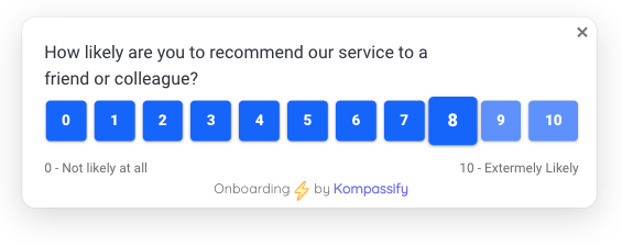
An in-app survey is a short questionnaire presented to users inside the product itself, while they are using it. It typically takes the form of a slide-in card in a corner, a slim bar at the top or bottom of the screen, or a small centred dialog, and it asks one question, occasionally two. It is triggered by something the user did rather than by a schedule, and it is answered in a click without leaving the page.
In-app survey, defined. A micro-questionnaire delivered inside a product, triggered by user behaviour, designed to be answered in seconds without interrupting the task in progress. Its defining property is context: the question arrives while the experience it asks about is still happening, so the answer describes reality rather than memory.
The pattern is often confused with its neighbours in the feedback stack. They each collect something different:
| Method | Where it lives | What it's good at | Its weakness |
|---|---|---|---|
| In-app survey | Inside the product, triggered by behaviour | High response rate, in-context accuracy, fast iteration | Room for one or two questions only |
| Email survey | The inbox, days later | Length: you can ask ten questions | Low response, recall bias, self-selecting sample |
| Feedback widget | A permanent button in the UI | Catching unprompted, spontaneous reports | Only hears from users motivated enough to click |
| User interview | A scheduled call | Depth, follow-up questions, the "why behind the why" | Tiny sample, expensive, slow |
| Product analytics | Event data | What users did, at full population scale | Never tells you why they did it |
The last row is the important one. Your product analytics can show you that 40% of trials stall on the same screen; only a question asked on that screen tells you whether the cause is a missing integration, an unclear label, or a price users hadn't expected. Behavioural data narrows the search; in-app surveys end it. Used together they form a loop: analytics finds the anomaly, a microsurvey explains it, and the fix gets measured back in analytics.
Why In-App Surveys Outperform Email Surveys
The case for asking inside the product, in five parts:
-
They ask while the experience is still warm
Memory decays fast and rewrites itself faster. A user asked on Friday how their Tuesday setup went will report a smoothed, tidied version of the truth. Asked thirty seconds after finishing setup, they'll tell you about the specific field that confused them, because it's still on the screen behind the survey.
-
They reach the silent majority, not the vocal minority
Email surveys are answered by people who love you and people who are furious with you. Everyone in the middle, where most of your revenue lives, deletes the email. An in-app question requires no inbox trip and no motivation, so it captures the ordinary user whose ordinary opinion is the one you're missing.
-
They can be targeted with surgical precision
You can ask a question of exactly the users who used feature X twice last week, on the Pro plan, in their second month. That kind of targeting turns a generic "how are we doing?" into a specific question with an actionable answer, and it's why segmentation matters as much to surveys as to onboarding.
-
They close the loop fast enough to matter
Ship a change on Monday, see whether the question's answers shift by Thursday. In-app surveys make feedback a continuous instrument rather than a quarterly event, which is the difference between measuring your product and steering it.
-
They explain the numbers your dashboards can't
Every metric that matters (activation, churn, adoption) is a number wrapped around a human reason. The survey is the only instrument that reaches the reason, and it costs a fraction of what a research project does.
The same properties make in-app surveys easy to abuse. Because they're cheap to ship and impossible to ignore, they multiply: one team's NPS, another's feature poll, a third's exit survey, all firing at the same tired user. Every unwanted prompt spends trust you'll want later. Treat survey impressions as a scarce shared budget with an owner, or your response rate will decline for reasons no individual survey can explain.
The 6 Types of In-App Survey (and When to Use Each)
Surveys split into two families. Relationship surveys measure how users feel about the product overall and are run continuously on a rolling sample. Transactional surveys measure one specific interaction and fire right after it. You want both, and you want to know which is which; mixing them is how teams end up with an NPS score that moves for reasons nobody can trace.
| Type | Family | The question it asks | Best trigger |
|---|---|---|---|
| NPS | Relationship | How likely are you to recommend us? (0–10) | ~30 days in, then quarterly per user |
| CSAT | Transactional | How satisfied were you with this? (1–5) | Immediately after a specific interaction |
| CES | Transactional | How easy was it to do X? (1–7) | Right after a task completes |
| Product-market fit | Relationship | How disappointed would you be without us? | Users with two-plus weeks of real usage |
| Feature feedback | Transactional | Is this feature doing what you needed? | Second or third use of that feature |
| Exit / cancellation | Transactional | What made you decide to leave? | On cancel intent or flow abandonment |
1. NPS: the loyalty trend line
One question, an 0–10 scale, and an open follow-up. Net Promoter Score is best understood not as a number to optimise but as a trend to watch and a machine for generating verbatims. Run it on a rolling sample so a portion of your base sees it each month rather than everyone at once, and never survey the same user more than quarterly.
2. CSAT: satisfaction with one specific thing
"How satisfied were you with this?" on a 1–5 scale, fired immediately after the interaction it asks about: a support conversation, an import, a report export. CSAT is narrow by design, which is exactly why its answers are actionable. If CSAT for your CSV importer sits at 3.1 while everything else is at 4.4, you've found your sprint.
3. CES: how hard did that feel?
Customer Effort Score asks users to rate how easy a task was, usually on a seven-point agree/disagree scale ("The product made it easy for me to complete X"). Effort predicts churn better than delight does: users rarely leave because a product wasn't charming, they leave because it was tiring. Fire CES after the tasks that carry your value: setup, first invite, first successful export.
4. Product-market fit: the "very disappointed" question
"How would you feel if you could no longer use this product?" with three options: very disappointed, somewhat disappointed, not disappointed. The share answering "very disappointed" is a blunt, honest read on whether your product is a need or a nice-to-have, and the free-text follow-up from that group tells you which segment to build for. Only survey users with genuine usage behind them; asking a day-one trialist produces noise.
5. Feature feedback: the microsurvey with the best hit rate
The most underused of the six and often the most useful. After a user has used a specific feature two or three times, ask one question about that feature: does it do what they expected, what's missing, would they recommend it. Because the context is razor-sharp, the answers arrive pre-sorted into a backlog. Pair it with feature discovery work: a feature with low usage and high satisfaction has a discoverability problem, not a quality one.
6. Exit surveys: the expensive lesson, collected
Triggered on cancellation intent or on abandoning a critical flow, with a short list of pre-written reasons plus "other". Keep it to one screen and one click; a user on their way out will not fill in a form. The value isn't in saving that user; it's that fifty exit answers over a quarter will name your top two churn drivers more clearly than any analysis of behaviour ever could.
The Anatomy of a Microsurvey People Actually Answer
A survey that gets answered is a small machine with five parts. Get any one wrong and the response rate collapses in a way the others can't compensate for:
A microsurvey is five parts: an event trigger, one question, a one-click answer, an optional open follow-up, and a graceful exit that remembers it was used.
1. The trigger: an event, not a timer
The survey fires because the user just did something: completed onboarding, exported a report, used a feature for the third time, clicked cancel. "Five seconds after page load" is not a trigger, it's an ambush: the user hasn't done anything yet, so there's nothing to have an opinion about.
2. The question: one, specific, and neutral
"How easy was it to build your first report?" beats "How do you like our new reporting experience?": the first is answerable, the second is a mood. Avoid leading phrasing ("How much did you enjoy…"), avoid double-barrelled questions ("How fast and accurate was…"), and avoid asking about things the user hasn't done.
3. The answer: one click to respond
Open with a scale, a set of options, or thumbs, never a blank text field. A text box as the first interaction asks the user to compose prose before they've decided to participate, and most won't. Once they've clicked something, the psychology inverts: they've committed, and the follow-up gets typed.
4. The open follow-up: where the value actually is
The score is a thermometer; the free-text answer is a diagnosis. Always ask one open follow-up after the click ("What's the main reason for your score?"), always make it optional, and always read every answer for the first hundred. Teams that only track the number miss the entire point of having asked.
5. The exit: dismissible, and permanent
A visible dismiss control, and a survey that respects it: dismissed means gone for that user for that survey, not gone until tomorrow. Anything else converts a request into a nag, and nagging is how you lose the next survey too, the same lesson that governs every in-app message you send.
Timing: When to Ask, and When to Stay Quiet
Two versions of the same survey, on the same screen. The only difference is the moment it chose, and that difference is worth more than any amount of question-wording craft:
The left survey will be dismissed by almost everyone who sees it, and it will make the next survey easier to dismiss too. The right one is answered in a click by a user who just felt something worth reporting. Same product, same team, same question underneath: a completely different data set.
The timing rules that matter most:
- Wait for competence. Nobody can rate a product they haven't used. Relationship surveys belong after the aha moment, not before it, typically two to four weeks in, and never during the first session.
- Fire on completion, not interruption. The moment after a task finishes is a natural pause. The moment during it is not, and a survey there costs you both the answer and the task.
- Never survey inside a critical flow. Checkout, onboarding steps, error recovery, billing. Ever. A survey that costs a conversion is the most expensive feedback you'll ever collect.
- Cap the frequency, globally. One survey per user per month across all teams, with a hard exclusion for anyone who answered in the last 30 days. Frequency capping is the single highest-leverage setting in a survey programme.
- Sample, don't blanket. A rolling 20% of the eligible segment gives you the same trend line at a fifth of the attention cost, and keeps a clean control group.
30 In-App Survey Questions That Get Answers
Grouped by what you're trying to learn. Use them as written or as a starting point, but only ever one at a time.
Onboarding & first experience
- How easy was it to get set up? (1–5)
- What almost stopped you from finishing setup?
- What were you hoping to accomplish when you signed up?
- Was anything confusing in the last few steps?
- How long did you expect setup to take, compared to how long it took?
- What's the one thing that would have made this faster?
Activation & value
- Have you gotten value from the product yet? (Yes / Not yet / Not sure)
- What's the main thing you use us for?
- What's blocking you from using this more?
- How would you feel if you could no longer use this product?
- What nearly made you give up in your first week?
- What did you use before this, and what made you switch?
Feature feedback
- Does this feature do what you expected? (Yes / Partly / No)
- What's missing from this feature?
- How often do you expect to use this? (Daily / Weekly / Rarely)
- What did you try to do here that you couldn't?
- If we removed this tomorrow, what would you use instead?
- How easy was this to find? (1–5)
Satisfaction, effort & loyalty
- How satisfied were you with this? (1–5)
- The product made it easy for me to complete this task. (1–7, agree/disagree)
- How likely are you to recommend us to a colleague? (0–10)
- What's the main reason for your score?
- What's one thing we could do to earn a higher score?
- How does this compare to what you expected? (Better / As expected / Worse)
Churn, exit & abandonment
- What made you decide to cancel?
- What could we have done to keep you?
- Which of these best describes why you're leaving? (options + other)
- Are you moving to something else, or stopping altogether?
- What stopped you from finishing just now?
- Would you consider coming back if we fixed that? (Yes / No / Maybe)
Question hygiene in one line: ask about something the user just did, in words they'd use themselves, with no adjective that hints at the answer you want. If a question can be answered with "well, it depends", it needs to be narrower.
In-App Survey Best Practices: 8 Rules
1. One question, always: earn the second one
Start with a single question and one optional open follow-up. If you're convinced you need a third, run the one-question version first and see how much you learn; most teams discover the extra questions were producing data nobody used. Length is the tax you pay on every response you'll ever collect.
2. Target narrowly, so the answers are usable
"Everyone" is not an audience. Survey a defined segment (trial users in week two, admins who set up an integration, users who used the new editor twice) and the answers arrive already attached to a decision. Broad surveys generate averages; narrow surveys generate sprints.
3. Ask on the screen the question is about
Feedback about the report builder belongs on the report builder, moments after a report is built. Context does half the work of the question: the user doesn't have to remember anything, and their eyes are already on the thing you're asking about.
4. Make dismissal easy and permanent
A clear "Not now" that actually means not now. Hidden or delayed close buttons buy you a few coerced responses and cost you the credibility of every future prompt. Respecting a dismissal is the cheapest trust you'll ever buy.
5. Never interrupt money or momentum
No surveys during checkout, upgrade, onboarding steps, or error states. The rule holds even when the temptation is strongest, especially then, because a survey on an error screen reads as a product asking for applause while it's on fire.
6. Read the verbatims, tag them, count the tags
Open answers are where the value lives, but only if someone processes them. Tag every response into a small, stable set of themes (pricing, missing feature, confusion, performance, bug) and track the tag counts over time. A rising theme is a roadmap item with evidence attached, far more persuasive than an average.
7. Close the loop, visibly
When you ship something a survey asked for, say so: in a release note, an in-app announcement, or a reply to the person who suggested it. "You asked, we shipped" is the single most effective way to keep response rates from decaying, because it proves that answering is not shouting into a void.
8. Treat the response rate as a health metric
Track it per survey and in aggregate. Falling response rates usually mean you're asking too often, too broadly, or too early, not that users have stopped caring. Prune surveys the way you'd prune any other in-app surface: if it hasn't changed a decision in two quarters, retire it and give the attention back.
In-App Surveys: Do vs. Don't
✅ Do
- Ask one question, with an optional open follow-up
- Trigger on a completed action, in context
- Target a narrow, defined segment
- Open with a one-click scale, not a text box
- Cap frequency across all teams: one per user per month
- Sample a rolling percentage rather than everyone
- Tag and count the free-text answers
- Tell users what changed because they answered
❌ Don't
- Ship a six-question form as a modal
- Fire on a page-load timer with no event behind it
- Survey during checkout, onboarding, or an error
- Ask day-one users to rate a product they haven't used
- Re-show a survey the user already dismissed
- Use leading or double-barrelled wording
- Collect verbatims nobody ever reads
- Let every team run its own uncoordinated survey
How to Run In-App Surveys Without Writing Code
Everything above (event triggers, segment targeting, frequency caps, per-user dismissal memory, response analytics) is a meaningful amount of engineering if you build it yourself, and it's the kind of engineering that never quite makes it up the backlog. With Kompassify the survey layer runs on top of your existing product with no code:
- Build the survey visually. Pick the format (slide-in, bar, or modal), write the question, choose the scale, and add the open follow-up. No release cycle, no frontend ticket.
- Trigger it on real behaviour. Fire after a specific action, on a chosen page, for a chosen segment: the users who just finished onboarding, the admins on the Pro plan, the people who used the new feature twice.
- Frequency and dismissal are handled. Per-user state means a dismissed survey stays dismissed and a recent respondent isn't asked again; the manners are built in rather than reimplemented per survey.
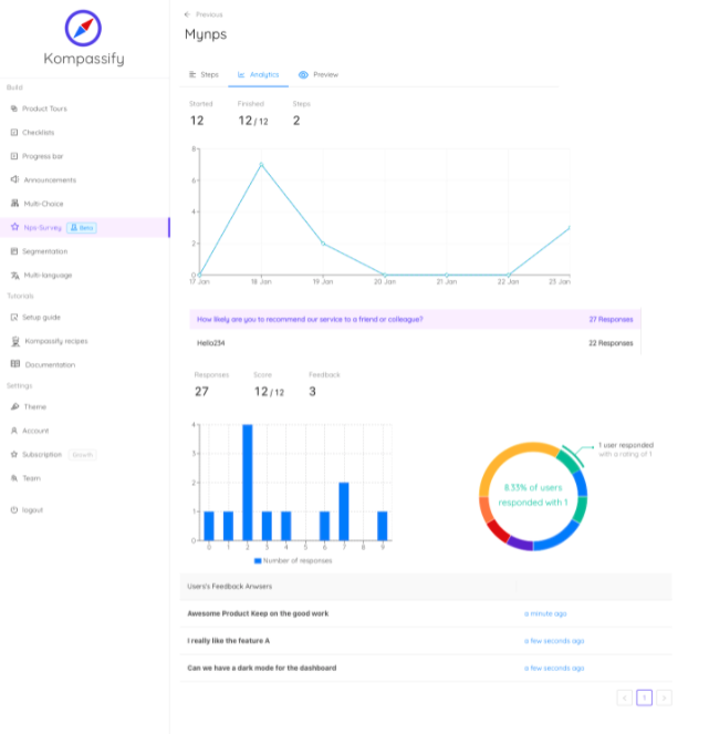
- See answers next to behaviour. Responses land in the same analytics as your product tours and checklists, so a score always comes with the journey that produced it.
- Close the loop from the same place. Ship the fix, then announce it to exactly the users who asked: survey, announcement, and tour from one builder and one snippet.
Kompassify is GDPR compliant and EU-hosted, free for under 100 monthly active users, with paid plans from $129/month.
Ask Your Users, Inside Your Product
Kompassify lets you build in-app surveys, product tours, tooltips and onboarding checklists on top of your existing product, no code, no release cycle. Trigger the right question at the right moment, read the answers next to the behaviour that produced them, and ship the fix from the same place. GDPR compliant, EU-hosted, and free for under 100 monthly active users.
Start for Free →Frequently Asked Questions
What is an in-app survey?
An in-app survey is a short questionnaire shown to users inside a product while they are using it, rather than sent to them by email afterwards. It usually appears as a small slide-in card, a bar, or a lightweight modal, asks one or two questions, and is triggered by something the user just did: finishing onboarding, using a feature for the third time, hitting an error. Because it arrives in context and takes seconds to answer, an in-app survey typically collects far more responses than the same question sent by email, and the answers are more accurate: the user is describing an experience they are having, not one they are trying to remember.
What is the difference between an in-app survey and an email survey?
Context and timing. An email survey reaches the user hours or days later, in a different tool, and asks them to recall how something felt, so it collects fewer responses, skewed toward people with strong opinions. An in-app survey reaches the user at the exact moment the experience happens, inside the product, in one click. The trade-off is length: email tolerates ten questions, in-app tolerates one or two. That constraint is a feature, not a limitation: a single well-timed question answered by many users beats a long questionnaire answered by few.
What types of in-app surveys should a SaaS product run?
Six cover almost everything. NPS measures overall loyalty and gives you a trend line. CSAT measures satisfaction with one specific interaction. CES measures how hard a task felt. Product-market-fit surveys ask how disappointed users would be without the product. Feature-feedback microsurveys ask about a single feature right after it is used. Exit surveys ask why someone is cancelling or abandoning a flow. Most teams should start with one relationship survey (NPS or PMF) running continuously on a sample of users, and add transactional microsurveys at the two or three moments in the product where you have a real decision to make.
When should you trigger an in-app survey?
After a completed action, never before or during one. The rules that matter: wait until the user has enough experience to have an opinion (typically after the aha moment, not on day one), trigger on an event rather than a timer, never interrupt a task in progress, and never fire during checkout, onboarding steps, or error recovery. A survey shown to someone mid-task doesn't just get dismissed; it teaches the user that your prompts are noise, which costs you every future prompt too.
How long should an in-app survey be?
One question, plus one optional open-ended follow-up. That's the format that works. Every extra question costs responses, and the drop-off between question one and question five is steep enough that a five-question in-app survey usually collects less total signal than a one-question one. If you genuinely need more, ask the first question in-app to establish the score, then invite the small group who opted in to a longer conversation elsewhere. In-app is for the pulse; interviews are for the depth.
What is a good in-app survey response rate?
Well-targeted in-app microsurveys commonly land in the double digits, versus low single digits for the same question by email, but the number depends far more on targeting and timing than on the question itself. Rather than chasing a benchmark, watch your own trend: if response rate falls over successive waves, you are surveying the same people too often or asking at the wrong moment. Cap frequency (one survey per user per month is a common ceiling), sample rather than blanket, and always exclude users who answered recently.
How do you add in-app surveys without coding?
With a no-code platform like Kompassify you build the survey visually, choose the format (slide-in, bar, or modal), pick the trigger event and the audience segment, set frequency caps, and publish to your live product without a release. Responses land in built-in analytics next to your product tours, checklists and announcements, so you can see the score alongside the behaviour that produced it. Kompassify is GDPR compliant and EU-hosted, free for under 100 monthly active users, with paid plans from $129/month.