Watch a first-time user who does not work in software use your product, and the experience is disorienting for everyone in the room. They hover over a button for eight seconds without clicking it. They read a label three times. They ask, quietly, "will this send it to everyone?", and when nobody can answer immediately, they close the tab and email your support address instead.
Nothing about that is a capability problem. The person doing it may run a clinic, manage a construction site, or handle a caseload that would flatten most product teams. What they lack is something your team stopped being able to see years ago: the accumulated conventions of software interfaces, and the confidence that comes from knowing which mistakes are recoverable.
This guide is about designing onboarding for those users, the ones your funnel calls "slow" and your support inbox calls "frequent". It covers the five barriers that actually stop them, nine techniques that address each barrier directly, what to measure, and the well-meant mistakes that make things worse. None of it requires making the product simpler for everyone else.
Key Takeaways
- "Non-technical" means unfamiliar with software conventions, not less capable. The gap is vocabulary and confidence, and both are addressable.
- Fear stops more people than confusion does. Users who don't know whether an action is reversible will stop rather than risk it.
- Say the outcome first, the control second. "To let your team see this, turn on Sharing" is readable; "Enable sharing permissions" is not.
- One decision per screen. Two choices side by side doubles the perceived risk of getting it wrong.
- Give them somewhere safe to practise: sample data, a draft state, a visible undo. Confidence is built by surviving a mistake, not by avoiding one.
- Help must be where the confusion is. A help centre in another tab is a help centre that gets replaced by a support email.
- Route by segment, don't average. One flow pitched at the middle patronises experts and still loses beginners.
What "Non-Technical" Actually Means
The label is unhelpful, because it sounds like a statement about a person when it is really a statement about a mismatch. The users in question are frequently experts: at medicine, at logistics, at law, at running a business with a payroll. What they have not spent fifteen years absorbing is the invisible curriculum of software:
-
The vocabulary
Sync, instance, workspace, integration, environment, token, seat, workflow. Each has a precise meaning in your product and no meaning at all in a veterinary practice. Nobody will admit to not knowing them, which means you will never hear about it in a support ticket either.
-
The conventions
That a toggle takes effect immediately but a form needs saving. That a greyed-out item means "not yet" rather than "broken". That the gear icon is settings. These are learned, not obvious, and a user who has not learned them cannot infer their way past a screen the way your team can.
-
The confidence that mistakes are cheap
Experienced users click things to find out what they do, because they know almost everything is recoverable. Someone without that background assumes the opposite: that the wrong click might send an invoice, delete a record, or embarrass them in front of colleagues. So they don't click, and your funnel records it as a drop-off.
The reframe that changes the work. Stop treating this as "users who need things simplified" and start treating it as "users who need things translated and made safe". Simplification removes capability from your product. Translation and reversibility remove risk from the user's experience, which is what was actually blocking them, and costs nobody else anything.
The Five Barriers That Actually Stop People
Technique 1: Write the Outcome, Then the Control
Most onboarding copy is written control-first, because that is how the people who built the product think about it. Flipping the order costs nothing and changes readability entirely:
| Instead of | Say | Why it works |
|---|---|---|
| Configure your integration settings | To get your bookings in here automatically, connect your calendar | Outcome first tells them whether to care before it tells them what to do |
| Enable sharing permissions | To let your team see this, turn on Sharing | Names the consequence, not the mechanism |
| Invite users to your workspace | Add the people who need to see these schedules | Uses their word for the thing, not yours |
| Your data will be synced | We'll copy your existing records over; the originals stay where they are | Answers the unasked question: does this destroy anything? |
| Are you sure? | This will email all 43 staff members. Send it? | States the real consequence, so the answer is possible |
Three habits carry most of the improvement. Use the user's domain nouns (patients, shifts, cases, invoices) rather than your data model's. Delete hedges: "may", "should", "typically" and "if applicable" each add a decision the reader now has to make alone. And define a term where it appears, not in a glossary, because nobody navigates to a glossary mid-task.
Technique 2–4: Reduce What Each Screen Asks For
2. One decision per screen
Two choices presented together do not add up to twice the difficulty; they multiply it, because the user now has to hold both open while judging the risk of each. Splitting a settings page into three sequential questions feels slower to a designer and is reliably faster in practice for a hesitant user, because each question can be answered and closed. An onboarding wizard is the standard shape for this, and it exists precisely because parallel decisions are expensive.
3. Pre-fill everything you can defend
Every empty field is a request for a decision. Sensible defaults, with a visible way to change them and a note saying they can be changed later, convert a form full of choices into a form full of confirmations, which is a categorically easier task. The rule of thumb: if your team would have picked the same value 80% of the time, pick it for them.
4. Order by dependency and block what isn't ready
Never show an action that cannot yet succeed. If step four requires something from step two, the step-four control should be visibly unavailable with a plain-language reason, "available once you've added a location", rather than clickable and then failing. A failure that a user caused is a failure they will blame themselves for, and self-blame is what precedes abandonment.
Technique 5–6: Make Mistakes Cheap, and Say So
If you fix only one thing on this page, fix this one. Fear is a larger source of stalling than confusion, and it responds to a smaller intervention.
5. Give them somewhere safe to practise
A sample project, a demo workspace, a draft mode: anywhere a user can press things and find out what happens without consequence. Confidence with software is not built by reading; it is built by taking an action, seeing the result, and discovering that nothing bad happened. Sample data also solves the other first-session problem, which is that an empty state gives a hesitant user nothing to reason about.
6. Make reversibility visible, in words
Undo is a feature; knowing undo exists is the feature that changes behavior. A short line next to a decision, "you can change this any time in Settings", removes the risk calculation that was blocking the click. Where something genuinely is not reversible, say that too, equally plainly: predictability is what is being bought here, and a user who trusts your warnings will act faster on everything else.
Skipping straight to rung three is the default in most products, and it is where non-technical users are lost.
Technique 7–9: Show It, Explain It Where It Happens, Hold Their Place
7. Show rather than tell
A twenty-second clip of the action being performed communicates more to a low-confidence user than three paragraphs, because it removes the interpretation step entirely; there is nothing to translate. This is the strongest argument for onboarding videos and animated hints in this context specifically. Keep them short, silent-friendly with captions, and adjacent to the thing they describe rather than collected on a separate page.
8. Put help where the confusion is
The gap between "we have a help centre" and "help was available at the moment of doubt" is where most abandonment lives. A tooltip on the confusing field, a "what's this?" beside the unfamiliar term, a hotspot on the control nobody finds: each removes the need to leave the task, which matters doubly for someone who would rather abandon than admit confusion. A knowledge base is still worth having; it is just not where the first-session save happens.
9. Hold their place across sessions
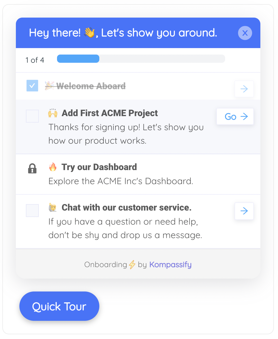
Less confident users take longer, get interrupted, and often deliberately stop to come back when they have more time. A flow that forgets them punishes exactly that behavior. A persistent onboarding checklist with per-user progress solves it, and does something else valuable at the same time: it makes the whole task visible, so "how much more of this is there?", a question that quietly drives a lot of abandonment, has an answer on screen. A progress indicator does the same job on shorter flows.
Well-Meant Mistakes That Make It Worse
✅ Do
- Route less confident users into a slower path
- Say the outcome before naming the control
- Use the user's domain words, not your data model's
- Show what an action will actually do before it does it
- Provide sample data to practise on
- Say "you can change this later" beside the decision
- Keep help inline, at the point of doubt
- Segment your metrics by confidence, not just overall
❌ Don't
- Remove features to "simplify" for everyone
- Write copy that sounds like it's addressing a child
- Front-load a long tour before anything is useful
- Hide the advanced path so it can't be found later
- Rely on icons alone to carry meaning
- Send people to a separate help site mid-task
- Assume silence means the flow worked
- Design and test only on your team's own devices
Two of those deserve expanding. Simplifying by removal is the most common overcorrection: the product gets less capable, power users get annoyed, and the non-technical user is no better off, because their problem was never the number of features, it was that the ones in front of them were unreadable and felt dangerous. And the long front-loaded tour is specifically counterproductive here: a nervous user shown fourteen steps before doing anything now has fourteen things to be anxious about and still no experience of succeeding. One step, done, beats fourteen explained, the same principle behind progressive onboarding.
The tone trap. Writing plainly is not the same as writing down. "Don't worry, this is easy!" tells a struggling user that their difficulty is unusual, which is the opposite of reassuring. Plain, specific and neutral is the register: state what will happen, state that it can be undone, and leave the emotional commentary out. Respect reads as clarity, not as encouragement.
What to Measure, and Why the Average Lies
Overall onboarding metrics are dominated by the users who were never going to struggle, which means the segment this guide is about is statistically invisible in exactly the reports teams look at. The fix is to split every number:
| Measure | What to look for | What it usually means |
|---|---|---|
| Time per step, by segment | Steps where one segment takes 3–4× longer | That step is written for a different reader |
| Abandonment point, by segment | A single screen absorbing most exits | An unexplained term, or an action that feels irreversible |
| Help opens per screen | Concentration on one or two screens | A defect list, ranked: fix those screens first |
| Support contacts per new account | Recurring questions with the same wording | The exact sentence your interface should have said |
| Return rate next day | Users who left mid-setup and came back | Whether your flow is resumable in practice, not just in theory |
One qualitative practice outperforms all five, and costs an afternoon: watch three real users from the segment attempt setup without help, and stay silent while they do it. Every team that runs this exercise finds at least one sentence they had read a hundred times and never noticed was ambiguous. It is the same reasoning behind a periodic onboarding audit, applied to the users least likely to tell you what went wrong.
Shipping the Slower Path Without Slowing Everyone Down
The practical version of everything above is two paths, not one product: a direct route for people who want to move fast, and a guided route with more explanation, sample data and a checklist for people who need it, chosen by role, by a one-tap question at signup, or by observed hesitation. Neither group is made worse off by the other's existence, which is the whole advantage over a single flow pitched at the average.
That is straightforward to run as a guidance layer on top of your live product. Kompassify is built for it:
- Two paths, one product. Target tours and tooltips by segment, so the slower guided route reaches the people who need it and nobody else sees it.
- Explain things where they happen. Place tooltips and hotspots on the exact control that confuses people: no engineering ticket, no separate help site.
- Hold their place. An onboarding checklist remembers progress per user, so someone who stopped on Tuesday resumes on Thursday.
- Change the wording the same day. The sentence that lost someone yesterday can be different this afternoon, which is the only way to converge on copy that works.
- Find the screens that hurt. Per-step analytics show where the slow segment stalls, so you fix the screen rather than the average.
Kompassify is GDPR compliant and EU-hosted, free for under 100 monthly active users, with paid plans from $129/month.
Guide the Users Who Stall, Without Slowing Down the Rest
Kompassify adds product tours, onboarding checklists, tooltips and hotspots to your existing product with no code, targeted by segment, so less confident users get the slower, better-explained path while everyone else moves at their own speed. Change the wording the same day you learn it's wrong. GDPR compliant, EU-hosted, and free for under 100 monthly active users.
Start for Free →Frequently Asked Questions
What does "non-technical user" actually mean?
Not "less capable": it means someone whose expertise is in a domain other than software. A nurse, a bookkeeper, a warehouse supervisor, a lawyer, a restaurant owner. They are frequently expert at genuinely difficult work; what they lack is the accumulated conventions of software interfaces: what a toggle implies, what "sync" means here, which actions are reversible, that product teams absorbed so long ago they no longer see them as knowledge at all. Onboarding for these users is a translation and confidence problem, not a simplification problem.
Why do non-technical users stall during onboarding?
Five barriers, and none of them is ability. Vocabulary they do not share, so instructions are unreadable. Invisible prerequisites: step four cannot be done until something in step two was configured, and nothing says so. Fear of causing irreversible damage, which makes stopping safer than guessing. No mental model of what the product is or how its parts relate, so nothing can be inferred. And no acceptable way to ask, because admitting confusion feels like admitting incompetence. Each has a specific fix, and the fixes rarely involve removing features.
How do you write onboarding copy for non-technical users?
Lead with the outcome in their words, then name the control. "To let your team see this calendar, turn on Sharing" rather than "Enable calendar sharing permissions." Use their domain vocabulary rather than yours (patients, invoices, shifts, cases) and define any product-specific term the first time it appears, in the place it appears rather than in a glossary. Cut hedges and conditionals; a sentence with two clauses and a "may" is a sentence a nervous user will read three times and still not act on. The UX microcopy guide covers the mechanics in more depth.
Should you build a separate onboarding flow for non-technical users?
Usually a separate path rather than a separate product. Segment on role or on a one-tap self-description at signup, and route less confident users into a slower flow: fewer decisions per screen, more explanation in context, sample data to practise on, and a checklist that holds their place. Everyone else takes the direct route. This is far better than a single flow pitched at the middle, which manages to be patronising for experts and still too fast for beginners.
How do you reduce the fear of breaking something?
Make the consequences of every action visible and reversible, and say so out loud. A prominent undo, a clearly-labelled draft state, a sandbox or sample workspace to practise in, and confirmation dialogs that state what will actually happen in plain terms rather than asking "Are you sure?". The single highest-leverage sentence in onboarding for a nervous user is some version of "you can change this later" (placed next to the decision, not in a help article) because most stalling is not confusion about how, it is unwillingness to risk a mistake.
What should you measure when onboarding non-technical users?
Segment every onboarding metric by confidence or role rather than reading the average, because the average is dominated by users who were never going to struggle. Watch time-per-step for the slow segment specifically, the point where they abandon, how often they open help on each screen, and whether they return the next day. A step where one segment takes four times as long as another is not a slow user; it is a step written for somebody else.
How do you add guidance for non-technical users without engineering time?
Put the guidance layer on top of the product rather than inside it. With a no-code platform like Kompassify you build tooltips, product tours, hotspots and onboarding checklists visually on your live product, target them to the segment that needs the slower path, and publish without a release, so the wording of the step that confused someone yesterday can be different today. That iteration speed matters more here than anywhere else, because the only reliable way to find the sentence that loses non-technical users is to watch them, change it, and watch again. Kompassify is GDPR compliant and EU-hosted, free for under 100 monthly active users, with paid plans from $129/month.