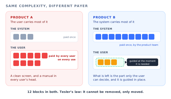
Every product team has had this meeting. Someone puts a screenshot on the wall, points at a settings panel with fourteen options, and says the product is too complicated. Everyone agrees. Two sprints later the panel has four options, the release notes say the experience has been simplified, and support starts receiving a new kind of ticket: people asking why the product did something they did not tell it to do.
Nothing went wrong with the execution. The team removed ten options from the screen. What they could not remove was the ten decisions those options represented. Those decisions still had to be made by someone. Some were now made by the code, some by a default that fits most accounts and not all of them, and some were quietly handed to the user in a worse form: a behaviour they now had to predict instead of a setting they could read.
There is a name for this, and it is one of the most useful ideas a product team can carry into a simplification project. It is called Tesler's law, or the law of conservation of complexity, and it says that every application has an amount of complexity that cannot be removed. It can only be moved. The design question is never whether the complexity exists. It is who carries it, how often they pay for it, and whether they can see it.
This guide covers what Tesler's law means, the difference between the complexity you should remove and the complexity you can only relocate, a simple ledger for working out who pays and how many times, the three ways simplification leaks back out, seven examples from SaaS products, a three-question test for where each decision in a workflow should live, where in-app onboarding fits, a complexity audit you can run on one workflow this week, the cases where the user should keep the complexity on purpose, and what to measure.
Key takeaways
- Tesler's law says every product has a fixed amount of complexity that cannot be removed, only moved between the system and the user.
- It applies to essential complexity, the difficulty that comes from the job itself. Accidental complexity, the difficulty you added by accident, should simply be deleted.
- Where complexity lands decides what it costs. The product team pays once, an admin once per account, each user once to learn it, and each user again on every use to operate it.
- Simplification leaks back out in three ways: surprise (the system decided wrongly), ceiling (the override is gone) and hiding (the capability exists and nobody can find it).
- Test each decision in order: can the system work it out, does one answer suit most users, is it the same for the whole account? Only what fails all three belongs with the user.
- That residue is exactly where onboarding belongs. Guidance on something that should have been a default means paying for the same complexity twice.
What Is Tesler's Law? (Meaning and Definition)
Tesler's law is attributed to Larry Tesler, a computer scientist who worked on interaction design at Xerox PARC and later at Apple. The idea is simple enough to state in a sentence and awkward enough that most teams spend years arguing against it without knowing its name.
Tesler's law: definition
Tesler's law states that for any system there is a certain amount of complexity that cannot be reduced. The only open question is who deals with it: the people who build the product, or the people who use it. A design can move that complexity around, but it cannot make it disappear.
Law of conservation of complexity: meaning
The law of conservation of complexity is the other common name for Tesler's law. The wording borrows from physics on purpose: just as energy is conserved and only changes form, the difficulty inherent in a task is conserved and only changes owner. Removing a field from a form does not remove the question the field was asking. It moves the answer somewhere else.
The classic illustration is an email. Sending one requires a sender, a recipient and a route between them. None of that can be wished away. An early mail tool might have asked the user to type all three. A modern one fills in the sender because it already knows who is signed in, suggests the recipient from previous conversations, and never mentions routing at all. The complexity did not shrink. It moved into the software, where it is paid for once by the people who built it instead of every time by the people who send mail.
The sentence worth writing on a whiteboard: when someone says a screen is too complex, the useful reply is not how do we remove this, but who is going to carry it instead, and will they know they are carrying it?
Tesler's law is often listed alongside other so-called laws of UX, but it is different in kind from most of them. The others describe how people perceive and react to interfaces. This one describes a budget. It is less a rule about design than a rule about accounting, and that is why it is so useful to product teams: it turns an argument about taste (is this too complicated?) into an argument about allocation (who should pay for this?), which is an argument you can actually settle.
Essential vs Accidental Complexity: Which Part the Law Is About
The most common misreading of Tesler's law is to treat it as an excuse. If complexity cannot be removed, the reasoning goes, a complicated product is simply honest. That is wrong, and the correction comes from a distinction software engineers borrow from Fred Brooks: complexity comes in two kinds, and the law only governs one of them.
Essential complexity
The difficulty that comes from the job itself. Payroll has tax rules. Scheduling has time zones and conflicting calendars. Permissions have to express who can see what. No design removes these, because they are part of the problem the customer is paying you to solve. This is the complexity Tesler's law says you can only move.
Accidental complexity
The difficulty that comes from how the product happens to be built. Two screens that do nearly the same thing. A setting that exists because of an old integration. A label that uses an internal team's word instead of the customer's. None of this is conserved. It can be deleted outright, and it should be, before you spend any effort deciding where the rest should live.
| In a typical SaaS product | Essential (move it) | Accidental (delete it) |
|---|---|---|
| Scheduling | Participants are in different time zones. | The user has to pick their own time zone from a list of hundreds. |
| Data import | The customer's columns do not match your fields. | The importer rejects the file without saying which column failed. |
| Permissions | Different people must see different things. | Three separate places to grant access, each with its own vocabulary. |
| Reporting | The customer wants a view nobody else needs. | A blank report builder with no starting point for the common views. |
| Notifications | Different people want to hear about different events. | Every notification is on by default and switched off one at a time. |
The order matters. If you start relocating complexity before you have deleted the accidental part, you end up carefully guiding users through a problem you created. That is the most expensive kind of onboarding there is, because it teaches something that should not exist, and it will need maintaining for as long as the accident survives. Our guide to feature bloat covers the related problem of capability nobody uses, which is often where accidental complexity accumulates.
Who Pays for Complexity, and How Often
Tesler's law is usually drawn as a seesaw between two parties, the system and the user. For a SaaS product that picture is too coarse, because there are at least four places the same unit of essential complexity can land, and each one pays a different number of times.
-
The product team pays once. If the system works it out, the cost is engineering and design time spent a single time, plus maintenance. Every user after that gets it for free.
-
An admin pays once per account. If it is a configuration choice, one person in each customer decides it on behalf of everyone else. This is how most B2B products handle decisions that vary by company but not by person.
-
Each user pays once to learn it. If the user has to understand a concept or a rule, every single seat pays that cost, but ideally only one time.
-
Each user pays again on every use to operate it. If the user has to make the decision each time they do the task, the cost is multiplied by users and by uses. This is the expensive place, and it is where most unexamined complexity ends up.
The same decision, paid in four places. Moving it one row up does not make it smaller. It changes how many times it is paid.
The arithmetic is deliberately crude, and it is still clarifying. Take an illustrative product with 200 customer accounts, 5,000 users and a task each user performs 40 times. A decision the product team builds into the system is paid once. The same decision made by admins is paid 200 times. Made by users as something to learn, it is paid 5,000 times. Made by users as something to decide every time, it is paid 200,000 times. None of these numbers is a benchmark. The ratio between them is the point.
This is why the most effective simplifications rarely look like simplifications. They do not remove a screen. They take one decision that users were making on every use and turn it into something the system infers, or an admin sets once. From the outside, nothing changed. From the ledger, the product just got dramatically cheaper to use.
The row that does not show up in your analytics: operating cost is paid in seconds of hesitation spread across thousands of sessions. No single user complains about it, and no funnel step drops because of it. It surfaces instead as a product that feels heavy, and as churn that nobody can attribute to anything in particular.
The Three Leaks: Why Simplifying Often Moves Complexity Somewhere Worse
Tesler's law has a corollary that matters more in practice than the law itself. When you move complexity into the system, some of it leaks back to the user. The leak is usually harder to deal with than the original complexity, because it arrives without a label. There are three common forms.
Automation is only an improvement when it is right. When it is wrong, the user has to notice that something happened, work out what the system did, and figure out how to undo it. That is three problems in place of the one setting they used to have. The fix is not less automation but visible automation: say what the system did, and where to change it.
Removing a setting because most people never touch it is sound. Removing the only way for the other people to get their job done is not. They do not stop needing the capability. They build a workaround outside your product, and you lose sight of them. Our guide to power users covers the people who hit this ceiling first.
Moving an option into an advanced panel keeps it available and makes it invisible. The complexity has not gone. It has moved from the screen into the user's memory, where it now has to be known about in advance. Our guide to progressive disclosure covers when hiding pays for itself and when it buries things.
The three leaks have something in common. In each case the product looks simpler in a screenshot and is harder to use in practice, because the complexity that used to be written on the screen is now implicit. A setting you can read is a small cost paid in the open. A behaviour you have to predict, a limit you discover at the worst moment, or an option you have to already know exists is the same cost paid in the dark. Tesler's law does not say you should never move complexity. It says you should know where it went.
Tesler's Law Examples in SaaS Products
The examples below are common patterns rather than claims about any particular product. Each one shows the same move: a piece of essential complexity that did not shrink, only changed payer. The line under each one says where it went.
1. Time zones detected instead of chosen
Asking every user to find their time zone in a long list charges each of them for knowledge the browser already has. Detecting it and showing the result, with a way to change it, moves the cost to the product team. The visible result matters: a detected value the user cannot see is a surprise leak waiting for the first person who travels.
Where it went: from every user, once, to the system.
2. Column mapping suggested instead of built from scratch
An importer that asks users to map every column by hand makes them do the matching the software could attempt itself. Suggesting a match for each column and asking the user to confirm only the uncertain ones keeps the user in charge of the essential part, the columns only they can interpret, and hands the rest to the system.
Where it went: the obvious matches to the system, the ambiguous ones stay with the user.
3. Roles instead of individual permissions
Granting forty permissions one at a time to every new colleague charges the admin on every hire. Predefined roles collapse the common combinations into one choice. The essential complexity, that different people need different access, is untouched. It is simply decided once, as a role, instead of again for each person.
Where it went: from per-person admin work to a one-time role design.
4. Report templates instead of a blank builder
A blank report builder is maximally flexible and asks every user to rediscover the same five reports that most accounts want. Starting from templates moves the common cases to the product team and leaves the builder for what is genuinely specific to one customer.
Where it went: the common views to the product team, the unusual ones stay with the user.
5. Sensible notification defaults instead of everything on
Turning every notification on and letting users switch them off one by one looks neutral. In practice it makes each user do the filtering the product could have done by role. A small, relevant default set with a visible way to add more moves the decision from every user to the product team. Our guide to digital nudges covers defaults as a design tool in more depth.
Where it went: from every user, on every noisy day, to the system.
6. Workspace settings instead of personal settings
Some decisions look personal and are really organisational: fiscal year start, default currency, naming conventions. Asking each user to set them produces inconsistency and repeated work. Moving them to the account level means one admin decides once, and everyone else inherits a product that already fits their company. Our guide to enterprise onboarding covers the account layer and the seat layer as two separate onboarding jobs.
Where it went: from every user to one admin per account.
7. The concept that has to stay with the user
Some complexity survives every test. A marketing tool has to explain the difference between a segment and a list, because the user decides which to use and the consequences differ. A finance tool has to explain what closing a period does, because the user is accountable for it. This is the residue: the part of the job only the user can own. It cannot be moved, so the only question left is how cheaply the user can learn it, and that is where onboarding enters.
Where it went: nowhere. It stays with the user, and gets guided in place.
Where Each Decision Should Live: A Three-Question Test
The ledger suggests a simple order of preference: move each decision to the payer who pays least often, as long as that payer can actually make it well. In practice that becomes three questions, asked in sequence, for every decision a workflow asks the user to make.
Each step down the tree moves the cost to someone who pays more often. Only the decisions that fail all three questions belong with the user, and those are the ones worth guiding.
Q1. Can the system work it out reliably?
If the answer is already in your data, in the browser, or implied by something the user just did, the system should supply it. The important word is reliably. A guess that is right nine times out of ten still produces a surprise for one user in ten, so absorb it only if you also show what the system did and where to change it.
Q2. Is one answer right for most users?
If most people would pick the same option, pick it for them and keep the override visible. A default is the cheapest form of simplification there is, because it removes the decision for the majority without removing the capability for anyone. The failure mode is the invisible default, which turns into a ceiling leak for the minority.
Q3. Is the answer the same for everyone in the account?
If the decision varies by company but not by person, it belongs with an admin, once. This is the most under-used move in B2B products, where many settings sit on every user's profile for no better reason than that is where they were first built. When you move a decision to the admin, move the guidance with it: the admin now needs to understand it properly, and nobody else needs to see it.
What is left: the user carries it
Everything that fails all three questions is essential complexity that belongs with the user. It is usually a judgement only they can make, a concept they must understand to use the product well, or a choice they are accountable for. There is nothing left to relocate, which means the job changes from moving the complexity to lowering its price.
Where Onboarding Fits: Guidance Is for the Residue
Most teams reach for onboarding first. A screen confuses people, so it gets a tour. Tesler's law suggests the opposite order. Onboarding is the right tool for the complexity that remains after you have deleted what was accidental and moved what could be moved. Used there, it is extraordinarily efficient. Used anywhere else, it is a way of paying for the same complexity twice: once to build the confusing thing, and again to explain it.
The reason guidance works on the residue comes straight from the ledger. The residue is a cost each user has to pay at least once. What guidance does is shift that payment from the expensive row to the cheaper one: it turns something users would otherwise work out on every use, by trial and error, into something they learn once, at the moment they first meet it. A tooltip on the field that asks the hard question, a short tour through the one workflow where the concept first appears, a checklist that sequences the admin's one-time setup. Each of these reduces how often the user pays without pretending the complexity is not there.
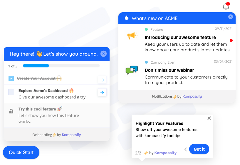
Guidance is how you lower the price of the complexity that has to stay with the user: explained on the element where the decision is made, sequenced where there is setup to do, and gone once it is learned.
Three rules keep guidance on the right side of the law.
1. Guide the decision, not the screen
A tour of a whole screen spreads the explanation evenly across everything, including the parts that carry no essential complexity at all. Attach the guidance to the specific control where the user has to make a real choice, and leave everything else alone. Our guide to tooltips covers how short that explanation can be.
2. Guide the payer who actually pays
If you moved a decision to the admin, the admin needs a checklist and every other seat needs nothing. Showing an account-level concept to every user charges thousands of people for a decision one person made. Target the guidance to the role that carries the complexity.
3. Let the guidance retire
The whole point is to move the user from the operating row to the learning row. Once they have learned it, the guidance has done its job, and leaving it in place turns it into a new source of noise. Show it once, make it available again when someone needs it, and measure whether the decision gets faster.
This is also why onboarding for complex products cannot be fixed by making the product simpler alone, a point our guide to onboarding for complex products makes from the other direction. Some difficulty is the product. The best onboarding does not apologise for it. It makes sure users meet each piece of it once, at the right moment, with an explanation on the spot.
How to Run a Complexity Audit on One Workflow
The law is only useful if it turns into work. The audit below takes a single important workflow, usually an afternoon, and produces a ranked list of changes. Pick the workflow with the most support questions or the slowest completion, not the one that looks worst in a screenshot.
1. List every decision the workflow asks for
Walk through the workflow as a new user and write down every point where the user has to choose, type, interpret or remember something. Not every screen, every decision. A form with eight fields and two real choices has two decisions and six chores. Both lists are useful, but only the decisions carry essential complexity.
2. Strike out the accidental ones
For each item, ask whether it exists because of the customer's job or because of how the product was built. Duplicate paths, legacy options and your own internal vocabulary go on a separate list. Those are deletions, not design problems, and they should be fixed before anything else is touched.
3. Run the three questions on what remains
For each remaining decision: can the system work it out, is one answer right for most users, is it the same for everyone in the account? Mark each one absorb, default, admin or user. Be strict with the word reliably in the first question, because a wrong automation is a surprise leak in waiting.
4. Price each decision with the ledger
Note roughly how often each decision is made: once per account, once per user, or on every use. A decision users make on every use that could be a default is almost always the top item on the list, even when it looks trivial, because it is multiplied by everything.
5. Check each planned move for its leak
For every decision you plan to absorb, default or hide, write down which leak it risks. If you are automating, how will the user see what happened? If you are removing an option, where do the people who need it go? If you are hiding it, how will anyone find it? A move with no answer to its leak question is not ready.
6. Guide the residue, and only the residue
Whatever is marked user after the three questions gets guidance, attached to the element where the decision is made and targeted to the people who make it. Everything else gets product work, or nothing. Our guide to building an onboarding checklist covers sequencing the one-time setup decisions that tend to land with admins.
Two outputs come out of the audit, and they go to different places. The deletions and relocations are roadmap items, because they change the product. The residue is guidance work, which does not need a release and can ship the same week. Separating the two is most of the value: it stops product teams from explaining what they should fix, and stops onboarding teams from waiting for fixes that were never going to remove the underlying difficulty.
When the User Should Keep the Complexity
Tesler's law is sometimes read as absorb everything you can. That reading produces products that act on the user's behalf in ways they did not ask for and cannot explain. Some complexity belongs with the user on purpose, even when the system could technically handle it.
| Situation | Why the user keeps it | What to do instead of absorbing it |
|---|---|---|
| The user is accountable for the outcome | If someone answers for a decision, such as who receives a campaign or what gets deleted, they need to make it knowingly. | Keep the decision explicit. Name the consequence next to the action. |
| The judgement is the value | In expert tools the user's choices are the product. Automating them removes what they came for. | Offer suggestions the user accepts, rather than decisions the system takes. |
| The system cannot be reliably right | A guess that fails often creates more work than the choice it replaced. | Ask, with a well-chosen default and a one-line explanation. |
| Mistakes are costly or irreversible | A little deliberate friction is what prevents an accident. | Keep the step, explain it once, and make it hard to do by mistake. |
In each of these cases the complexity stays with the user because the user should own it, and the design job is to make that ownership easy to exercise. That is guidance territory again, but of a specific kind: not help me skip this, but help me do this correctly. Our guide to mental models in UX covers the related problem of users misunderstanding what a control will do, which is what turns kept complexity into mistakes.
What to Measure
Complexity is not a metric, but the places it lands leave fingerprints. The table below maps each one to a signal you can track, and to what that signal usually means for where a decision should live.
| Signal | What it tells you | Likely move |
|---|---|---|
| Most users pick the same option | The decision has a right answer for the majority. | Make it the default and keep the override visible. |
| Everyone in an account picks the same option | The decision is organisational, not personal. | Move it to account settings, guide the admin. |
| Users undo an automated action soon after it happens | A surprise leak: the system is deciding wrongly for some users. | Show what it did, or turn it back into a choice. |
| Why did it do that tickets | Complexity was absorbed without being made visible. | Surface the automation and its setting. |
| A feature's usage fell after a simplification | A hiding or ceiling leak: the capability got harder to reach. | Mark the new entry point, or restore the override. |
| Time on a step stays flat across attempts | Users are paying the operating cost every time and not learning. | Absorb or default it if you can; guide it if you cannot. |
| High drop-off on one step of a guided flow | That step carries the residue and the explanation is not landing. | Rewrite that step, attached to the element where the decision happens. |
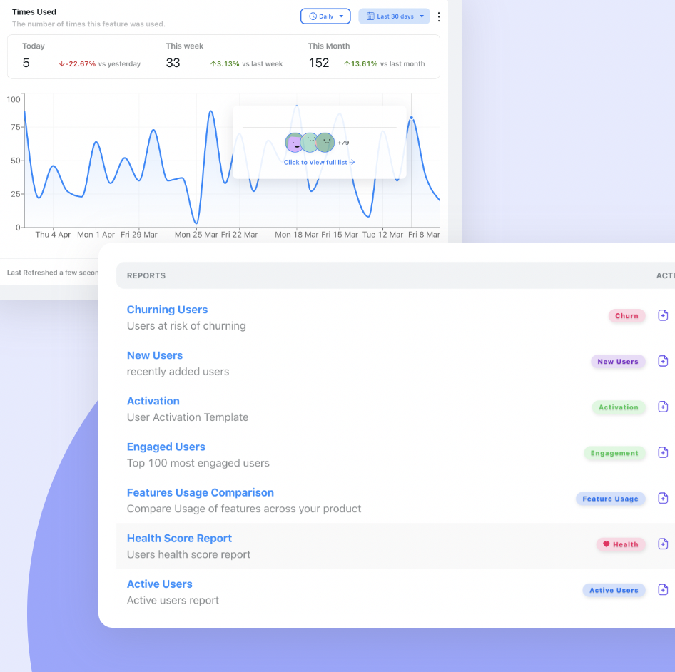
Feature usage before and after a simplification is the fastest way to catch a hiding or ceiling leak: if usage drops after an option moved, the complexity did not go away, it just got harder to reach.
Most of these need only ordinary event data, which our guide to behavioural analytics covers setting up without a data team. The one that costs nothing is reading support conversations for the phrase why did it, which is the clearest signal that complexity moved into the system without being made visible.
Guiding the Residue With Kompassify
The audit produces two lists. The product work is yours. The residue, the essential complexity that should stay with the user, is what Kompassify is built for, and it can be handled without waiting for a release:
- Tooltips and hotspots attached to the exact element where a hard decision is made, so the explanation sits on the choice rather than above the page.
- Product tours built by selecting elements in your own interface, for the one workflow where a concept first appears, not for the whole product.
- Onboarding checklists that sequence one-time setup, such as the account-level decisions that belong with an admin. A checklist item can open a page, redirect or start a tour.
- Segment and page targeting, so guidance reaches the role that carries the complexity and nobody else.
- Announcements for telling users when you have moved something, which is the simplest protection against hiding and surprise leaks after a simplification ships.
- No-code product analytics, with feature usage, user flow and activation reports plus per-step tour analytics, so you can see whether a step's drop-off falls once it is guided.
It installs with a single script, needs no engineering time for any of the above, is free up to 100 monthly active users with plans from $129/month, and is GDPR-compliant and EU-hosted. A fair caveat: guidance cannot turn a decision into a default or move a setting to the admin panel. That part is product work. What it can do is lower the price of everything that should stay with the user, starting this week, and tell you which of the product changes are worth the roadmap slot. See the product tours and product analytics pages for details.
Guide the complexity that has to stay
Put the explanation on the decision, give admins a checklist for the one-time setup, and measure whether each guided step gets faster. No code required. Free up to 100 monthly active users, plans from $129/month, GDPR-compliant and EU-hosted.
Start for free →Tesler's Law: Do vs. Don’t
✅ Do
- Delete accidental complexity before relocating anything.
- Ask who pays, and how often, for every decision in a workflow.
- Move decisions to the payer who pays least often and can still decide well.
- Show what the system did whenever it decides for the user.
- Keep overrides visible when you add a default.
- Move organisational decisions to the admin, and guide the admin.
- Attach guidance to the decision, not to the whole screen.
- Watch feature usage after every simplification.
❌ Don’t
- Treat a cleaner screenshot as proof the product got simpler.
- Use Tesler's law as an excuse for accidental complexity.
- Automate a decision the system gets wrong for a meaningful share of users.
- Remove the only way for a minority to do their job.
- Hide a capability without marking where it went.
- Tour something that should have been a default.
- Show account-level concepts to every seat.
- Take away a decision the user is accountable for.
The One-Paragraph Version
Tesler's law, also called the law of conservation of complexity, says every product has an amount of difficulty that cannot be removed, only moved between the people who build it and the people who use it. It governs essential complexity, the part that comes from the customer's job, not accidental complexity, which you should simply delete. Where essential complexity lands decides what it costs: the product team pays once, an admin once per account, each user once to learn it, and each user again on every use to operate it, so moving a decision one row up can remove most of its total cost without changing anything visible. Simplification leaks back out as surprise when the system decides wrongly, as a ceiling when the override disappears, and as hiding when the capability becomes unfindable, so every move needs an answer to its leak. Test each decision in order: can the system work it out reliably, is one answer right for most users, is it the same for the whole account? What fails all three is the residue, and the residue is exactly where onboarding belongs: guided on the element where the decision is made, targeted at whoever carries it, and retired once it is learned.
Frequently Asked Questions
What is Tesler's law?
Tesler's law states that every system has a certain amount of complexity that cannot be reduced, only moved. The question a design answers is who deals with that complexity: the people who build the product or the people who use it. It is attributed to Larry Tesler, who worked on interaction design at Xerox PARC and later at Apple. For a product team the practical reading is that simplifying a screen never removes the decisions behind it; it only changes who makes them, how often and whether they can see it.
What is the law of conservation of complexity?
The law of conservation of complexity is another name for Tesler's law. It borrows its wording from physics: just as energy is conserved and only changes form, the difficulty inherent in a task is conserved and only changes owner. Removing a field from a form does not remove the question the field was asking. The answer now has to come from somewhere else: the system, a default, an admin or the user's own knowledge.
What is an example of Tesler's law?
Email is the classic example. Sending a message always needs a sender, a recipient and a route. A modern mail tool fills in the sender because it knows who is signed in, suggests recipients from past conversations and never mentions routing. The complexity is still there, but the software carries it, once, instead of every user carrying it on every message. In SaaS the same move shows up as detected time zones, suggested column mappings in an importer, permission roles instead of individual permissions and report templates instead of a blank builder.
Does Tesler's law mean complex products are fine?
No. Tesler's law applies to essential complexity, the difficulty that comes from the job the customer is doing. Accidental complexity, such as duplicate screens, legacy options or confusing internal vocabulary, is not conserved and should be deleted. The law is a reason to think carefully about where the essential part lives, not an excuse to keep the accidental part.
What is the difference between essential and accidental complexity?
Essential complexity comes from the problem itself: payroll has tax rules, scheduling has time zones, permissions have to express who sees what. No design removes it. Accidental complexity comes from how the product happens to be built: two screens that do almost the same thing, a setting that exists for an old integration, a label in your team's language instead of the customer's. The distinction, which software engineers borrow from Fred Brooks, tells you what to delete and what to relocate.
How does Tesler's law apply to user onboarding?
Onboarding is the right tool for the complexity that should stay with the user after you have deleted what was accidental and moved what could be moved. Used there, guidance turns something users would otherwise work out by trial and error on every use into something they learn once, at the moment they first meet it. Used on complexity that should have been a default or an admin setting, it means paying for the same complexity twice: once to build the confusing thing and again to explain it.
Why does simplifying a product sometimes make it harder to use?
Because the complexity that was removed from the screen leaks back in a less visible form. Automation that decides wrongly produces surprise: the user must notice, understand and undo it. Removing an option produces a ceiling for the minority who needed it. Moving an option into an advanced panel produces hiding: the capability still exists but has to be known about in advance. Each looks simpler in a screenshot and costs more in practice, which is why every simplification needs an answer to its leak.
How do you decide where complexity should live?
Ask three questions in order for each decision a workflow asks the user to make. Can the system work it out reliably? If so, absorb it and show what it did. Is one answer right for most users? If so, make it the default and keep the override visible. Is the answer the same for everyone in the account? If so, let an admin decide once. Whatever fails all three belongs with the user, and that residue is what in-app guidance should cover.
How is Tesler's law different from reducing cognitive load?
Cognitive load is about how much a person has to handle at one moment, and it is reduced by showing less at once. Tesler's law is about who owns the complexity over the life of the product, and it is addressed by moving decisions to whoever pays least often. They often point the same way, but not always: hiding options lowers load in the moment and can raise the total cost if people later have to find what was hidden. Keeping the two separate stops a team from mistaking a less crowded screen for a simpler product.