The install is the expensive part. Whatever it cost you (an ad, a listing, a review, a recommendation) the money is already spent by the time someone taps the icon for the first time. What happens in the next ninety seconds decides whether you bought a user or a download, and the gap between those two outcomes is almost entirely a design problem.
Mobile app onboarding is the flow you get to design for that window. It is not the tour of your tab bar, and it is not the three-slide carousel someone added because every other app has one. It is the shortest credible route from an empty first launch to the moment the app has visibly done something for the person holding it, and everything that does not shorten that route is, on a phone, actively working against you.
This guide covers what mobile onboarding is and where it diverges from web onboarding, why the first session sets your retention curve, the six screen patterns worth knowing, a five-step method for designing a flow that survives contact with real users, how to handle permissions, the metrics that actually indicate success, and the failure modes that show up in nearly every app teardown.
Key Takeaways
- Onboarding ends at value, not at the last slide. If a user finishes your flow and the app has not yet done anything for them, the flow finished but the onboarding didn't.
- The first session is the whole game. Day-1 retention is largely set before the user has been in the app for two minutes, and every later number is downstream of it.
- Three screens is a ceiling, not a target. Each screen before the first real action must earn its place with data, not with a stakeholder's request.
- Prime permissions before the system asks. The OS dialog gives you one attempt; your own screen before it is where the "why" belongs.
- Delay the signup wall until the user has something worth keeping. Asking for an account before showing value is the most expensive screen in most mobile funnels.
- Design for interruption. Mobile sessions end mid-task without warning; a flow that cannot resume where it stopped will lose people who intended to come back.
- Keep the iterable parts out of the binary, or your onboarding improves at the speed of the app store review queue.
What Is Mobile App Onboarding?
Mobile app onboarding is everything that happens between the first launch and the first real result: the value screens, account creation, any questions you ask to personalize the experience, the permission requests, and the guidance that carries someone through one meaningful action. It is a funnel with an unusually short fuse, and the definition worth holding onto is the one that includes an outcome:
Mobile app onboarding, defined. The first-session sequence that takes a new user from install to their first meaningful outcome inside the app, and does it fast enough, and with few enough demands, that the person still has a reason to open the app again the next day. Screens are the mechanism; the outcome is the definition.
The distinction matters because it changes what counts as success. Under the screen-based definition, an onboarding flow with a 78% completion rate is doing well. Under the outcome-based one, that same flow is failing if most of those completers never perform the action the app exists for. Teams that measure completion tend to add screens; teams that measure outcomes tend to remove them. The second group generally has better numbers.
Where mobile diverges from web
Most onboarding advice was written for a browser tab on a laptop, and three constraints break it on a phone:
-
You cannot show the instruction and the thing at once
On the web, a tooltip can sit beside the element it describes. On a phone, guidance either covers the interface or replaces it, which means every step of explanation costs a step of doing. Sequential beats simultaneous, and short beats complete.
-
The session can end at any moment, without warning
A call, a notification, a train stop. Mobile setup has to be splittable into pieces that each stand alone, and it has to remember where someone stopped, which is why a persistent onboarding checklist outperforms a linear tour for anything longer than a minute.
-
The platform interrupts you with its own dialogs
Notifications, location, camera, contacts, tracking. These are blocking, unstyleable, and single-shot: once a user taps "Don't Allow", recovering means talking them into their device settings. No web flow has an equivalent obstacle, and no web-derived playbook accounts for it.
-
Changing it takes a release
A web team fixes a confusing onboarding step the same day it is spotted. A native team writes it into a sprint, waits for review, and then waits for users to update. This is why the parts of onboarding you expect to iterate on should live outside the binary. See shipping changes without a release below.
Why the First Session Decides Your Retention Curve
Mobile retention has a shape everyone in the category recognizes: a steep cliff in the first day or two, a gentler slope for a week, and then a long flat tail of people who genuinely adopted the app. Almost all of the interesting decisions happen on the cliff, and the cliff is the first session.
Shape, not benchmarks: every category has its own numbers. What is universal is that the third row governs the two below it, and the third row is decided in the first ninety seconds.
The practical consequence is that mobile onboarding is not a nice-to-have layer on top of the product; it is the part of the product most users will ever see. A feature shipped for month-three power users reaches a small fraction of installs. A screen removed from the first session reaches all of them. That asymmetry is why onboarding work has an unusually high return on a phone, and why the aha moment deserves to be identified before any screens get designed.
A trap worth naming. Optimizing onboarding completion is easy: remove friction from the flow, and more people finish it. But if the flow does not end at value, you have just made it cheaper to reach a place that does not matter. Always pair a completion metric with a retention metric: if completion goes up and day-7 stays flat, the change was cosmetic.
Six Mobile Onboarding Patterns That Work
There are only so many moves available on a small screen, and the good flows combine three or four of the following rather than using all six. Each has a job, and each has a way of going wrong:
1. The value screens (not a feature carousel)
One to three full-screen panels shown before anything is asked of the user. Their job is to answer "what will this do for me", not "what does this app contain". The version that fails is the feature carousel: three slides describing your tabs, swiped past by everyone. The version that works states an outcome in the user's language, shows the app producing it, and gets out of the way. If you cannot write it without the word "easily", it is probably a feature slide in disguise.
Value screenOutcome first, capability never
PersonalizationOnly ask what changes the flow
Permission primingEarn the yes before you spend the ask
2. Progressive or delayed signup
Let people in first. A guest state, a local-only session, or a single-tap social login placed after the app has done something visible converts far better than an account wall on screen one, because by then the user has something to lose. When you do ask, ask for the minimum, and gather the rest later through progressive profiling at moments where each answer visibly improves the experience. Most signup flow losses on mobile are self-inflicted: fields nobody needed, a password policy nobody could satisfy on a thumb keyboard, an email verification step that sends the user to a different app and hopes they come back.
3. Personalization questions that change something
Two or three taps that route the user into a different first experience: a role, a goal, a use case. The rule is strict: if the answer does not change what happens next, do not ask the question. A personalization step that visibly reshapes the next screen buys attention; one that quietly feeds a CRM spends it. Done well this is the cheapest personalized onboarding available on mobile, because it needs no behavioral data: the user simply tells you.
4. Permission priming
A screen of your own, in your own words, immediately before the system dialog. It explains the specific benefit ("so we can tell you the moment your order ships", not "to improve your experience") and offers a way to decline that does not burn the system prompt. The user who taps "Not now" on your screen can be asked again next week. The user who taps "Don't Allow" on the OS dialog usually cannot be. That asymmetry is the entire argument for the pattern.
5. First-run coach marks, used sparingly
A short overlay pointing at the one control that is genuinely non-obvious. The failure mode is well known: five coach marks in a row, dismissed as a block, remembered by nobody. Treat them as an exception rather than a layer: one per screen, only where a real observed drop-off justifies it, and never as a substitute for an interface that explains itself. The web equivalent, a focused product tour, follows exactly the same rule and fails in exactly the same way when it doesn't.
6. The empty state as the first instruction
The most underused screen in mobile onboarding. A new user's first real view is almost always empty (no items, no history, no data) and that screen is a free, perfectly-timed instruction that requires no overlay and interrupts nothing. A good empty state names one action, explains what it will produce, and offers a way to try it with sample data. Teams that get this right often find they can delete half their coach marks.
How to Design a Mobile Onboarding Flow in 5 Steps
The order below is deliberate. Almost every bad mobile onboarding flow was designed screen-first, which is how apps end up with a beautiful carousel in front of a funnel nobody measured.
- Define the first value moment as an event you can query
- Work backwards to the shortest path that reaches it
- Decide what to ask, and when to ask it
- Make the flow resumable
- Instrument every screen, then delete the worst one
1. Define the first value moment as an event you can query
Not "the user is onboarded", a specific, logged event that means the app has done its job once: the first scan completed, the first transfer sent, the first playlist played to the end, the first report generated. Write it as the query you would run. If your team cannot agree on that one event, stop designing screens; the disagreement will reappear in every review as a fight about what belongs in the flow. This is the same discipline that makes activation measurable on any platform.
2. Work backwards to the shortest path that reaches it
List every step that stands between first launch and that event, in order, including the ones you did not design: the permission dialog, the email verification, the loading screen with no explanation. Then mark each step as required for value, required by us, or habit. The first category stays. The second gets moved later if it possibly can. The third is where the deletions come from, and there are always more of them than the team expects. Drawing this as a user flow makes the argument in ten minutes that a document would take a week to lose.
3. Decide what to ask, and when to ask it
Every question and every permission has a price, and the price rises the earlier you charge it. Sort your asks by how much value the user has received when the ask arrives, then move each one as late as it can go while still working. Notification permission after the user sets up the thing they want to be notified about. Location when they tap something that obviously needs it. Account creation when there is state worth saving. The goal is that every ask arrives as an obvious consequence of something the user just chose to do, rather than as a toll gate.
4. Make the flow resumable
Assume the session ends at the worst possible moment, because on mobile it eventually does. Persist progress per user rather than per session, let people leave a step and come back to it, and make the remaining work visible when they return: a checklist, a progress indicator, a single card on the home screen saying what is left. Flows that restart from the beginning after an interruption convert the interruption into a churn event, which is an expensive way to handle a phone call.
5. Instrument every screen, then delete the worst one
Log an event on entry and exit for every screen in the flow, so drop-off is attributable to a specific screen rather than to "onboarding". Then run the exercise that improves mobile onboarding faster than any redesign: find the screen with the worst exit rate that is not required for value, and remove it. Measure for a week. Most teams can do this two or three times before they hit a screen that genuinely has to stay, and the compounding effect on time to value is usually larger than anything they would have designed instead.
Permission Requests Without the Damage
Permissions are the one part of mobile onboarding where a single mistimed tap has permanent consequences. The system dialog is unstyleable, blocking, and effectively single-use, which makes the screen before it the most important screen in your flow.
The priming screen does two jobs: it supplies the reason the OS dialog cannot, and it lets the undecided decline harmlessly instead of permanently.
Three rules cover most of it. Never ask in the first ten seconds: a permission requested before any value has been delivered is a request for trust you have not earned. Tie the ask to the moment it becomes useful, so the user is already thinking about the thing the permission enables. And give "not now" a real home: an easy decline on your own screen preserves the ability to ask again later, which is worth far more than a marginal opt-in squeezed out of someone who did not want it.
Mobile Onboarding Metrics Worth Tracking
Four numbers, read in order. Each one answers a question the previous one raises, and none of them means much alone:
| Metric | What it answers | What a bad number tells you |
|---|---|---|
| Onboarding completion rate | How many openers finish the flow? | The flow is too long, too demanding, or asks too early |
| Time to first value | How long from launch to the first real result? | There are steps in the path that value doesn't require |
| Activation rate | How many reach the event that predicts retention? | The flow ends somewhere other than value |
| Day-1 / day-7 retention | Did any of it change behavior? | You improved the funnel without improving the product's usefulness |
| Drop-off per screen | Which screen is doing the damage? | Nothing, but without it, every other row is undiagnosable |
Two supporting measures are worth adding once the basics are in place. Permission opt-in rate per prompt, split by where in the flow the prompt fired, will settle the priming argument with data rather than opinion. And completion by segment (by acquisition source, by device class, by the answer to your personalization question) routinely reveals that the flow works for one group and fails badly for another, which is an argument for segmented onboarding rather than for another round of copy edits. If you want the wider metric set that these sit inside, the user onboarding metrics guide covers the full list.
Mobile Onboarding Mistakes: Do vs. Don't
✅ Do
- End the flow at a real outcome, not at a final slide
- Let people use the app before asking for an account
- Prime every permission with your own screen first
- Ask only the questions that change what happens next
- Treat the empty state as your best instruction surface
- Persist progress so an interrupted session can resume
- Log entry and exit per screen from day one
- Delete a screen before you design a new one
❌ Don't
- Open with a feature carousel nobody swipes through
- Put a signup wall in front of any visible value
- Fire the system permission dialog on first launch
- Stack five coach marks on the first screen
- Collect profile data the flow never uses
- Restart the flow from step one after an interruption
- Ship a flow you cannot change without a release
- Celebrate completion rate while day-7 retention is flat
One more failure mode deserves its own mention because it is invisible in the funnel: onboarding that works for the team's phone. Flows designed on a recent device, on office wifi, in one language, tend to break on an older handset with a slow connection, and the users on that handset are frequently the ones your growth depends on. Test the flow on the worst device you are willing to support, and if you ship in more than one market, treat localized onboarding as part of the flow rather than as a translation task performed afterwards.
Shipping Onboarding Changes Without an App Release
Everything above assumes you can iterate. On mobile that assumption is not free: a native flow compiled into the binary improves at the speed of your release train and your users' update habits, which for a lot of apps means an onboarding experiment takes a month to read. The teams that get ahead here make one structural decision early: the parts of onboarding they expect to change often do not live in the binary.
In practice that means driving copy, ordering and eligibility from remote config, and rendering the genuinely iterative surfaces (value screens, questions, checklists, announcements) in a way that can be updated server-side. It also means recognizing where the real setup work actually happens: for most B2B and prosumer products the phone is the companion, and the substantive configuration, invitations and integrations happen in the web app. That surface can be guided immediately.
Kompassify is a no-code digital adoption platform for exactly that layer:
- Build guidance visually on your live product. Create product tours, tooltips and hotspots on top of the real interface: no code, no deploy, no review queue.
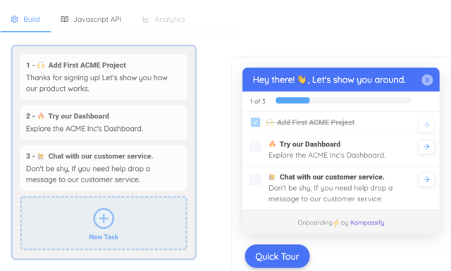
- Give setup a memory. An onboarding checklist tracks completion per user, so someone who was interrupted returns to the step they were on rather than the beginning.
- Send different people down different paths. Target guidance by segment, so the answer someone gave to your personalization question actually changes what they see next.
- Announce what changed. Push release notes and new-feature announcements in-app instead of hoping people read the store listing.
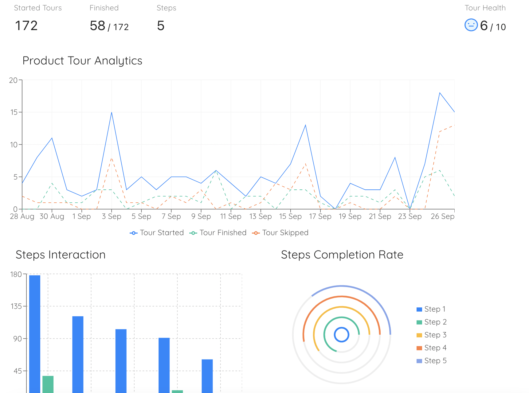
- Measure per step. Built-in analytics show completion and drop-off for each step, so the next iteration is a decision rather than a guess.
Kompassify is GDPR compliant and EU-hosted, free for under 100 monthly active users, with paid plans from $129/month.
Fix the Step That's Losing Your New Users
Kompassify adds product tours, onboarding checklists, tooltips and hotspots to your existing product (no code, no release cycle) so the screen that's leaking users can get help this week instead of next quarter. Target by segment, track completion per step, and see whether the fix worked. GDPR compliant, EU-hosted, and free for under 100 monthly active users.
Start for Free →Frequently Asked Questions
What is mobile app onboarding?
Mobile app onboarding is the sequence of screens and interactions a person passes through between opening an app for the first time and getting their first real result from it. In practice it covers the value screens or carousel, account creation, any personalization questions, permission requests, and the guidance that helps someone complete one meaningful action inside the app. It is not a tutorial about your interface: it is the shortest credible path from install to a reason to open the app again tomorrow.
How is mobile app onboarding different from web onboarding?
Three constraints change everything. Screen space means you cannot show a step and its explanation side by side, so guidance has to be sequential and short. Session length is measured in a minute or two rather than a working session, so multi-step setup has to be splittable and resumable. And the mobile platform itself inserts blocking dialogs (notification, location, camera and tracking permissions) that a web onboarding flow never has to design around. On top of that, shipping a change to a native flow means an app store release, while web onboarding can be updated the same afternoon.
How many screens should a mobile onboarding flow have?
Fewer than you have been asked for. A reliable ceiling is three screens before the user can do something real, and every screen past that should have to justify itself with data rather than with a stakeholder request. The useful question is not "how many screens" but "how many screens stand between install and the first action that produces value"; if the answer includes a carousel nobody reads, a signup wall before any value is visible, and four permission prompts, the count is already too high regardless of the number.
When should a mobile app ask for notification and location permissions?
After the user has seen why the permission helps them, and never in the first few seconds of the first session. The pattern that works is permission priming: show your own screen explaining the specific benefit in the user's terms, let them opt in on that screen, and only then trigger the system dialog. This matters because the operating system gives you one shot: a denied permission is expensive to recover, since re-asking means walking the user into their device settings. Ask at the moment the permission unlocks something they are already trying to do.
What metrics measure mobile app onboarding?
Four, in order. Onboarding completion rate tells you how many people who open the app get through the flow. Time to first value tells you how long that takes. Activation rate tells you how many complete the one action that predicts retention, not "finished the tour", but the real action. And day-1 and day-7 retention tell you whether any of it mattered, because onboarding that improves completion while leaving day-7 flat has optimized a number rather than an outcome. Track drop-off per screen underneath all four, since that is the only view that tells you which screen to change.
Should mobile onboarding require signup before the user sees the app?
Only when the app genuinely cannot function without an account. A hard signup wall on screen one asks for commitment before you have earned any, and it is consistently one of the largest single drop-offs in mobile funnels. The stronger pattern is delayed or progressive signup: let people use the app in a guest or local state, show them something worth keeping, and ask for the account at the moment they have something to lose: a saved item, a completed setup, a result they want on another device.
How do you improve mobile onboarding without shipping a new app release?
Put the parts you expect to iterate on outside the binary. Anything driven by remote config or rendered in a web view, the value screens, the personalization questions, checklists, contextual tips and announcements, can be changed without a store submission and a review queue. Many teams also run the companion web app or responsive product where most real setup happens, and that surface can be guided with a no-code platform like Kompassify: build tours, tooltips, hotspots and checklists on top of the live product in a visual editor, target them by segment, and publish immediately. Kompassify is GDPR compliant and EU-hosted, free for under 100 monthly active users, with paid plans from $129/month.