Ask five people on a product team to describe how a new user gets from signup to their first real result, and you will get five different answers, all of them shorter than the truth. The designer remembers the screens they designed. The engineer remembers the endpoints. Support remembers the three places people get stuck, none of which appear in anybody else's version. Nobody is lying; they are each holding a fragment. A user flow is what you draw when you decide to stop arguing from fragments.
A user flow is a diagram of one job, from the moment a user enters to the moment they are done: every screen they see, every action they take, and (the part that makes it useful) every decision the product makes on their behalf about where they go next. It is deliberately unglamorous. There are no colors to argue about and no layout to critique. What it produces is agreement about what actually happens, which is the prerequisite for changing it.
This guide covers the whole subject: what a user flow is (and what it isn't), the small set of symbols a user flow diagram uses, how flows differ from task flows, wireflows, funnels and user journey maps, a seven-step method for creating one from real product data, six annotated user flow examples from SaaS products, the best practices that keep a flow honest, and what to do once the diagram has told you where users leave.
Key Takeaways
- A user flow is one job, drawn end to end: the ordered screens, actions and decisions between an entry point and a completed state, not a sitemap, not a wireframe.
- The branches are the point. A flow with no decision diamonds is a task flow: the ideal path. Real users are almost never on the ideal path.
- Five shapes are enough: pill for start and end, rectangle for screen or action, diamond for decision, parallelogram for data in or out, arrow for direction, with every branch labelled.
- Flows differ from journey maps by altitude: journey maps say which stage hurts across channels; user flows say which click causes it inside the product.
- Draw it from the shipped product, not from memory, then attach a real drop-off number to every step; an unmeasured flow is an opinion in diagram form.
- The diagram is the diagnosis, not the cure: once you know which step leaks, the fix is usually guidance at that step (a tooltip, a checklist, a tour) not a redesign of the whole path.
What Is a User Flow? (Meaning & Definition)
A user flow is the ordered sequence of screens, actions and decisions a person passes through to complete one specific job in a product. It starts at an entry point (a marketing page, an invite email, a notification, a menu item) and ends at a state you can actually verify: the project is published, the teammate is invited, the data is imported. In between sits everything the product asks of the user, and everything the product decides about the user.
User flow, defined. A user flow is a diagram of a single task in a product, drawn from entry point to completed state, showing each screen or action as a node and each possible route between them as a labelled arrow, including the routes that lead nowhere. Its job is not to describe how the product looks, but to make visible where the path forks, loops, stalls, or quietly ends.
Two words in that definition carry the weight. Single: a user flow covers one job, not your whole product, "invite a teammate," not "collaboration." The moment a flow tries to cover everything it becomes a sitemap, and sitemaps have never explained a drop-off in their lives. And possible: a flow that only draws the route you hoped users would take is a specification, not a map. The value is in the branches: the permission check that sends half your invitees to a screen nobody designed, the empty workspace that greets a user who imported nothing.
User flows are sometimes called user flow charts or flow diagrams, and the notation is borrowed openly from flowcharting. That borrowing is a feature: a product manager, a designer, an engineer and a support lead can all read a diamond without training, which is exactly why the format survives in a discipline that reinvents its artifacts every few years.
User Flow Diagram Symbols: The Whole Notation
The vocabulary is small on purpose. Five shapes cover almost every flow worth drawing, and every extra symbol you invent is a symbol you will have to explain in the meeting:
Three conventions turn those shapes into something readable. Draw left to right, because time reads left to right and a flow that wanders is a flow nobody checks. Label every arrow leaving a diamond ("yes / no," "has data / empty," "admin / member") since an unlabelled branch is a decision you have not actually made. And give every dead end a node: if a route ends with the user stranded, draw the stranding. Erasing it from the diagram does not erase it from the product.
Five shapes and two labelled branches. The branch that matters is usually the one nobody designed: here, the invitee who arrives at a workspace with no seats left.
User Flow vs. Task Flow vs. Wireflow vs. Journey Map vs. Funnel
These five artifacts get used interchangeably in meetings and then produce five different conversations. They are not competing formats; they answer different questions, and the fastest way to pick one is to know which question you are actually stuck on:
| Artifact | What it shows | Question it answers | Branches? |
|---|---|---|---|
| User flow | Screens, actions and decisions for one job, all routes included | Where does the path fork, stall, or dead-end? | Yes, that's the point |
| Task flow | The single ideal path through one task | What is the intended sequence? | No |
| Wireflow | A user flow drawn with wireframes as the nodes | What does each step look like, in order? | Usually light |
| User journey map | A persona across stages and channels, with emotion and pain | Which stage of the relationship hurts, and why? | Not structurally |
| Funnel / conversion report | Counts of users passing a small number of ordered steps | How many people make it through? | No, aggregate only |
User flow vs. user journey map
This is the pair people mix up most, and the difference is altitude. A user journey map lives around the product: it follows a persona across stages and channels (the ad, the demo, the first login, the support ticket, the renewal) and records what they were thinking and feeling at each one. A user flow lives inside the product and is purely mechanical: this screen, that click, this fork, in one session. A journey map tells you that "week one feels overwhelming"; a user flow tells you that 41% of users hit the empty project screen and never come back. Most teams need both, in that order: build the journey map to find the painful stage, then draw the flow of the task inside it to find the fixable step.
User flow vs. funnel
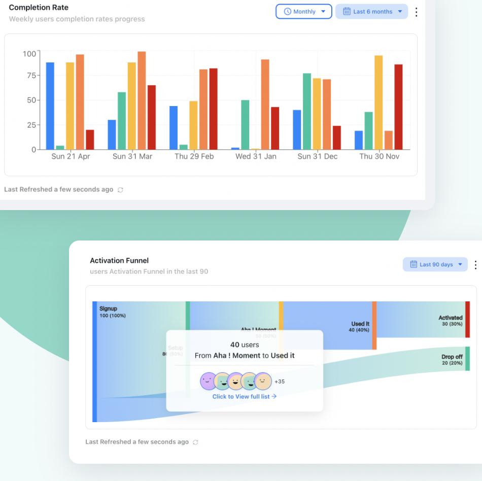
A funnel is a user flow with all the interesting parts removed. It gives you four bars and a conversion rate; the flow gives you the reason. When your product analytics show a 60% drop between "account created" and "first project," the funnel has done its job and can't do more; the six screens, two permission checks and one silent validation failure hiding inside that single bar are what the flow exists to expose. Use funnels to find which flow to draw, then the flow to find what to fix.
Why User Flows Matter for Onboarding and Activation
User flows are a design artifact, but their biggest payoff is in user onboarding, where the gap between the intended path and the real one is widest and most expensive:
-
They turn a drop-off number into a location
"Activation is 22%" is not actionable; "62% of users who reach the import screen leave without picking a file" is. A flow forces the aggregate metric down to a specific node, which is the only altitude at which anyone can actually ship a fix.
-
They expose the states nobody designed
Every product has screens that exist only through a branch: the workspace with zero data, the trial that expired mid-task, the read-only member who clicked an admin link. These are where new users land most often and where design attention arrives last, which is why empty states deserve a node of their own on every flow.
-
They make step-count visible, and step-count is time to value
Nothing shortens time to value like deleting steps, and nothing reveals deletable steps like seeing eleven rectangles in a row where the team assumed there were four. Counting nodes is the cheapest optimization exercise in product work.
-
They show that different users need different paths
An admin setting up a workspace and an invited member joining one are doing different jobs and should not receive the same guidance. Flows drawn per persona make that obvious, and make the case for segmenting onboarding rather than shipping one tour for everybody.
-
They tell you where guidance belongs, and where it doesn't
A flow shows which steps users complete unaided; those steps need no help, and adding it there is pure friction. The two or three nodes that leak are where a tooltip, a checklist item, or a tour step earns its interruption.
The flow's real output isn't the diagram; it's the arrow pointing down. One node is doing most of the damage, and now you know which one.
How to Create a User Flow in 7 Steps
Drawing a user flow takes an afternoon if you resist two temptations: starting from screens instead of jobs, and drawing from memory instead of from the shipped product. The sequence below is deliberately data-first; the diagram is worth having only because you can trust it.
- Pick one job and write it as a sentence
- Name the entry points and the completed state
- List the steps between them, in order
- Add a decision wherever the product routes users differently
- Walk the flow in your live product and correct it
- Attach a real number to every step
- Mark what you'll change, and what you'll leave alone
1. Pick one job and write it as a sentence
Start with a sentence in the user's language: "As a new admin, I want my team's data in the workspace so I can run my first report." Not "onboarding flow," not "the projects module": a job with a beginning and an end. The sentence is doing real work: it fixes the scope, names the persona, and states the outcome you will later measure. Flows fail more often from being too broad than from being too shallow, and the cure is always the same, which is to split one flow into two.
2. Name the entry points and the completed state
Most flows have more than one door. Users reach "invite a teammate" from an empty state, a settings page, a nudge inside a checklist, and a link in a shared report, and each door drops them in with different context and different expectations. List every entry point, because a step that reads as obvious from one door reads as a non sequitur from another. Then define the completed state precisely enough to query: not "the user is onboarded," but "the invitee has accepted and opened a shared project." If you can't write it as a query, you can't tell whether the flow works.
3. List the steps between them, in order
Now write the middle as plain text, one line per screen or action, before you draw anything. Text keeps you honest; it is very easy to skip a step in a diagram and very obvious when a list jumps from "clicks Import" to "sees results." Include the steps that belong to the product rather than the user, like a confirmation email or a background sync, because waiting is where users decide whether something has broken.
4. Add a decision wherever the product routes users differently
This is the step that separates a user flow from a to-do list. Walk your list and ask at each line: could two users see different things here? The usual suspects are role and permissions, plan and limits, empty versus populated data, validation failures, first visit versus return visit, and device. Each "yes" becomes a diamond with one labelled arrow per outcome, and every arrow needs somewhere to land, even if the honest destination is a screen that says nothing useful. That is a finding, not a drafting error.
5. Walk the flow in your live product and correct it
Open a genuinely new account and do the job yourself, slowly, writing down every screen you actually meet. The shipped product always has more steps than the team remembers: an interstitial added for a compliance requirement, a modal from a launch two quarters ago, a verification email that now takes ninety seconds. Then watch a handful of session recordings of real users doing the same job. Your walk-through gives you the true structure; the recordings give you the hesitations, and hesitation is where guidance belongs.
6. Attach a real number to every step
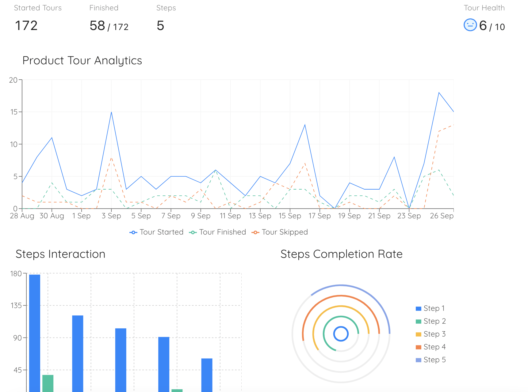
A flow without data is a diagram of opinions. Put the count of users who reach each node next to it, and the percentage who continue. Two patterns matter and they need opposite fixes: a discovery problem, where few users ever reach a node, means the entry point is the issue: nobody is finding the door. An execution problem, where many reach a node and few leave it, means the step itself is too hard, too vague, or too demanding right now. Guess wrong about which one you have and you will spend a sprint making a screen prettier that almost nobody sees.
7. Mark what you'll change, and what you'll leave alone
Close the exercise by marking at most three nodes on the diagram: the leak you will fix, the dead end you will give a real destination, and the step you will delete outright. Deletion is worth its own line because it is the highest-leverage move available and the one teams skip: a step removed can never confuse anyone again. Everything else on the flow gets left alone on purpose, and writing "leave" next to it is what stops the exercise from turning into a redesign nobody scheduled.
The trap: drawing the flow you wish you had. A user flow assembled from the spec and the design files will be tidy, short, and wrong, and it will be wrong in the specific way that hides your problem, because the steps most likely to be forgotten (the verification email, the permission check, the empty state) are exactly the steps where users leave. If the diagram makes your product look better than your activation rate does, you have drawn the task flow by accident.
6 User Flow Examples for SaaS Products
Rather than an abstract template, here are the six flows most worth drawing in a SaaS product, with the decision that usually hides inside each one. Draw them in this order: they are ranked by how directly they touch revenue.
1. Signup to first value
The flow that decides everything downstream: from the pricing page or ad through account creation, verification, workspace setup, and the first action that delivers a real result. The hidden decision is almost always email verification, a step that splits your new users into those who continue and those who go back to their inbox, get distracted, and never return. Draw it as its own diamond and put a number on both branches. Most of what a well-designed signup flow buys you is lost again in the four screens after it, which is why the flow must not stop at "account created."
Two diamonds decide most of this product's activation rate: whether the email gets verified, and whether the empty workspace offers a next action.
2. First-run setup of an empty account
The flow that begins after signup and ends when the account contains enough of the user's own reality to be useful: connected integration, imported records, invited teammate, configured project. It is usually a multi-session flow, which is the property that breaks most designs: a user who leaves at step three and returns tomorrow needs to resume, not restart. That single requirement is the argument for an onboarding checklist over a linear wizard, and the flow diagram is where the multi-session shape becomes impossible to ignore.
3. Invite a teammate
Deceptively simple, and one of the highest-value flows in any collaborative product, because a second user in an account changes retention economics entirely. It also has two protagonists, the inviter and the invitee, and the second one's flow is the one that usually goes undrawn. The hidden decisions cluster there: does the invitee already have an account, are there seats left on the plan, do they land in the workspace they were invited to or in a generic home screen with no idea why they are there?
4. Discover and adopt a second feature
Adoption beyond the first feature almost never happens by accident, and this flow shows why: its entry points are weak. Nobody wakes up wanting your reporting module; they arrive at it via a menu item they have never clicked, an announcement they may have dismissed, or a moment of need the product failed to notice. Drawing it usually reveals that the flow has no real entry point at all, which reframes the problem as feature discovery rather than feature usability, and points the fix at a contextual nudge instead of a redesign.
5. Hit a limit and upgrade
The revenue flow. A user bumps into a plan ceiling (seats, records, exports) and the product decides in that instant whether the moment reads as a natural next step or a shakedown. Draw every route into the paywall separately, because context is everything: a user blocked mid-task needs a different screen from a user browsing plans in settings. The decision worth labelling is what happens on "not now," since that branch determines whether you have a conversion later or a churned account.
6. Recover from an error
The flow teams almost never draw, and the one where trust is actually decided. Failed import, expired session, rejected payment, sync conflict: each has a moment where the product tells the user something went wrong, and the flow question is what the arrow out of that node points to. If the honest answer is "nothing: the user is expected to figure it out," you have found a genuine defect that no usability test of the happy path would ever have surfaced.
A shortcut worth taking. If you only ever draw one flow, draw the one between signup and the moment a user first gets a real result from your product. Everything else in the business (activation, retention, expansion) is downstream of whether that path is walkable, and it is the flow where a single deleted step is most likely to show up in next month's numbers.
User Flow Best Practices: Do vs. Don't
✅ Do
- Scope each flow to one job with a verifiable end state
- Draw left to right, one node per screen or action
- Label every branch leaving every decision
- Include entry points: all of them, not just the main one
- Give dead ends a node so they can't stay invisible
- Walk the live product before you trust the diagram
- Put a real drop-off number beside each step
- Draw separate flows for meaningfully different segments
❌ Don't
- Try to cover the whole product in one diagram
- Draw only the happy path and call it a user flow
- Confuse it with a sitemap, wireframe, or funnel report
- Build it from the spec instead of the shipped product
- Invent new symbols the team has to be taught
- Hide the ugly branches to keep the picture clean
- Let the diagram go stale after the next release
- Answer every leak with "add a tour step"
From Flow Diagram to Guided Flow
A finished user flow hands you two things: a list of steps that leak, and a diagnosis of why each one leaks. Those two facts map cleanly onto the kind of help that fixes them, and matching them correctly is most of the skill, because the wrong intervention on the right step still does nothing:
| What the flow shows | The real problem | What fixes it |
|---|---|---|
| Few users ever reach a node | Discovery: nobody finds the door | A hotspot or an in-app announcement at the entry point |
| Many arrive, few continue | Execution: the step is unclear or hard | A tooltip or a short product tour at that exact moment |
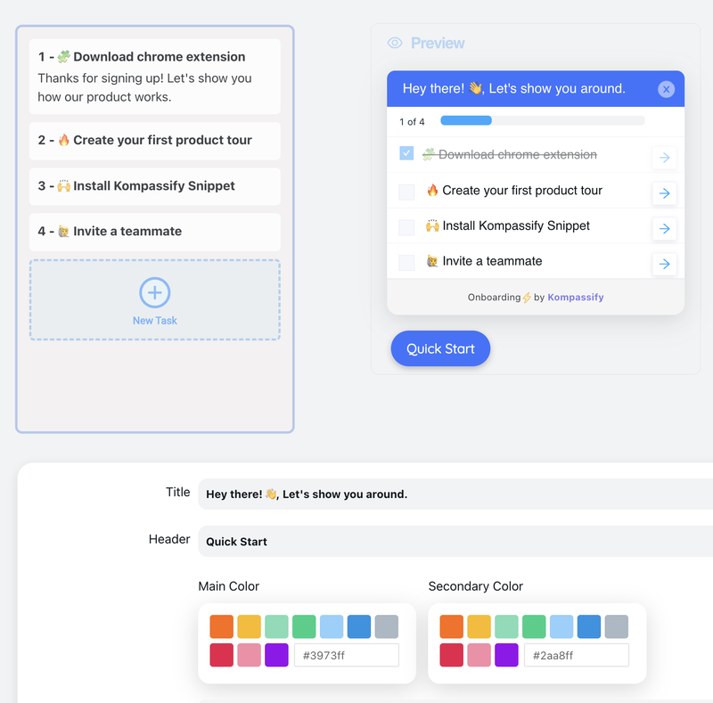
| Users leave and come back later | Multi-session: progress isn't remembered | A checklist that persists and resumes per user |
| A branch ends nowhere | An undesigned state | A real destination plus a contextual explanation |
| Different segments stall at different nodes | One path for several jobs | Segment-targeted flows per role or plan |
This is the part where most user flow exercises quietly die. The diagram gets drawn, the leaking steps get identified, and then the fixes enter the engineering backlog behind everything else, so the flow is still accurate a year later, which is exactly the problem. With Kompassify the guidance layer sits on top of your live product instead of inside your release cycle:
- Guide the exact step that leaks. Build a tour, tooltip or hotspot on the specific screen your flow flagged, in a visual editor on top of your real product: no code, no deploy.
- Give multi-session flows a memory. An onboarding checklist tracks completion per user, so someone who left at step three returns to step four instead of the beginning.
- Send different paths to different people. Target guidance by segment so admins, invited members and trial users each get the flow you drew for them.
- Rescue the dead ends. Put a contextual message on the branches nobody designed (the empty workspace, the missing permission, the expired trial) while the real fix is scheduled.
- Close the loop with numbers. Built-in analytics show completion and drop-off per step, so the next version of the diagram is drawn from evidence rather than memory.
Kompassify is GDPR compliant and EU-hosted, free for under 100 monthly active users, with paid plans from $129/month.
Fix the Step Your Flow Just Found
Kompassify adds product tours, onboarding checklists, tooltips and hotspots to your existing product (no code, no release cycle) so the leaking node on your diagram can get help this week instead of next quarter. Target by segment, track completion per step, and see whether the fix worked. GDPR compliant, EU-hosted, and free for under 100 monthly active users.
Start for Free →Frequently Asked Questions
What is a user flow?
A user flow is the ordered sequence of screens, actions and decisions a person passes through to complete one specific job in your product: signing up, inviting a teammate, publishing their first project. It is drawn as a diagram: entry points as ovals, screens and actions as rectangles, decisions as diamonds, and arrows for every possible move between them. Unlike a wireframe, a user flow says nothing about layout; unlike a funnel, it shows every branch and dead end rather than one aggregate percentage. Its purpose is to make the real path visible so you can see where it forks, where it loops, and where it quietly ends.
What is the difference between a user flow and a user journey map?
Scope and altitude. A user flow is inside the product and mechanical: this screen, that click, this decision, for one task in one session. A user journey map is around the product and emotional: it follows a persona across stages and channels, an ad, a demo call, the first login, a support ticket, a renewal, and records what they think and feel at each stage. Journey maps tell you which stage hurts; user flows tell you which click causes it. Most teams need both, and they are usually built in that order: map the journey to find the painful stage, then draw the user flow of the task inside it to find the fixable step.
What are the symbols used in a user flow diagram?
The notation borrows from flowcharts and stays deliberately small. An oval or rounded pill marks an entry point or an end state. A rectangle is a screen the user sees or an action they take. A diamond is a decision, a fork with a labelled branch for every outcome, including the unhappy ones. A parallelogram marks data going in or out, such as a form submission or an emailed link. Arrows carry the direction of travel, and every arrow leaving a diamond must be labelled with the condition that sends the user down it. Anything beyond these five shapes usually costs more in explanation than it adds in precision.
How do you create a user flow?
Start from a job, not a screen: pick one thing a user is trying to accomplish and name the entry points that lead into it and the completed state that ends it. List the required steps between them, then add a decision diamond wherever the product can send different users to different places: permissions, plan limits, empty accounts, validation failures. Draw it left to right, label every branch, then walk the flow inside your live product and correct it, because the shipped product always has more steps than anybody remembers. Finally, put your product analytics next to it so each step carries a real drop-off number, and mark the steps you want to change.
What are examples of user flows in SaaS products?
The flows worth drawing first are the ones that decide revenue: signup to first value, first-run setup of an empty account, inviting a teammate, discovering and adopting a second feature, hitting a plan limit and upgrading, and recovering from an error or a failed import. Each has a clear job, a measurable completed state, and at least one decision that quietly routes users into a dead end: an unverified email, an empty workspace, a permission the inviter did not have, an upgrade screen with no context about what changed.
What is the difference between a task flow and a user flow?
A task flow is the single ideal path through a task: one line, no branches, the version a designer would demo. A user flow keeps the branches: different entry points, different user segments, different decisions, and the routes people take when something fails. Task flows are useful for writing a specification or a happy-path test; user flows are what you need when you are trying to explain why activation is stuck, because stuck users are almost never on the ideal path.
How do you turn a user flow into in-product guidance?
Once the flow is drawn and each step carries a drop-off number, you know exactly where a user needs help and what kind. A step people never reach needs discovery: a hotspot or an announcement. A step people reach and abandon needs explanation at that moment, a tooltip or a short product tour. A multi-session flow needs a checklist that remembers progress. With a no-code platform like Kompassify you build each of those on top of your live product in a visual editor, target them to the segment that stalls, and publish without a release cycle. Kompassify is GDPR compliant and EU-hosted, free for under 100 monthly active users, with paid plans from $129/month.