Every chart in a SaaS dashboard can be dressed up. Sign-ups spike when you run ads. Page views climb when a post ranks. Even revenue can look healthy for months while the business underneath it quietly erodes. One chart resists all of that: the retention curve.
User retention is the measure of how many users keep coming back to your product over time, and the retention curve is how you actually see it. Take everyone who signed up in a given week, track what percentage of them is still active on day 1, day 7, day 30, day 90, and plot it. The line starts at 100% and falls. How it falls (and above all, whether it stops falling) tells you more about your product in five seconds than most metrics tell you in a quarter.
The stakes are hard to overstate. Acquiring a new customer costs 5 to 25 times more than retaining an existing one (Harvard Business Review), and research by Bain & Company shows that increasing retention by just 5% can boost profits by 25% to 95%. The curve is where you find out whether any of that upside is available to you.
This guide covers the full picture: what a retention curve is, how to build one properly from cohort data, the three shapes every curve takes and what each one means, how to read the cliff, the slope, and the asymptote, what a good curve looks like, and which levers actually bend it upward.
Key Takeaways
- A retention curve plots one cohort over time. The x-axis is time since sign-up, the y-axis is the percentage of that cohort still active. It always starts at 100% and falls; the question is how, and whether it stops.
- Flattening is the benchmark that matters. Every product loses users early. A curve that levels into a stable plateau signals product-market fit; a curve that declines toward zero describes a leaky bucket no acquisition spend can fill.
- Read it in three parts. The early cliff is an onboarding and activation problem, the slope is a habit problem, and the height of the plateau is a product-value signal.
- Define "active" as a value action, not a login. A curve built on logins flatters you and hides the truth. Build it on the action that represents real usage.
- Compare cohorts, not averages. A single blended curve across all users hides improvement and decay alike. Progress shows up as newer cohorts flattening higher than older ones.
- The curve diagnoses; onboarding treats. Where the curve drops tells you which fix to ship; the fixes themselves live in your retention playbook.
What Is a Retention Curve?
A retention curve (you will also see it called a retention chart or retention graph) is a line chart that answers one question: of the users who started together, how many are still here?
It is built from a cohort: a group of users who signed up in the same period (the same day, week, or month). The x-axis is time since sign-up. The y-axis is the percentage of the cohort still active at each point. Day 0 is always 100%; everyone was, by definition, active the day they signed up. From there the line only moves down, because a cohort can lose members but never gain them.
That last property is what makes the curve so honest. Metrics like monthly active users blend new sign-ups with long-time users, so strong acquisition can mask terrible retention for a long time. A retention curve permits no such blending: it follows the same fixed group of people and simply reports how many are left.
Retention, defined. User retention is the percentage of users who continue to use your product over time, where "use" means performing a meaningful action, not merely holding an account. Retention is measured against a cohort's starting size: if 1,000 users signed up in a week and 180 of them are still active 30 days later, that cohort's day-30 retention is 18%. The retention curve is this calculation repeated at every point in time and drawn as a line.
Why product teams obsess over it
Because everything else compounds on top of it. Retention determines how much each acquired user is ultimately worth, how fast word of mouth can grow, and whether paid acquisition is an investment or a subsidy. Two products with identical sign-up numbers and different curves are two completely different businesses: one is filling a reservoir, the other is filling a sieve.
How to Build a Retention Curve (Step by Step)
The mechanics are simple; the decisions along the way are where teams go wrong. Four steps.
1. Group users into cohorts by sign-up date
Weekly cohorts are the standard for most SaaS products: large enough to smooth out noise, granular enough to detect change quickly. Monthly cohorts suit products with lower sign-up volume; daily cohorts only make sense at consumer scale.
2. Define what "active" means
This is the decision that makes or breaks the curve. If "active" means "logged in," your curve will flatter you: users who open the app, remember why they left, and close it again all count as retained. Instead, pick the action that represents real value: created a project, sent a message, published a tour, ran a report. The same principle that defines a good activation event defines a good retention event: an outcome, not a visit.
3. Choose your retention type and time grid
There are three standard ways to count a user as retained on day N, and they produce different curves:
- N-day retention: active on exactly day N. The strictest measure; standard for daily-use consumer products.
- Unbounded retention: active on day N or any day after. More forgiving; useful for detecting true churn rather than quiet weeks.
- Bracketed (rolling) retention: active within a window, such as week 2 or month 3. The default for B2B SaaS, where nobody expects daily usage.
Match the grid to your product's natural cadence. A daily habit product is judged on D1/D7/D30. A weekly-use B2B tool should be judged on W1/W4/M3; measuring it on a daily grid manufactures churn that is not real.
4. Plot it, and keep plotting it
One curve is a snapshot; the discipline is in plotting every cohort and watching how the curves shift as you ship changes. Kompassify's no-code product analytics tracks the user interactions this depends on (including churning, engaged, and activated user reports) without piping data into a separate analytics stack.
A worked retention curve example
Here is an illustrative weekly cohort of 1,000 sign-ups for a B2B SaaS product, using "performed a core action" as the activity definition:
| Time since sign-up | Users still active | Retention | Reading |
|---|---|---|---|
| Day 0 | 1,000 | 100% | The whole cohort, by definition |
| Day 1 | 420 | 42% | The cliff: more than half never came back after the first session |
| Day 7 | 250 | 25% | The slope: still falling as the habit fails to form for some |
| Day 30 | 180 | 18% | Approaching the plateau |
| Day 60 | 170 | 17% | Flattening: losses have nearly stopped |
| Day 90 | 170 | 17% | The asymptote: a stable core of retained users |
The worked example, plotted: the cliff ends by day 7, the slope eases through day 30, and the curve settles into a stable 17% asymptote.
This cohort's curve flattens at roughly 17%: those 170 users have made the product part of how they work. Whether 17% is cause for celebration or alarm depends on the product and its economics, but the shape is healthy: the bucket leaks early, then seals. The work now is raising the plateau, mostly by fixing the day-0-to-day-7 losses.
The Three Retention Curve Shapes (And What Each Means)
Every retention curve ever plotted takes one of three shapes. Identifying yours is the fastest product diagnosis available.
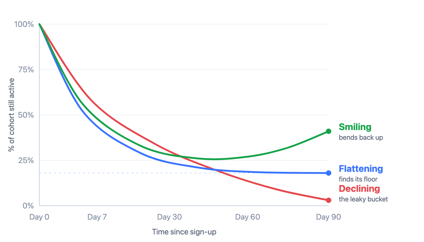
The three retention curve shapes: declining (the leaky bucket), flattening (a retained core), and smiling (churned users returning).
| Shape | What It Looks Like | What It Means | What To Do |
|---|---|---|---|
| Declining | Falls steadily toward zero, never levels off | A leaky bucket. Users try the product, extract no lasting value, and leave; the product has not found product-market fit for this audience | Stop scaling acquisition. Fix activation and core value first; pouring users into this curve burns money |
| Flattening | Falls early, then levels into a stable plateau | The healthy shape. A core group has adopted the product for good; the plateau height measures how strong the core value is | Work both ends: raise the plateau by fixing early drop-off, and grow confidently on top of a curve that holds |
| Smiling | Falls, flattens, then bends back up | Resurrection: churned and dormant users are returning, through re-engagement, a major launch, seasonality, or network effects | Find the cause and systematize it. A product that retains and resurrects grows even with flat acquisition |
The flattening curve deserves the most attention because it carries the most-cited heuristic in product strategy: if your retention curve flattens, you have found product-market fit for some segment of your users. The plateau is that segment. Study it (who those users are, what they did in their first week, which features they live in) because the path to a higher plateau is making more of your sign-ups look like them.
When retention curves bend back up. The smiling curve is the rarest shape, and it almost never happens by accident. Typical causes: a major feature launch communicated with a strong feature announcement, a re-engagement campaign that lands, a seasonal workflow returning (tax season, planning cycles), or network effects, teammates pulling dormant users back in. If you see a genuine bend, find the mechanism and turn it into a repeatable motion.
How to Read a Retention Curve Like a Product Team
A retention curve has three regions, and each one indicts a different part of the user journey. This is how to interpret what you see.
The cliff: day 0 to day 7
The steep early drop is where most of the cohort is lost, and it is almost always an onboarding problem. Users signed up with intent, hit friction or confusion before experiencing value, and never returned. If your day-1 retention is dramatically below your day-7-to-day-30 trend, the product is losing people before its value ever had a chance to register; the gap between sign-up and the aha moment is too wide.
The slope: weeks 2 to 6
Users who survive the cliff have seen the value once. The slope measures whether that first success turns into a habit. A persistent decline through this region means users are not finding reasons to return: features go undiscovered, the product has not attached itself to a recurring workflow, or the value delivered was a one-time job. This is the region where feature discovery and engagement loops earn their keep.
The asymptote: where the curve settles
The height of the plateau is your product's core-value score. It represents users for whom the product simply works. Raising it is slow, compounding work, but because every future cohort inherits it, small improvements here are worth more than they look.
Cohort over cohort: the comparison that shows progress
A single curve tells you where you stand; overlaid curves tell you where you are heading. Plot each month's cohort as its own line. If the March cohort flattens at 17%, April at 19%, and May at 22%, your onboarding and product changes are working; the curves are nesting upward. If newer cohorts sit below older ones, something regressed: a broken flow, a lower-intent acquisition channel, a paywall moved too early. This cohort-over-cohort view is the single most useful retention report a product team can review monthly.
Cohort over cohort: March flattens at 17%, April at 19%, May at 22%; newer curves nesting higher is what progress looks like.
Segment before you conclude
A blended curve averages away its own insights. Split it by acquisition channel, plan, persona, or platform and the story sharpens: organic sign-ups might flatten at twice the height of paid social; users who joined a team might retain triple the rate of solo users. Those gaps are the roadmap; they tell you which users to acquire more of and which behaviors to push every new user toward.
Retention Curve Benchmarks: What Does Good Look Like?
The honest answer: published retention benchmarks vary so much by product category, audience, and measurement method that copying someone else's number is usually a mistake. A meditation app, a CRM, and an API tool have different natural cadences, different definitions of "active," and different healthy plateaus. Cross-company comparisons only mean something when the methodology matches, and it almost never does.
What generalizes is the shape and the discipline:
- The universal benchmark is flattening. Whatever your category, a curve that levels off beats a curve that declines, at any absolute height. Flat-at-10% is a business; declining-through-30% is a countdown.
- Judge the curve on your product's natural cadence. Daily-use products earn judgment on D1/D7/D30. Weekly B2B tools should be read on W1/W4/M3. Measuring a weekly-cadence product on a daily grid produces a terrifying curve that is lying to you.
- Your best benchmark is your own history. The question that matters is not "is 18% good?" but "was it 15% two quarters ago?" Cohort-over-cohort improvement is the benchmark you control.
- Mind the denominator. A curve measured from all sign-ups will sit far lower than one measured from activated users. Both are useful: the first grades your whole funnel, the second grades the product, but never compare one against the other.
Beware benchmark shopping. Teams under pressure gravitate to whichever published benchmark makes their curve look best: a consumer-app comparison for a B2B product, unbounded retention against someone's N-day figure. The curve's job is diagnosis, not reassurance. Fix the measurement to be honest first; only then does improvement mean anything.
Retention modeling: projecting from the curve
Once a curve has flattened, it becomes a forecasting tool. The plateau tells you approximately how many of each new cohort's users will still be around long-term, which lets you project active users and revenue from planned acquisition, and puts a hard ceiling on growth math. It also reframes lifetime value: users on the plateau have dramatically longer lifetimes than the cohort average suggests, which is why raising the plateau by even a few points changes what you can afford to spend on acquisition. This is retention modeling in its simplest, most useful form: read the asymptote, and let it discipline the plan.
Common Retention Curve Mistakes
- Building the curve on logins. Logging in is not value. Curves built on logins run higher and flatter than reality and hide exactly the problem you are trying to find.
- Averaging all users into one curve. A blended curve mixes this month's sign-ups with power users from three years ago. Improvement and decay cancel out and the chart shows a comforting, meaningless line. Always cohort.
- Reading the curve too early. A two-week-old cohort cannot tell you whether the curve flattens. Wait until cohorts mature past your product's habit window before drawing conclusions, and never judge a curve on its most recent, still-moving data points.
- Measuring on the wrong cadence. Judging a monthly-use product on daily retention manufactures churn. Match the grid to the product's natural rhythm.
- Tracking the rate but never the curve. A single day-30 number can hold steady while the shape underneath deteriorates: a higher cliff offset by a briefly slower slope. The rate is a summary; the curve is the truth.
- Diagnosing without segmenting. If the blended curve worsens, the cause is almost always concentrated in one segment or channel. Split the curve before you ship a fix, or you will fix the wrong thing.
How to Bend the Curve Upward
The curve is a diagnostic, and each region points at its own treatment. This is the map; the full tactics live in our dedicated guide to increasing user retention.
- A steep cliff → fix activation. Shorten the path from sign-up to first value: a focused product tour, a 3–5 task onboarding checklist, and fewer steps before the aha moment. Nothing moves a retention curve faster than fixing its first seven days.
- A long slope → build the habit. Surface the features users have not discovered with in-app announcements and contextual tours, and attach the product to a recurring workflow rather than a one-time job.
- A low plateau → listen, then fix. The users who stayed know why; the users who left told you on the way out. Run NPS surveys in-app, read the detractor verbatims, and put the top themes on the roadmap.
- No bend-back → engineer resurrection. Dormant users are not gone. A relevant feature launch, announced in-app through a notification widget when they next visit, is the cheapest reacquisition channel you have.
Retention Curves: Do vs. Don't
A quick reference for keeping your curve honest and useful.
✅ Do
- Build curves from cohorts grouped by sign-up date
- Define "active" as a value action, not a login
- Match the time grid to your product's natural cadence
- Overlay cohorts to see whether newer ones flatten higher
- Segment by channel, plan, persona, and platform
- Let cohorts mature before drawing conclusions
- Study the plateau users; they define your best-fit segment
- Use the asymptote to model growth and lifetime value
- Pair the curve with qualitative feedback to explain the why
❌ Don't
- Track a blended all-users curve and call it retention
- Count logins as activity to make the chart look better
- Judge a weekly-use product on daily retention
- Compare your curve to benchmarks with different methodology
- Read a curve from a cohort that is two weeks old
- Watch a single day-30 rate while the shape deteriorates
- Scale acquisition on top of a declining curve
- Ship retention fixes without segmenting the drop first
- Treat the curve as a report instead of a diagnosis
Retention Curve vs. Retention Rate
The two get used interchangeably, and they should not be. One is a number; the other is the story behind it.
| Retention Rate | Retention Curve | |
|---|---|---|
| What it is | A single number: % of users still active after a fixed period (e.g., day-30 retention) | The full trajectory: that same percentage plotted at every point in time for a cohort |
| Best for | Reporting, goal-setting, quick comparisons | Diagnosis: where users are lost and whether a loyal core exists |
| What it hides | Everything about when and why users left | Little, but it needs cohorting and patience to read correctly |
| Failure mode | The number holds steady while the shape underneath worsens | Over-reading young cohorts whose curves have not settled |
| Use them | As the headline | As the investigation behind the headline |
In practice: report the rate, work from the curve. A team that sets a "raise day-30 retention from 18% to 22%" goal will find every actionable insight for reaching it inside the curve: in the cliff, the slope, and the cohort comparison.
Ready to See Your Own Retention Curve Clearly?
Kompassify combines no-code product analytics (churning, engaged, and activated user reports) with the tools that actually bend the curve: product tours, onboarding checklists, in-app announcements, and NPS surveys. GDPR compliant, EU-hosted, and free for under 100 monthly active users.
Start for Free →Frequently Asked Questions
What is a retention curve?
A retention curve (also called a retention chart or retention graph) is a line chart showing what percentage of a user cohort is still active over time. The x-axis is time since sign-up (day 1, day 7, day 30…), the y-axis is the percentage of the cohort still active, and the line always starts at 100% and moves down. Its shape (declining to zero, flattening into a plateau, or bending back up) is one of the fastest ways to diagnose the health of a product.
What is user retention?
User retention is the measure of how many users keep coming back to your product over time. A retained user continues to perform a meaningful action, not just logging in, days, weeks, or months after signing up. It is the foundation of SaaS growth: acquiring a new customer costs 5 to 25 times more than retaining one, and Bain & Company research shows a 5% retention increase can boost profits by 25% to 95%.
How do you read a retention curve?
In three parts. The initial cliff, how much of the cohort is lost in the first days, points to onboarding and activation problems. The slope, how quickly it keeps falling, measures whether first value turns into a habit. The asymptote, whether and where it flattens, is your core product-value signal. Then overlay cohorts: newer curves flattening higher than older ones is what improvement looks like.
What does a good retention curve look like?
A good retention curve flattens. Every product loses users early; the question is whether the curve levels into a stable plateau or keeps declining toward zero. A flattening curve is widely treated as a signal of product-market fit, and the higher the plateau, the stronger the core value. Because absolute numbers vary by category and measurement method, the most reliable benchmark is your own earlier cohorts.
What does it mean when a retention curve bends back up?
A curve that bends back up, a smiling retention curve, means churned or dormant users are returning. That resurrection usually has a deliberate cause: a major feature launch with a strong announcement, a re-engagement campaign, a seasonal workflow, or network effects pulling users back. It is the rarest shape, and it compounds: a product that retains and resurrects grows even with flat acquisition.
What is the difference between retention rate and a retention curve?
A retention rate is a single number: the percentage of users still active after a fixed period, like day-30 retention. A retention curve is the full trajectory for a cohort. The rate is for reporting; the curve is for diagnosis. Teams that only watch the rate see that retention changed; teams that read the curve see where and when users were lost.
What tools can you use to build a retention curve?
Any tool that can cohort users by sign-up date and track an activity event over time. Kompassify's no-code product analytics tracks how users interact with your product and reports churning, engaged, and activated users without a separate analytics stack, and because Kompassify also includes product tours, onboarding checklists, in-app announcements, and NPS surveys, you can act on what the curve shows from the same platform. There is a free plan for under 100 monthly active users.