Every metric your team cares about (activation, retention, revenue) is computed over one population: the people who made it through your signup flow. Nothing your product does can reach the visitor who opened the registration form, saw nine fields and a dropdown asking for their company size, and closed the tab. The signup flow is the narrowest point of the entire funnel, and it is routinely the least designed: assembled once from a form library, wired to the auth system, and never looked at again.
It deserves better, because it isn't paperwork; it's a negotiation. The visitor is offering you the most fragile thing they have, a few minutes of motivated attention, and the form is your counter-offer. Every field you add raises your price. Every reassurance you remove raises their risk. And the deal doesn't close when the account is created: a signup flow that dumps its graduates onto an unexplained dashboard has won the negotiation and lost the customer in the same minute.
This guide covers the whole subject: what a signup flow is (and where it ends, later than you think), how it relates to login, welcome screens, and onboarding, the anatomy of a high-converting signup form, signup flow examples rewritten before-and-after, and eight best practices, including how to fix the most common leak, the post-signup handoff, without touching your codebase.
Key Takeaways
- The signup flow is the sequence from "Sign up" click to first authenticated moment inside the product, the front door every future user must pass through, and the narrowest point of your funnel.
- Signup and onboarding are one journey, not two projects. Signup turns a visitor into an account; onboarding turns the account into a user. The handoff between them is where most signups are lost.
- A high-converting signup form has five parts: a value reminder, the minimum viable fields, a one-click alternative (social sign-in or SSO), one clearly-labeled button, and a trust line that removes the last fear.
- Every field must earn its place. Anything that doesn't change what happens next belongs in progressive profiling, asked later, in a welcome survey, once the user has seen value.
- Measure three rates, not one: start rate, completion rate, and first-action rate. The last one is the leak most teams never instrument, and usually the cheapest to fix.
- The flow's real finish line is the first win, not the created account: bridge signup straight into a welcome screen, product tour, or checklist, no code required.
What Is a Signup Flow? (Meaning & Definition)
A signup flow (also written sign-up flow, and sometimes called the registration flow) is the sequence of screens a visitor crosses to become a registered user of your product: the signup page, the registration form or social sign-in buttons, any email-verification step, and the landing moment, the first authenticated screen the brand-new user sees. In a product-led SaaS it is the single highest-leverage stretch of UI you own, because it processes every future customer exactly once, at the moment their motivation peaks.
Signup flow, defined. The signup flow is everything between "I want to try this" and "I'm inside, doing the thing I came for." It starts at the signup button and (this is the part most teams miss) it does not end when the account row is written to the database. It ends when the new user is standing somewhere deliberate, pointed at a first action. The account is a milestone; the handoff is the finish line.
The term sits next to several neighbors, and keeping them straight prevents real design mistakes: a signup form written like a lead-capture form asks too much, and a signup flow that thinks it ends at the database dumps its users too early. Here's the map:
| Surface | Who crosses it | Its job | Where it ends |
|---|---|---|---|
| Signup flow | Visitors becoming users, once each | Create the account with minimum friction, then hand off | The user's first deliberate screen inside the product |
| Login flow | Existing users, every session | Authenticate fast and get out of the way | Wherever the user left off |
| Welcome screen | Brand-new users, right after signup | Greet, confirm value, ask one routing question | The first step of onboarding |
| Onboarding flow | New users, across the first sessions | Guide to the first win and the habits after it | An activated, retained user |
Read the table top to bottom and you can see the relay: the signup flow hands to the welcome screen, the welcome screen hands to the onboarding flow, and the onboarding flow hands to the product itself. Every drop happens at a baton pass, which is why this guide spends as much time on the handoff as on the form.
Why the Signup Flow Matters More Than the Screens Around It
It's tempting to treat signup as plumbing: necessary, invisible, done. The reasons it belongs on your onboarding team's roadmap, not just your auth backlog:
-
It gates every other metric you track
Activation rate, retention curves, NPS: all of them are computed over the survivors of this one flow. A leak here is invisible in product analytics precisely because the people it loses never become users at all: they exist only as a gap between your landing-page traffic and your account creations.
-
It spends the moment of peak motivation
Motivation decays from the second the visitor decides to try your product. Every field, every verification email, every "check your inbox" detour spends that motivation before the product has shown anything in return. The signup flow is the only part of your funnel that can lose a user before the product gets a single chance to impress them.
-
It sets the clock on time to value
Time to value starts ticking at the signup click, not at the first login. A flow that takes ninety seconds and ends on a routed first step has already beaten a flow that takes four minutes and ends on a blank dashboard, before either product has done anything.
-
It's the first promise your product keeps, or breaks
The landing page said "simple." A nine-field form says otherwise, immediately. New users read the signup flow as a free sample of the product's respect for their time, and they're right to: the team that ships a bloated signup form usually ships a bloated first-run experience behind it.
-
Its worst leak is the one nobody instruments
Teams measure form completion and celebrate. But an account that never takes a first action is a signup in name only, and the stretch right after the form, where the new user lands alone on an empty screen, is where activation quietly dies. The signup flow owns that stretch, whether anyone designed it or not.
The abandoned-form illusion. A signup flow leak rarely looks like a leak; it looks like "low landing-page conversion" or "poor traffic quality," because the lost visitors never show up in any in-product funnel. Before buying more traffic, walk your own signup flow on a phone, on a slow connection, as someone who has never seen the product. Count the fields, the taps, and the seconds. That audit is free, and it usually pays better than the next campaign.
The Anatomy of a High-Converting Signup Form
Strip the signup forms of the products you most enjoy using and you'll find the same five parts, each answering a question the hesitating visitor is silently asking:
Value reminder, one-click path, minimum fields, a button that names the win, and a trust line: five parts, five silent questions answered. Anything on the form that isn't one of these five is friction wearing a badge.
1. The value reminder: "why am I doing this?"
One headline that restates what the visitor gets, framed as what's about to happen: "Publish your first product tour in 15 minutes" beats "Create your account." The visitor arrived motivated; the reminder keeps that motivation on screen while the form asks its small price. It's the same principle a good welcome screen applies one step later: never let the value out of the user's sight during a transition.
2. The one-click path: "can I skip the typing?"
"Continue with Google" (or your market's equivalent, including enterprise SSO) placed above the classic fields. It collapses the whole form into one click for the users who'll take it, and it removes the two classic signup killers: the invent-a-password chore and the typo'd email address. Keep the email-and-password route available below: some users won't link accounts, and both paths should feel first-class.
3. The minimum fields: "how much do you want from me?"
For most SaaS products: work email, password, done. Every field beyond that must name the thing that changes because you asked. Company name, team size, phone number, "how did you hear about us": none of them change what happens next, so none of them belong here. They belong in progressive profiling: asked one at a time, later, inside the product, ideally through a multi-choice welcome survey whose answers visibly shape the user's path; a question that routes is a question users forgive.
4. The named action: "what do I get?"
The button says what happens, not what the database does: "Create my first tour →", "Start mapping my data", "Get my workspace", not "Submit" or "Register." One button, one style; if your form has two buttons of equal weight, one of them is stealing conversions from the other.
5. The trust line: "is this safe?"
One quiet line under the button that removes the last fear: "Free for up to 100 monthly active users, no credit card needed" answers the money fear; "GDPR compliant, hosted in the EU" answers the data fear. Pick the fear your audience actually has and answer it in plain words. This is the cheapest conversion lever on the whole form: it costs one sentence.
Signup Flow Best Practices: 8 Rules That Compound
The principles, in the order you should apply them:
1. Count the taps from click to product, then cut them
Walk the flow yourself, on a phone, and count every tap, field, and screen between the signup button and the first real product screen. Each one is a toll booth. Most flows can lose a third of their taps without losing anything the business needs: merge the "confirm password" field, drop the marketing checkboxes, collapse two-screen forms into one. The count is your baseline metric; every practice below lowers it.
2. Make every field justify the next screen
The test for any field is brutal and simple: what changes based on the answer? If the answer routes the user (their role decides their tour), the field can stay, though it usually works better as a welcome-survey question after signup. If the answer feeds a CRM report, it goes. A signup form is not a lead form; treating it like one taxes every user to benefit a spreadsheet.
3. Offer the one-click path, keep the classic path
Social sign-in above, email-and-password below, both visually first-class. And make the email field forgiving: accept plus-addressing, trim stray spaces, and validate inline as the user types, not with a full-page error after submit. The user who mistypes their email and sails through anyway becomes your hardest support ticket next week.
4. Don't let verification break the spell
If you must verify email, do it without ending the session: let the user into the product immediately and verify in the background, or at minimum make the verification email instant, single-click, and returning the user to where they were headed, not to a login page that asks them to start over. Every minute between "check your inbox" and "back in the product" is motivation you don't get back. The same goes for CAPTCHAs and password rules: fight abuse with invisible defenses first, and never make the honest majority pay for the bots.
5. State the deal next to the button
Free plan? Say so. No credit card? Say so. Data in the EU? Say so. The visitor is one fear away from closing the tab, and they will not go hunting in your pricing page or privacy policy to resolve it. One trust line under the CTA, in plain words, answering the one fear your audience actually has: it's the highest-leverage sentence in your funnel.
6. Design the handoff like it's the product's first feature, because it is
The moment after the account exists is the most commonly unowned screen in SaaS. Own it. The new user should land on a welcome screen that greets them by name, confirms the value, asks one routing question, and launches the matching first step: a product tour, an onboarding checklist, or the exact screen where their first win happens. If they'll land on an empty state, make it a designed one that continues the conversation the form started.
7. Defer the questions, then actually ask them
Progressive profiling only works if the "later" arrives. Schedule the deferred questions deliberately: role and goal in the welcome survey (they route the first session), team context after the first win (it earns an invite prompt), the rest never; most deferred fields turn out to be fields nobody needed. Asking one question at the moment its answer visibly improves the user's next screen converts better than any nine-field form, and it builds the habit of answering.
8. Instrument all three rates, and fix the cheapest leak first
Start rate tells you if the signup page persuades. Completion rate tells you if the form respects. First-action rate tells you if the handoff delivers. Most teams instrument the first two and stop, which is exactly backwards, because the third leak is usually the widest and the cheapest to fix: it needs a welcome flow and a guided first step, not an auth-system rewrite. Watch all three weekly, the way you'd watch any step of your onboarding funnel.
Signup Flow Examples: The Interrogation vs. The Open Door
Here is the same moment, a motivated visitor deciding whether your product is worth a form, designed both ways. The left version is the lead-capture reflex; the right version applies the anatomy from this guide:
Please complete all required fields.
Join the teams onboarding their users without code.
The same transformation works on the flow's copy at every step. A few before-and-after rewrites:
- The headline: "Create your account" → "Publish your first product tour in 15 minutes", the form leads with the win, not the chore.
- The fields: name, email, phone, company size, referral source → email and password, or one Google click; everything else moves to the welcome survey, where answering it visibly routes the user.
- The button: "Submit" → "Create my first tour →", the button names what the user gets, not what the form does.
- The fine print: silence → "Free for up to 100 MAU, no credit card needed", the fear is answered where the hesitation happens.
- The landing: …an empty dashboard → a welcome screen that greets Sarah by name, asks what she's here to do, and opens the tour builder with a 3-step starter, the flow ends at a first win, not at the database.
Notice what changed in every rewrite: the flow stopped talking about your account and started talking about the user's next fifteen minutes. Same craft as every other onboarding surface, applied one screen earlier than most teams think to apply it.
Signup Flow Design: Do vs. Don't
✅ Do
- Lead with a value reminder, not "Create your account"
- Ask for the minimum: email and password, or one click
- Offer social sign-in / SSO above the classic fields
- Name the win on the button ("Create my first tour →")
- Answer the big fear in a trust line under the CTA
- Validate inline, forgive typos, keep errors next to fields
- Hand off into a welcome screen, tour, or checklist
- Track start, completion, and first-action rates weekly
❌ Don't
- Treat the signup form as a lead-capture form
- Ask questions whose answers change nothing downstream
- Break the session with a "check your inbox" dead end
- Label the most important button in your funnel "Submit"
- Hide the free plan and make users hunt for pricing terms
- Punish honest users with CAPTCHAs and password gymnastics
- Drop freshly signed-up users onto an unexplained dashboard
- Celebrate completion rate while first-action rate goes unmeasured
Fixing the Signup-to-Activation Handoff Without Engineering Time
The form itself lives in your auth system, and changing it takes a sprint. But the widest leak, everything that should happen after the form, doesn't have to wait for one. The entire handoff described in this guide can be layered onto your existing product with Kompassify, no code required:
- A welcome modal that catches every brand-new user on their first login (name, value confirmation, one clear first step) targeted to first-session users only, so nobody sees it twice.
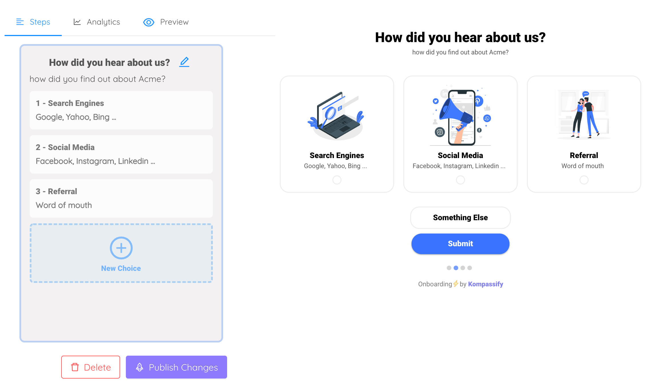
- A multi-choice welcome survey that asks the questions you just cut from the signup form (role, goal) and routes each answer to a different path. The marketer, the developer, and the founder each get their own first win, and you get your segmentation data anyway.
- A product tour per path that walks the new user to their first completed action instead of leaving them to wander the interface.
- An onboarding checklist with a progress bar that keeps the momentum visible across the whole first session, with "Create your account ✓" already ticked, because progress you can see is progress you continue.
Everything ships with a single script snippet, is targeted by segment, and is measured in built-in analytics, so the first-action rate your signup flow was missing becomes a number on a dashboard. Kompassify is GDPR compliant and EU-hosted, free for under 100 monthly active users, with paid plans from $129/month.
Turn Your Signups Into Users
Kompassify lets you build welcome modals, multi-choice welcome surveys, product tours, and onboarding checklists on top of your existing product: no code, no release cycle. Catch every new signup at their first login, route them to the right first win, and close the gap between "account created" and "user activated." GDPR compliant, EU-hosted, and free for under 100 monthly active users.
Start for Free →Frequently Asked Questions
What is a signup flow?
A signup flow is the sequence of screens a visitor crosses to become a registered user: from clicking "Sign up" on your website, through the registration form (or a social sign-in button), any verification step, to the moment they land inside the product for the first time. It is the front door of your funnel: everything your product does afterward, onboarding, activation, retention, only happens to the people this flow lets through. A good signup flow asks for the minimum, keeps the promised value visible while the user types, and ends with a deliberate handoff into the first session rather than an unexplained dashboard.
What is the difference between a signup flow and user onboarding?
The signup flow turns a visitor into an account; onboarding turns that account into an active user. Signup ends the moment the user is authenticated inside the product for the first time; that instant is where onboarding begins, usually with a welcome screen, a product tour, or an onboarding checklist. The two are often designed by different teams and stitched together badly, which is why so many products greet a freshly signed-up user with a blank dashboard: the signup flow finished its job and nobody owned the handoff. Treat signup and onboarding as one continuous journey with a designed bridge between them.
How many fields should a signup form have?
As few as your product genuinely needs to create an account: for most SaaS products that is an email address and a password, or a single social sign-in button. Every additional field must earn its place by changing what happens next; anything you merely want for sales or marketing can be asked later, once the user has experienced value, through progressive profiling or a short welcome survey. A field you can defer is a field you should defer: the form's job is to open the door, not to fill your CRM.
Should a SaaS signup flow offer social sign-in?
Almost always yes. A "Continue with Google" or SSO button collapses the entire form into one click, removes the invent-a-password chore, and eliminates typos in the one field you truly need, the email address. Offer it above the classic email-and-password fields, not instead of them: some users prefer not to link accounts, and enterprise users may need their company's SSO. The goal is that the fastest honest path from "I want to try this" to "I'm inside" is one or two clicks.
Should you ask for a credit card at signup?
Only if your strategy deliberately trades volume for intent. A credit-card wall filters out the merely curious, so the signups that survive convert to paid at a higher rate, but far fewer people ever see your product, and your onboarding gets no chance to convince them. For product-led SaaS the more common choice is a free plan or free trial with no card required, stated plainly next to the signup button ("Free for up to 100 monthly active users, no credit card needed"), because that reassurance is one of the strongest friction-removers a signup form can carry.
What should happen immediately after signup?
A designed handoff, not a dead drop. The best signup flows end on a welcome screen that greets the user by name, confirms the value they came for, asks one routing question, and launches the matching first step: a product tour, a checklist, or the exact screen where their first win happens. The moment after signup is the highest-motivation moment the user will ever have; spending it on an empty dashboard is how products lose signups they worked hard to earn. The signup flow's real finish line is the user's first completed action, not the created account.
How do you measure signup flow conversion?
Break it into three rates and watch them separately: start rate (visitors who begin the form after landing on the signup page), completion rate (starters who finish creating the account), and, the one most teams forget, first-action rate (new accounts that complete a meaningful first step in the product). A leak between start and completion points at the form itself: too many fields, verification friction, missing social sign-in. A leak after completion points at the handoff: users got through the door and found nobody home. Fixing the second leak is usually cheaper and moves activation more.
How do you improve the signup-to-activation handoff without coding?
With a no-code onboarding platform like Kompassify you can build everything that should happen after the signup form on top of your existing product: a welcome modal that greets brand-new users on their first login, a multi-choice welcome survey that routes each role or goal to a different product tour, and an onboarding checklist with a progress bar that carries momentum through the first session. Everything is created in a visual editor, targeted to first-time users, and shipped with a single script snippet, no release cycle needed. Kompassify is GDPR compliant and EU-hosted, free for under 100 monthly active users, with paid plans from $129/month.