Open almost any B2B product and there is a bell in the top right with a red number on it. Click it and you find a comment from a colleague, four automated status messages, a promotion for a plan you are already on, and something from March. The number goes away. Nothing was learned. Next week the number is back, and by now nobody looks.
In-app notifications are one of the few product surfaces that can degrade to zero value while continuing to look completely healthy on a dashboard. The feed still gets opened, because the badge demands it. The badge still gets cleared, because it is annoying. Neither of those facts means anyone read anything.
This guide is about the notification layer specifically: the persistent, addressed, user-pulled part of your in-app communication. Broadcast messages that interrupt (modals, banners, slideouts, tooltips) are a different system with different rules, covered in our in-app messaging guide. Knowing which of the two you are building is most of the design problem.
Key Takeaways
- Notifications are addressed and persistent; messages are broadcast and interruptive. Mixing the two is what destroys the feed.
- Four categories belong in a feed: personal, workflow, system and relevant product news. Everything else is marketing wearing a bell.
- The badge is a promise. A number that never reaches zero teaches users to ignore it permanently.
- Batch by object or by day. Five events about the same document are one notification, not five.
- Write actor–action–object, link the whole item to the exact destination, and show a relative timestamp.
- Mute rate is the honest metric. Click rate stays fine right up until people switch the category off.
What In-App Notifications Actually Are
In-app notification, in one paragraph
An in-app notification is a message delivered inside your product to a specific user about something that has happened or needs their attention. It normally lives in a persistent notification center opened from a bell icon, carries a read/unread state, and stays available until the user deals with it. The defining properties are that it is addressed, it concerns this person, and persistent: it waits rather than interrupting, and the user chooses when to look.
Three surfaces get confused with each other constantly, and the distinction is not academic; it determines where a piece of communication should live and what rules apply to it.
| In-app notification | In-app message | Push notification | |
|---|---|---|---|
| Audience | One user, addressed personally | A segment, broadcast | One user, outside the product |
| Delivery | Waits in a feed, user pulls | Appears on screen, interrupts | OS-level, requires permission |
| Lifespan | Persistent until read or cleared | Shown once, then gone | Transient, often missed |
| Typical use | Comment, approval, job finished, relevant release | Onboarding step, announcement, prompt | Bringing a lapsed user back |
| Main risk | Becoming noise nobody reads | Interrupting at the wrong moment | Permission denied, or uninstall |
The routing rule. If the user must see it now for the current screen to make sense, it is a message. If they need a record of it and can act later, it is a notification. If it is neither, if it is a thing you want them to know rather than a thing they need, it probably belongs in your changelog and nowhere else.
Two Delivery Models: Interrupt and Inbox
Every notification system has to choose, per item, between demanding attention now and waiting to be found. Most products get into trouble by defaulting everything to one of the two.
Interrupt (pushed to the surface)
- Toast, snackbar, or a banner that appears in place
- Right for: something that just happened as a result of the user's own action, or something time-critical
- Cost: attention, immediately and non-negotiably
- Budget: a handful per session before it reads as chaos
Inbox (waits in the feed)
- Notification center behind a bell, with read state and history
- Right for: anything the user can act on later, and anything they may want to find again
- Cost: almost none, until the feed loses credibility
- Budget: generous, but only while the hit rate stays high
A small number of items deserve both: an approval that blocks someone else's work, a failed payment, an export the user is standing there waiting for. The pattern that works is a transient toast at the moment of the event plus a permanent entry in the feed, so that a user who missed the toast still has a record. The pattern that does not work is a toast alone, which is a notification you deliberately threw away.
The Anatomy of a Notification Center
A feed that stays trusted has seven parts, and the ones teams skip are consistently the last three.
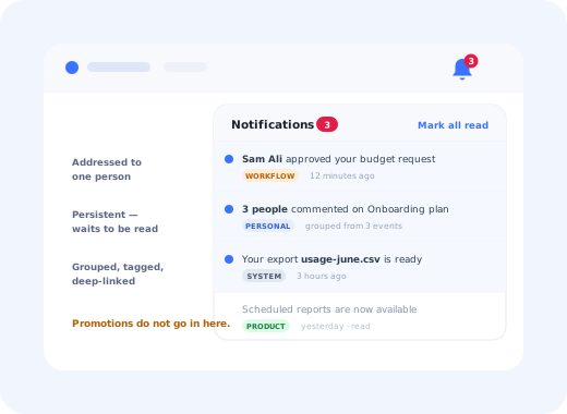
Four items, four categories, one grouped event, and every line says who did what to which thing.
- The entry point and badge. A consistent, discoverable icon with a state that means something. Count for items needing individual attention, plain dot for everything else.
- Items with structure. Actor, action, object, timestamp, and the whole row clickable to the exact destination, not to a dashboard the user then has to navigate from.
- Read state that survives. Unread should be visually obvious, read items should stay available, and opening the panel should not silently mark everything read; that is how people lose things.
- Grouping. Five comments on one document is one item that expands, not five rows. Grouping by object beats grouping by time for anything collaborative.
- Categories or filters. Once you have more than about three kinds of notification, users need to separate "things waiting for me" from "things that happened".
- An empty state that is not a void. "You're all caught up" plus a pointer to preferences is a genuinely good empty state; see our empty states guide for the general pattern.
- A visible route to preferences. Users who can turn one category off do not turn all of them off. The link belongs in the panel itself, not three levels into settings.
What Belongs in the Feed, and What Does Not
| Category | Examples | Should it raise the badge? |
|---|---|---|
| Personal | Mention, comment, reply, share, assignment | Yes, always |
| Workflow | Approval waiting, review requested, task due, handoff | Yes, this is the highest-value category |
| System | Export ready, import failed, integration disconnected, quota reached | Only when action is required |
| Product news | A new capability in the area this user actually works in | Rarely: a dot, not a count |
| Promotional | Upgrade prompts, webinars, unrelated launches | No, this does not belong in the feed at all |
The fourth row is where judgement is required. Product news can legitimately live in a feed (it is one of the few places a returning user will look for what changed) but only when it is relevant to that user, and only as a low-priority item. The moment release announcements start raising a numeric badge, the badge stops meaning "something needs you" and starts meaning "we published something", which is the beginning of the end. Our feature announcement playbook covers how to sequence a launch across surfaces, and release notes covers the durable record that the feed should link to rather than replace.
The promotional slide. Every over-stuffed feed got there the same way: a team with nothing to announce noticed that the notification center had good open rates, and used it. Open rates are a property of the badge, not of the content; they will hold up for months while trust drains away, and by the time the metric moves, the users who muted it are not coming back. This is the same mechanism as banner blindness, applied to a component people cannot scroll past.
Writing the Notification
Notification copy has an unusually strict job: it is read in under a second, out of context, next to nine other lines. Three rules do most of the work.
1. Actor, action, object, in that order
The user scans the first three words. Put the person and the verb there, and name the specific thing rather than its type.
2. Link the whole item to the exact destination
Not to the module, not to a list the user then has to search. Deep-link to the comment, the approval, the file. A notification that requires navigation after the click has moved the work to the user and kept none of the benefit.
3. Use the user's vocabulary, not the system's
Internal object names leak into notification templates faster than anywhere else in a product, because notifications are usually written by whoever built the event. "Entity sync completed" means nothing to the person reading it. Our UX microcopy guide covers the rewriting patterns; the shortcut is to read the line aloud and ask whether a new customer would understand it.
Frequency, Batching and the Badge
There is no universal daily limit, because the tolerable volume depends entirely on the hit rate. A feed where four items in five are worth opening can run hot; a feed where three in four are noise gets muted at almost any volume. Three mechanisms keep the ratio healthy.
1. Batch by object, then by time
Five comments on one document is "3 people commented on Onboarding Q3 plan", expandable. A digest of everything that happened while someone was away beats a wall of individual rows they will clear without reading. Batching is the single highest-leverage change available to a noisy feed.
2. Give each category its own badge policy
Personal and workflow items raise a count. System items raise a count only when the user must do something. Product news gets a dot at most. Written down as a table, this is a five-minute decision that prevents the most common form of feed decay.
3. Respect timing and the user's context
Notifications generated by a user's own action should appear immediately; everything else can wait for a natural break. If you also send email or push for the same events, suppress the duplicate when the user is active in the product; being told the same thing three ways is how a useful system becomes an irritating one. Our triggers guide covers the general rules for timing in-product interruptions.
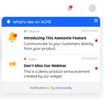
A product-news feed works when it is relevant and low-priority: a dot, not a red number.
Preferences: The Cheapest Retention Feature in the System
Granular controls feel like a nice-to-have and behave like an insurance policy. A user who is annoyed by one category and can only choose between everything and nothing will choose nothing, and you have then lost the approval notifications along with the marketing. Three levels are usually enough: per-category on/off, a delivery choice per category where more than one channel exists, and a temporary mute.
The mute rate per category is also the most honest instrument you will ever have for judging whether that category deserves to exist. It is not a vanity metric and it does not lag: people switch things off the week they get annoyed.
Measuring In-App Notifications
| Metric | What it tells you | Watch out for |
|---|---|---|
| Feed open rate | Whether the entry point is discoverable and the badge is believed | Stays high on badge pressure alone, long after content quality collapses |
| Item click / action rate | Whether individual notifications are worth acting on | Must be read per category; one strong category masks three weak ones |
| Time to action | Whether the feed is actually unblocking work | Only meaningful for workflow items where someone is waiting |
| Mute / opt-out rate | Whether a category is welcome | The one number that cannot be flattered; treat any rise as a verdict |
| Cleared-without-opening | Whether people are dismissing rather than reading | A high rate here with a healthy open rate means the feed is theatre |
Track all of these by category rather than in aggregate, and compare categories with each other rather than with published benchmarks from other products; feed performance depends almost entirely on what you chose to put in the feed, which makes cross-company comparison meaningless.
Six Ways Notification Centers Die
- Marketing in the feed. The fastest route to a permanently ignored bell, and the hardest to reverse because trust does not come back when the promotions stop.
- A badge that never clears. If reaching zero is impossible, users stop trying, and the badge becomes wallpaper with a colour.
- No grouping. An active document generating twenty rows makes the feed unusable for everything else in it.
- Dead-end links. Clicking a notification and landing on a dashboard is the interaction equivalent of "figure it out yourself".
- Silent auto-read on open. Marking everything read when the panel opens loses items permanently and is experienced as the product hiding things.
- All-or-nothing preferences. The user who wanted one category off turns everything off, including the ones that were doing real work.
In-App Notifications: Do vs. Don't
✅ Do
- Write actor–action–object and name the specific object
- Deep-link the whole row to the exact destination
- Group related events into one expandable item
- Give each category its own badge policy
- Put preferences one click from the panel
- Track mute rate per category and act on it
❌ Don't
- Put promotions in the notification feed
- Let a numeric badge count low-value items
- Mark everything read the moment the panel opens
- Send the same event by email, push and feed at once
- Use internal object names in the copy
- Judge the feed on open rate alone
Adding a Notification Layer Without Building One
A full notification system (event model, read state, grouping, preferences, deep links) is a real engineering project, and it is the right investment when the notifications are generated by your own product's workflows. But a large share of what teams want the bell for is not workflow at all: it is telling users what changed, in the product, in a place they can find it later.
That part does not need an engineering project. An in-app announcement widget gives you a persistent, user-pulled list of updates, targeted to the segment each update is relevant to, published without a release, which covers the product-news category properly and keeps it out of the workflow badge where it does damage. Pair it with a short walkthrough for anything users need to learn, and the announcement stops being an announcement and starts being adoption.
Tell the right users what changed, where they'll see it
Kompassify gives you an in-app announcement widget, targeted tooltips and guided walkthroughs on top of your existing product, so product news reaches the segment it matters to, without competing with the notifications people rely on. Free up to 100 monthly active users, plans from $129/month, GDPR-compliant and EU-hosted.
Start for free →The One-Paragraph Version
In-app notifications are addressed, persistent and pulled, which makes the feed a genuinely valuable surface and a fragile one. Keep it to things a specific user needs a record of, group aggressively, let only real work raise a numeric badge, write actor–action–object with a deep link, expose per-category preferences, and watch the mute rate rather than the open rate. Broadcast news belongs in an announcement surface of its own, next to the bell rather than inside it.
Frequently Asked Questions
What are in-app notifications?
In-app notifications are messages delivered inside a product to a specific user about something that has happened or needs their attention: a teammate's comment, a finished export, an approval waiting, a new capability in the area they work in. They usually live in a persistent notification center reached from a bell icon, they carry a read or unread state, and they remain available until the user deals with them. That persistence is what separates them from a broadcast in-app message such as a modal or banner, which appears once, interrupts, and disappears.
What is the difference between in-app notifications and push notifications?
Push notifications are delivered by the operating system to a user who is not currently in your product, and they require explicit permission that many people decline. In-app notifications are delivered inside your interface to a user who is already there, so they need no permission, cannot be revoked at the OS level, and can be far richer, but they only reach people who come back. In practice they are complementary: push is for bringing someone back, the in-app feed is for everything they missed while they were away.
What is the difference between in-app notifications and in-app messages?
An in-app message is broadcast and interruptive: a modal, banner, tooltip or slideout shown to a segment of users at a chosen moment, usually to announce, guide or prompt. An in-app notification is addressed and persistent: it concerns one user, it waits in a feed with a read state, and the user chooses when to open it. The rule of thumb is that anything the user needs to act on later belongs in the feed, while anything that must be seen right now to make sense of the current screen belongs in a message.
What should go in a notification center?
Four categories cover almost everything: personal notifications about someone acting on your work, workflow notifications about something waiting for you, system notifications about jobs and status changes, and product news about capabilities relevant to what you do. Everything else is marketing wearing a bell icon. The test is whether the item is addressed to this specific user and whether they would reasonably want a record of it. If the answer to either is no, it belongs in a message, an email, or nowhere.
How should you write a notification?
Lead with the actor and the action, name the specific object, and make the whole item a link to the exact place the user needs to go. 'Sam approved your budget request for Q3' beats 'You have a new approval'. Keep it to one line where possible, put a relative timestamp next to it, and avoid product jargon that only makes sense from the inside. Every notification should answer three questions instantly: who did what, to which thing, and what happens if I click.
How many in-app notifications is too many?
The volume that matters is not per day but per unit of value. A feed where most items are worth opening can carry a high volume; a feed where three in four are noise gets muted at almost any volume. Batch related events into one item rather than sending five, group by object or by day, and be strict about which categories can raise the badge. If the mute rate for a category is climbing, that category is the answer to the question.
Should a notification badge show a count?
Show a count only for items that genuinely need individual attention, and use a plain dot for everything else. A numeric badge is a promise that there are that many distinct things to deal with; when the number is inflated by low-value items, users learn that clearing it is not worth the effort and start ignoring it permanently. A badge that never reaches zero has stopped being a signal and become decoration.
What metrics should you track for in-app notifications?
Track four things per category rather than in aggregate: open rate of the feed itself, click or action rate on individual items, time from delivery to action, and mute or unsubscribe rate. The last one is the honest measure of whether a category is welcome. Click rate can stay respectable right up until people turn the whole thing off. Compare categories against each other rather than against external benchmarks, because feed performance depends almost entirely on what you choose to put in it.