"Remove friction" is the most repeated instruction in product design and one of the least useful, because it treats every obstacle as equivalent. Some friction is a broken form field. Some is a confirmation dialogue that has saved thousands of users from deleting a year of work.
The useful version of the idea is narrower: find the places where users are spending effort that produces nothing for them, and remove those. That requires being able to tell the difference, and knowing where to look, because most friction is invisible from inside the team that built the product.
This guide covers what user friction is, the four types and which of them you should keep, how to locate friction with data you already have, and what to do about each kind once you find it.
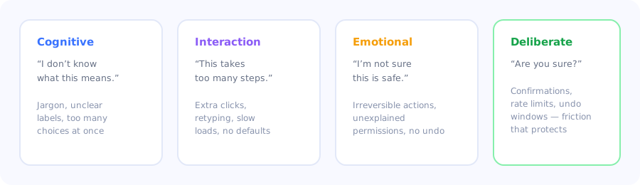
Three types to hunt down, one to protect.
Key Takeaways
- Friction is effort that produces nothing for the user. Effort that produces safety or value is not friction.
- Cognitive friction is the most expensive and least visible. Users who do not understand something rarely report it; they leave.
- Some friction should be added. Confirmations, undo windows and rate limits protect users from irreversible mistakes.
- Find it where behaviour and intent diverge. Drop-off, rage clicks, repeat visits to the same help page, and support tickets.
- Not every friction point is a product fix. Some are, some are a guidance problem, and the cost difference is enormous.
- Your team cannot feel it. Everyone who built the product has already paid the learning cost that new users have not.
What is user friction?
User friction definition: any element of a product experience that makes it harder for a user to accomplish what they came to do: additional steps, unclear language, slow responses, unnecessary decisions, or uncertainty about what will happen next. Friction is measured in the effort a user spends that produces no value for them.
The second sentence is the operative one. A three-step checkout is not friction if each step does something the user needs. A single-step form is friction if the one field asks for information the user does not have. Step count is a proxy, and a bad one.
The four types
| Type | The user thinks | Typical causes | Verdict |
|---|---|---|---|
| Cognitive | "I don't understand what this means" | Internal jargon, ambiguous labels, too many choices at once, no explanation of consequences | Remove: highest cost |
| Interaction | "This is taking too many steps" | Extra clicks, retyping known data, slow loads, missing defaults, no keyboard path | Remove: usually easy |
| Emotional | "I'm not sure this is safe" | Irreversible actions, unexplained permission requests, no undo, unclear data handling | Remove the doubt, not the safeguard |
| Deliberate | "Wait, am I sure?" | Confirmation dialogues, undo windows, rate limits, review steps | Keep: this is protection |
Cognitive friction is the one to prioritise. Interaction friction is annoying and visible: users complain about extra clicks. Cognitive friction is silent: a user who does not understand a screen does not file a ticket saying "your label is ambiguous". They guess, get it wrong, and quietly conclude the product is not for them. It is the most expensive kind and the least likely to appear in your feedback channels.
The friction you should keep
The reflex to remove every obstacle produces products that are pleasant right up until they let someone destroy something important. Deliberate friction is a feature, and it belongs in four places:
- Irreversible actions. Deleting data, cancelling a plan, sending to an audience. A confirmation step here costs two seconds and prevents an unrecoverable mistake.
- Consequential decisions. Choices that are hard to change later (a workspace URL, a currency, a data residency region) deserve a moment of explicit attention.
- Security-sensitive operations. Re-authentication before changing billing details or granting admin access.
- Actions affecting other people. Bulk notifications, permission changes, anything that reaches beyond the user's own account.
The rule that distinguishes good deliberate friction from bad: it must inform, not merely delay. "Are you sure?" adds a click and no information. "This will permanently delete 1,247 records and cannot be undone" adds the same click and everything the user needs to decide correctly.
How to find friction in your product
You cannot feel friction in a product you built; every member of the team has already paid the learning cost that new users have not. So you look for it in behaviour rather than in opinion.
Drop-off in funnels you can name
Time-on-step outliers
Repeated and abandoned attempts
Support tickets, grouped by underlying question
Help-centre searches that return nothing
Watching five new users do one task
1. Drop-off in funnels you can name
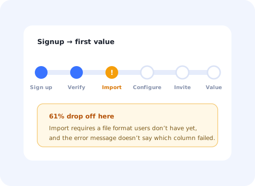
Define the funnel by the outcome (signup to first value, empty state to first record, invite to accepted) and look at step-level completion. The step with the sharpest drop is where to start. This is the cheapest diagnostic available and the one most teams only run after something has already gone wrong.
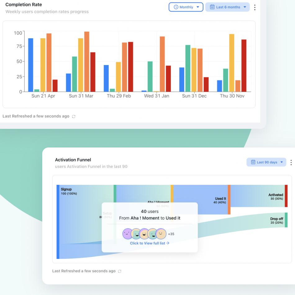
Name the funnel by its outcome, then look at step-level completion. The sharpest drop is where to start.
2. Time-on-step outliers
A step that takes far longer than its neighbours signals confusion even when completion looks healthy. Users are figuring something out that should have been obvious, and the ones who completed it are the survivors of a filter you cannot see in the completion rate.
3. Repeated and abandoned attempts
Users who start the same flow three times, submit a form repeatedly, or click the same non-responsive element in quick succession are telling you something specific. Rage clicks in particular are unambiguous: the user believed something would happen and it did not.
4. Support tickets, grouped by underlying question
Group by what the user was trying to do, not by product area. Five tickets about different screens that all reduce to "I couldn't tell which permission level to pick" is one friction point, and it will be invisible if you file them under five different features.
Ranking those groups by volume gives you a prioritised list of cognitive friction, the kind you would otherwise never see.
5. Help-centre searches that return nothing
Internal search with no results is one of the highest-signal, lowest-effort datasets in any product. It tells you exactly what users expected to exist, in their own words. Every empty search is either missing documentation or a feature named something nobody would guess.
6. Watching five new users do one task
No amount of analytics replaces watching someone hesitate. Give five people who have never used the product one realistic task and say nothing while they attempt it. Every pause, every wrong click, every moment of re-reading is a friction point, and unlike a funnel chart, you also see why.
What to do about each kind
Cognitive friction: change the words before the design
Most cognitive friction is a labelling problem, and labels are the cheapest thing in the product to change. Use the words your users use, not your internal model names; the vocabulary in your support tickets is the vocabulary to ship. Explain consequences at the point of decision rather than in documentation. Where the underlying concept is genuinely complex, a well-placed tooltip answers the question where it is being asked, which is more effective than any help page. The microcopy guide covers the writing side in depth.
Interaction friction: default, remember, skip
Three moves solve most of it. Default anything you can reasonably infer. Remember anything the user has already told you; asking twice is the most common avoidable friction in SaaS. Skip steps that do not apply, rather than showing them disabled.
Emotional friction: explain rather than remove
The fix is rarely to delete the safeguard. It is to remove the uncertainty around it: say what a permission is used for at the moment you request it, show what will happen before it happens, and provide an undo where one is possible. Emotional friction is doubt, and doubt responds to information.
When the fix is guidance, not a rebuild
This distinction decides how much a friction point costs to resolve. If users cannot complete a step because the product genuinely makes it hard, that is engineering work. If they cannot complete it because they do not know what to do, guidance solves it in a day.
The telltale sign of a guidance problem: users who receive help (a walkthrough, a colleague, a support reply) complete the step easily and never struggle with it again. That is not a broken flow; that is an unexplained one. A short product tour, a better empty state, or a checklist item will move the number this week.
Friction do's and don'ts
✅ Do
- Prioritise cognitive friction first
- Group support tickets by underlying question
- Watch new users attempt a real task
- Default and remember everything you can
- Explain consequences at the point of decision
- Keep confirmations on irreversible actions
- Make deliberate friction informative
- Re-measure the same funnel after the fix
❌ Don't
- Treat every step as friction to delete
- Judge flows by click count alone
- Rely on your team's intuition about difficulty
- Ask for the same information twice
- Remove safeguards to improve a conversion metric
- Ship "Are you sure?" with no information
- Rebuild a flow that only needed explaining
- Assume silence means nothing is wrong
Two metrics tell you whether the work landed: step-level completion in the funnel you fixed, and customer effort score asked immediately after the task. The first shows whether more people got through; the second shows whether it got easier for the ones who already did.
Reducing friction with Kompassify
A large share of what teams classify as product friction is actually unexplained complexity: the flow works, and users do not know what to do. That subset is solvable without engineering time.
- Find the step with product analytics: funnel completion and drop-off, per segment.
- Explain in place with tooltips on the controls that generate the most confusion.
- Guide the whole task with an interactive product tour when a single tooltip is not enough.
- Replace blank screens with a checklist that names the next action.
- Confirm it worked with an in-app effort survey on the same flow, before and after.
Kompassify is a no-code digital adoption platform for SaaS teams: tours, checklists, tooltips, announcements, surveys and analytics in one place. Free up to 100 monthly active users, paid plans from $129/month, GDPR-compliant with EU hosting.
Fix the friction you can fix this week
Find the step users abandon, explain it in place, and measure whether completion moved, no engineering ticket required.
Start for Free →Frequently Asked Questions
What is user friction?
User friction is any element of a product experience that makes it harder for someone to accomplish what they came to do: extra steps, unclear language, slow responses, unnecessary decisions, or uncertainty about what will happen next. The precise definition is effort a user spends that produces no value for them, which is why step count alone is a poor measure. A three-step flow where each step does something useful is not friction; a one-field form asking for information the user does not have is.
What are the types of user friction?
Four. Cognitive friction is not understanding what something means, caused by jargon, ambiguous labels or too many choices at once. Interaction friction is the flow taking too many steps, caused by extra clicks, retyping and missing defaults. Emotional friction is uncertainty about whether an action is safe. Deliberate friction is the protective kind, such as confirmation dialogues and undo windows, and it should be kept rather than removed.
Which type of friction should you fix first?
Cognitive friction, because it is both the most expensive and the least visible. Users complain about extra clicks, so interaction friction surfaces in feedback. A user who does not understand a screen rarely files a ticket saying the label is ambiguous. They guess, get it wrong, and quietly conclude the product is not for them, which means the damage never reaches your feedback channels at all.
Is all friction bad?
No. Deliberate friction protects users and belongs on irreversible actions such as deleting data or cancelling a plan, on consequential decisions that are hard to change later, on security-sensitive operations, and on actions that affect other people. The rule that separates good deliberate friction from bad is that it must inform rather than merely delay: 'Are you sure?' adds a click and no information, while 'This will permanently delete 1,247 records and cannot be undone' adds the same click and everything needed to decide.
How do you find friction points in a product?
Look at behaviour rather than opinion, because nobody who built the product can still feel its friction. Six sources work well: step-level drop-off in a named funnel, time-on-step outliers that signal confusion even when completion looks fine, repeated attempts and rage clicks, support tickets grouped by underlying question rather than by product area, help-centre searches that return no results, and watching five new users attempt one realistic task in silence.
How do you reduce user friction?
It depends on the type. Cognitive friction is usually a labelling problem, so use the words your users use, explain consequences at the point of decision, and answer questions in place with a tooltip. Interaction friction responds to three moves: default anything you can infer, remember anything the user already told you, and skip steps that do not apply rather than showing them disabled. Emotional friction is doubt, so explain the safeguard rather than removing it.
When is friction a guidance problem rather than a product problem?
When users who receive any help complete the step easily and never struggle with it again. That pattern means the flow is not broken, it is unexplained. The distinction matters because the cost difference is enormous: genuine complexity requires engineering work, while an unexplained step can be fixed with a tooltip, a better empty state or a checklist item in a day.
How do you measure whether a friction fix worked?
Use two measures together. Step-level completion in the funnel you changed tells you whether more people got through. A customer effort score survey triggered immediately after the task tells you whether it became easier for the people who were already completing it. Completion alone can improve for reasons unrelated to your change, so the effort measure is what confirms the specific fix landed.