Loading states are the part of an interface that teams design last and users experience first. Every new account, on every product, meets a loading state before they meet anything else, and what happens in those two seconds sets an expectation about whether the product is fast, whether it is working, and whether it is worth waiting for.
The interesting finding in this area is that perceived duration and actual duration are only loosely related. The same 1,800ms wait can feel instant or broken depending on what is on the screen while it happens. Which means a well-designed loading state is one of the few genuinely cheap performance improvements available: you are not making anything faster, you are changing how long it feels.
This guide covers the four loading patterns and when each is correct, the timing thresholds that decide between them, the specific mistakes that make waits feel longer, and why loading states matter disproportionately during onboarding.
Key Takeaways
- Under ~400ms, show nothing. A spinner that flashes for 200ms makes a fast app feel unstable.
- Skeletons for known layouts, spinners for unknown ones. A skeleton that does not match what loads is worse than no skeleton.
- Past ~10 seconds, show real progress and what is happening. An indeterminate spinner at that length reads as failure.
- Never reserve the wrong space. Content that jumps when it arrives undoes everything the loading state achieved.
- Loading and empty are different states and must look different, or new users read "loading" as "nothing here".
- Optimistic UI beats every loading state when the action almost always succeeds: the wait disappears entirely.
The Timing Thresholds That Decide Everything
Almost every loading-state decision follows from how long the wait is. These bands are the working model most interface teams converge on, and they are more useful than any pattern preference.
| Duration | How it feels | What to show |
|---|---|---|
| Under ~100ms | Instantaneous, direct manipulation. | Nothing at all. |
| ~100–400ms | Fast, but noticeable. | Nothing, or a subtle in-place state on the control that was clicked. |
| ~400ms–2s | A wait. Attention starts to drift. | Skeleton if the layout is known; spinner if it is not. |
| ~2–10s | Long enough to wonder whether it broke. | Skeleton or progress, plus a label saying what is happening. |
| Over ~10s | Attention is gone; abandonment risk is real. | Determinate progress, a step label, and a way to leave and be notified. |
The delay you should almost always add: do not render a loading indicator until the request has been pending for around 300–400ms. Most requests resolve faster than that, and a spinner that appears and disappears in 150ms produces a flicker that makes a genuinely fast interface feel unreliable. Counter-intuitively, showing the loading state later makes the product feel quicker.
The Four Patterns
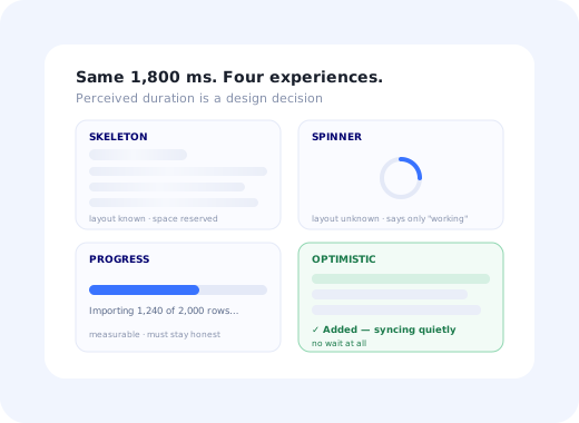
Here are the four states rendered live, so the differences are visible rather than described.
1 · Skeleton
Known layout. Reserves the exact space the content will occupy.
2 · Spinner
Unknown layout or short indeterminate wait. Says "working", nothing more.
3 · Progress
Importing 1,240 of 2,000 rows…
Long or measurable work. Answers "how much longer?"
4 · Optimistic
✓ Added, syncing quietly
Show the result immediately; reconcile in the background. No wait at all.
1. Skeleton screens
Grey placeholder shapes matching the structure of the content that is coming. They work for two reasons: they reserve the correct space so nothing shifts when the real content arrives, and they give the eye something with structure to read, which makes the wait feel shorter than a spinner of identical duration.
The condition is that you must know the shape in advance. A skeleton showing five rows where two arrive is a small broken promise, and users notice. Use them for dashboards, lists, profiles, tables and cards: anywhere the layout is predictable.
2. Spinners
Honest and cheap. A spinner communicates exactly one thing, something is happening, and it is the right choice when you genuinely do not know what will render, or when the wait is short and in-place (a button that becomes a spinner while saving). Its weakness is that it carries no information about duration, which is why it degrades badly past a couple of seconds: an indeterminate spinner running for fifteen seconds is indistinguishable from a hung application.
3. Progress indicators
For measurable work: imports, uploads, exports, migrations, report generation. The rule is that determinate progress must be honest. A bar that sits at 90% for thirty seconds is worse than no bar, because it converts a wait into a broken promise. If you cannot measure progress accurately, show completed steps instead, "Uploading… Validating… Importing 1,240 of 2,000 rows", which conveys movement without claiming a percentage you cannot support.
4. Optimistic UI
The best loading state is the one that never appears. When an action nearly always succeeds (toggling a setting, adding an item, marking something done) render the result immediately and reconcile with the server in the background, reverting with a clear message on the rare failure. This is how the fastest-feeling products feel fast: not by being quicker, but by removing the wait from the user's experience of the interaction.
Use it where failure is rare and reversible. Do not use it for payments, destructive actions or anything where a false confirmation would be materially misleading.
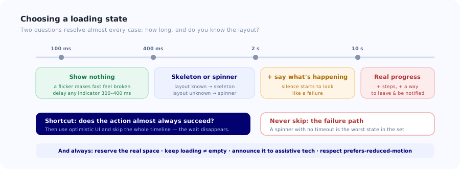
Two questions (how long, and do you know the layout) resolve almost every loading-state decision.
Six Mistakes That Make Waits Feel Longer
The flickering spinner
An indicator that appears for 150ms and vanishes. It registers as a flash rather than as feedback, and it makes a fast interface feel unstable. Fix: delay the indicator by 300–400ms, and once shown, keep it visible for a minimum period so it does not blink out.
Layout shift on arrival
The skeleton reserved 200px, the content needs 340px, and the page jumps, often just as the user reaches for a button. This is the single most damaging loading-state bug because it can cause mis-clicks, and it discards the main benefit of using a skeleton at all. Reserve the real dimensions, including images.
Blocking the whole screen for a partial update
A full-page overlay while one panel refreshes. It takes away everything the user could otherwise be reading and makes the wait feel total. Load regions independently and let the rest of the interface stay usable; a page where three sections resolve at different times feels considerably faster than one that appears all at once.
Confusing loading with empty
A blank area during loading is indistinguishable from "you have nothing here", and new users, who legitimately have nothing, will conclude the product is broken or pointless. Loading and empty must be visually distinct states, and the empty one should say what to do next. See designing empty states.
Long waits with no explanation
Past a few seconds, silence becomes suspicious. Say what is happening ("Importing your contacts", "Building your first report") because a labelled wait is tolerated far better than an unlabelled one of identical length. During onboarding this is also an opportunity: the wait can explain what the user is about to get.
No failure state
Every loading state needs a timeout and an error path. A spinner that spins forever because a request failed silently is the most frustrating outcome in the whole category: the user cannot tell whether to wait, retry or leave. Set a deadline, then show what went wrong and what they can do about it.
Why This Matters Most During Onboarding
Loading states carry more weight for new users than for anyone else, for three reasons that compound.
New users have no patience budget. An existing customer waiting four seconds for a report knows the report is worth it. A new user waiting four seconds on their second screen has no such evidence and is still deciding whether to continue. The same wait costs far more early on, which is directly a time to value problem.
New accounts hit the slowest paths. Imports, integrations, first sync, initial index build: the heaviest operations in most products are concentrated in the first session, precisely when tolerance is lowest. Instrument the loading times new users actually experience separately from your overall averages, because a healthy median can conceal a brutal first-run experience.
An empty new account looks like a broken one. This is the loading/empty confusion at its most costly. A new user sees a blank screen and cannot tell whether the product is loading, broken, or simply has nothing to show, and they have no prior experience to resolve the ambiguity. This is a common contributor to first-session drop-off in the first-time user experience.
✅ Use the wait well
- Say what is being prepared, in the user's terms.
- Let them continue setting something else up meanwhile.
- Show partial results as they arrive rather than all at once.
- Offer "we'll email you when it's ready" past ~30 seconds.
- Make loading and empty states obviously different.
- Measure first-session load times separately.
❌ Waste it
- Block the whole screen while one section loads.
- Show a progress bar that stalls at 90%.
- Fill the wait with marketing copy nobody asked for.
- Start a product tour on top of a still-loading screen.
- Leave a spinner running with no timeout.
- Assume your median load time describes a new account.
One specific interaction to check: if you run in-app guidance, make sure a tour or tooltip does not fire while its target is still loading. A step anchored to a skeleton points at a placeholder, and when the real content arrives and the layout settles, the tooltip is left beside the wrong element. Trigger guidance on content being ready, not on the page having navigated; onboarding triggers covers the timing rules.
Accessibility and Motion
Loading states are frequently invisible to assistive technology, because a visual change alone announces nothing.
- Announce the state change. Put the loading region in an
aria-live="polite"container, or usearia-busy="true"on the region while it loads. - Give spinners an accessible name.
role="status"with text such as "Loading your projects"; a decorative div announces nothing at all. - Announce completion too, not just the start, so a screen-reader user knows when the content is available.
- Respect
prefers-reduced-motion. Slow or remove shimmer and spin animations for users who have asked for that; fast looping animation can be genuinely uncomfortable, and skeletons work perfectly well static. - Keep contrast sufficient on skeleton placeholders, and never rely on animation alone to convey that something is loading.
- Do not trap focus in a loading region, and return focus somewhere sensible once the content arrives.
See where new users actually get stuck
Loading states are one part of a first session; the rest is knowing which screens people stall on and getting help to them there. Kompassify adds product tours, tooltips, checklists and announcements to your existing product with no code changes, and reports per-step drop-off so you can see exactly where new accounts stop. GDPR compliant, EU-hosted, free up to 100 monthly active users and from $129/mo after that.
Start for Free →A Loading-State Checklist
- Indicator delayed by ~300–400ms, with a minimum display time once shown.
- Skeleton where the layout is known, spinner where it is not.
- Reserved space matches the real content, no shift on arrival.
- Regions load independently; no full-screen block for a partial update.
- Loading and empty are visually distinct.
- Waits over ~2s are labelled with what is happening.
- Waits over ~10s show real progress or completed steps, plus a way to leave.
- Every loading state has a timeout and an error path.
- Announced to assistive technology, on start and on completion.
prefers-reduced-motionrespected.- First-session load times measured separately from the overall median.
- In-app guidance waits for content, not just for navigation.
Frequently Asked Questions
When should you use a skeleton screen instead of a spinner?
Use a skeleton when you know the shape of the content that is coming (dashboards, lists, tables, profiles, cards) and a spinner when you do not, or when the wait is short and in-place such as a button that becomes a spinner while saving. Skeletons work for two reasons: they reserve the correct space so nothing shifts when real content arrives, and they give the eye something structured to read, which makes an identical wait feel shorter. The condition is accuracy: a skeleton showing five rows when two arrive is a small broken promise that users notice.
How long should a wait be before you show a loading indicator?
Delay it by roughly 300 to 400 milliseconds. Most requests resolve faster than that, and an indicator that appears and disappears within 150ms registers as a flicker rather than as feedback; it makes a genuinely fast interface feel unstable. Counter-intuitively, showing the loading state later makes the product feel quicker. Once the indicator has appeared, give it a minimum display time so it does not blink out immediately either.
What are the timing thresholds for loading states?
Under about 100ms feels instantaneous and needs nothing. From roughly 100 to 400ms is noticeable but should still show nothing, or at most a subtle in-place state on the control that was clicked. From about 400ms to 2 seconds, use a skeleton if the layout is known and a spinner if it is not. From 2 to 10 seconds, add a label saying what is happening. Beyond about 10 seconds, show determinate progress or completed steps and offer a way to leave and be notified when it finishes.
What is optimistic UI and when should you use it?
Optimistic UI renders the result of an action immediately and reconciles with the server in the background, reverting with a clear message on the rare failure. It is the best loading state because it is no loading state at all: the wait disappears from the user's experience of the interaction, which is how the fastest-feeling products achieve that feeling without necessarily being faster. Use it where failure is rare and reversible, such as toggling a setting or marking something done. Do not use it for payments, destructive actions, or anything where a false confirmation would be materially misleading.
Why do loading states matter more during onboarding?
Three reasons that compound. New users have no patience budget: an existing customer waiting four seconds knows the result is worth it, while a new user on their second screen has no such evidence and is still deciding whether to continue. New accounts also hit the slowest paths: imports, integrations, first sync, initial index builds are concentrated in the first session precisely when tolerance is lowest. And an empty new account looks identical to a broken one, because a new user has no prior experience to tell loading apart from nothing-here. It is directly a time to value problem.
What is the difference between a loading state and an empty state?
A loading state says work is in progress and content is coming; an empty state says there is genuinely nothing here yet and tells the user what to do about it. They must look clearly different, because a blank area during loading is indistinguishable from an empty result, and new users, who legitimately have nothing, will read the ambiguity as the product being broken or pointless. This confusion is a common and avoidable contributor to first-session drop-off.
How do you make loading states accessible?
A visual change alone announces nothing to assistive technology. Put the loading region in an aria-live="polite" container or set aria-busy="true" on it while it loads. Give spinners an accessible name using role="status" with text such as "Loading your projects", since a decorative div announces nothing. Announce completion as well as the start, so a screen-reader user knows when content is available. Respect prefers-reduced-motion by slowing or removing shimmer and spin animations; skeletons work perfectly well static. Keep placeholder contrast sufficient, and do not trap focus in a loading region.
Should a product tour start while the page is still loading?
No. A tour step anchored to an element that has not rendered will point at a skeleton placeholder, and when the real content arrives and the layout settles, the tooltip is left beside the wrong element or nothing at all. Trigger in-app guidance on content being ready rather than on the page having navigated; wait for the target element to exist and for the layout to stabilise. This is one of the most common causes of tour steps that appear misaligned in production but look fine in testing against cached data; onboarding triggers covers the timing rules.