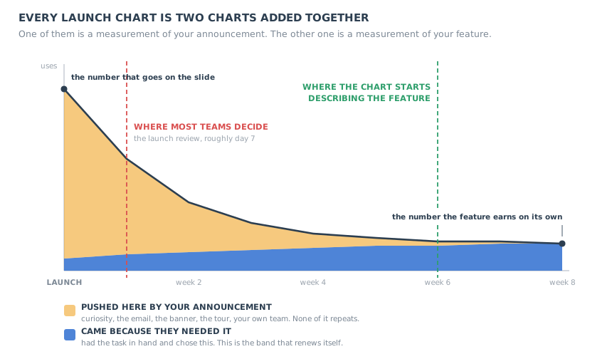
The chart after a launch is almost always the same chart. Usage goes vertical on the day the announcement goes out, holds for a day or two, and then falls. By the end of the second week it is somewhere near the floor, and by the end of the month the line is flat enough that nobody opens the report any more.
Two readings of that chart get offered in the same meeting, and both of them are wrong. The first is the launch-week slide: look at the peak, declare the feature a hit, move on. The second arrives a fortnight later: look at the floor, declare the feature a flop, quietly stop maintaining it. The peak was never a measurement of the feature, and neither was the floor, at least not yet.
What sits underneath both readings is the novelty effect: the lift a new thing gets purely for being new. It is one of the most reliable findings there is about human behaviour, and it is also the single most common reason product teams make the wrong call about something they just shipped. It makes good features look like fads, it makes announcements look like adoption, and it quietly punishes every improvement you make to an interface people already knew how to use.
This guide is about reading a launch properly: what the novelty effect actually is, what a launch spike is really made of, the four shapes a launch can take and what each one is telling you, why the right unit of time is an occasion rather than a day, how novelty biases experiments in two opposite directions at once, and what to put in place before you launch so the chart is worth looking at afterwards.
Key takeaways
- The novelty effect is the temporary lift in usage a feature gets for being new rather than for being good. Its mirror image, change aversion, is the temporary drop a changed feature gets for being changed.
- A launch spike is largely something you caused. Announcements, tours, curiosity, your own team and forced exposure all push usage at the same moment, and none of them repeat.
- The peak is a measurement of your distribution. The settled level is the measurement of your feature, and the two belong in separate sentences.
- Four shapes are possible after a launch, and the most frequently killed one is the slow climb with no spike: a feature that works, announced badly.
- Read adoption in occasions, not calendar days. A thirty-day window is generous for a daily task and meaningless for a quarterly one, so the same behaviour produces opposite verdicts.
- Novelty inflates new variants and change aversion deflates changed ones, which is why short experiments on existing users measure the transition, not the steady state.
- The fix is set up before launch, not after: name the natural frequency, hold a segment back, instrument the second occasion, and leave a permanent way into the feature behind once the announcement expires.
What Is the Novelty Effect? (Meaning and Definition)
Novelty effect: definition
The novelty effect is the temporary change in behaviour that a new thing produces because it is new, rather than because of what it does. In a product it appears as a burst of usage in the days after a launch, made up of curiosity, inspection and the push of the launch itself, which fades regardless of whether the feature is any good. The behaviour that remains once it has faded is the behaviour the feature actually earns.
The term comes out of psychology and education research, where it names a nuisance that researchers have been working around for a very long time: introduce any new method, tool or piece of equipment and the measurements move for a while, then drift back, because part of what you measured was the newness. It is a nuisance there for the same reason it is a nuisance in a product team. It arrives at exactly the moment someone wants an answer, it looks like the answer, and it is not the answer.
In experimentation the same thing usually goes by a different name, the primacy effect: a variant performs unusually well at first simply because it is unfamiliar to people who know the alternative. Its opposite number is change aversion, where an unfamiliar variant performs unusually badly for the same reason. One mechanism, two signs, and which sign you get depends on whether the newness feels like a discovery or like an interruption.
That symmetry is worth sitting with, because it has an uncomfortable implication. A brand new capability tends to be flattered by its first week. A redesign of something people already knew how to use tends to be punished by its first week. If your team reads week one as the verdict, you will systematically over-invest in net-new features and systematically kill improvements to the parts of the product that are actually load-bearing.
What the novelty effect is not
Three neighbouring ideas get collapsed into it, and keeping them apart makes the diagnosis much easier.
-
It is not the decay of a delighter
In the Kano framework, features that once delighted people become expected and eventually invisible. That decay runs over years and happens across a whole market as competitors copy the idea. The novelty effect runs over weeks and happens inside one user's head. Our Kano model guide covers the long-run version; this guide is about the short one.
-
It is not a product-level retention curve
A retention curve describes whether people keep coming back to your product. A novelty curve describes whether people keep coming back to one capability inside it, and a user can be perfectly retained while abandoning the thing you shipped last month. See our retention curve guide for the product-level picture.
-
It is not a verdict on quality
A fall after launch is the default shape of nearly every launch, including the good ones. The fall tells you that the push stopped. Where the line lands and whether it holds there is the part that tells you about the feature.
Why the First Number After a Launch Is Not About the Feature
Here is the sentence that makes the whole thing tractable. A launch chart is two charts added together. One of them records the people you pushed into the feature. The other records the people who arrived because they had the task in hand and chose it. On day one the first chart is so much larger than the second that the total is, for practical purposes, a picture of your distribution rather than of your product.
The useful move is not to find a cleverer metric. It is to go through the spike and name what it is made of, because each component has a different lifespan and a different way of being subtracted.
| What the spike is made of | Why it does not repeat | How to subtract it |
|---|---|---|
| Announcement reach | You sent it once. The in-app message expires, the email gets buried, the banner comes down. | Tag the users who saw the announcement and chart them separately from those who did not. |
| Curiosity inspection | People open a new thing, look at it and close it. That is a visit, not a use. | Count a completed action with a real outcome, never a screen view or a click on the entry point. |
| Your own organisation | Support agents, sales demos, QA and the team itself all touch the feature in launch week. | Exclude internal and demo accounts from every launch number, permanently. |
| Forced exposure | A tour step or a checklist item that routes people through the feature produces usage by construction. | Separate guided first use from unguided use. Only the second one predicts anything. |
| The try-everything segment | A small group of power users and evaluators opens everything you ship, once. | Segment by prior breadth of feature use, and read the rest of the base on its own. |
Run that subtraction honestly on a typical launch and the remaining number is usually small, slightly embarrassing, and far more informative than the one on the slide. It is also the only number that can grow on its own.
A launch spike is good news about your distribution and no news at all about your feature. Treat it as the measurement of the launch, treat the settled level as the measurement of the product, and never let the two share a sentence.
None of this is an argument against announcing things loudly. A feature nobody hears about cannot be adopted, and our guide to announcing a new product feature covers how to do that well. The argument is only that the announcement and the feature need separate scorecards, because one of them is temporary by design.
The Four Curves a Launch Can Follow
Once you accept that the peak is uninformative, the question becomes what shape the line makes afterwards. There are only four interesting ones, and each carries a different verdict and a different action.
Four launches, four shapes. The peak looks similar in three of them, which is why the peak is not where the information is.
-
1. Spike and collapse
The line goes up, comes down and keeps going until it is indistinguishable from zero. Nobody kept the feature. This is the one shape that genuinely reads as failure, with one important caveat: before you act on it, check that the task the feature serves has actually occurred for the people you gave it to. A collapse and a long wait look identical on a thirty-day chart.
What to do: confirm the occasions happened, then either re-aim the feature at a narrower job or retire it on purpose rather than by neglect.
-
2. Spike and settle
The line falls, then stops falling at a level clearly above where it started, and stays there. This is what successful adoption looks like, and it almost never looks like the launch week. The settled level is usually concentrated in one identifiable group rather than spread thinly across the base, which is the most useful thing about it.
What to do: the settled level is the result, not the peak. Find out who is in it, and work out how much of the base looks like them.
-
3. Slow climb with no spike
There was barely a launch bump at all, and then the line started rising and kept rising. This is a feature that is being found the hard way, one real need at a time, and it is the most frequently killed curve on this page. It gets reviewed at week two, when it is still near zero, and the conclusion drawn is that the feature failed. What failed was the announcement.
What to do: do not rebuild anything. Reach the segment again and make the feature findable from where the task starts.
-
4. Dip and recover
Usage of something that already existed drops on the day you change it, then climbs back toward the old level and sometimes past it. This is change aversion draining away on schedule. It is the expected shape for a redesign, which is why the worst time to judge one is the week you ship it.
What to do: watch the slope, not the level. A dip that is still recovering is fine. A dip that stopped recovering is a real regression.
There is a fifth non-shape worth naming, because it is the only reading you can safely take early: the flat line at zero, where even the launch failed to produce a bump. That is not a novelty question, it is a reach question, and the answer is almost always that the people you built it for never knew it existed. Our feature discovery guide is the right place to start on that one.
Occasions, Not Calendar Days
Here is where most measurement advice quietly goes wrong, including advice that is otherwise good. Almost every standard adoption metric is defined over a fixed window: used again within seven days, still using it after thirty, active in the last month. A fixed window looks neutral. It is not. It bakes in an assumption about how often the underlying task occurs, and that assumption is different for every feature you ship.
Two users, identical willingness, the same measurement window. The window is the only thing that differs, and it produces opposite verdicts.
Consider two users who behave in exactly the same way: both use the feature every single time they have the task it serves. The first user's task comes up every working day, so inside a thirty-day window they had dozens of chances to come back and took all of them. The second user's task is a quarterly report, so inside the same window they had no chances at all. The first user reads as adopted, the second reads as dead, and the difference between them is not behaviour. It is the calendar.
The correction is to stop counting days and start counting occasions: the number of times the task the feature serves has genuinely come up for that user since they first used it. Three or four occasions is roughly where a curve starts to mean something, because that is enough for a habit to have either formed or failed.
Working out a feature's natural frequency
You do not have to guess. The task existed before the feature did, and it left traces: how often the manual version of the job happened, how often someone exported data to do it in a spreadsheet, how often the support queue got the question. Look at the frequency of the job, not the frequency of your product.
From there the read-out date follows arithmetically. This is a rule of thumb, not a benchmark, and the only arithmetic in it is the interval multiplied by three or four.
| How often the task occurs | Example | Roughly when the curve is readable | What a 30-day window would tell you |
|---|---|---|---|
| Several times a day | Clearing a queue, searching, switching views | Within a week or two | A fair verdict, possibly a generous one |
| Weekly | A team update, a weekly reconciliation | Around a month to six weeks | Four or five occasions. Borderline, read the slope |
| Monthly | Invoicing, a month-end close, a payroll run | A quarter | One occasion. Essentially nothing |
| Quarterly or annually | Board reporting, renewals, compliance returns | Two full cycles | Zero occasions. A guaranteed false negative |
The metric to replace the fixed window
One number does most of the work here, and it is cheap to define: of the users who used the feature once, what share used it again on their next natural occasion for that task. Call it the second-occasion return rate. It has two properties that make it worth more than almost anything else on a launch dashboard. It is close to unaffected by how loud your announcement was, because everybody in the denominator already used the thing once. And it is comparable across features with completely different rhythms, because the unit is an occasion rather than a day.
This is deliberately not a replacement for the standard adoption numbers. Our feature adoption guide sets out the four metrics worth tracking and the denominator traps that go with them, and our user onboarding metrics guide does the same one level up. This is about when any of those numbers becomes safe to read, which is a question none of them answers on its own.
How the Novelty Effect Corrupts Your A/B Tests
Experiments are supposed to be the cure for this entire problem, and they mostly are. But an experiment run on existing users has novelty inside both arms of it, and because the two biases have opposite signs it is easy to get a confident result that reverses after rollout.
The mechanism is simple. Someone who knows the old version and is shown the new one reacts partly to the change itself. If the change reads as a discovery, you get a novelty premium and the variant wins by more than it deserves. If it reads as an interruption to something they had already automated in their head, you get a change aversion penalty and the variant loses by more than it deserves. Both effects decay over the course of the test, which means a short test is measuring a transition rather than a steady state.
That is why so many teams have the experience of a clean win in the test that simply does not show up in the aggregate numbers a month after rollout. Nothing went wrong with the maths. The win was partly made of newness, and newness does not survive being rolled out to everyone.
A user who has never seen the old flow cannot react to the change, only to the thing itself. For signup, activation and first-session work this removes the problem entirely rather than correcting for it, which is always the better trade.
Plot the difference between variants over time instead of only the cumulative total. A gap that is still shrinking week on week has not converged, whatever the significance calculation says about the totals.
Quote the final week of the test alongside the overall result. If the two disagree, the overall result contains novelty and the final week is the better estimate of what you are about to ship.
Write down in advance that the decision uses the converged window. Deciding afterwards which window to trust is how a transition effect becomes a permanent belief about your product.
The sizing and stopping side of this is a separate discipline, and our onboarding A/B testing guide covers sample size, duration and the stopping rules in detail; our product experimentation guide covers the wider programme. What this section adds is the bias those rules do not catch, because it is not a sampling problem. It is a problem with when you measured, not with how many people you measured.
Novelty Effect Examples in SaaS
The abstract version is easy to agree with and hard to apply. Here are seven launches that produce novelty curves, and what the spike in each one is actually measuring.
-
The AI feature launch
The most novelty-prone launch there is, because the category itself is still novel. Everyone opens it once to see what it does, which produces a spike that is almost entirely inspection. The honest number arrives only after people have had a real task they could have given it and either did or did not.
The spike is measuring: curiosity about the category. See our AI feature adoption guide for the trust and verification work that decides what happens next.
-
The dashboard redesign
The reverse case. Usage of a screen people used daily drops the week you change it, support contacts rise, and the loudest customers write in. Nearly all of that is change aversion and nearly all of it drains within a few weeks, but it arrives exactly when the team is most nervous.
The dip is measuring: the cost of the change, not the value of it. Our product redesign rollout guide covers how to stage one so the dip is small and legible.
-
Streaks, badges and points
Gamification layers have a novelty curve built into the mechanic itself. The first badge is interesting, the fourth is wallpaper. A layer that is still driving behaviour after the newness has gone is attached to something the user wanted anyway; one that is not was always borrowing.
The spike is measuring: the reward being unfamiliar. Our onboarding gamification guide covers which mechanics survive that.
-
The checklist added to the empty state
Completion jumps the week it goes live, because the cohort that sees it first includes everyone already in the product who had never been offered one. That backlog is a one-off. The steady-state number is whatever new signups do, and it is always lower than launch week.
The spike is measuring: a backlog clearing. Compare new signups only, and see our empty states guide for the surface itself.
-
The new integration
A connection is set up once and then runs silently forever. Usage of the setup screen is supposed to spike and collapse, and a team reading that screen as an adoption metric will conclude that a perfectly healthy integration died.
The spike is measuring: exactly what it should. Count connected accounts and data flowing, never setup sessions. Our integration onboarding guide covers the blockers in between.
-
The re-announcement of an old feature
A campaign pointed at something you shipped two years ago produces a spike shaped exactly like a launch, with no new capability behind it at all. This is the cleanest natural experiment most teams have, because the product did not change: whatever usage remains after the campaign is pure discovery that had been missing.
The spike is measuring: how many people never knew. If the settled level is higher afterwards, you had a discovery problem, not a product problem.
-
The template or starter-content gallery
Galleries get browsed on launch day by people who have no intention of using anything in them. Views collapse, which looks alarming, while the handful of templates that solve a real recurring job keep being opened quietly for years.
The spike is measuring: browsing. Track per-template repeat use, not gallery visits, and let the long tail die without ceremony.
Five Moves to Make Before You Launch
Everything above is diagnosis, and diagnosis after the fact is worth much less than five minutes of preparation before it. These five go in the launch document, not in the post-mortem.
- Write down the natural frequency and the read-out date.
- Instrument the second occasion, not the first click.
- Hold a segment back, or stagger the announcement.
- Leave a permanent way in behind the announcement.
- Pre-register what you will do at each outcome.
1. Write down the natural frequency and the read-out date
One sentence: the task this serves comes up about once a week for the people it is for, so we will read the curve on the such-and-such date. Writing it before the numbers exist is the entire trick, because afterwards everybody has a position to defend and the window quietly becomes whichever one supports it. This belongs next to the launch checklist items in our product launch checklist.
2. Instrument the second occasion, not the first click
Most launch instrumentation records an entry: the button pressed, the panel opened, the modal dismissed. Almost none of it records the completed outcome, and even less records the repeat. Before launch, define the one event that means the job got done, and define what counts as the user's next natural occasion so the return can be measured at all. Our behavioural analytics guide covers getting the event layer right.
3. Hold a segment back, or stagger the announcement
If everyone is told at once you have no comparison group, and your only available comparison is this week against last week, which is contaminated by the launch. Announce to a portion of the base first, or exclude one segment for a fortnight. The unannounced group tells you what organic discovery looks like, which is the number you will be living with once the campaign ends. The same holdout logic appears in our digital nudges guide, and user segmentation is how you carve the groups.
4. Leave a permanent way in behind the announcement
This is the one that pays for itself and the one that is nearly always skipped. An announcement has a lifespan of days. After it expires, the only people who can still find the feature are the people who already remember it, which guarantees the slow decline everyone then interprets as novelty. A tooltip on the control, a hotspot where the task starts, a line in the empty state or a checklist item keeps producing first-time users for months, at a low and steady rate, long after the campaign is over. That steady trickle is what turns a spike-and-collapse into a slow climb.
5. Pre-register what you will do at each outcome
Four curves, four decisions, written down in advance: what you will do if it collapses, if it settles, if it climbs slowly, if it dips and recovers. Pre-registering the response is what stops the read-out meeting from turning into an argument about which chart to look at, and it is the difference between a feature that gets retired deliberately and one that rots because nobody wanted to say so.
Reading a Launch: What Becomes Legible, and When
A launch does not become readable all at once. Different questions become answerable at different moments, and most launch reviews fail because they ask a late question at an early date.
| What to look at | What it answers | When it becomes readable | The trap |
|---|---|---|---|
| Announcement reach and click-through | Did the message arrive and was it worth opening? | Within days | Reading it as adoption. It is a measure of your campaign. |
| First completed action, excluding guided use | Can people get through it unaided? | Within the first week or two | Counting opens and views, which curiosity inflates enormously. |
| Second-occasion return rate | Did anyone keep it? | After three or four natural occasions | Using a fixed day count instead of the task's own rhythm. |
| Settled level versus pre-launch baseline | Is the product permanently different? | Once the slope flattens | Comparing against the peak, which guarantees a disappointing story. |
| Announced versus unannounced segment | How much of this was the campaign? | From the moment the holdout exists | Not having a holdout, so this question can never be answered. |
| Composition of the settled band | Who is this feature actually for? | Once the slope flattens | Reading the average instead of looking at who is in the band. |
| Slope of the recovery, after a change | Is this change aversion or a real regression? | Two to four weeks, by direction not level | Judging a redesign on the level in week one, when it is always bad. |
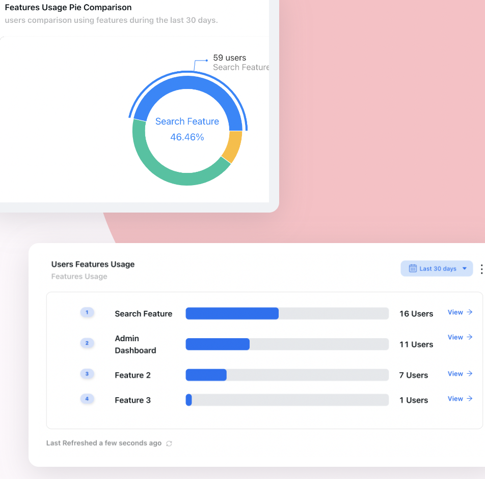
Comparing a new feature against established ones is the fastest way to see where it has settled. The launch week will always be the tallest bar on the chart; the question is what it looks like next to the features people already rely on, a month later.
When a Novelty Spike Is Not a Problem
The point of all this is better decisions, not permanent suspicion. There are cases where a spike followed by a collapse is the correct shape and treating it as a failure would be the mistake.
Imports, migrations, integration setup, account configuration, a one-time verification. A healthy version of these is used once per account and then never again. The right metric is coverage of the accounts that need it, not repeat usage, and a collapse means the queue cleared.
A seasonal offer, an event, a limited-time programme. The spike is the deliverable. Measure what the campaign was for, not whether people kept doing it afterwards, because nobody intended them to.
Sometimes the aim of a launch is to put a capability into people's heads so it is there when the need eventually arrives. If that is the aim, say so, and measure recall or later first-use rather than usage in the launch window.
If the occasions have genuinely occurred, several times, for the people the feature was built for, and the line is still at the floor, then the novelty effect is not hiding anything and the feature did not land. Retire it on purpose. Features kept alive out of embarrassment cost more than they look.
Getting a Feature Past Its Launch Week with Kompassify
Most of the work above splits into two jobs: being able to see the two populations separately, and leaving something behind in the product once the announcement has expired. Both are no-code jobs in Kompassify, which matters because the whole point is to run them on your own schedule rather than queueing them behind an engineering release.
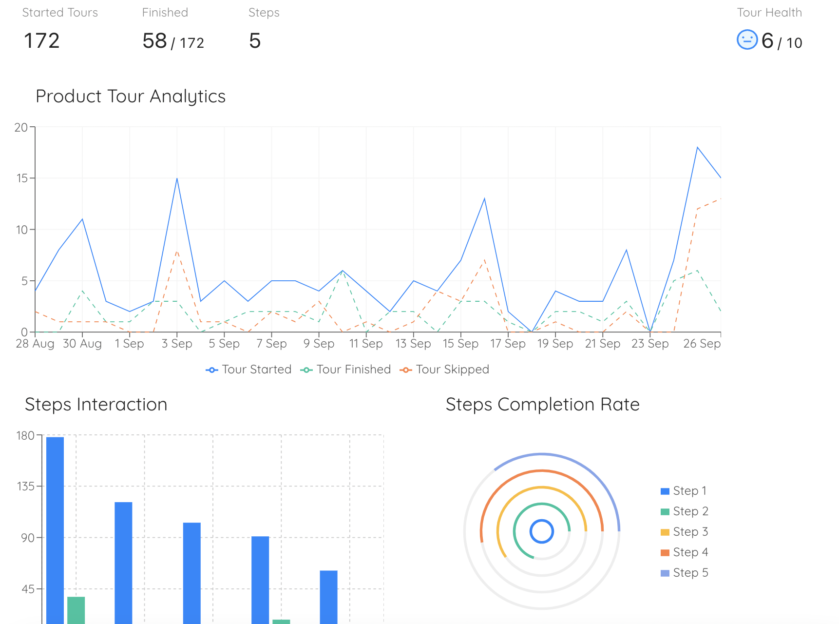
Per-step analytics is how you tell guided first use apart from unguided use. A step that everybody reaches and nobody completes is forced exposure, and it inflates launch numbers while telling you nothing about adoption.
-
Announce to a segment, not to everyone
The announcements widget publishes a what's-new entry to the segment you choose, so holding a group back for a fortnight is a targeting decision rather than a release decision. The unannounced group is your comparison, and it costs nothing to keep.
-
Leave a tooltip or a hotspot where the task starts
Attach guidance to the control itself rather than to a campaign, and it keeps introducing the feature to people who arrive at that screen for the first time next month. This is the trickle that turns a collapse into a climb, and it needs no code to place.
-
Bring people back for the second occasion
An onboarding checklist item can redirect to the right page or launch a guide, which is a practical way to make the second visit happen rather than hoping for it. The second occasion is the one that decides the curve.
-
Watch the usage report, not the launch total
Product analytics gives you a feature usage report, activation and milestone reports, user flow visualisation and a per-user view, which is what lets you see where a feature settled and go and look at who is still using it, instead of an average that hides both populations at once.
-
Re-reach the people who tried it once
The users who used the feature once and did not return are the most informative group you have, and the cheapest to reach. A targeted in-app guide aimed only at them answers whether the problem was the feature or the moment.
Make a launch that is still working in six weeks
Announce features to the segment you choose, leave tooltips and checklists behind when the campaign expires, and watch feature usage settle in real analytics. No code required. Free up to 100 monthly active users, plans from $129/month, GDPR-compliant and EU-hosted.
Start for free →For the launch itself, our guides to announcing a new feature and the product launch checklist cover the campaign, while product stickiness covers the account-level version of the same honesty problem and time to value covers the first win that has to happen before any of this matters.
Novelty Effect: Do vs Don't
✅ Do
- Write down the task's natural frequency and the read-out date before you ship.
- Quote the settled level, and keep the peak in a separate sentence about distribution.
- Count completed actions rather than opens, views or entry-point clicks.
- Exclude internal, demo and sales accounts from every launch number.
- Hold a segment back from the announcement so you have something to compare against.
- Judge a redesign on the slope of its recovery, not on the level in week one.
- Leave a permanent entry point behind when the campaign expires.
- Decide in advance what you will do at each of the four possible shapes.
❌ Don't
- Present launch-week usage as adoption, however good it looks.
- Kill a feature at week two without checking whether the occasions happened.
- Use a fixed thirty-day window for a monthly or quarterly task.
- Read repeat usage of a one-time setup screen as a sign of anything.
- Ship an A/B win to everyone without checking whether the gap had converged.
- Roll back a redesign in the first week because support contacts rose.
- Count usage that a tour or checklist step routed people into as organic.
- Let a feature rot quietly instead of retiring it on purpose.
The One-Paragraph Version
A launch chart is two charts added together: the people you pushed and the people who needed the thing. On day one the first one dominates so completely that the total is a measurement of your announcement rather than of your feature, and the fall that follows is the push wearing off, not the product failing. The information is in what the line does afterwards, which takes three or four natural occasions of the underlying task to become visible, which may be two weeks or two quarters depending entirely on the job and not at all on the calendar. In the meantime the same bias runs backwards through every change you make to something people already knew how to use, so the week you ship a redesign is the week it will look worst. Decide the read-out date before the numbers exist, hold a segment back so you have something to compare against, leave a way into the feature behind when the campaign expires, and judge the settled level rather than the peak.
Frequently Asked Questions
What is the novelty effect?
The novelty effect is the temporary change in behaviour that a new thing produces simply because it is new, rather than because of what it does. In a product it shows up as a burst of usage in the days after a launch that comes from curiosity, from your own announcement and from people inspecting the change, and that fades whether the feature is good or not. The term comes from psychology and education research, where introducing any new method tends to move the numbers for a while before they settle. In experimentation the same thing is usually called the primacy effect, and its mirror image, where people react badly to a change at first and then get used to it, is called change aversion.
Why does feature usage drop after launch?
Because the launch itself was supplying most of the usage. An announcement, a tour, a banner, an email and a wave of curiosity all push people into a feature at the same moment, and none of those pushes repeats. What is left after a few weeks is the usage the feature generates on its own, when someone has the task in hand and chooses it. A drop is therefore the expected shape of almost every launch, and the useful question is not whether usage fell but what level it fell to and whether that level is holding or still sliding.
How long does the novelty effect last?
Long enough to cover the window in which most launch decisions get made, which is the whole problem. There is no fixed number, because the novelty drains out of the chart at the speed of the task, not at the speed of the calendar. A feature that belongs to a daily task will have given most users three or four natural occasions within a fortnight, so its curve settles quickly. A feature that belongs to a monthly close or a quarterly report may not have given a single user a second real occasion in six weeks, so nothing has settled at all and the chart cannot be read yet, however flat it looks.
How do you tell the novelty effect from real adoption?
Stop looking at the peak and look at what the curve does after it. A pure novelty spike collapses toward zero. Real adoption spikes and then settles at a level clearly above where it started, usually inside one identifiable segment rather than across your whole base. The cheapest single test is a return on the next occasion: of the people who used the feature once, what share used it again the next time they had the task it serves. That number is almost unaffected by how loud your announcement was, which is exactly why it is worth more than the launch week total.
What is the difference between the novelty effect and change aversion?
They are the same mechanism with opposite signs. The novelty effect lifts the numbers for something new because it is new. Change aversion depresses the numbers for something changed because it is changed, and it hits hardest when the change lands on a workflow people had already automated in their heads. Both fade. That symmetry matters when you launch: a brand new capability tends to be flattered by its first week and a redesign of an existing one tends to be punished by it, so reading week one as the verdict will make you over invest in the first and kill the second.
Does the novelty effect affect A/B tests?
Yes, and in both directions, which is why experiment results on existing users often shrink after rollout. A variant that is new to someone who knows the old version carries a novelty premium; a variant that disrupts a learned habit carries a change aversion penalty. Both of those decay over the course of the test, so a short test measures the transition rather than the steady state. The practical defences are to test onboarding changes on new users, where there is no old version to compare against, to run long enough that the gap between variants stops moving, and to report the final window separately from the first.
How long should you wait before judging a new feature?
Work it out from the feature's natural frequency rather than from the calendar. Decide how often the task the feature serves actually occurs for the people it is for, then wait for three or four of those occasions before you read the curve as a verdict. A daily task gives you a readable chart in a couple of weeks, a weekly task in roughly a month and a half, a monthly task in a quarter. Write that date down in the launch document, before the numbers exist and before anyone has an opinion to defend, and write down what you will do at each possible outcome.
Is a usage spike after an announcement a bad sign?
No. A spike is good news about your distribution: the announcement reached people and they were willing to look. It is just not news about the feature, because you caused it. Treat the spike as the measurement of your launch and the settled level as the measurement of your product, and keep the two numbers in separate sentences. The failure mode is not having a spike, it is having nothing else.
How do you reduce the novelty effect in your data?
You cannot remove it, but you can isolate it. Hold a segment back from the announcement, or stagger the rollout, so you have a group whose usage was not pushed; compare the announced and unannounced groups rather than comparing this week with last week. Exclude internal accounts, which inflate every launch. Count a completed action rather than a view, so curiosity visits do not register as adoption. And leave a permanent way into the feature behind after the announcement expires, because otherwise the only people who can still find it are the ones who already remember it.