Sit through enough roadmap meetings and you notice that every feature arrives with the same argument: customers are asking for it. The requests are real, the advocates are sincere, and the implicit model underneath is that satisfaction is a bank account: every shipped feature is a deposit, and bigger features are bigger deposits. Then the quarter ends, the big feature is live, adoption is a rounding error, and the loudest complaint in support is about something so basic nobody thought to put it on the roadmap at all.
The Kano model is the framework that explains this, and it does it with one uncomfortable move: it refuses to treat satisfaction as a single dial. Developed by Professor Noriaki Kano in 1984, the model separates how fully a feature is implemented from how users feel about it, and shows that different features connect those two axes with fundamentally different curves. Some features can only disappoint: done perfectly they earn silence, done badly they earn rage. Some pay back linearly, more being genuinely better. And a few delight wildly out of proportion to their cost, precisely because nobody expected them. A roadmap that doesn't know which curve each feature sits on is spending its quarters blind.
This guide covers the model end to end: what it is and where it came from, how to read the Kano graph, the five categories with SaaS examples of each, why yesterday's delighter is today's table stakes, the paired questionnaire and evaluation table that classify your own features, Better-Worse coefficients for reading the results, a step-by-step method for running the analysis with in-app surveys, the model's honest limitations, and how to act on what you find without waiting for a release cycle.
Key Takeaways
- Satisfaction is not one dial. The Kano model plots how fully a need is met against how the user feels, and different features follow different curves between those axes.
- The five categories: must-be (expected, can only disappoint), performance (more is better, linearly), attractive (unexpected delight), indifferent (nobody cares), and reverse (presence annoys).
- Must-bes are asymmetric. Flawless execution earns nothing; failure is loud and immediate. They are entry tickets, not investments.
- Delight decays. Attractive features migrate to performance and then to must-be as the market copies them: a Kano classification is a snapshot with a date on it.
- The questionnaire is a pair. Each feature gets a functional and a dysfunctional question; the two answers combine in an evaluation table to reveal the category.
- Segment before you survey. Enterprise admins and solo users classify the same feature differently; pooling them averages real signals into a meaningless "indifferent."
What Is the Kano Model? (Definition & Origin)
The Kano model is a theory of how quality attributes relate to customer satisfaction, built to correct a specific mistake: the assumption that satisfaction is one-dimensional, so that doing more of anything customers value must make them proportionally happier. Kano's observation was that this is true for only one class of features, and that treating it as true for all of them systematically misallocates effort, because it overinvests in things that can no longer pay back and underinvests in the unglamorous basics whose absence quietly poisons everything else.
The Kano model, defined. A two-dimensional model of quality that plots how fully a need is met (from absent or broken to fully implemented) against how satisfied the customer feels (from frustrated to delighted), and classifies features by the shape of the curve connecting the two: must-be features that can only disappoint, performance features that pay back linearly, attractive features that delight without being expected, plus indifferent and reverse features, each identified empirically with a paired questionnaire rather than by debate.
The model was published in 1984 by Noriaki Kano, professor at the Tokyo University of Science, with his colleagues, in a paper titled "Attractive Quality and Must-Be Quality" in the journal of the Japanese Society for Quality Control. It came out of the quality movement in Japanese manufacturing, but the insight transferred to software with unusual ease, because software teams, more than most, live inside the one-dimensional assumption. Feature requests arrive pre-articulated, votes can be counted, and a backlog sorted by vote count feels rigorous. The Kano model's point is that vote counts measure only what users can articulate, and users articulate performance needs almost exclusively. Nobody requests the basics; they're assumed. Nobody requests the delighters; they can't imagine them. A backlog sorted by requests is a backlog of middles.
It is equally worth being clear about what the model is not. It is not a prioritization algorithm: it says nothing about cost, effort, or sequencing, and a delighter that takes three years is still a bad quarter-one bet. It is a satisfaction lens: it tells you what kind of payback to expect from a feature, and it pairs with, rather than replaces, your effort estimates and strategy. Used that way, it is one of the few frameworks that reliably changes a roadmap discussion, because it replaces "how much do people want this?" with the sharper question "what happens if we don't do it?"
How to Read the Kano Graph
The whole model fits in one picture. The horizontal axis is objective: how fully the feature is implemented. The vertical axis is subjective: how the user feels. The three main categories are three differently shaped paths across that space:
The Kano graph. A must-be feature (red) climbs out of dissatisfaction but never rises above neutral: perfection earns silence. A performance feature (blue) pays back linearly. An attractive feature (green) starts at neutral (nobody misses what nobody expected) and ends in delight.
Three things are worth noticing before moving on. First, only the blue line matches roadmap intuition. The linear relationship (invest more, satisfy more) is real, but it describes one category, not the nature of satisfaction. Second, the red curve never crosses into positive territory. There is no amount of investment in a must-be that produces delight; there is only the removal of a reason to be angry. That's not an argument against doing must-bes well; it's an argument against expecting applause for them, and against gold-plating them past the point of reasonable. Third, the dashed arrow is the part everyone forgets. The curves are not fixed properties of features; they are positions in a market at a moment in time, and the direction of drift is always downward. We'll come back to that.
The Five Kano Model Categories, With SaaS Examples
1. Must-be features: the basics that can only disappoint
Must-be features (Kano's atarimae hinshitsu, "taken-for-granted quality") are the ones users never mention until they fail. Login that works. Password reset that arrives. Data that is still there tomorrow. Autosave. An export that produces the file it promised. In B2B, add the invisible layer buyers assume: security, permissions that hold, an audit trail, uptime. Their defining property is asymmetry: implementing them flawlessly moves satisfaction to zero, not above it, while failing at them produces the loudest anger your support inbox will ever see.
The roadmap rule for must-bes is: cover them to a reasonable standard, verify they stay covered, and resist the urge to invest past that point; the curve has flattened and there is nothing further up it. The subtler trap is discovering them late. Because nobody requests must-bes, they are invisible in feature-request data, and the first signal of a missing one is churn you can't explain. New-market entrants hit this constantly: the delighter that justified the product gets built, and the boring basics that the incumbent taught everyone to expect get scheduled for "later."
2. Performance features: where more genuinely is better
Performance features (also called one-dimensional) are the ones where satisfaction really does track implementation, roughly linearly, in both directions. Speed. Storage and usage limits. Search that finds the thing. Report accuracy. Price against value. These are the features users can articulate when asked what they want, which is exactly why feature requests and sales-call objections overindex on them, and why a backlog sorted by request volume ends up being a performance backlog wearing a strategy costume.
Performance features are where competition actually happens: prospects compare tools attribute by attribute here, and every increment you ship is legible to the market. The roadmap rule is to choose your battleground consciously: you cannot lead on every performance attribute, and the linear curve means half-hearted investment produces exactly half-hearted results. Pick the one or two performance dimensions your positioning depends on and be deliberately, visibly better there.
3. Attractive features: the delighters nobody asked for
Attractive features (miryokuteki hinshitsu, "attractive quality") are the inverse of must-bes: their absence costs nothing, because nobody expected them, while their presence produces delight out of proportion to their size. They are, definitionally, the features that never appear in request data: users cannot ask for what they haven't imagined. A genuinely smart default that configures itself from context. The command palette in a tool whose users live on the keyboard. An automatically generated summary that turns out to be exactly what you'd have written. The undo on a destructive action you'd braced yourself to have lost.
Delighters have two operational quirks. First, they are usually small: delight correlates with unexpectedness, not effort, which is why a two-week polish item routinely outperforms a two-quarter platform bet on sheer satisfaction. Second, they have a discovery problem: a delighter nobody finds delights nobody. An unexpected feature is by definition one users aren't looking for, so shipping it silently is indistinguishable from not shipping it. Pairing every delighter with deliberate feature discovery, and a proper feature announcement, is not marketing vanity; it is the second half of building the feature.
4. Indifferent features: the ones nobody's satisfaction notices
Indifferent features move no needle in either direction: present or absent, users shrug. Every product accumulates more of these than its team would ever admit: the settings toggle used by nobody, the integration built for one deal that closed anyway, the dashboard widget that seemed obviously useful in the sprint review. Individually each is harmless; collectively they are how feature bloat happens: every indifferent feature still costs maintenance, adds interface surface, and dilutes the path to the features that do move satisfaction. The category's real value in a Kano analysis is as a veto: a feature that tests indifferent is a feature you now have permission not to build, which is frequently the most profitable finding in the whole exercise.
5. Reverse features: the ones whose presence annoys
Reverse features actively subtract satisfaction by existing: some users would pay for their removal. Autoplaying anything. Forced onboarding you cannot skip on the fifth login. Streak mechanics guilt-tripping a professional who was on vacation. The AI assistant that reopens itself. Reverse classifications are also frequently a segmentation finding rather than a global one: the same always-on guidance that reassures a first-time user reads as condescension to a power user, and the gamification that energizes one audience irritates another (which is why onboarding gamification done well is opt-in and audience-aware). When a feature tests reverse in one segment and attractive in another, the answer is almost never "don't build it"; it's "make it targetable, and never force it on the segment it offends."
The five categories side by side:
| Category | When present | When absent | SaaS examples | Roadmap rule |
|---|---|---|---|---|
| Must-be | Nothing: taken for granted | Loud, immediate dissatisfaction | Working login, autosave, data integrity, uptime, security basics | Cover to a reasonable standard, then stop investing |
| Performance | Satisfaction rises with quality | Satisfaction falls with quality | Speed, storage limits, search quality, report depth | Pick your battleground; be visibly better there |
| Attractive | Disproportionate delight | Nothing: nobody expected it | Smart defaults, command palette, an uncannily good auto-summary | Ship one or two per cycle, and make sure they're discovered |
| Indifferent | Nothing | Nothing | The toggle nobody uses, the widget from that one sprint review | Don't build; if built, candidate for removal |
| Reverse | Active annoyance (for some) | Relief (for the same people) | Autoplay, unskippable onboarding, forced streaks | Segment it, make it optional, or drop it |
The Must-Be Asymmetry, Live
The single most useful thing the Kano model teaches is the asymmetry of the basics, so here it is running on this page. The same feature, autosave, in both of its states:
This asymmetry is why intuition and vote-counting fail at the low end of the roadmap. No user will ever request "please continue to not lose my work," so the request data stays silent right up until the failure, and the failure doesn't generate a feature request either; it generates a cancellation. The practical discipline is to maintain an explicit list of your product's must-bes and audit them the way you'd audit uptime, treating "no news" as the success state it actually is. The same asymmetry also explains a pattern every support team knows: months of silence about a feature, then an outage of it, then fury; the fury was always there, stored as an expectation.
Why Delighters Stop Delighting: The Decay of Attractive Quality
Kano's categories are not permanent properties of features; they are positions in a market at a moment in time, and they drift in one direction only. What delights when it is rare becomes a comparison point once competitors copy it, and a baseline expectation once it is everywhere. Kano described this as the life cycle of quality attributes; you can watch it happen to almost any feature old enough to have a history:
The one-way drift of attractive quality: delight → comparison point → entry ticket. Real-time collaboration, dark mode, and single sign-on have all made the same journey.
The strategic consequences are bigger than they look. First, delight is a treadmill, not a trophy case: a product that stops producing new attractive features doesn't stay delightful, it slowly becomes a list of other people's table stakes. Second, the decay rate is set by your competitors, not by you: the faster a market copies, the shorter a delighter's half-life, which in fast-moving categories can be a year or less. Third, and most practically: date your classifications. A Kano analysis from three years ago is not evidence about today's market, and the feature it called attractive may now be the must-be whose absence is quietly feeding your churn. Re-run the questionnaire on your core attributes at a sensible cadence, and treat a category downgrade not as bad news but as the market telling you where the floor moved.
The Kano Model Questionnaire and Evaluation Table
What separates the Kano model from a satisfying diagram is that the categories are measurable. You don't debate whether a feature is a delighter in a meeting; you ask users a structured pair of questions and read the answer out of a table. For each feature, the questionnaire asks the same thing twice, once assuming the feature exists (the functional form) and once assuming it doesn't (the dysfunctional form), and both are answered on the same five-option scale:
"How would you feel if the product saved your work automatically?"
- I like it that way
- I expect it to be that way
- I am neutral
- I can live with it that way
- I dislike it that way
"How would you feel if the product did not save your work automatically?"
- I like it that way
- I expect it to be that way
- I am neutral
- I can live with it that way
- I dislike it that way
"I expect it" + "I dislike its absence" → autosave is a must-be. No meeting required.
The pairing is the clever part. A single "how much do you want this?" question collapses every category into one enthusiasm score, precisely the one-dimensional mistake the model exists to fix. The pair separates them: a user who expects presence but dislikes absence is describing a must-be; one who likes presence and dislikes absence is describing a performance feature; one who likes presence but is neutral about absence is describing a delighter. Each response pair maps to a category through the standard evaluation table:
| Functional ↓ / Dysfunctional → | I like it | I expect it | I'm neutral | I can live with it | I dislike it |
|---|---|---|---|---|---|
| I like it | Questionable | Attractive | Attractive | Attractive | Performance |
| I expect it | Reverse | Indifferent | Indifferent | Indifferent | Must-be |
| I'm neutral | Reverse | Indifferent | Indifferent | Indifferent | Must-be |
| I can live with it | Reverse | Indifferent | Indifferent | Indifferent | Must-be |
| I dislike it | Reverse | Reverse | Reverse | Reverse | Questionable |
Two labels in the table need a word. Questionable is not a sixth kind of feature: it marks a contradictory answer pair (liking both the presence and the absence of the same thing) and almost always means the question was misread; a feature collecting many questionable answers has a wording problem, not a category. Reverse answers, read carefully, are a gift: they tell you which segment would pay you to not ship the thing, before you ship it.
Reading the results: Better-Worse coefficients
With responses collected, the simple read is the mode, whichever category a feature lands in most often. The sharper read is the pair of Better-Worse coefficients, which compress the distribution into two numbers. Using the shares of Attractive (A), One-dimensional/performance (O), Must-be (M), and Indifferent (I) answers:
- Better = (A + O) ÷ (A + O + M + I), the share of users whose satisfaction would increase if you ship the feature.
- Worse = − (O + M) ÷ (A + O + M + I), the share whose satisfaction would decrease if you don't (written negative by convention).
A feature scoring Better 0.63, Worse −0.31, say, delights far more than its absence hurts: an attractive lean, a differentiator you can schedule on your own timeline. High on both (0.6 / −0.7) is a performance feature: it cuts in both directions. Low Better with a deeply negative Worse (0.2 / −0.8) is a must-be: shipping it earns little praise, but not shipping it is actively costing you. Low on both is your veto: indifferent, and the analysis just saved you a quarter. Plotting every tested feature on those two axes turns a stack of survey responses into a one-glance roadmap conversation.
How to Run a Kano Analysis: Step by Step
The method, end to end:
- Choose 8–12 candidate features, phrased as user outcomes.
- Write the functional/dysfunctional pair for each, and pilot the wording.
- Segment your audience before fielding anything.
- Field the questions in-app, in small doses, at relevant moments.
- Classify with the evaluation table, then compute Better-Worse per segment.
- Turn categories into roadmap decisions, and validate against real usage.
1. Choose the features to test, as outcomes, not implementations
Kano analysis prices attention: each feature costs two questions, so a survey testing your whole backlog will be abandoned by question six. Pick the 8–12 candidates where classification would actually change a decision: the upcoming bets you're unsure about, not the shipped basics you can observe directly. Phrase each as an outcome the user can picture ("your work is saved automatically as you type") rather than an implementation ("real-time persistence layer"); users classify experiences, not architecture.
2. Write the question pairs, and pilot them on someone unforgiving
Keep the functional and dysfunctional forms exact mirrors, one behavior each, no compound features ("saved and versioned" is two questions pretending to be one).
The dysfunctional form is where wording goes wrong. A double negative like "how would you feel if the product didn't fail to save" produces questionable answers by the dozen. Pilot the pairs on two or three people before fielding anything; every questionable-heavy result you prevent is a feature you don't have to re-survey.
3. Segment before you field: pooled answers lie
This is the step that decides whether the analysis means anything. Categories are properties of an audience, not of a feature: SSO is a must-be to an enterprise admin and an irrelevance to a solo founder, and a survey that pools them will report a meaningless "indifferent" that is true of nobody. Decide the two or three segments whose roadmaps you'd actually build differently (by plan, by role, by maturity) using your existing user segmentation and personas, and plan to read every result per-segment from the start.
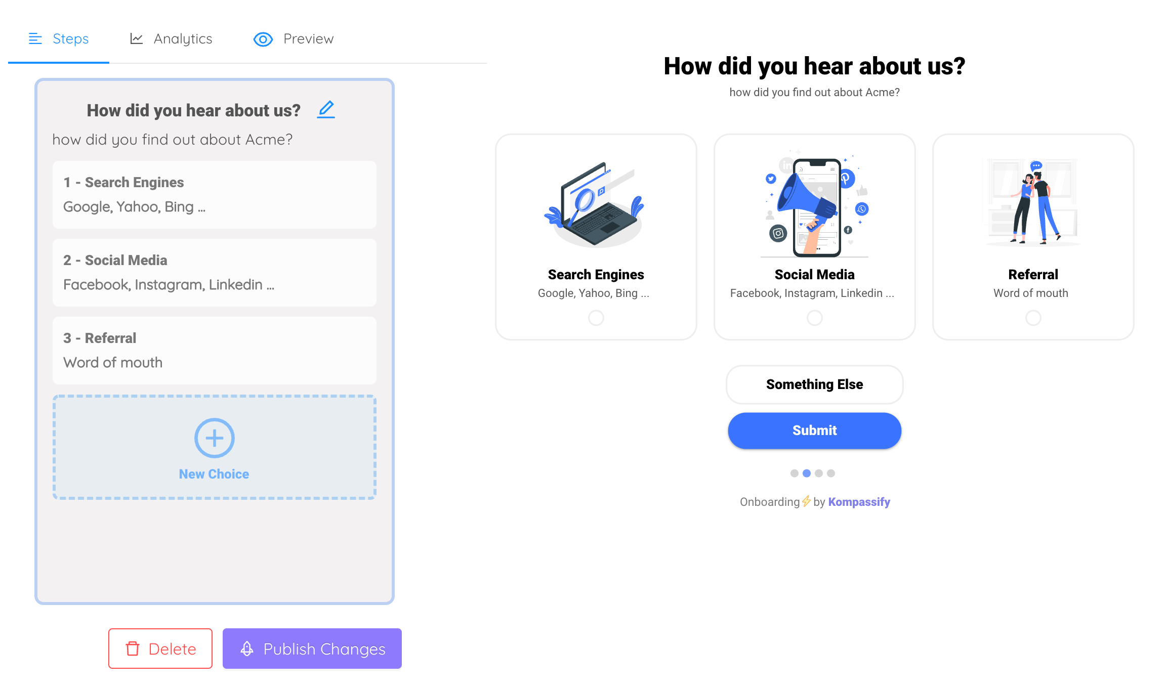
4. Field it in-app, in small doses, at relevant moments
Email surveys reach the people who read email; your product reaches the people who use the product. Fielding the pairs as in-app surveys gets responses from users in context, and lets you dose the questions properly: one pair per survey, the functional and dysfunctional forms of a single feature, triggered after a relevant action rather than on login, frequency-capped so no user is interrogated twice in a week. A few dozen responses per segment is genuinely enough to see the pattern; the signal is in the shape of the distribution, not the third decimal. Resist the urge to run all twelve features at once on everyone; rotating one-pair surveys across the audience gets you the same coverage without teaching users that popups are punishment.
5. Classify, then compute Better-Worse per segment
Run each response pair through the evaluation table, tally the categories per feature per segment, and take the mode as the headline classification. Then compute Better-Worse coefficients for the sharper picture: two features can share a "performance" mode while one skews attractive and the other skews must-be, and the coefficients catch what the mode blurs. Set aside questionable-heavy features for re-wording rather than torturing meaning out of contradictory answers, and note anywhere a feature classifies differently across segments: those disagreements are findings, not noise.
6. Turn categories into decisions, and check them against reality
The classification maps to the roadmap almost mechanically: every must-be covered to a reasonable standard before anything else, deliberate investment on your one or two chosen performance battlegrounds, one delighter per cycle shipped with its discovery plan, indifferent features vetoed, and reverse features made optional or targetable. Then close the loop: the questionnaire measured what users say; your product adoption data measures what they do. A "delighter" nobody touches after launch either has a discovery problem or was flattery in the survey; the two disagree often enough that checking is not optional, and the check is what turns Kano from an opinion poll into an instrument.
Kano Model Examples: A SaaS Roadmap, Classified
Four features from a recognizable B2B roadmap, run through the lens:
-
SSO / SAML: must-be (for one segment), indifferent (for another)
Enterprise admins answer "expect it" / "dislike its absence": the textbook must-be pair, and its absence doesn't lower their satisfaction so much as end the conversation before it starts. Solo users are indifferent in both directions. The decision this produces isn't "build SSO"; it's "build SSO for the enterprise tier, and don't spend a sprint polishing it past reasonable, because no admin will ever love you for SAML."
-
Report generation speed: performance
"Like it" / "dislike it": satisfaction tracks the number almost linearly, in both directions, across every segment. This is a classic battleground feature: if fast reporting is part of your positioning, every increment is legible to the market and worth shipping; if it isn't, "acceptably fast" is a defensible place to stop and spend the difference on a delighter.
-
AI-drafted weekly summary: attractive (today)
"Like it" / "neutral about its absence": nobody misses what they haven't imagined, but the first uncannily accurate draft gets screenshotted into Slack. Two riders come with the classification: a discovery plan, because an unexpected feature is one nobody is looking for, and an expiry date, because in an AI-fast market this row of the table is migrating toward performance while you read this.
-
Always-on usage streaks: reverse (for professionals)
A mechanic that tests attractive with casual audiences collects "dislike it that way" on the functional question from professional users: presence itself annoys them. That's not a kill verdict; it's a targeting instruction: opt-in, segment-gated, and never attached to guilt. The Kano survey is one of the few instruments that catches this before launch instead of in the one-star reviews after.
Notice what the classification changed. All four features had advocates and could cite requests. The Kano lens didn't rank them; it assigned each a different kind of decision: build-to-standard (SSO), invest-or-don't-compete (speed), ship-with-a-megaphone-and-an-expiry-date (AI summary), and target-or-annoy (streaks). That's the model's real output: not a priority order, but the right question per feature.
What the Kano Model Gets Wrong (Honest Limitations)
The model earns its place on the shortlist of frameworks that actually change decisions, but it has real edges, and knowing them is part of using it:
- It measures stated preference, not behavior. Users answering a hypothetical are imagining a feature, and imagination flatters; the survey's "attractive" and the post-launch usage data disagree often enough that validating classifications against real adoption is a required step, not a nicety.
- It's a snapshot. The decay of attractive quality means every classification carries an implicit expiry date; an analysis old enough to predate your newest competitor is evidence about a market that no longer exists.
- It ignores cost entirely. Kano tells you the satisfaction payoff's shape, not its price. A delighter that takes three years and a must-be gap that takes a week are not equals, whatever the table says. The model feeds prioritization; it isn't one.
- Categories blur across segments. A pooled result is frequently a fiction that is true of no actual user. This is a limitation only if you skip segmentation; done per-segment, the disagreements become the most actionable findings in the study.
- Questionnaire quality is a single point of failure. Ambiguous wording, compound features, and clumsy dysfunctional forms all silently corrupt the output. The questionable count is your smoke alarm. Heed it.
One more boundary worth drawing: Kano tells you which features are worth building; it says nothing about whether anyone will form the habit of using them. Those are different problems with different frameworks; once the roadmap is chosen, the Hook Model picks up exactly where Kano leaves off, turning the features you chose into loops users return to. The two pair unusually well: one decides what deserves to exist, the other makes what exists get used.
Kano Analysis: Do vs. Don't
✅ Do
- Test 8–12 features where classification would change a decision
- Phrase features as outcomes users can picture
- Keep functional and dysfunctional forms exact mirrors
- Segment first; read every result per segment
- Field in-app, one pair per survey, frequency-capped
- Compute Better-Worse, not just the mode
- Date your classifications and re-run as the market moves
- Validate survey verdicts against real adoption data
❌ Don't
- Sort the backlog by request volume and call it analysis
- Survey the whole backlog in one 24-question marathon
- Use double negatives in the dysfunctional form
- Pool enterprise and solo users into one "average" answer
- Gold-plate must-bes past reasonable: the curve flattened
- Ship a delighter silently and expect delight
- Treat a three-year-old classification as current evidence
- Read "questionable" answers as anything but a wording bug
Running the Whole Loop Without a Release Cycle
Everything the Kano method needs from your product (asking the paired questions, targeting them by segment, announcing the delighters it tells you to ship, and measuring whether reality agrees) is a guidance layer, and a guidance layer is exactly what shouldn't wait on engineering. That's the job Kompassify does:
- Field the questionnaire in-app. Build the Kano pairs visually as in-app surveys, shown as a slide-in, bar, or modal, triggered by a real usage event, and frequency-capped so the research never becomes the annoyance it's measuring.
- Ask the right segment. Audience targeting puts the enterprise-tier questions in front of enterprise admins and the newcomer questions in front of newcomers, which is the difference between a Kano analysis and a mush of pooled averages.
- Give delighters their discovery plan. In-app announcements, product tours, and tooltips make sure the attractive feature you just shipped is actually encountered: a delighter nobody finds delights nobody.
- Keep the must-bes learnable. An onboarding checklist walks every new user through the basics they expect to just work, so an expectation is never left to luck.
- Close the loop with analytics. Per-flow completion and drop-off show whether the feature the survey called a delighter is being discovered and used, the reality check that keeps the whole method honest.
You run the analysis; the layer that asks, announces, and measures ships the same day you think of it. Kompassify is GDPR compliant and EU-hosted, free for under 100 monthly active users, with paid plans from $129/month.
Ask the Kano Questions Where Your Users Actually Are
Kompassify puts in-app surveys, product tours, onboarding checklists, and announcements on top of your existing product (no code, no release cycle) so you can field the Kano questionnaire to the right segment, launch the delighters it uncovers with a proper discovery plan, and measure whether real usage agrees. GDPR compliant, EU-hosted, and free for under 100 monthly active users.
Start for Free →Frequently Asked Questions
What is the Kano model?
The Kano model is a framework for understanding how product features relate to customer satisfaction, developed by Professor Noriaki Kano in 1984. Its central insight is that satisfaction is not one-dimensional: implementing a feature better does not always make users happier, because different features follow different curves. Must-be features can only disappoint: their presence is taken for granted but their absence causes immediate dissatisfaction. Performance features pay off linearly: more is better. Attractive features, or delighters, create disproportionate satisfaction when present but cause no complaint when missing, because nobody expected them. The model classifies features into these categories (plus indifferent and reverse) using a paired questionnaire, so a roadmap can cover the basics, compete deliberately on performance, and invest in genuine delight instead of treating every feature request as equal.
What are the five Kano model categories?
Must-be (basic expectations): taken for granted when present, infuriating when absent: login that works, autosave, data that doesn't disappear. Performance (one-dimensional): satisfaction rises roughly linearly with how well the feature is done: speed, storage, search quality; this is where users can articulate what they want and where competitors are compared. Attractive (delighters): unexpected features that delight when present but cost nothing when absent, because nobody was looking for them. Indifferent: features whose presence or absence moves nobody's satisfaction, the category most feature bloat comes from. Reverse: features whose presence actively annoys some users: forced gamification, autoplaying media, aggressive upsell prompts. A sixth label, questionable, marks contradictory questionnaire answers rather than a real category.
Who created the Kano model?
The model was developed by Noriaki Kano, professor emeritus at the Tokyo University of Science, and his colleagues, and published in 1984 in the paper "Attractive Quality and Must-Be Quality" in the journal of the Japanese Society for Quality Control. Kano's contribution was to challenge the assumption that customer satisfaction is a single dimension where more quality always equals more satisfaction. By separating how fully a need is met from how the customer feels about it, he showed that quality attributes fall into distinct types with fundamentally different satisfaction curves, and that these types can be identified empirically with a structured pair of questions per feature.
How does the Kano questionnaire work?
Each feature is tested with a pair of questions. The functional form asks how the user would feel if the feature were present ("How would you feel if the product saved your work automatically?"), and the dysfunctional form asks how they would feel if it were absent. Both are answered on the same five-option scale: I like it that way, I expect it to be that way, I am neutral, I can live with it that way, I dislike it that way. The two answers are then combined in an evaluation table to classify the feature: expecting it when present but disliking its absence marks a must-be; liking its presence and disliking its absence marks a performance feature; liking its presence while being neutral about its absence marks a delighter. Contradictory combinations, liking both presence and absence, are marked questionable and usually mean the question was misread.
What is the difference between must-be and performance features?
The shape of their satisfaction curve. A must-be feature has an asymmetric curve: implementing it flawlessly earns you nothing, because users take it for granted, but failing at it produces immediate, loud dissatisfaction. Password reset, autosave, and uptime are classic examples. A performance feature has a roughly linear curve: the better you do it, the happier users get, and the worse you do it, the unhappier. Speed, storage limits, and search quality behave this way. The practical consequence is that must-bes are entry tickets you cover to a reasonable standard and then stop investing in, while performance features are where deliberate competitive investment actually pays back in satisfaction.
Why do delighters stop delighting over time?
Because expectations are set by the market, not by your roadmap. Kano described a life cycle of quality attributes: a feature that delights when it is rare becomes a comparison point once competitors copy it, and a basic expectation once it is everywhere. Autosave was astonishing when documents first started saving themselves; today losing a draft is unforgivable and nobody praises autosave. The same migration has happened to real-time collaboration, dark mode, and single sign-on. The practical consequence is that a Kano classification is a snapshot with a date on it, not a permanent property of the feature: categories drift downward over time, which is why the analysis should be re-run as the market matures, and why a strategy of resting on yesterday's delighters quietly turns into missing today's basics.
How many responses do you need for a Kano analysis?
Less than teams assume, provided the sample is segmented properly. The categories emerge from the dominant answer pattern, so a few dozen thoughtful responses per segment are usually enough to see whether a feature skews must-be, performance, attractive, or indifferent: the signal is in the shape, not in decimal precision. What genuinely breaks the analysis is pooling audiences whose expectations differ: enterprise admins and solo users will classify the same feature differently, and averaging them produces a mushy "indifferent" verdict that is true of nobody. Segment first, then collect until each segment's pattern is stable, and treat surveying an order of magnitude more users as a way to slice segments finer rather than as a requirement for validity.
How do you run a Kano analysis without engineering time?
The whole loop (asking the questions, targeting the right users, and acting on the answers) can run on top of your existing product with a no-code platform like Kompassify. The paired functional and dysfunctional questions can be fielded as in-app surveys built visually, shown as a slide-in, bar, or modal, triggered by a real usage event, targeted at a specific audience segment, and capped in frequency so nobody is nagged. When the analysis says a delighter is worth shipping, in-app announcements and product tours make sure users actually discover it, a delighter nobody finds delights nobody, and built-in analytics show whether real usage confirms what the survey predicted. Kompassify is GDPR compliant and EU-hosted, free for under 100 monthly active users, with paid plans from $129/month.