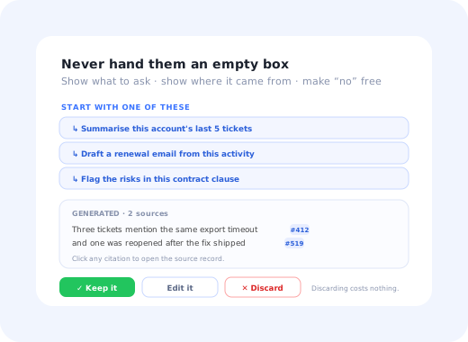
Almost every SaaS product shipped an AI feature in the last two years. A much smaller number can show you a chart where people kept using it. The usual shape is a spike on launch day, a second smaller spike when it got announced again, and then a long flat line at a few percent of active users, with a support queue full of "what is this for?" underneath.
The instinct is to blame the model. Usually it is not the model. AI features fail to get adopted for reasons that are specific to AI and largely unrelated to output quality: users cannot tell what the feature can do, cannot tell whether the answer is right, cannot predict what it will cost them, and cannot face a blank prompt box at the exact moment they are busy.
This guide is about that gap. It covers why AI features are harder to adopt than ordinary ones, the three-stage path a user has to walk before they rely on one, the patterns that move people along it, how to design for verification rather than for magic, and which metrics tell you the truth about an AI feature. For adoption mechanics that apply to any feature, start with our feature adoption guide; everything here sits on top of it.
Key Takeaways
- AI features carry a verification cost. Every output has to be checked, and if checking takes as long as doing the task, adoption stops at curiosity.
- The blank prompt is the biggest single drop-off. Users who are shown what to ask convert to first use far more readily than users handed an empty box.
- Adoption runs Try → Trust → Rely. Most products optimise the first stage and ignore the second, which is where the real loss happens.
- One bad output early is disproportionately expensive. Trust is asymmetric: it is built slowly and destroyed in a single interaction.
- Unclear cost kills usage quietly. If people cannot tell what a run costs in credits, money or time, the safe choice is not to press the button.
- Measure acceptance, not activation. Whether the output was kept, edited or thrown away says more than how many people clicked.
What AI Feature Adoption Actually Means
AI feature adoption, defined
AI feature adoption is the process by which users move from noticing an AI capability in your product to relying on it as part of how they work. It differs from ordinary feature adoption in one structural way: the user has to develop a working mental model of what the feature can and cannot do reliably, and that model can only be built through repeated experience of outputs they were able to verify. Until they have it, every use costs them extra effort, which is why AI features can have high trial rates and near-zero habitual use at the same time.
That last sentence is the whole problem in miniature. With a conventional feature, trying it and understanding it are roughly the same act: you click "export to CSV", you get a CSV, you now know what the button does forever. With an AI feature, a single successful run teaches you almost nothing about the next one, because the next input is different. Users need several successful, verifiable runs before the feature becomes predictable enough to use without thinking, and most products never keep them around long enough to get there.
Six Reasons AI Features Are Harder to Adopt
These are not model problems. Every one of them is a product design problem, and every one of them is fixable without touching the model.
-
1. The verification tax
A generated summary has to be read against the source. A generated query has to be checked before it runs. If verification costs as much as doing the work manually, a rational user stops using the feature, no matter how good it is.
-
2. The blank prompt
An empty text box asks the user to invent the use case, in their own words, before they have any idea what the feature is good at. It is the least helpful empty state in modern software.
-
3. Non-determinism breaks learning
People learn interfaces by repetition. When the same action produces different results, the usual learning loop does not close, and users cannot form the rule of thumb that makes a feature feel safe.
-
4. Invisible capability boundaries
Nothing in the interface tells the user what is inside the feature's competence. So they either ask for something impossible and conclude it is useless, or ask for something trivial and conclude it is pointless.
-
5. The professional risk of being wrong
If the output goes to a customer, a regulator or a colleague, the user owns the mistake, not the model. Anywhere the stakes are visible, adoption requires an obvious review step before anything leaves the building.
-
6. Unpredictable cost
Credits, tokens, seats, "fair use": if a user cannot tell what pressing the button costs, the risk-free choice is not to press it. Ambiguous pricing suppresses usage more quietly and more thoroughly than a high price does.
The asymmetry that governs everything else. Trust in an AI feature builds linearly and collapses instantly. Ten good outputs make a user slightly more willing; one confidently wrong output in a high-stakes moment ends the relationship with the feature more or less permanently. That asymmetry is why the first three runs matter more than the next three hundred, and why a conservative, well-scoped first experience beats an impressive but unreliable one.
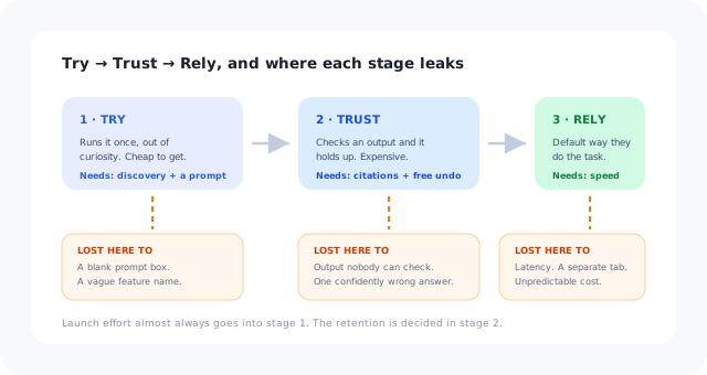
Most launches are optimised for the first stage. The money is lost in the second.
The Three Stages: Try, Trust, Rely
Ordinary feature adoption is usually modelled as awareness → activation → habit. AI features need a stage of their own inserted in the middle, because knowing how to use something and believing its output are different achievements.
The user runs it once. They need to know it exists, understand roughly what it is for, and have something concrete to ask. Lost here to: poor discovery, blank prompts, and vague naming.
The user gets an output they can check, and it holds up. They need visible sources, an easy comparison, and a safe way to reject the result. Lost here to: unverifiable output, no undo, one bad answer.
The feature becomes the default way they do that task. They need it to be where the work happens, fast enough not to break flow, and consistent enough to predict. Lost here to: latency, awkward placement, and inconsistency.
Almost all launch effort goes into Stage 1: announcements, banners, badges. Stage 2 gets no design attention at all, which is why trial numbers look healthy and retention of the feature does not.
Diagnosing which stage you are losing people at is straightforward: compare the share of active users who ever ran the feature (Stage 1), the share who ran it more than three times (Stage 2), and the share who used it in more than half of the relevant sessions (Stage 3). A healthy feature loses users at every stage; an unhealthy one has a cliff at exactly one of them.
Solving the Blank Prompt Problem
If your AI feature opens with an empty box and a friendly cursor, this section is probably worth more than the rest of the guide combined. The blank prompt is where the largest, cheapest gains are, and every fix is a content decision rather than an engineering one.
1. Replace the empty box with three real starting points
Not "Try asking me anything", three specific, clickable prompts drawn from what your users actually do, phrased in their language. The goal is to convert an open-ended creative task into a choice between three options, which is a far easier decision for a busy person.
2. Make the first run about their own data
A demo on sample data proves nothing and is forgettable. The same feature run against the user's own workspace is the moment the value becomes concrete, the AI equivalent of an aha moment. If it needs data to be useful, the first-run experience should say so plainly rather than producing an empty result.
3. Do the first one for them
The strongest pattern available: run the feature pre-emptively and show the result, with the prompt that produced it visible above. The user sees what to ask, sees what comes back, and learns the shape of the interaction without having composed anything.
4. State the boundaries in the interface
One line saying what the feature works well on (and, more usefully, what it does not) prevents the two failure paths at once. Users stop asking for the impossible, and stop assuming the trivial is all it can manage.
5. Keep the good prompts around
A visible history of what this user asked before, and a shared library of prompts that worked for their team, turns a one-off into a habit. It also quietly teaches new users what good input looks like in your product.
Designing for Verification, Not for Magic
The single most common design mistake in AI features is presenting output as a finished answer. It feels confident and demos beautifully, and it puts the entire verification burden on the user with no tools to carry it. Features that get adopted do the opposite: they make checking fast.
Link each claim to the record, document or row it came from. Verification then costs one click rather than a full re-read, which is the difference between a feature that gets used and one that gets admired.
When AI edits something the user wrote, show what changed rather than swapping the text. People accept edits they can see and reject edits they cannot.
An obvious undo, a "keep mine" option, and no penalty for declining. Cheap rejection is what makes trying feel safe in the first place.
The same logic applies to confidence. Hedging language on every output trains users to ignore it; silent confidence on everything trains them to over-rely and then get burned. The useful middle is structural: distinguish clearly between what was retrieved from their data and what was generated, because those two things deserve different levels of scrutiny and users are perfectly capable of applying them. Our guide to building user trust through design covers the broader signal set.
Eight Patterns That Drive AI Feature Adoption
| Pattern | What it does | Stage it helps |
|---|---|---|
| Put it where the work is | Surface the capability inside the screen where the task happens instead of in a separate "AI" tab that requires a decision to visit | Try, Rely |
| Suggested prompts, not an empty box | Three concrete starting points in the user's own vocabulary | Try |
| Pre-run the first result | Show output before any input is required, with the prompt visible | Try, Trust |
| Inline citations | Every claim links to its source record so checking costs one click | Trust |
| Accept / edit / reject | Three explicit outcomes rather than a silent overwrite, and each one is a usable signal | Trust |
| Visible, honest cost | What a run costs, and what remains, stated before the click rather than discovered after it | Try, Rely |
| Contextual introduction on the right screen | A hotspot or short tooltip triggered by the relevant state, not a global announcement banner | Try |
| Second-chance re-introduction | A single, targeted reappearance for users who tried once and stopped, with a different example than the first time | Trust, Rely |
Announcement is not adoption. The launch banner, the changelog post and the badge on the nav item all belong to Stage 1, and they are the part teams do well. If your AI feature has been announced three times and usage still is not moving, the problem is downstream of awareness and another announcement will not fix it. Our guide to announcing a new feature covers doing Stage 1 properly, once.
Metrics That Tell the Truth About an AI Feature
Standard adoption metrics flatter AI features badly, because curiosity inflates every top-of-funnel number. These six do not.
| Metric | Definition | What it exposes |
|---|---|---|
| First-run rate | Share of exposed users who complete one real run | Discovery and the blank-prompt problem |
| Acceptance rate | Share of outputs kept rather than discarded | Whether the output is actually useful, as judged by the user |
| Edit depth | How much of a kept output the user changed | The gap between "usable" and "right", a soft quality signal |
| Return rate after first use | Share who run it again within a fair window | The Try → Trust transition, and the single most diagnostic number here |
| Post-failure survival | Share who use it again after one rejected output | Whether rejection is cheap enough to be survivable |
| Share of task | Proportion of relevant tasks done with the feature | Genuine reliance, as opposed to occasional novelty use |
Feed these into whatever composite you already use; our product engagement score guide covers how to weight a new feature without letting it distort the overall number. And resist reporting "AI users" as a single count: a user who ran it once out of curiosity and a user who runs it eleven times a day are not the same thing, and averaging them hides the only interesting distinction.
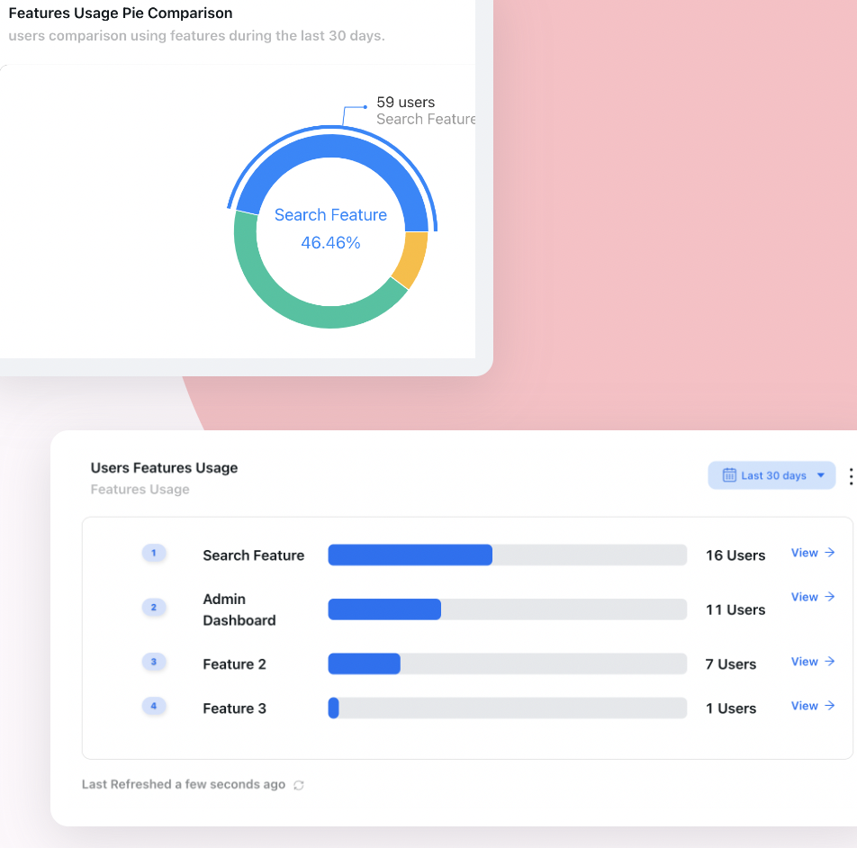
The bottom row is what an announced-but-unadopted feature looks like from the analytics side.
Rolling It Out Without Burning First Impressions
Because trust is asymmetric, the sequence of who sees an AI feature first matters more than it does for ordinary features. A staged rollout is not caution here; it is how you avoid spending your one chance at a first impression on the least forgiving audience.
- Ship first to the users whose workload the feature fits best, not to everyone at once.
- Give that group a way to report a bad output in one click, and read every report yourself for the first fortnight.
- Fix the top failure mode before widening, not the most interesting one, the most frequent one.
- Widen by segment, with the introduction adapted to what each segment actually does.
- Re-approach the users who tried once and stopped, exactly once, with a different example.
- Only then make it a default part of the workflow.
AI Feature Adoption: Do vs. Don't
✅ Do
- Offer three concrete prompts instead of an empty box
- Run the first one on the user's own data
- Cite sources so verification costs one click
- Show edits as a diff, never as a silent replacement
- State the cost of a run before the click
- Introduce it on the screen where the task lives
- Measure acceptance and return rate, not clicks
❌ Don't
- Hide the feature behind a separate "AI" tab
- Present generated output as a finished answer
- Overwrite the user's work without an undo
- Launch to your whole base on day one
- Announce it repeatedly instead of fixing Stage 2
- Add a hedging disclaimer to every single output
- Report one "AI users" number and call it adoption
Introducing AI Features Without an Engineering Release
Nearly everything above is a matter of what users see and when: which screen the feature is introduced on, which three prompts are offered, which segment sees it first, and what the users who tried once and stopped are shown next. Those are exactly the decisions that are painful to iterate on when each change needs a release.
Kompassify lets you build that layer over your product without touching the code: a hotspot on the screen where the capability is relevant, a two-step walkthrough that shows what to ask, a checklist that gets a team from first run to third, and a targeted re-introduction for the segment that tried it once and never came back. Each of those can be edited and republished the same day, so the introduction can be rewritten as fast as you learn what confused people. Kompassify is free up to 100 monthly active users, from $129/month on paid plans, GDPR-compliant and EU-hosted.
Get your AI feature past the launch-day spike
Introduce new capability on the screen where it matters, show users exactly what to ask, and re-approach the people who tried once, all without an engineering release. Free up to 100 monthly active users, plans from $129/month, GDPR-compliant and EU-hosted.
Start for free →The One-Paragraph Version
AI features fail to get adopted for reasons that have little to do with model quality: users cannot tell what to ask, cannot cheaply verify the answer, cannot predict what a run costs, and cannot afford to be wrong in front of a customer. Fix the blank prompt with three concrete starting points and a first run on their own data, make verification a one-click act with citations and diffs, make rejection free, state the cost up front, and introduce the feature on the screen where the work happens rather than in a separate tab. Then measure acceptance rate and return-after-first-use instead of clicks, because those are the two numbers that know whether anyone actually trusts it.
Frequently Asked Questions
What is AI feature adoption?
AI feature adoption is the process by which users move from noticing an AI capability in your product to relying on it as part of how they work. It differs from ordinary feature adoption in one structural way: the user has to build a working mental model of what the feature can and cannot do reliably, and that model can only form through repeated experience of outputs they were able to check. Until they have it, every use costs extra effort, which is why AI features frequently show high trial rates and near-zero habitual use at the same time.
Why do users try an AI feature once and never come back?
Usually because the second use is more expensive than the first. The first run is powered by curiosity, which is free. The second requires the user to decide the feature is worth the verification effort, and that decision fails when the output cannot be checked cheaply, when the user cannot predict what the feature is good at, when a run has an unclear cost in credits or time, or when the first output was confidently wrong. Trust in AI features builds slowly and collapses in a single interaction, so one bad early answer is disproportionately expensive.
How do you fix the blank prompt problem?
Stop asking the user to invent the use case. Replace the empty box with three concrete, clickable prompts drawn from what your users actually do and phrased in their vocabulary. Make the first run operate on the user's own data rather than a sample, since that is where the value becomes real. Where you can, run it pre-emptively and show the result with the prompt that produced it visible above, so the user learns the shape of the interaction without composing anything. Add one line stating what the feature is and is not good at, and keep a visible history of prompts that worked.
What metrics should I track for an AI feature?
Six, none of which are click counts. First-run rate shows whether discovery and the blank prompt are working. Acceptance rate, the share of outputs kept rather than discarded, shows whether the output is useful as judged by the user. Edit depth shows the gap between usable and right. Return rate after first use is the most diagnostic single number, because it captures the Try to Trust transition. Post-failure survival shows whether rejecting an output is cheap enough to be survivable. Share of task shows genuine reliance rather than novelty use.
Should AI features live in their own tab?
Almost never. A separate AI tab requires the user to make a decision to go there, which means the feature only ever gets used by people who already believe in it. Surfacing the capability inside the screen where the task actually happens removes that decision entirely and puts the feature in front of people at the moment it is relevant. The separate-tab pattern also encourages treating AI as a product category rather than as a way of doing an existing job faster, which is usually the wrong framing for adoption.
How do you design AI output that users trust?
Make checking fast rather than making the answer look confident. Cite sources inline so verification costs one click instead of a full re-read. When the feature edits something the user wrote, show a diff rather than silently replacing the text; people accept edits they can see and reject edits they cannot. Make rejection free with an obvious undo and a keep-mine option. And distinguish structurally between what was retrieved from the user's own data and what was generated, because those deserve different levels of scrutiny and users are perfectly capable of applying them.
Why isn't announcing the AI feature enough?
Because announcement only addresses the first of three stages. Banners, changelog posts and nav badges get people to try something once, and most teams do that part well. The loss happens at the second stage, where the user has to decide whether the output can be trusted, and no amount of additional announcement affects that decision. If a feature has been announced three times and usage still is not moving, the problem is downstream of awareness; look at verification cost, first-run quality and where the feature sits in the workflow instead.
Should you roll an AI feature out to everyone at once?
No, and the reason is specific to AI rather than general caution. Because trust collapses on a single bad interaction, a broad launch spends your one first impression on your least forgiving users simultaneously. Ship first to the group whose workload the feature fits best, give them a one-click way to report a bad output, read every report for the first fortnight, fix the most frequent failure mode rather than the most interesting one, then widen by segment with the introduction adapted to what each group does. Re-approach the people who tried once and stopped exactly once, with a different example.