Most users who stall in onboarding are not confused. They know the calendar integration exists, they meant to invite their team, and they saw the template gallery on day one. They simply did not do it, because it was not the easiest thing to do at that moment, or it was not visible when it mattered, or it could wait until tomorrow. Tomorrow rarely comes.
That gap between intention and action is where digital nudges work. A nudge does not add an option, remove one, or pay the user to pick one. It changes the context around a choice so that the action a user already wants to take becomes easier, more visible or better timed. A preselected template, a checklist that starts two steps in, a hotspot on the one button that matters: each of these is a nudge.
Every interface already nudges, whether anyone designed it to or not. The order of the options, the setting that is on by default, what is large and what is grey all push people somewhere. This guide is about doing it on purpose: what a digital nudge is and where the idea comes from, the eight types that work inside a SaaS product, a three-question test that separates a nudge from a dark pattern, a six-step method for designing one, and how to tell whether it changed anything.
Key Takeaways
- A nudge changes the context of a choice, not the choice. Every option stays available, and ignoring the nudge costs the user nothing.
- Users rarely stall for lack of information. They stall on effort, attention and timing, which is exactly what nudges address.
- Match the nudge to the barrier. A reminder will not fix a step that is too hard, and a shorter step will not fix one nobody noticed.
- The line between a nudge and a dark pattern is testable. Ask whose goal it serves, whether it survives being noticed, and whether no is as easy as yes.
- Measure the behaviour, not the nudge. Clicks on a tooltip mean nothing if the target action does not rise against a holdout group.
What Is a Digital Nudge?
Digital nudge: definition
A digital nudge is a change to a software interface that makes one choice easier, more noticeable or better timed, in order to steer users toward a behaviour, without removing any option or changing its cost. Ignoring it is free. Inside a SaaS product, digital nudges usually take the form of defaults, highlights, well-timed tooltips, progress indicators and short prompts placed exactly where a decision is made.
The idea comes from behavioural economics. Richard Thaler and Cass Sunstein popularised it in their 2008 book Nudge, which showed that the way a choice is presented (what they called choice architecture) predictably changes what people choose, even when the options themselves stay the same. The classic examples are physical: fruit placed at eye level in a canteen, or employees enrolled in a pension plan by default while remaining free to opt out. Researchers in information systems later applied the same thinking to screens, and the term digital nudging stuck.
Software is a natural home for nudges because every screen is choice architecture. Someone decided which option is selected when the page loads, which button is blue, and whether the invite prompt appears on day one or day ten. Four properties separate a deliberate nudge from an ordinary design decision.
Nothing is hidden, locked or made more expensive. A required setup step is a mandate, not a nudge.
Dismissing it takes one click or none. Once avoiding it takes effort, it has become a push.
A nudge exists to make a specific action more likely. A generic “Explore our features” banner is decoration.
A help article is information users have to go and find. A nudge sits where the decision actually happens.
Why Onboarding Needs Nudges, Not More Information
The usual response to low adoption is more explanation: a longer tour, a better help centre, another onboarding email. It helps less than expected, because most users who skip a valuable step already know it exists. The barriers are behavioural, and behavioural science has names for the common ones.
| Barrier | What it looks like in a SaaS product | What helps |
|---|---|---|
| Present bias | “I’ll connect our data later, once I’ve looked around.” Later never arrives. | A smaller first step, offered at the moment motivation is highest |
| Status quo bias | Users keep whatever settings, templates and workflows they started with, even poor ones. | Defaults chosen deliberately, because most people never change them |
| Limited attention | The feature that solves their problem is one menu away, and nobody looks there. | One salient cue on the next step, shown in context |
| Choice overload | Twelve templates on offer, so the user picks none and starts from blank. | One recommended option, with the rest a click away |
| Ambiguity aversion | “What happens if I import the wrong file?” So nothing gets imported. | Say what happens next and how to undo it |
None of these is solved by telling users more. They are solved by changing what is easy, what is visible and when things appear. It is also why long product tours so often fail: they add information at a moment when the user has no decision to make. The cost of piling on explanation is covered in our guide to cognitive load in onboarding.
8 Types of Digital Nudges, With In-App Examples
Each type pairs a behavioural mechanism with the in-app surface that usually delivers it. Most products need three or four of them, applied to the two or three behaviours that predict retention, rather than all eight scattered everywhere.
- Smart defaults
- Salience: making the next step stand out
- Just-in-time prompts
- Progress and commitment
- Social norms
- Friction removal
- Feedback
- Planning prompts and reminders
1. Smart defaults
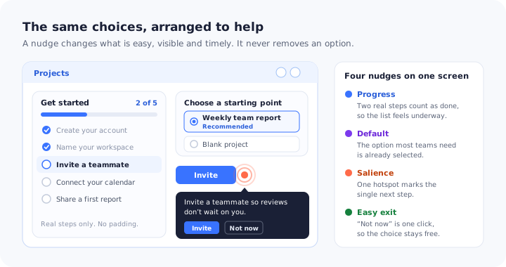
People keep what they are given. Preselect the template, setting or option that your most successful customers end up choosing: the recommended project template already selected, weekly summary emails switched on for team leads, the most common integration listed first. Because the majority never revisit a default, this is the most powerful nudge in any product, and the one most often chosen by accident by whoever happened to build the form.
One firm limit: defaults must never be used for consent. Marketing emails, data sharing and anything that costs money have to be opt-in, and under GDPR a pre-ticked box is not valid consent. The details are in our guide to GDPR and user onboarding.
2. Salience: making the next step stand out
Attention is the scarcest resource in a new account. A salience nudge makes one element visibly different from everything around it so the eye lands there first: a pulsing hotspot beside the button that creates a first project, a subtle highlight on an unused tab, a small badge on a menu item that was just added. The rule is one at a time. Three pulsing dots on the same screen are not salient, they are noise, and users quickly learn to ignore all of them. The pattern is covered in depth in our guide to UX hotspots.
3. Just-in-time prompts
The same message lands or fails depending on when it appears. A tooltip about scheduled exports is irrelevant on day one and genuinely useful the third time someone manually downloads the same report. Just-in-time prompts are triggered by what the user is doing rather than by how long ago they signed up: opening a screen for the first time, repeating a manual task, reaching a limit, finishing a related step. Timing deserves its own design work, and our guide to onboarding triggers covers the options and how to choose between them.
4. Progress and commitment
People want to finish what they have started. An onboarding checklist that counts the steps a user has genuinely completed, such as creating the account and naming the workspace, opens at two of five rather than zero of three, and a list that already feels underway gets finished more often than one that looks untouched. Asking users to choose a goal at signup works in a similar way: having said they want to run weekly team reviews, people are more inclined to take the steps that lead there. The psychology behind this, including the endowed progress and Zeigarnik effects, is covered in our guide to onboarding progress bars.
Count only real progress. A bar that jumps to 40% for nothing, or a list padded with trivial ticks, works once and then teaches users that your progress indicators cannot be trusted.
5. Social norms
When people are unsure, they look at what others like them do. “Most teams on your plan start with the weekly report template” gives a hesitant user a reason to act that is not simply the product telling them to. In B2B it works best when the comparison group is specific: the same role, a similar team size, the same use case.
The norm has to be true, and you should be able to show where the number comes from. An invented norm is not a nudge but a fabrication, and in a product that holds customers’ data it is an expensive way to lose their trust.
6. Friction removal
The most underrated nudge is simply making the target action shorter. A tooltip that says “Connect your calendar in Settings” is a sign; a tooltip with a button that opens the calendar connection directly is a door. Prefill what you already know, link each prompt straight to the place where the action happens, collapse three screens into one, and let users skip optional fields until later. Every step removed between intention and action is worth more than a more persuasive sentence. Our guide to user friction covers how to find the steps that cost the most.
7. Feedback
An action that produces no visible result rarely gets repeated. Feedback nudges confirm what just happened and what it achieved: “Report scheduled. Your team will receive it every Monday at 9:00”, or a first dashboard that fills with the data the user has just imported. This is the nudge that turns a one-off action into a routine, and it is often missing entirely from setup flows that end on a generic “Success!” message.
8. Planning prompts and reminders
Some steps genuinely cannot happen now: the admin who needs sign-off from IT, the user who first has to find last year’s data export. A planning prompt accepts that and captures the intention instead of losing it: “Not ready to import yet? Choose when we should remind you.” The reminder then arrives at the time the user picked, pointing straight at the step. A reminder the user scheduled themselves carries a commitment that a reminder sent at a time they did not choose does not.
The eight types at a glance:
| Nudge | Mechanism | Typical in-app surface | Use it when |
|---|---|---|---|
| Smart default | Status quo bias | Preselected option or template | Most successful users make the same choice |
| Salience | Limited attention | Hotspot, highlight, badge | The next step exists but goes unnoticed |
| Just-in-time prompt | Relevance in the moment | Tooltip triggered by behaviour | A feature only makes sense in a specific context |
| Progress and commitment | Endowed progress, goal commitment | Checklist, progress bar, goal question | Setup has several steps that users abandon midway |
| Social norm | Social proof | One line of copy inside a prompt | Users hesitate and a true peer comparison exists |
| Friction removal | Ease | Direct link, prefill, one-click action | Users intend to act but the path is long |
| Feedback | Reinforcement | Confirmation that shows the result | An action has to be repeated to become a habit |
| Planning prompt | Intention capture | Prompt with a reminder time the user picks | The step genuinely cannot happen right now |
Nudge or Dark Pattern? A Three-Question Test
The mechanisms that make nudges work are exactly the ones that make dark patterns work. A default can preselect the useful template or the annual plan nobody asked for. Social proof can report a real norm or invent one. Urgency can remind someone that their trial ends tomorrow or pretend it ends in ten minutes. What separates the two is not the technique. It is who the design serves, and whether it depends on the user not noticing.
Run every proposed nudge through the same three questions. Only three yeses make it a nudge.
1. Is it toward a goal the user already has?
The goal should belong to the user, stated at signup or visible in what they are trying to do, not to your quarterly plan. Nudging a new user who has just created a project toward inviting the colleague they mentioned is help. Nudging every user toward an upgrade prompt on day two is a sales message. Sales messages are allowed, but they should look like offers rather than guidance. The commercial side of this is covered in our guide to in-app upsell prompts.
2. Would it still work if users saw how it works?
A good nudge survives being noticed. A user who realises the recommended template is preselected because most teams like theirs use it shrugs and carries on. A user who realises the “3 people are viewing this plan” counter is random, or that the decline link was made tiny and grey on purpose, feels tricked, and is right to. If a design only works while it stays hidden, it is manipulation.
3. Is saying no as easy as saying yes?
Declining should take one click and carry no guilt. Close buttons that are hard to find, tours that cannot be skipped, decline links written as “No, I don’t like saving time” (usually called confirmshaming), and cancellation flows that take five screens when signing up took one all fail this question. Friction deliberately added to the path a user wants to take has its own name, sludge, and it is best understood as the nudge in reverse.
Six onboarding dark patterns to remove first
A tour with no way out turns guidance into a toll booth. Every step should have a visible exit.
Bars that jump for nothing, or checklists padded with trivial ticks, teach users that your indicators lie.
Marketing emails or data sharing switched on by default. Not a nudge, and not valid consent under GDPR.
Decline copy written to make people feel foolish for saying no to an offer.
Countdown timers and “today only” offers that quietly reset on the next visit.
Upgrading takes one click, while downgrading or cancelling takes a support ticket.
Regulators have noticed. Deceptive interface design is no longer only a trust problem. The EU’s Digital Services Act prohibits online platforms from designing interfaces that deceive or manipulate their users, and consumer-protection authorities on both sides of the Atlantic have acted against subscription traps and hidden opt-outs. A nudge that passes all three questions is not only more respectful. It is also the safer design.
For the wider picture of how small interface decisions build or spend trust, see our guide to building user trust. For the related question of when a habit loop becomes manipulative, see the manipulation section of our guide to the Hook Model.
How to Design a Digital Nudge in 6 Steps
Good nudges start from a behaviour and a barrier, not from a surface. Teams that start with “let’s add a tooltip” end up with tooltips; teams that start with the behaviour end up with the right intervention, which is sometimes a tooltip and sometimes a shorter form.
1. Pick one behaviour that predicts retention
Start from an action, not a screen. The best candidates are the things retained customers did early and churned customers did not: inviting a colleague, connecting a data source, sharing a first report. “Increase engagement” is not a behaviour; “create a second project within seven days” is. If you have not yet identified yours, our guide to increasing user activation shows how to find the actions that matter.
2. Find where intention turns into inaction
Look for the point where users who clearly meant to act stop: the integration screen opened and abandoned, the invite dialog closed without sending, the import started and never finished. Funnel data shows where it happens; a handful of short conversations shows why. Our guide to the onboarding funnel covers how to locate the drop-off precisely.
3. Name the barrier before choosing the nudge
The barrier decides the nudge. If users never saw the step, the problem is attention: use salience. If they saw it and it was too long, the problem is effort: remove friction. If they were not ready, the problem is timing: use a just-in-time prompt or a planning prompt. If they were unsure what would happen, the problem is ambiguity: say what happens next and how to undo it. Choosing a nudge before naming the barrier is how teams end up adding a reminder to a step that was simply too hard.
4. Use the smallest surface that works
Escalate only when the smaller option has failed. A hotspot interrupts less than a tooltip, a tooltip less than a banner, and a banner less than a modal. Most nudges belong in the first two. A modal that blocks the screen to suggest an optional step has stopped being a nudge, because ignoring it is no longer free. Our guide to in-app banners covers when a banner is the right level and when a modal is justified.
5. Write it as an offer, with an easy exit
One sentence on what the user gets, one button that performs the action, and a plain “Not now”. Lead with the user’s goal rather than the feature name: “Invite a teammate so reviews don’t wait on you” rather than “Try our collaboration features”. Give the decline option the same size and tone as the accept, and make sure a dismissed nudge stays dismissed. Our guide to UX microcopy has patterns for prompts and buttons.
6. Test it against a holdout group
Show the nudge to most eligible users and hold it back from a random slice, then compare the target behaviour between the two groups. Without a holdout, any rise could be seasonality, a marketing campaign or the release that shipped the same week. Our guide to A/B testing onboarding covers how big the groups need to be and how long to run the test.
How to Measure Whether a Nudge Worked
A nudge is an intervention with a single purpose, which makes it easier to measure than most onboarding work, as long as you measure the behaviour it targets rather than the nudge itself.
| Signal | What it tells you |
|---|---|
| Target behaviour rate, nudged vs. holdout | Whether the nudge caused the action at all |
| Time to behaviour | Whether users act sooner, even if the same share eventually act |
| Behaviour repeated after 30 days | Whether it became a habit or stayed a one-off click |
| Dismissal rate | Whether the nudge is reaching the wrong users or the wrong moment |
| Opt-outs, complaints and churn in the nudged group | Whether it helped the metric but hurt the relationship |
| Clicks and completion on the nudge itself | Where the nudge loses people (useful for tuning only) |
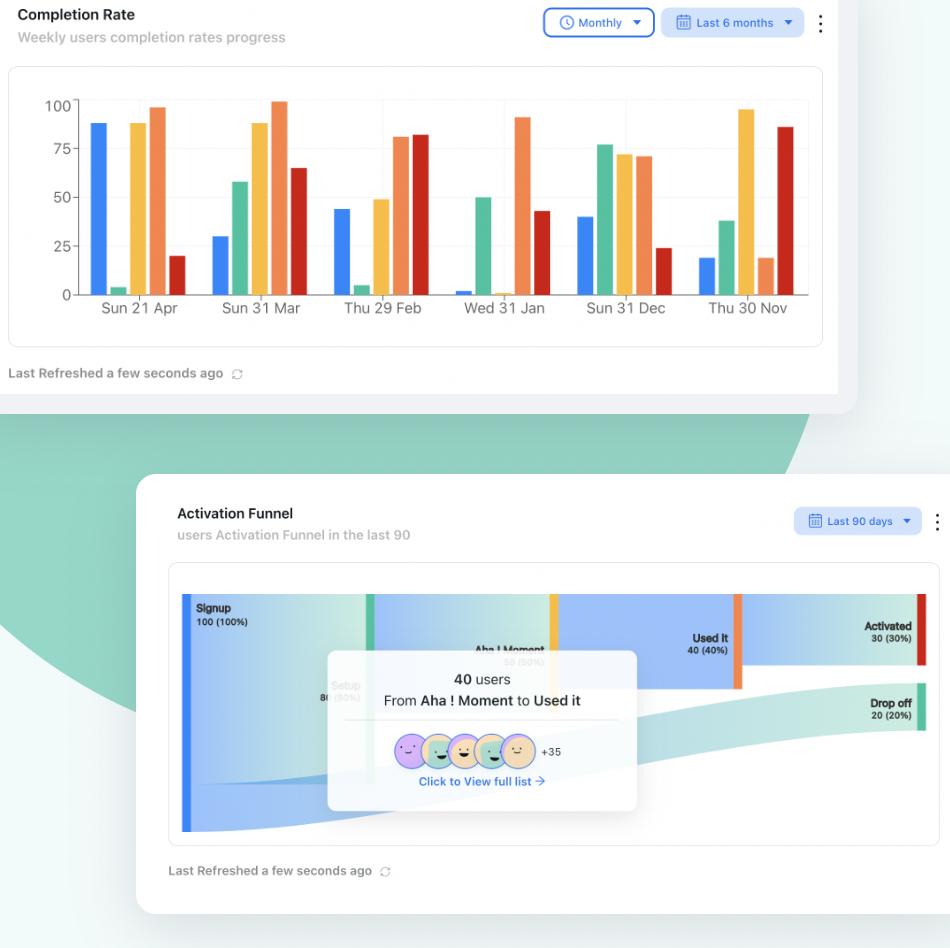
Point a nudge at the step where the funnel narrows, then check that the next stage grows for nudged users and not just the click count.
Clicks are not the result. A tooltip that plenty of users click but that does not move the target behaviour against the holdout is decoration with good numbers. Remove it, or go back to step three and check whether you named the right barrier.
Watch the backfire signals as closely as the gains. A nudge that lifts the target action by nagging can still cost more in dismissals, ignored guidance and quiet churn than it earns. For the full set of onboarding measures and how they relate, see our guide to user onboarding metrics.
Digital Nudges: Do vs. Don’t
✅ Do
- Nudge toward the user’s goal, not your target
- Match every nudge to a named barrier
- Preselect the option successful users choose
- Make one element salient per screen
- Link each prompt straight to the action
- Make “Not now” as visible as “Yes”
- Count only real progress
- Test every nudge against a holdout
❌ Don’t
- Use defaults to collect consent
- Pulse three hotspots at once
- Invent a social norm or a deadline
- Block the screen for an optional step
- Shame users who decline
- Pad a checklist with trivial ticks
- Show a nudge again after it was dismissed
- Judge a nudge by its click-through rate
Building In-App Nudges With Kompassify
Most of the nudges in this guide are not product features. They are a thin layer on top of the product you already have: a highlight here, a prompt there, a checklist that counts what is already done. It is also the layer you will want to change every week as you learn which nudges work, which is exactly why it should not sit in a release queue.
With Kompassify you build that layer visually, without code. Add a hotspot to make the single next step salient, and anchor tooltips to the exact control with a button that takes users straight to the action. Build an onboarding checklist that shows real progress, and ask a multi-choice question at signup so users can name their goal and receive the guidance that matches it. Use a slim banner for gentle, dismissible reminders, and short product tours for the moments that need more than one step. Target each nudge by page and user segment so it only reaches the people it is meant for, and publish a change the same day you decide to make it.
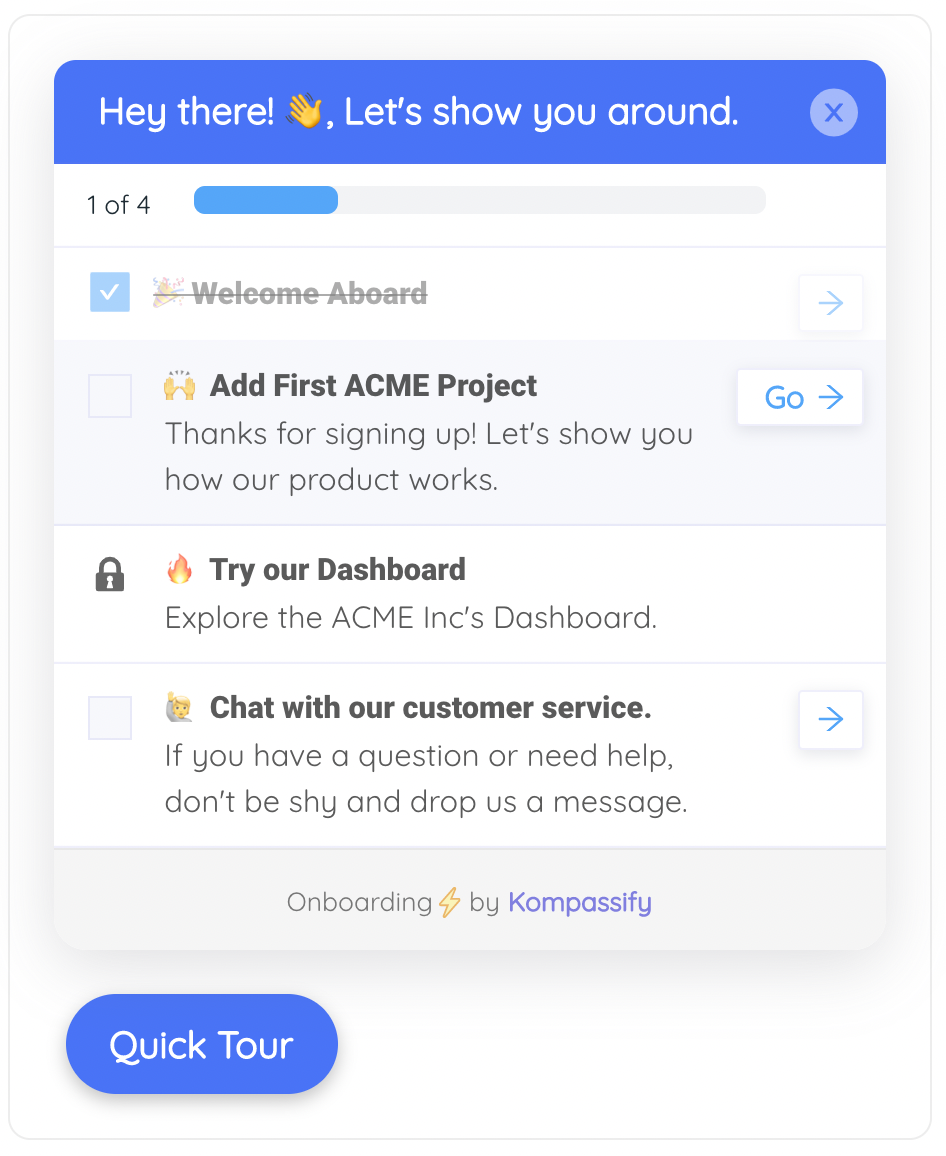
Three nudges in one widget: real progress already counted, a Go button that is a door rather than a sign, and a later step locked until the earlier ones are done.
Measurement sits alongside the guidance. Per-step completion shows where a nudge or tour loses people, and product analytics shows whether the target behaviour is actually rising for the users who saw it.
Nudge users toward the actions that matter
Add hotspots, tooltips, checklists and goal questions to your live product, target them by segment and see which ones change behaviour. No code required. Free up to 100 monthly active users, plans from $129/month, GDPR-compliant and EU-hosted.
Start for free →The One-Paragraph Version
A digital nudge changes the context of a choice, not the choice: it makes one action easier, more visible or better timed without removing any option, and ignoring it costs nothing. Nudges work in onboarding because users rarely stall for lack of information; they stall on present bias, status quo bias, limited attention, choice overload and ambiguity. The eight types that work inside SaaS products are smart defaults, salience, just-in-time prompts, progress and commitment, social norms, friction removal, feedback, and planning prompts. The same mechanisms power dark patterns, so test every nudge with three questions: does it serve a goal the user already has, would it still work if they saw how it works, and is saying no as easy as saying yes. Design each one by picking a behaviour that predicts retention, finding where intention breaks, naming the barrier, choosing the smallest surface and writing it as an offer, then measure the target behaviour against a holdout group rather than clicks on the nudge.
Frequently Asked Questions
What is a digital nudge?
A digital nudge is a small change to a software interface that makes one choice easier, more noticeable or better timed in order to steer users toward a behaviour, without removing any option or changing its cost. Common examples in SaaS products are a preselected recommended setting, a hotspot on the next step, a tooltip triggered at the right moment and an onboarding checklist that shows real progress. Ignoring a nudge costs the user nothing.
What are examples of digital nudges in apps?
A recommended template selected by default, a pulsing hotspot beside the button that creates a first project, a tooltip about scheduled reports that appears after someone downloads the same report by hand for the third time, a checklist that counts the steps already completed, a prompt with a button that opens the calendar connection directly, a confirmation that shows what an action achieved, and a planning prompt that lets users choose when to be reminded about a step they cannot do yet.
What is nudge theory in UX design?
Nudge theory comes from behavioural economics and was popularised by Richard Thaler and Cass Sunstein in their 2008 book Nudge. It holds that the way choices are presented, which they called choice architecture, predictably influences what people choose even when the options stay the same. In UX design it means deliberately choosing defaults, order, visual emphasis and timing so that the choice that serves the user is also the easiest one to make.
What is the difference between a nudge and a dark pattern?
Both use the same behavioural mechanisms. A nudge moves users toward a goal they already have, still works when they understand how it works, and makes declining as easy as accepting. A dark pattern serves the company's goal at the user's expense, depends on the user not noticing, or makes saying no harder than saying yes, for example through hidden close buttons, invented urgency, pre-ticked consent or guilt-tripping decline copy.
Are digital nudges ethical?
They can be, and every interface nudges anyway through its defaults and layout. A nudge is ethical when it serves a goal the user holds, is transparent enough to survive being noticed, and leaves every option equally easy to choose. It becomes unethical when it relies on concealment, pressure or friction added to the path the user wants to take. Defaults should never be used to obtain consent.
What is sludge in UX?
Sludge is friction deliberately added to the path a user wants to take, such as a cancellation flow that needs several screens and a support ticket when signing up took one click, or an opt-out buried deep in settings. It is often described as the nudge in reverse: instead of making the helpful choice easier, it makes the choice the user actually wants harder.
How do you measure whether a nudge works?
Compare the target behaviour between users who saw the nudge and a randomly held-back group who did not. Also track how quickly users act, whether the behaviour is repeated after 30 days, how often the nudge is dismissed, and whether opt-outs, complaints or churn rise in the nudged group. Clicks on the nudge itself help you tune its copy and timing but do not show whether it changed behaviour.