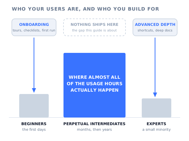
Open your product analytics and pick a customer who has been paying for a year. Look at what they actually do. There is a good chance they touch a handful of screens out of the dozens you have shipped, always in the same order, always at the same time of day. They have never opened the bulk editor. They export to a spreadsheet every Friday to do something your filters already do. When they hit a problem they message the one colleague who set the account up.
That customer is not a beginner. They have been using the product for a year and they are good at the part they use. They are also not an expert, and they never will be. They are a perpetual intermediate, and so is almost everybody else paying you.
The interaction designer Alan Cooper gave this population its name, and made the observation that follows from it: software teams design for the two ends of the skill range and ignore the middle, even though the middle is where nearly all of their users live and nearly all of the hours are spent. Onboarding is built for a state people leave within a week. Advanced depth is built for a few percent who would have found it anyway. The people in between get a changelog they do not read and a help centre they visit only when something has already gone wrong.
This guide covers what a perpetual intermediate is, why the beginner stage is so short and expertise so rare, what the middle costs you in renewal, expansion and support volume, the four jobs intermediates have that onboarding never covers, how to find them in your own data with two numbers, eight ways to design in-app guidance for them, the traps at either end of the range, and what to measure.
Key takeaways
- A perpetual intermediate is a user who learned enough of your product to do their job and then stopped. It is not a stage on the way to expertise. For most users it is the destination.
- The beginner state lasts days, because nobody wants to stay in it. Expertise stays rare, because most users have no reason to acquire it. The middle is permanent by default.
- Guidance budget goes to the two ends: welcome tours for week one, shortcuts and deep docs for the top few percent. The population in the middle is the one with no plan.
- Intermediates have four recurring jobs onboarding never covers: resuming after a gap, doing an occasional task, adopting something that shipped after they joined, and getting unstuck.
- Find them with two numbers per user, breadth and frequency. Serve them with guidance that can be entered at the moment of need instead of at signup: a tooltip on the control, a tour triggered on the page where the task starts, a checklist that stays available, an announcement where the change is.
What Is a Perpetual Intermediate? (Meaning and Definition)
Perpetual intermediate: definition
A perpetual intermediate is a user who has learned enough of a product to complete their own work and then stops learning, remaining at that level for as long as they use the product. They are past the point where onboarding is relevant and nowhere near the point where advanced material is. The term was named by the interaction designer Alan Cooper, whose argument was that this group, not beginners and not experts, should be the primary design target for most software.
The word that does the work in that definition is perpetual. Everybody accepts that users pass through an intermediate stage. The uncomfortable part is that for most people it is not a stage at all. There is no natural force pushing a competent user towards mastery. Once the product does the job they came for, the pressure that drove the first burst of learning is gone, and the learning stops with it.
It helps to be precise about what intermediate does not mean. It is not a measure of intelligence, of technical confidence, or of how much someone likes your product. Some of your most loyal, highest-paying, most vocal customers are perpetual intermediates. It is also not the same thing as being a light user: a perpetual intermediate can be in your product for three hours every day, doing the same four things extremely well.
What it does mean is narrow, confident competence. They know a path. They do not know the product. And because the path works, they have no reason to find out what else is there.
Why the Beginner Stage Is Short and Expertise Stays Rare
The three groups are not three equal thirds, and they are not a funnel where everyone advances one stage at a time. They behave very differently, and the reason the middle is so crowded is that the states on either side of it are unstable for opposite reasons.
Nobody wants to be a beginner, so nobody stays one
Being a beginner is uncomfortable. You do not know the words, you are slow, you are afraid of breaking something, and you may have to ask for help in front of colleagues. Users work hard to leave that state as fast as possible, and they leave it in one of two directions: they get competent enough to stop feeling like a beginner, or they give up and stop using the product. Either way the state is measured in days, not months. Our guide to learnability covers how the speed of that first climb is the part you can actually influence.
This is why activation work pays: it decides which of the two exits people take. It is also why activation work alone is not enough. It optimises the shortest phase of the whole relationship.
Becoming an expert requires a reason, and most users do not have one
Expertise costs time, and time spent learning a tool is time not spent doing the work the tool exists for. People pay that cost when something makes it worth paying: the product is the centre of their working day, their performance is judged on how well they use it, they are the person colleagues ask, or they simply enjoy it. That describes a small minority of any user base. For everyone else your product is one of a dozen tools they touch between other commitments, and the incentive to go deeper never appears.
This is the same force described by the paradox of the active user: users optimise for finishing the task in front of them, not for becoming good at the software. The paradox explains the behaviour in a single session. Perpetual intermediacy is what that behaviour adds up to over two years.
The middle is what is left, and it never empties
If the bottom state drains in days and the top state only fills for people with a specific reason, the middle accumulates everyone else and keeps them. New users arrive and join it within a week. Almost nobody leaves it upward. The only real exit is churn.
Expertise is bought in the first few days and then barely moves. Every moment that follows is a moment your onboarding was never designed to reach.
Read that timeline as a budget question rather than a UX one. Every moment marked on it is a moment where the user needed something from you, and every one of them happens long after your onboarding stopped running.
The Hourglass Problem: Where Guidance Budget Actually Goes
Draw two shapes for your own product. The first is the population: a thin sliver of beginners, a very wide middle, a thin tail of experts. The second is where your guidance effort goes: heavy at the start, heavy at the expert end, and almost nothing in between. The two shapes are close to opposites, which is why the middle feels so quietly neglected without anyone ever deciding to neglect it.
It happens for understandable reasons. First-run experience has an obvious owner and an obvious metric, so it gets built and rebuilt. Advanced material gets built because the users who ask for it are the loudest and the most engaged, and because it feels like a reward for your best customers. The middle asks for nothing. It does not complain in the community, it does not churn dramatically, and it does not fail any metric on a dashboard. It just quietly uses a small corner of what you sell it.
The rule of thumb worth adopting: if a piece of guidance can only be met in a user's first week, it serves the shortest phase of the relationship. Anything you build for the middle keeps paying for years, because the middle is where the years are.
The practical consequence is not that onboarding matters less. It is that the guidance layer should not retire when onboarding ends. The same mechanisms that walk a new user to their first result, tours, tooltips, checklists and announcements, are the mechanisms that serve month nine. The difference is what triggers them and what they say.
Six Things That Are True About Perpetual Intermediates
You can recognise this group without a research programme. Each of these traits leaves a trace in data you already collect, and each one points at a different fix.
They learned one route through the interface and repeat it. Anything not on that route is invisible to them, including things that would save them an hour a week.
They cannot ask for a feature they have never met, so they never do. Silence from this group is not satisfaction, it is a lack of information. See our guide to feature discovery.
For anything they do monthly or quarterly, each attempt is close to a first attempt. They relearn the same task several times a year and nobody counts those attempts.
A single bad experience with a screen is usually enough to retire it permanently. The workaround they invented that day becomes the way they work forever.
They do not open documentation for a question that takes ten seconds of guessing. They will read one sentence if it appears next to the control they are staring at.
Most of what they know came from watching a colleague, not from you. When that colleague leaves, the account's knowledge of your product leaves with them.
Put those six together and a picture emerges that is very different from the one most onboarding programmes assume. The intermediate is not under-motivated or under-informed in general. They are precisely informed about a narrow slice and completely uninformed about the rest, and no amount of welcome-flow polish changes that, because the welcome flow ran before any of it mattered.
What the Middle Costs You
This is not a design nicety. A base of narrow, competent, permanently incurious users produces four specific commercial problems, and they tend to show up in that order.
Renewal rests on one workflow
A customer who uses one part of your product has exactly one reason to keep paying. If that workflow changes, if the person who runs it leaves, or if a cheaper tool does that one thing, there is nothing else holding the account. Breadth of use is one of the more reliable components of a customer health score for exactly this reason: it measures how many reasons the customer has to stay.
Expansion never starts
Expansion revenue usually comes from a second use case, a second team, or a higher tier that unlocks something the customer now wants. None of that happens if the customer never learns that the second use case exists. Upgrades are not blocked by price here, they are blocked by ignorance, and a pricing page cannot fix it.
Roadmap effort disappears into features nobody meets
Every feature you ship after a customer's first month arrives for an audience who has already stopped exploring. Without something that puts it in front of them, adoption is limited to the people who happen to stumble across it. That is how products accumulate feature bloat: not by building the wrong things, but by building things that were never introduced to anyone.
Support carries a pile it cannot shrink
A predictable share of your ticket volume is not defects and not configuration. It is competent users who cannot find a button, or who forgot how a screen works since the last time they used it. More support headcount answers those faster; it does not reduce them. The only thing that reduces them is an answer that appears in the product at the moment the question forms, which is the argument in our guide to in-app support.
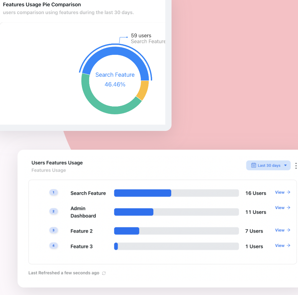
Feature usage side by side is the fastest way to see the shape of the problem: a couple of features carry everything, and the rest of the product is met by almost nobody.
None of these four problems looks like a guidance problem on a dashboard. They look like a churn problem, a pricing problem, a roadmap problem and a staffing problem. Underneath, they are all the same thing: a user base that stopped learning in week one and was never given a reason or a way to start again.
The Four Jobs Onboarding Never Covers
Intermediates are not guidance-free because they need nothing. They are guidance-free because what they need arrives on a different schedule from the one your onboarding runs on. Four situations come back again and again, for every user, for as long as they stay a customer.
| The job | When it happens | What the user needs | What fits |
|---|---|---|---|
| Resume after a gap | After a holiday, a busy quarter, parental leave, a seasonal lull | Re-orientation and a summary of what changed, not a lesson | A short welcome-back flow and an announcement digest |
| Do the occasional task | Monthly close, quarterly reporting, annual renewal setup, an audit | The steps, once, at the moment the task starts | A tour triggered on the page where that task begins |
| Adopt something new | Every release after the user's first month | A reason to care, then a guided first run | An announcement that can launch the tour for it |
| Get unstuck | Any session, without warning | One answer, at the control that raised the question | A tooltip or hotspot on the element itself |
If those four look familiar, it is because they map onto the workflow half of the 5 moments of need: applying something, solving a problem, and coping with change. A user meets a feature as new exactly once. They apply it, forget it, and relearn it for years. Onboarding addresses the one moment; these four are the rest of the lifetime.
Notice also what none of the four asks for. None of them wants a product tour of the whole interface. None of them wants a video library. They want a small, specific thing at a specific second, and then they want you to go away.
How to Find Your Perpetual Intermediates in Product Data
You do not need a survey for this. Two numbers per user, calculated over a rolling thirty days, are enough to split your base into four groups that need four different things.
- Breadth: how many distinct core features the user touched. Define a short list of core features first, eight to fifteen of them, and ignore everything incidental such as opening settings or changing a password.
- Frequency: how many days the user was active at all.
Plot the two against each other and the four groups separate cleanly.
Two numbers per user, breadth and frequency, split your base into four groups that need four different things. The crowded cell is the one nobody staffs.
The bottom-right cell is the one this guide is about, and in most SaaS products it is also the largest. These are engaged, frequent, narrow users. They are not at risk today, which is precisely why nobody works on them, and they are the group with the most headroom, because they are already in the product every day.
Three practical notes on doing this well. First, run it per user and per account, because an account can look broad while every individual in it is narrow: five people each using a different single feature is not the same as five people using five features each. Second, never average breadth across your base; the average hides the shape and the shape is the whole point. Third, recompute it monthly, because a user who moves from three features to five has adopted something, and that movement is the metric worth reporting.
Our guides to user segmentation and behavioural analytics cover how to build these segments without a data team, and Kompassify product analytics reports feature usage side by side so you can see which features carry the base and which are met by almost nobody.
Eight Ways to Design for the Middle
None of these requires a redesign. They are changes to when guidance runs, what triggers it, and who sees it. Together they turn a one-week onboarding programme into a guidance layer that keeps working in month nine.
1. Teach the second method only after the first one works
Intermediates keep the first method that worked, forever, unless something interrupts. So do not put the faster path in the welcome tour where it competes with everything else and means nothing. Put it where the slow path is being used, and offer it after the user has done the slow thing a few times: a single line next to the bulk-edit button for the user who has edited twenty records one at a time this week. This is the practical use of progressive disclosure after onboarding rather than during it.
What this changes: the workaround stops being permanent.
2. Make guidance re-enterable, not one-shot
A tour that runs once on signup and is then unreachable is a tour that only ever served beginners. Give flows a second door: a checklist that stays available in the product, where an item can start the relevant tour when the user is ready rather than when you were. Our guide to onboarding checklists covers how to structure one so it survives past week one.
What this changes: skipping guidance stops being a one-way decision.
3. Trigger the occasional task where and when it starts
Anything a user does monthly or quarterly should be guided every time, because every attempt is nearly a first attempt. The trigger is the page, not the signup date: when somebody opens the reconciliation screen or the quarterly report builder, that is the moment to offer the steps. See our guide to onboarding triggers for how to decide between page, event and segment triggers.
What this changes: the rare task stops being relearned from scratch.
4. Re-orient returning users instead of re-onboarding them
Somebody coming back after two months does not need to be taught the product again, and treating them like a new user is faintly insulting. They need to know what moved, what is new, and where they left off. Keep it to one short flow. Our guide to re-onboarding covers how to size it for how long they were away.
What this changes: a returning user gets productive in minutes, not days.
5. Announce changes where the change is
A changelog entry reaches people who already follow your changelog, which is roughly your expert tail. For everyone else, the introduction has to happen in the product, ideally close to the thing that changed, and it has to lead somewhere: a short guided first run rather than a paragraph of prose. Our guide to announcing a new feature covers the sequencing.
What this changes: new features get met by more than the top decile.
6. Answer at the element, not in an article
The question an intermediate has is almost always attached to something on screen: what does this toggle do, which of these two fields do I fill, why is this button greyed out. A sentence in the right place is worth more than a well-written article they will never open, because they will not leave the task to find it. Our guides to contextual help and hotspots cover the formats and where each one belongs.
What this changes: the how-to ticket never gets written.
7. Design for recovery, not for prevention
Intermediates are confident, which means they act first and read afterwards, which means they will make mistakes. A product that makes mistakes cheap to undo produces users who explore; a product that makes them expensive produces users who stay on the path they know. If an action cannot be undone, say so at the action, and say what will happen, not that you should be careful.
What this changes: fear stops being the reason the rest of the product is unused.
8. Target by behaviour, not by signup date
Days since signup is a poor proxy for what someone knows. A user who joined last week and uses eight features has different needs from one who joined last year and uses two. Segment on what people have actually done, then aim each flow at a segment: the narrow-and-frequent group gets the second use case, the returning group gets a re-orientation, the broad group gets left alone.
What this changes: guidance stops interrupting the people who do not need it.
The Two Traps at Either End
Once a team accepts that the middle is the majority, there are two ways to get the response wrong, and they pull in opposite directions.
Trap one: building for the people who ask
The users who write in, join the community, answer your survey and request features are disproportionately your experts. They are wonderful, they are worth listening to, and they are not representative. Interfaces drift towards density because the loudest feedback asks for density, and every increment of it costs the silent majority a little more. Our guide to power users covers how to use that group without letting them redesign the product for everyone.
The workable compromise is layering: the default interface serves the middle, and depth is available to anyone who goes looking. Keyboard shortcuts, bulk actions and advanced settings should exist and should be discoverable, but they should not be the first thing an intermediate has to navigate past.
Trap two: treating everybody as a beginner forever
The opposite failure is to decide that since users never learn, guidance should be permanent. Tooltips on every control, a tour that reappears monthly, a checklist that never finishes. Users stop noticing any of it soon enough, and then they stop noticing the important one too. Our guide to banner blindness covers how quickly that happens.
The discipline that prevents it is retirement: guidance that a user has consumed should not come back, and guidance for a feature the user already uses should never have fired. That is a targeting and state problem, not a copywriting problem, which is why it is worth solving in the guidance layer rather than in the product code.
Designing for Perpetual Intermediates: Do vs. Don't
✅ Do
- Design the default interface for the middle, and layer depth on top.
- Trigger guidance on pages and behaviour, not on signup date.
- Guide occasional tasks every time they happen.
- Keep a way back into any flow the user skipped.
- Announce changes in the product, next to the change.
- Put one-sentence answers on the controls that raise questions.
- Measure how many features an account uses, not just whether it logs in.
❌ Don’t
- Assume users advance towards expertise on their own.
- Treat the welcome tour as the whole guidance programme.
- Let your loudest users define the default experience.
- Show the same tip to people who already use the feature.
- Put new features only in a changelog or a release email.
- Send someone to documentation for a ten-second question.
- Report an average breadth number and call it adoption.
Serving Perpetual Intermediates With Kompassify
Most teams do not ignore the middle on purpose. They ignore it because every idea in this guide, guidance that fires on the right page for the right segment and then retires itself, sounds like product code: a state machine, per-user flags, a release for every copy change. With Kompassify that logic lives in the guidance layer on top of your product, so it can be built and changed without touching the codebase.
-
Segment targeting on every flow
Target tours, checklists, hotspots and announcements by role, plan, company attributes or behaviour, so the second use case is offered to the narrow-and-frequent group and nobody else.
-
Tooltips and hotspots on the real elements
Attach a one-sentence answer to the control that raises the question, so an intermediate gets unstuck without leaving the task or opening a ticket.
-
Checklists that stay available
A checklist item can open a page, redirect or start a tour, which gives every flow a second door for the user who skipped it the first time.
-
An announcements widget that leads somewhere
The announcements widget introduces what shipped after a customer joined and can launch the tour for it, turning a release note into a first run.
-
Per-user tracking, so guidance retires itself
Consumed steps stay consumed. Users do not meet a tip for something they already do, which is what keeps a permanent guidance layer from turning into permanent clutter.
-
Analytics that show breadth, not just completion
Per-step tour analytics plus feature usage reporting tell you whether a flow moved anyone from three features to four, which is the number that matters for this group.
You build each flow visually on top of your live product and publish it without a release cycle, which is what makes maintaining guidance for the middle realistic rather than theoretical. Kompassify is GDPR compliant and EU-hosted, free for under 100 monthly active users, with paid plans from $129/month.
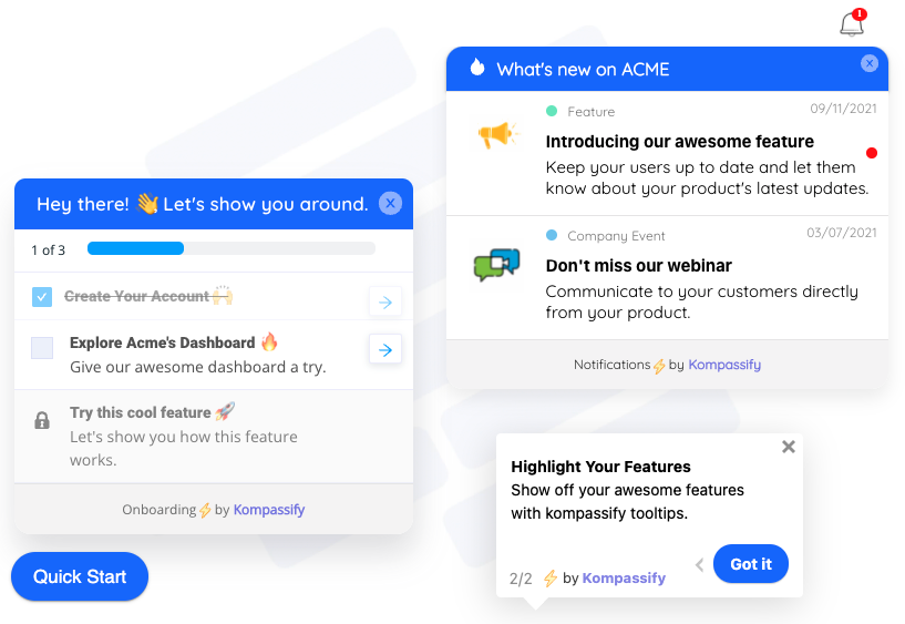
The same three formats that welcome a new user are the ones that serve month nine: a checklist to re-enter a flow, an announcement for what shipped since, a tooltip at the control.
Build guidance that outlives your welcome tour
Target flows by behaviour, answer at the element, and see whether users actually widened their use of the product. No code required. Free up to 100 monthly active users, plans from $129/month, GDPR-compliant and EU-hosted.
Start for free →What to Measure
Tour completion tells you nothing about this group, because the tour they would complete ran a year ago. These six numbers do, and each one has an action attached to it.
| Metric | What it tells you | What to do when it is bad |
|---|---|---|
| Feature breadth per user | How wide the average path through your product is | Introduce the second use case in-product to the narrow-and-frequent segment |
| Breadth movement month on month | Whether anyone is widening, which is the real adoption number | Check that anything you shipped was introduced anywhere other than a changelog |
| Adoption of features shipped after signup | Whether your roadmap reaches existing customers at all | Pair each release with an in-product announcement that launches a guided first run |
| Share of tickets that are how-to | How much of support is competence, not defects | Move the top ten answers onto the controls that raise them |
| Time to first action after a gap | How expensive returning is for a user who was away | Add a short welcome-back flow triggered by inactivity length |
| Repeat attempts at occasional tasks | Whether quarterly work is relearned from scratch each time | Attach a tour to the page where that task starts, every time |
One framing note for reporting these upwards. Breadth is not a vanity metric, it is a renewal metric: it counts how many reasons a customer has to keep paying. Our guide to licence utilisation covers how the same question looks from the commercial side of the account.
The One-Paragraph Version
Perpetual intermediates are the users who learned enough of your product to do their job and then stopped, and they are almost everyone. The beginner state drains within days because nobody wants to stay in it, expertise stays rare because most people have no reason to pay for it, and the middle accumulates everybody else and keeps them for years. Guidance budget, meanwhile, goes to the two thin ends: a welcome tour for week one and advanced depth for the loudest few percent. The cost shows up as renewals resting on a single workflow, expansion that never starts, features nobody meets and a permanent pile of how-to tickets. Find this group with two numbers, breadth and frequency, then serve them with guidance that can be entered at the moment of need: a tooltip on the control, a tour triggered on the page where an occasional task starts, a checklist that stays available, an announcement where the change actually is, all targeted by behaviour and retired once consumed. Onboarding decides whether a user reaches the middle. What you build next decides whether they ever leave it.
Frequently Asked Questions
What is a perpetual intermediate?
A perpetual intermediate is a user who has learned enough of a product to do their own job and then stops learning, staying at that level indefinitely. They are not new, so onboarding no longer fits them, and they are not experts, so advanced material does not either. The term comes from the interaction designer Alan Cooper, whose point was that the beginner stage is short, expertise is rare, and the intermediate state is where almost every user spends almost all of their time.
Who came up with the idea of perpetual intermediates?
The interaction designer Alan Cooper named the population in his work on interface design. His argument was that software is usually designed either for first-time users or for experts, while the majority of people sit permanently in between, and that this middle group deserves to be the primary design target rather than an afterthought.
Why do most users never become experts?
Because expertise is not their goal. For most people your product is one tool among many that they use for part of a working day, and once they can complete the task they came for, there is no pressure to learn more. Learning anything else costs time now for a benefit that is uncertain and later. Users who do become experts almost always have a reason: the product is central to their job, they use it daily, or their role makes them the person others ask.
Is a perpetual intermediate the same as a casual user?
No. Frequency and breadth are different things. A perpetual intermediate can be a daily user who knows one narrow path through the product extremely well. A casual or occasional user might log in twice a quarter. Many users are both, but the distinction matters because the fixes differ: a narrow daily user needs help discovering the rest of the product, while an occasional user mainly needs help remembering what they already learned.
Should you design your product for beginners, intermediates or experts?
Design the product itself for intermediates, because that is where the usage hours are, and handle the two ends with layers on top: guidance that appears for people meeting something for the first time, and shortcuts and depth that experts can find once they look for them. The mistake to avoid is letting first-run experience decisions define the interface everyone lives in for years.
How do you identify perpetual intermediates in product data?
Score every account or user on two axes over a rolling 30 days: breadth, meaning how many distinct core features they used, and frequency, meaning how many days they were active. Users who are frequent but narrow are your perpetual intermediates. Users who are broad and frequent are power users, users who are narrow and rare are at risk, and users who are broad but rare are usually administrators or evaluators who configured something once.
What kind of in-app guidance works for intermediate users?
Guidance that can be entered at the moment of need rather than at signup: a tooltip or hotspot on the control that raises the question, a short tour triggered on the page where an occasional task starts, a checklist that stays available so a flow can be started later, and an announcement that introduces something new where the change actually is. What does not work is a long welcome tour, because intermediates left the welcome state a long time ago.
Does onboarding still matter if most users are perpetual intermediates?
Yes, but it is the first chapter rather than the whole book. Onboarding decides whether someone reaches the intermediate state at all, which is why activation work pays. The point about perpetual intermediates is that the work should not stop there: the same guidance layer that gets a user to their first result is the one that should keep serving them in month nine, when a new feature ships, when they return after a gap, or when a quarterly task comes round again.