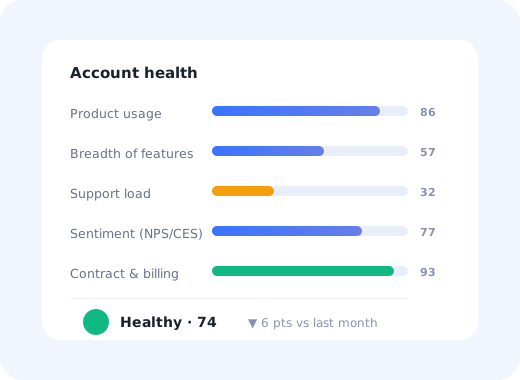
Ask five SaaS teams how they know an account is in trouble and you will get five answers: the CSM "has a feeling", logins are down, the champion stopped replying, NPS dipped, or nobody noticed until the cancellation email arrived.
A customer health score is the attempt to replace that with something a machine can compute every morning. Done well, it gives you a ranked list of accounts to talk to before the renewal conversation goes badly. Done badly, and it usually is done badly the first time, it produces a green dashboard full of accounts that churn anyway.
This guide covers what belongs in a health score, how to weight the inputs, how to set thresholds that actually trigger action, and the failure modes that make most first attempts useless.
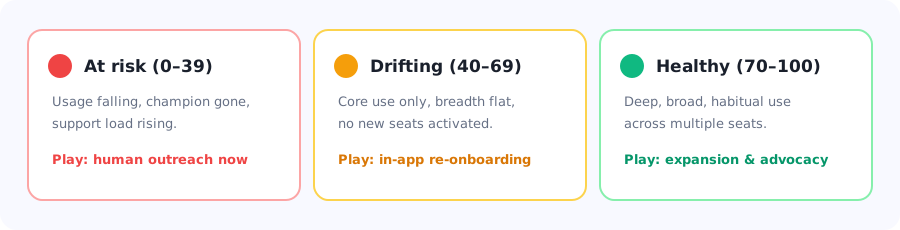
A health score is only worth building if each tier maps to a different, pre-agreed action.
Key Takeaways
- A health score is a prediction, not a report card. Its only job is to tell you which accounts need attention this week.
- Behaviour beats sentiment. What accounts do in the product is a stronger churn signal than what they say in a survey.
- Breadth matters more than volume. An account using one feature heavily is more fragile than one using four features moderately.
- Trend beats snapshot. An account at 60 and falling is in more danger than an account at 45 and climbing.
- Every tier needs a pre-agreed play. A score with no attached action is a dashboard nobody opens twice.
- Validate against real churn. If your score did not flag the accounts that actually left last quarter, the weights are wrong.
What is a customer health score?
Customer health score definition: a composite number, usually on a 0–100 scale, that combines product-usage, engagement, support and commercial signals into a single estimate of how likely an account is to renew, expand, or churn. It is recalculated continuously and used to prioritise which customers get proactive attention.
The word "health" is doing a lot of work there. A health score is not a satisfaction measure and not a value measure: it is a risk-prioritisation tool. The right question to ask of any candidate input is not "does this describe the customer?" but "does knowing this change who I call first?"
Health score vs the metrics you already track
NPS tells you how an account feels about you at one moment. Churn rate tells you what already happened. A health score sits between them: it is a forward-looking estimate built mostly from behaviour, updated far more often than a survey and far earlier than a cancellation.
That is also why a health score is not a substitute for those metrics. It consumes them. NPS and CSAT responses are inputs; churn is the outcome you validate the score against.
What to put in a customer health score
There is no universal formula, and any article that hands you one is selling a template rather than a method. What there is, is a reliable set of categories, and a strong opinion about which of them deserve the most weight.
| Signal category | Example inputs | Typical weight | Why it matters |
|---|---|---|---|
| Depth of usage | Weekly active users vs licensed seats, sessions per active user, core-action frequency | 25–35% | The most direct evidence that the product is embedded in real work. |
| Breadth of adoption | Number of distinct features used, number of teams or departments active | 20–30% | Single-feature accounts are one workflow change away from leaving. |
| Onboarding progress | Setup completion, time to first value, integrations connected | 10–20% | Dominant in the first 90 days; fades to near-zero after that. |
| Support & friction | Ticket volume per seat, reopened tickets, unresolved bugs, low CES scores | 10–15% | A rising ticket rate with flat usage is one of the clearest early warnings. |
| Sentiment | NPS, CSAT, in-app survey responses, escalations | 5–15% | Useful but sparse and self-selected, never let it dominate. |
| Relationship & commercial | Champion still employed, exec sponsor engaged, invoices paid, renewal date proximity | 10–15% | Catches risk that usage data is structurally blind to. |
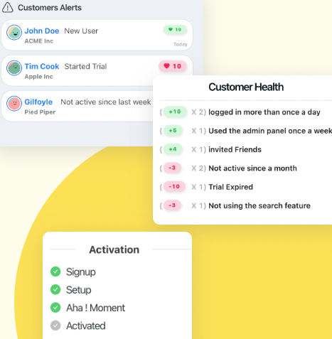
A working health score is a list of weighted behaviours, each one worth points up or down.
The single most common weighting error: loading up on login counts. Logins measure habit, not value. An account whose users log in daily but only ever touch one screen is not healthy: it is dependent on one workflow and exposed the moment that workflow changes. Weight breadth and core-action completion above raw session counts.
How to build a health score, step by step
Define what the score is predicting
Look at accounts that already churned
Pick five to seven inputs, no more
Normalise everything to a common scale
Assign weights and compute the score
Set thresholds and attach a play to each tier
Validate, then recalibrate every quarter
1. Define what the score is predicting
"Health" is too vague to build on. Choose one: likelihood to renew in the next 90 days, likelihood to expand, or likelihood to churn. These need different inputs: an expansion score cares about seat saturation and feature ceilings; a churn score cares about declining usage and support friction. Trying to make one number do all three produces a score that does none of them well.
2. Look at accounts that already churned
Before choosing any input, pull the last 20–30 accounts that left and ask what was visibly different about them 90 days before they cancelled. This is the step teams skip, and it is the only one that grounds the model in reality. You are looking for signals that were observable in advance, not the reasons stated in the exit interview, which are usually rationalisations.
The patterns that show up most often: a drop in weekly active seats, a collapse in the number of distinct features touched, and a champion who stopped logging in entirely while the rest of the account carried on.
3. Pick five to seven inputs, no more
Every extra input dilutes the signal and makes the score harder to explain to the person expected to act on it. If a CSM cannot say in one sentence why an account dropped 12 points, they will stop trusting the number. Five well-chosen inputs beat fifteen mediocre ones, every time.
4. Normalise everything to a common scale
Raw inputs are incomparable: ticket counts, feature counts and NPS scores live in different units. Convert each to a 0–100 sub-score first. For most inputs, percentile rank within your customer base works better than absolute thresholds, because it adapts automatically as your product and customer mix change.
For usage-based inputs, score the trend as well as the level. A simple approach: 70% of the sub-score from the current 30-day level, 30% from the change versus the previous 30 days. This is what lets a score fall before an account hits the floor.
5. Assign weights and compute the score
Start with the weights in the table above, then adjust based on what step 2 told you. Do not over-engineer this at the start: a transparent weighted average that your team understands and trusts will outperform a black-box model that nobody can interrogate.
Health score = Σ (sub-score × weight)
Example: depth 82 × 0.30 + breadth 45 × 0.25 + onboarding 90 × 0.15 + support 60 × 0.15 + sentiment 70 × 0.15 = 70.4
6. Set thresholds and attach a play to each tier
Three tiers is almost always right; five is a false precision that makes the middle bands meaningless. What matters is not where you draw the lines but that each band has a pre-agreed, specific action, not "monitor closely", which is what teams write when they have not decided anything.
7. Validate, then recalibrate every quarter
The test is simple and unforgiving: of the accounts that churned last quarter, what share were flagged as at-risk 60 days beforehand? If the answer is under half, your inputs or weights are wrong. Run this check every quarter: your product changes, your customer mix changes, and a score calibrated on last year's behaviour decays quietly.
Turning the score into action
A health score earns its keep only when a change in score triggers something. The most effective programmes pair human outreach for high-value accounts with automated, in-product intervention for everyone else, because most SaaS businesses cannot afford a CSM for every account, and most declining accounts do not need one.
At-risk accounts: find the missing habit, not the missing feature
When an account drops into the red, the instinct is to schedule a call and demo more features. Usually the real problem is narrower: a team that never got past the first workflow, or a set of new users who joined after the original onboarding and were never onboarded at all. Look at which seats are inactive before you look at which features are unused.
Drifting accounts: re-onboard in the product
The middle tier is where automated intervention pays for itself. An account using one feature deeply and nothing else does not need a meeting: it needs a well-timed nudge toward the second feature. A targeted product tour, a short checklist for the unadopted area, or a hotspot on the feature they have never opened will move breadth scores at a fraction of the cost of human outreach.
This is also where feature discovery work shows up directly in the health score: breadth is a component you can actively engineer, not just observe.
New seats: onboard them, every time
In most B2B accounts, health decays through staff turnover rather than dissatisfaction. The people who were trained leave, and the people who replace them get a login and nothing else. An automatic first-time user experience that triggers for every new seat, not just at account creation, is one of the highest-leverage retention mechanisms available, and it is invisible in most health-score designs.
Healthy accounts: ask them for something
The green tier is not a rest state. These are the accounts to route into referrals, case studies, beta programmes and expansion conversations. If your health score only ever triggers rescue missions, you are using half of it.
Why most health scores fail
✅ Do
- Start from the accounts that actually churned
- Weight breadth of adoption heavily
- Score the trend, not just the level
- Keep it to five to seven inputs
- Attach a specific play to every tier
- Make the score explainable in one sentence
- Score per-seat activity, not just per-account
- Recalibrate against real churn quarterly
❌ Don't
- Build the score around login counts
- Let NPS dominate the weighting
- Use one score for churn and expansion
- Add an input because the data exists
- Create five tiers with vague middles
- Ship a black box CSMs cannot interrogate
- Set thresholds once and never revisit them
- Report the score without a trend arrow
The account-average trap: a 200-seat account where 30 power users are thriving and 170 seats are dormant will often score as healthy. Aggregate usage looks fine; the renewal will not be. Always compute active seats as a share of licensed seats, and treat a falling ratio as a red flag regardless of what the headline score says.
Building the usage half of the score with Kompassify
The hardest part of a health score is not the arithmetic: it is getting reliable, feature-level usage data without a six-month analytics project. Kompassify tracks in-product behaviour with no code, which gives you most of the behavioural inputs a health score needs.
- Feature-level usage for breadth scoring, without asking engineering to instrument every button.
- Onboarding and checklist completion per user and per account, so the first-90-days component is real rather than assumed.
- Per-seat activity, so you can spot the 170 dormant seats behind a healthy-looking average.
- In-app surveys feeding the sentiment component from inside the product rather than from an email list.
- Targeted interventions (tours, checklists, tooltips and announcements) triggered at exactly the segment your score just flagged.
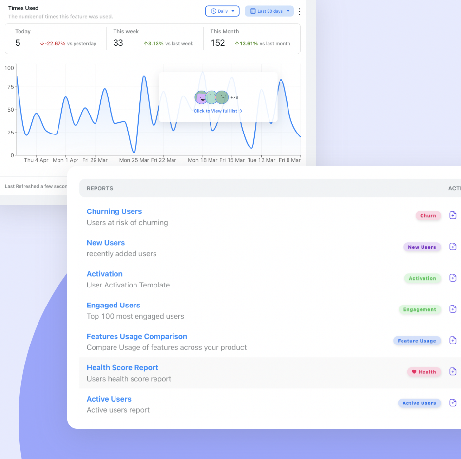
The behavioural half of a health score: feature usage, churning users and activation, per account.
Kompassify is a no-code digital adoption platform for SaaS teams. It is free up to 100 monthly active users, paid plans start at $129/month, and it is GDPR-compliant with EU hosting. See product analytics for what it tracks out of the box.
Get the usage data your health score is missing
Track feature adoption, onboarding completion and per-seat activity with no code, then act on it in the same product.
Start for Free →Frequently Asked Questions
What is a customer health score?
A customer health score is a composite number, usually on a 0-100 scale, that combines product usage, engagement, support and commercial signals into a single estimate of how likely an account is to renew, expand or churn. It is recalculated continuously and used to decide which customers get proactive attention. It is a risk-prioritisation tool rather than a satisfaction measure.
What should be included in a customer health score?
Six categories cover almost every useful input: depth of usage (active seats, core-action frequency), breadth of adoption (distinct features and teams using the product), onboarding progress (setup completion, time to first value), support and friction (ticket volume per seat, reopened tickets), sentiment (NPS, CSAT, in-app surveys), and relationship or commercial signals (champion still present, invoices paid, renewal proximity). Depth and breadth of usage should carry the most weight.
How do you calculate a customer health score?
Normalise each input to a 0-100 sub-score, usually by percentile rank across your customer base, then compute a weighted average. For example: depth 82 x 0.30 + breadth 45 x 0.25 + onboarding 90 x 0.15 + support 60 x 0.15 + sentiment 70 x 0.15 gives a score of 70.4. For usage inputs, blend the current level with the recent trend so the score can fall before an account hits the floor.
What is a good customer health score?
There is no universal good score, because the number is only meaningful relative to your own thresholds. What matters is that each band maps to a different action: an at-risk band that triggers human outreach, a drifting band that triggers automated in-product re-onboarding, and a healthy band that triggers expansion and advocacy motions. Three tiers is almost always the right number; five creates false precision.
How is a health score different from NPS?
NPS measures how an account feels about you at a single moment and depends on someone choosing to respond. A health score is a forward-looking estimate built mostly from observed behaviour, updated continuously and available for every account whether or not they answer surveys. NPS is best used as one weighted input into the health score, never as the score itself.
Why do most customer health scores fail?
The three most common causes are building the score around login counts rather than meaningful actions, letting sparse survey data dominate the weighting, and shipping a score with no pre-agreed action attached to each tier. A fourth is the account-average trap: a large account where a minority of seats are thriving and most are dormant will often score as healthy right up until renewal.
How often should a health score be recalculated and recalibrated?
Recalculate continuously, typically daily, so the trend component is meaningful. Recalibrate the weights and thresholds quarterly by checking what share of accounts that actually churned were flagged as at-risk 60 days beforehand. If the answer is under half, the inputs or weights are wrong. Product changes and shifts in customer mix quietly degrade a score that is never revisited.
Can you build a health score without a dedicated data team?
Yes, if you can get reliable feature-level usage data. The arithmetic is a weighted average, which any spreadsheet or CS platform can do. The bottleneck is behavioural data, which is why no-code product analytics that tracks feature usage, onboarding completion and per-seat activity without engineering work is usually the fastest path to a first working score.