There is a familiar meeting in every product company. Someone has redesigned a flow, and someone else asks whether it worked. What follows is twenty minutes of numbers that do not answer the question: sessions are up, but so is time on page; support tickets fell, but so did traffic; the survey score moved by 0.2, which may or may not be noise. Everyone leaves with the impression that the redesign was fine. Nobody has learned anything.
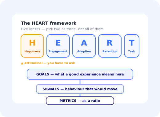
The HEART framework was built to stop that meeting from happening. It is a small, opinionated structure for measuring user experience across five categories (Happiness, Engagement, Adoption, Retention and Task Success) and, more importantly, a process for deciding which numbers deserve to be on the dashboard at all. Its central claim is unglamorous and correct: most teams pick metrics because they are available, not because they answer a question, and the fix is to write the question down first.
It came out of user experience research at Google, aimed at large products where "improve the experience" needed to become something an engineering team could be held to. But nothing about it requires Google's scale. It works just as well on a twelve-person SaaS product, and arguably better, because a small team cannot afford a dashboard nobody acts on.
This guide covers what the HEART framework is, what each letter actually measures and how to calculate it, the Goals–Signals–Metrics process that turns the categories into real numbers, how to decide which categories to keep for a given project, two worked examples, how HEART sits alongside pirate metrics and a north star metric, the mistakes that make HEART dashboards useless, and how to collect the two hardest signals from inside a live product.
Key Takeaways
- HEART is five lenses, not five obligations: Happiness, Engagement, Adoption, Retention, Task Success. Most projects should use two or three and ignore the rest on purpose.
- Goals–Signals–Metrics is the framework. The letters are just categories; the value comes from writing the goal, then the behaviour that would prove it, then the number, in that order.
- Happiness is attitudinal and must be asked for. No amount of clickstream data tells you how a flow felt, which is why HEART pairs surveys with behaviour rather than choosing between them.
- Ratios beat totals. "1,400 completions" moves with traffic. "68% of users who started finished" moves with the experience, and that is the thing you changed.
- Task Success is the category most teams cannot instrument, because nobody has defined what an attempt is. Defining it is the work; the arithmetic is trivial.
- HEART measures a feature; a north star measures a company. They are complementary, and confusing them produces a north star nobody can influence.
What Is the HEART Framework?
HEART framework: definition
The HEART framework is a model for measuring the quality of a user experience across five categories (Happiness, Engagement, Adoption, Retention and Task Success) using a Goals–Signals–Metrics process to choose what to track for each one. It was created by user experience researchers at Google as an alternative to reporting whatever a web analytics tool produces by default, and it is applied to a specific product, feature or flow rather than to a company as a whole.
Two design decisions make HEART different from the average metrics list. The first is that it includes an attitudinal category. Happiness cannot be derived from behaviour: a user who completes a task quickly may have been delighted or may have been grimly determined, and the clickstream looks identical. HEART insists that you ask, which means a survey is part of the instrumentation, not a soft extra.
The second is that HEART is explicitly scoped. It is not a company scorecard. You apply it to one thing (the onboarding flow, the new dashboard, the mobile editor) and the same product may run three different HEART sets at once with different categories in each. That scoping is what keeps the numbers interpretable: when a metric moves, you know which change to look at.
The one-line version: HEART tells you which kinds of things to measure about an experience; Goals–Signals–Metrics tells you how to pick the exact numbers. The first without the second is a poster. The second is the framework.
The Five HEART Categories
(One attitudinal category and four behavioural ones: the orange card is the one you cannot get from analytics)
Happiness
Happiness covers everything a user thinks and feels that you can only learn by asking: satisfaction, perceived ease, perceived speed, confidence, and willingness to recommend. The standard instruments are a CSAT rating attached to a specific interaction, a Customer Effort Score after a task, and NPS for the relationship as a whole. The failure mode is scope: a product-wide satisfaction score will not move when you fix one screen, so if you are measuring a screen, ask about the screen, immediately after it, in an in-app survey rather than a quarterly email.
Engagement
Engagement is depth and frequency of voluntary use in a period: sessions per active user per week, actions per session, share of days active, documents created. The critical qualifier is per user. Total engagement rises when you acquire more people and tells you nothing about the experience; engagement per active user is the version that responds to design. Engagement is also the category most easily misread: for a tax filing tool, more time in product is a failure, and for a collaboration tool it is a success. Decide which kind of product you are before you decide which direction is good. Our user engagement guide goes deeper on the individual measures.
Adoption
Adoption counts new users of a product or feature within a defined window: the people who used it for the first time in the last 30 days, divided by the people who could have. It is the right lens for a launch and the wrong lens for a mature surface, because a two-year-old feature has nobody left to adopt it. The precision that matters is in the denominator: adoption of a permissions setting among all users is a meaningless number, while adoption among admins who have more than five teammates is a real one. See our feature adoption guide for the full treatment.
Retention
Retention asks how many of the people who were present in one period are still present in a later one. Inside HEART it is usually scoped to the feature rather than the product: of the users who adopted this feature last month, how many used it again this month. That is a far sharper signal than product-level retention, because it isolates whether the thing you built earned a second visit. When you plot it over successive periods you get a retention curve, and the shape of that curve says more than any single percentage.
Task Success
Task Success is the category that most directly measures whether the design works, and the one teams most often leave empty because it takes real thought to define. It has three standard measures: completion rate (attempts that finished), time on task (how long finishing took), and error rate (how often something went wrong on the way). They are read together. A completion rate that rises while time on task also rises usually means people are pushing through friction rather than gliding, which is a worse outcome than the headline suggests, and exactly the kind of thing a friction audit exists to find.
Goals, Signals, Metrics: The Half Everyone Skips
The five letters are the famous part. The process below is the part that produces a usable dashboard, and it is the part that gets cut when a team is in a hurry.
Run it per category, per project. Here is what one pass looks like for the Task Success category of a workspace setup flow:
A new admin can get their workspace configured well enough to invite their team, in one sitting, without contacting support.
Positive: they reach the invite screen and send at least one invitation. Negative: they abandon on the integration step, open the help widget, or return three days later still at step two. Naming the negative signal is not optional: it is what stops you from only measuring the happy path.
Setup completion rate (workspaces that sent an invite ÷ workspaces created). Median time from first login to first invite. Support contacts per 100 new workspaces. Step-level drop-off across the setup checklist.
The denominator rule. Every HEART metric should be a ratio with a stated population. "1,400 completions" goes up when marketing runs a campaign. "68% of workspaces that started setup sent an invite" only moves when the setup experience changes, which is the entire point of measuring it.
How to Choose Which HEART Categories to Use
The framework is a menu. Picking two or three categories and deliberately writing "not measured this quarter, and here is why" next to the others is a sign of a healthy process, not a lazy one. The choice follows from what kind of thing you are measuring.
Nobody has adopted it yet and nobody can be retained on it. What matters is whether people find it and whether it works the first time.
A one-time experience with a hard definition of done. Measure whether it completes, whether it felt easy, and whether the people who finished came back.
Adoption happened years ago. The question is whether people keep choosing to be there and whether they enjoy it.
The population is unchanged, so adoption is noise. What you want is a before-and-after on effort and outcome.
HEART Framework Examples
Two filled-in examples, in the format a team can copy into a document. Note that neither uses all five categories, and both express every metric as a ratio.
Example 1: A user onboarding flow
| Category | Goal | Signal | Metric |
|---|---|---|---|
| Task Success | A new user completes setup unaided in one session | They finish the checklist; they do not open support | Checklist completion rate; median time to first key action |
| Happiness | Setup feels easy rather than bureaucratic | They rate the flow well immediately after finishing | Post-onboarding CES, asked in-app at completion |
| Retention | Onboarding produced a reason to come back | They return in week two without a prompt | Week-2 return rate of users who completed onboarding vs. those who did not |
| Not measured: Adoption (everyone in the population is new by definition) and Engagement (too early to be meaningful). | |||
That third row is worth dwelling on. Comparing completers with non-completers is what turns an onboarding metric into an argument for investment, and it is a comparison almost nobody runs. Our user onboarding metrics guide covers the surrounding KPI set in detail.
Example 2: A newly launched reporting feature
| Category | Goal | Signal | Metric |
|---|---|---|---|
| Adoption | The people who need reports find and try them | First-time report creation among eligible accounts | % of admin users who created a report within 30 days of launch |
| Task Success | Building a useful report is possible without documentation | Reports get saved rather than abandoned half-built | Saved reports ÷ report builder sessions started; error rate on the query step |
| Retention | The feature is worth returning to, not a one-off curiosity | A second report, or a re-run of the first, in the next month | Month-2 feature retention of month-1 adopters |
| Not measured: Happiness (deferred until the flow stabilises) and Engagement (adoption has to happen first). | |||
HEART vs. Pirate Metrics vs. North Star
These three get pitted against each other in blog posts and they are not competitors. They operate at different altitudes, and a well-run product team uses all three for different purposes.
| HEART | Pirate Metrics (AAARRR) | North Star Metric | |
|---|---|---|---|
| Scope | One product, feature or flow | The whole customer funnel | The whole company |
| Question it answers | Is this experience any good? | Where are we losing people? | Are we creating more value overall? |
| Usual owner | Product and design | Growth | Leadership |
| Includes how users feel? | Yes, Happiness is a first-class category | No | Rarely |
| Cadence | Per project, before and after a change | Continuous | Continuous, reviewed quarterly |
| Fails when | All five categories are filled in for everything | Stages are measured with no shared definitions | Nobody's daily work can move it |
In practice the chain runs downwards. The north star says what the company is optimising. Pirate metrics find the stage of the funnel that is leaking. HEART is what you reach for once you know which experience inside that stage you are going to rebuild.
HEART Framework: Do vs. Don't
✅ Do
- Write the goal as a sentence before choosing any metric
- Pick two or three categories and record why you dropped the rest
- Name a negative signal for every positive one
- Express every metric as a ratio with an explicit denominator
- Ask the Happiness question in-app, right after the experience
- Take a baseline before you ship the change
- Scope HEART to one flow so movements are attributable
- Read completion rate, time on task and error rate together
❌ Don't
- Fill in all five categories for every project by default
- Use product-wide NPS to judge a single screen
- Report raw totals that move with traffic
- Assume more engagement is always better; check the product type
- Measure Adoption on a feature that shipped two years ago
- Leave Task Success blank because defining an attempt is hard
- Change the metric definition mid-quarter and compare anyway
- Build the dashboard before anyone has agreed the goals
Collecting HEART Signals With Kompassify
Four of the five categories come straight out of a product analytics tool. The two that stall teams are Happiness, which requires asking a question at the right moment, and Task Success, which requires a flow whose steps are defined and tracked. Both normally mean engineering work. Kompassify lets a product team do them without it:
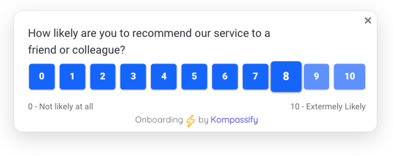
- Happiness, asked at the right instant. Publish an in-app CSAT, CES or NPS survey that fires when a specific flow completes, not on a quarterly schedule, so the score is about the thing you changed.
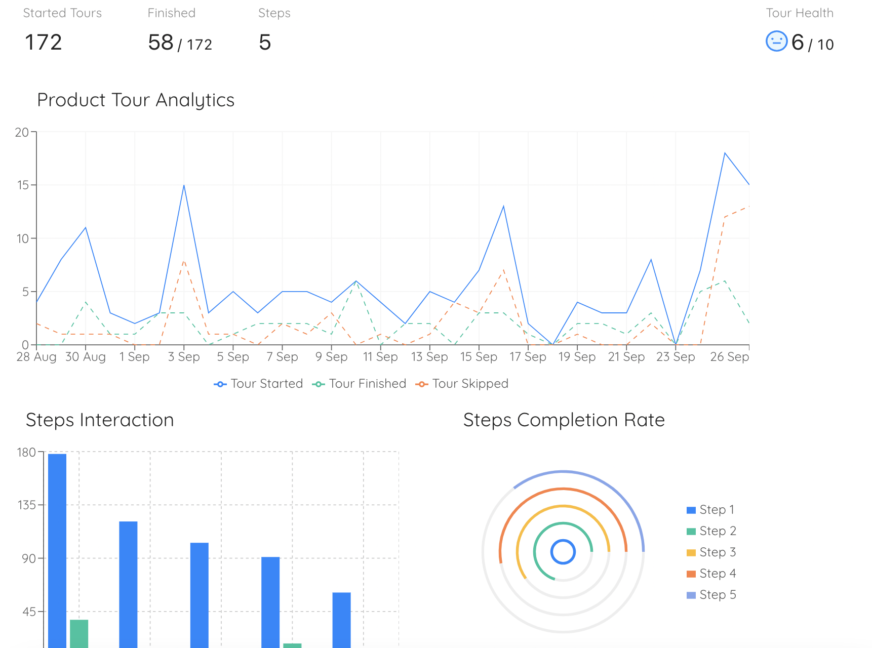
- Task Success, defined and tracked. Build the flow itself as an onboarding checklist or product tour; per-step completion and drop-off are recorded automatically, which is the completion-rate metric the category asks for.
- Comparable populations. Target guidance and surveys by segment so the denominator stays stable between the before and after measurement.
- A clean before-and-after. Ship the new guidance to part of your base first and compare completion and sentiment against the rest, without a release cycle in between.
- Adoption prompts you can measure. Announce a new feature to the eligible segment with a hotspot or in-app message, and see adoption move against a known denominator.
Kompassify is GDPR compliant and EU-hosted, free for under 100 monthly active users, with paid plans from $129/month.
Instrument the Two Categories Analytics Can't Give You
Kompassify adds in-app surveys, onboarding checklists, product tours and tooltips to your existing product with no code, so Happiness gets asked at the right moment and Task Success gets measured step by step. GDPR compliant, EU-hosted, and free for under 100 monthly active users.
Start for Free →Frequently Asked Questions
What is the HEART framework?
The HEART framework is a way of measuring user experience across five categories: Happiness, Engagement, Adoption, Retention and Task Success. It was developed by researchers at Google to solve a specific problem: teams were reporting whatever their analytics tool made easy, usually page views and session counts, and calling it user experience. HEART forces a different order of operations: decide what a good experience would mean for this specific product or feature, work out what user behaviour would signal it, and only then choose the metric. The five categories are a menu, not a checklist; most features should be measured on two or three of them.
What do the letters in HEART stand for?
Happiness: attitudinal measures of how users feel, collected by asking them, such as satisfaction scores or ease-of-use ratings. Engagement: how deeply and how often people use the product in a given period. Adoption: how many new users start using a product or feature in a defined window. Retention: how many users are still there after that window. Task Success: whether people can actually complete the job they came to do, measured by completion rate, time on task and error rate. The first is attitudinal; the other four are behavioural.
What is the Goals-Signals-Metrics process?
Goals-Signals-Metrics is the part of HEART that does the actual work, and the part most teams skip. For each HEART category you keep, first write the Goal in plain language: what success looks like for users and for the business. Then name the Signals: the specific user behaviours or attitudes that would move if the goal were met, and equally the ones that would move if it failed. Finally choose the Metrics: the countable, trackable version of each signal, expressed as a ratio rather than a raw total wherever possible. Skipping straight to metrics is how teams end up with dashboards full of numbers nobody can act on.
Do you have to measure all five HEART categories?
No, and trying to is the most common way to misuse the framework. HEART is a menu of lenses; the discipline is choosing the two or three that matter for the thing you are measuring and deliberately ignoring the rest. A new feature launch usually lives on Adoption and Task Success. An onboarding flow lives on Task Success, Adoption and Retention. A long-lived collaboration surface lives on Engagement and Happiness. Filling in all five for every project produces a dashboard that is complete, expensive and unread.
How is the HEART framework different from pirate metrics or a north star metric?
They answer different questions and work well together. Pirate metrics (AAARRR) follows a user through the business funnel: acquisition, activation, retention, referral, revenue, and is owned mostly by growth. A north star metric is one company-wide number that everyone steers by. HEART is narrower and more surgical: it measures the quality of an experience for a specific product, feature or flow, and it is the only one of the three that treats how users feel as a first-class category alongside what they do. A typical setup uses a north star for direction, pirate metrics for the funnel, and HEART for the feature you are actually working on this quarter.
How do you measure Happiness in the HEART framework?
By asking, because happiness is attitudinal and cannot be inferred from clicks. The practical options are a short in-app survey attached to a specific experience: a satisfaction rating right after a task completes, an ease-of-use question after a setup flow, or a periodic relationship survey such as NPS. Two rules keep the number honest: ask immediately after the experience you are measuring rather than in a quarterly batch, and ask about one thing, because a satisfaction score for an entire product tells you nothing about the screen you just changed.
What is task success rate and how do you calculate it?
Task success rate is the share of users who set out to complete a defined task and actually finished it: successful completions divided by attempts, expressed as a percentage. The difficulty is not the arithmetic, it is defining an attempt and a completion precisely enough that the number means the same thing next quarter. Pair it with the other two task-success measures, time on task and error rate, because a rising completion rate that comes with rising time on task usually means people are grinding through a flow rather than sailing through it.
How do you collect HEART signals without engineering time?
Behavioural signals come from your product analytics, but the two hardest categories to instrument are Happiness, which requires asking, and Task Success, which requires knowing whether a specific flow completed. With a no-code platform like Kompassify you can publish an in-app survey that fires the moment a flow finishes, build the guided flow itself as a checklist or product tour whose per-step completion is tracked automatically, and target both to a segment so the numbers are comparable. Kompassify is GDPR compliant and EU-hosted, free for under 100 monthly active users, with paid plans from $129/month.