Ask three customer success leaders which metrics they track and you will get three lists that barely overlap. One reports meetings and tickets. One reports an NPS score and a churn percentage. One reports a health score whose formula nobody outside the team can explain. All three are measuring something. Only one of them can answer the question that matters: which accounts are drifting, and what should we do this week?
The problem is rarely a missing number. It is that the numbers sit in one undifferentiated list, so a lagging revenue figure and a weekly behavioural signal get treated as if they were the same kind of thing. They are not. One tells you what already happened; the other tells you what is about to.
This guide sorts customer success metrics into four layers, explains what each layer is good for and where it lies to you, gives the formulas that matter, and ends with a build order, because you do not need all of them, and the order you add them in decides whether the dashboard gets used.
Key Takeaways
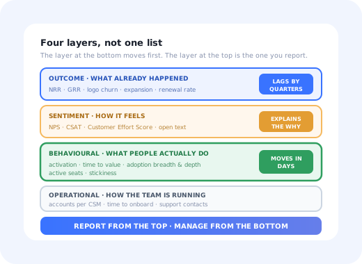
- Four layers, four jobs. Outcome metrics describe the result, behavioural metrics predict it, sentiment metrics explain it, operational metrics describe your team.
- Report outcomes upward, manage behaviour downward. Net revenue retention belongs in the board pack; adoption depth belongs in the weekly review.
- Every metric needs an owner and a trigger. A number nobody acts on when it moves is decoration.
- If it can only go up, it is not measuring the product. Totals rise with time and headcount. Use rates and ratios.
- Match cadence to velocity. Weekly for behaviour, quarterly for sentiment, monthly for revenue: reviewing everything weekly makes slow metrics look like noise.
- Health scores are a summary, not evidence. A score is only as good as the behaviours behind it, and it should always be clickable down to them.
What Are Customer Success Metrics?
Customer success metrics: definition
Customer success metrics are the measures a software company uses to tell whether existing customers are reaching the outcome they bought the product for, and whether they are likely to keep paying for it. They span four layers (the revenue result, the behaviour that produces it, the sentiment that surrounds it, and the operational effort spent on it) and they are only useful as a set, because no single layer can both explain a problem and warn you about it in time.
The distinction that matters most is between metrics that describe and metrics that predict. Net revenue retention describes what happened to your revenue base over the past year. It is a fine number to be judged on and a terrible number to manage with, because by the time it moves the decisions that caused it are eleven months old. Meanwhile, the share of new accounts that reached their first real outcome in week one is knowable on day eight, and it forecasts the same revenue figure with a long lead. Both are customer success metrics. Only one is actionable while the outcome is still open. If that split is unfamiliar, our guide to leading vs lagging indicators covers the mechanics.
The second distinction is between the customer and the team. Accounts per CSM, response time and QBR completion are real metrics, but they measure you. They belong on the dashboard (a CS team stretched three times too thin is a genuine cause of churn) but they must never be mistaken for evidence that customers are succeeding.
The Four Layers of Customer Success Measurement
Think of the layers as a stack, with money at the top and behaviour underneath. Signals travel upward slowly: a user who stops opening the reporting module in March becomes a contraction in December. Reading the stack from the bottom is what buys you the months in between.
The four layers of customer success measurement, and the lag between them.
Layer 1: Outcome Metrics
These are the numbers a board, an investor or a CFO will use to judge the customer success function. They are unambiguous, comparable across companies, and almost entirely backward-looking.
| Metric | What it is | What it actually tells you |
|---|---|---|
| Net revenue retention (NRR) | Revenue from a cohort at the end of a period ÷ revenue at the start, including expansion, contraction and churn | Whether the existing base grows on its own. Above 100% means the base funds growth without new logos. It hides a lot: strong expansion in a few accounts can mask broad churn. |
| Gross revenue retention (GRR) | The same ratio with expansion excluded: churn and contraction only | The honest leak rate. GRR cannot exceed 100%, so it is the number to watch when NRR looks healthy and you suspect upsells are covering losses. |
| Logo churn | Customers lost ÷ customers at the start of the period | How many relationships ended, regardless of size. Diverging logo and revenue churn is diagnostic: small accounts leaving quietly is a different problem from one large one leaving loudly. |
| Expansion revenue | Additional revenue from existing customers: seats, tiers, add-ons | Whether success is converting into growth. Expansion that comes only from seat inflation is weaker than expansion from new use cases. |
| Renewal rate | Contracts renewed ÷ contracts up for renewal | Contract-level survival. Most useful when you split it by cohort and by whether the account ever activated properly. |
NRR is the one that gets quoted, and it deserves a guide of its own; formula, segment splits and what good looks like are in net revenue retention. The churn side, including how to define the denominator without flattering yourself, is in user churn.
Segment before you celebrate. A single company-wide NRR figure is nearly always a blend of two different businesses: a well-served enterprise tier that expands, and a long tail that quietly leaves. Split every outcome metric by segment, by acquisition channel and by whether the account completed onboarding. The split is usually the finding.
Layer 2: Behavioural Metrics, The Ones That Move First
This is the layer you can actually work with. Every metric here is observable within days of the behaviour that caused it, which means an intervention still has time to change the outcome.
| Metric | How to calculate it | Why it predicts renewal |
|---|---|---|
| Activation rate | Accounts reaching your defined value milestone ÷ accounts started, per cohort | An account that never reached first value has no reason to renew. This is the earliest strong signal you will get. |
| Time to value (TTV) | Median days from signup or kickoff to the value milestone | Long TTV correlates with abandonment because enthusiasm is a depreciating asset. Track the median and the tail separately. |
| Adoption breadth | Distinct core features used ÷ core features relevant to that account's use case | Single-feature accounts are the easiest to replace. Breadth is switching cost measured honestly. |
| Adoption depth | Frequency and volume within the features they do use | Distinguishes a product that is embedded in a workflow from one that gets opened when someone remembers it. |
| Active seat ratio | Seats active in the period ÷ seats licensed | The most under-used number in B2B SaaS. It is exactly the figure the buyer's finance team will compute before renewal. |
| Stickiness (DAU/MAU) | Daily active users ÷ monthly active users | Tells you whether the product is a habit or an occasional errand. Only meaningful for products with a genuine daily use case. |
| Customer health score | A weighted composite of the above, expressed as one number or band | A triage device, not evidence. Useful for ranking a book of accounts; useless if you cannot click through to the behaviours behind it. |
Three of these have dedicated guides worth reading before you implement them: time to value for defining the milestone honestly, product stickiness for when DAU/MAU is and is not appropriate, and customer health score for building a composite that does not quietly become astrology. If your product reports a single engagement figure, the product engagement score is the standard way to combine adoption, stickiness and breadth into one.
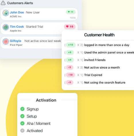
The behavioural layer is the only one where an intervention still changes the outcome.
Define the value milestone before you measure anything else. Activation rate, time to value and half of any health score depend on one decision: what counts as value in your product. Pick the action that best separates accounts that renewed from accounts that did not, not the action that is easiest to instrument, and not "completed onboarding". Our guide to user activation covers how to find it.
Layer 3: Sentiment Metrics, Three Scores, Three Jobs
Sentiment metrics are the only layer that tells you why. They are also the layer most often misused, because teams treat the three main scores as interchangeable and ask them all at the wrong moment.
-
Net Promoter Score: the relationship measure
Asked periodically of the whole base, it tracks overall sentiment over time and surfaces themes in the follow-up comment. It is a trend line, not a diagnosis, and it is meaningless below a decent response volume. See Net Promoter Score.
-
CSAT: the transactional measure
Asked immediately after one specific interaction (a support resolution, an onboarding session, a new feature) it tells you whether that thing landed. Its value comes from being narrow and timely. See customer satisfaction score.
-
Customer Effort Score: the churn predictor
Asks how hard something was. Effort predicts leaving better than satisfaction does, because people abandon products that are difficult long before they abandon products they dislike. See Customer Effort Score.
The failure mode across all three is asking too much. Response rates collapse under repetition, and the customers who stop answering first are usually the ones already drifting, which biases the score upward exactly when it should be falling. The mechanics of that trap are in survey fatigue. Pair the numbers with the open text: the score tells you the temperature, the comments tell you the cause, and turning comments into themes is covered in customer feedback analysis.
Layer 4: Operational Metrics, Measuring the Team, Not the Customer
These describe how the customer success function is running. They matter (a team covering four times the accounts it can serve is a structural cause of churn) but they answer a different question, and mixing them into the same list as retention is how dashboards end up measuring effort instead of results.
Coverage. Read alongside segment: 200 accounts is generous in tech-touch and impossible in enterprise.
Kickoff to go-live. Distinct from time to value: a customer can be live and still not getting anything out of it.
Rising contacts on a stable base usually means a product or documentation problem, not a support one.
How much of the book is in firefighting. A useful check on whether "proactive" is real or aspirational.
Share of accounts with no human touch at all. Names the population your product has to serve alone.
Whether the motion you designed is actually running. Low completion invalidates conclusions drawn from it.
The long-tail number is the one worth staring at. In most SaaS companies the majority of accounts get no scheduled human contact, so their entire experience of "customer success" is whatever the product does unattended. Designing for that population deliberately is the subject of digital customer success.
How to Build the Dashboard: 6 Steps
You do not need every metric above. You need one from each layer that your team can act on, and then depth where the acting happens. Build in this order; each step makes the next one interpretable.
- Define the value milestone
- Instrument activation and time to value against it
- Add the outcome metric you will be judged on
- Add one sentiment measure at one real moment
- Compose a health score only once the inputs are trustworthy
- Attach a trigger and an owner to every number
1. Define the value milestone
One sentence, product-specific, checkable in your data: "an account has reached value when it has published a live workflow that ran at least twice". Test the definition by looking backward: if accounts that renewed and accounts that churned both cleared it at similar rates, it is the wrong milestone. Almost every downstream metric inherits this decision, which is why it comes first.
2. Instrument activation and time to value
Count, per weekly or monthly cohort, how many accounts reach the milestone and how long they take. Two numbers, one chart. This alone is more actionable than most full CS dashboards, because it tells you whether the problem is that customers never start or that they stall halfway. The stage-by-stage version of this is the onboarding funnel, and the cohort view that shows whether it is getting better or worse over time is in cohort analysis.
3. Add the outcome metric you will be judged on
Usually NRR or GRR, sourced from billing rather than from a CRM field somebody updates by hand. Report it monthly, segmented. Do not add the other four outcome metrics yet; they will not change any decision you make this quarter, and every extra tile lowers the odds that anyone reads the board.
4. Add one sentiment measure at one real moment
Pick the moment first, then the score. Just after onboarding completes, CSAT tells you whether the handover landed. Mid-lifecycle, a relationship NPS gives you a trend. On a workflow people complain about, CES tells you how bad it really is. One survey, placed well, beats a quarterly blast that nobody answers twice.
5. Compose a health score only once the inputs are trustworthy
A health score built on shaky instrumentation is worse than none, because it launders bad data into a confident-looking number. Once activation, adoption and support signals are reliable, weight them, validate against last year's renewals, and make every score clickable down to the raw behaviours. A score a CSM cannot explain to a customer is a score they will quietly ignore.
6. Attach a trigger and an owner to every number
This is the step that separates a dashboard from a decoration. For each metric write down: who looks at it, how often, and what happens when it crosses a line. "Active seat ratio below 40% at day 60 → CSM runs the seat-expansion play" is a metric doing work. A tile with a sparkline and no owner is a tile that will be stale within a quarter.
A useful test: for every number on your dashboard, name the last decision it changed. Metrics that cannot answer that question in three months of history should be archived, not because they are wrong, but because they are costing attention that the acting metrics need.
The Metrics That Mislead
Some numbers are not merely useless; they actively point in the wrong direction. These are the ones worth removing on purpose.
Use instead
- Weekly active seats ÷ licensed seats
- Activation rate per cohort
- Median time to value, plus the 90th percentile
- Support contacts per active account
- Share of accounts using more than one core feature
- Response rate alongside every survey score
Retire these
- Total logins: rises with headcount, not health
- Cumulative signups: cannot go down, ever
- Meetings held and tickets closed as success measures
- Average time to value alone: one 400-day outlier moves it
- A health score with no visible inputs
- An NPS quoted without its response rate
The general rule: if a number cannot fall when the product gets worse, it is not measuring the product. Totals fail this test. Rates and ratios usually pass it. And any average hiding a long tail should be reported with a percentile beside it, because in customer success the tail is where the churn lives.
Choosing a Review Cadence
Reviewing everything at the same frequency is one of the quietest ways to make a good dashboard useless. Fast metrics look stale at quarterly intervals; slow metrics look like noise weekly.
| Cadence | What to review | The question being asked |
|---|---|---|
| Weekly | Activation of the newest cohort, at-risk list, active seat drops, support spikes | Which accounts need something from us before Friday? |
| Monthly | Time to value trend, adoption breadth by segment, NRR and GRR, health-score distribution | Is the motion working, and for which segment? |
| Quarterly | Relationship NPS, churn reasons, cohort retention curves, coverage and capacity | Is the strategy right, and can the team execute it? |
The quarterly retention curve is the one most teams skip and most regret skipping: whether the curve eventually flattens tells you if you have a retention problem or an onboarding one. How to read it is in retention curves.
Customer Success Metrics: Do vs. Don't
Do
- Split every metric by segment before drawing a conclusion
- Report outcome metrics upward and behavioural metrics inward
- Give every number an owner, a threshold and a play
- Validate the health score against accounts that actually churned
- Publish the response rate next to every survey score
- Archive a metric the moment it stops changing decisions
Don't
- Manage the team with a metric that lags by a year
- Count team activity as customer outcome
- Build a health score on instrumentation you do not trust
- Blend enterprise and long-tail accounts into one figure
- Ask for sentiment more often than you act on it
- Add a tile because the tool offers it
Measuring the In-Product Half Without a Data Team
Two layers of this stack come from systems you already have. Billing gives you the outcome metrics; your helpdesk and CRM give you most of the operational ones. The behavioural and sentiment layers are the ones that usually stall, because they need instrumentation inside the product, and that request joins the engineering backlog behind the features.
Kompassify covers that in-product half without a release. Onboarding checklists and product tours mark the milestones that define activation and report their own completion rate per step, so you can see exactly where accounts stall rather than only that they did. In-app NPS, CSAT and multi-choice surveys can be triggered at the moment that matters (after onboarding completes, after a specific feature is used for the first time) and each guide, tooltip and survey reports its own numbers by segment. The whole thing is built from a visual editor, so defining a new milestone does not mean waiting for a sprint.
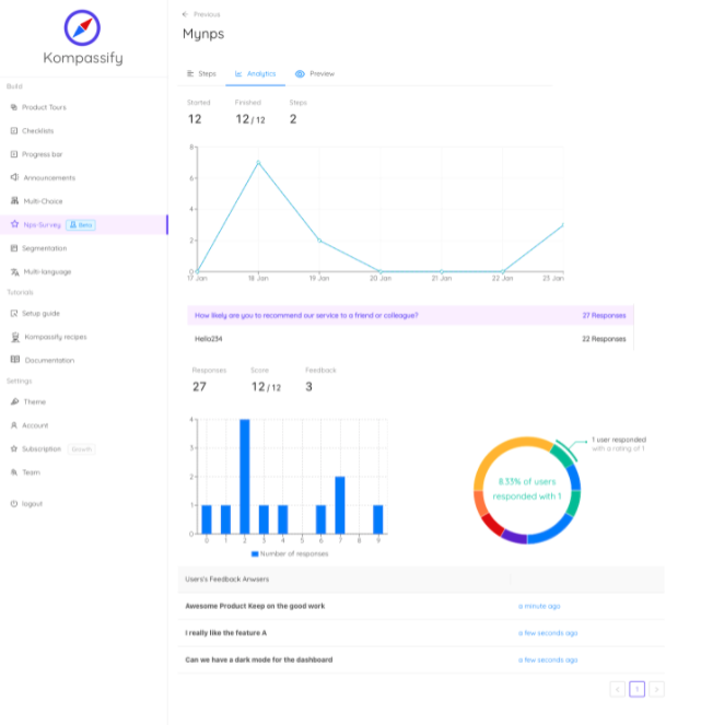
Sentiment collected at the moment it refers to, rather than in a quarterly blast.
Measure the moments your dashboard cannot see
Kompassify lets customer success, onboarding and product teams build guided onboarding, contextual help and in-app surveys, with adoption and completion data on every one, no engineering ticket required. Free up to 100 monthly active users, plans from $129/month, GDPR-compliant and EU-hosted.
Start for free →The One-Sentence Version
Customer success metrics work as a stack rather than a list: report the outcome layer upward, manage the behavioural layer weekly, use sentiment to explain what the behaviour is telling you, and delete anything that has not changed a decision this quarter.
Frequently Asked Questions
What are customer success metrics?
Customer success metrics are the measures a SaaS company uses to tell whether existing customers are reaching the outcome they bought the product for, and whether they are likely to keep paying for it. They fall into four layers: outcome metrics such as net revenue retention and gross revenue retention, which describe the result in money; behavioural metrics such as activation rate, time to value and adoption depth, which predict that result weeks or months earlier; sentiment metrics such as NPS, CSAT and Customer Effort Score, which explain how it feels; and operational metrics such as accounts per CSM or time to onboard, which describe how the team is running. A dashboard with only one layer is either a scoreboard you cannot act on or a work log that never connects to revenue.
What is the most important customer success metric?
Net revenue retention is the single number most boards use to judge a customer success function, because it folds churn, contraction and expansion into one figure and it is hard to flatter. But it is a lagging measure: by the time it moves, the decisions that caused it were made months ago. The most important metric to work with day to day is whichever behavioural measure predicts renewal in your product, usually depth of adoption in the accounts that renewed versus those that did not. Report net revenue retention upward, and manage the behavioural leading indicator downward into the team.
What is the difference between customer success metrics and onboarding metrics?
Onboarding metrics cover the first stretch of the relationship: whether new users start, finish setup, reach first value and come back. Customer success metrics cover the whole life of the account, including everything after the customer is productive: expansion, renewal, health, support load and advocacy. Onboarding metrics are a subset, and usually the most predictive subset, because an account that never activated rarely recovers later. Teams that measure only the later metrics find out about a bad cohort a year after they could have fixed it. The onboarding-specific set is covered in our guide to user onboarding metrics.
Which customer success metrics are vanity metrics?
Total logins, total accounts, meetings held, tickets closed and cumulative signups are the usual offenders. They all rise with time and headcount whether or not customers are succeeding, which means they can never fall in a way that tells you something is wrong. The test is simple: if a number cannot go down when the product gets worse, it is not measuring the product. Replace each one with a rate or a ratio: logins per active seat rather than total logins, share of licensed seats active rather than total accounts.
How often should customer success metrics be reviewed?
Match the cadence to how fast the metric can move. Behavioural metrics, activation, feature adoption, weekly active seats, are worth a weekly look, because a drop this week is still fixable this month. Sentiment scores move slowly and should be read quarterly or per release, not weekly, or you will chase noise and exhaust your respondents. Outcome metrics such as net revenue retention are monthly or quarterly board numbers. The mistake is reviewing everything at the same frequency: it makes the slow metrics look noisy and the fast metrics look stale.
How do you measure customer success without a data team?
Start with the two or three events that mean value was delivered in your product, and count how many accounts reach them and how long they take. That is most of the behavioural layer. Billing already gives you the outcome layer. In-app surveys placed at real moments give you the sentiment layer without a research programme. A tool such as Kompassify covers the in-product half of that: onboarding checklists, guides and surveys that report their own completion and response rates per segment, so you can see which accounts reached the milestone without instrumenting a pipeline first.