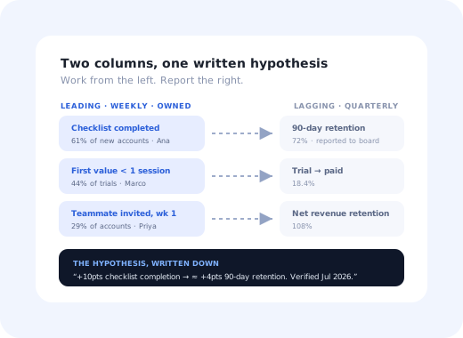
Every product team has a version of this meeting. Quarterly churn came in at 4.8%, up from 4.1%. The room agrees this is bad. Somebody asks what caused it. Nobody knows, because the users who churned in Q3 made their real decision somewhere in Q2, in a week nobody was measuring, over something nobody logged.
That is the problem leading indicators exist to solve. A lagging indicator tells you what happened; a leading indicator tells you what is about to. Churn, revenue, retention and satisfaction are all lagging: they are the scoreboard. Checklist completion in week one, the number of teammates invited by day seven, whether an account ever connected a data source: those move first, and they move while you can still do something about them.
This guide covers the difference, the three tests a leading indicator has to pass, how to find yours in your own data, a working set of leading indicators for onboarding, activation, retention, expansion and support, and the failure mode that ruins them: optimising one until it stops predicting anything.
Key Takeaways
- Lagging indicators are outcomes; leading indicators are behaviours. You can act on a behaviour this week. You cannot act on last quarter's revenue.
- A leading indicator must pass three tests: it predicts the outcome, you can influence it directly, and it moves soon enough to be useful.
- Teams over-collect lagging indicators because they are easy to get and are what leadership asks for. That is why so many dashboards are historical records with no steering wheel.
- Correlation is where you start, not where you stop. Confirm with a controlled change; otherwise you will optimise a symptom.
- Every leading indicator decays. Once it becomes a target, people find ways to move it without moving the outcome; recheck the link every quarter.
- Run a two-column dashboard. Leading indicators on the left for the team, lagging on the right for the board, with the link between them written down.
What Are Leading and Lagging Indicators?
The two definitions
A lagging indicator (also called a lag measure) reports an outcome that has already happened: quarterly churn, revenue, retention rate, net promoter score. It is accurate, it is what the business is actually judged on, and by the time it moves the cause is weeks or months in the past.
A leading indicator (a lead measure) is a behaviour or input that reliably precedes that outcome and that your team can influence directly: the share of new accounts that finish onboarding, the number of teammates invited in week one, the proportion of trials that reach a first meaningful action. It is less accurate as a measure of business health and far more useful as a place to act.
The distinction is not about which metrics are better. It is about which question you are asking. A lagging indicator answers "did it work?" A leading indicator answers "is it working?", and the second question is the only one you can still respond to.
| Leading indicator | Lagging indicator | |
|---|---|---|
| Measures | A behaviour or input | An outcome or result |
| Timing | Moves now, days or weeks ahead | Moves after the fact, often a quarter later |
| Influence | The team can change it this sprint | Only changeable indirectly, through other things |
| Certainty | Probabilistic: a good bet, not a guarantee | Definitive: it is the actual result |
| Audience | The team doing the work | The board, investors, the annual review |
| Examples | Checklist completion, teammates invited, first integration connected, weekly active days in month one | Churn rate, net revenue retention, expansion revenue, NPS |
| Failure mode | Gets gamed, or stops predicting | Arrives too late to act on |
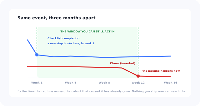
The gap between the two lines is the only window you get to change the outcome.
Why Dashboards Fill Up With Lagging Indicators
Nobody sets out to build a dashboard you cannot act on. It happens for three structural reasons, and recognising them is most of the fix.
Revenue, churn and account counts require no instrumentation. Leading indicators require you to decide what behaviour matters and then track the event, which is real work.
Boards ask about outcomes, correctly. The mistake is letting the reporting metric become the working metric, so the team ends up steering by a number they cannot move.
Churn is a fact. "Users who invite a teammate in week one retain better" is an inference. The second is more useful, and it feels softer, so it loses arguments it should win.
A dashboard that is an excellent historical record and a useless steering wheel, accurate about a quarter that is already over, and silent about the one currently going wrong.
The Three Tests of a Good Leading Indicator
Not every early number is a leading indicator. Most are just early numbers. A real one passes all three of these, and failing any single test is disqualifying.
1. Predictive: it actually correlates with the outcome
Users who do this thing must retain, convert or expand measurably better than users who do not. If the two groups behave the same, you have found an activity, not an indicator. Check this in your own data with a cohort analysis rather than borrowing someone else's benchmark, because activation behaviour is specific to a product in a way that churn is not.
2. Influenceable: your team can move it this month
"Customer's company grew headcount" might predict expansion beautifully and is useless to you. "Percentage of new accounts that complete the setup checklist" is something onboarding, product or customer success can change deliberately with work they are already able to do. If nobody in the room can name an action that would move the number, it is context, not a lever.
3. Timely: it moves inside your decision cycle
An indicator that resolves in eleven months is a lagging indicator wearing a disguise. For onboarding work you generally want signals that appear within the first session, the first week and the first month, because those are the windows in which you can still ship a change and see the effect.
The relationship you are looking for. A useful leading indicator lets you finish this sentence with a straight face: "If we increase X by ten points this quarter, we expect Y to improve by roughly Z, because we have seen that relationship hold in our own cohorts." If you cannot fill in every blank, the metric is not ready to steer by, and writing the sentence down is a fast way to find out which part is missing.
How to Find Your Own Leading Indicators in Five Steps
1. Pick one lagging outcome that matters
Not four. Ninety-day retention, trial-to-paid conversion, or seat expansion: one, chosen because it is the thing the team is currently accountable for. Everything downstream depends on this being a single number.
2. Split users by the outcome and look backwards
Take everyone who reached the good outcome and everyone who did not, then compare what they did in their first days. You are looking for behaviours with a large gap between the two groups, not the most common behaviour, the most discriminating one.
3. Shortlist behaviours that are early, common and controllable
Drop anything that happens too late to act on, anything so rare it cannot carry a target, and anything you have no way to encourage. What survives is usually three to five candidates, and they are frequently unglamorous: connecting a data source, inviting one colleague, creating a second project.
4. Test the link rather than assuming it
This is the step teams skip, and skipping it is how you end up with a company-wide push on a behaviour that merely correlates with being an engaged user. Deliberately increase the behaviour for one group (an onboarding change, a prompt, a checklist item) and see whether the outcome follows. Our guide to A/B testing onboarding covers running that cleanly.
5. Write the relationship down and give it an owner
One sentence linking the leading indicator to the lagging one, the size of the effect you observed, the date you observed it, and the person responsible for the number. Undocumented relationships turn into folklore within two quarters, and folklore is how a metric survives long after it stopped predicting anything.
A Working Set of Leading Indicators
These are the pairings that hold up across most B2B SaaS products. Treat them as candidates to test in your own data rather than as answers; the point of the previous section is that the specific behaviour is always product-specific.
| Area | Leading indicator (act on this) | Lagging indicator (reported) |
|---|---|---|
| Onboarding | Share of new accounts completing the setup checklist; drop-off rate per step | 90-day retention of the cohort |
| Activation | Percentage reaching the first meaningful action within one session; median time to first value | Trial-to-paid conversion rate |
| Adoption | Number of core features used in month one; second-session return rate | Stickiness and monthly active users |
| Retention risk | Weekly active days trending down; admin login gap; support tickets unanswered | Gross churn, logo churn |
| Expansion | Seats invited vs seats purchased; usage approaching a plan limit | Net revenue retention, expansion MRR |
| Support load | Repeat questions from one screen; failed searches in the help widget | Ticket volume, cost per ticket |
| Advocacy | Referrals sent; invitations accepted; template or dashboard sharing | NPS, review volume |
Two things are worth noticing about that table. First, most of the left-hand column is onboarding behaviour, which is why teams that take onboarding metrics seriously tend to get earlier warning about everything else. Second, several leading indicators feed a composite: a customer health score or a product engagement score is essentially a weighted bundle of leading indicators pointed at churn.
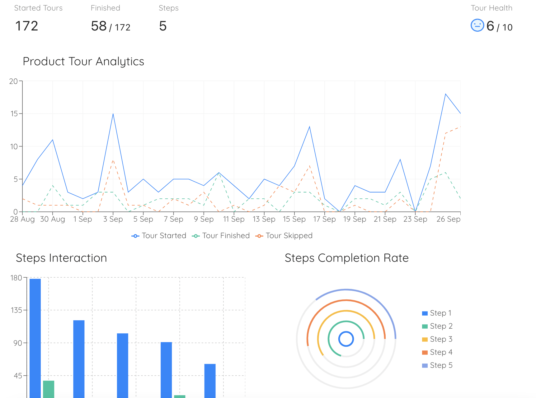
Step-level completion is a leading indicator you can read weekly. Churn is the same story, told a quarter late.
The Trap: When a Leading Indicator Stops Leading
Every leading indicator has a shelf life, and it expires for a predictable reason: the moment it becomes a target, people start moving it directly rather than moving the thing it was standing in for.
The mechanism is easy to see in a concrete case. Suppose you find that accounts completing the onboarding checklist retain far better, so completion becomes a company goal. Within a quarter, somebody has reduced the checklist to four trivial items, somebody else auto-completes two of them, and completion is up eighteen points. Retention has not moved. The indicator was never causal on its own: it was a proxy for a user who had genuinely set the product up, and the proxy has been detached from the thing it proxied.
Three habits that keep this honest. Re-run the correlation every quarter and be willing to retire an indicator that has stopped predicting. Pair every leading indicator with a guardrail metric that would move if you were gaming it: checklist completion alongside week-four retention of completers, not just completions. And never let the definition of the behaviour change in the same period you are targeting it, because you will not be able to tell improvement from redefinition.
Building the Two-Column Dashboard
The practical output of all this is a single view with two columns and an explicit link between them. It takes an afternoon and it changes what meetings are about.
Weekly cadence, owned by name, each one something the team can move this sprint. This is the column the team actually works from.
Monthly or quarterly, reported rather than steered. This is what the business is judged on, and it should not change often.
One sentence per pair stating the expected relationship and when it was last verified. This is the part that makes the dashboard a model rather than a wall of numbers.
If you already run a north star metric, it usually belongs in the middle: a north star is deliberately built to sit between behaviour and revenue, which is exactly the junction the two columns are describing. And if you set product OKRs, the healthy pattern is a lagging objective with leading key results: the outcome you want, measured by the behaviours you can actually deliver.
Leading vs Lagging Indicators: Do vs. Don't
✅ Do
- Pick one lagging outcome before choosing any leading indicator
- Verify the link in your own cohorts, not in a benchmark report
- Confirm causation with a deliberate change to one group
- Give every leading indicator a named owner
- Pair each one with a guardrail that would expose gaming
- Re-check the relationship every quarter
- Report lagging numbers upward, work from leading numbers
❌ Don't
- Steer the team by a metric they cannot move
- Assume a correlation you have not tested
- Adopt another company's activation metric wholesale
- Track twelve leading indicators at once
- Redefine the behaviour while you are targeting it
- Keep an indicator that has stopped predicting
- Treat a lagging indicator's movement as feedback on this week's work
Moving the Left-Hand Column
There is an awkward gap between identifying a leading indicator and improving it. You establish that accounts connecting a data source in week one retain far better, and then the work of getting more of them to do it lands in a product backlog behind everything else, and the number sits still for two quarters.
That gap is what in-app guidance closes. With Kompassify, the interventions that move onboarding-stage leading indicators (a checklist that makes the setup path explicit, a tooltip on the step where people stall, a targeted message to accounts that have not connected anything yet) are built and published without an engineering release, and step-by-step completion data comes back so you can see which step is actually costing you the number. That makes the loop short enough to run weekly: read the indicator, ship the change, watch the funnel, keep or revert. Kompassify is free up to 100 monthly active users, from $129/month on paid plans, GDPR-compliant and EU-hosted.
Move the numbers that move first
Build the checklists, tooltips and in-app messages that lift onboarding-stage leading indicators, then see completion step by step, without an engineering release. Free up to 100 monthly active users, plans from $129/month, GDPR-compliant and EU-hosted.
Start for free →The One-Paragraph Version
Lagging indicators (churn, revenue, retention, NPS) report outcomes that are already settled. Leading indicators are the behaviours that precede them and that your team can change this sprint. A real leading indicator has to pass three tests: it predicts the outcome in your own cohorts, someone on your team can move it deliberately, and it resolves inside your decision cycle. Find yours by splitting users on the outcome and looking backwards, confirm the link with a controlled change rather than a correlation, write the relationship down with an owner, and pair every indicator with a guardrail, because the moment a proxy becomes a target, somebody will find a way to move it without moving anything that matters.
Frequently Asked Questions
What is the difference between a leading and a lagging indicator?
A lagging indicator reports an outcome that has already happened: quarterly churn, revenue, retention rate, net promoter score. It is accurate and it is what the business is judged on, but by the time it moves the cause is weeks or months in the past. A leading indicator is a behaviour or input that reliably precedes that outcome and that your team can influence directly, such as the share of new accounts completing setup or the number of teammates invited in week one. Lagging answers “did it work?”; leading answers “is it working?”, and only the second question can still be responded to.
What are examples of leading indicators?
In SaaS, the useful ones are almost all early-lifecycle behaviours. For onboarding: setup checklist completion rate and drop-off per step. For activation: the percentage of users reaching a first meaningful action within one session, and median time to first value. For adoption: number of core features used in month one and second-session return rate. For retention risk: weekly active days trending down and admin login gaps. For expansion: seats invited versus seats purchased, and usage approaching a plan limit. Each of these should be tested against your own outcome data rather than adopted because it worked elsewhere.
What makes a good leading indicator?
Three tests, and failing any one is disqualifying. It must be predictive: users who do the thing must retain, convert or expand measurably better than users who do not, verified in your own cohorts rather than in someone else's benchmark. It must be influenceable: your team must be able to move it this month with work they can already do, otherwise it is context rather than a lever. And it must be timely: it has to resolve inside your decision cycle, because an indicator that settles in eleven months is a lagging indicator in disguise.
How do you find leading indicators for your product?
Pick one lagging outcome you are accountable for, such as ninety-day retention or trial-to-paid conversion. Split users into those who reached it and those who did not, then compare what each group did in their first days; you are looking for the most discriminating behaviour, not the most common one. Shortlist candidates that are early, reasonably common and controllable. Then test the link rather than assuming it: deliberately increase the behaviour for one group and see whether the outcome follows. Finally, write the relationship down with the observed effect size, the date and a named owner.
Why do leading indicators stop working?
Because once a proxy becomes a target, people start moving the proxy rather than the thing it stood for. If checklist completion predicts retention and then becomes a company goal, someone will shorten the checklist, someone will auto-complete two items, completion will jump, and retention will not move. The indicator was never causal on its own: it was standing in for a user who had genuinely set the product up. Guard against this by re-running the correlation quarterly, pairing every leading indicator with a guardrail metric that would expose gaming, and never redefining the behaviour in the same period you are targeting it.
Is NPS a leading or lagging indicator?
Net promoter score is usually a lagging indicator, despite frequently being described as predictive. It is a summary judgement a user forms after an accumulation of experiences, which means by the time the score moves, the experiences that caused it are already in the past. It also arrives on a survey cadence rather than continuously. It becomes more useful when paired with genuinely leading signals: support ticket sentiment, weekly active days, or effort scores collected immediately after a specific difficult interaction rather than at a random point in the month.
How many leading indicators should a team track?
Three to five, and fewer is usually better. Each one needs a named owner, a weekly cadence, a documented relationship to the lagging outcome, and a guardrail metric; that is real overhead, and a team tracking twelve of them is not tracking any of them. The practical structure is a two-column view: three to five leading indicators on the left, worked weekly by the team, two or three lagging outcomes on the right, reported monthly or quarterly upward, and one written sentence per pair stating the expected relationship and when it was last verified.
How do leading indicators relate to OKRs and north star metrics?
A north star metric is deliberately constructed to sit between behaviour and revenue, which puts it exactly at the junction the two columns describe; it is generally the most lagging of the leading indicators, or the most leading of the lagging ones, depending on how it was built. For OKRs, the healthy pattern is a lagging objective with leading key results: state the outcome you want in the objective, and measure progress with the behaviours your team can actually deliver. Setting a lagging key result gives a team a target they can only affect indirectly, which is where quarterly plans usually come apart.