Every product team has had this meeting. Retention is 38%, it was 38% last quarter, and nobody in the room can say whether the onboarding work shipped in the meantime did anything at all. The number is real, and it is useless, because it blends a user who signed up two years ago with one who signed up on Tuesday, and those two people have nothing in common except a row in the same table.
Cohort analysis is the fix, and it is a small idea with an outsized effect: group users by when they started or by what they did, then measure each group from its own day zero. The moment you do that, "38%" turns into a set of separate stories: March's signups fell off a cliff, June's flattened out, and the ones who finished the checklist in their first session behaved like a different product entirely.
This guide covers the whole thing: what a cohort actually is, the two families of cohort you will build, how to construct the table from your own event data, how to read it across rows, columns and diagonals, and the sizing and windowing mistakes that make cohort charts confidently wrong.
Key Takeaways
- A cohort is a group with a shared start. Everyone is measured from their own day zero, which is what makes different groups comparable.
- Acquisition cohorts answer "is the product improving?" Behavioural cohorts answer "which actions predict retention?" You need both.
- Read the table three ways. Rows are one cohort's life story, columns compare cohorts at the same age, diagonals expose calendar events that hit everyone.
- The period length must match your usage rhythm. Daily periods on a monthly product manufacture churn that does not exist.
- Small cohorts are noise with a colour gradient. Below a few dozen users per cell, one person returning moves the number more than your change did.
- Cohorts show that something changed; experiments show what caused it. Use the two together rather than choosing between them.
What Cohort Analysis Actually Is
Cohort analysis, in one paragraph
Cohort analysis is the practice of splitting users into groups that share a starting event, most often the week they signed up, and then tracking each group separately over time, measured from its own day zero rather than from the calendar. Because every group is followed from the same point in its own lifecycle, cohorts can be compared with each other: cohort A at week 4 against cohort B at week 4. The output is usually a cohort table, a grid with groups down the side and periods since day zero across the top.
The reason this matters is that blended metrics move for two completely different reasons, and they look identical from the outside. Suppose your overall weekly active rate holds steady at 40% for six months. That is compatible with a product where every cohort retains 40%, and equally compatible with a product where retention is collapsing and a growing acquisition budget is refilling the bucket fast enough to hide it. One of those is a healthy business. The other is a business with a few quarters left.
The mixing problem. A blended number is a weighted average of cohorts of different ages. When the mix changes (a big signup month, a churned enterprise account, a seasonal spike) the average moves without any user changing their behaviour. Cohorting removes the mix from the measurement, which is the entire point.
This is also why cohort analysis is the natural companion to onboarding work. Onboarding only ever affects new users, so its effect is invisible in any metric that includes people who signed up before the change shipped. Put the same change in a cohort table and it appears exactly where it should: as a step change between the last cohort that saw the old flow and the first one that saw the new one.
Acquisition Cohorts vs Behavioural Cohorts
Almost every cohort you will ever build falls into one of two families, and they answer different questions. Teams tend to start with the first and get their best insights from the second.
Everyone who signed up in the same week, month or quarter. Answers: is the product getting better over time? Did the change we shipped in April help the people who arrived after it?
Everyone who completed the checklist, invited a teammate, or connected an integration in their first week, whenever they joined. Answers: which early actions separate the users who stay from the ones who vanish?
| Acquisition cohort | Behavioural cohort | |
|---|---|---|
| Grouped by | Date of first signup | An action taken (or not taken) in a defined window |
| Typical question | Are newer users retaining better than older ones? | Do users who do X retain better than users who do not? |
| Needs | A signup timestamp and a return event | A reliable event taxonomy |
| Main risk | Attributing a change to your work when the traffic mix moved | Reading correlation as causation: engaged users do more of everything |
| Best used for | Tracking whether onboarding and product changes compound | Choosing an activation event and designing what to push users toward |
The behavioural cohort trap. "Users who invite a teammate retain 3× better" is almost always true and almost never actionable on its own, because inviting a teammate is a symptom of being committed as much as a cause of it. Forcing the action on everyone rarely reproduces the retention. Treat behavioural cohorts as a way to generate candidate activation events, then confirm the causal direction with an onboarding A/B test.
The Anatomy of a Cohort Table
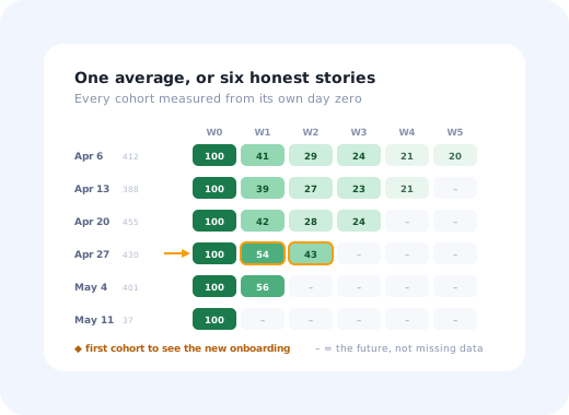
A cohort table is a triangle wearing a rectangle's clothes. Each row is one cohort, each column is a period since that cohort's day zero, and the reason the bottom-right is empty is simple: the cohort that signed up last week has not yet had a week 6. Here is a worked example: weekly signup cohorts for a B2B product, with the percentage of each cohort still performing a meaningful action in each later week.
| Signup week | Users | Week 0 | Week 1 | Week 2 | Week 3 | Week 4 | Week 5 |
|---|---|---|---|---|---|---|---|
| Apr 6 | 412 | 100% | 41% | 29% | 24% | 21% | 20% |
| Apr 13 | 388 | 100% | 39% | 27% | 23% | 21% | |
| Apr 20 | 455 | 100% | 42% | 28% | 24% | ||
| Apr 27 ◆ | 430 | 100% | 54% | 43% | |||
| May 4 | 401 | 100% | 56% | ||||
| May 11 | 37 | 100% |
Four things are worth noticing before we go anywhere near a method. Week 0 is always 100% by construction, because a cohort is defined by having been there. The staircase of empty cells is not missing data; it is time that has not happened yet, so the newest cohort has only one column and the oldest has six. The step between Apr 20 and Apr 27 is the signature of a change that only affected new users: 42% to 54% at week 1, and it is still holding at 43% in week 2 where the earlier cohorts had already fallen to 28%. And the May 11 cohort has 37 people in it, so when its week-1 cell arrives it will not be evidence of anything: one person changing their mind will move it by nearly three points.
Read the columns, not the diagonal edge. The interesting comparison here is vertical: four cohorts at week 1, three of them around 40% and two of them above 54%. That is the same-age comparison, and it is the only one that is fair. Whether the new cohorts' advantage survives to week 4 and week 5 is a question the table cannot answer yet, which is the honest answer, and a much better one than a blended number that would have shown nothing at all.
How to Build a Cohort Table in Five Steps
You do not need a data warehouse to do this. You need two events, a date function and a spreadsheet, or a product analytics view that will do the grouping for you. The hard parts are all definitional.
- Define day zero: the event that puts someone in a cohort.
- Define the return event that counts as "still here".
- Choose a period length that matches how the product is used.
- Count, divide, and lay it out as a grid.
- Shade it, then delete the cells you cannot trust.
1. Define day zero
For acquisition cohorts this is normally account creation, but "normally" hides a decision: in a B2B product with a trial, day zero can be the signup, the first login, or the day the account was provisioned by an admin, and those can be weeks apart. Pick the one that starts the clock on the experience you are trying to measure, write the definition down, and use the same one every time; most disagreements about cohort charts turn out to be two people using different day zeros.
2. Define the return event
This is the decision that determines whether your table is informative or decorative. "Logged in" is a terrible return event: it counts people who opened a tab and closed it, while a genuinely meaningful action (published something, ran the report, sent the message) tracks the value the product exists to deliver. If you have already chosen an aha moment or a north star action, reuse it here so the cohort table and the rest of your onboarding metrics agree with one another.
3. Choose the period length
Match the period to the product's natural rhythm. A team chat tool is a daily or weekly product; a payroll tool is a monthly one; an annual review platform may only be honestly measurable in quarters. The test is simple: if a perfectly happy user would not be expected to return within one period, the period is too short, and your chart will show a collapse that is really just a calendar mismatch.
4. Count and divide
For each cohort c and each period n, count the distinct members of c who performed the return event during period n, then divide by the total size of c. Two rules stop most errors: always divide by the original cohort size rather than by the survivors from the previous period, and count a user as retained in period n whether or not they were active in period n−1. Users come back. A table that forgets that will overstate churn badly.
5. Shade it, then delete what you cannot trust
Colour is not decoration here; a heat-shaded grid is readable in two seconds and the same numbers in black text take two minutes. Then be ruthless about removing cells that will mislead: partial periods at the bottom right, and any cohort small enough that individual users move the percentage more than the effect you are studying. A greyed-out cell communicates honestly. A confident-looking percentage built on 37 users does not.
Most product analytics views already hold the two events you need; the rest of cohort analysis is grouping and division.
Reading the Table in Three Directions
A cohort table is one of the few charts that means three different things depending on which way your eye travels. Teams that only read rows miss most of what is in it.
How this group decays over time. The healthy shape is a steep early drop that flattens into a plateau. A row that keeps sliding towards zero has no plateau, which means no core of habitual users.
The only fair comparison between cohorts, because every cell is measured the same number of periods after day zero. This is where an onboarding improvement shows up as a step change.
Every cohort at the same moment in real time. A dip that runs down a diagonal is not about onboarding; it is an outage, a holiday, a pricing change or a broken email.
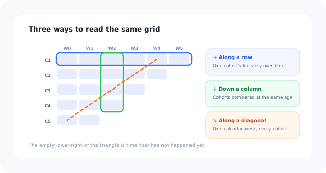
Same grid, three questions. Most teams only ever read it horizontally.
The row shape is the part with the most established interpretation, and it is covered in depth in our retention curve guide; a curve is simply one row of this table plotted as a line. If you want the visual vocabulary first (smile curve, flattening, decay to zero), start with what a retention curve is and come back. The column view is the one this guide is really about, because it is where product decisions get made.
What Teams Actually Use Cohort Analysis For
- Proving an onboarding change survived the first week. Activation rates move easily; week-4 retention does not. Comparing the pre-change and post-change cohorts down the week-4 column is the honest version of "the new flow worked", and it is the single most common use of the table.
- Choosing an activation event. Build behavioural cohorts for four or five candidate first-week actions and see which one separates the retention curves most sharply. That gap is the evidence behind picking one activation milestone over another.
- Finding which segment is dragging the average. Cohort by plan, role, acquisition channel or company size, and the flat blended number usually turns out to be two very different curves averaged together, the starting point for segmenting guidance rather than shipping one flow for everyone.
- Separating a product problem from a calendar problem. If the dip runs along a diagonal it happened to everyone at once and it is not your onboarding. That single distinction saves a lot of wasted redesign.
- Catching decay early. Because each cohort is independent, a deterioration in newly acquired users shows up months before it is large enough to move the blended churn rate.
Six Ways Cohort Charts Lie
Cohort tables look rigorous, which makes their failure modes more dangerous than a bad bar chart's. These are the ones that recur.
- Cohorts too small to mean anything. Weekly cohorts feel natural, but if you sign up 40 users a week, each cell moves 2.5 points per person. Widen to fortnights or months rather than reading noise as a trend.
- Partial periods shown as complete. The most recent cohort has not finished its current period, so its last cell is always artificially low, and it is the cell everyone looks at first. Grey it out.
- Survivorship in the denominator. Dividing by last period's survivors instead of the original cohort makes every curve look like it flattens beautifully. It is the most common arithmetic error in hand-built cohort tables.
- A period that does not match the product. Daily cohorts on a product used weekly produce a terrifying chart about nothing at all.
- Ignoring what changed upstream. A cohort that arrived during a discount campaign or a viral spike is a different population, not a better-onboarded one. Always ask what the traffic mix was doing before crediting the product.
- Treating a step change as proof of causation. Cohorts are observational. They tell you the world changed after a date; they cannot rule out the three other things that changed the same week. Pair with a controlled test when the decision is expensive.
Cohort Analysis: Do vs. Don't
✅ Do
- Write down the day-zero and return-event definitions and reuse them everywhere
- Divide by the original cohort size, always
- Grey out partial periods and thin cohorts
- Read columns, not just rows
- Annotate the table with what shipped and when
- Pair a suggestive cohort step with an experiment before making a big bet
❌ Don't
- Use "logged in" as the return event
- Compare a 3-week-old cohort with a 12-month-old one at different ages
- Present a percentage built on a dozen users
- Force the behaviour a good cohort happens to share and expect the retention to follow
- Change the definition mid-quarter and compare across the change
- Report a blended retention number as if cohorting did not exist
Closing the Loop: From the Table Back Into the Product
A cohort table is a diagnostic instrument, and diagnostics only pay for themselves when something changes as a result. The loop that works looks like this: find the column where cohorts diverge, use your onboarding funnel to locate the step where the weaker cohort stalls, ship a targeted change to that step for new users only, then wait for the next cohort to age far enough to fill the same column and compare.
The "for new users only" part is what makes the measurement clean, and it is also the part that traditionally requires a release cycle. It does not have to. In-app guidance (a checklist, a short contextual walkthrough, a tooltip on the step that stalls people) can be published to a specific segment on a specific date, which is precisely the shape of intervention a cohort table can measure. Our guide to reducing time to value covers what to change once you know where the stall is.
See how each cohort actually behaves
Kompassify shows you how every onboarding tour, checklist and survey performs step by step, so you can see which cohort completed what, then publish a targeted fix to new users without an engineering release. Free up to 100 monthly active users, plans from $129/month, GDPR-compliant and EU-hosted.
Start for free →The One-Paragraph Version
Cohort analysis replaces one number that mixes everybody with a grid of groups measured from their own day zero, so you can tell the difference between a product that is getting better and a product whose average is being propped up by acquisition. Define day zero and a return event that means something, pick a period that matches how your product is really used, divide by the original cohort size, then read the table down the columns rather than only across the rows.
Frequently Asked Questions
What is cohort analysis?
Cohort analysis is a way of grouping users who share a starting event, most often the week they signed up, and then following each group separately over time instead of blending everyone into one average. Because every group is measured from its own day zero, a cohort table lets you compare users who are at the same age in their lifecycle rather than users who happen to be in the product on the same calendar day. That is what makes it possible to say whether a change you shipped in March actually made new users behave differently, or whether the overall number moved because you acquired more people.
What is the difference between acquisition cohorts and behavioural cohorts?
An acquisition cohort groups users by when they arrived: signups in week 1, signups in week 2, and so on. It answers questions about whether the product is getting better over time. A behavioural cohort groups users by something they did or did not do: completed the onboarding checklist, invited a teammate, connected an integration, regardless of when they joined. It answers questions about which actions predict retention. Most teams start with acquisition cohorts because they are easier to build, and get their best insights from behavioural ones.
How do you build a cohort table?
Pick the event that defines day zero (usually signup), pick the return event that counts as retained (a meaningful action, not a page load), choose a period length that matches your product's natural usage rhythm, then for each cohort count how many members performed the return event in period 0, period 1, period 2 and so on, and divide by the size of the cohort. The result is a triangular grid: cohorts down the left, periods since day zero across the top, retention percentages in the cells. Shade the cells so patterns are visible at a glance.
How do you read a cohort chart?
Read it three ways. Across a row you see one cohort's life story: a steep drop then a flattening is healthy, a curve that keeps falling to zero is not. Down a column you compare cohorts at the same age, which is the only fair way to tell whether recent signups behave better than older ones. Along a diagonal you are looking at a single calendar week across all cohorts, which is where you spot outages, seasonality and pricing changes that hit everyone at once.
What is a good period length for cohort analysis?
Match it to how often a healthy user would naturally return. A daily collaboration tool is usually analysed in days or weeks; a monthly reporting product in months; a product used once per project cycle may need quarters. Choosing a period shorter than the natural usage rhythm produces a curve that looks like catastrophic churn when nothing is wrong, and choosing one that is too long hides the early drop-off where onboarding problems actually live.
How large does a cohort need to be?
Large enough that a handful of users changing their mind cannot move the percentage more than the effect you are trying to measure. As a working rule, be sceptical of any cell built on fewer than a few dozen users, and never make a decision on a single-digit cohort: a 12-person cohort moves by more than eight points every time one person returns. If your weekly cohorts are too small, widen the period to fortnights or months rather than pretending the noise is a trend.
Does cohort analysis prove that an onboarding change worked?
It provides strong evidence but not proof, because cohorts differ in more than the change you shipped: traffic mix, seasonality and pricing all move between weeks. Cohort analysis tells you that something changed for users who joined after a given date and lets you see how durable the change is; a controlled A/B test tells you that your change caused it. The practical pattern is to use an A/B test to establish causation and a cohort table to confirm that the effect survives past the first session.
What is the difference between a cohort table and a retention curve?
They are the same data in two shapes. A cohort table is the grid of every cohort against every period; a retention curve is one row of that grid plotted as a line, or an average of several rows. The table is better for spotting which cohorts differ and when, and the curve is better for judging the shape: whether retention flattens into a stable plateau or decays towards zero. Teams normally use the table to find the story and the curve to explain it.