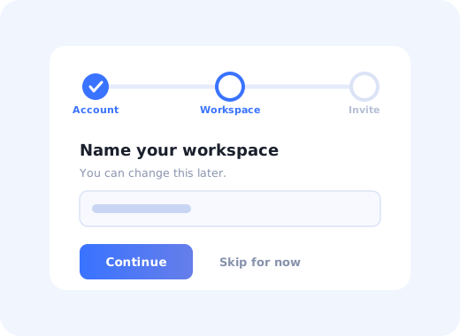
Almost every SaaS product has one: the short sequence of screens that appears immediately after signup, asks a handful of questions, and hands the user a configured workspace. Some of them are the reason users reach value on day one. Most are the reason they never get past day one.
The difference is rarely visual design. It is whether the wizard is collecting things the product genuinely cannot work without, or whether it has quietly become the place every team appended their favourite question.
This guide covers what an onboarding wizard is, when it is the right pattern (and when a checklist or product tour would serve better), how to design one that people finish, and six wizard patterns worth copying.
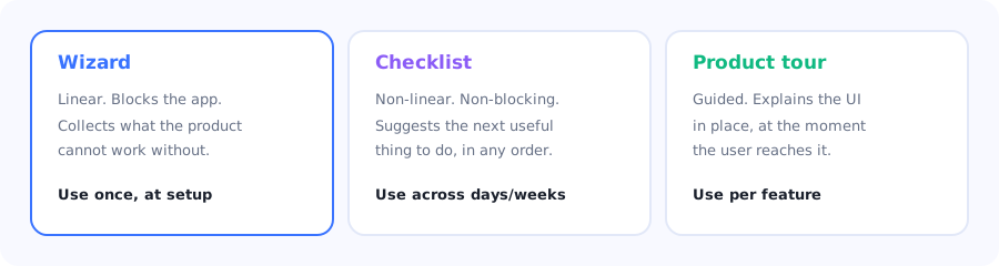
Three different jobs. Most weak onboarding is a wizard doing a checklist's work.
Key Takeaways
- A wizard is for setup, not for teaching. It should collect only what the product cannot function without.
- Every step must earn its place. The test: if this answer were missing, would the product be broken or merely less personalised?
- Show progress honestly. A visible, accurate step indicator is one of the largest single levers on completion.
- Let people skip. A skippable step gets abandoned; an unskippable one gets the whole signup abandoned.
- End inside the product, never on a summary screen. The last click should place the user in a workspace that already has something in it.
- Instrument every step. Wizard drop-off is the most precisely diagnosable funnel you will ever own.
What is an onboarding wizard?
Onboarding wizard definition: a short, linear sequence of screens shown immediately after signup that collects the information and choices a product needs before it can be useful: account details, workspace configuration, integrations, and team invitations. Unlike a checklist or a tour, a wizard is blocking: the user completes it, skips it, or abandons signup.
The blocking part is what makes wizards powerful and dangerous in equal measure. You have the user's full attention exactly once, with no competing UI. Every question you ask is paid for out of that attention, and the budget is smaller than most teams assume.
Wizard vs checklist vs tour
| Onboarding wizard | Onboarding checklist | Product tour | |
|---|---|---|---|
| Shape | Linear, blocking | Non-linear, persistent | Guided, contextual |
| Job | Configure the product | Drive a sequence of first wins | Explain the interface in place |
| Timing | Once, at signup | Across the first days or weeks | When the user reaches a feature |
| Failure mode | Too long, users abandon signup | Ignored if items feel like chores | Clicked through without reading |
| Right length | 2–4 steps | 3–6 items | 3–5 steps per tour |
The most common structural mistake in SaaS onboarding: putting checklist work inside the wizard. "Create your first project", "Connect your calendar", "Explore the dashboard" are all valuable, and none of them belong in a blocking sequence between the user and the product. Move them to a checklist the user can work through at their own pace.
When you should (and should not) use a wizard
✅ Use a wizard when
- The product genuinely cannot render a useful screen without input (a workspace name, a data source, a currency)
- Early choices meaningfully branch the experience
- Setup requires an irreversible or hard-to-change decision
- An integration must be connected before anything works
- Your product is multi-tenant and the user must create or join an organisation
❌ Use something else when
- You are collecting marketing or enrichment data
- The information could be inferred or defaulted
- You want to teach the interface; that is a tour's job
- The task is a first win rather than a prerequisite
- The answer only changes cosmetics
The question that removes half of most wizards: "If this field were blank, would the product be broken, or just less personalised?" Anything in the second category belongs in settings, in a checklist, or nowhere. Company size and job title are the classic offenders: genuinely useful to your go-to-market team, and pure friction for the user trying to reach value.
How to design an onboarding wizard people finish
Cut the steps to what the product cannot work without
Show accurate progress at every step
Ask one thing per screen
Default everything you can
Make every step skippable
Use early answers to branch what happens next
End inside a workspace that already has something in it
1. Cut the steps to what the product cannot work without
List every field, then delete anything that fails the broken-or-less-personalised test. Two to four steps is the range where completion stays high. Beyond five, drop-off climbs sharply and the steps at the end perform worst, which is unfortunate, because teams tend to put the hardest and most valuable step (connecting an integration, inviting the team) last.
2. Show accurate progress at every step
A step indicator does two jobs: it tells users how much is left, and it commits you publicly to not adding more. Users who can see "step 2 of 3" complete at meaningfully higher rates than users facing an unbounded sequence.
The rule that matters: the indicator must be honest. A wizard that says "step 2 of 3" and then reveals a fourth step destroys trust at exactly the wrong moment. If steps are conditional, count the maximum, not the minimum. The same principles that govern a good onboarding progress bar apply here.
3. Ask one thing per screen
A single question with plenty of space consistently beats a dense form, even though it means more screens. Each screen becomes a trivial decision instead of a small project, and, critically, you learn exactly which question people refuse to answer. A ten-field form that gets abandoned tells you nothing about which field caused it.
4. Default everything you can
Pre-fill from the signup email domain, the browser locale, the timezone, the invite that brought them in. Every field a user does not have to think about is a field that cannot cause abandonment. Sensible defaults with an obvious way to change them beat empty required fields in essentially every case.
5. Make every step skippable
This is the recommendation teams resist hardest, and the data is not ambiguous: a skippable step loses that step, while an unskippable one risks losing the user. Make "Skip for now" visible but secondary, and, the part most teams forget, put the skipped item straight into the onboarding checklist so it is not lost, just deferred.
6. Use early answers to branch what happens next
The strongest reason to have a wizard at all is that it lets you personalise everything downstream. A role or use-case question in step one can select which template is created, which tour runs, and which checklist appears. This is what multi-choice onboarding is for, and it is the difference between a question that costs the user something and a question that pays them back immediately.
If you ask a branching question and then show everyone the same next screen, delete the question.
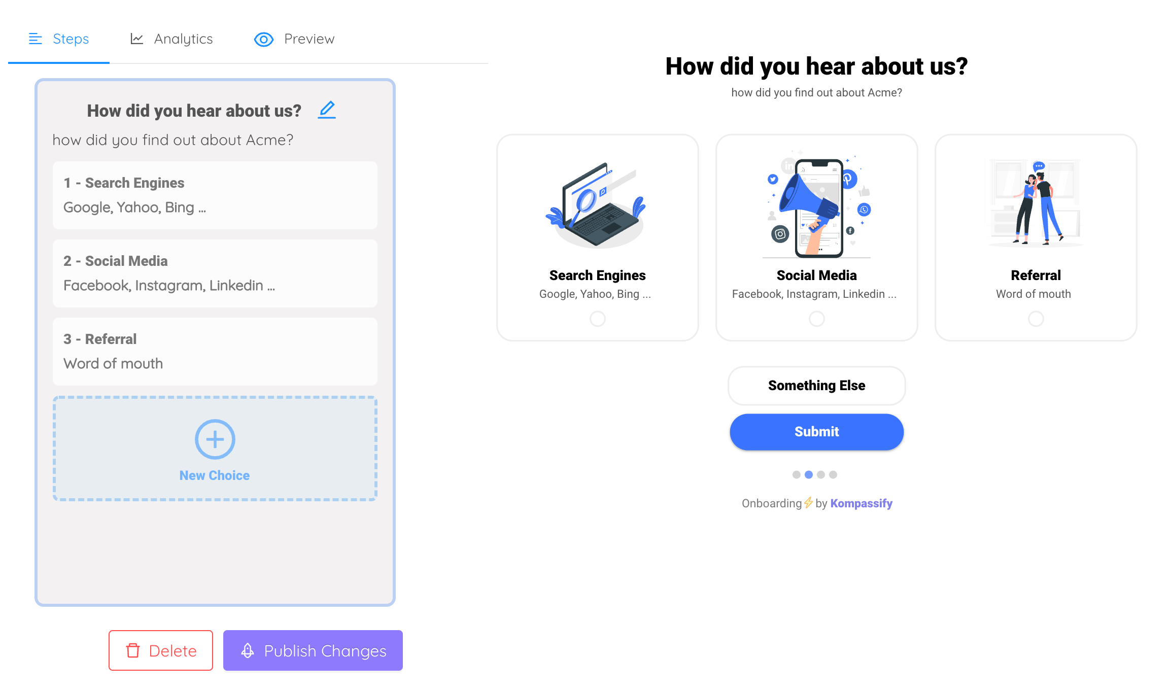
One branching question in step one, and everything downstream can be personalised to the answer.
7. End inside a workspace that already has something in it
The last click of a wizard should not land on "You're all set!"; it should land the user in the product, with their first object created, sample data loaded, or the view they configured already open. An empty state at the end of a wizard wastes the entire investment: the user did the work, and the product responded with nothing.
6 onboarding wizard patterns worth stealing
Step one asks a single question, "What will you use this for?", with three to five large, visual options. Everything afterwards is shaped by the answer: templates, sample data, the first tour, the checklist.
Rather than asking users to create their first object, the wizard creates one for them based on their answers: a sample project, a demo dashboard, a template document clearly marked as an example.
For products whose value depends on customer data, the entire wizard is one screen: connect a source. No profile questions, no preferences, just the one action that makes everything else possible.
The wizard collects only the two genuinely blocking items. Everything else that used to be step three through seven moves into a persistent checklist the user works through over the following days.
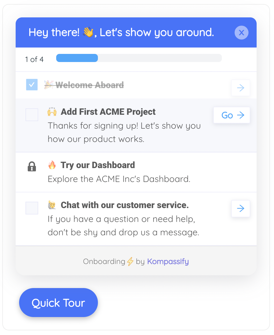
Everything that is not strictly blocking moves here, where users can work through it at their own pace.
Instead of a generic "invite your team", the step explains what specifically unlocks with a second person (shared views, assignment, approvals) and offers pre-filled suggestions from the email domain.
State is saved at every step, so a user who closes the tab at step two returns to step two rather than the beginning, and a persistent banner offers to resume rather than restart.
Measuring wizard performance
A wizard is the cleanest funnel in your product: fixed steps, known order, one entry point. Instrument it properly and it will tell you exactly where your onboarding fails.
| Metric | What it tells you | What to do about it |
|---|---|---|
| Step completion rate | Which specific screen loses people | Cut, default, or make that step skippable. |
| Skip rate per step | Which questions users consider irrelevant | A step skipped by most users should not be in the wizard. |
| Time per step | Which question is confusing rather than unwanted | Long time plus high completion usually means unclear wording, not a bad question. |
| Overall completion rate | Whether the wizard as a whole is worth its length | Compare against a shortened variant before adding anything new. |
| Activation rate by path | Whether completing the wizard actually helps | If skippers activate at the same rate, the wizard is decoration. |
That last row is the one worth taking seriously. Compare activation rates between users who completed the wizard and those who skipped through it. If the two groups activate at similar rates, your wizard is a toll booth rather than a setup step, and the fastest available improvement is deletion.
Building an onboarding wizard with Kompassify
Wizards are usually built into the product itself, which makes them slow to change: every experiment needs an engineering ticket, a release, and a rollback plan. That is why most teams ship one wizard and never iterate on it.
Kompassify lets you build and modify the guidance layer without code, which changes the economics of iteration:
- Branch on a first-step choice using multi-choice onboarding, then trigger a different tour and checklist per answer.
- Move deferred steps into a checklist so a skipped item is postponed rather than lost.
- Guide the first real task with a short product tour once the user lands in the workspace.
- Track step-level completion and drop-off with product analytics and change the flow the same day.
- Target by segment so enterprise trials, self-serve signups and invited teammates each get the right sequence.
Kompassify is a no-code digital adoption platform for SaaS teams: free up to 100 monthly active users, paid plans from $129/month, GDPR-compliant with EU hosting.
Ship a shorter wizard this week
Move the non-blocking steps into a checklist, branch the experience on one question, and see step-level drop-off, without an engineering ticket.
Start for Free →Frequently Asked Questions
What is an onboarding wizard?
An onboarding wizard is a short, linear sequence of screens shown immediately after signup that collects the information and choices a product needs before it can be useful, such as a workspace name, a data source, or a first integration. Unlike a checklist or a product tour, a wizard is blocking: the user either completes it, skips it, or abandons signup. That makes it powerful and expensive at the same time.
What is the difference between an onboarding wizard and an onboarding checklist?
A wizard is linear and blocking, runs once at signup, and exists to configure the product. A checklist is non-linear and non-blocking, persists across days or weeks, and exists to drive a sequence of first wins. The most common structural mistake in SaaS onboarding is putting checklist work, such as creating a first project or exploring the dashboard, inside the blocking wizard.
How many steps should an onboarding wizard have?
Two to four steps is the range where completion stays high. Beyond five, drop-off rises sharply, and the later steps perform worst, which is a problem because teams tend to place the most valuable step, such as connecting an integration or inviting the team, at the end. Apply one test to every step: if this answer were missing, would the product be broken, or merely less personalised? Only the first category belongs in the wizard.
Should onboarding wizard steps be skippable?
Yes. A skippable step loses that step, while an unskippable one risks losing the user entirely. Make the skip option visible but secondary, and move any skipped item straight into the onboarding checklist so it is deferred rather than lost. Forcing a team invitation is a particularly reliable way to lose solo evaluators who would otherwise have converted.
Where should an onboarding wizard end?
Inside the product, in a workspace that already has something in it: the first object created, sample data loaded, or the configured view already open. Ending on a summary or congratulations screen, or worse on an empty state, wastes the entire investment, because the user did the work and the product responded with nothing they can act on.
How do you measure whether an onboarding wizard is working?
Track step completion rate, skip rate per step, time per step, overall completion rate, and, most importantly, activation rate split by whether users completed or skipped the wizard. If skippers activate at roughly the same rate as completers, the wizard is a toll booth rather than a setup step, and the fastest improvement available is to remove it.
When should you use a product tour instead of a wizard?
Use a tour when the goal is to explain the interface rather than configure the product. A wizard collects input the product cannot work without; a tour teaches a user what a screen does at the moment they arrive on it. If you find yourself writing explanatory copy inside wizard steps, the content probably belongs in a contextual tour or tooltip instead.
Can you build an onboarding wizard without code?
The blocking setup screens themselves are usually part of the product, but almost everything around them, including the branching, the deferred checklist, the follow-up tour and the step-level analytics, can be built and changed without engineering work using a digital adoption platform. That matters because the main reason teams never improve their wizard is that every experiment requires a release.