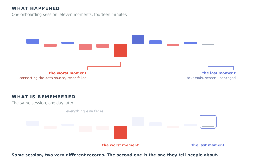
Every onboarding team eventually runs into a number they cannot explain. The funnel looks healthy. Seventy one percent of new accounts finish setup. Median time to first report is under fifteen minutes. Nothing in the product analytics suggests a problem. Then the quarterly survey comes back with an onboarding satisfaction score of 6.4 out of 10, a customer success manager forwards an email describing setup as painful, and a sales engineer mentions that three prospects in a row asked whether implementation is really as hard as their colleague said.
The usual reaction is to distrust one of the two sources. Either the survey is noisy and unrepresentative, or the analytics are measuring the wrong thing. In most cases neither is true. The two numbers disagree because they are recordings of different things. Your analytics record the session as it happened, second by second. Your survey records what is left of that session in someone's memory a day or a week later, and memory is not a recording. It is a summary, and it is built by a rule that throws away most of the material.
That rule has a name. The peak-end rule says that when people look back on an experience, they judge it by its most intense moment and by how it ended. The average barely matters. The length barely matters. Two moments do almost all the work, and in most SaaS onboarding flows neither of those two moments was designed by anybody.
This guide explains what the rule is and where it came from, why it makes your funnel and your survey disagree, where the worst moment usually hides in a software onboarding, why shortening a flow is usually the wrong first fix, and how to find and repair the two moments that actually survive. It ends with how to build them into a product, how to measure them without fooling yourself, and where the rule stops being useful.
Key takeaways
- The peak-end rule says a remembered experience is dominated by its most intense moment and by its final moment. The middle is compressed almost to nothing.
- Duration neglect is the companion finding: how long something took has very little weight in the memory. Cutting three steps changes less than repairing one bad one.
- Your product analytics measure the session as it happened. Your surveys, renewals and referrals are answered from the memory of it. They are not supposed to match.
- Negative peaks outweigh positive ones. Repairing the worst moment buys more than adding a delightful one somewhere else.
- Every onboarding has an ending whether you design one or not. The default ending is a tour's last step followed by an unchanged screen, which is an anticlimax by construction.
- A survey fired straight after a hard step measures the trough. One fired after a win measures the peak. When you ask is part of what you measured.
What the Peak-End Rule Is
Peak-end rule: definition
The peak-end rule states that people evaluate an experience after the fact almost entirely on two data points: the most intense moment they went through, and how it felt at the end. The rest of the experience, including how long it lasted, contributes very little to the remembered judgement.
The rule comes out of work by the psychologists Daniel Kahneman and Barbara Fredrickson and the colleagues who ran the original studies with them. The design of those studies is worth knowing, because it is exactly the design a product team should copy. Participants rated an unpleasant experience twice: once continuously, while it was happening, and once afterwards, from memory. The two sets of ratings did not behave the same way. The live ratings tracked whatever was happening at that second. The retrospective ratings tracked the worst point and the final point, and were nearly indifferent to how long the whole thing had gone on.
The most quoted result is the uncomfortable one. Adding extra time to an unpleasant experience, where the extra time was mildly less unpleasant than what came before, made people remember the longer episode as better than the shorter one. More total discomfort, better memory. That is not a rounding error or a quirk of one experiment; it is what you get when the summary is built from the end rather than from the sum. The same pattern has since been reported for pleasant experiences, for long ones such as holidays, and for clinical procedures.
For anyone building software the translation is direct. Onboarding is a short, emotionally uneven experience that each user goes through exactly once and then never repeats. It is close to a perfect candidate for peak-end compression. Whatever a user says about how hard your product was to set up, they are not replaying the session. They are reporting a summary, and that summary was assembled from the moment that hurt most and the moment it stopped.
The Two Selves: Why Your Funnel and Your Survey Disagree
Kahneman's framing for this is that two different selves are involved, and they are not asked the same questions. The experiencing self lives through the session one second at a time. The remembering self shows up afterwards, writes the summary, and then makes every decision that matters commercially: whether to come back, whether to expand, whether to recommend, what to answer on a survey, what to say in a renewal call.
Product teams instrument the experiencing self extremely well and the remembering self hardly at all. Every step transition, every dwell time, every drop-off is captured. Then the only channel through which the remembering self speaks, the survey or the sales conversation, is treated as soft data and discounted when it disagrees with the funnel. The disagreement is the signal. It usually means there is a moment in the flow that is intense enough to dominate the memory and small enough to disappear into an average.
| The experiencing self | The remembering self | |
|---|---|---|
| What it is | The user living through the session, second by second | The user a day later, holding a compressed summary |
| Where you see it | Product analytics, step completion, timings, session replay | Surveys, reviews, renewal calls, what they tell a colleague |
| What it weighs | Everything, equally, in real time | The peak and the end, almost nothing else |
| How duration counts | Fully: twice as long is twice as much experience | Barely: twice as long is remembered about the same |
| What it is good for | Finding where users stall, fail or abandon | Predicting what they will say, renew and recommend |
| Typical team response | Trusted, dashboarded, reviewed weekly | Called anecdotal when it contradicts the dashboard |
| Who it decides for | Whether this session finishes | Whether there is a next year |
This is why a healthy funnel and a mediocre score can both be accurate descriptions of the same onboarding. The funnel is telling you that people get through. The score is telling you what getting through felt like in retrospect. If you want to know which step is responsible, you do not need more funnel data. You need to find the one moment intense enough to have survived the compression. That is a different search, and behavioural analytics and session replay are much better at it than a completion chart, because you are looking for intensity rather than volume.
Duration Neglect, and Why a Shorter Onboarding Is Usually the Wrong Fix
The single most common onboarding improvement plan is to make the flow shorter. Cut the tour from eleven steps to seven. Remove two fields from the setup form. Merge the workspace step into the profile step. It feels obviously right, it is easy to scope, and it produces a before and after screenshot that anyone can understand.
Duration neglect says most of that effort buys you very little in the memory. Among the users who reach the end, the four steps you removed were never the thing they held against you. They were part of the compressed middle. What they held against you was the step where the integration failed, or the screen where they could not tell which of three plans included the feature they had been sold, or the point at which they had to leave the product to find an API key. Those are the moments that made it into the summary, and every one of them survives a shortening that leaves them in place.
The memory keeps two points off this curve and discards the shape between them. Removing minutes from the flat middle moves the remembered score much less than lifting the single deepest point.
None of this means length is free. It is not. A longer flow gives people more opportunities to give up, and a user who abandons at step nine never reaches an ending at all, so none of this rule applies to them. The distinction worth holding is that length is a completion problem and shape is a memory problem. Manage length in your onboarding funnel, because it governs who finishes. Manage the peak and the end separately, because they govern what the finishers think of you afterwards. Teams that only run the first project keep hitting the same wall: completion goes up, sentiment does not move, and nobody can explain why.
A useful reframing for planning: if you cut two steps out of a flow, ask which of the remaining steps is now the worst one. If the answer is the same step as before, you have improved your completion rate and left the memory untouched.
Where the Negative Peaks Hide in SaaS Onboarding
Negative peaks are rarely exotic. Across most B2B products they cluster into the same six places, and they share a family resemblance: each is a moment where the user has to act on something the product has not given them, and where failure is both possible and unexplained. Intensity comes from helplessness far more than from effort. A hard step where you know exactly what to do next is remembered as work. A short step where you do not is remembered as a wall.
The user has decided to try your product and is immediately asked to stop and go elsewhere: check an inbox, wait for a sync, get an admin to approve them. Intensity here comes from the interruption, not the duration. Fifteen seconds of being told nothing feels worse than two minutes of a progress indicator that says what is happening and how much is left.
The first screen after signup is often a correct but useless view of zero data. The user cannot judge whether the product is good, cannot start, and has no obvious first move. This is the most common negative peak in self-serve products and also the cheapest to fix, which is why empty states deserve real design attention rather than an illustration and a heading.
Connecting a data source or an integration puts the user in someone else's interface, looking for something they have never heard of, with an error message written for a developer. It is the classic peak in products that need a connection before they can show value, and the only reliable repair is to take the user through it inside your own product rather than linking out to documentation.
An import that rejects the file, a validation that fires on a field the user believed was optional, a save that silently does not save. What makes this a peak is not the failure but the absence of a next action. An error that says what happened, why, and what to do about it is a bump. One that says an error occurred is a wall, and walls are what get remembered.
The user is halfway through building something and hits a feature that is not in their plan, or a seat cap, or a usage limit. The emotional content is not the price; it is the reversal. They were making progress and now they are not, for a reason nobody mentioned earlier. Surfacing limits before the work starts converts a peak into an informed decision.
Not an error and not a wall: just a screen where the path stops being obvious. The user tries two things, neither of them is it, and the feeling is that they are doing this wrong. This one rarely shows up in analytics as a failure because nothing failed. It shows up as a gap in the timestamps, and then as a sentence in a survey about the product being confusing.
Two things about this list are worth saying plainly. First, negative peaks count for more than positive ones. Adding a moment of delight somewhere else in the flow does not cancel a wall; the wall is still the most intense point and therefore still the peak. Repair comes before delight, every time. Second, most of these moments are already described inside your own organisation. Support tickets, sales objections and the first question on every implementation call are a better inventory of your negative peaks than any dashboard, and they are free.
Peak-End Rule Examples, Inside and Outside Software
The rule is easier to hold on to through examples, and the non-software ones are useful because the mechanics are so visible. Each of these is the same shape: an experience whose remembered quality was set by one intense moment and one final moment, rather than by its overall content.
-
The queue that ends well. Two queues of identical length, one that ends at a disorganised counter and one that ends with someone who greets you and gets it done in thirty seconds. People report the second as a shorter wait. The wait was the same. The end was not.
Memory keeps: the final thirty seconds.
-
The holiday with one bad day. Ten days of which nine were good and one involved losing a bag at an airport. Ask a month later and the bag comes up first. Duration neglect means the nine days do not outvote the one, because they were never being added up.
Memory keeps: the worst hour of ten days.
-
The flight that lands late. A comfortable six hours followed by forty minutes on the tarmac and a slow baggage belt becomes a bad flight. The airline optimised the six hours and left the end undesigned, which is exactly the trade most onboarding flows make.
Memory keeps: the last forty minutes.
-
The import that failed twice. Twelve minutes of setup, eleven of which were uneventful, one of which was a column mapping that rejected the file without saying which column was wrong. The next day the user describes your onboarding as fiddly. They are describing sixty seconds of it.
Memory keeps: the one screen that fought back.
-
The trial that expired quietly. Fourteen good days ending with a locked screen and a pricing table. Nothing was broken and the product worked well throughout, but the final state of the relationship is a door closing, and that is what gets summarised.
Memory keeps: the lockout, not the fortnight.
-
The tour that stops. Seven well written steps, the last one says you are all set, the user clicks the button and the screen is exactly as it was before the tour started. No new state, no next action, nothing achieved. The most common ending in SaaS, and structurally an anticlimax.
Memory keeps: an ending that contained nothing.
-
The setup that finishes with the real thing. The same seven steps, but the last one produces the user's first genuine output: a report with their data in it, a workspace with their team in it, a live page with their content on it. Same effort, different ending, and a noticeably different answer to the survey two days later.
Memory keeps: the moment it became theirs.
The Ending Nobody Designs
Every onboarding has an ending. The only question is whether anyone chose it. When nobody chooses it, the ending is whatever happened to be last, and in software what happens to be last is almost always an administrative event rather than an achievement: a modal closing, a tour finishing, a trial expiring, a checklist reaching one hundred percent with no acknowledgement.
It is worth noticing how many endings a single onboarding actually contains, because teams often design none of them while assuming someone else covered one.
-
The end of the tour. The last step of a product tour. Usually treated as a dismissal rather than a conclusion, and usually the weakest of the six.
-
The end of the checklist. The final item ticked. This one has natural ceremony available to it and is frequently wasted, because the reward for finishing is that the checklist disappears.
-
The end of setup. The moment configuration stops and normal use could begin. Often invisible: no screen marks it, so the user never learns that they are done.
-
The end of the first session. Where the user actually stops, which is rarely where you planned. Whatever is on screen when they close the tab is a candidate for the remembered ending.
-
The end of the trial. For self-serve products this is frequently the strongest ending in the whole relationship, and it is usually designed by the billing system.
-
The end of the onboarding period. For assisted onboarding, the handover from the implementation team to normal support. A real event for your company that is often never announced to the customer.
Pick the one a user would name if asked when onboarding finished, and treat that as the ending you are designing. It is not always the one on your project plan. In a product where setup is assisted but value arrives later, the remembered ending is often the first unassisted week, not the kickoff call. In a self-serve product it is usually the first session, whatever your checklist says.
The reason the default ending is so weak is structural rather than careless. A tour is a temporary layer over an interface. Its natural conclusion is its own removal, so the last thing it does is subtract itself and return the user to the screen they started on. Nothing has been produced. That is the anticlimax by construction, and it is why an ending has to be designed as its own thing rather than inherited from whatever mechanism delivered the guidance.
The Peak-End Grid: What Users Actually Say
Putting the two variables on axes makes the priorities visible, and makes an uncomfortable point unavoidable: the quadrant most SaaS onboarding sits in is not the painful one. It is the forgettable one.
The forgettable quadrant is the quiet one. Nothing went wrong, nobody complains, and nobody ever says anything good about you either.
The mild peak with no ending, the quadrant where most products live, deserves attention precisely because it generates no signal at all. Those users finish, they do not write tickets, their score is a six or a seven, and they are invisible in every review meeting because nothing failed. They are also the population from which advocacy never comes, and advocacy is not a nice extra in product-led growth: it is the distribution channel.
How to Map the Peaks and the End of Your Onboarding
This is a half-day exercise with a pen, not an analytics project. The output is a list of moments with a number against each, and the two moments that matter fall out of it immediately. Do it on one specific journey for one specific segment; averaging across segments hides exactly the intensity you are looking for.
- Choose one journey and one starting point.
- List every moment, not every screen.
- Score each moment for felt intensity, not effort.
- Mark the peak and mark the real end.
- Check your scores against evidence you already have.
- Fix the peak first, then design the end.
1. Choose one journey and one starting point
Pick a real segment and a real entry: a marketing manager arriving from a demo request, or an operations lead invited by a colleague who already bought. Different entries produce different peaks, and a map that covers all of them covers none of them. If you have already done journey mapping work, reuse the segments you defined there rather than inventing new ones.
2. List every moment, not every screen
A moment is anything with emotional content: a decision, a wait, a failure, a success, a handoff, a surprise. Some screens contain three moments and some contain none. Include the parts that happen outside your product, because the user does not draw that boundary: the email that did not arrive, the call with your implementation team, the message to a colleague asking for access. Twenty to forty moments is normal for a B2B onboarding.
3. Score each moment for felt intensity, not effort
Use a simple scale from minus three to plus three and ask how it felt, not how long it took or how hard it was. A ten minute task the user knows how to do scores near zero. A ninety second task where they do not know whether they are doing it right scores minus two. This is the step where teams cheat by scoring their own workload instead of the user's experience, and the map becomes useless the moment they do.
4. Mark the peak and mark the real end
The peak is the largest absolute value on the list, and in most products it is negative. The end is whichever of the six endings this segment would actually name. Write both at the top of the page. Everything else on the list is now context rather than priority, which is the point of the exercise and usually the hardest part to accept.
5. Check your scores against evidence you already have
Take the three worst moments on your map and look for them in support tickets, in sales call notes, in the questions asked during onboarding calls, and in session recordings around those steps. If your predicted peak does not appear anywhere in that evidence, you probably scored your own anxieties. If something appears constantly that is not on your map, add it and rescore.
6. Fix the peak first, then design the end
In that order, and with the understanding that they are different kinds of work. Repairing a peak is usually product work: a better error, an inline connection flow, a limit surfaced earlier. Designing an ending is usually content and sequencing work, which means it can often ship in a day. Do the cheap one second rather than first, because a good ending on top of an unrepaired wall reads as tone deaf.
Five Ways to Repair a Negative Peak
A peak can be lowered without removing the underlying task. What makes a moment intense is usually uncertainty, isolation or reversal, and each of those has a fix that does not require rebuilding the feature.
-
1. Name what is about to happen, before it happens. A step that has been described in advance cannot produce the same spike, because the user is no longer wondering whether something has gone wrong. Telling someone that the next screen needs a key from another tool, where to find it and roughly how long it takes converts a wall into an errand.
Removes: uncertainty about whether this is normal.
-
2. Put the help on the element, not in a document. Sending a user to a help centre in another tab at the worst moment of their onboarding adds a context switch to an already bad minute. The same paragraph delivered as a tooltip on the field in question costs them nothing.
Removes: the search for an explanation.
-
3. Make failure cheap and visibly reversible. Much of the intensity in a setup step comes from the fear of doing something permanent to real data. A preview before applying, a clear undo, or a statement that nothing is saved until the final confirmation removes most of the emotional charge without changing the mechanics at all.
Removes: the fear of an irreversible mistake.
-
4. Turn dead waiting into narrated waiting. If a sync takes four minutes, four minutes of a spinner and four minutes of a running account of what is being processed are the same duration and completely different experiences. Where the wait blocks everything, give the user something useful to do in it, even if it is only choosing a setting that will be needed later.
Removes: helplessness, which is the actual cost of waiting.
-
5. Never end a failure without a next action. Every error state in an onboarding path should name what went wrong and what to do now, including the option of asking a human. An error with a way forward is a bump. An error with nothing after it is where a peak comes from, and it is also where support tickets and abandoned trials come from.
Removes: the dead end.
These repairs overlap with general friction reduction work, but the selection criterion is different and worth keeping separate. Friction work goes after the sum of small costs. Peak work goes after one moment, deliberately ignoring the rest, because that one moment is doing more damage to your reputation than all the small costs combined.
How to Design an Ending Worth Remembering
A good ending is not a celebration. Confetti on a screen where nothing was achieved is worse than no ending, because it tells the user that your idea of an accomplishment is them clicking through your instructions. A good ending does five specific jobs, and the celebration, if there is one, is just the wrapper.
-
It marks the finish explicitly. The user should not have to infer that onboarding is over. Say it: setup is complete, you are live, your workspace is ready. An unannounced ending is experienced as an unfinished one, and unfinished things generate a low hum of doubt rather than a memory of success.
-
It shows the thing they now have. The ending should put the user in front of the artefact they created, not in front of a message about it. Their report, their workspace with their data, their page, their first automation running. This is the difference between an ending that contains an achievement and one that contains an announcement.
-
It names the next useful action without demanding it. One clear suggestion, phrased as an invitation, and no second modal. The aha moment is often close by at this point, and a single well chosen next step is how users get there under their own steam.
-
It says where help lives from now on. The end of onboarding is where guidance changes from something that comes to you to something you have to go and find. Show the user the place they will use later, once, while they are still in a learning frame of mind.
-
It leaves a workspace worth returning to. Whatever is on screen when the last overlay closes is the final image of the session. If it is the same empty screen they saw at the start, the ending you designed has been overwritten by the state of your product.
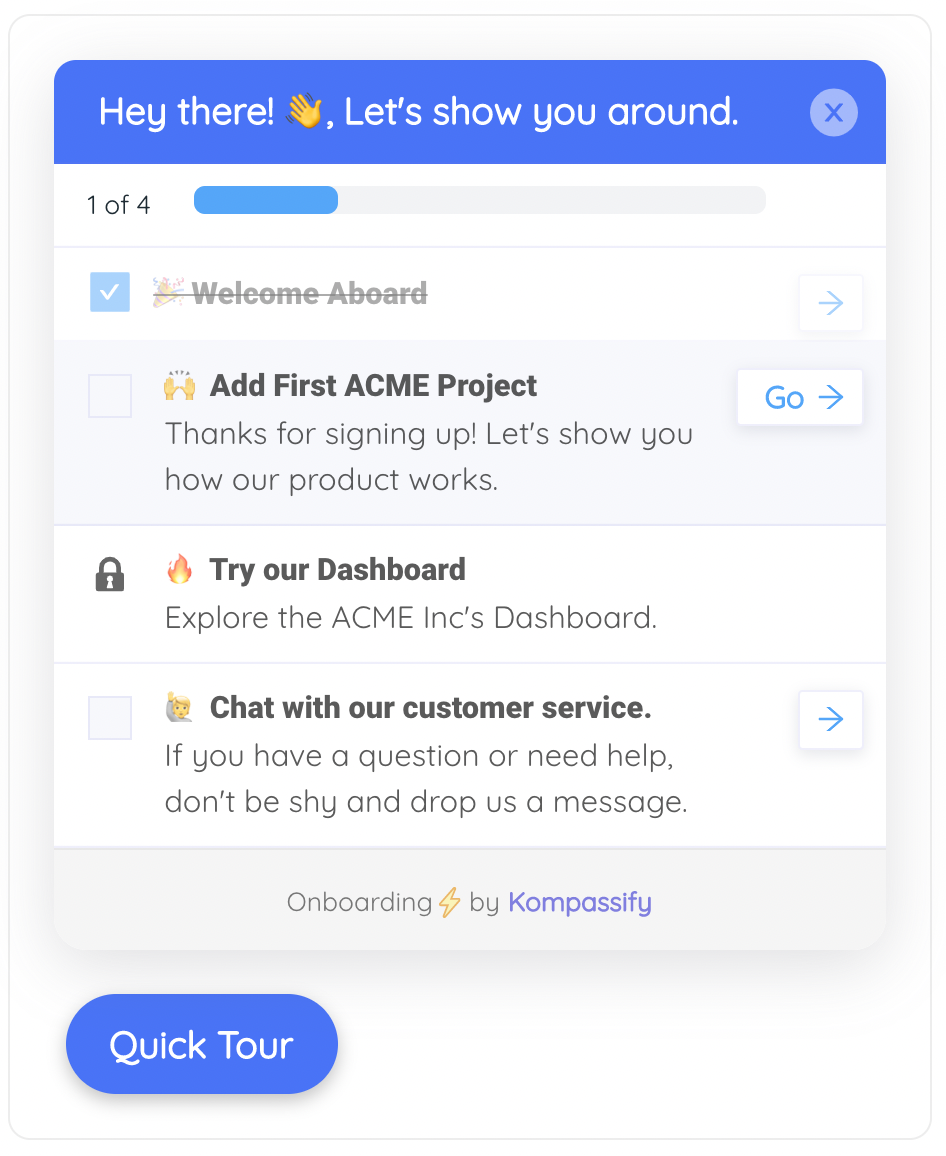
A checklist gives an onboarding a finish line the user can see coming, which is half of an ending. The other half is what is on the screen after the last item is ticked.
One warning about ceremony. Celebration works when it marks something real and stops working quickly when it does not, which is the same lesson the gamification literature keeps repeating. One meaningful acknowledgement at the point of genuine completion is worth more than a congratulation on every step, and far more than a congratulation on finishing a tour that produced nothing.
Building the Peaks and the End with Kompassify
The two moments this rule cares about are mostly built out of small pieces of in-product guidance placed at exact points, which is the kind of change that should not need an engineering ticket. Kompassify is a no-code platform for exactly that: you build the guidance on top of your existing product, target it at the users and pages you choose, and change it whenever the flow changes.
-
Lower the peak with a tooltip on the step that hurts. Attach an explanation to the specific field or button where people get stuck, so the help arrives without the user leaving the screen. This is the cheapest repair available for the credentials step and the unexpected limit.
-
Warn before the hard step, not after it. A short modal or an announcement placed one step earlier can set expectations about what is coming, what the user will need to have ready and how long it takes, which is most of what converts a wall into an errand.
-
Give the flow a visible finish line. An onboarding checklist makes the end predictable, keeps progress visible across sessions, and gives you a defined moment to design, which a tour on its own does not.
-
Make the last step do something. Tour steps and modals can carry a call to action that sends the user to a specific page, so the final step can land them on the thing they just built rather than dismissing itself and leaving the screen unchanged.
-
Ask at the moment you mean to measure. A short in-app survey triggered right after the step you are trying to repair tells you about that step. One triggered after the ending tells you about the ending. Choosing the trigger deliberately is the whole discipline.
-
Watch where the tour is actually abandoned. Per-step completion data shows you which step people leave on, which is frequently the same step your peak map predicted and occasionally a step nobody suspected.
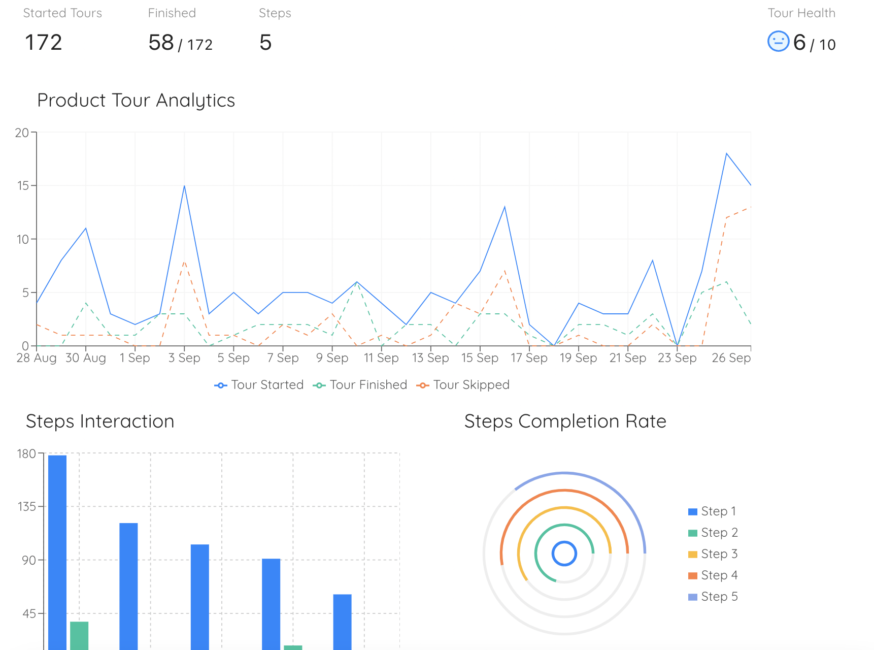
Step-level drop-off is the closest thing in a dashboard to a negative peak: the point where enough people stopped that the shape of the flow changes there.
Design the two moments that survive
Put an explanation on the step that hurts, give your onboarding a finish line users can see, and end it on something they built rather than on a dismissed tooltip. No code required. Free up to 100 monthly active users, plans from $129/month, GDPR-compliant and EU-hosted.
Start for free →How to Measure the Peak and the End Without Fooling Yourself
The measurement mistake this rule exposes is averaging. A single satisfaction score covering the whole onboarding is a number about two moments pretending to be a number about a process, and it moves for reasons you cannot trace. Measuring the two moments separately gives you something you can act on.
| What to measure | Where it comes from | What it tells you | The trap |
|---|---|---|---|
| Step-level drop-off | Tour and checklist analytics | Which step is intense enough to stop people | A step people finish can still be the peak |
| Time gaps between steps | Product analytics timestamps | Where people leave to find something or ask someone | Long gaps also mean lunch |
| Retries and repeated errors | Error logging on onboarding paths | The strongest candidate for the negative peak | Only counts failures the product noticed |
| A one-question survey at the hard step | In-app survey triggered on that step | The trough, deliberately | Do not read it as a score for onboarding |
| A one-question survey at the ending | In-app survey triggered on completion | The end, deliberately | Will flatter you if the ending is good |
| The same question a week later | Email or in-app, after the fact | The memory, which is what you are managing | Lower response rate, and worth it anyway |
| The words in support tickets | Support, in the first thirty days | Which moment is being retold | Only the users who bothered to write |
The trigger point is not a detail. A survey fired immediately after your hardest step measures the trough and will look like a crisis. The same survey fired two minutes later, after a success, measures the recovery and will look fine. Neither is wrong, but a team that changes its trigger without noticing has changed its baseline, and will spend a quarter explaining a movement it caused itself. Whatever you do with NPS or CSAT during onboarding, fix the trigger and leave it alone.
It is also worth measuring the gap between your funnel and your survey on purpose, rather than treating it as noise. A high completion rate next to a flat satisfaction score is the classic signature of an undesigned ending. A healthy satisfaction score next to a poor completion rate usually means the users who make it through are having a good experience and the ones who do not are hitting a wall you have never seen, because they left before they could tell you about it.
When the Peak-End Rule Misleads You
The rule is a description of how memory works, not a licence to manage impressions. There are four situations where leaning on it produces worse decisions, and they are worth naming because each one is a place teams reliably overreach.
A well designed ending on top of a product that does not work is theatre, and users see through it quickly. The peak is still the peak. Ceremony that is not attached to a real accomplishment reduces trust rather than raising a score.
For high-frequency products, the memory of onboarding is overwritten within a fortnight by the memory of using the thing. The rule governs the first impression and the stories told early; it does not govern a two-year relationship.
Moving a survey trigger to a happier moment raises the score without changing anything for anyone. It is the easiest form of measurement theatre available to an onboarding team and the fastest way to make your own data useless.
Peaks and endings only exist for users who reach them. If half your signups never get past step two, the work is completion, not memory, and every hour spent on the ending is an hour spent on a population that already likes you.
There is a fifth caution that is more about internal politics than psychology. Because the rule licenses ignoring most of a flow, it can be used to dismiss legitimate complaints about the middle: it does not matter, nobody remembers it. Users do experience the middle even if they do not recall it in detail, and the accumulated cost of a tedious middle shows up as UX debt and as slower work forever after. The rule tells you what dominates the memory. It does not tell you that the rest is free.
Peak-End Rule: Do and Do Not
✅ Do
- Map the moments of one real journey and score them for felt intensity.
- Find the single most intense moment and treat it as a priority on its own.
- Repair negative peaks before adding positive ones.
- Decide which of the six endings your users would actually name.
- End on something the user made, not on a message about it.
- Fix your survey triggers and then leave them alone.
- Read a funnel and survey mismatch as information, not as noise.
- Tell users what a hard step involves before they reach it.
❌ Do not
- Assume a shorter flow is automatically a better remembered one.
- Average satisfaction across an entire onboarding and act on the number.
- Celebrate the completion of a tour that produced nothing.
- Add delight somewhere else and expect it to offset a wall.
- Let the billing system design the end of your trial.
- Move a survey trigger to a happier moment and call it an improvement.
- Dismiss a tedious middle because nobody remembers it in detail.
- Design endings while half your signups never reach one.
If you only take one thing from this, take the pairing. Most onboarding teams already know how to find the step where users drop off. Far fewer have ever asked which moment their users would describe if a friend asked what setting up the product was like, or what was on the screen the last time the guidance spoke to them. Those two questions cost nothing to ask and usually point at work that was not on the roadmap.
The companion piece to this one is about the knowledge users lose rather than the feelings they keep: recognition over recall covers why they forget what you taught them, while this covers why they remember how it felt. Onboarding has to survive both, and the two problems have opposite fixes.
Frequently Asked Questions
What is the peak-end rule?
The peak-end rule is a finding from behavioural psychology: when people look back on an experience they do not average it out. They judge it almost entirely by its most intense moment, the peak, and by how it felt at the end. The rest of the experience, including how long it lasted, has very little weight in the memory. For a product team the practical reading is that the score a customer gives your onboarding is not a summary of the whole flow. It is a report on two moments, and one of them is usually a moment nobody on the team designed.
Who discovered the peak-end rule?
It comes out of work by the psychologists Daniel Kahneman and Barbara Fredrickson and the colleagues who ran the original experiments with them. Their studies asked people to rate unpleasant experiences while they were happening and then again afterwards, and found the two ratings followed different rules. The moment-by-moment ratings tracked what was actually happening; the retrospective ratings tracked the worst moment and the final moment and largely ignored duration. The same pattern has since been reported for pleasant experiences and for long ones such as holidays and hospital stays.
What is an example of the peak-end rule in software?
A data import is the clearest one. A user spends twelve minutes on a setup that is mostly uneventful, hits one screen where the column matching fails twice with an unhelpful message, eventually gets through it, and then finishes with a report that looks exactly right. Ask them the next day how setup went and you will hear about the column matching, not about the eleven minutes that worked. Move the failure to the very last step instead, and the same twelve minutes get remembered as a bad experience, because the failure is now both the peak and the end.
What is duration neglect?
Duration neglect is the companion finding to the peak-end rule: how long an experience lasted has surprisingly little influence on how it is remembered. In the original studies, extending an unpleasant experience with extra time that was mildly less unpleasant made people remember the whole episode as better, even though it objectively contained more discomfort. For onboarding it means that cutting a flow from eleven steps to eight changes the memory much less than repairing the one step where people get stuck, which is the opposite of how most teams spend their time.
Does the peak-end rule mean a long onboarding is fine?
Not quite. It means length is the wrong first lever, not that length is free. A long onboarding still costs you in the moment: more steps mean more chances to drop out, and a person who abandons at step nine never reaches an ending at all. What duration neglect tells you is that among the users who do finish, the extra minutes are not what they hold against you. So treat length as a completion problem to be managed in your funnel, and treat the peak and the end as the memory problem that decides what they say about you afterwards.
How does the peak-end rule apply to user onboarding?
Onboarding is the single experience most likely to be judged by this rule, because it is short, emotionally uneven and never repeated. A user goes through it once, forms a memory of it, and that memory becomes their working belief about how hard your product is. Everything they tell a colleague, everything they write in a review, and much of what they answer in a survey is generated from that memory rather than from a replay of the session. So the two moments worth designing hardest are the worst one and the last one.
Why do our onboarding analytics and our survey scores disagree?
Because they are measuring two different things. Your product analytics record the experience as it happened, moment by moment, which is why completion rates and step timings can all look healthy. Your surveys, renewals and referrals are answered from memory, which is compressed down to the peak and the end. A flow with a 71 percent completion rate and one genuinely awful step will look fine in the funnel and mediocre in the survey, and neither number is wrong. Reading them as two views of the same session, rather than as a contradiction, usually points straight at the step to fix.
How do you design the end of an onboarding flow?
Decide first where the end actually is, because most flows have several candidates: the last tour step, the last checklist item, the first real piece of work completed, or the day the onboarding period formally closes. Pick the one the user would name and make that the ending you design. A good ending does five things: it confirms the user finished, it shows the thing they now have, it names the next useful action without forcing it, it tells them where help lives from now on, and it leaves the workspace in a state they can start working in. An ending that only says the tour is over does none of those.
Is the peak-end rule the same as the aha moment?
No, although they touch. The aha moment is about value: the point where a user first understands what the product does for them. The peak-end rule is about memory: which moments survive and shape the story afterwards. A well placed aha moment often becomes the positive peak, which is exactly why it is worth engineering, but a strong aha moment does not protect you from a worse negative peak later in the flow. In practice you want the aha moment high, the worst moment shallow and the ending deliberate, and those are three separate pieces of work.