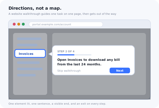
“Website walkthrough” means two different things, and the confusion costs teams money in both directions. To one group it is a video: a recording of someone clicking through a site while explaining it. To another it is an overlay on the live page: a sequence of highlighted elements with short instructions that the visitor follows while doing the task.
This guide is mostly about the second kind, because it is the one that changes whether visitors complete the thing they came to do. It is also about knowing when not to build one. Most pages on most websites do not need a walkthrough, and adding one to a page that does not need it is the most common way to make walkthroughs look useless.
What follows: the two kinds and when each fits, the pages that genuinely need a walkthrough, the anatomy of one that gets finished, seven example patterns, a six-step build, and the mistakes that get it closed.
Key Takeaways
- A walkthrough is for pages where the visitor has a task and the path is hidden. Portals, multi-step forms, member areas, redesigns. Never the homepage.
- Interactive beats video when the visitor is on the page with the task in front of them. Video wins for explanation at a distance.
- Three to five steps, one task, one sentence each. A tour of the whole site is a map, not directions.
- Trigger on the first visit to the task, not on every visit. Then offer it, never force it.
- The walkthrough is a patch, not a fix. If the same step confuses everyone, change the page and retire the step.
- Measure task completion after the walkthrough, not walkthrough completion.
What Is a Website Walkthrough? (Definition & Meaning)
Website walkthrough: definition
A website walkthrough is a guided, step-by-step explanation of how to do one thing on a website. An interactive walkthrough runs as an overlay on the live page: it dims everything except one element, explains it in a sentence, and moves to the next element when the visitor is ready. A walkthrough video is a recording of the same task, watched separately from the page. Both guide; only the interactive kind guides the visitor while they do the task.
A website walkthrough differs from a product walkthrough mainly in its setting. A product walkthrough explains a software application's features to a user who has just signed up. A website walkthrough explains a site to a visitor or a logged-in customer: how to find an invoice in a customer portal, how to complete a multi-step booking, where things moved after a redesign, how to use a member area. The mechanics are the same, and the same tools build both. The audience is different in ways that change the design: website visitors are more varied, less committed, and far more often on a phone.
Interactive vs. Video Walkthroughs: When Each Fits
The question is not which is better. It is where the visitor is when they need the explanation.
| Interactive walkthrough | Walkthrough video | |
|---|---|---|
| The visitor is | On the page, with the task in front of them | Anywhere: a help article, an email, a sales page |
| Best for | Doing: portals, forms, account settings, new navigation | Explaining: what a site offers, how a process works end to end |
| Length | 3–5 steps, under a minute | 1–3 minutes |
| Stays accurate | As long as the elements it points at exist; needs upkeep | Until the site changes; then it lies confidently |
| Measured by | Task completion after the walkthrough | Watch time, then nothing |
| Fails when | It launches on pages with no task | It is the only help on a page where the visitor is stuck |
A video that tours the whole site belongs in the help centre and on the sales page; the onboarding videos guide covers the length and placement rules. The moment a visitor is on the page trying to do the thing, a video asks them to leave it, watch, remember, come back and reproduce; an interactive walkthrough asks them to click next. That is the whole case for interactive, and it only applies on pages with a task.
When a Website Needs a Walkthrough (and When It Never Does)
The test has two parts. Does the visitor arrive with a task? And does the page hide the path to it? A walkthrough is justified only when both are true. One without the other is a page that needs a better design, not a guide.
Pages that need one
- Customer portals after login: insurance, utilities, banking, telecoms, SaaS billing. The visitor wants a document or a setting and the portal has forty menu items.
- Multi-step forms: applications, claims, bookings, registrations where the steps span pages and the visitor cannot see how far they have to go.
- Redesigned navigation: returning visitors know where things were; the walkthrough shows where they are now, once.
- Member and account areas: the part of the site where a visitor becomes a user and the tasks multiply.
- Seller and partner dashboards: the supply side of a marketplace has a job to finish before anything works.
- Intranets and internal sites: employees with a process to follow and no time to learn the tool.
Pages that never do
- The homepage. Nobody arrives at a homepage with a task the homepage hides. A walkthrough there is a pop-up with extra steps.
- Single-action pages: a contact form, a pricing page, a checkout with one button. If the action is not obvious, the page is broken.
- Content pages: articles, documentation, landing pages. The task is reading.
- Pages the visitor sees once. A walkthrough teaches; there is nothing to learn for a page nobody returns to.
- Any page where the fix is a label. If one clearer heading would remove the confusion, write the heading.
Notice what the left column has in common: every one of those pages sits after some kind of login or commitment. That is where website walkthroughs earn their keep, and it is why the practice overlaps so heavily with onboarding in regulated and service industries. The utility and insurance onboarding guides both turn on the customer portal, which is the website walkthrough's home ground.
The Anatomy of a Good Website Walkthrough
A walkthrough that gets finished has six parts, and most abandoned ones are missing two of them: a clear exit and a rule about when it never shows again.
The two parts most often missing are the exit and the never-again rule. Without them a walkthrough is an interruption that repeats.
1. A trigger with an audience
Who sees it, on which page, and when. The strongest trigger is the first visit to the page where the task lives: first login to the portal, first arrival at the redesigned menu. Every other trigger is an offer, not a launch: a small “show me around” button, a hotspot on the element people miss, a link from the help centre. The onboarding triggers guide covers the rules in detail; the short version is that a walkthrough fires once per person per task.
2. A spotlight, not a pointer
Dim the page and leave one element lit. A tooltip with an arrow on an undimmed page competes with everything else; a spotlight removes the competition. It also makes the walkthrough safe to leave, because clicking the dimmed area is an obvious way out.
3. One sentence per step, verb first
“Open Invoices to download any bill from the last 24 months.” Not “This is the Invoices section, where you will find your billing history and can download statements.” The first tells the visitor what to do and what they get; the second describes furniture. The tooltip writing rules apply to every step.
4. Visible progress
“Step 2 of 4” is the single cheapest completion lever in a walkthrough. A visitor who can see the end will usually reach it; one who cannot assumes the worst around step three.
5. An exit on every step
A skip link, plainly worded, on every step. No “no thanks, I don't want to save time” copy. A visitor who skips has told you something useful: the walkthrough was not for them, or it arrived at the wrong moment. Make the skip count as done.
6. A never-again rule
Finished or skipped, the walkthrough does not return unless the visitor asks for it. This is the rule that separates a walkthrough from a nuisance, and it requires the tool to remember the visitor across sessions, which is a question to ask before choosing one.
Website Walkthrough Examples: 7 Patterns
The patterns below are drawn from the kinds of site where walkthroughs consistently pay off. Each is described by where it runs, what its steps are, and the mistake that ruins it.
1. The portal first-login walkthrough
Where: a customer portal for a utility, insurer, bank or telecom, on the first login after account creation. Steps: where your documents are, how to pay or update payment, where to change contact details, how to reach support. Four steps, each on the element. The mistake: including every menu item. The four steps are the four reasons people log in, and the analytics behind the portal say what those are.
2. The redesigned-navigation walkthrough
Where: any site after a redesign, shown only to returning visitors who used the old layout. Steps: the two or three things that moved, in the order people look for them. The mistake: showing it to new visitors, who never knew the old layout and now learn that something is confusing. The redesign rollout guide covers the targeting rule and how long to keep it live.
3. The multi-step form guide
Where: an application, claim, booking or registration that spans several pages. Steps: one at the start showing the overall path and what documents to have ready; then a single tooltip on each page's one non-obvious field. The mistake: walking through the obvious fields. A guide on “enter your email” teaches visitors to close guides.
4. The self-service account walkthrough
Where: the account or settings area of any site with subscriptions, on the first visit. Steps: how to change the plan, how to update billing, how to cancel or pause. Yes, cancel: a visitor who cannot find it will call, and the call costs more than the churn. The mistake: hiding the step that support tickets are actually about.
5. The seller or partner dashboard walkthrough
Where: the supply side of a marketplace or partner programme, on first login. Steps: the setup order that gets a listing live: profile, first listing, payout details, in that sequence. The mistake: a walkthrough with no checklist behind it. Setup spans days; the walkthrough shows the path once and a persistent checklist holds the place. The marketplace onboarding guide covers the pairing.
6. The intranet or internal tool walkthrough
Where: an employee site or internal web application, at rollout and for each new joiner. Steps: the process, not the tool: where to submit the thing, where to check its status, who to ask. The mistake: replacing training with a walkthrough. It is the reminder after training, not the training; the software rollout guide covers the rest.
7. The “what changed on this page” hotspot
Where: any page with one new thing, for returning visitors. Steps: one. A pulsing dot on the new element that opens a single tooltip on click. The mistake: making a three-step walkthrough out of a one-sentence change. The hotspot guide is the reference for when a dot beats a sequence.
How to Create a Website Walkthrough in 6 Steps
- Pick one task on one page.
- Walk the path yourself and cut it to the fewest clicks.
- Write the steps: one sentence each, verb first.
- Decide the trigger and the audience.
- Build it on the live site with a no-code tool.
- Watch the numbers, then prune.
1. Pick one task on one page
Start from the support queue or the analytics, not from the site map. The task is the thing visitors ask about most, or the page where they arrive and leave without acting. One task. A second task is a second walkthrough.
2. Walk the path yourself and cut it to the fewest clicks
Before writing a single step, do the task on the site and count the clicks. If the path has eight steps, the first improvement is to the path, not the walkthrough. A walkthrough over a bad path is a well-lit maze.
3. Write the steps: one sentence each, verb first
Three to five sentences, each pointing at one element and saying what the visitor gets by using it. Write them in a document first, read them in sequence, and remove any step that describes rather than instructs.
4. Decide the trigger and the audience
First visit to the page for people who have not done the task: launch. Everyone else: offer. Write the never-again rule down. Decide whether mobile visitors get the same walkthrough, a shorter one, or a single hotspot instead.
5. Build it on the live site with a no-code tool
A no-code walkthrough tool is added to the site once, through the template or the tag manager, and from then on walkthroughs are built by clicking the elements on the live page and typing the steps. Target by page and by visitor attribute, preview, publish. No release, no developer in the loop for the twenty small edits the walkthrough will need over its life. The no-code onboarding guide covers what to check before installing one.
6. Watch the numbers, then prune
After two weeks, look at step-level completion and at whether the task got done afterwards. A step where many visitors leave is either badly written or unnecessary. A walkthrough everyone finishes but that does not change task completion is decoration. Remove steps before adding them.
Why Visitors Close Walkthroughs
Every one of these appears in the average website walkthrough, and each one is enough on its own.
-
It launches on the homepage
The visitor has no task yet and the walkthrough has nothing to guide them to. It reads as a pop-up.
-
It launches on every visit
The second time is an interruption; the third time teaches the visitor to close all walkthroughs on sight.
-
It tours the site instead of guiding a task
Nine steps across five sections is a map. The visitor wanted directions.
-
It patches a page that should be fixed
If every visitor needs the same step, the page needs a label, a button or a redesign. The walkthrough is the evidence, not the fix.
-
It was never opened on a phone
The tooltip covers the element it explains, the highlighted item is below the fold, and the skip link is under a thumb.
-
It blocks the page
A walkthrough that cannot be dismissed is a modal with a step counter. The dimmed area should always be a way out.
-
It points at an element that moved
Sites change; walkthroughs anchored to specific elements break silently. The maintenance guide covers how to notice before visitors do.
How to Measure a Website Walkthrough
| Metric | What it tells you | Healthy looks like |
|---|---|---|
| Started / shown | Whether the trigger reaches people with the task | High on a first-visit launch; lower and fine on an offered walkthrough |
| Completion per step | Which step loses people | A gentle slope; a cliff at one step means that step |
| Skipped at step 1 | Wrong audience or wrong moment | Low on a well-targeted trigger |
| Task completed after walkthrough | Whether it worked | Higher than for visitors who did not see it |
| Tickets about the task | Whether the confusion is gone | Falling within weeks |
The fourth row is the one that matters, and it is the one most tools do not show by default: a walkthrough that everyone finishes and that changes nothing has failed just as surely as one everyone closes. Measure the task, not the tour.
Website Walkthroughs: Do vs. Don't
Do
- Build walkthroughs for pages with a task and a hidden path: portals, forms, member areas.
- Keep it to three to five steps, one sentence each, verb first.
- Launch once on first visit, offer everywhere else, never repeat.
- Show progress and a plain skip on every step.
- Test on a phone before publishing.
- Measure task completion after the walkthrough.
Don't
- Put a walkthrough on the homepage or a single-action page.
- Tour the whole site.
- Auto-launch on every visit.
- Use a walkthrough to avoid fixing the page.
- Block the page or hide the exit.
- Judge it by its own completion rate.
Building a Website Walkthrough Without a Developer
The practical obstacle to good website walkthroughs is not design; it is that the walkthrough needs twenty small edits over its life and each one goes through a developer. So the walkthrough ships once, drifts, and gets switched off.
Kompassify's product tours run on any website after adding one script to the site once. From then on, walkthroughs are built in a visual editor on the live page: click the element, write the step, choose the trigger and the audience by page and visitor attribute, preview on desktop and mobile, publish. A hotspot, a single tooltip and a persistent checklist are built the same way, so the seven patterns above use one tool. The never-again rule is built in, and the analytics show started, finished, skipped and completion per step.
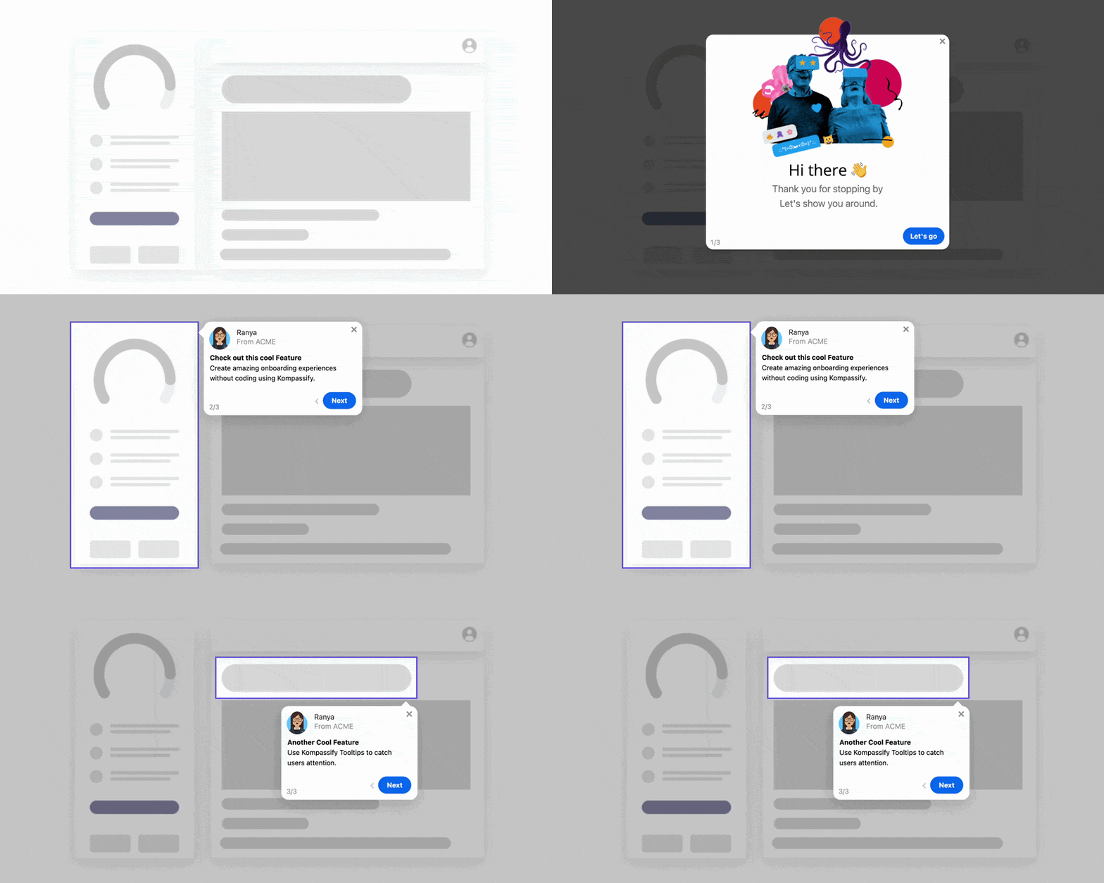
A Kompassify walkthrough on a live page: one element lit, one sentence, a next button, and an exit. Built by clicking the element, not by writing code.
Add a walkthrough to your site this afternoon
Install once, build on the live page, target by page and visitor, and measure completion per step. Free up to 100 monthly active users, plans from $129/month, GDPR-compliant and EU-hosted.
Start for free →The One-Paragraph Version
A website walkthrough guides a visitor through one task on one page, and it belongs only where the visitor arrives with a task and the page hides the path: customer portals, multi-step forms, member areas, redesigned navigation, seller dashboards and intranets, never the homepage. Interactive beats video when the visitor is on the page with the task in front of them; video wins for explanation at a distance. A walkthrough that gets finished has a first-visit trigger, a spotlight, one sentence per step, visible progress, an exit on every step and a rule that it never returns. Keep it to five steps, test it on a phone, treat it as a patch that points at what the page should fix, and measure whether the task got done afterwards rather than whether the walkthrough did.
Frequently Asked Questions
What is a website walkthrough?
A website walkthrough is a guided, step-by-step explanation of how to do something on a website. It comes in two forms. An interactive walkthrough is an overlay on the live site that highlights one element at a time with a short tooltip and a next button, so the visitor performs the task while being guided. A walkthrough video is a recording of someone doing the task, watched separately. The interactive form suits pages where the visitor has a task to complete right now, such as a customer portal or a multi-step form; the video suits explanation at a distance, such as a help article or a sales page.
What is the difference between a website walkthrough and a product tour?
Mostly the setting. A product tour guides a user through a software application's workflow, usually right after signup, and its subject is a feature. A website walkthrough guides a visitor or a logged-in customer through a website: a portal, a booking flow, a member area, a redesigned navigation. The mechanics are the same, a sequence of highlighted elements with short explanations, and the same no-code tools build both. The design differences follow from the audience: website visitors are more varied, less committed and more likely to be on a phone, so a website walkthrough has to be shorter, easier to leave and safer to skip.
How long should a website walkthrough be?
Three to five steps, covering one task. A walkthrough that tries to show the whole site is a tour of the map rather than directions to a destination, and visitors close it around the fourth step. If a task genuinely needs more than five steps, split it: guide the first part, let the visitor complete it, and offer the next walkthrough from where they finished. Each step should be one sentence that starts with a verb and points at one element.
Can I add a walkthrough to my website without coding?
Yes. No-code walkthrough tools such as Kompassify work by adding one script to the site's template or tag manager, once. After that, walkthroughs are built in a visual editor on top of the live page: you click the element to highlight, write the step, choose the trigger and the audience, and publish. Changes go live without touching the site's code or waiting for a developer, which matters because walkthroughs need frequent small edits as the site changes.
Should a website walkthrough start automatically?
Only for a first visit to a page where the visitor is very likely to have the task the walkthrough covers, such as the first login to a customer portal or the first visit after a redesign. Everywhere else, offer it rather than launch it: a small prompt, a help button, or a hotspot on the element people get stuck on. Auto-launching on every visit is the fastest way to teach visitors to close walkthroughs without reading them, and a walkthrough should never fire twice for the same person unless they ask for it.
Do website walkthroughs work on mobile?
They work if they were designed for it, which most are not. On a small screen a tooltip can cover the element it is explaining, a highlighted item may be below the fold, and a five-step sequence is a lot of thumb travel. Test every walkthrough on a phone before publishing, shorten it for mobile if the tool allows different versions, and prefer a single hotspot or a short banner over a multi-step sequence for the mobile version of a page.