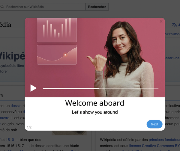
The onboarding video project follows a familiar arc. Someone proposes it, everyone agrees, and three weeks later there is a four-minute product overview with a voiceover and a music bed. It gets embedded on the empty dashboard, linked from a welcome email, and added to a page called Resources. Play rate settles somewhere around a tenth of new users, average watch time lands under a minute, and the conclusion is drawn: users don't watch videos.
They do. What they do not do is watch a video that arrives before they have a question, that covers six topics when they needed one, or that shows a screen they are already looking at. Video is a precise instrument used bluntly almost everywhere.
Key Takeaways
- Video for understanding, interactive guidance for doing. The medium follows the job.
- Six distinct types, six different lengths: treating them as one format is why videos go unwatched.
- The first ten seconds decide everything: the viewer must recognise their own problem immediately.
- Placement beats production value. A rough video at the moment of confusion outperforms a polished one in a library.
- Design for sound-off. Captions and on-screen text are not accessibility extras, they are the default viewing mode.
- Recordings age badly: every UI change is a re-record, so keep them short and chaptered.
- Completion rate is vanity; whether viewers went on to do the task is the only real measure.
What Is an Onboarding Video?
Onboarding video (definition): a short recorded explanation shown to new or newly promoted users to help them understand a product, a concept, or how to complete a specific task. It is one channel in a broader customer education programme, not a replacement for in-product guidance, and not a substitute for a product that explains itself.
The single most useful thing you can do before recording anything is decide which of two jobs the video has. Understanding jobs are about why: why this product exists, what this concept means, what good looks like. Doing jobs are about how: click here, then here, then this happens. Video is excellent at the first and mediocre at the second, and almost every disappointing onboarding video is a doing job filmed as an understanding video.
What video is genuinely good at
-
Showing what "working" looks like
A finished dashboard, a completed workflow, the outcome the user is aiming at. Static screenshots cannot convey momentum, and text cannot convey scale.
-
Explaining a model before the clicks
Permissions, workspaces, billing cycles: anything a user must hold in their head before any instruction makes sense.
-
Crossing systems you don't control
When a workflow moves through a third-party tool, an interactive walkthrough cannot follow. A recording can.
-
Carrying a human voice
Tone, warmth and credibility travel through video in a way they do not through a tooltip. This matters most in the first minute of a relationship.
And what it is bad at
Video cannot adapt to the viewer's account, cannot verify that they did the step, cannot be searched by a person scanning for one detail, and cannot be corrected without a re-record. It also has a hard structural weakness: it demands the user stop working to watch it. Anything that the user should be doing right now pays that cost for no benefit.
The Six Types of Onboarding Video
Each of these has a different audience, a different placement and a different natural length. Deciding which one you are making, before writing a script, removes most of the ways a video goes wrong.
Sets expectations and orients. Not a feature tour: it answers "what is this, and what should I do first?"
Teaches the mental model behind a part of the product, so the how-tos afterwards make sense.
One task, start to finish. If it covers two tasks, it is two videos with two placements.
A genuinely long one-off configuration: integrations, imports, permissions. Chapter it so people can skip to their step.
Shows a realistic workflow end to end so the viewer recognises their own situation in it.
What changed and why it matters, for existing users. Pairs with your release notes.
The overview video is the one to be suspicious of. "A general introduction to the product" has no specific viewer and no specific moment, which is why it ends up on a resources page being watched by nobody. If you cannot name the question it answers and the screen it belongs on, it is not a sixth type; it is a video looking for a purpose.
How Long Should an Onboarding Video Be?
Length matters less than most guidance suggests, and the opening matters far more. Viewers do not abandon because a video is four minutes long; they abandon because at 0:08 they still do not know whether it is about their problem.
Three rules that beat any length target
Name the problem in the first sentence. No greeting, no company introduction, no "in this video we'll cover". Start at "Your import failed and there are three usual causes."
One video, one job. A video that covers importing and exporting cannot be placed anywhere well, because it belongs on two screens and is half-irrelevant on each.
Chapter anything over two minutes. Chapters convert a long video from something to be endured into a reference someone can jump around in, and the chapter titles tell you which parts to shorten next time.
Video or Interactive Walkthrough?
This is the decision that determines whether your onboarding video was worth making. The two mediums are not competitors so much as tools for different verbs.
🎬 Reach for video when…
- The subject is why, not how
- You need to show an outcome the user cannot see yet
- The workflow leaves your product
- Tone and credibility matter more than precision
- The user is deliberately learning, not mid-task
- The content is stable and won't change next sprint
🖱️ Reach for an interactive walkthrough when…
- The user should do the thing right now
- The steps happen in their account, with their data
- You want to know whether they completed it
- The interface changes often
- Different segments need different paths
- The task spans several sessions
The product walkthroughs guide covers the second column in depth. The important point here is the failure mode of ignoring the split: a video showing the screen the user is currently on. It asks someone to watch a recording of the thing in front of them, then reproduce it from memory, strictly worse than pointing at it.
The best combination is sequential, not either/or. A 40-second video that explains why permissions work the way they do, followed immediately by a three-step product tour that has the user set them. Understanding, then doing: each medium used for the verb it is good at.
How to Make an Onboarding Video in 7 Steps
- Name the question and the placement first
- Write the script, then cut a third of it
- Build a clean demo account
- Record audio and screen separately
- Edit out every dead second
- Add captions, chapters and a transcript
- Place it where the question happens
1. Name the question and the placement first
Write one sentence: "This video answers ___ for ___, and it will live on ___." If you cannot fill in the third blank, stop: the video will be produced and then orphaned, which is the most common way video budgets are wasted.
2. Write the script, then cut a third of it
Unscripted screen recordings are how a ninety-second video becomes four minutes of hesitation. Write it, read it aloud with a timer, then delete the introduction, the summary at the end, and every sentence that starts with "as you can see". Aim for roughly 140 words per minute of finished video.
3. Build a clean demo account
Realistic data, sensible names, no "test test 123", nothing that could be a real customer's information. This account should be maintained and reused: half the cost of re-recording after a UI change is rebuilding the state you filmed in.
4. Record audio and screen separately
The single biggest quality upgrade available to a team without a studio. Recording separately means a fumbled sentence costs one line of narration rather than a whole take, and it lets you re-record the audio for a different language over the same capture. Use a fixed window size and enlarge the cursor.
5. Edit out every dead second
Page loads, mouse travel, thinking pauses, the moment where a modal animates in. Viewers do not experience an edit as jarring; they experience an unedited pause as abandonment permission. Zoom in on small targets rather than expecting people to find a 12-pixel icon.
6. Add captions, chapters and a transcript
Captions because most in-product viewing happens with the sound off. Chapters because they turn length into navigability. A transcript because it makes the content searchable, indexable, and far cheaper to localise, which matters as soon as you have a multi-language user base.
7. Place it where the question happens
The final step and the one that determines the return on the previous six, covered next.
Where to Place Onboarding Videos
Placement does more for a video's performance than production quality ever will. The rule is the same one that governs any help content: minimise the distance between the question and the answer.
| Video type | Where it belongs | Where it dies |
|---|---|---|
| Welcome | The first screen after signup, or the first onboarding email | A resources page nobody visits |
| Concept explainer | Inside the knowledge base article about that concept | A YouTube channel with no context |
| Task tutorial | On the screen where the task is performed | A video library the user must search |
| Setup walkthrough | Beside the setup form, and in the setup email | Halfway down a long documentation page |
| Use-case story | The welcome screen or an empty state | The marketing site only |
| Feature update | An in-app announcement to existing users | A changelog nobody subscribes to |
Note the pattern in the right-hand column: every one of them is a destination the user has to choose to visit. Video libraries fail for the same reason help centres do: they require the viewer to know that a video exists and which one answers their question, at exactly the moment they are least equipped to guess.
Sound Off, Captions On, and Localisation
A significant share of in-product video is watched in an open-plan office, on a laptop with no headphones, by someone who will not turn the volume up. Design for that viewer first and the accessible version comes almost free.
✅ Do
- Caption every video, and check the auto-generated text
- Put key terms on screen, not only in the narration
- Publish a transcript alongside the player
- Keep narration and screen capture as separate assets
- Enlarge the cursor and zoom into small controls
- Check contrast: video compresses thin light text badly
❌ Don't
- Autoplay with sound
- Rely on a music bed to carry pacing
- Hide the only copy of an instruction in the audio
- Burn subtitles into the video file
- Film UI text too small to read at 50% player size
- Re-shoot from scratch for each language
Keeping the narration separate is what makes localisation affordable: a new language is a translated transcript and a fresh audio track over the same screen capture, not a new production. If your interface itself is translated, you will eventually need per-language captures too, but that decision can wait until the audience justifies it.
Measuring Whether the Video Worked
| Metric | What it tells you | What to do about it |
|---|---|---|
| Play rate | Whether the placement and thumbnail earned attention | Low? Move it closer to the question, not up the page |
| Retention curve | Where people leave | Early cliff = slow opening. Cut the first 10 seconds |
| Chapter replays | Which part was genuinely needed | Promote that chapter into its own short video |
| Downstream task completion | Whether viewers actually did the thing | The only number that justifies the next video |
| Ticket volume on the topic | Whether it deflected anything | Flat? The video answered a question nobody was asking |
Compare viewers against non-viewers on the same downstream action, in the same segment. A video with 80% completion and no measurable effect on activation is entertainment: pleasant, and not the reason it was funded. Your product analytics should be able to answer that question before the next video is commissioned.
Pairing Video With In-Product Guidance
The practical way to get value from onboarding video is to stop treating it as a channel of its own and start treating it as one step inside in-product guidance. With Kompassify that pairing is built without engineering time:
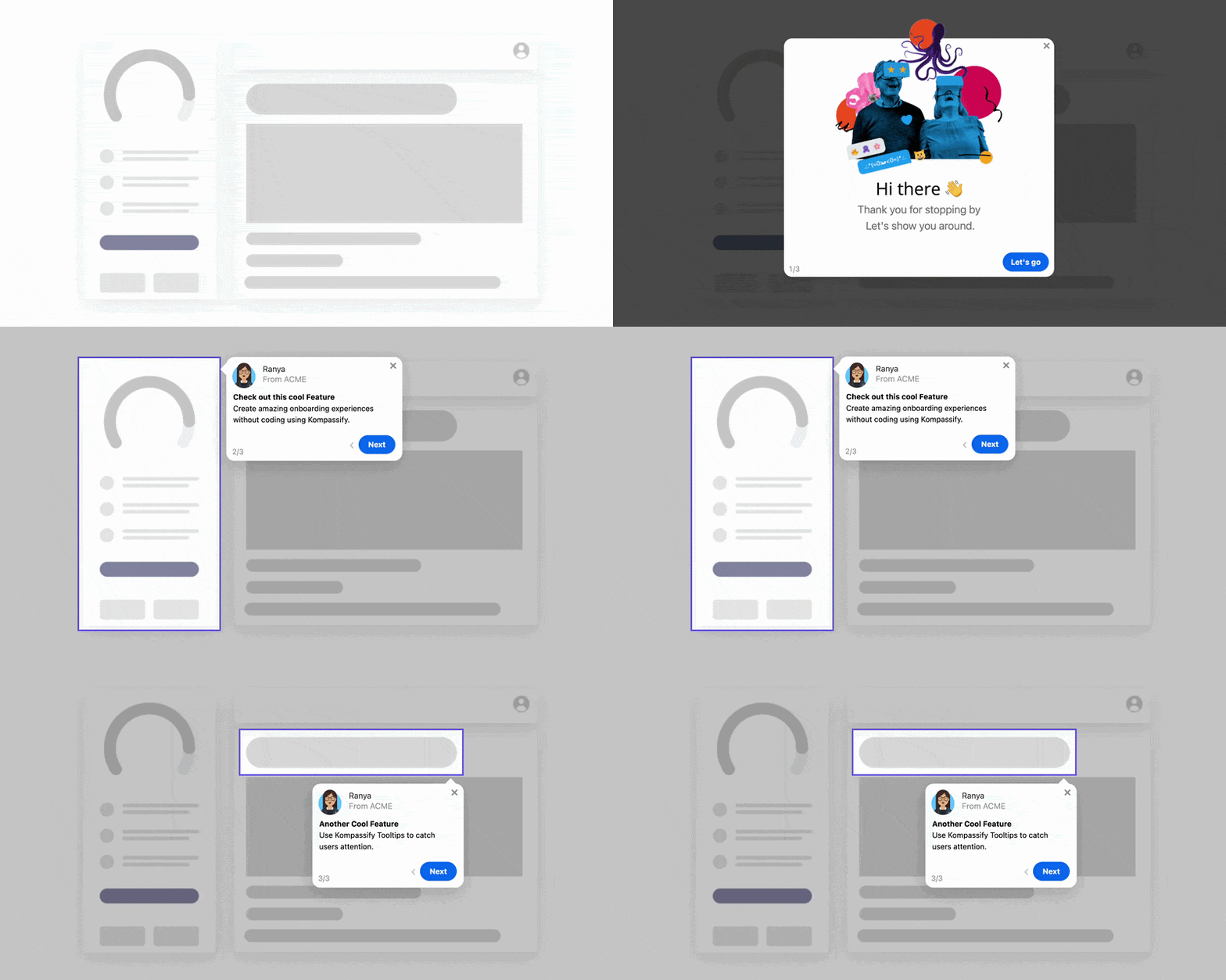
- Put the video in the step. Embed a short explainer inside a product tour step or a modal, so understanding and doing happen in one sequence rather than in two tabs.
- Show it only to the people it is for. Target by role, plan or lifecycle stage, so a setup walkthrough reaches admins and not the members they invited.
- Trigger it at the moment, not at signup. Fire the video when the user reaches the screen or hits the state it explains, the timing question covered in the onboarding triggers guide.
- Cap it. Show-once by default, so a welcome video does not greet the same person every morning.
- Follow it with a checklist. Pair the video with an onboarding checklist that tracks whether the thing it explained actually got done.
- Measure the pair, not the play. Built-in analytics show completion of the guidance the video sits inside, so you can see whether watching led to doing.
Kompassify is GDPR compliant and EU-hosted, free for under 100 monthly active users, with paid plans from $129/month. You can also try a live demo to see guided steps running inside a real product.
Put Your Videos Where the Questions Are
A good onboarding video in the wrong place performs worse than a rough one in the right place. Kompassify lets you embed videos inside product tours, modals and in-app announcements on your live product, targeted by segment, triggered at the right moment, capped so nobody sees them twice, and measured against what users did next. No code, no release cycle. GDPR compliant, EU-hosted, and free for under 100 monthly active users.
Start for Free →Frequently Asked Questions
What is an onboarding video?
An onboarding video is a short recorded explanation shown to new or newly promoted users to help them understand a product, a concept or a task. In practice it covers six distinct jobs: a welcome video that sets expectations, a concept explainer, a task tutorial, a setup walkthrough for a one-off configuration, a use-case story showing what the product is for, and a feature update. They are not interchangeable: a two-minute welcome video and a six-minute setup walkthrough succeed and fail for completely different reasons, and treating them as one format is why so many onboarding videos go unwatched.
How long should an onboarding video be?
Match the length to the job, not to a universal rule. A welcome or positioning video should be 30 to 60 seconds: it exists to orient, not to teach. A concept explainer runs 60 to 90 seconds. A single task tutorial should be 45 to 120 seconds, one task only. A setup walkthrough for a genuinely long configuration can run three to five minutes, provided it is chaptered so people can skip to their step. The reliable predictor of abandonment is not the total length but whether the viewer can tell, in the first ten seconds, that the video is about their specific problem.
When is a video better than an interactive product tour?
Video wins when the subject cannot be pointed at: why the product exists, what a concept means, how something looks when it is working, or a workflow that spans systems you do not control. An interactive walkthrough wins whenever the user is meant to do the thing right now, because it happens in their own account with their own data and cannot fall out of date the way a recording does. The rough rule: video for understanding, interactive guidance for doing. Showing a video of a screen the user is currently looking at is almost always the wrong choice.
How do you make an onboarding video without a production team?
Write the script first: a screen recording without a script is how a ninety-second video becomes four minutes. Then prepare a clean demo account with realistic data, record the audio separately from the screen so you can re-record either one alone, capture the screen at a fixed resolution with a large cursor, and cut ruthlessly: remove every pause, every page load and every sentence that begins with a greeting. Add captions, publish it where the question actually arises, and keep the source files so a UI change means a re-record of one section rather than the whole video.
Where should onboarding videos be placed?
Where the question already exists. A welcome video belongs on the first screen after signup or in the first onboarding email. A task tutorial belongs on the screen where that task is performed, not in a separate video library. A setup walkthrough belongs next to the setup form. A concept explainer belongs in the relevant knowledge base article. Video libraries perform poorly on their own because they require the user to know both that a video exists and which one answers their question, the same distance problem that undermines help centres.
Do onboarding videos need captions and transcripts?
Yes, and not only for accessibility. A large share of in-product video is watched with the sound off, in an office or shared space, so a video that carries its meaning purely in the narration simply fails for those viewers. Captions fix that, a transcript makes the content searchable and indexable, and both make localisation dramatically cheaper: translating a transcript and re-recording narration over the same screen capture costs a fraction of reshooting. Design the visuals so the video still makes sense with no audio at all.
How do you measure whether an onboarding video worked?
Play rate tells you whether the placement and thumbnail earned attention. The retention curve tells you where people leave, and a sharp early drop is almost always a slow opening rather than a bad video. Completion matters only for short videos; for anything chaptered, watch which chapters get replayed. The number that actually matters is behavioural: did viewers go on to complete the task the video was about, more often than non-viewers? A video with excellent completion and no downstream effect is entertainment.
Can you add onboarding videos to a product without engineering time?
Yes. With a no-code platform like Kompassify you can place a video inside a step of a product tour, a modal or an in-app announcement on top of your live product, target it to the segment it is relevant to, and control how often it appears, without a release cycle. That also makes it practical to pair the two mediums properly: a short video to explain why something matters, followed immediately by an interactive walkthrough that has the user do it. Kompassify is GDPR compliant and EU-hosted, free for under 100 monthly active users, with paid plans from $129/month.